Annotated SaaS Screenshot OCR Cleanup: A Practical Field Guide
A practical guide to cleaning annotated SaaS screenshots before OCR, with capture rules, crop choices, contrast checks, export settings, and review tips.
Annotated SaaS Screenshot OCR Cleanup: A Practical Field Guide
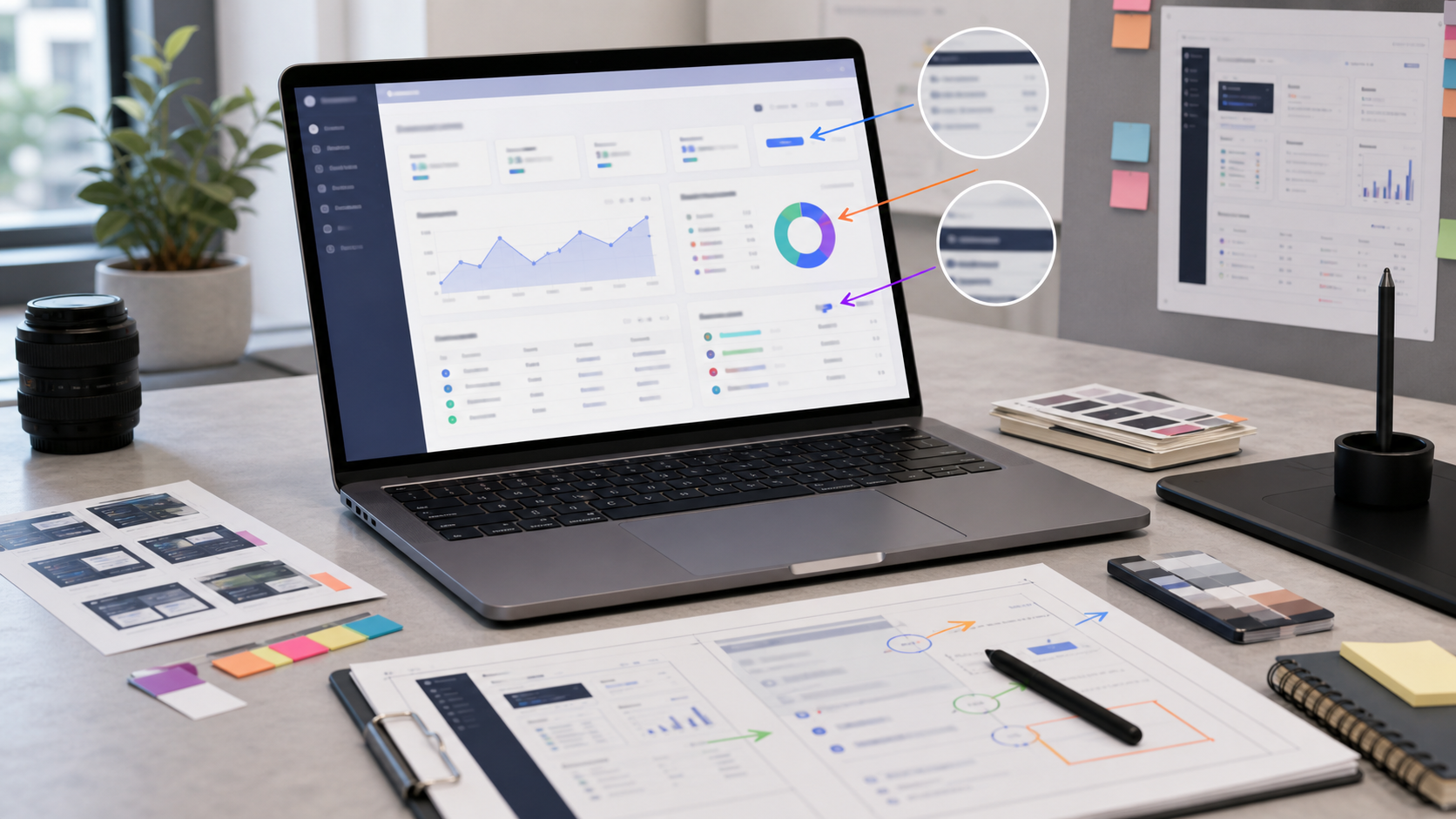
Annotated SaaS screenshots look simple until you try to extract text from them. A support article may include a browser window, a product sidebar, tiny table rows, red arrows, numbered callouts, blurred account details, a watermark from a staging build, and a caption pasted on top by the writer. To a human reader, the screenshot is understandable. To OCR, it is a crowded image with several competing text systems.
This guide is for documentation teams, customer education teams, QA leads, and support operations people who need searchable text from screenshots without turning every image into a manual transcription project. The goal is not to make screenshots prettier for their own sake. The goal is to prepare them so OCR sees the right text, ignores the junk, and gives you a result that is good enough to search, quote, archive, or attach to a ticket.
The examples here focus on SaaS screens because they are especially messy: dense navigation, small labels, repeated UI controls, data tables, badges, icons with labels, and overlays from product tours. The same approach also helps with admin panels, analytics tools, CRM screens, dashboards, and internal web apps.
Why Annotated Screenshots Need Different OCR Prep
Most OCR advice assumes a clean document: black text on white paper, straight lines, predictable paragraphs. SaaS screenshots are different. They are usually captured from an interface designed for visual scanning, not machine reading. Text may be 11 to 14 pixels tall. Some labels are gray. Some words are inside buttons. Some strings are truncated. A selected tab might be white text on a saturated background. A tooltip might float over an unrelated panel.
Annotations add another layer of difficulty. An arrow can cross through a label. A number marker can look like real interface data. Highlight boxes can reduce contrast around the exact text you need. A blur patch can introduce texture that OCR mistakes for characters. Even a helpful red rectangle can make nearby letters harder to segment.
That is why cleanup for screenshot OCR is less about applying one magic filter and more about making a few deliberate choices before extraction. You decide what text matters, isolate it, improve readability without distorting it, and export a version that OCR can handle.
A practical tool chain can stay simple. Use a crop or resize step when the screenshot contains too much surrounding context, use an editor such as /ai-photo-editor when you need to clean distracting marks, run OCR with /image-ocr, and only compress with /compress-image after you have preserved a readable source copy. If you need to share the result as a packet, convert the cleaned screenshots with /image-to-pdf.
The Three Text Layers That Confuse OCR
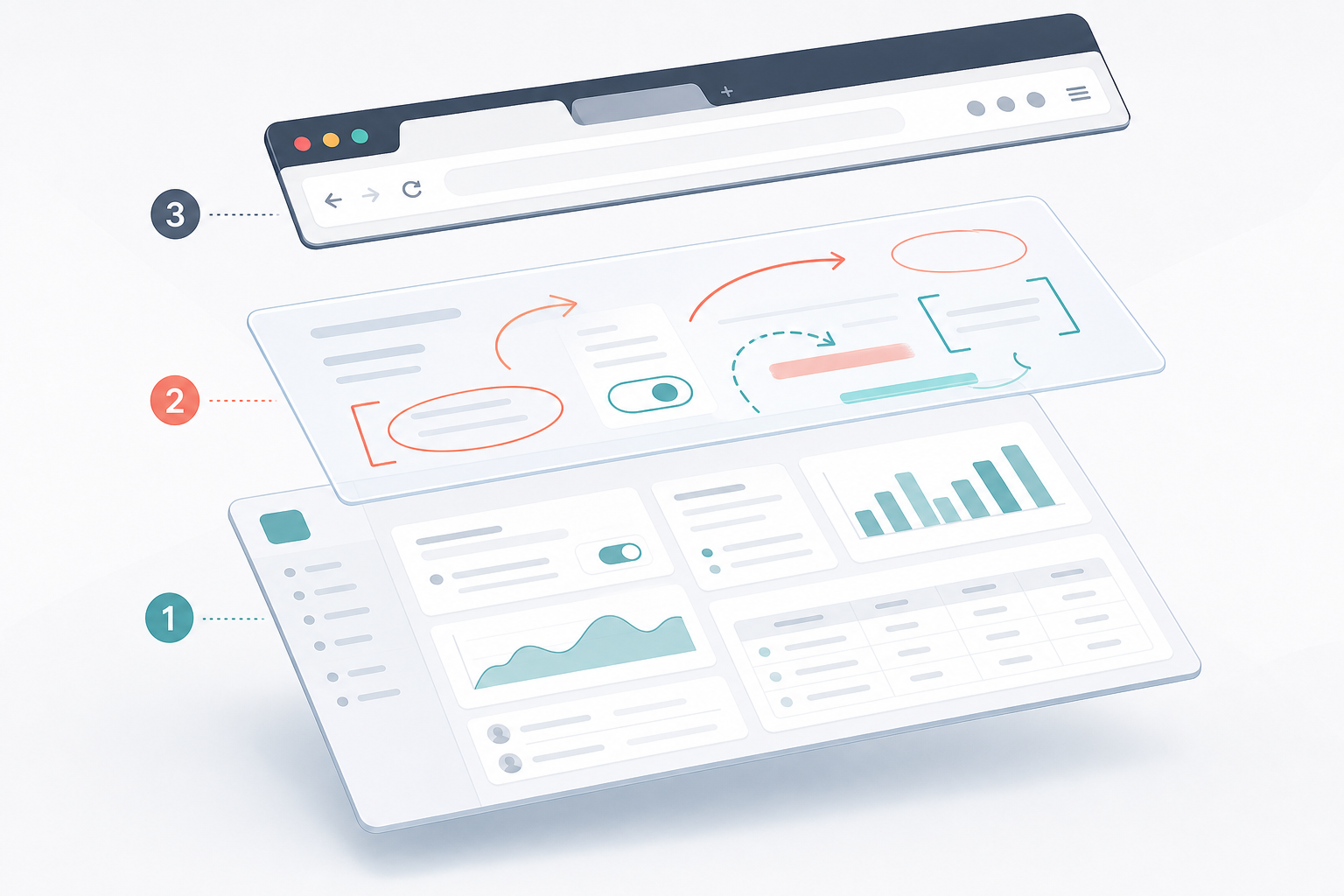
Before editing anything, separate the screenshot into three mental layers. This makes decisions faster and prevents accidental loss of useful text.
| Layer | Examples | OCR risk | What to do |
|---|---|---|---|
| Product interface text | Menus, tabs, labels, table headers, button names, field values | Usually the target text, but often small or low contrast | Preserve, crop closer, sharpen carefully |
| Annotation text | Numbered callouts, pasted labels, arrows, highlight captions | Can pollute OCR output or be mistaken for product text | Keep only if it is part of the record |
| Capture environment text | Browser tabs, URL bar, bookmarks, OS menu, notification banners | Usually irrelevant and highly distracting | Crop out whenever possible |
This distinction is especially important for knowledge base migrations. A screenshot may contain both the product state and instructional labels added by a writer years ago. If you are extracting text to rebuild documentation, annotation labels may be useful. If you are extracting product strings for search indexing, those same labels may be noise.
Do not begin by asking how to improve the whole screenshot. Ask what text should survive. That one question controls your crop, cleanup, contrast, and export choices.
Product Text
Product text is often small, repeated, and visually quiet. It may include sidebar labels, filters, column names, item statuses, and modal instructions. OCR errors here matter because they can break search results or create misleading records.
Give product text priority when cropping. If the screenshot includes a full browser window but the useful text is inside one modal, crop to the modal plus a small margin. If a table has twenty rows but only the header and selected row matter, crop to those regions. You are not making a museum copy of the entire screen; you are preparing a machine-readable image.
Annotation Text
Annotation text is useful only when it carries meaning outside the product itself. A label such as Step 2 or Click here may be important for a training handout, but it is usually not useful for a product text index. OCR cannot know the difference. If annotation text is visually prominent, it may dominate the output.
When you need to keep annotations, make them visually separate from product text. Place callout labels in open space. Avoid covering UI labels. Keep arrows from crossing words. If you inherit messy screenshots, consider creating two versions: an archival visual version with annotations and a clean OCR version without them.
Capture Environment Text
The browser and operating system frame can create a surprising amount of junk. Tab titles, extension labels, bookmark names, URL fragments, profile names, and notification text may all be picked up. In compliance or support contexts, that surrounding text may also expose private information.
The cleanest fix is cropping. Use /resize-image only after crop decisions are done, because resizing the wrong area simply makes irrelevant text easier for OCR to read. For recurring screenshot sets, standardize capture dimensions and hide bookmark bars, extensions, and personal profile indicators before taking the screenshot.
Capture Rules That Save Cleanup Time
If you control the original screenshot, preparation starts before editing. A good capture can save several minutes per image and reduce transcription errors later.
Use the browser zoom level that makes text readable without changing the product state. For many SaaS apps, 110 percent or 125 percent browser zoom creates a better OCR source than a full-screen 100 percent capture. The tradeoff is that less of the interface fits on screen. For OCR, that is often acceptable.
Use a stable viewport. If your team captures help center images at random widths, the same page may show different labels, collapsed menus, or shortened table columns. That makes OCR review harder. Pick a small set of viewport sizes, such as desktop wide, desktop narrow, and mobile, then name files accordingly.
Turn off decorative overlays. Product tours, chat widgets, cookie banners, extension badges, and system notifications create extra text. If the overlay is not the subject of the screenshot, remove it before capture.
Prefer light mode unless dark mode is the actual topic. OCR often handles high-contrast dark text on a light background more predictably than pale text on dark panels. Dark mode screenshots can still work, but they usually need more careful contrast handling.
Avoid JPEG when capturing UI text. PNG is usually a better source format for screenshots because it preserves sharp edges around letters and interface lines. If a screenshot arrives as JPEG, do not repeatedly re-save it while editing. Convert once if needed with /convert-image, then keep a clean master copy.
Crop Before You Enhance
Cropping is the highest-value cleanup step for OCR because it removes entire classes of mistakes. It is also reversible if you keep the original file.
Start with the smallest crop that still preserves context. A cropped modal should include its title, form labels, key buttons, and enough surrounding interface to identify where it belongs. A cropped table should include headers and the selected rows. A cropped settings panel should include the section title and any relevant toggles or field labels.
Avoid ultra-tight crops that slice off letter edges. OCR engines use surrounding whitespace and line shape to infer characters. A crop that touches the top of capital letters or cuts the descenders from letters like g, p, and y can introduce errors. Leave a few pixels of breathing room around text blocks.
For long dashboards, split the screenshot instead of shrinking it. A full-page capture of a complex admin screen may look impressive, but it often forces text into a tiny scale. Split it into logical sections: navigation and page title, primary table, details panel, and modal or drawer. Smaller images with readable text usually beat one giant image with everything included.
If you need to keep a full visual record, create two assets: the full screenshot for human review and cropped OCR images for extraction. Store them with related names, such as billing-settings-full.png and billing-settings-ocr-modal.png.
Clean Annotations Without Losing Evidence
Annotated screenshots often come from bug reports, support escalations, onboarding docs, and QA notes. The annotations may be part of the evidence, but they may also block the text you need.
Use this decision table before removing anything:
| Annotation type | Keep for OCR? | Cleanup choice |
|---|---|---|
| Arrow pointing to a blank region | Usually no | Remove if it crosses useful text |
| Number marker beside a UI control | Sometimes | Keep if steps matter, otherwise remove |
| Highlight rectangle around a field | Usually yes | Keep if it does not reduce contrast |
| Pasted explanatory label | Depends | Move outside the OCR crop or create a separate note |
| Blur over private data | Yes, if privacy is required | Keep blur, but crop away unrelated blurred regions |
| Hand-drawn circle through text | Usually no | Recreate a cleaner crop if possible |
For inherited images, cleanup should be conservative. Do not erase marks that are required to understand a bug report or legal record. Instead, make an OCR-specific duplicate. The duplicate can remove arrows, callouts, and labels that obscure interface text while the original remains untouched.
AI-assisted cleanup can help when an arrow or marker crosses a textured background, but use it carefully around letters and numbers. If the area contains real product text, do not ask an editor to invent the missing characters. Replace the screenshot from source when possible. If that is not possible, document that the OCR result was manually reviewed.
Contrast, Sharpness, and Scale Settings That Help
OCR likes clear character edges. SaaS screenshots often contain anti-aliased text, subtle gray labels, and icons close to letterforms. The trick is to improve readability without creating halos or distortions.
Increase contrast gently. A small contrast increase can help gray UI labels stand out, but too much contrast can merge thin strokes or make colored badges look like heavy blocks. If text is already crisp, leave it alone.
Avoid aggressive sharpening. Oversharpened screenshots develop bright outlines around letters. Humans may read them, but OCR may split one character into multiple shapes. If you sharpen, use a mild setting and inspect small text at 100 percent zoom.
Scale up small screenshots before OCR when the source is clean. Enlarging a crisp PNG by 150 to 200 percent can help OCR read tiny UI labels. Enlarging a compressed JPEG may also enlarge artifacts, so inspect the result. For dense screenshots, resizing with /resize-image can be helpful when you keep proportions and avoid stretching.
Do not compress before OCR. Compression is useful for publishing, email, and storage, but it can damage thin UI text. Run OCR from the cleanest available version, then create a smaller derivative later with /compress-image if you need a web-friendly asset.
File Format Choices for Screenshot OCR
The format you choose affects both extraction quality and future editing.
| Format | Best use | OCR notes |
|---|---|---|
| PNG | Original UI screenshots, cleaned OCR masters | Strong choice for sharp interface text |
| WebP | Published web images where size matters | Good for delivery, but keep a PNG master |
| JPEG | Photos of screens or legacy assets | Watch for artifacts around small text |
| Bundled evidence, review packets, archives | Useful after cleanup, not always ideal as the only source |
For most SaaS screenshot projects, keep PNG as the working format. Export WebP or compressed images only for the final article, help center page, or ticket attachment. If the final deliverable is a document, assemble cleaned images into a PDF after OCR review using /image-to-pdf.
Naming matters too. OCR review becomes much easier when filenames describe the screen and purpose. Use names like admin-users-filter-ocr.png, invoice-modal-annotated.png, and settings-permissions-clean.png. Avoid vague names like screenshot-final-v3-new.png.
A Review Checklist Before You Run OCR
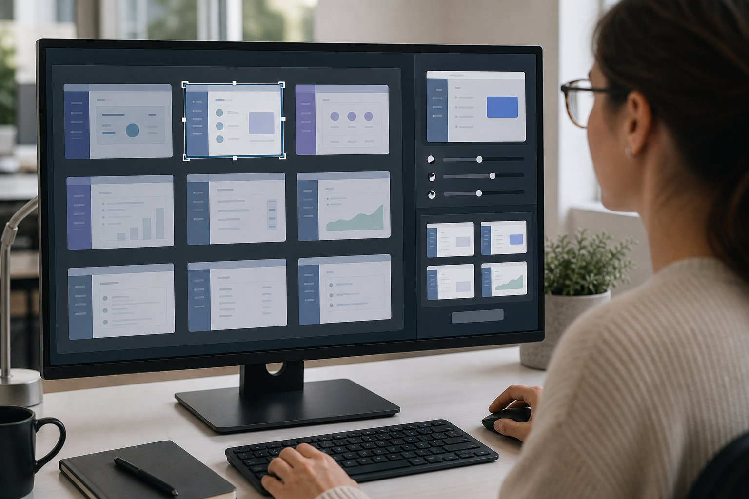
Use this checklist when preparing a batch of annotated SaaS screenshots. It is intentionally practical rather than perfect.
- The image contains only the screen area needed for extraction.
- Browser tabs, bookmarks, extension icons, and personal account indicators are cropped out.
- Product text is not covered by arrows, labels, or marker strokes.
- Any annotation text left in the image is intentionally part of the record.
- Private information is removed, blurred, or cropped away before OCR.
- The source file is preserved separately from the cleaned OCR copy.
- Small text remains readable at 100 percent zoom.
- The image has not been repeatedly saved as JPEG.
- Contrast changes did not turn thin letters into blobs.
- The filename identifies the product area and image purpose.
After the first OCR pass, review the output against the image. Do not trust the result blindly just because the screenshot looks readable. Common errors include confusing 0 and O, reading icons as letters, merging sidebar labels, dropping punctuation from settings names, and treating annotation numbers as product values.
For high-stakes records, spot-check every line. For lower-risk content migration, review samples from each screenshot type: modal, table, sidebar, mobile screen, dark panel, and annotated bug report. If one type performs poorly, adjust that group instead of reprocessing everything the same way.
Examples: What to Keep, Crop, or Remove
Consider a screenshot of a billing settings modal with a red arrow pointing at the Save button. The useful text includes the modal title, field labels, selected plan name, and Save button. The browser tab, left navigation, and unrelated account sidebar are not needed. Crop to the modal. If the arrow does not cover text and the article is instructional, keep it. If the OCR output is meant for indexing product strings, remove the arrow or use a clean duplicate.
Now consider a QA screenshot of a failed import screen. It contains a table of errors, a toast notification, and a hand-drawn circle around one row. The toast may be important because it states the failure reason. The circle may not be needed if it crosses the row text. Crop to the error area and toast. Keep enough table headers to make each cell meaningful. If the circle blocks characters, request a fresh capture or duplicate the image and clean only the circle from the OCR copy.
A third example is a product analytics dashboard. It includes cards, charts, side labels, dates, and legends. OCR may pull random axis numbers and legend labels before it reads the page title. Decide whether you need chart text at all. If the goal is to identify the dashboard page and report filters, crop to the header and filter bar. If the goal is to archive chart labels, split each chart into its own image.
Handling Screenshots With Mixed Logos and Icons
SaaS interfaces are full of icons that resemble letters. A magnifying glass beside a search field, a bell icon beside notifications, a gear beside settings, and a company logo in the top-left corner can all interfere with OCR segmentation. Logos are especially tricky because they may contain stylized letters that OCR tries to read.
If a logo is not relevant, crop it out. If cropping would remove useful navigation context, leave it but expect a bit of junk in the OCR output. Do not spend time perfecting logo cleanup unless the logo overlaps the target text.
Icons inside buttons are usually safe if the button label is clear. Problems happen when the icon replaces the label or sits very close to it. In those cases, OCR may produce odd characters before the button text. If the exact button label matters, crop around the button with enough margin and review manually.
Badges and pills need special attention. Labels like Beta, New, Draft, Failed, or Pending may be short, colored, and tightly padded. OCR can miss them or merge them with nearby words. If those statuses matter, crop at a scale where the badge text is clearly readable.
Mobile SaaS Screenshots Need Their Own Pass
Mobile screenshots are not just smaller desktop screenshots. They often contain status bars, bottom navigation, truncated labels, and compressed cards. OCR may read the time, carrier, battery percentage, and notification icons before the actual app content.
Crop out the phone status bar unless it is relevant. Keep bottom navigation only if it identifies the active section. If the screen contains stacked cards, process one or two cards at a time instead of forcing OCR through the full phone screen.
Be careful with screenshots captured from high-density devices. They may look large in pixel dimensions but still contain tiny text when displayed or processed. Inspect the image at actual size. If the content is readable but small, scaling up a clean PNG can help. If the content is cramped or truncated, capture the screen again with a larger accessibility text setting only if that does not change the meaning of the interface.
Building a Small Team Standard
A team standard does not need to be a large document. A short rule set can prevent most OCR cleanup mistakes.
Define the source format. For example: capture as PNG, keep original, create a separate cleaned OCR copy, export smaller versions only after review.
Define the crop rules. For example: remove browser chrome, keep page title when useful, split long dashboards, and crop modals as standalone images.
Define annotation rules. For example: do not place arrows over text, keep callout labels outside interface panels, and create clean duplicates for OCR when annotations are visually heavy.
Define privacy rules. For example: crop personal data when possible, blur only when cropping would remove needed context, and never rely on OCR cleanup to hide sensitive information after extraction.
Define review rules. For example: check names, numbers, statuses, dates, field labels, and error messages manually. These are the strings most likely to matter later.
Once these rules are in place, the actual tool choices become simpler. A writer can crop and resize. A support lead can clean annotations. An operations person can run OCR and assemble a PDF packet. The key is that everyone understands which version is for reading, which version is for OCR, and which version is for publishing.
Final Takeaway
Annotated SaaS screenshots are valuable because they show context, but that same context can confuse OCR. The best cleanup is targeted: remove capture noise, protect the product text, handle annotations deliberately, keep a high-quality source, and review the extracted output where mistakes would matter.
You do not need a complex production system to get better results. A few consistent habits, supported by simple tools for cropping, conversion, OCR, cleanup, compression, and PDF assembly, will make screenshot text easier to search, reuse, and archive.