Risograph Color Separation Proof Sheets for Remote Print Approval
Build clear Risograph proof sheets that show individual ink layers, overprint combinations, registration risks, and final artwork without requiring specialist layout software.

Risograph Color Separation Proof Sheets for Remote Print Approval
Risograph artwork can look deceptively simple on a monitor. A poster may contain only two colors, a few halftones, and a bold title, yet the final print depends on decisions that a flattened preview hides: which marks belong to each ink drum, where colors overlap, how paper affects the image, and how much misregistration the design can tolerate.
That makes remote approval unusually difficult. Sending a single colorful JPEG asks the reviewer to approve an attractive simulation rather than the actual separation plan. Sending only raw grayscale plates creates the opposite problem: the production information is present, but a client may not understand how the plates combine.
A useful proof sheet connects those two views. It shows the intended result alongside the individual ink layers and the areas most likely to change on press. This guide explains how to create a compact, readable proof pack for two- and three-color Risograph jobs using ordinary image and PDF tools.
Why a Flattened Preview Is Not Enough
In conventional digital printing, a composite preview often resembles the output closely enough for routine approval. Risograph printing introduces variables that deserve separate inspection.
Each ink color is printed as its own pass. Slight movement between passes can produce colored fringes, open gaps, or shifted details. Semi-transparent inks interact with both the paper and one another. A dark-looking region might be a solid dark ink, two lighter inks overprinted, or a halftone pattern whose appearance changes with scale.
A flattened preview conceals those distinctions. It cannot tell the reviewer whether a black element exists on a dedicated black plate or is simulated by overlapping blue and red. It also makes accidental marks on a separation harder to detect.
A good review pack answers five questions:
- What should the finished piece broadly look like?
- What information prints with each ink?
- Which colors are created by overprinting?
- Where is registration especially sensitive?
- What exactly is the reviewer being asked to approve?
The pack does not need to predict every physical characteristic of a press. It needs to expose the structure of the artwork clearly enough for an informed decision.
Choose the Right Proofing Stage
Not every exported image represents the same commitment. Before assembling pages, decide what kind of approval you need.
| Proof stage | Main purpose | Appropriate content | What it does not confirm |
|---|---|---|---|
| Composition review | Check layout and hierarchy | Full-color concept, trim boundary, approximate paper color | Final separations or ink behavior |
| Separation review | Confirm plate contents | Composite, individual plates, overprint map, detail crops | Exact press registration |
| Preflight review | Catch production errors | Final-size plates, margins, bleed, registration details | Exact physical ink color |
| Press sample review | Judge printed output | Scanned or photographed test print with notes | Consistency across an entire run |
For remote separation approval, the second and third stages are usually the most relevant. Avoid mixing an early concept with production-ready plates without labeling their status. A reviewer should never have to guess whether a page is exploratory or final.
Record the project dimensions, intended paper, ink names, number of colors, and current revision before exporting any images. These facts provide context for every page that follows.
Prepare the Source Artwork Before Export
A proof pack cannot rescue ambiguous source files. Inspect the artwork at its intended print dimensions before generating plates.
Confirm that every visible object has an assigned ink destination. Watch for gray anti-aliased edges left behind after selections, hidden layers that accidentally reappear, and rich composite colors that were never translated into printable separations. If the artwork includes photographs, examine how their tonal range maps to halftones.
Keep one untouched master. Make proof exports from copies so resizing, flattening, or conversion cannot alter the production file.
Standardize the Canvas
Every separation should have identical pixel dimensions and alignment. Even a one-pixel discrepancy can make a digital overprint simulation look incorrectly registered.
Use the final trim size plus any required bleed as the common canvas. Do not crop each color independently around its visible marks. Empty space is meaningful because it preserves the relationship between plates.
If source exports arrive at inconsistent dimensions, use Resize Image to create matching review copies. Apply the same width, height, and scaling method to every plate. Never stretch one axis merely to force a match; return to the source if aspect ratios differ.
Use Stable Review Formats
PNG is a dependable choice for sharp grayscale plates, line art, and transparency. JPEG may be acceptable for photographic source references, but repeated JPEG exports can soften fine halftones and create artifacts around hard edges.
If collaborators have supplied mixed formats, normalize the review copies with Convert Image. Retain the originals separately. Format conversion should make the proof pack easier to assemble, not replace archival source files.
Name exports by function and revision rather than by vague sequence. For example:
orchard-poster_r04_composite.pngorchard-poster_r04_plate-fluorescent-pink.pngorchard-poster_r04_plate-medium-blue.pngorchard-poster_r04_overprint-map.png
This convention keeps files understandable when they are downloaded outside the PDF.
The Five Views Every Separation Proof Should Include
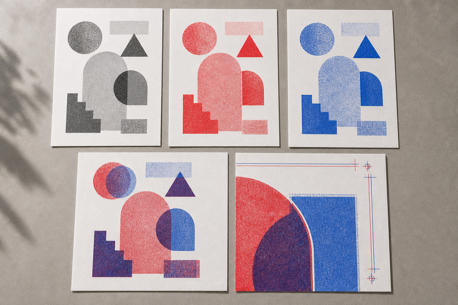
A compact proof set should present several complementary views. Each reveals a different class of problem.
1. Source or Intended Composite
Begin with the clearest available representation of the intended piece. Show the whole composition, its orientation, and the trim boundary. If the artwork runs to the edge, indicate where bleed extends beyond the finished size.
Treat the colors as approximate unless the image comes from a controlled press sample. Screen previews cannot reliably communicate the exact interaction among ink, paper, monitor calibration, and ambient light.
2. One Page for Each Ink Plate
Show each plate alone as a dark grayscale image on white. Dark areas should correspond to greater ink coverage. This makes small unwanted marks, missing objects, and unexpected gradients easier to see.
Keep plate pages visually consistent. Use the same scale, page position, border, and orientation. Include an ink identifier in the surrounding document layout, but do not colorize the plate itself if color would make tonal coverage harder to judge.
For a three-color job, provide three separate plate pages even if one plate contains only a small accent. Combining small plates on one page may save space, but it weakens direct comparison and can conceal alignment errors.
3. Approximate Overprint Simulation
The simulation shows how plates interact. Colorize each separation with a representative screen color, then combine them using a consistent transparency or multiply-style treatment. The purpose is to reveal overlap logic, not to promise a perfect color match.
Look for areas where two inks unexpectedly create a third color, text becomes too dark, or a light halftone disappears beneath a stronger plate. If a particular overprint is intentional, call attention to it in the approval notes.
4. Registration-Risk Details
Add enlarged crops of the most sensitive regions. Useful candidates include reversed lettering, thin outlines around filled shapes, small eyes in character art, closely aligned geometric borders, and multi-ink text.
A detail crop should include enough surrounding material to establish location. Avoid enlarging it until individual pixels dominate the view. The goal is to inspect the relationship among plates at a practical scale.
Show a slightly offset example only when it helps explain the design tolerance. Make it unmistakably illustrative so it cannot be confused with the intended output.
5. Paper and Ink Context
The same inks can feel markedly different on bright white, warm natural, gray, or colored stock. Include the stock name or a neutral paper description in the page notes. A photographed swatch can provide context, but lighting and camera processing make it unsuitable as an exact color reference.
If the design relies on paper showing through as a third or fourth color, state that explicitly. Reviewers accustomed to opaque digital printing may otherwise assume the empty regions are white ink.
Simulate Misregistration Without Misleading the Reviewer
Perfectly aligned digital plates can encourage unrealistic expectations, but an exaggerated offset can make a sound design appear defective. A useful tolerance check stays separate from the main composite.
Duplicate the plate stack and shift one ink by a small, documented amount in horizontal or vertical directions. Inspect what happens at critical edges. The exact offset you test should reflect the printer's guidance and the nature of the piece rather than a universal number.
Classify the result by consequence:
| Edge construction | Likely effect of movement | Practical response |
|---|---|---|
| Two solid shapes touch exactly | A light gap may appear | Add a modest trap or allow overlap |
| Thin outline follows another color | A visible colored halo may appear | Thicken, simplify, or use one plate |
| Small text uses multiple inks | Letterforms may become fuzzy | Keep small text on a single plate |
| Loose halftone textures overlap | Movement may feel intentional | Preserve if it suits the design |
| Reversed detail cuts through two plates | Openings may close unevenly | Enlarge the detail or reduce coverage |
Risograph character often comes from slight variation. The aim is not to remove every possible offset but to distinguish charming movement from movement that damages legibility or meaning.
Check Halftones at Three Scales
Halftones are easy to misjudge when a PDF viewer automatically scales a page. Review them in three ways.
First, inspect the complete composition at normal reading size. This reveals whether tonal hierarchy works. Second, inspect a representative crop at 100 percent pixel view to catch broken patterns, unintended moiré, or compression artifacts. Third, print a proof at actual size on an ordinary printer if possible. It will not simulate Risograph output, but it can reveal details that vanish once the design leaves a zoomed monitor.
Avoid screenshots of zoomed editor windows. Export the plate directly, then make a controlled crop from that file. Screenshots may introduce scaling, interface color management, or display artifacts unrelated to the artwork.
If a plate contains very fine patterns, do not aggressively shrink its image merely to reduce the review PDF. Fine lines need adequate resolution to remain visible. File size reduction should come after visual checks.
Build a Compact PDF Review Pack
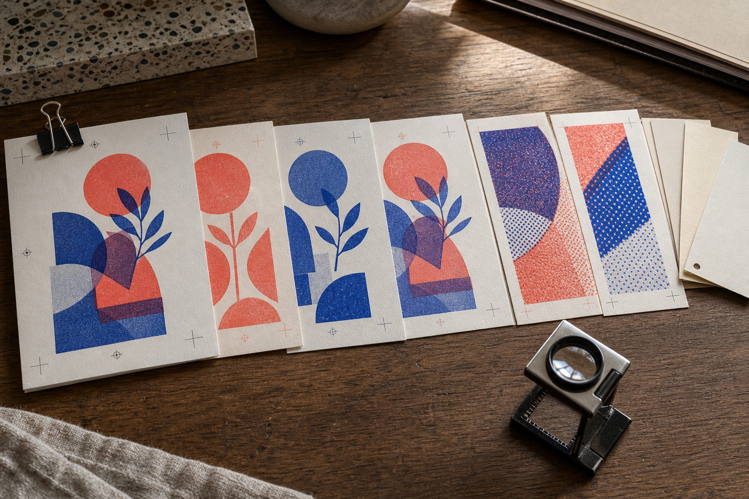
Once all views are ready, arrange them in an order that supports comparison. A practical sequence is:
- Approval summary and full composite
- First ink plate
- Second ink plate
- Additional ink plates, if any
- Overprint simulation
- Registration-risk details
- Paper reference and production notes
- Approval checklist
Keep the artwork in the same position on each full-page view. When a reviewer moves between pages, the image should appear stable while plate content changes. This makes missing or extra elements much easier to spot.
Use Image to PDF to place ordered image exports into a single review document. Before merging, prefix filenames with page numbers such as 01, 02, and 03. File explorers do not always preserve a hand-arranged order.
If notes, detail pages, or a cover sheet already exist as separate PDFs, combine them with PDF Merge. Open the resulting document and inspect every transition. Check that portrait and landscape pages have not rotated unexpectedly and that no blank page has slipped into the set.
Keep Annotations Outside Critical Artwork
Place arrows, circles, and notes in the page margin whenever possible. An annotation directly over a halftone can conceal the very issue it describes. Use thin leader lines to connect notes to artwork.
Maintain a simple distinction between production marks and review marks. Registration targets, trim lines, and plate identifiers belong to the production context. Colored comment circles and numbered callouts belong only to the review layer. Never let a temporary annotation become part of a final ink plate.
Make Comparison Easy on Small Screens
Remote reviewers may open the PDF on a phone or tablet. Give each page a clear visual purpose and avoid tiny multi-column layouts. A plate should occupy most of its page. Detail crops should be large enough to interpret without extreme zooming.
If the full piece is unusually tall or wide, include both a complete overview and selected readable sections. Do not sacrifice the overview; reviewers still need to understand where each crop belongs.
Control File Size Without Damaging Fine Marks
Large proof PDFs create friction, but indiscriminate compression can corrupt the evidence. Thin lettering, one-pixel lines, and regular dot patterns are particularly vulnerable.
Compress photographic paper references more heavily than separation plates. Preserve PNG or another lossless source for crisp monochrome art. If you need smaller preview images for email or project software, make separate copies with Compress Image and compare them against the originals at 100 percent view.
Inspect these areas after compression:
- Thin diagonal lines
- Small reversed text
- Pale halftone dots
- Hard boundaries between white and solid coverage
- Repeated geometric patterns
- Gradients near their lightest printable values
Do not repeatedly compress the same exported file. Return to the clean review source for each new size target.
Write an Approval Request That Produces a Clear Answer
A polished PDF still needs a precise request. Ask reviewers to approve named decisions rather than offering an open invitation to react.
A concise approval checklist might include:
- Overall layout and trim orientation are correct.
- Each ink plate contains the intended elements.
- Deliberate overprint regions are understood.
- Registration-sensitive details have been reviewed.
- Paper choice and approximate ink references are acknowledged.
- Spelling, dates, and contact details have been checked.
- The approved revision identifier matches the attached file.
Separate aesthetic preferences from production corrections. A comment such as make the blue calmer is not actionable unless the printer and designer know whether it refers to a different ink, reduced coverage, altered overprinting, or only the on-screen simulation.
Ask reviewers to reference page numbers and callout numbers. Consolidated feedback is safer than comments scattered across chat messages, email threads, and marked screenshots.
Common Proof-Pack Failures
Several recurring mistakes make remote approval less reliable.
Colorized Plates Without Grayscale Versions
A bright yellow plate may become almost invisible on a white screen. Always provide a high-contrast grayscale version for coverage inspection, even if a colorized version appears in the simulation.
Different Crops for Different Plates
Independently trimmed plates cannot be compared accurately. Preserve a shared canvas and identical placement from export through PDF assembly.
Unlabeled Simulations
A vivid composite can be mistaken for a guaranteed color result. Identify it as an approximation and include the intended ink and paper references nearby.
Excessive Page Decoration
Large logos, colored backgrounds, and decorative frames compete with subtle plate information. Use a quiet document design so the artwork remains the strongest visual element.
Approval of the Wrong Revision
Place the revision identifier on every page, not only the cover. If pages are exported or shared individually, their status should remain traceable.
Final Preflight Before Sending
Open the finished PDF in a viewer different from the application used to create it. Move through every page at fit-to-page size, then inspect delicate details at higher magnification.
Confirm the following:
- The H1-style project heading, revision, dimensions, inks, and paper reference agree throughout the document.
- Plate pages use the same orientation, scale, and canvas.
- Each plate has the correct ink identifier.
- The composite and overprint simulation are clearly described as visual references.
- Detail crops correspond to the current revision.
- No temporary notes cover production-critical marks.
- Thin lines and halftones survived export and compression.
- PDF pages appear in the intended order.
- The approval request names the decisions required.
- The filename contains the current revision and an unambiguous proof status.
Finally, keep the sent PDF with the approved source exports. If changes are requested, create a new revision rather than silently replacing the old document. A clear chain of proof files makes later production questions much easier to resolve.
A Better Remote Approval Artifact
The strongest Risograph proof is not the most elaborate one. It is the one that lets a reviewer connect the attractive composite to the physical logic of separate ink passes.
Show the complete design, expose every plate, demonstrate important overlaps, enlarge vulnerable details, and state what the simulation cannot promise. Package those views in a stable PDF with consistent scale and explicit revision information. The result gives designers, printers, and clients a shared object for discussion before paper and ink are committed.