Subtitle-Safe Vertical Video Crops for Product Demos
Learn how to turn landscape product demos into vertical clips without cutting off subtitles, interface details, gestures, or the visual context viewers need.
Subtitle-Safe Vertical Video Crops for Product Demos
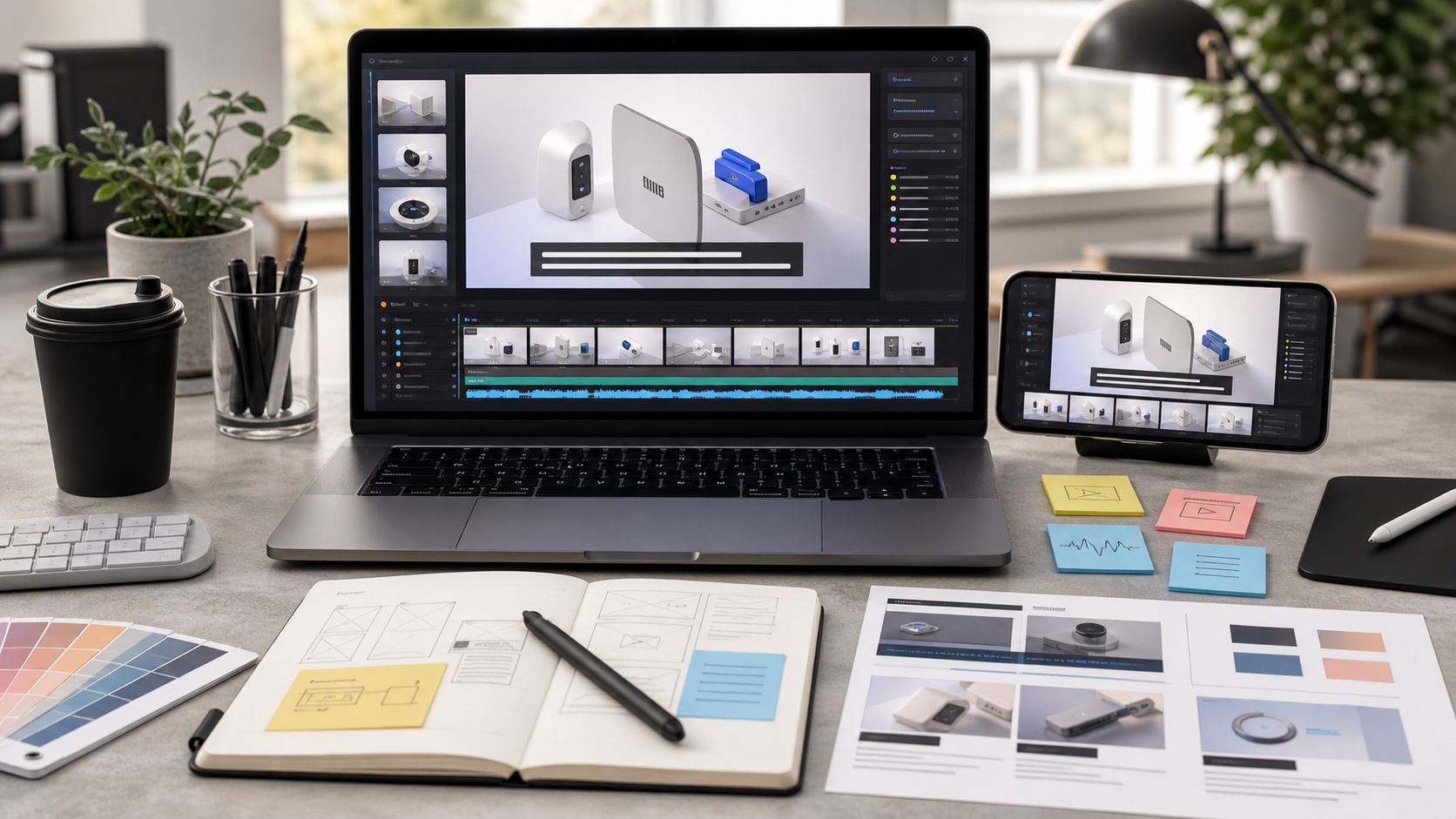
A landscape product demo often looks perfectly clear on a laptop and strangely confusing when cropped for a vertical feed. The cursor disappears off the side, a settings panel is reduced to a sliver, subtitles cover the button being discussed, and the presenter competes with the interface for a narrow strip of space.
This is not merely an aspect-ratio problem. It is a visual-priority problem.
A useful vertical cutdown must preserve the action that proves the product claim. If the narration says that a user can export a report in two clicks, the viewer needs to see those clicks. A technically correct 9:16 crop is still a failed demo when it hides the menu, cursor, confirmation state, or caption needed to understand the moment.
This guide presents a practical system for adapting landscape recordings into subtitle-safe vertical product demos. It is intended for small product, support, documentation, and marketing teams that need clear clips without rebuilding every demonstration from scratch.
Why ordinary center cropping fails
Center cropping assumes that the important content remains near the horizontal center of every frame. That assumption may hold for a talking-head recording, but it rarely holds for a software or physical-product demonstration.
Software interfaces distribute meaning across the screen. Navigation may sit on the left, controls on the right, and the result may appear in a modal or notification near an edge. Physical demonstrations have similar complications: hands enter from the sides, tools rest beside the subject, and before-and-after comparisons may use the full width.
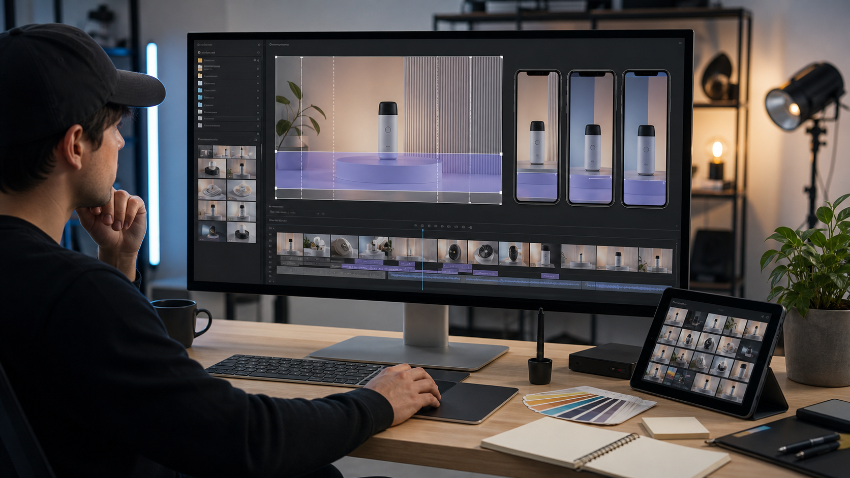
A vertical crop retains only a narrow portion of a 16:9 source. Depending on the source resolution and output framing, more than two-thirds of the horizontal scene may be excluded. The missing area often contains context that the editor did not initially consider important.
Subtitles add another constraint. They need a stable, readable region, but common vertical platforms also place interface elements near the top, bottom, and right edge. A caption positioned safely inside the exported frame can still collide with a platform description, account label, reaction controls, or playback overlay.
The solution begins before cropping: identify what the viewer must see, what the viewer must read, and what can disappear.
Map the visual priority before choosing a crop
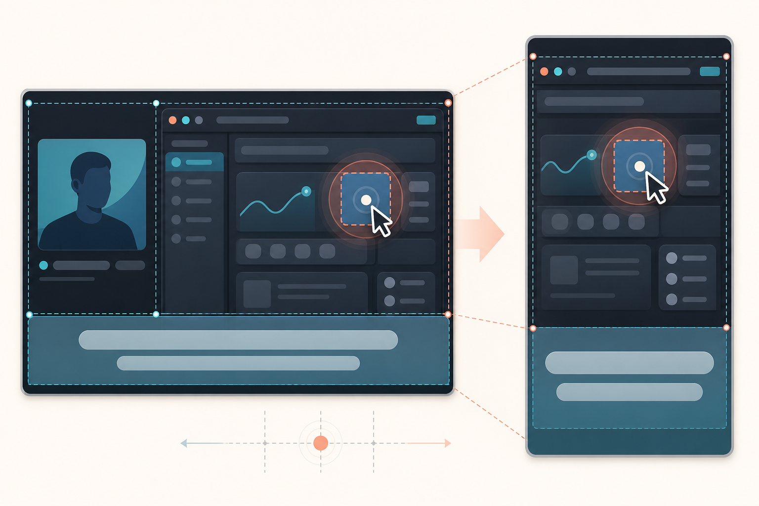
Watch the landscape source once without editing. For every meaningful beat, classify the visible elements into four levels:
- Primary action: The click, gesture, product state, object, or result that proves the spoken point.
- Supporting context: The panel title, selected item, device orientation, or earlier state needed to interpret the action.
- Optional context: Presenter video, decorative background, browser chrome, empty canvas space, or repeated controls.
- Disposable material: Accidental notifications, unused applications, desktop clutter, dead space, and irrelevant edges.
Do not assign one priority map to the entire recording. The focal area can move from a left navigation item to a right settings panel within seconds. Mark those changes on a simple timeline.
For example, consider a landscape demo that shows how to change an account notification setting:
| Moment | Primary action | Supporting context | Safe to remove |
|---|---|---|---|
| Opening | Account page heading | Selected navigation item | Browser tabs and wallpaper |
| Selection | Notification menu item | Cursor approach | Presenter thumbnail |
| Change | Toggle and its current state | Setting label | Most of the left navigation |
| Confirmation | Saved-state indicator | Toggle after the change | Empty panel space |
This table reveals that no single static crop will serve the entire clip. The frame either needs to move between beats, or the demonstration needs a composed layout that places selected source regions inside a vertical canvas.
When the source contains small UI text, capture a clean still at each important state. Run the still through image OCR if you need to check whether labels remain machine-readable after scaling. OCR is not a substitute for human review, but repeated recognition errors can warn that the interface has become too small.
Choose among four vertical composition methods
There is no universally correct way to turn a landscape demo into a vertical clip. Choose the least complex method that preserves the evidence.
Static crop
Use a static 9:16 crop when the focal action remains in one narrow region. This works well for a mobile-device recording placed in a landscape production, a centered product close-up, or a single dialog box.
A static crop is easy to review and visually calm. Its weakness is inflexibility. If the action crosses the crop boundary, viewers lose it immediately.
Reframed crop with deliberate moves
A reframed crop changes horizontal position at selected moments. It can follow a cursor from navigation to a result panel or move between a presenter and a physical object.
Treat these moves as cuts or purposeful transitions, not continuous surveillance. Constantly following a cursor produces a restless frame and can make the interface harder to understand. Hold each crop long enough for the viewer to establish where they are.
As a starting rule, move the frame only when the primary visual priority changes. If a cursor briefly travels through unimportant space, the crop does not need to chase it.
Stacked composition
A stacked composition places two useful regions one above the other. A common arrangement puts the application interface in the upper portion and a presenter, device, or enlarged result in the lower portion.
This method is helpful when both regions carry meaning, but it reduces the size of each. Avoid stacking two full landscape frames; the resulting details will usually be too small. Crop each source region tightly before placing it in the stack.
Focus window over a contextual background
This composition uses a large, sharply cropped detail over a softened or dimmed version of the full source. The background preserves spatial context while the focus window makes the action legible.
Use it sparingly. The detail window should clarify one action, not become a decorative box that jumps around every second. Maintain consistent dimensions and corner treatment so viewers recognize it as a magnified view.
| Source condition | Preferred method | Main risk |
|---|---|---|
| One centered action | Static crop | Edge content may disappear later |
| Focus changes a few times | Deliberate reframing | Excessive camera motion |
| Two simultaneous subjects | Stacked composition | Both regions become too small |
| Tiny control within a wide interface | Focus window | Visual clutter and duplication |
Build a subtitle-safe vertical master

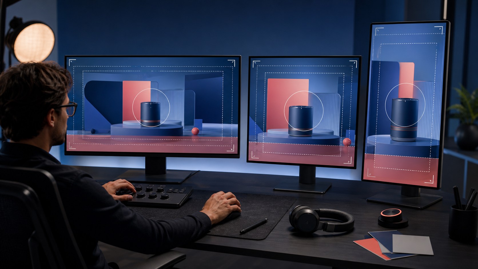
Create a vertical master canvas before placing subtitles. The master should reserve distinct regions for platform interference, essential visuals, and captions.
Exact overlays vary between platforms, devices, posting modes, and interface updates, so avoid treating one pixel template as permanent. Instead, use conservative internal margins and test the exported clip in the actual publishing preview.
A practical vertical frame can be considered as five zones:
- Top exclusion zone: Keep critical labels and product states away from the upper edge.
- Central evidence zone: Place the most important action here whenever possible.
- Caption zone: Reserve a predictable band for one or two subtitle lines.
- Bottom exclusion zone: Protect captions from descriptions, controls, and navigation elements.
- Right-side exclusion zone: Avoid placing tiny controls beneath reaction or sharing interfaces.
The caption zone should not be an afterthought. Add a temporary caption block at the start of editing, even if the final transcript is not ready. This forces every crop decision to account for the space subtitles will occupy.
Keep essential interface actions above the caption block. If the product control naturally appears at the bottom of the source, move or scale the source composition rather than covering that control with subtitles.
For a talking-head segment, eye position can sit slightly above the vertical center while captions remain lower. For a software demonstration, the active control often belongs near the center because it is less likely to collide with platform overlays.
Prepare subtitles before final reframing
Cropping first and adding subtitles last creates expensive surprises. A translated caption may be longer than the English version. A two-line subtitle may cover a tooltip that seemed safe during the first edit. A highlighted keyword may create a wider line than expected.
Generate or clean the transcript early. If you are starting from a narrated recording, a video-to-subtitles tool can provide the timing foundation. Review names, technical terms, keyboard shortcuts, measurements, and product-specific language manually.
Use these subtitle rules for compact product demonstrations:
- Prefer complete, short phrases over large sentence blocks.
- Break lines at natural grammatical boundaries.
- Keep a control name and its action together when possible.
- Avoid placing a single short word on a second line.
- Leave enough on-screen time to read the caption and inspect the demonstrated action.
- Do not transcribe meaningless filler when it delays the useful instruction.
- Use consistent capitalization for interface labels.
Subtitles and interface labels compete for the same reading attention. If narration repeats a long label already visible on screen, consider a concise caption that preserves meaning rather than creating two dense text regions.
The demonstration may also need a brief pause after a click. Viewers often require a fraction of a second to connect the caption, cursor, and resulting interface state. Cutting immediately after the result appears can make a correct edit feel incomplete.
Reframe screen recordings without losing orientation
Screen recordings need landmarks. When a vertical crop jumps from the left navigation to a right panel without context, viewers may believe they are seeing a different page.
Use at least one of these orientation aids:
Establish the full interface briefly
Show the complete application frame at the start, even if it is smaller than ideal, then move into the detailed crop. One or two seconds can be enough to establish the relationship between navigation, content, and settings.
Do not expect viewers to read small text during this establishing view. Its job is spatial orientation, not detailed instruction.
Preserve a stable landmark
Keep a recognizable element—such as a panel edge, toolbar, device bezel, or selected navigation color—inside consecutive crops. The landmark helps the viewer understand how the second view relates to the first.
Cut on completed actions
Move to a new crop after a click or panel transition, not during the moment the viewer is trying to locate the cursor. A completed action provides a natural visual boundary.
Magnify results, not every movement
Small cursor travel does not deserve constant zooming. Save magnification for controls, before-and-after states, numerical results, warnings, and confirmation messages.
If a source screenshot or inserted still needs preparation, use resize image to create predictable dimensions before adding it to the vertical composition. Consistent source sizes reduce accidental softness caused by repeatedly scaling the same asset inside an editor.
Handle cursor paths, taps, and hand gestures
The pointer or hand is part of the explanation. It directs attention, demonstrates sequence, and often supplies the only visible evidence that the action occurred.
For cursor-based demos, enlarge the pointer modestly if the editor permits it, but do not let it obscure compact controls. A subtle click indicator can help when the interface state changes slowly. Keep pointer styling consistent across clips in the same series.
When reframing, inspect the entire cursor path—not just its destination. A crop that reveals the button but hides the approaching cursor weakens the connection between instruction and action.
For physical demonstrations, include enough of the hand or tool to make the gesture understandable. A tight crop of a fingertip may hide whether the person tapped, swiped, rotated, or pressed and held. Likewise, a craft or repair demo may need the tool angle and object edge, not only the contact point.
Slow down only the difficult action, not the entire clip. If the source lacks enough frames for a clean slowdown, use a short hold on the completed state instead of manufacturing a visibly jerky movement.
Protect thin text and interface lines during export
A vertical crop often scales the source up, which can expose compression artifacts. Thin type, one-pixel dividers, small icons, and subtle selection states are especially vulnerable.
Start with the highest-quality source available. Whenever possible, record the application at a resolution and zoom level that make the target control readable before editing. Increasing browser or application zoom for the original recording is usually better than aggressively enlarging a tiny control afterward.
Avoid repeated export cycles. Keep a high-quality master and create distribution copies from that master. Every unnecessary lossy transcode can soften text edges and introduce color noise around cursors or icons.
Inspect the finished video at actual mobile size. A large desktop preview can make marginal text appear readable. Then pause on the densest interface frame and check:
- Are selected and unselected states distinguishable?
- Do thin borders remain continuous?
- Can the cursor be separated from the background?
- Are subtitles sharper than the interface behind them?
- Does the focus remain clear without zooming the player?
If the frame includes an imported screenshot, compress it only after deciding its display dimensions. The compress image tool can help reduce supporting asset size, but judge the result by fine interface detail rather than by the photograph-oriented appearance of the full frame.
Adapt one master to several placements
A single vertical export may be used on a landing page, in a help article, and on multiple social platforms. Those placements do not necessarily present video in the same way.
Create a clean vertical master containing the essential demonstration and subtitles, but no platform-specific buttons or decorative imitation interfaces. From that master, make placement-specific variants only when needed.
For a landing page, viewers may see custom playback controls or a poster image before playback. The opening frame should therefore explain what the clip demonstrates without depending on a social caption.
For a help center, clarity usually matters more than aggressive pacing. Allow enough time to inspect menus and settings. If the clip loops, make the transition back to the start obvious and comfortable.
For a social cutdown, the first visible action needs to arrive quickly, but do not remove the orientation moment if doing so makes the demonstration incomprehensible. A short product-state preview can establish relevance before the step sequence begins.
Maintain a small adaptation record for each export:
| Variant | Caption style | Opening frame | Ending | Review device |
|---|---|---|---|---|
| Landing page | Burned in or player captions | Clear product state | Stable result frame | Phone and desktop |
| Help article | Readable instructional captions | Interface orientation | Brief result hold | Typical support device |
| Social placement | Conservative safe margins | Action-led opening | Clean loop or concise close | Native posting preview |
Run a three-pass quality audit
Review the export three times with a different purpose on each pass.
Pass one: watch without sound
Confirm that subtitles and visible actions tell a coherent story. You should be able to identify the product area, understand the action, and recognize the result.
Note any moment when the caption refers to an element outside the crop. Also note when platform-safe margins force your eyes away from the important action.
Pass two: listen without reading
Focus on pacing and synchronization. The spoken instruction should not arrive long before the relevant control is visible. The result should remain on screen long enough to match the narration.
Listen for references such as “over here,” “this button,” or “the option on the right.” These phrases may no longer make sense after reframing. Replace or trim them where possible.
Pass three: inspect on a real phone
View the file at normal brightness and ordinary holding distance. Do not pinch to zoom. Check the smallest text, subtitle line breaks, cursor visibility, motion smoothness, and any collision with playback controls.
If the destination has a native preview, use it. Device-level inspection is the only reliable way to catch situations where a technically safe caption feels cramped by surrounding interface elements.
Final publishing checklist
Before approving the vertical product demo, verify the following:
- The primary action remains visible throughout every instructional beat.
- Each crop retains enough context to explain where the action occurs.
- Frame moves happen at meaningful transitions rather than following every cursor movement.
- Subtitles fit within a conservative internal area.
- No caption covers a button, tooltip, hand gesture, result, or confirmation state.
- Small interface text is readable on a phone without zooming.
- Cursor paths and physical gestures remain understandable.
- The opening establishes the product or task quickly.
- The final state stays visible long enough to inspect.
- The export has been reviewed with sound, without sound, and in the intended publishing preview.
- A high-quality vertical master is retained for future variants.
Make the crop serve the proof
The best vertical product demo is not necessarily the most dynamic one. It is the version that preserves the evidence behind the message.
Begin by mapping visual priority, reserve subtitle space before reframing, and choose a composition based on how the focal area changes. Use motion only when it helps viewers follow that change. Protect interface detail during export, then audit the result on the device where it will actually be watched.
When every click, label, gesture, and result has a deliberate place in the vertical frame, the cutdown stops feeling like a compromised landscape video. It becomes a clear demonstration designed for a narrow screen.