Ceramic Glaze Test Tile Photography: A Color-Consistent Studio Catalog Guide
Build a searchable, color-consistent catalog of ceramic glaze test tiles with controlled lighting, reliable filenames, useful detail views, and compact review sheets.
Ceramic Glaze Test Tile Photography: A Color-Consistent Studio Catalog Guide
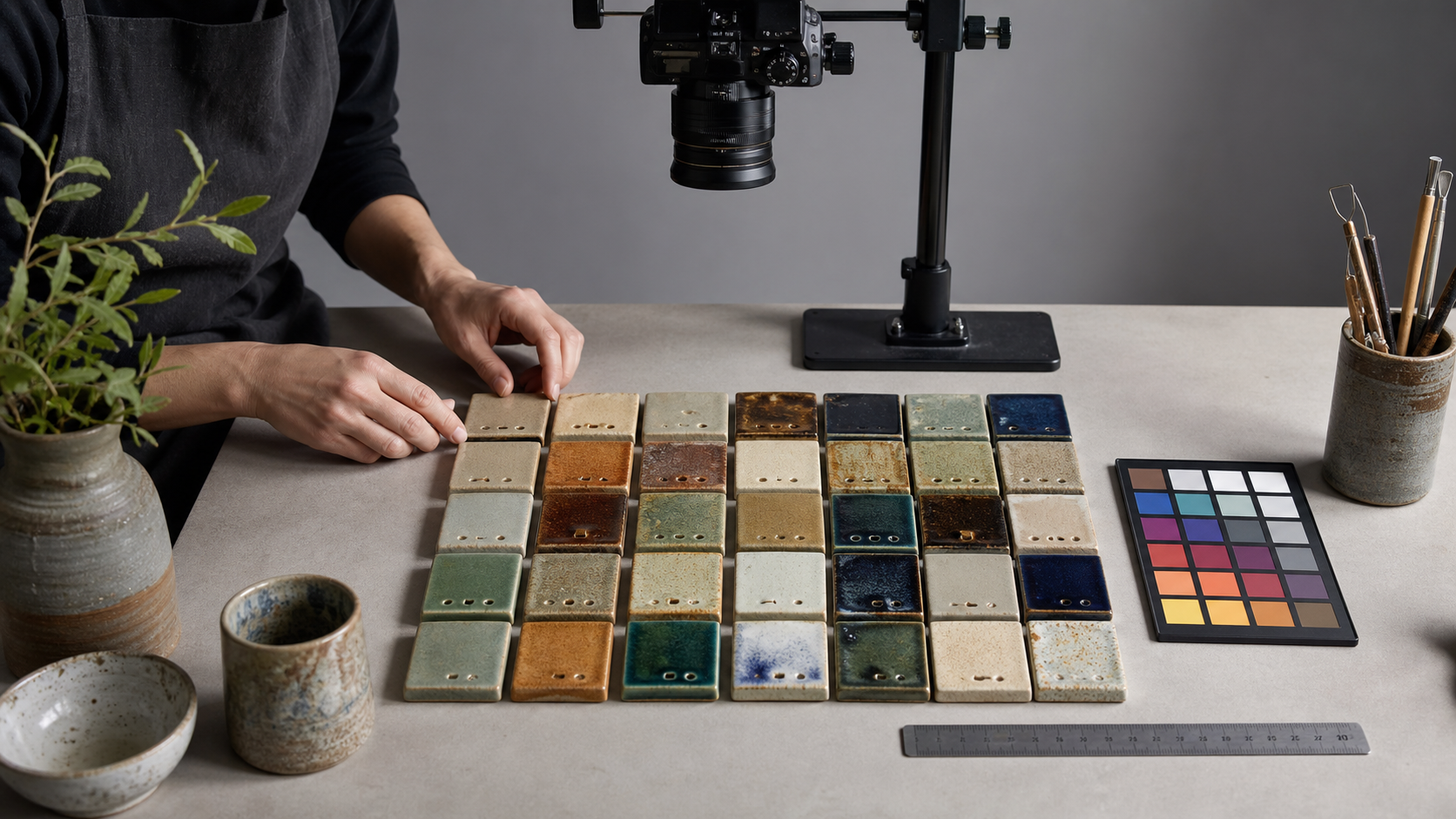
A glaze test tile can preserve months of experimentation in a few square centimeters. It may record a clay body, firing schedule, application thickness, glaze recipe, and the effects of a particular kiln position. Yet many studios document these tests with hurried phone photographs taken under changing room light. The result is an archive that remembers that a tile existed without reliably showing what it looked like.
A useful photographic catalog does not need museum equipment. It needs consistent capture conditions, enough views to describe the surface, and a naming system that connects every image to the physical tile and recipe record. The objective is not perfect scientific color measurement. It is a dependable visual reference that helps you compare tests, find promising combinations, and avoid repeating failed experiments.
This guide presents a practical system for individual potters, community studios, teaching workshops, and small ceramic businesses. It covers lighting, camera placement, glossy surfaces, filenames, image preparation, searchable records, and compact PDF review packs.
Decide What the Catalog Must Answer
Before building a photography station, define the questions the archive should answer. A production potter may need to compare batches of one glaze over time. A teaching studio may care more about helping students identify combinations. A glaze researcher may need close surface detail and exact firing context.
A strong catalog usually supports four questions:
- What color family does the glaze belong to under neutral light?
- Is the surface glossy, satin, matte, crystalline, crawled, pinholed, or otherwise textured?
- How does it behave over edges, texture, carving, or a second glaze?
- Which clay body, recipe, application, and firing produced the result?
Those questions should determine the photographs you make. A single flat image might be enough for a stable opaque glaze. It is rarely enough for an iridescent, crystalline, heavily pooled, or highly reflective surface.
Create a minimum record before photographing:
| Field | Example format | Why it matters |
|---|---|---|
| Tile ID | G24-017 | Connects files, tile, and recipe |
| Clay body | Stoneware-B | Explains color and fit differences |
| Glaze or recipe code | GL-042 | Avoids ambiguous informal names |
| Application | Three brushed coats | Records thickness and method |
| Firing | Cone 6 oxidation | Provides essential context |
| Kiln position | Top-front | Helps identify firing variation |
| Date or batch | 2026-07-B | Supports comparisons over time |
Keep the permanent tile ID short enough to write or stamp on the unglazed back. Descriptive names can change; identifiers should not.
Build a Repeatable Lighting Station
Color inconsistency usually begins with light, not the camera. Daylight from a window changes with weather, season, hour, and surrounding reflections. Household lamps may combine different color temperatures, while some inexpensive LEDs reproduce reds or blue-greens poorly.
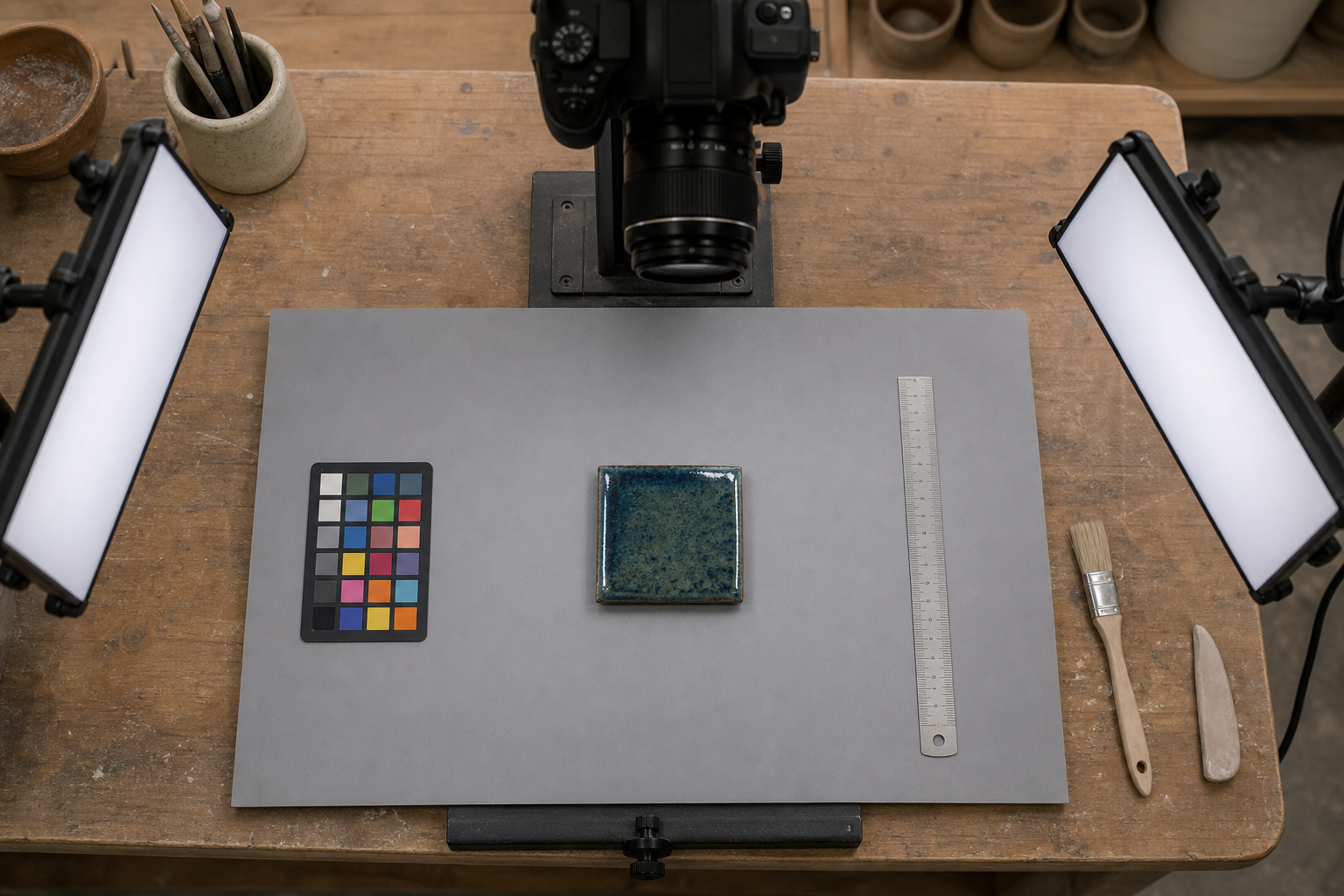
Choose one controlled location and leave its important dimensions fixed. A basic station can use:
- A neutral gray, matte background
- Two matching high-quality lamps with diffusion
- A phone or camera held in a fixed overhead mount
- Position marks for the tile, lights, and tripod
- A small color reference target
- A ruler or scale for the first image in each batch
Avoid vivid walls, clothing, and nearby objects that can reflect color into glossy glaze. A red apron may create a warm patch in a mirror-like black glaze. A green cutting mat can contaminate the lower edge of a white tile. Neutral surroundings reduce these surprises.
Place two diffused lamps on opposite sides of the tile at approximately 45 degrees. This creates balanced illumination while still revealing form. If both lamps are too close to the camera axis, glossy tiles may show broad frontal glare. If the lamps are too low, texture becomes dramatic but color may look uneven.
Mark every position with removable tape. Record the lamp model, camera height, and exposure settings in a small station note. The measurements do not need to be sophisticated; they need to be repeatable.
Control Mixed Light
Turn off overhead fixtures and block strong window light during capture. Mixing daylight, warm ceiling light, and cool LEDs creates color casts that are difficult to correct consistently. Photograph at the same lamp brightness each time and allow lamps to reach stable output if their manufacturer recommends a warm-up period.
Set a fixed white balance when the camera permits it. Automatic white balance can interpret a large blue or amber glaze as a lighting problem and shift the entire image in the opposite direction. A fixed value or a custom balance made from a neutral target is more dependable across a batch.
Include a Reference Without Ruining the Composition
Place a gray or color reference card beside the first tile in every session. You do not need to include it in every final catalog image. Its purpose is to reveal whether the session is warmer, cooler, brighter, or darker than previous sessions.
Do not assume an unknown printed gray card is neutral. Purpose-made photographic references are preferable. Even then, regard the card as a consistency aid rather than a promise that every viewer will see identical color. Monitors, browsers, room lighting, and human perception introduce additional variation.
Set the Camera for Comparison, Not Drama
Catalog photographs should make differences between tiles easy to judge. Dramatic shadows, shallow focus, and heavy contrast may produce attractive social media images, but they obscure the evidence that makes a reference archive useful.
Mount the camera parallel to the face of the tile for the primary view. A phone copy stand, overhead arm, or stable tripod prevents gradual changes in angle and scale. Use the same camera or phone lens whenever practical. Avoid ultra-wide lenses because they can distort tile edges and alter apparent proportions.
Select moderate exposure settings:
- Use the lowest practical ISO to limit noise.
- Choose an aperture that keeps the tile surface and edges sharp when using a camera.
- Lock exposure for tiles photographed under the same lighting.
- Use a timer or remote release to prevent movement.
- Disable portrait mode, beauty filters, scene enhancement, and automatic color effects.
Glossy white glazes can fool automatic exposure into making the image too dark. Dark glazes can cause the opposite error. Check the histogram or highlight warning if available. Preserve bright reflections without allowing large important areas to become featureless white.
Leave a small border around the tile rather than cropping tightly in-camera. That margin makes later rotation and alignment easier. You can standardize dimensions with the image resizer once the master photographs have been reviewed.
Create Three Views for Difficult Glazes
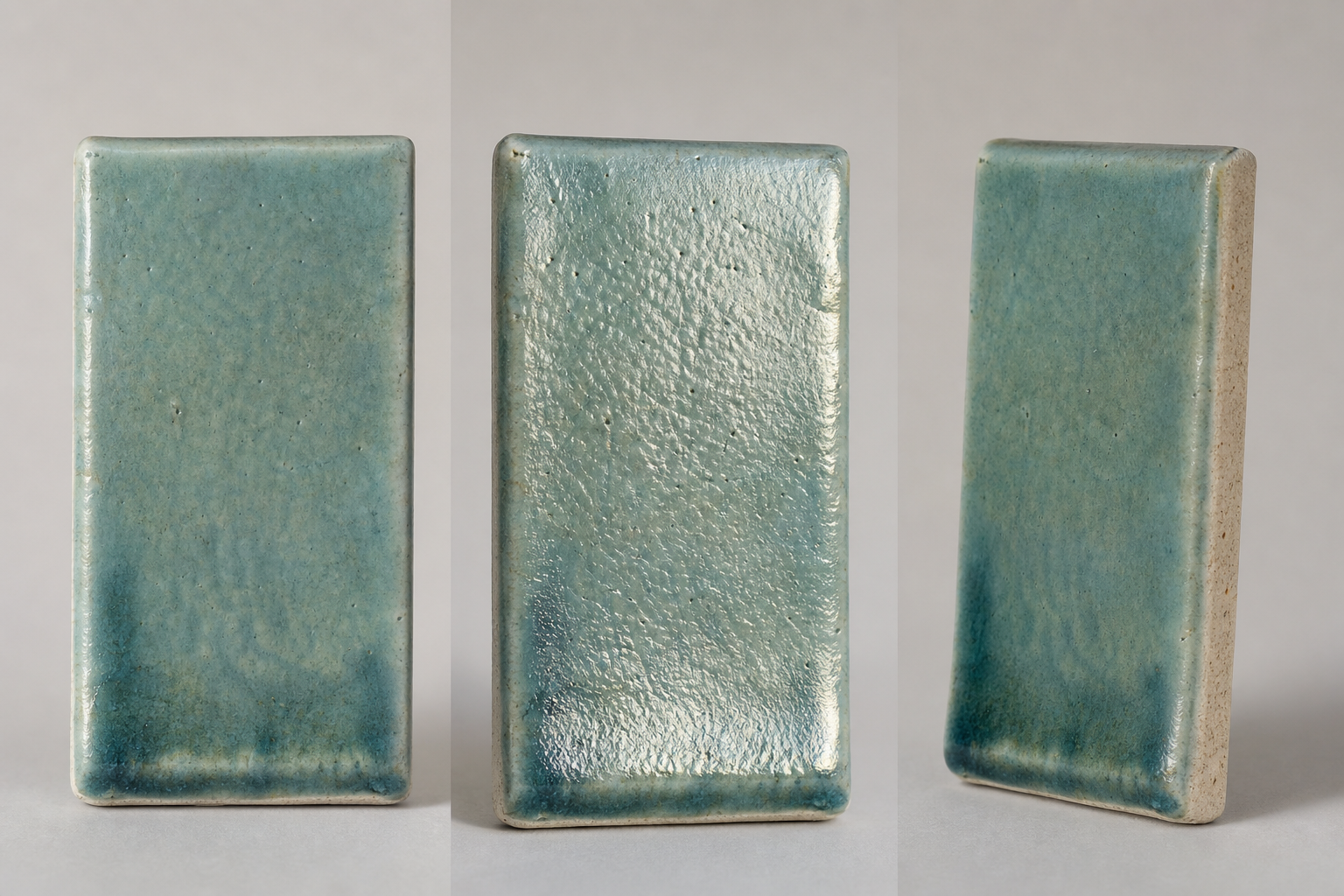
Some glazes change dramatically with viewing angle. Others hide their most important evidence when photographed straight on. A three-view record captures color, surface, and edge behavior without producing an excessive number of files.
View One: Neutral Comparison
Make the primary image directly above the tile with balanced, diffused lighting. This is the view used in index grids and broad color comparisons. Keep crop, scale, orientation, and background consistent across the archive.
View Two: Raking-Light Texture
Move or switch off one lamp so that light travels across the surface at a shallow angle. This view can reveal pinholes, crawling, crazing, crystals, brush ridges, orange peel, and subtle matte variation.
Do not substitute this image for the neutral view. Raking light exaggerates relief and produces a less even color record. It is supporting evidence.
View Three: Edge and Pooling
Photograph the tile at an oblique angle, especially if it has a ridge, carved line, hole, or stepped thickness. This reveals transparency, pooling, breaking color, glaze thickness, and movement near the lower edge.
For highly reflective glazes, adjust the camera and diffusion until the reflection describes gloss without covering the whole surface. A controlled highlight is useful because it communicates sheen. Eliminating every reflection can make a glossy surface look falsely matte.
Use view suffixes that remain stable:
Nfor neutral overheadTfor texture under raking lightEfor edge or angled detailBfor the unglazed back and handwritten notes
A complete set might be named G24-017_N, G24-017_T, G24-017_E, and G24-017_B.
Handle Glare Without Misrepresenting the Surface
Gloss is part of the object, so glare management should reveal the glaze rather than cosmetically redesign it. Begin with larger diffusion. A larger apparent light source creates broader, softer reflections that are easier to position than small hard hotspots.
If the tile reflects the camera, photographer, or ceiling, build a simple neutral enclosure around the scene using white diffusion material and gray or black cards. Leave only the opening required by the lens. For very dark reflective glazes, a controlled pale reflection may show the surface more clearly than a completely black environment.
A circular polarizing filter can reduce some reflections, especially on nonmetallic surfaces. Cross-polarized lighting can suppress glare even further, but it may remove visual evidence of gloss and alter the appearance of certain effects. If polarization is used, note it in the record and retain a conventional image for comparison.
Avoid painting over highlights, cracks, pinholes, or uneven edges in an editor. Basic rotation, neutral color correction, and dust cleanup outside the tile are reasonable. Altering the glaze surface turns documentation into illustration.
Use a File Naming System That Survives Growth
Folders called new tests, best blue, and misc kiln work until the archive reaches several hundred images. Filenames should remain useful when files are copied outside their original folders or passed to another person.
A durable pattern is:
TileID_Clay_Firing_View_Version.ext
For example:
G24-017_SWB_C6OX_N_v01.jpg
The exact abbreviations matter less than consistency. Maintain a short key explaining each code. Avoid spaces, slashes, parentheses, and punctuation with special meanings in filenames. Use leading zeros for sequence numbers so alphabetical sorting remains logical.
Separate identity from interpretation. G24-017 is a stable identity. A phrase such as storm-blue-satin is an interpretation that might later change. If descriptive keywords are valuable, store them in a spreadsheet, catalog application, or metadata field instead of making them the only identifier.
Keep original captures in a read-only master folder. Export catalog copies into a separate directory. That separation prevents repeated resizing and compression from degrading the only available image.
Prepare Consistent Catalog Images
After capture, process one representative tile before applying the same restrained settings to a batch. Correct rotation, crop to a consistent aspect ratio, and make modest exposure or white-balance adjustments using the session reference.
Do not force every glaze to the same brightness. A deep tenmoku should remain dark, and a translucent celadon should not be edited into an opaque pastel. The aim is to remove capture variation, not material variation.
A practical export set contains:
| Export | Typical purpose | Suggested treatment |
|---|---|---|
| Master | Long-term source | Original resolution, minimal edits |
| Catalog image | Browsing and comparison | Consistent dimensions and crop |
| Thumbnail | Fast grids and spreadsheets | Small dimensions, moderate compression |
| Detail crop | Surface diagnosis | High-resolution crop from texture view |
Use the image converter when source formats are inconvenient for browsers or shared systems. JPEG is suitable for most full-color photographs without transparency. WebP can reduce delivery size for a web catalog. PNG is usually unnecessarily large for ordinary tile photography, although it can be useful for diagrams or images requiring lossless edges.
Resize once from the master rather than repeatedly resizing an already exported image. For browser-friendly copies, the image compressor can reduce storage and page weight. Inspect glossy transitions, crazing lines, and fine crystals at 100 percent after compression. Those details are often the first to suffer from an aggressive setting.
Be Conservative With Automated Editing
Automated enhancement can be helpful for removing an accidental background distraction or producing a separate presentation image. It should not silently modify the evidence copy. If you use the AI photo editor, work from a duplicate and label the result as an edited presentation asset.
Do not use generative tools to reconstruct missing tile corners, fill glaze defects, invent texture, or equalize uneven application in the catalog master. A visually cleaner tile is not necessarily a more accurate record.
Connect Images to Searchable Records
Images become significantly more useful when connected to structured text. A spreadsheet is sufficient for many studios. Use one row per tile rather than one row per image, with columns for the stable tile ID, recipe code, clay, firing, application, location, notes, and filenames.
Useful controlled terms might include:
- Surface: gloss, satin, matte, dry, crystalline
- Visual behavior: breaking, pooling, speckled, variegated, translucent
- Defects: pinhole, blister, crawl, craze, shiver, run
- Color family: blue, green, amber, white, black, neutral, multicolor
- Status: reject, investigate, promising, production candidate
Controlled terms improve filtering because semi matte, semimatte, and satin-ish otherwise become separate categories. Keep a notes field for observations that do not fit the controlled vocabulary.
Photograph the back of each tile if it contains handwritten information. The image OCR tool may help extract clear identifiers and short notes, but verify every result against the physical object. Ceramic pencil, oxide marks, curved surfaces, and firing discoloration can cause recognition errors. OCR output should accelerate transcription, not replace verification.
Assemble Contact Sheets for Review
A catalog is useful for searching, while a contact sheet is useful for seeing relationships. Arrange neutral-view images into grids grouped by glaze family, clay body, firing, or experiment series. Keep every tile at the same visual scale and place its ID directly beneath it in the layout application.
Contact sheets are especially effective for:
- Comparing application thickness across one recipe
- Reviewing a line blend or triaxial blend
- Showing kiln-position variation
- Selecting candidates for a larger test piece
- Discussing results during a studio meeting
Do not place too many tiles on one page. If surface differences disappear at the intended print or screen size, split the group. Add separate detail pages for textures that require enlargement.
When the images are ready, combine them into a portable review document with image to PDF. Use a consistent page size and preserve enough resolution for moderate zooming. Include the experiment name, firing reference, and creation date in the document itself so that a detached PDF remains identifiable.
A PDF review pack is not a substitute for the master archive. It is a snapshot of a particular comparison or decision.
Run a Short Quality Audit
Before adding a session to the main catalog, compare it with a trusted earlier session. Place similar tiles side by side and check whether the background, scale, sharpness, and neutral reference appear reasonably consistent.
Use this audit checklist:
- The tile ID in the filename matches the physical tile.
- The neutral image is sharp across the important surface.
- Highlights retain useful detail.
- The background does not cast visible color onto the glaze.
- White balance is consistent with the session reference.
- At least one image clearly communicates sheen.
- Texture defects remain visible after export.
- Crop, orientation, and scale match the catalog standard.
- Recipe and firing records point to the same tile ID.
- Master files and delivery copies are stored separately.
If an image fails, recapture it while the lighting station is still assembled. Trying to rescue a blurred or clipped photograph later usually takes longer and produces a weaker record.
Back Up the Catalog as a Connected Set
The photographs, spreadsheet, abbreviation key, and recipe records form one archive. Backing up only the images preserves appearance but loses meaning. Backing up only recipes loses the observed result.
Maintain at least two copies on different storage devices, with one copy in another physical location or a reputable remote storage service. Use open, widely supported formats for exported records, such as CSV for tabular data and JPEG or TIFF for photographic masters according to your preservation needs.
Periodically test restoration by opening a sample of files and confirming that the spreadsheet links or filenames still resolve. A backup that has never been checked is an assumption.
If tiles are discarded, keep their identifiers and photographic records. Mark their physical status as discarded rather than deleting the row. Failed and superseded tests can prevent repeated mistakes, and gaps in an identifier sequence become easier to explain.
A Practical Capture Sequence
Once the station and naming rules are established, a batch can be documented efficiently:
- Confirm that every tile has a unique permanent ID.
- Enter the clay, glaze, firing, application, and kiln-position data.
- Clean loose dust without polishing or changing the surface.
- Set the tile on the marked background position.
- Photograph the session reference and scale.
- Capture the neutral overhead view.
- Capture texture and edge views where the glaze requires them.
- Photograph the back if it contains original notes.
- Rename files immediately using the stable tile ID.
- Copy originals to the master location before editing.
- Export standardized catalog and thumbnail versions.
- Verify identifiers, color consistency, sharpness, and detail.
- Add selected tiles to a contact sheet or PDF review pack.
- Back up the images and structured records together.
The first session will take time because you are making decisions about positions, codes, and export settings. Later sessions become much faster precisely because those decisions no longer need to be improvised.
Treat Consistency as Studio Memory
A glaze photograph cannot reproduce every way a surface changes in the hand, under sunlight, or across a curved pot. It can still be an honest and highly useful record. Consistent lighting makes sessions comparable. Multiple views preserve color, texture, and edge behavior. Stable identifiers connect the visible result to its material history.
The real value appears after dozens or hundreds of tests. Instead of relying on a vague memory of a blue tile from several firings ago, you can filter by clay body, compare neutral views, open the raking-light detail, and locate the original recipe. That turns a box of ceramic fragments into durable studio knowledge.