Compress Tutorial Screenshots Without Blurring UI Text
A practical guide to shrinking tutorial screenshots while preserving thin text, interface lines, cursor details, annotations, and readable mobile documentation.
Compress Tutorial Screenshots Without Blurring UI Text
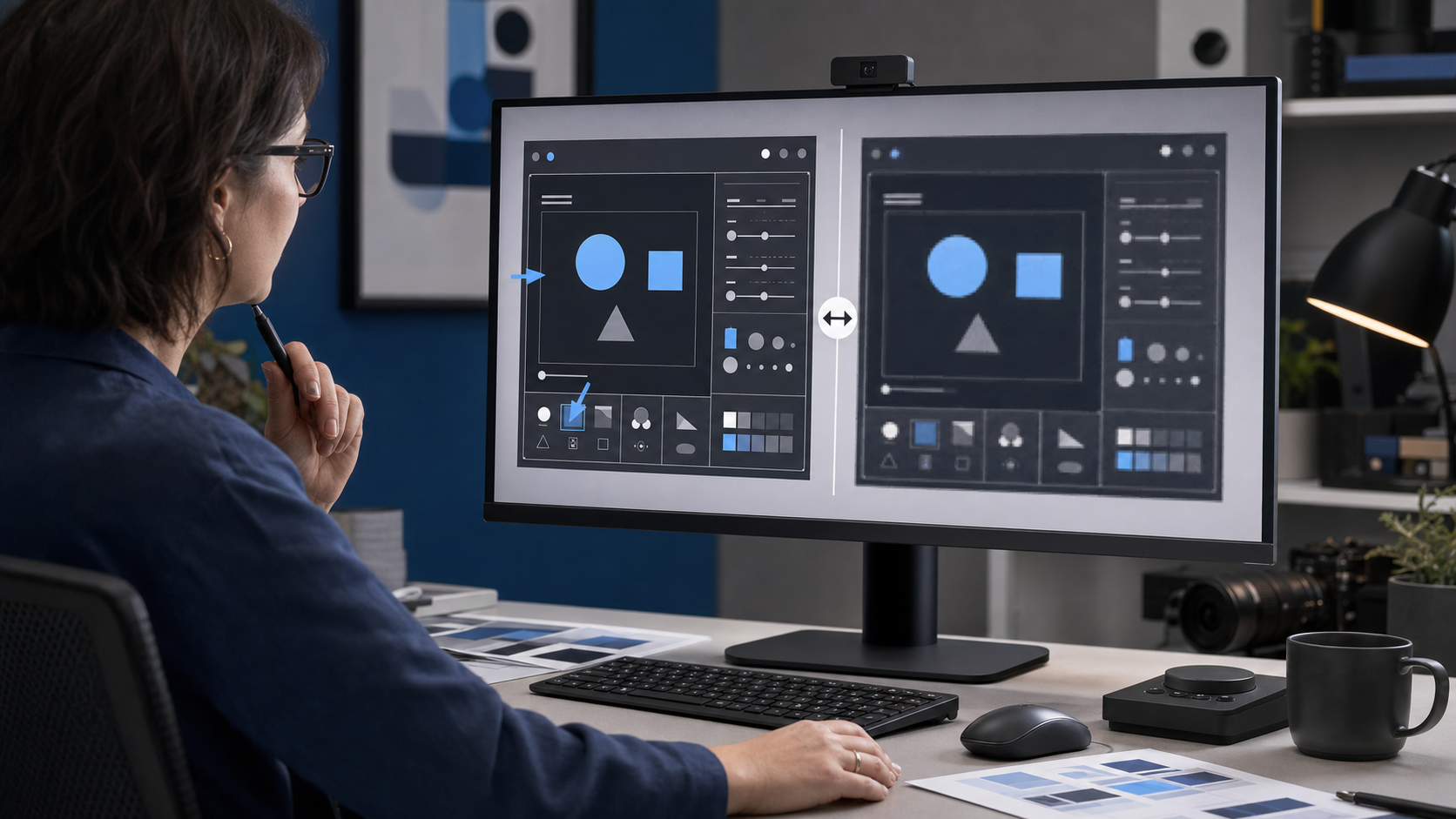
A tutorial screenshot can look perfectly sharp in the source file and become frustratingly fuzzy after publication. Small labels acquire halos, one-pixel dividers fade, disclosure arrows lose their shape, and highlighted menu items become harder to distinguish from their surroundings. The file may be impressively small, but the image no longer performs its actual job: helping someone recognize an interface and take the correct action.
This problem appears in help centers, onboarding guides, release notes, internal manuals, support replies, and product education pages. It is especially common when a team applies photo-oriented compression rules to interface captures. Photographs contain continuous tones and irregular detail that can conceal some loss. Interface screenshots contain repeated edges, flat fills, tiny glyphs, and precise spacing. Those features expose even modest damage.
The solution is not simply to save everything as a large PNG. A better approach treats screenshot dimensions, capture density, cropping, format, compression, and page presentation as connected decisions. This guide presents a practical system for reducing screenshot weight while keeping controls and instructional details readable.
Why UI Screenshots Break Differently From Photographs
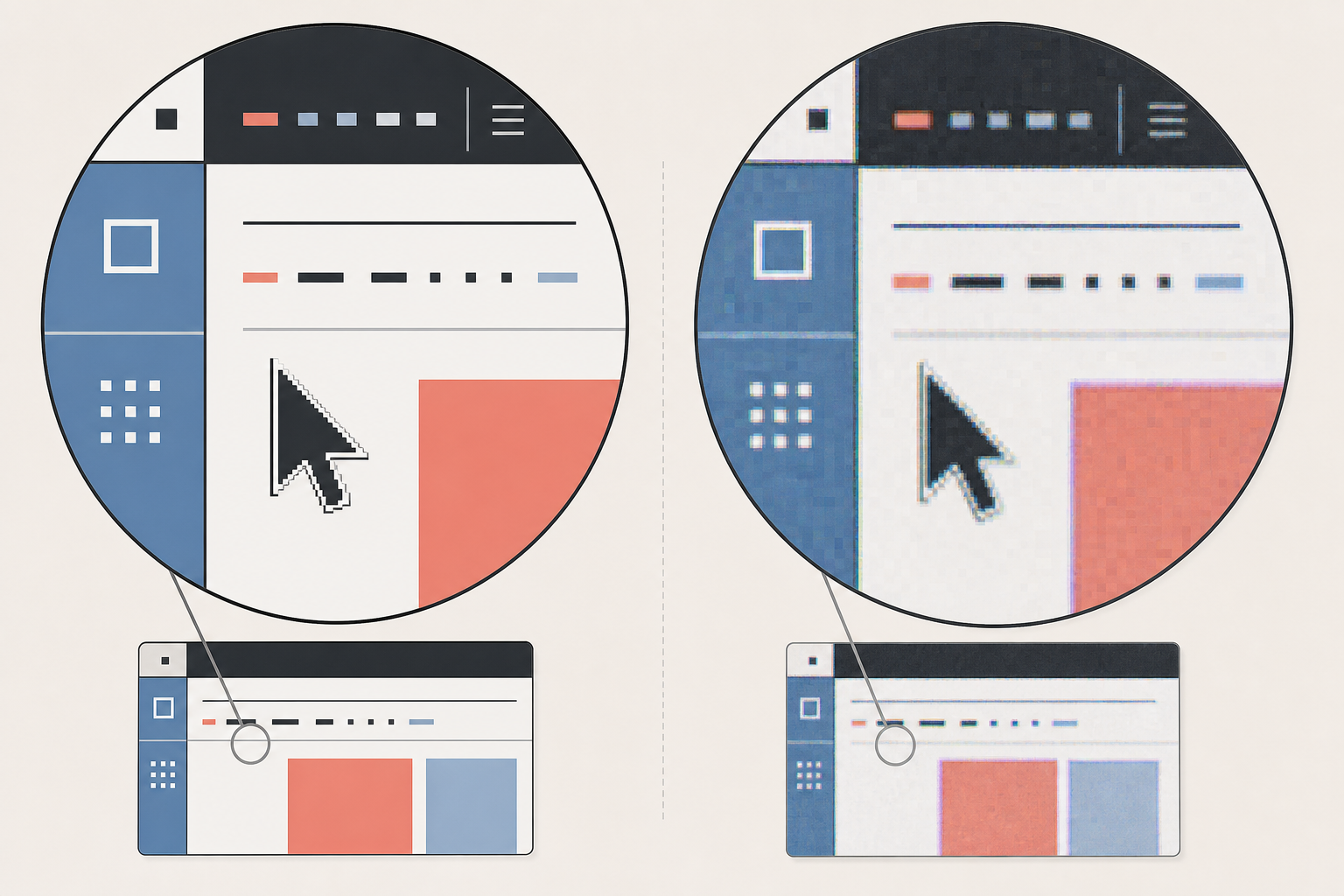
A typical interface capture contains several elements that are unusually sensitive to image processing:
- Small text formed from thin strokes
- One-pixel borders and separators
- Flat areas with sharp color transitions
- Compact icons with limited internal space
- Cursor tips and selection handles
- Dashed focus rings
- Syntax highlighting and colored status indicators
- Annotation arrows, boxes, and numbered markers
Lossy compression divides visual information into patterns that can be approximated. That works reasonably well for clouds, fabric, skin, or foliage. Around interface text and hard edges, approximation may create ringing, block patterns, color bleed, or soft transitions. The effect becomes more noticeable when an image is resized again by a content management system or displayed at a non-native scale.
Chroma subsampling is another concern. Some lossy exports preserve brightness detail more accurately than color detail. Small colored text, red validation messages, blue links, and orange annotation lines can consequently look softer than neutral elements beside them.
The damage is not always obvious at full desktop size. It often appears when a reader views the article on a narrow phone, zooms into a step, or uses a high-density display. That is why evaluating only the source image at 100 percent zoom is insufficient.
Start With the Instructional Target
Before changing export settings, identify what the reader must see. Every screenshot should have a primary instructional target: the control, state, value, or relationship that makes the step understandable.
For example, consider a capture of a complex analytics dashboard. If the instruction is to open a date selector, the date selector is the target. The surrounding charts provide context, but they do not need equal visual priority. Cropping closer to the target may remove hundreds of thousands of pixels without sacrificing useful information.
Ask four questions for each image:
- What exact control or result must remain legible?
- How much surrounding interface is required for orientation?
- Will the screenshot be read mainly on desktop, mobile, or both?
- Does color carry meaning that would be lost if edges or hues softened?
These questions prevent a common mistake: compressing a needlessly large capture until its important details barely survive. Removing irrelevant pixels is generally safer than forcing severe compression onto a full-screen image.
Use the recognition test
Hide the accompanying paragraph and look at the screenshot by itself. Can a reader identify the intended control within a few seconds? If not, the image probably needs a tighter crop, a clearer annotation, or a different capture state.
Annotations should guide attention rather than compensate for a chaotic composition. A thin outline around the relevant region is often enough. Large arrows, multiple circles, and several colors can add visual noise and increase the number of sharp edges the encoder must preserve.
Capture at a Deliberate Size
Compression quality begins before export. Capturing an enormous desktop and shrinking it later can produce weaker results than preparing a focused browser or application window first.
Set the application to a size that resembles the final documentation frame. Close unrelated panels, reduce unnecessary whitespace, and make sure the relevant menu is not partly hidden. If the product supports responsive layouts, select the layout readers are most likely to encounter.
High-density captures can be useful because they retain more source detail. A screenshot intended to appear at 800 CSS pixels might be captured at 1600 physical pixels and displayed at half size. This can make text and lines look clean on high-density screens. It also increases the pixel count, so the benefit must be weighed against file size.
A sensible rule is to retain a two-times-density version only when the screenshot includes small UI elements that genuinely benefit from it. A large decorative image or a loosely cropped window may not justify the extra pixels.
Avoid enlarging a screenshot after capture. Upscaling cannot restore character shapes or edges that were never recorded. If the source is too small, recapture it at the appropriate window size or display density.
Crop Before You Resize or Compress
Cropping is the highest-value optimization available for many tutorial screenshots. It reduces dimensions without introducing artifacts and increases the relative size of the instructional target.
A useful crop should preserve three layers:
- Target: the control, message, or outcome discussed in the step
- Local context: nearby labels or navigation needed to locate the target
- Orientation cue: enough of the window structure to show where the reader is
The orientation cue might be a sidebar edge, toolbar, dialog title area, or recognizable content panel. It does not need to be the entire application window.
Leave a small amount of breathing room around dropdowns, floating menus, and tooltips. Cropping exactly against their edges can make the interface feel truncated. It can also hide shadows that communicate layering.
If the original capture contains private account details, crop or redact them before uploading the file to any publishing system. Do not rely on compression to make sensitive content unreadable. Blur can sometimes be reversed or interpreted, while opaque redaction applied to a flattened copy is more dependable.
After cropping, use an image resizing tool such as Resize Image to set a purposeful output width. Keep the untouched source separately so later documentation redesigns do not require enlarging a reduced derivative.
Choose the Format From the Pixel Structure
No single format is best for every screenshot. Select it according to the image content and the publishing environment.
| Format | Strong use case | Main caution |
|---|---|---|
| PNG | Small captures with flat colors, sharp text, transparency, or few color variations | Full-screen captures can become large |
| Lossy WebP | Larger screenshots where moderate loss is visually acceptable | Fine colored text and edges require inspection |
| Lossless WebP | Interface images that need exact edges with potentially better size than PNG | Compatibility with a specific publishing stack should be confirmed |
| JPEG | Screenshots dominated by photographs, maps, video frames, or textured content | Usually poor for small UI text and flat color boundaries |
| AVIF | Large, complex captures where the site reliably supports modern delivery | Encoding choices and downstream resizing can affect fine detail |
PNG is a safe starting point for dialogs, menus, code editors, settings panels, and tightly cropped controls. It is lossless, but it is not automatically small. Screenshots containing gradients, shadows, photos, or a large variety of colors may produce substantial PNG files.
Lossy WebP can be effective for full-page captures or interfaces with photographic material. The correct quality setting depends on the content, not a universal number. A value that looks excellent on a dashboard may damage a terminal capture or a panel filled with compact text.
JPEG should generally be avoided for text-heavy interfaces. It can still be appropriate when the screenshot is primarily a video frame or photograph with a small interface overlay. If format testing is needed, Convert Image can create alternative versions for visual comparison.
Transparency also affects the decision. If a screenshot or callout panel requires a transparent background, PNG or a transparency-capable modern format is appropriate. Confirm how translucent shadows and antialiased edges appear against both light and dark page backgrounds.
Resize With the Final Display Width in Mind
A screenshot is frequently damaged by repeated scaling rather than a single aggressive compression pass. The author resizes it, the CMS creates derivatives, the page constrains it with CSS, and a browser displays it at a fractional width. Each stage can change fine details.
Determine the maximum width at which the image will actually appear. If the article column is 760 pixels wide, exporting a standard-density image at 1400 pixels may provide little benefit unless high-density delivery is intentional. Conversely, uploading a 600-pixel image and stretching it to 760 pixels will visibly soften it.
Use integer-friendly dimensions where possible. A 1600-pixel source displayed at 800 pixels has a clean two-to-one relationship. A 1373-pixel source displayed at 783.4 pixels requires less predictable sampling. Responsive design will sometimes create fractional sizes anyway, but clean source and target dimensions reduce avoidable problems.
Do not judge only the image opened in a desktop viewer. Place it in the actual article layout and inspect it at common viewport widths. Page-level CSS, responsive image selection, and browser scaling are part of the result.
Protect narrow lines during resizing
One-pixel dividers can disappear when their position falls between output pixels. If an important line becomes faint after reduction, try a slightly different output width or capture the interface at a smaller native scale. Adding sharpening is not always the answer; it may create halos around every glyph.
When annotations are added after capture, size their strokes for the final display dimensions. A two-pixel outline on a large source can become too faint after reduction. Create annotations on a copy prepared near its delivery size, or use vector annotations that are rasterized only during final export.
Compress in Controlled Steps
Once cropping and dimensions are correct, compression becomes a refinement step rather than a rescue attempt.
Keep a lossless master and make derivatives from that master. Reopening and resaving a lossy screenshot accumulates damage. This matters when several people successively edit, annotate, and publish the same file.
Create a short series of candidates rather than guessing one setting. For a lossy format, export a high-quality version, a middle candidate, and a more aggressive candidate. Compare them at the actual display size and at magnified scale. The smallest acceptable file is the one that preserves the instructional target, not necessarily the one that looks adequate from a distance.
A tool such as Compress Image is most useful after the crop and output dimensions have been finalized. Record the selected format and approximate settings in the documentation style guide so recurring image types receive consistent treatment.
Inspect these high-risk regions in every candidate:
- Lowercase letters with fine stems, such as
i,l, andt - Small punctuation and decimal points
- Red, orange, or blue text on neutral backgrounds
- Chevron and disclosure icons
- Dashed selection borders
- Cursor tips
- Thin chart gridlines
- Syntax highlighting
- Small badges with text inside colored fills
If the middle candidate damages these areas, choose the larger version or change format. Do not assume that readers will infer a missing decimal point or recognize a softened icon.
Build a Small Screenshot Test Matrix
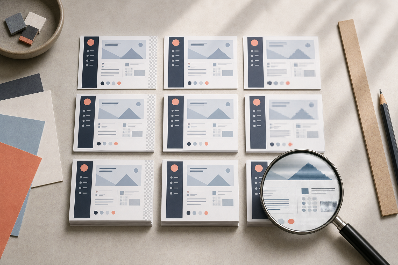
A test matrix makes format decisions faster and less subjective. It does not need to be elaborate. Select three representative screenshots from the product:
- A text-heavy settings panel
- A mixed-content screen with icons, shadows, and a photograph or chart
- A compact menu or dialog with annotations
For each sample, generate a few realistic candidates. Compare format, pixel width, visual quality, and file weight. Review them inside the site rather than in isolation.
| Candidate | Width | Format | Review focus | Decision |
|---|---|---|---|---|
| A | Final CSS width | PNG | Baseline edge quality | Keep as reference |
| B | Two-times display width | PNG or lossless WebP | High-density clarity versus weight | Use if benefit is visible |
| C | Two-times display width | Lossy WebP | Text edges and colored labels | Accept only after close review |
| D | Final CSS width | Lossy WebP | Small-screen delivery | Test on phone |
The purpose is not to select one permanent winner. It is to establish useful defaults for recognizable image classes. A tightly cropped menu might use PNG, while a large page containing photographs might use WebP. Exceptions remain possible when the instructional target demands them.
Include real mobile testing. A screenshot that is nominally responsive may become too small to read when the page column narrows. In that case, consider a mobile-specific crop, a tap-to-enlarge presentation, or two separate screenshots instead of one panoramic capture.
Handle Annotations Without Creating New Problems
Annotations improve tutorials when they answer a precise question: where should the reader look? They become counterproductive when they obscure the interface or depend on tiny labels.
Use a restrained annotation system:
- One primary accent color with sufficient contrast
- Consistent outline and arrow thickness
- Minimal overlap with interface text
- Short labels placed outside dense controls
- Numbered markers only when the prose uses the same sequence
Do not communicate a critical distinction through color alone. Readers with color-vision differences may not distinguish a red outline from a green one. Combine color with shape, position, numbering, or a written description.
Check annotation visibility against dark and light interfaces. A single red arrow may work on a pale dialog but disappear over a colorful chart. A subtle contrasting border around the annotation can improve separation, although it must remain clean after compression.
If an annotation contains text, treat that text as part of the screenshot’s critical detail. It needs sufficient size at the final presentation width. Whenever possible, keep explanations in accessible HTML text and use the image only to point at the relevant region.
Account for Mobile Readers and Zooming
Desktop authors often underestimate how small a full-window capture becomes on a phone. An image measuring 1400 by 800 pixels may be displayed at roughly 350 CSS pixels wide. Interface labels that looked comfortable during editing can become unreadable even if compression quality is technically excellent.
For mobile-first documentation, favor sectional captures. Show the sidebar in one image and the detailed control panel in another if both are necessary. This gives each instructional target more space and may produce smaller files than a single dense capture.
Avoid embedding multiple steps into one giant screenshot unless their spatial relationship is essential. A sequence of focused images usually gives readers clearer stopping points and lets the page load only the pixels required for each explanation.
Zooming should remain possible when detail matters. Ensure the site does not replace a useful high-resolution source with an undersized derivative when the image is opened. At the same time, provide meaningful alt text so readers who cannot inspect the pixels still understand the image’s instructional purpose.
Good alt text describes the relevant state and location, not every visible control. For example: “Export dialog with the transparent background option enabled beneath the format selector.” That is more useful than “Screenshot of settings.”
Run a Pre-Publish Screenshot Audit
Before publishing, review the image as part of the complete article. A technically sharp screenshot can still be confusing if it shows a different product version, uses inconsistent annotations, or contradicts the written step.
Use this checklist:
- The screenshot shows the current interface state described in the article.
- The instructional target is visible without excessive searching.
- Unrelated browser tabs, notifications, and account details are removed.
- Small labels, punctuation, and status indicators remain distinguishable.
- The image is not being enlarged beyond its exported dimensions.
- Desktop and mobile layouts select an appropriate source.
- The chosen format preserves thin lines and colored text.
- Annotations remain clear at the actual article width.
- Alt text explains the relevant control or result.
- The filename is descriptive and stable.
- The lossless master is retained outside the publishing derivative folder.
Also look for accidental version clues. Dates, usernames, feature flags, test data, and outdated navigation can make a tutorial age prematurely. Use realistic but non-sensitive sample content, and recapture screens when the product interface changes materially.
Set Practical Team Defaults
A small set of defaults prevents every author from repeating the same experiments. Keep the rules based on image characteristics rather than personal preference.
A practical starting policy might be:
- Crop to the smallest region that retains target, local context, and orientation.
- Keep a lossless master for every annotated or frequently reused screenshot.
- Use PNG for compact, text-heavy interface captures unless testing shows a clear alternative.
- Test lossless or lossy WebP for larger mixed-content screens.
- Avoid JPEG for small UI text unless the image is dominated by photographic material.
- Export at the intended display width or a deliberate two-times density.
- Inspect every lossy candidate inside the actual page at desktop and mobile sizes.
- Split dense full-window captures when mobile labels become too small.
These are starting points, not guarantees. Product interfaces vary. A dark code editor, a pastel design canvas, and a dense spreadsheet will respond differently to the same encoder settings.
Track a few representative reference images in the team’s publishing guide. When the site changes its image service, CMS, or article width, rerun the matrix. This is particularly important if automatic optimization begins converting uploads into a different format behind the scenes.
Optimize for Understanding, Not the Lowest Number
Screenshot optimization succeeds when the reader can identify the correct control quickly and confidently. File weight matters because heavy pages load slowly, consume data, and discourage readers from continuing. Yet an aggressively compressed image that forces someone to zoom, guess, or abandon the tutorial is not efficient.
The most reliable order is straightforward: clarify the instructional target, capture deliberately, crop unnecessary context, choose a suitable display width, test formats, and then apply controlled compression. Preserve a lossless master so future revisions start from clean pixels.
When a screenshot remains too heavy, revisit its composition before lowering quality again. A tighter crop, two focused images, or removal of irrelevant photographic content can save more bytes while improving the lesson. The best tutorial screenshot is rarely the largest or the smallest. It is the lightest version that still makes the next action unmistakable.