Mobile-First Screenshot Callouts for Release Notes
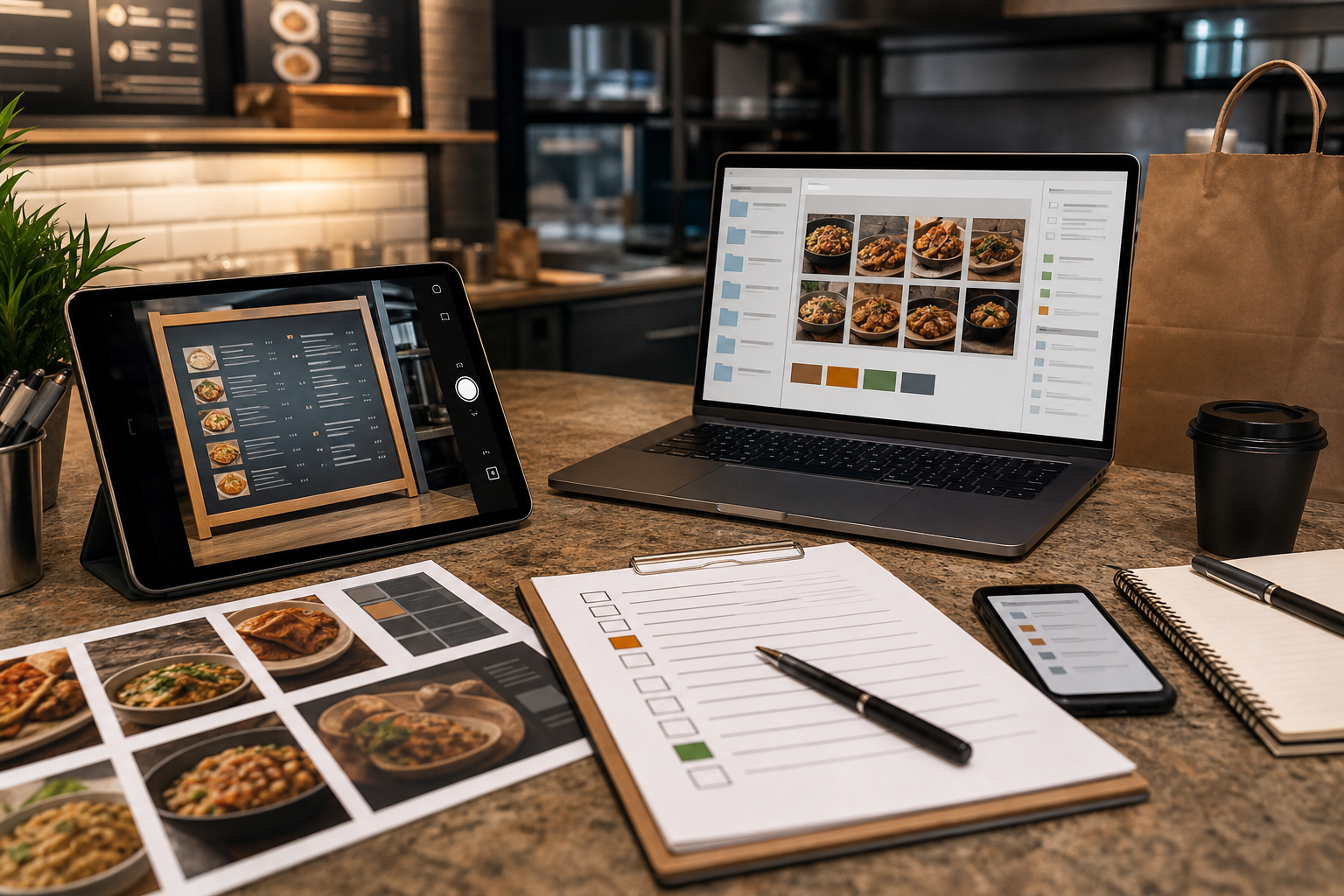
A practical workflow for turning raw product screenshots into readable, lightweight, mobile-first release note visuals with clean crops, callouts, OCR checks, and export hygiene.
Mobile-First Screenshot Callouts for Release Notes
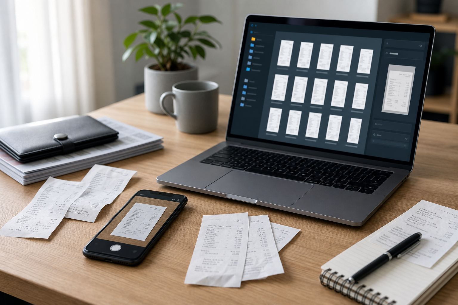
Release notes are often written for people who are already busy. They scan a short update, look for the one change that affects their work, and decide whether to click deeper. A good screenshot can make that decision faster. A poor screenshot does the opposite: it shows too much interface, shrinks the important change into a blur, and turns a useful product update into a vague announcement.
The problem is not usually design talent. It is workflow. Product teams capture a raw screen, paste it into a changelog, maybe draw a rectangle around the new feature, and export whatever the screenshot tool gives them. That can work on a desktop monitor, but release notes are increasingly read on phones, in email clients, inside help centers, and in narrow in-app panels. The screenshot has to survive all of those contexts.
This guide focuses on a specific niche: preparing mobile-first screenshot callouts for product release notes. The workflow is useful for SaaS teams, indie app builders, documentation writers, support teams, and anyone who publishes frequent updates without a dedicated visual production pipeline. The goal is not to make screenshots decorative. The goal is to make the change unmistakable at small sizes while keeping the file light and the asset easy to reuse.
Why Release Note Screenshots Fail on Mobile
Most release note screenshots fail because they were created at the wrong viewing size. A full desktop screenshot might look acceptable while the editor is zoomed in, but it becomes unreadable when placed inside a 390-pixel-wide mobile viewport. The same issue happens in newsletters where images are constrained by templates, or in help centers where article bodies have fixed maximum widths.
There are four common failure patterns.
First, the screenshot includes too much surrounding interface. The new button, field, filter, or setting appears somewhere inside a large layout, but the reader has to hunt for it. The screenshot documents the entire product instead of the specific change.
Second, the annotation competes with the interface. Thick arrows, oversized labels, and high-saturation boxes can cover the exact detail they are supposed to explain. Callouts should reduce effort, not add another layer of visual noise.
Third, the export is too heavy for the job. Release notes often contain multiple screenshots, especially when covering a monthly batch of changes. A few uncompressed PNGs can make the page feel slow, particularly on mobile connections. Running final images through a tool like /compress-image is not an afterthought; it is part of publishing discipline.
Fourth, the screenshot is not checked as an image. Teams read the article draft but rarely inspect the final visual at the size readers will actually see. Thin text, small icons, and pale dividers may disappear after resizing or compression.
A mobile-first workflow solves these issues before publishing. It forces the screenshot to prove its value at the smallest likely size, then scales up gracefully for desktop.
The Mobile-First Screenshot Workflow
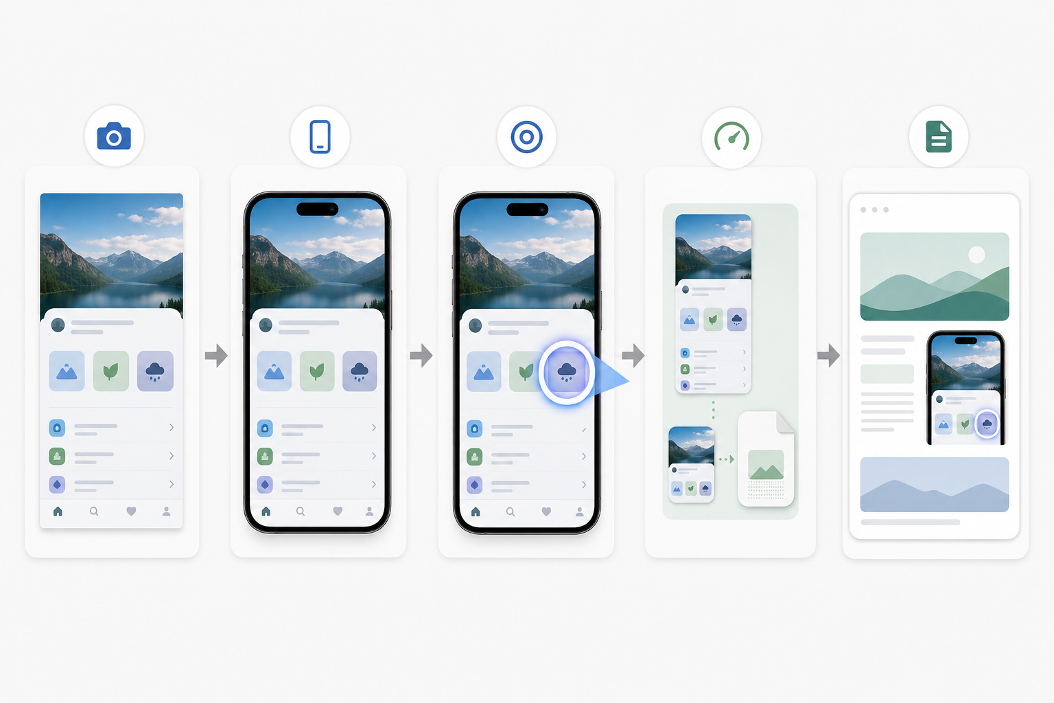
A reliable release note image moves through six stages: capture, crop, simplify, annotate, verify, and export. Each stage answers one practical question.
Capture asks: what is the smallest truthful view of the product change?
Crop asks: what can be removed without making the screenshot confusing?
Simplify asks: what visual distractions can be reduced before annotation?
Annotate asks: where should the reader look first?
Verify asks: is the result readable at mobile width?
Export asks: which file format and compression level fit the publishing context?
This sequence matters because it prevents annotation from becoming a rescue tool. If a screenshot needs three arrows and a paragraph of explanation, the crop is probably too wide or the selected screen is not the best evidence of the change. Start with the image itself, then use callouts sparingly.
For example, imagine a release note announcing a new saved filter menu in a project dashboard. A raw screenshot of the full dashboard may include the sidebar, header, table rows, avatars, status pills, and empty space. The saved filter menu occupies perhaps five percent of the frame. A better visual starts by cropping to the toolbar and the first few rows of the table. The reader still understands the feature context, but the new menu is now the main subject.
If the crop changes the image dimensions significantly, resize it for the intended surface with /resize-image. A consistent width across release note visuals helps the page feel deliberate, and it prevents one screenshot from dominating the article while another looks like an afterthought.
Step 1: Capture the Right State, Not the Most Complete State
The best screenshot is not always the one that shows the entire feature. For release notes, the screenshot should show the moment when the new behavior becomes obvious.
If you changed an empty state, capture the empty state. If you added a warning before deletion, capture the warning dialog. If you improved a table filter, capture the dropdown open and one or two affected rows visible underneath. Avoid screenshots that require readers to infer the change from surrounding context.
Before taking the screenshot, prepare the product state deliberately. Use realistic but non-sensitive sample data. Keep names, emails, file titles, and account details generic. If the interface includes customer data, replace it in the product environment or crop it out. Blurring sensitive content can work in emergencies, but it often makes screenshots look messy and distracts from the release note.
Also check browser zoom and system display scaling. Screenshots captured at unusual zoom levels can create inconsistent type sizes across a changelog. Pick a standard setup for the team, such as 100 percent browser zoom on a common desktop width for web apps, or a known simulator/device size for mobile apps. Consistency is more important than chasing a perfect universal size.
For mobile app screenshots, capture the most compact state first. If the feature is readable on a small phone screen, it will usually be readable in larger contexts. For desktop features, crop toward a mobile article presentation rather than preserving the full desktop window.
A useful rule: the screenshot should still make sense when viewed at about the width of a phone held in portrait orientation. If the important detail vanishes at that size, the screenshot needs a tighter crop or a different composition.
Step 2: Crop for Recognition and Context
Cropping is where release note images become useful. The goal is to remove everything that is not helping the reader recognize the change.
A strong crop usually includes three things: the changed element, one nearby landmark, and enough surrounding interface to show where the element lives. The landmark might be a sidebar section, a toolbar title, a table header, or a modal edge. Without a landmark, a tight crop can feel like a random fragment. With too many landmarks, the important detail gets buried again.
Think in three crop types.
A feature crop shows a new control or UI area in context. It works well for buttons, menus, filters, settings, and navigation changes.
A comparison crop shows before and after states side by side or stacked. It works for visual redesigns, density changes, table improvements, and chart updates. Keep comparison crops simple; if both sides are dense, readers may struggle to see the difference.
A detail crop isolates a small interface element. It works for icons, badges, status labels, keyboard shortcuts, and small visual affordances. Detail crops often need more annotation because they are detached from the full screen, so use them only when the surrounding UI is unnecessary.
When you crop, preserve clean edges. Avoid cutting through text lines, icons, or controls unless the crop is intentionally showing a close detail. A screenshot that cuts halfway through a sidebar or modal can look accidental. If you need a narrow crop, align it to natural interface boundaries.
After cropping, test the image in the approximate article width. You can use /convert-image later if the crop needs to become a different format, but the crop decision should happen before format decisions. Composition comes first.
Step 3: Use Callouts That Behave Like Interface, Not Decorations
Callouts should guide attention without fighting the product UI. In release notes, the safest callout styles are restrained: a thin outline, a subtle highlight, a small magnified inset, or a soft background emphasis around the changed area.
Avoid heavy arrows unless direction is genuinely important. Arrows can be useful when the target is small or when the relationship between two areas matters, but they often make product screenshots feel like support tickets rather than polished updates. If a simple outline does the job, use the outline.
A good callout has clear hierarchy. The changed element should remain more important than the callout shape. The callout color should contrast with the interface but not clash with it. If your product UI uses blue heavily, a blue rectangle around a blue button may disappear. Choose a highlight color that is visible but not alarming.
Keep labels out of the image whenever possible. Text inside images creates localization, accessibility, and scaling problems. It can also become unreadable on mobile. Explain the change in the release note body, then let the image show the evidence. This is also why the image prompts for this article specify no text inside the generated images: visual support should not depend on embedded words.
If a screenshot already includes annotations from a design or QA tool, consider cleaning them up before publishing. Extra comments, cursor marks, inspection overlays, and measurement guides can confuse readers. When an image needs object removal, background extension, or gentle cleanup, an editor like /ai-photo-editor can help, but use it carefully. The published screenshot should remain faithful to the real product experience. Do not edit the interface in a way that suggests a feature exists differently than it actually does.
Step 4: Check Readability With OCR and Human Eyes
Readability is not just a design judgment. If the screenshot contains important interface text, run a quick OCR check. A tool like /image-ocr can help reveal whether the key labels are still legible after cropping and resizing.
OCR is not a perfect quality score, but it is a useful warning system. If OCR cannot detect the main button label, tab name, or table heading, many readers may struggle too. This is especially true for screenshots with thin type, low contrast, or compression artifacts.
Use OCR checks for images where text is essential to understanding the update. For example, a screenshot announcing a renamed setting depends on that setting label being readable. A screenshot showing a new layout may depend less on exact text and more on spatial structure.
Pair OCR with a fast human check. Open the image at the size it will appear on mobile. Do not zoom in. Ask three questions.
Can I identify the changed area in two seconds?
Can I read the one or two labels that matter?
Does the crop show enough context to trust what I am seeing?
If the answer is no, fix the image rather than relying on caption text to compensate. A release note visual should reduce explanation load.
Step 5: Export for the Surface Where the Image Will Live
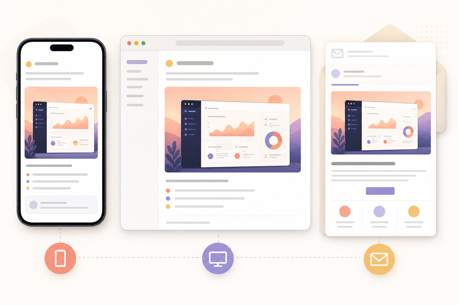
Release note screenshots often travel. The same image may appear in a web changelog, an email newsletter, an in-app announcement, and a help article. Export decisions should reflect the most restrictive surface, not only the nicest one.
For interface screenshots, PNG is often best during editing because it preserves sharp edges and text. For final publishing, WebP can reduce size while keeping UI detail crisp, depending on your CMS and browser support requirements. JPEG is usually less ideal for UI because it can introduce artifacts around text and icons, but it can be acceptable for photographic product imagery or mixed screenshots with large photo areas.
Keep an editable master and a publishing export. The master can be a high-quality PNG with layers or separate callout elements if your workflow supports them. The publishing export should be resized and compressed for the final page.
Compression is especially important for release notes that include several screenshots. Use /compress-image after resizing, then inspect the result. Compression should not blur thin UI lines, distort icon shapes, or create color noise around text. If it does, reduce the compression strength or export at a slightly different size.
Also consider whether the screenshot needs to be reused in a PDF release packet, sales enablement document, or customer update deck. If so, exporting a clean image and then placing it into a PDF later may be cleaner than screenshotting the final article. For visual handoffs, /image-to-pdf can be useful when a set of screenshots needs to become a shareable review document.
A Practical Export Decision Table
Use this table as a starting point for release note screenshot exports. Adjust based on your CMS, design system, and audience.
| Publishing surface | Recommended approach | Why it works | Watch out for |
|---|---|---|---|
| Web changelog | Resize to the article content width, then compress | Keeps layout consistent and avoids oversized downloads | Over-compression around small UI text |
| Email newsletter | Use a conservative width and small file size | Email clients vary, and large images can load slowly | Tiny labels may become unreadable on mobile email |
| In-app announcement | Crop tightly and avoid embedded text | Users are already inside the product and need quick recognition | Modals and banners may constrain height |
| Help center article | Keep more context than a changelog image | Readers may need orientation for support tasks | Screenshots can become stale after UI changes |
| PDF release packet | Use high-quality images before PDF assembly | Reviewers may zoom or print the document | File size can grow quickly with many PNGs |
The main point is to avoid a single careless export. A screenshot that works in a desktop web article may not work in an email. A screenshot that looks sharp as a PNG may be unnecessarily heavy for a long changelog. Match the export to the surface.
Example: Turning a Raw Feature Screenshot Into a Release Note Visual
Suppose your team ships a new bulk action menu for invoices. The raw screenshot shows the entire billing page: navigation, filters, invoice table, account switcher, and a selected row. The new menu appears after the user selects several invoices.
Start by capturing the exact state: two or three invoices selected and the bulk action menu open. Use realistic invoice names or neutral sample data. Remove any internal account details before capture.
Next, crop to include the table header, selected rows, and the open menu. Do not include the whole sidebar unless the billing location matters. The reader only needs enough context to understand that this is a table action.
Then add a subtle callout around the menu or selected row area. If the menu is visually obvious, skip the callout and rely on the crop. If the table is dense, a thin outline around the menu can help.
Resize the image to the width used by your release note body. If your article column is 760 pixels wide on desktop, export around that width or a little higher for high-density screens. Then check the same image at mobile width. If the menu text becomes unreadable, create a mobile-specific crop rather than forcing the desktop crop to do everything.
Run OCR on the final image if menu labels are important. If OCR reads the labels cleanly, you have a reasonable signal that the text survived. Finally, compress the image and inspect it again. The final asset should be light enough for the page and clear enough to understand without zooming.
When to Use One Screenshot, Two Screenshots, or a Short GIF
Not every release note needs a screenshot. Some changes are better explained with text, especially backend improvements, permissions changes, bug fixes, and performance updates. But when a visual helps, choose the smallest format that explains the change.
Use one screenshot when the change is a visible state: a new button, a renamed setting, a redesigned panel, a new empty state, or a clearer error message.
Use two screenshots when comparison matters. Before-and-after images work well for layout density, visual redesigns, chart improvements, and clearer flows. Keep both crops aligned so the difference is easy to scan.
Use a short GIF when motion is the feature: drag and drop, inline editing, hover behavior, menu discovery, or a multi-step interaction. Keep GIFs short and focused. A looping micro demo can be effective, but a long screen recording inside release notes can distract from the written update. If you need to make a lightweight motion asset, /gif-maker can fit this part of the workflow.
Do not use a GIF to hide unclear writing. If the change requires a long animation to understand, the release note may need a clearer description or a separate documentation link.
A Screenshot Review Checklist Before Publishing
Before you publish, run through this checklist. It is short enough to become part of the release note process without slowing the team down.
| Check | Pass condition |
|---|---|
| Purpose | The image shows one clear product change or comparison |
| Crop | The changed area is visible within two seconds |
| Context | The reader can tell where the feature lives in the product |
| Privacy | No customer data, internal notes, or sensitive account details are visible |
| Annotation | Callouts guide attention without covering the feature |
| Mobile readability | The important labels remain readable at phone width |
| OCR check | Essential UI text can be detected or is visibly legible |
| File size | The image is resized and compressed for its publishing surface |
| Format | PNG, WebP, JPEG, or GIF is chosen for the actual content type |
| Reuse | The filename and export are clear enough to find later |
This checklist also helps with consistency across contributors. Release notes are often produced by product managers, marketers, engineers, and support writers at different times. A shared visual standard prevents the changelog from becoming a patchwork of random capture styles.
Naming and Version Hygiene for Release Note Assets
File naming sounds boring until a release note needs an update six months later. Use filenames that identify the product area, feature, date or release version, and image purpose.
A useful pattern is:
billing-bulk-actions-release-2026-05-crop.webp
For comparison images, add state names:
dashboard-density-before-2026-05.png
dashboard-density-after-2026-05.png
For mobile-specific crops, be explicit:
saved-filters-mobile-crop-2026-05.webp
Avoid vague names like screenshot-final-final.png or new-feature.png. Those names become impossible to manage when the team publishes frequently.
Keep original captures separate from final exports. The original is useful if you need to re-crop or re-export later. The final export is what goes into the article. If your CMS stores only the final image, keep a lightweight local or shared-folder archive of source captures for important releases.
Version hygiene also matters when UI changes quickly. A release note screenshot should represent the product state at publication. If the interface changes before the note goes live, recapture rather than editing the old screenshot into a fictional state. Trust is more valuable than visual convenience.
Accessibility Notes for Screenshot-Heavy Release Notes
Screenshots are not a replacement for accessible writing. Some readers use screen readers, some browse with images blocked, and some skim in environments where images load slowly. The release note should still make sense without the image.
Write alt text that describes the relevant product change, not every visible detail. For example, use “Invoice table showing the new bulk action menu opened above selected rows” rather than “Screenshot of billing page.” Specific alt text gives the image a job.
Do not put essential explanation only inside the image. If a callout label says “New,” the article text should also explain what is new. Embedded text inside screenshots is difficult to translate and may be missed by assistive technology.
Color-only callouts can also be weak. If the screenshot uses a highlight, make sure the crop and surrounding article text still identify the changed area. A reader who cannot distinguish the highlight color should not lose the meaning of the update.
Finally, keep image count intentional. Multiple visuals can improve comprehension, but a release note with too many screenshots can become slow and exhausting. Use images where they reduce ambiguity.
Common Mistakes and Better Fixes
One common mistake is using a full-page screenshot for every update. The better fix is a feature crop that preserves one nearby landmark. Full-page screenshots are useful for major redesigns, but they are too broad for most incremental changes.
Another mistake is drawing large labels directly into the image. The better fix is to explain the change in body text and use a restrained visual callout. This keeps the screenshot cleaner and easier to reuse.
A third mistake is exporting at the capture size. Modern screens can produce very large images, and those images may be far bigger than the article needs. Resize first, then compress.
A fourth mistake is checking only the desktop draft. The better fix is to preview the final article or image at mobile width. If you cannot preview the full page, at least open the image at a narrow size and inspect it without zooming.
The last mistake is treating screenshots as disposable. Release notes become historical product records. Clean assets, sensible names, and honest visuals make future audits, help center updates, and customer conversations easier.
A Repeatable Mini Workflow for Small Teams
Here is a compact workflow that works well for teams publishing weekly or monthly updates.
- Capture the product in the exact state that demonstrates the change.
- Remove sensitive data at the source or crop it out.
- Crop around the changed area with one clear context landmark.
- Resize to the article width and check the image at mobile width.
- Add only the minimum callout needed to guide attention.
- Run OCR when interface text is essential.
- Export in the best format for the publishing surface.
- Compress the final image and inspect it again.
- Save with a descriptive filename that includes the feature and release.
- Add specific alt text when placing the image in the article.
This workflow is deliberately simple. It does not require a design system, a complex template, or a production handoff. It just makes each screenshot earn its place in the release note.
Final Thoughts
Mobile-first screenshot callouts are a small operational detail with a visible payoff. They make release notes faster to scan, easier to trust, and more useful across web, email, in-app, and support contexts. The work is not about making product updates look flashy. It is about respecting the reader’s attention.
The strongest release note visuals are clear before they are beautiful. They show the right state, crop away the noise, guide attention with restraint, and export at a size that loads quickly. Once that workflow is repeatable, screenshots stop being last-minute evidence and become part of the product communication system.