Mobile-First Screenshot Readability Guide for Technical Docs
A practical guide for making mobile UI screenshots readable in technical documentation, with crop rules, compression settings, annotation checks, and export decisions.
Mobile-First Screenshot Readability Guide for Technical Docs
Mobile screenshots look simple until they land inside documentation. A feature that is obvious on a phone can become nearly unreadable once the image is placed inside a help article, scaled inside a two-column layout, compressed by a CMS, viewed on a small laptop, or opened by a customer who is already confused. The screenshot may technically show the right screen, but the important control is too small, the annotation covers the label, or the final image is soft enough that thin UI lines disappear.
This guide is for documentation teams, support teams, product marketers, and solo builders who publish mobile product instructions. The goal is not to make every screenshot beautiful. The goal is to make every screenshot useful at the exact size where readers will see it.
That means thinking about cropping, density, annotations, file format, compression, and placement as one practical system. A sharp mobile screenshot can fail if it contains too much irrelevant surrounding UI. A perfectly cropped screenshot can fail if it is exported as a blurry JPEG. A helpful arrow can fail if it points to an element that vanishes on dark mode.
Below is a field-tested approach for preparing mobile screenshots that remain readable in technical documentation without bloating page weight.
Why Mobile Screenshots Break in Documentation
Mobile UI screenshots are usually tall, narrow, and dense. They contain small labels, icon-only controls, status bars, bottom navigation, floating action buttons, toasts, permission prompts, keyboard overlays, and occasionally tiny validation messages. In the app, the user can hold the device close. In documentation, that same screen is often displayed at 320 to 520 pixels wide inside a responsive article.
The most common failure is scale. A screenshot captured from a modern phone may be 1170 pixels wide or more. That sounds generous, but the article layout may render it at half that width. If the original screenshot includes the entire device frame, excess blank space, or a long scroll area, the actual instructional detail may occupy only a small fraction of the visible image.
The second failure is compression. Thin text, hairline borders, low-contrast dividers, small icons, and subtle disabled states do not survive aggressive export settings. Compression artifacts are especially noticeable around dark text on light backgrounds and around colorful UI icons.
The third failure is annotation clutter. Documentation screenshots often get arrows, boxes, blur areas, numbered markers, or callouts added after capture. Each layer can help, but too many layers compete with the interface. On mobile screenshots, there is limited space, so annotation choices need to be stricter than they would be for a wide desktop capture.
The fourth failure is context mismatch. The screenshot may show a logged-in state, sample data, notification badge, beta feature, or account name that does not match the article. Even when this is harmless, readers may focus on the difference instead of the instruction.
A useful screenshot passes a simple test: a reader should know where to look in less than two seconds, and the important UI element should still be legible after the image is placed in the article.
Start With the Reader's Viewing Size
Before editing the screenshot, decide where it will appear. Do not judge the image only at full resolution. Judge it at the size your reader will actually see.
For most technical docs, there are three common placements:
| Placement | Typical rendered width | Best screenshot style |
|---|---|---|
| Inline article image | 320-720 px | Tight crop around the relevant UI region |
| Step-by-step visual | 280-480 px | Cropped screen section with one clear focus point |
| Full-screen reference | 640-960 px | Full mobile screen, but only when the whole screen matters |
If the screenshot will appear inline between paragraphs, a full-length phone screen is often too tall. Readers may need to scroll past a long image to continue the instructions, while the important button remains small. A tighter crop is usually better.
If the article explains page structure, navigation, or screen location, a full-screen mobile capture can be justified. In that case, keep annotations minimal and make sure the surrounding article text explains what part matters.
A good rule: if the instruction is about one button, field, menu item, error message, or toggle, crop to the neighborhood around that element. If the instruction is about the layout of the whole screen, keep the full screen.
Capture Clean Source Screenshots
Editing cannot fully rescue a messy source capture. Spend a few minutes preparing the app state before taking screenshots.
Use realistic but neutral sample data. Names like "Jane Example" or generic project titles are less distracting than production customer names, private messages, or joke data. Remove notification banners, battery warnings, debug overlays, and floating screen recorder controls. If your device shows a status bar, make sure the time, signal, and battery indicators are not pulling attention away from the product UI.
Capture in the theme that matches the article. If your docs are mostly light screenshots, do not insert one dark-mode screen unless the article is specifically about dark mode. If both themes matter, label the sections through surrounding copy rather than putting text labels inside the image.
Use a consistent device size when possible. Mixing screenshots from several phone sizes can create awkward rhythm in a documentation page. Buttons jump in scale, navigation bars change height, and the article starts to feel patched together. Consistency improves trust.
When you need to remove sensitive information or replace visual noise, edit the image deliberately. ConvertAndEdit's /ai-photo-editor can help clean visual distractions, but avoid altering the UI in a way that changes the product instruction. For documentation, accuracy matters more than polish.
The Readability Audit: Five Checks Before You Export
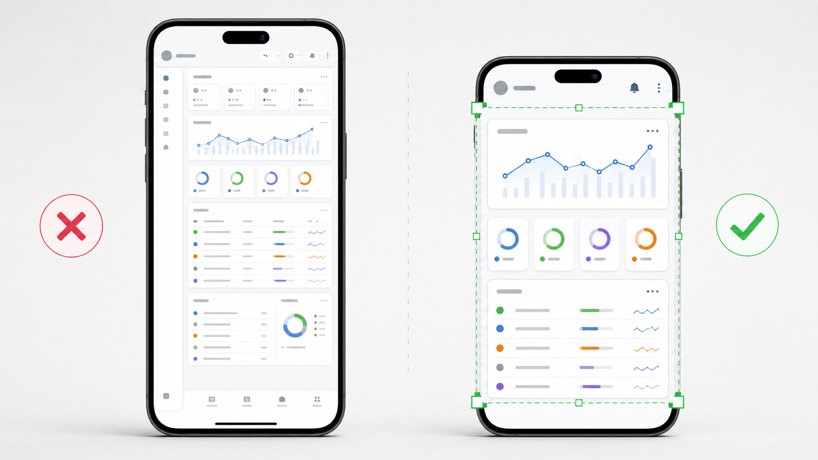
After you capture or receive a screenshot, run this five-part audit before final export.
1. Can the Reader Find the Target Immediately?
Open the screenshot at the width it will appear in the article. Look away for a moment, then look back. Can you identify the relevant button, field, icon, or message without reading the paragraph again?
If not, the screenshot may need a tighter crop, a simpler annotation, or a different capture state. Avoid solving this by adding more arrows. More annotation often makes a small image harder to parse.
A single highlight box around the target area is usually enough. For very small controls, crop closer before annotating.
2. Is the Smallest Necessary Text Legible?
Some text in a screenshot is decorative or incidental. Other text is essential. A settings label, error message, button name, or tab title may be the reason the image exists.
Check the smallest necessary text at rendered size. If it cannot be read comfortably, do one of the following:
| Problem | Better fix |
|---|---|
| Text is too small | Crop closer around the relevant area |
| Text is soft | Re-export from a sharper source or use less compression |
| Text is low contrast | Capture a cleaner state or choose a better theme |
| Text is hidden by annotation | Move the marker or use a thinner outline |
Do not rely on the browser's click-to-enlarge behavior unless your documentation platform makes that obvious. Many readers will not open the image separately.
3. Does the Crop Remove Unneeded UI?
Mobile screens often include navigation bars, headers, empty content areas, keyboard regions, and repeated list rows. These may be useful context, but they can also waste space.
Crop away areas that do not support the instruction. Keep enough context for orientation: a screen title, nearby field label, or neighboring control can help the reader understand where they are. Remove areas that only make the target smaller.
For example, if the instruction is "Tap the export icon in the top-right corner," keep the top app bar and enough below it to show the current screen. You probably do not need the bottom navigation bar.
You can prepare precise crops with /resize-image after choosing the right region. If you need to change format after cropping, /convert-image is useful for moving between PNG, WebP, and JPEG without rebuilding the asset from scratch.
4. Are Annotations Helping More Than They Distract?
Annotations should answer one question: where should the reader look? They should not become a second interface layered on top of the real one.
Use one annotation style per article when possible. Mixing red arrows, yellow boxes, numbered circles, blurred masks, and thick borders creates visual noise. A restrained outline or small marker is usually enough.
Avoid covering UI text. If an arrow must point to a label, place the arrow outside the control and point inward. If you use a translucent highlight, test it on both light and dark UI areas. Low-opacity yellow can work on white screens but become muddy on colorful screens.
If the article has multiple steps, consider using separate screenshots instead of one crowded screenshot with many markers. Readers follow technical instructions better when each image supports one action.
5. Is the File Light Enough for the Page?
A documentation page with ten large PNG screenshots can become sluggish, especially on mobile networks. Compressing screenshots is necessary, but the wrong settings can destroy the details that make the image useful.
Run final screenshots through /compress-image and inspect the output at rendered size. If the image contains text-heavy UI, avoid pushing compression until the file merely looks acceptable at full size. The real test is whether thin labels and icons remain sharp after placement.
A heavier image that clearly explains the step is better than a tiny image that creates support tickets. The target is not the smallest possible file. The target is the smallest file that remains readable.
Crop Rules for Common Mobile Documentation Cases
Different mobile documentation tasks need different crop choices. Use the table below as a practical starting point.
| Screenshot purpose | Recommended crop | Notes |
|---|---|---|
| Showing a button in a top bar | Top 25-40% of the screen | Keep the screen title for orientation |
| Showing a form field error | Field, error message, and one neighboring label | Avoid including the full keyboard unless relevant |
| Showing bottom navigation | Bottom 30-45% of the screen | Keep enough content above to show current section |
| Showing a settings toggle | Tight crop around row group | Include section heading if it clarifies location |
| Showing a permission prompt | Full prompt and a little app background | Do not crop away system context |
| Showing a long list action | Relevant list row plus adjacent row edges | Avoid showing too many repeated rows |
| Showing an empty state | Full central panel | Keep primary action if visible |
Cropping is not just aesthetic. It controls reading order. A tight crop tells the reader, "This exact area matters." A full screen tells the reader, "Understand the whole screen." Use that distinction intentionally.
Export Settings That Preserve Thin UI Details
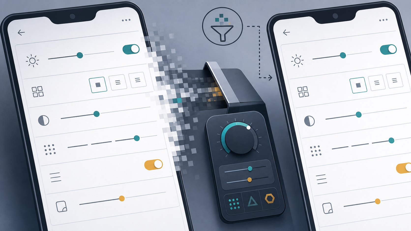
Mobile UI screenshots often contain sharp edges and flat color areas. That makes format choice important.
PNG is usually the safest format for screenshots with crisp text, icons, and interface lines. It preserves hard edges well, but file sizes can be large. WebP can produce smaller files while keeping good visual quality, especially when exported carefully. JPEG is usually a poor choice for text-heavy UI because it creates artifacts around letters and thin lines, although it can work for photo-heavy app screens.
| Image type | Best starting format | Why |
|---|---|---|
| Text-heavy app screenshot | PNG or WebP | Preserves sharp UI edges |
| Screenshot with many photos | WebP or JPEG | Handles photographic content efficiently |
| Transparent overlay or callout asset | PNG or WebP | Supports transparency |
| Final docs image with mixed UI and photos | WebP | Good size-quality balance |
When converting, keep a master copy of the clean source image. Make crops and compressed versions from that source rather than repeatedly saving over an already-compressed file. Repeated compression can add artifacts that are difficult to remove.
If your documentation platform automatically recompresses images, upload a slightly higher-quality version than you would otherwise. Then check the live page, not only the local file. CMS transformations can change sharpness, color, and dimensions.
Annotation Rules for Small Screens
Annotations on mobile screenshots need discipline because the canvas is narrow. Follow these rules to keep images readable.
Use the thinnest highlight that remains visible. Thick borders can cover labels, icons, and control edges. Use high contrast, but do not rely only on color. A red box around a red error state can disappear visually.
Place arrows outside the target when possible. If the screenshot is too narrow for an arrow, use a subtle outline or crop closer instead. Avoid long diagonal arrows across the UI; they pull attention through unrelated elements.
Blur sensitive information only when necessary, and blur consistently. Heavy blur can become the loudest element in the screenshot. If the sensitive area is not important, consider cropping it out instead.
Do not add text inside the image unless your documentation system has no better option. Text baked into screenshots is harder to localize, harder to update, and often too small on mobile. Put explanations in the article body where they can reflow and remain accessible.
Building a Screenshot Set for One Article
A strong documentation article rarely needs a screenshot for every sentence. It needs screenshots at the points where visual confirmation reduces uncertainty.
Start by listing the user actions in order. Then mark which actions are visually ambiguous. These are the likely screenshot points. For example, "Open Settings" may not need a screenshot if the navigation is obvious. "Enable advanced export under Account > Files" probably does.
For each screenshot, write the job of the image in one sentence:
| Screenshot | Job |
|---|---|
| Settings list crop | Show where the Files section appears |
| Export toggle crop | Show the exact toggle to enable |
| Confirmation toast crop | Show what success looks like |
If a screenshot does not have a clear job, remove it. Extra images make the article longer and create more maintenance work when the interface changes.
When your article includes many screenshots, standardize their width and alignment. A page with inconsistent image sizes feels less reliable. You can use /resize-image to prepare a consistent set before uploading.
Handling Retina Screenshots Without Oversized Files
Modern phones capture high-density screenshots. A 3x screenshot may look wonderfully sharp locally but become unnecessarily heavy when embedded at a small width.
The practical approach is to export at roughly 1.5x to 2x the rendered display width. If your article displays an image at 480 pixels wide, an exported width around 720 to 960 pixels often gives enough density for crisp rendering without massive file size. Exact needs vary by CMS and device, so test a representative article.
Avoid shrinking screenshots too far before upload. If an image is rendered at 480 pixels but exported at 480 pixels, it may look slightly soft on high-density displays. If it is exported at 2000 pixels wide, the file may be heavier than needed.
A balanced export plan might look like this:
| Rendered width in docs | Export width to test |
|---|---|
| 320 px | 640 px |
| 480 px | 800 px |
| 640 px | 960-1280 px |
| 800 px | 1200-1600 px |
After resizing, compress and inspect the image inside the article layout. Do not judge only from your file manager preview.
Dark Mode, Light Mode, and Contrast Traps
Dark-mode screenshots can look polished, but they introduce extra readability risks. Compression artifacts can be more visible in dark gradients, and low-contrast secondary labels may become difficult to read after resizing. Light-mode screenshots often preserve text more predictably, but they can wash out subtle borders.
Choose the mode your readers are most likely to use or the mode your product docs standardize on. If the product changes significantly between modes, use separate sections or separate articles.
Check these details before publishing dark-mode screenshots:
| Detail | Risk |
|---|---|
| Gray secondary labels | May become unreadable after compression |
| Hairline dividers | May vanish on dark backgrounds |
| Blue or purple links | May bleed into nearby dark colors |
| Glow effects | May create compression banding |
| Transparent annotations | May lose contrast |
If your screenshot contains thin UI lines, run a compression test before committing to dark mode. When clarity is close, choose the version that reads better, not the one that looks more dramatic.
Turning Screenshots Into PDF Review Packs
Some teams review documentation screenshots outside the CMS. Product managers, legal reviewers, localization partners, or support leads may prefer a PDF packet showing all screenshots in order.
This is useful when an article has many images or when reviewers need to approve visual states before publication. Export each screenshot with a meaningful file name, then combine them into a single review document with /image-to-pdf. If multiple reviewers send separate notes, you can also use /pdf-merge to combine the article draft, screenshot packet, and comments into one file.
For review packets, keep one screenshot per page when details are small. N-up layouts are efficient for visual scanning, but they can make mobile UI text too small. Use a grid only when reviewers are checking consistency rather than reading exact labels.
Good review packet naming helps prevent confusion:
| File name | Better than |
|---|---|
| account-settings-files-toggle.png | screenshot-final-2.png |
| checkout-error-card-number.png | mobile-error.png |
| onboarding-permission-prompt-ios.png | image-7.png |
Precise file names also help later when the product UI changes and you need to find outdated captures quickly.
Accessibility and Maintenance Checks
Screenshots are visual support, not a replacement for written instructions. The surrounding article should still explain the action in text. This helps screen reader users, supports localization, and makes the page easier to update.
Write alt text that describes the screenshot's instructional purpose. Avoid vague alt text like "App screenshot" or overly long descriptions of every visible element. A useful alt might be: "Mobile settings screen with the file export toggle highlighted." That tells the reader why the image is present.
Do not put essential instructions only inside the image. If a screenshot includes a highlighted button, the text should still say what to tap. If the product label changes later, updating body copy is faster than editing an annotated image.
Schedule screenshot reviews around product releases. Mobile UI changes frequently, and old screenshots can quietly damage trust. A small quarterly pass through high-traffic documentation pages is often enough for smaller teams.
Use this maintenance checklist:
| Check | Pass criteria |
|---|---|
| UI state still exists | Screen matches current app behavior |
| Target element still visible | Button, field, or message has not moved |
| Annotation still points correctly | Marker does not cover new text |
| Image still sharp | CMS changes have not softened the asset |
| Alt text still accurate | Description matches the current image |
A Practical Export Checklist
Before publishing a mobile screenshot in technical documentation, run this final checklist.
- View the screenshot at the article's rendered width.
- Confirm the target UI element is visible within two seconds.
- Crop away irrelevant headers, footers, lists, or blank space.
- Keep enough surrounding context for orientation.
- Remove private data, debug UI, notifications, and accidental overlays.
- Use one restrained annotation style.
- Make sure annotations do not cover labels or controls.
- Export from a clean source image, not a repeatedly compressed copy.
- Use PNG or WebP for text-heavy interface screenshots.
- Compress only as far as thin text and icons remain readable.
- Check the image on the live page or a realistic preview.
- Add useful alt text and keep written instructions complete.
This checklist is short enough to use during normal publishing, but it catches the failures that create most unreadable screenshots.
Example: Fixing a Crowded Mobile Settings Screenshot
Imagine you are documenting how to enable a file export setting in a mobile app. The first screenshot shows the entire settings screen from top to bottom. It includes the account avatar, profile name, notification preferences, billing section, help links, footer version number, and the export toggle near the lower middle.
At full size, the toggle is readable. In the article, it becomes tiny. The writer adds a red arrow, but the arrow crosses several settings rows and makes the screenshot feel busy.
A better version would crop from the section heading above the file settings to one row below the export toggle. The crop keeps enough context to show where the setting lives, but it removes profile and footer content. A thin outline around the toggle row replaces the long arrow. The image is exported as WebP at about twice the rendered width, then compressed carefully.
The result is smaller, clearer, and easier to update. If the profile section changes later, this screenshot does not need to be replaced because that area is no longer included.
Common Mistakes to Avoid
The first mistake is using full-device mockups for instructional screenshots. Device frames can be attractive in marketing pages, but they waste space in documentation. If the frame does not help the reader perform the task, remove it.
The second mistake is capturing too much vertical content. Long mobile screenshots are useful for audits, but they are often poor teaching images. Readers should not have to scan an entire phone screen to find one setting.
The third mistake is compressing after annotation without checking the final result. Annotation edges, arrows, and highlight boxes can introduce new artifacts. Always inspect the annotated final, not just the clean crop.
The fourth mistake is mixing screenshots from different product versions. One image may show an old tab label while the next shows a new one. Readers notice inconsistencies, especially when they are trying to follow instructions exactly.
The fifth mistake is hiding uncertainty with more visuals. If a step is confusing, rewrite the instruction first. Then use the screenshot to confirm the action.
Final Takeaway
Readable mobile screenshots are created by a chain of small decisions: capture a clean state, crop around the job of the image, annotate with restraint, export at the right density, compress carefully, and check the result where readers will actually see it.
For technical documentation, the best screenshot is not always the prettiest one. It is the one that reduces hesitation. When a reader can glance at the image, recognize the exact control, and continue the task without zooming or guessing, the screenshot is doing its job.