Subtitle-Safe Vertical Product Demo Clips: A Practical Cropping Guide for Landing Pages
Prepare vertical product demo clips that stay readable on mobile landing pages, with subtitle-safe framing, crop checks, compression choices, and export rules.
Subtitle-Safe Vertical Product Demo Clips: A Practical Cropping Guide for Landing Pages
Vertical product demo clips are easy to make and surprisingly easy to damage. A clip can look sharp in the editor, then become frustrating on the landing page because the captions sit too low, the mobile browser hides part of the frame, a cookie banner covers the final callout, or the compression pass turns small interface labels into mush.
This guide is for teams that use short, muted videos to explain a product feature on pricing pages, comparison pages, help center articles, launch posts, or narrow landing pages. The goal is not cinematic polish. The goal is a readable, subtitle-safe vertical clip that works when visitors are scrolling quickly, watching without sound, and viewing on a phone with browser chrome, sticky headers, chat widgets, and cookie prompts competing for space.
You do not need a full video department to get this right. You need a repeatable set of framing rules, a few export decisions, and a final inspection pass on the same surfaces where the clip will actually appear.
Why Vertical Demo Clips Break After Export
Most vertical product clips are assembled from horizontal or square source material. A screen recording might start as 16:9. A webinar clip might have a shared screen plus a speaker bubble. A mobile app recording might already be vertical, but the useful action may sit near the bottom of the phone screen. Once the clip is cropped, subtitled, compressed, and embedded on a page, the visible area can change again.
Common failure points include:
- Captions placed in the bottom 10 percent of the frame, where mobile browser controls, page overlays, or sticky consent bars can cover them.
- Product UI labels cropped off because the editor centered the cursor instead of the interface element being explained.
- Subtitles burned in too small because the clip was prepared on a desktop monitor instead of a phone-sized preview.
- Thin text destroyed by aggressive compression.
- A vertical export used inside a wide desktop container without enough poster image planning.
- The clip uploaded as a huge file that slows the first meaningful page interaction.
If the demo is decorative, these issues are annoying. If the demo is meant to explain the product, they are conversion problems. A visitor should understand the action without turning on audio, opening fullscreen mode, or replaying the clip three times.
Start With the Job of the Clip
Before cropping anything, define the job of the clip in one sentence. This prevents over-editing and helps decide what must stay visible.
Useful clip jobs include:
| Clip job | Keep visible | Can be sacrificed |
|---|---|---|
| Show a feature toggle | Toggle area, label, result state | Full browser chrome, empty sidebar |
| Explain a before-and-after edit | Original state, final state, transition moment | Exact cursor path |
| Demonstrate upload speed or simplicity | File picker, progress state, completed asset | Brand decoration around the app |
| Prove mobile friendliness | Phone frame, tap target, responsive layout | Desktop nav items |
| Show subtitle availability | Spoken moment, subtitle line, final exported clip | Presenter face if it competes with text |
A short landing page video should usually answer one question. If the clip tries to show setup, settings, editing, export, and sharing in one pass, the crop will have too many priorities. Split the asset or choose the most persuasive moment.
For muted product clips, prepare subtitles early. You can create a subtitle source with a tool such as Video to Subtitles, then decide whether the captions should remain as a sidecar file or be burned into the visual frame. Landing page demos often benefit from burned-in captions because autoplay environments are inconsistent and many embeds are watched silently.
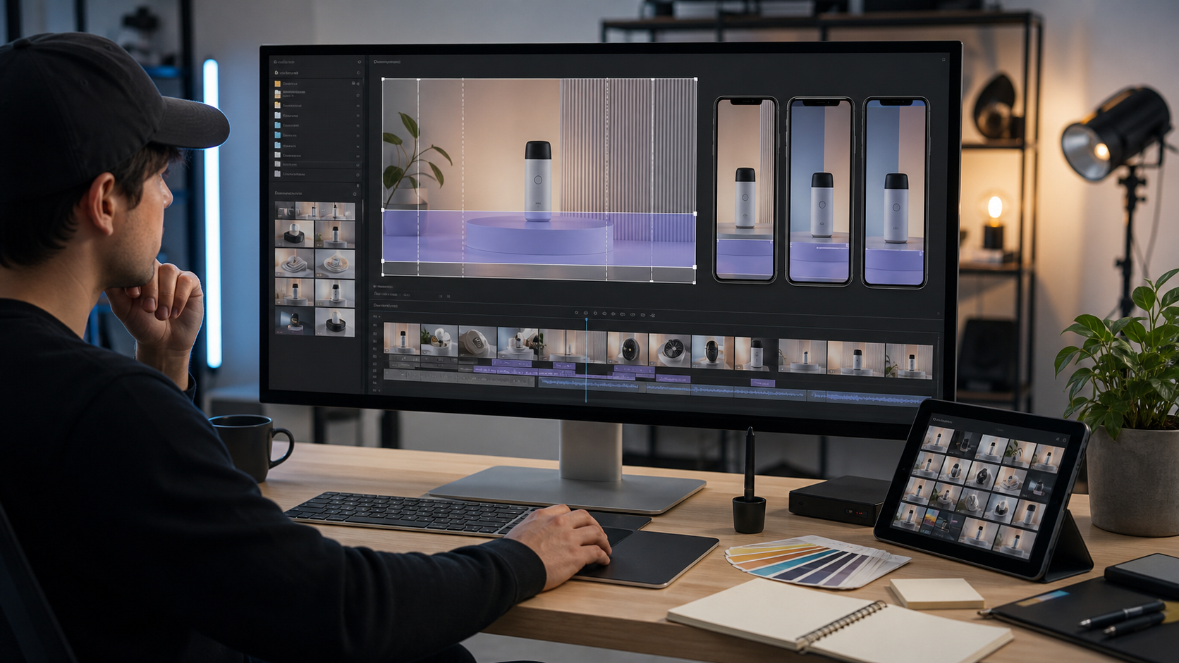
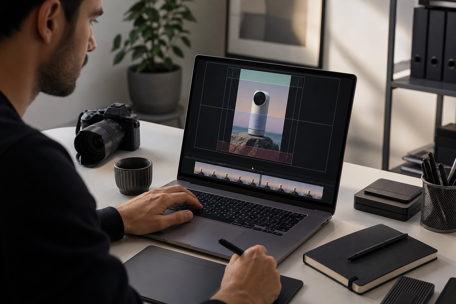
The Subtitle-Safe Crop Map
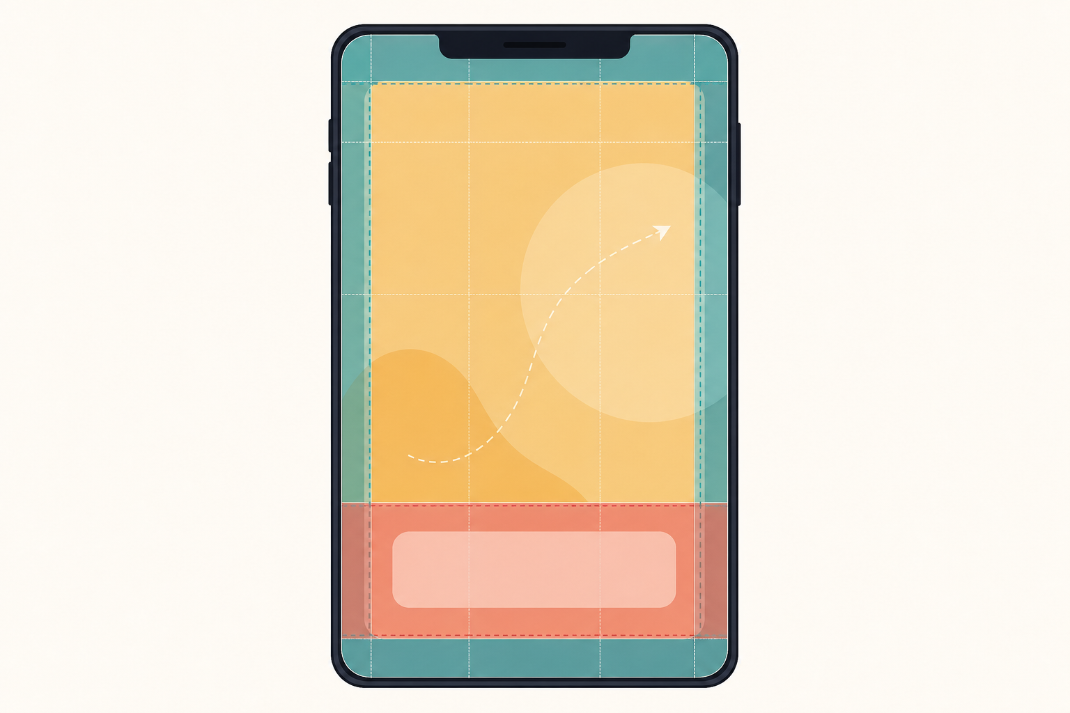
A vertical clip has less usable space than it seems. The full 9:16 frame is not equally valuable. Some zones should carry the message, some should support movement, and some should stay quiet.
A practical crop map looks like this:
| Zone | Approximate area | Best use | Avoid placing here |
|---|---|---|---|
| Top buffer | Top 8-12 percent | Breathing room, nonessential background | Critical UI labels, small status messages |
| Primary action | Upper-middle 35-45 percent | Product interface, cursor action, before-and-after result | Long subtitles |
| Caption band | Lower-middle 18-25 percent | One or two subtitle lines | Tiny product details behind text |
| Bottom buffer | Bottom 10-15 percent | Background, noncritical motion | Captions, buttons, final proof points |
This is not a rigid template. It is a way to protect comprehension. The bottom of a vertical frame is risky because it is the place most likely to collide with page controls and attention patterns. The top is also risky when the clip sits under a sticky header or appears in an in-app browser.
Place the product action slightly above center when possible. Place captions above the bottom buffer, not at the very bottom. If the product action is near the bottom of the original recording, crop with extra lower padding or zoom out slightly so the caption band does not cover the thing being explained.
Caption Height and Line Length
Readable subtitles are not just a font choice. They depend on how many words appear at once, where the words sit, and how the video is scaled on the page.
Use these rules as a starting point:
- Keep captions to one line when possible and two lines when necessary.
- Avoid three-line captions in vertical product clips.
- Use short clauses rather than full transcript sentences.
- Keep the caption band visually separate from small UI labels.
- Preview at the actual mobile embed width, not only in the editor.
A caption that looks subtle in a 1080 by 1920 export may become cramped inside a 320-pixel-wide mobile container. If a subtitle line contains a product name, file extension, or technical term, test that line specifically. Long unbroken words are where caption layouts usually fail.
Choose the Right Source Before Cropping
The best vertical crop starts before the edit. If you can record a fresh source, record with the final crop in mind.
For desktop software demos, use a browser window that is narrower than your full monitor. This keeps the important UI closer together and reduces the need for extreme zoom. For web apps, consider recording a tablet-width or compact desktop layout if it shows the same feature clearly. For mobile apps, turn off unnecessary status indicators and avoid placing key taps near the bottom edge when possible.
If you only have existing footage, inspect it before committing to a crop. Ask these questions:
- Does the important action stay in one region, or does it move across the frame?
- Are there any moments where the cursor, menu, or modal reaches the future caption band?
- Is the source sharp enough to survive a crop and compression pass?
- Does the clip need subtitles, labels, or both?
- Can the clip be shortened before crop decisions become complicated?
When a source recording contains a lot of empty space, cropping is helpful. When a source recording contains tiny interface text, cropping can make the page lighter but the UI harder to read after compression. The right answer is often a slightly less aggressive crop with stronger caption writing.
Crop Ratios That Fit Real Page Slots
Vertical video is usually described as 9:16, but landing pages use several shapes. The clip may appear inside a phone mockup, a product card, a narrow column, or a full-width mobile section. Pick the ratio for the page slot, not for a social platform by default.
| Page placement | Recommended ratio | Notes |
|---|---|---|
| Mobile-first hero proof | 9:16 | Strong for phone-like framing, needs careful top and bottom buffers |
| Feature section beside copy | 4:5 | Easier on desktop layouts, still useful on mobile |
| Product card preview | 1:1 or 4:5 | Good for grids, less dramatic but more stable |
| Help center embed | 16:9 or 4:5 | Choose based on whether UI labels or gestures matter more |
| Changelog micro demo | 4:5 or 1:1 | Keeps file size and layout impact controlled |
For landing pages, 4:5 is often more forgiving than 9:16. It still feels mobile-friendly, but it gives captions more width and creates fewer awkward desktop gaps. Use 9:16 when the phone experience is itself the proof, or when the page design gives the video enough room to breathe.
If you extract still frames for the poster image or supporting screenshots, resize them deliberately with Resize Image rather than relying on the browser to scale a very large asset. Poster images matter because many visitors see the poster before autoplay begins, and some will never play the video at all.
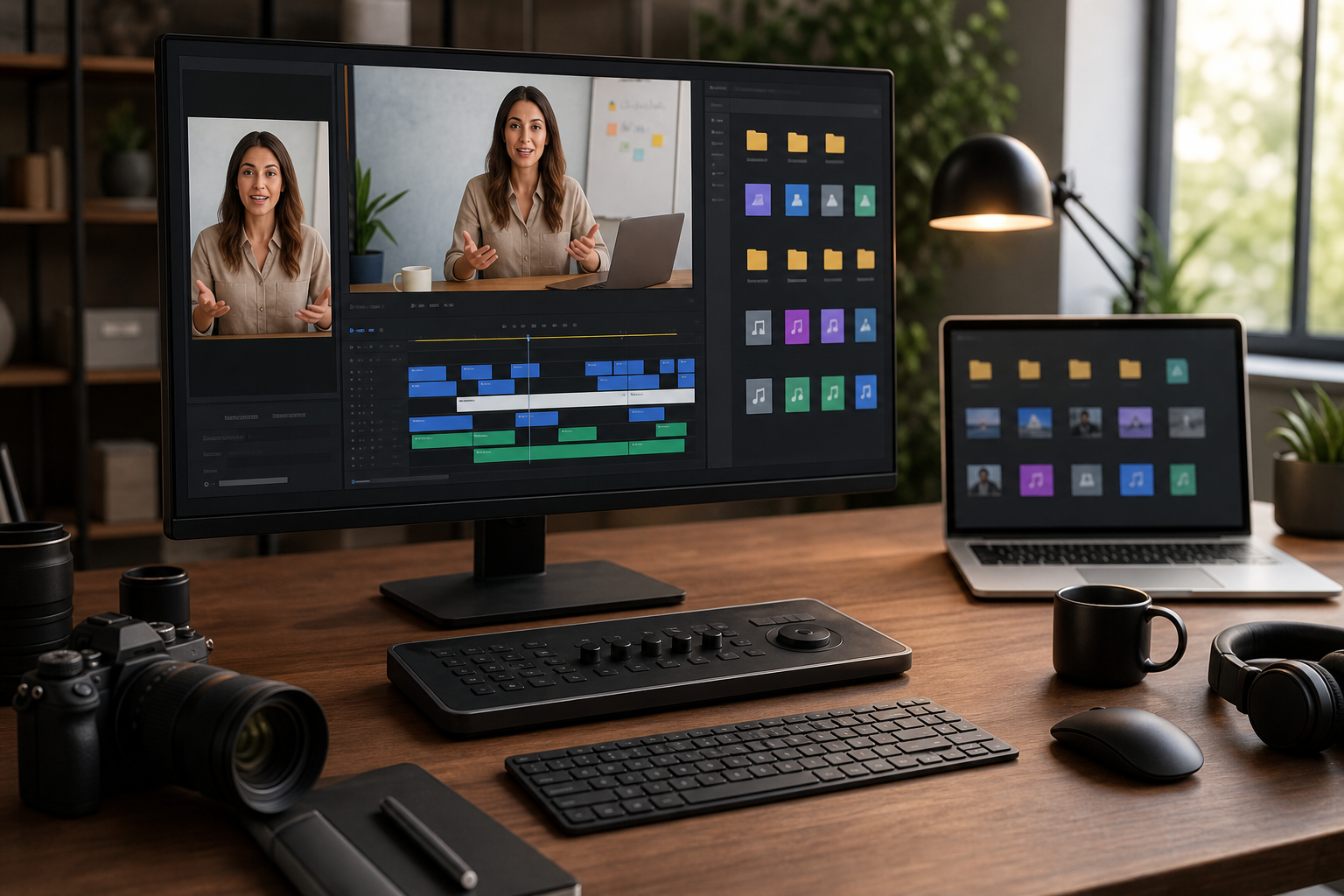
Burned-In Captions Versus Separate Subtitle Files
There are two common ways to provide captions: burn them into the video or attach a subtitle file such as VTT. Both have legitimate uses.
| Caption method | Strength | Weakness | Best fit |
|---|---|---|---|
| Burned-in captions | Always visible in the visual asset | Harder to edit later, must be designed carefully | Muted landing page demos, social cutdowns, animated product proof |
| Separate subtitle file | Accessible, editable, can be toggled | May not appear in every autoplay or custom embed context | Long explainers, documentation videos, player-based pages |
| Hybrid | Covers silent viewing and accessibility | Requires more production care | Important product pages where the clip carries key meaning |
For short landing page clips, burned-in captions often make the message more reliable. That does not remove the need for accessibility. If the page uses a video player that supports captions, provide a text alternative or subtitle track as appropriate. A burned-in line helps the silent viewer, while structured text helps assistive technology and future editing.
Use Video to Subtitles to create a starting transcript, then edit for brevity. Spoken language is usually too long for a small vertical frame. Replace filler with short, useful lines. The caption should explain the action, not duplicate every spoken word.
A Practical Cropping Pass
Once the source and caption plan are ready, make the crop in passes rather than trying to perfect it at once.
Pass 1: Find the Action Spine
Scrub through the clip and identify the path of attention. In a product demo, this is usually the cursor, tap target, changed setting, generated result, or highlighted asset. The action spine is the line the viewer’s eye follows.
Keep the action spine stable. If the crop chases every cursor movement, the clip feels nervous. If the crop stays fixed while the action leaves the frame, the clip feels broken. For most short clips, use a fixed crop and adjust the source recording or edit length before adding camera-like movement.
Pass 2: Reserve the Caption Band
Add temporary caption blocks or guides before final export. Even if the final caption style will be different, you need to see the occupied area while cropping. Watch for moments where a dropdown, modal footer, tooltip, or save button sits behind the caption band.
If the caption covers an important control, fix the crop before rewriting the entire caption. Moving the product action higher is often cleaner than shrinking the subtitle until it becomes unreadable.
Pass 3: Check the First and Last Frames
The first frame sells the play. The last frame is often where the viewer decides whether the feature made sense. Do not let either frame be a transitional blur, a half-open menu, or a blank loading state.
For the first frame, choose a clean poster or trim the clip so it begins on a meaningful state. For the last frame, end after the result is visible long enough to register. A fast cut to black can make a product action feel less complete.
If you need a clean still from the finished clip, export a frame and optimize it as an image. Tools like Compress Image help keep poster files light while preserving the sharp edges that make interface screenshots readable.
Compression Without Destroying UI Text
Product demos are harder to compress than lifestyle footage. They contain thin lines, small text, flat color fields, and sharp transitions. Compression settings that look fine for a person talking may damage a software interface.
Use this checklist after compression:
- Are small UI labels still readable at mobile size?
- Do cursor movements leave distracting trails?
- Does the caption edge remain sharp?
- Are flat backgrounds showing banding or blotchy blocks?
- Does the file begin quickly on a normal mobile connection?
- Is the poster image lighter than the video, and does it match the first meaningful frame?
If the video is too heavy, shorten it before crushing the quality. A clear six-second clip is usually better than a muddy fifteen-second clip. Remove dead time, loading pauses, and repeated cursor movement. Then adjust resolution and bitrate.
A useful export ladder for vertical landing clips:
| Export target | Typical size | Use case |
|---|---|---|
| 720 by 1280 | Lightweight mobile demos | Good default when UI text is large enough |
| 900 by 1600 | Sharper product UI | Better for text-heavy demos if file size stays reasonable |
| 1080 by 1920 | High-detail source master | Keep as a master or use when the page slot is large |
| 800 by 1000 | 4:5 page sections | Strong balance for desktop and mobile placements |
Do not export only one version if the page uses multiple placements. A hero page, a help article, and a changelog card may need different crops and file sizes. If still assets accompany the clip, convert them with Convert Image when the publishing system prefers WebP, PNG, or JPG for a specific use.
Design the Surrounding Page for the Clip
A subtitle-safe video can still fail if the page around it is hostile. The embed container, sticky elements, and nearby copy all affect whether the clip works.
Keep these page rules in mind:
- Do not place a sticky chat launcher over the lower-right corner of a demo that uses bottom captions.
- Avoid placing a cookie banner where it covers the caption band on first view.
- Give the video enough width for subtitles to breathe.
- Do not autoplay several videos in the same viewport.
- Use a poster that communicates the feature even before motion begins.
- Keep adjacent copy short enough that the video is not pushed into an awkward crop.
On desktop, a vertical clip can look stranded if it sits alone in a huge empty column. Pair it with concise copy, a product screenshot, or a comparison point. On mobile, the clip may fill most of the viewport, so the first frame and caption placement matter even more.
When AI Editing Helps, and When It Gets Risky
AI image and photo editing can help prepare supporting assets around a video. For example, you may want a cleaner poster image, a blurred background behind a product frame, or a corrected screenshot used beside the clip. A tool such as AI Photo Editor can be useful for removing distracting background elements or preparing editorial visuals.
Be careful with product truth. Do not use AI editing to invent interface states, fake customer results, alter analytics numbers, or make a feature appear to do something it cannot do. Landing page assets should clarify the product, not decorate it into a different product.
Good uses include:
- Cleaning a nonessential background around a device photo.
- Extending neutral space for a poster crop.
- Removing visual clutter from a supporting editorial image.
- Creating a neutral backdrop for a product frame.
Risky uses include:
- Changing UI labels or results in a way that misrepresents the feature.
- Adding fake partner logos, ratings, or customer names.
- Making generated output look faster, cleaner, or more accurate than it is.
- Replacing a real product screen with a fictional one.
For product demos, authenticity is part of usability. A slightly plain clip that accurately shows the feature is more trustworthy than a polished clip that raises questions.
A Pre-Publish Check for Landing Page Clips
Before publishing, review the clip in context. Do not approve it only from the editing timeline.
Use this check:
| Check | Pass condition |
|---|---|
| Mobile viewport | Captions readable without fullscreen mode |
| Desktop viewport | Vertical frame feels intentional, not like a misplaced social asset |
| First frame | Shows a meaningful product state or clear visual promise |
| Last frame | Leaves the result visible long enough to understand |
| Subtitle band | No page overlay, chat button, or browser control covers it |
| File weight | Page remains responsive and video starts without a long delay |
| Accessibility | Important meaning is available outside sound-only narration |
| Product accuracy | No edited state overpromises what the feature does |
Test at least one narrow phone width and one laptop width. If your page has a sticky header, cookie prompt, announcement bar, or chat widget, test with those elements active. Many teams approve video assets in a clean staging view, then discover the real page has an overlay sitting directly on the subtitles.
Also test the clip while scrolling. A video that reads well when centered may be confusing when only the upper half is visible during a fast scroll. The poster and first caption line should give enough context before the visitor commits attention.
Example: Turning a Feature Recording Into a Page-Ready Clip
Imagine a small SaaS team has a 22-second desktop recording showing a bulk image resize feature. The original recording is 16:9 and includes the full browser window, a sidebar, a settings panel, and a results list.
The landing page only needs to prove one thing: the user can upload images, choose a target width, and download resized files.
A practical edit would look like this:
- Trim the source to the six or seven seconds that show upload, setting, and completed result.
- Crop to 4:5 instead of 9:16 because the settings panel and results list need horizontal room.
- Keep the upload area and result count in the primary action zone.
- Place one-line captions in the lower-middle band, such as Upload images, choose a target size, and download the resized set.
- Export a sharp master, then create a lighter landing page version.
- Export a poster frame showing the completed result state.
- Preview in the actual landing page slot on mobile and desktop.
The final clip does not show every option. It does not need to. It proves the feature in the fewest readable moments. The page copy can handle the supporting details.
Common Mistakes to Remove Before Launch
The last review should be critical. Look for the small issues that make a clip feel less trustworthy.
Remove or fix:
- Captions that repeat obvious visual actions, such as clicking the button, without adding meaning.
- Cursor movement that wanders while the narrator talks.
- Crops that cut off modal edges or menu labels.
- Text so small that it only works on a Retina desktop display.
- Poster frames that show a loading spinner or empty state.
- Over-compressed UI areas where thin lines shimmer.
- Clip endings that stop before the result appears.
- Page overlays that compete with subtitles.
If you need to choose between showing more interface and keeping captions readable, choose readability for landing pages. The clip is there to communicate quickly. Detailed product education can live in a help article, longer video, or interactive demo.
Final Checklist
Use this compact version when preparing the next clip:
- Define the single job of the demo.
- Pick the page ratio before editing.
- Keep the primary action slightly above center.
- Reserve a lower-middle caption band.
- Avoid placing captions in the bottom edge zone.
- Shorten transcript language into readable subtitle lines.
- Trim dead time before lowering quality.
- Export a clean poster image.
- Check mobile and desktop page embeds with real overlays active.
- Confirm the asset shows the product accurately.
A vertical demo clip does not need to be elaborate to work. It needs to be legible, honest, fast, and framed for the place it will appear. When the crop protects the action and the captions survive the real page environment, the video can explain a feature in seconds without forcing visitors to stop, unmute, or guess.