Animated Email Signature GIFs: A Practical File Size Budget Guide
Build animated email signature GIFs that stay readable, restrained, and lightweight with frame planning, crop strategy, color reduction, testing, and fallback checks.
Animated Email Signature GIFs: A Practical File Size Budget Guide
An animated email signature can draw attention to a product launch, event, certification, or brand detail without asking the recipient to open an attachment. It can also become a heavy, distracting rectangle that repeats beneath every reply in a long conversation.
The difference is rarely animation skill alone. It is usually budget discipline.
Every extra pixel, frame, color, and second must be stored and transferred. A signature GIF that looks modest on a designer’s monitor may be downloaded repeatedly by recipients, quoted through long message threads, viewed on narrow mobile screens, or displayed beside plain-text business correspondence. Optimization therefore begins before export, not after a finished animation has already become too large.
This guide presents a practical system for planning, producing, compressing, and testing a small animated signature. It focuses on restrained brand motion rather than full banner advertisements. The aim is not to chase one universal file-size number. Email environments differ too much for that. The aim is to define a sensible internal budget, spend it on the frames that matter, and verify the result in realistic messages.
Decide whether the signature should move at all
Animation is useful when motion communicates something more efficiently than a static image. A short product rotation can reveal form. A subtle state change can demonstrate a feature. A restrained logo movement can distinguish a campaign signature from the everyday version.
Motion is less useful when it merely makes a decorative element blink forever. Repetition competes with the sender’s message, particularly when several employees participate in the same thread. It can also make the signature feel like an advertisement attached to a personal note.
Before opening an editor, write the animation’s job as one sentence. Good examples include:
- Show that a compact lamp folds into three positions.
- Reveal the date badge for an upcoming exhibition.
- Demonstrate the closed and open states of a product latch.
- Add one gentle highlight pass across a campaign mark.
If the sentence is only “make the signature more noticeable,” prepare a static alternative first. A carefully sized still image is often clearer, calmer, and easier to maintain.
Use a simple suitability test
Ask four questions:
- Does the movement explain a change, feature, or timely message?
- Can the complete idea be understood in roughly a few seconds?
- Will the first frame still make sense if animation does not play?
- Would seeing the loop ten times during a long email feel acceptable?
Four positive answers indicate a reasonable candidate. A negative answer to the third question is especially important: some recipients may see only the initial frame, while others may have images blocked until they choose to load them.
Set a file size budget before designing
There is no dependable maximum that guarantees identical behavior in every client, security gateway, network, and signature manager. Treat any public recommendation as a starting point, then establish a house limit based on your own delivery tests.
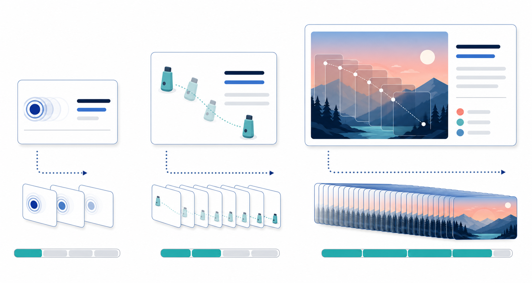
A useful budget has three levels:
| Level | Intended use | Design response |
|---|---|---|
| Preferred | Routine external email | Small dimensions, limited motion, short frame sequence |
| Exception | Temporary campaign or product demonstration | More frames only when they communicate useful change |
| Reject | Animation that remains heavy after reasonable edits | Replace it with a static image or hosted landing-page link |
Record actual byte size rather than relying on labels such as “optimized” or “web ready.” Those labels do not describe the result. Also evaluate the total signature, including portraits, social icons, certification marks, and tracking elements. A compact GIF does not rescue a signature surrounded by several oversized images.
Budget allocation becomes easier when the team agrees on priorities. Protect these qualities first:
- The sender’s name and contact information remain readable as live HTML text.
- The first frame communicates the essential message.
- Product edges and small brand shapes remain recognizable.
- Motion timing feels deliberate.
- Decorative color variation is reduced before essential clarity.
This order prevents a common mistake: preserving a smooth, colorful animation while making the signature’s useful content blurry or inconvenient.
Design the first frame as a complete fallback
The first frame is not an introduction that can depend on later frames. It is the fallback poster.
Place the recognizable product, logo, or campaign symbol in that frame. If the motion reveals a date or call to action only at the end, recipients who see a static preview may never receive the message. A better structure begins with a complete composition, animates one element, and returns to the same stable composition.
Avoid placing essential contact details inside the GIF. Names, telephone numbers, and web addresses should generally remain live text in the signature. Live text can be selected, copied, enlarged, and updated without re-exporting an animation. It also avoids turning a small spelling correction into an image-production task.
For the fallback frame, check the following:
- The subject is recognizable at the intended display size.
- The composition does not resemble a half-loaded transition.
- No essential object is outside the crop.
- Contrast remains adequate without depending on movement.
- The frame still works when viewed beside a long email on a phone.
Export this frame separately as a still image. It can serve as the static signature option, an accessibility-conscious alternative, and a diagnostic reference when testing different mail clients.
Reduce the frame before reducing the quality
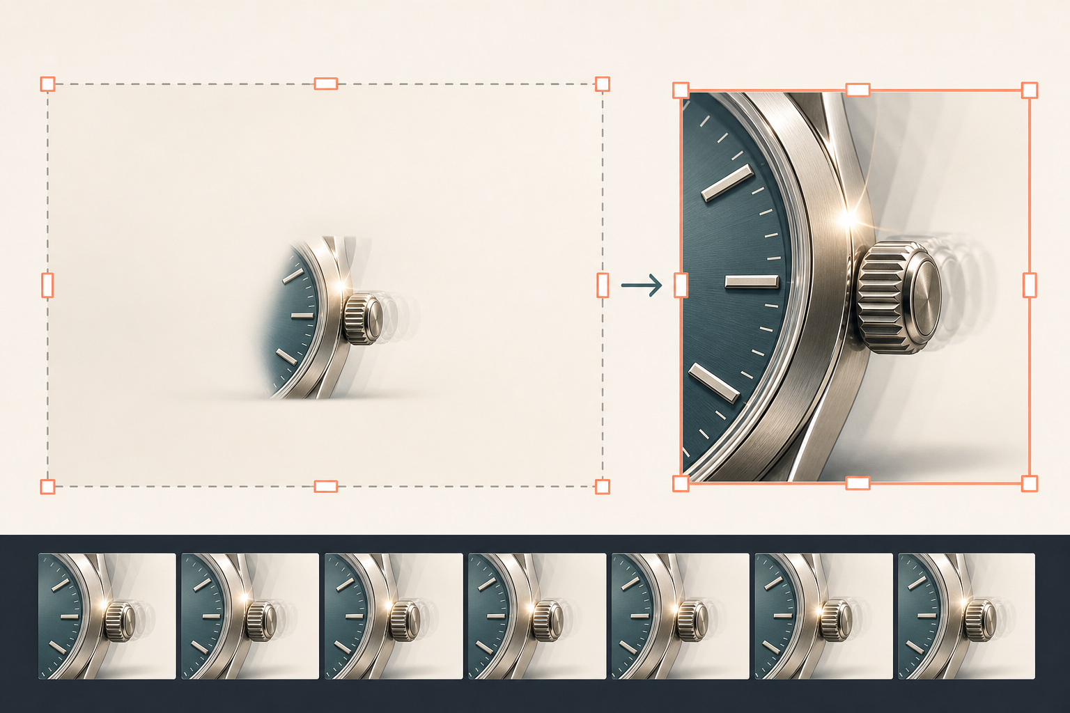
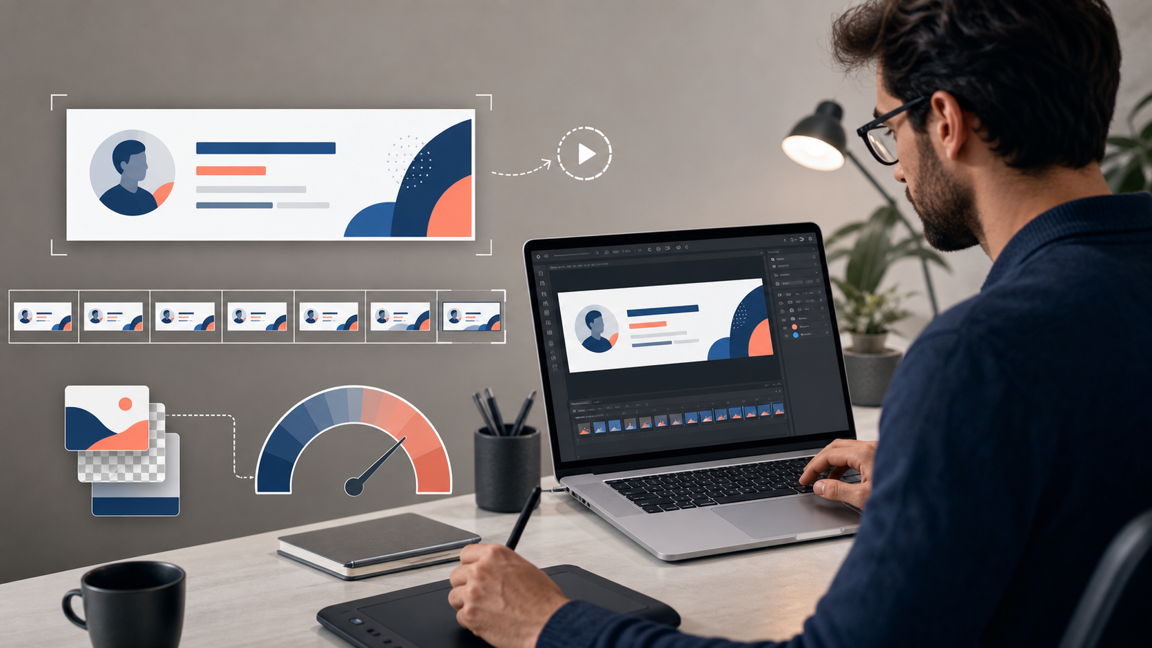
Pixel dimensions affect every frame, so oversized canvas area is one of the most expensive mistakes. Cropping away unused space can produce a larger saving than aggressive color reduction, and it usually causes less visible damage.
Start by viewing the animation at its real signature size rather than zoomed in. Identify which parts communicate the idea. A product hinge may need only a close crop around the mechanism; it may not need the entire product, desk, and studio background.
Use this reduction order:
- Remove empty borders and irrelevant background.
- Crop closer to the moving subject.
- Reduce the exported pixel dimensions.
- Remove unnecessary frames.
- Simplify color and fine texture.
- Apply stronger compression only if needed.
If the source still image is much larger than the intended signature, prepare it with the image resizer before assembling frames. Resize once from a good source rather than repeatedly scaling intermediate copies. Repeated resizing can soften fine edges and make later color reduction appear worse.
Separate stable and moving regions conceptually
A small animated accent is usually cheaper than changing the entire frame. Camera noise, film grain, shifting shadows, and textured photographic backgrounds can make nearly every pixel differ between frames. Those differences are costly even when the viewer barely notices them.
Whenever possible, keep the background stable and animate one defined region. Examples include a single rotating dial, a sliding cover, a restrained highlight, or two product states connected by a short transition.
If the source is video, lock the camera, lighting, focus, and exposure. A tripod and consistent light are not merely production niceties; they reduce unintended pixel changes that the GIF must encode.
Plan motion with fewer, more meaningful frames
A GIF does not need video-like smoothness to explain a simple change. The right question is not “How many frames can we keep?” but “Which frames carry new information?”
Review the sequence as thumbnails. Remove frames that show almost the same state as their neighbors. For a product opening, the closed state, a few transition positions, and the open state may be sufficient. If several frames add only tiny movement, their cost may exceed their communication value.
Timing can preserve the perceived rhythm after frames are removed. Hold important states longer and move quickly through transitions. A sequence with fewer well-timed frames can feel more intentional than a larger sequence playing at a uniform rate.
Consider these motion patterns:
| Motion pattern | Efficient approach | Common waste |
|---|---|---|
| Two-state product feature | Hold each state, use a short transition | Many near-identical intermediate frames |
| Logo accent | Animate one small element | Repainting the entire background |
| Screen demonstration | Crop to the relevant control | Recording the complete application window |
| Product rotation | Use selected angles | Exporting every video frame |
| Highlight sweep | Keep the object static | Adding grain, glow, and background movement together |
Use the GIF maker to assemble the selected frames and compare alternative timings. Save more than one draft: a restrained version, a middle version, and a richer version. Side-by-side testing makes the cost of extra smoothness visible.
Control color without damaging brand shapes
GIF uses a limited palette. The practical challenge is deciding where those colors matter.
Flat illustrations, logos, interface elements, and product silhouettes often adapt well because they contain broad areas of repeated color. Photographs with gradients, skin tones, reflections, or soft shadows are harder. Reducing their palette may introduce banding or speckled transitions.
Begin with a clean, limited source. If a design uses six deliberate colors, avoid adding subtle gradients that create hundreds of near-duplicates. If a photographic source is unavoidable, simplify the background and protect the subject’s important edges.
Inspect palette reduction at the final display size. Artifacts that look alarming at 800 percent zoom may disappear in the signature, while a broken one-pixel product edge may remain obvious. Judge according to actual use.
Dithering can make gradients appear smoother by mixing neighboring colors, but the added pattern may increase visual noise and file size. Test it rather than assuming it is always beneficial. For small brand graphics, a clean stepped gradient may look better than a field of moving speckles.
If source frames arrive in inconsistent formats or color modes, normalize them with the image converter before assembly. Keep one untouched master set so later experiments do not accumulate conversion artifacts.
Remove photographic noise and accidental movement
Video-derived GIFs often remain heavy after resizing because their frames contain noise. Sensor grain, automatic exposure adjustments, compression blocks, and moving reflections all create differences the encoder must preserve.
A practical cleanup pass may include:
- Stabilizing the source before frame extraction.
- Choosing a clean background with little texture.
- Reducing visible grain conservatively.
- Removing frames affected by focus hunting.
- Correcting brightness changes across the sequence.
- Masking movement outside the feature being demonstrated.
Do not over-smooth the product until materials and edges look artificial. The target is not a plastic-looking image; it is a stable image in which intentional movement dominates.
For isolated distractions, an editor such as the AI photo editor can help clean a source frame or simplify a background. Apply edits consistently across the sequence. Editing each frame independently may cause small shape or texture changes that flicker during playback.
Build an optimization ladder
Do not change five variables at once. Make one controlled reduction, export, record the size, and inspect the result. This reveals which compromise produced the saving.
A practical ladder is:
Pass 1: Structural reductions
Crop tighter, resize the canvas, shorten the sequence, and delete redundant frames. These changes often produce the best ratio of savings to visible damage.
Pass 2: Motion reductions
Lower the number of transition frames, extend the delay on key frames, and remove decorative secondary motion. Confirm that the idea remains obvious without explanation.
Pass 3: Palette reductions
Reduce colors in small steps. Watch brand colors, narrow outlines, product highlights, and transparent edges. Compare against the untouched export at actual size.
Pass 4: Source cleanup
Return to the frames if noise or shifting backgrounds are preventing further gains. Compression cannot efficiently solve a source in which every pixel changes unnecessarily.
Pass 5: Final compression
Use the image compressor for supported still assets around the signature and for preparing source components where appropriate. For the animation itself, use GIF-aware optimization in the assembly tool so frame timing and animation behavior remain intact.
Maintain a tiny test log:
| Version | Dimensions | Frames | Colors | Duration | File size | Decision |
|---|---|---|---|---|---|---|
| A | Source | Source | Source | Source | Measured | Baseline |
| B | Reduced | Reduced | Same | Similar | Measured | Check motion |
| C | Same as B | Same as B | Reduced | Similar | Measured | Check edges |
The measurements matter more than the version names. This log prevents circular editing and gives future campaigns a realistic starting point.
Test inside real email messages
A browser preview is necessary but insufficient. Build a normal email containing typical body text, the complete signature, and at least one reply. Send it through the mail systems your team actually uses.
Test on desktop and mobile, with a fast connection and a constrained connection where practical. Check the message with images initially blocked. Forward it, reply to it, and inspect what happens when the signature is quoted multiple times.
Record observations under four headings:
Appearance
Does the GIF display at the intended size? Is it sharp on common high-density screens? Does a dark interface make transparent or pale edges look dirty? Is the surrounding HTML aligned correctly?
Behavior
Does the animation start, loop, pause, or fall back in an acceptable way? Is the first frame useful? Does the loop become annoying while composing a reply?
Message handling
Does forwarding duplicate the image? Does the signature manager alter dimensions or recompress assets? Does the message become unwieldy after several quoted replies?
Accessibility and restraint
Can the main message be understood without motion? Is contact information available as text? Is the animation gentle enough to avoid constant flashing or abrupt high-contrast changes? When in doubt, reduce the movement and provide a static option.
Create a short compatibility matrix listing the clients, devices, and account types actually tested. Avoid claiming universal support based on one successful send.
Prepare static and campaign-safe alternatives
Every animated signature should have a static counterpart. This is not merely a backup for technical failure. Some departments, recipients, or message types are better served by a quieter signature.
Export the strongest fallback frame at the same display dimensions. Keep file names explicit, such as campaign-name-animated.gif and campaign-name-static.png, rather than final-v7-new.gif. Store the source frames, approved exports, display dimensions, and test notes together.
Define where animation is allowed. A launch announcement may justify it in new outbound messages for a limited period. Legal correspondence, support escalations, accessibility-sensitive communication, and long internal threads may be better with the static version.
Also define an end date. Expired event graphics and old launch messages make signatures look neglected. A scheduled removal date is part of the asset, just like its dimensions and approved file.
Final preflight checklist
Before deployment, confirm that:
- The animation has one clear communication purpose.
- The first frame works as a complete static composition.
- Essential contact details remain live text.
- The canvas is tightly cropped around useful content.
- Pixel dimensions match the intended display size.
- Redundant frames have been removed.
- Important states receive enough viewing time.
- Background noise and accidental movement are controlled.
- Palette reduction has not damaged key edges or brand colors.
- The actual file size meets the team’s documented budget.
- A static alternative is available.
- Desktop, mobile, blocked-image, reply, and forwarding cases were tested.
- The loop remains tolerable after repeated viewing.
- Campaign ownership and removal dates are recorded.
The best animated signature is not the one with the smoothest motion or the greatest number of colors. It is the smallest restrained asset that communicates its point, survives realistic email conditions, and then gets out of the reader’s way.