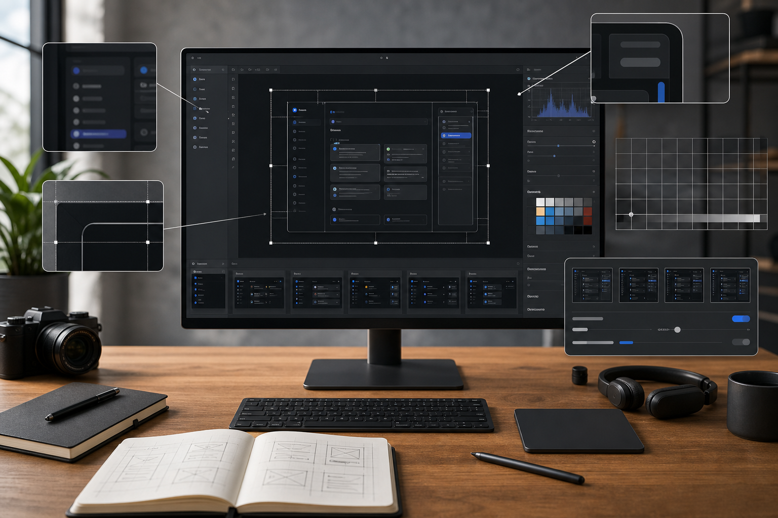
Compress Tutorial Screenshots Without Blurring Thin Text
A practical workflow for making tutorial screenshots smaller while keeping UI labels, code snippets, arrows, and thin interface lines readable across docs and help centers.
Compress Tutorial Screenshots Without Blurring Thin Text
Tutorial screenshots are unusually fragile. A product photo can survive a little softness, and a social graphic can hide compression artifacts behind color and motion. A screenshot cannot. Its value depends on tiny labels, thin borders, code punctuation, cursor states, annotations, and interface spacing staying readable after export.
That creates a practical problem for documentation teams, support teams, educators, and solo product builders: screenshots need to load quickly, but aggressive compression can ruin the exact details the image was meant to explain.
This guide gives you a repeatable workflow for compressing tutorial screenshots without turning menus, tables, code blocks, or form labels into mush. It focuses on browser-based work, sensible export choices, and quality checks you can do before publishing. You can use it for help center articles, onboarding guides, changelog posts, internal SOPs, course lessons, and developer documentation.
Why Screenshot Compression Is Different
Most image optimization advice is written for photography or marketing images. Screenshots have a different structure:
- Large areas of flat color
- Hard edges between panels
- Small text at regular intervals
- Thin gray divider lines
- Icons with one-pixel strokes
- Red, blue, or yellow annotations
- Code snippets where every character matters
A photo usually benefits from JPEG compression because natural texture hides small errors. A screenshot often exposes those errors immediately. Compression noise around letters, halos near arrows, and fuzzy one-pixel borders make the final tutorial feel less trustworthy.
The goal is not simply to make the file as small as possible. The goal is to make the file small enough for fast loading while preserving the information the reader needs.
A good screenshot compression workflow answers three questions:
- What does the reader need to inspect?
- What format preserves that detail efficiently?
- What size and quality level keep the image readable in its final layout?
Start With The Final Use Case
Before resizing or compressing anything, decide where the screenshot will appear. The same capture may need different treatment depending on the destination.
| Destination | Reader behavior | Recommended priority |
|---|---|---|
| Help center article | Scans steps and zooms into labels | Text clarity first |
| Blog tutorial | Reads on mobile and desktop | Balanced width and file size |
| Developer docs | Checks exact code and UI state | Maximum sharpness |
| Internal SOP | Follows a process repeatedly | Fast loading and readable labels |
| Changelog post | Understands a feature quickly | Crop and annotation clarity |
| Email support reply | Opens on mixed devices | Small file size with obvious focus |
A full-screen screenshot exported at native monitor size may look crisp locally, but it can become unreadable when squeezed into a narrow article column. Conversely, a heavily cropped screenshot may be perfect for one help article but too context-poor for a training deck.
Treat every screenshot as a designed asset, not a raw capture.
Capture Clean Before You Compress
Compression quality starts before the compression step. If the original screenshot is cluttered, too wide, or full of irrelevant panels, you will need more pixels and a larger file to explain the same thing.
Prepare The Interface
Before taking the screenshot:
- Close unrelated sidebars, popovers, and notifications.
- Use a clean browser profile if personal data could appear.
- Set the zoom level intentionally, usually 100 percent or 125 percent.
- Avoid capturing browser chrome unless it helps the instruction.
- Expand menus only when the menu is the subject.
- Use sample data that is short, realistic, and safe to publish.
A screenshot of a crowded dashboard is harder to compress because it contains more edges, labels, and colors. A focused screenshot is smaller and easier to read.
Use Larger UI Scaling When Needed
If your tutorial depends on small menu labels or code text, consider increasing app zoom before capture. This is especially useful for mobile-first documentation pages where the final image may be displayed at 320 to 420 CSS pixels wide.
Do not rely on readers zooming the browser. If a label matters, make it legible at the size where the image will actually appear.
A simple rule: if the screenshot text is smaller than the surrounding article body text after insertion, the image probably needs a tighter crop or a larger UI scale.
Crop Before Resize
Cropping is the most reliable form of compression because it removes pixels without damaging the remaining pixels. Before using a compressor, remove anything that does not help the step.
Use the image resize tool after you decide the visible area, not before. If you resize first and crop later, you may throw away useful detail and then enlarge a weak result.
Good Screenshot Crops
A strong tutorial crop usually includes:
- The control being used
- Enough surrounding interface to orient the reader
- The resulting state, if visible in the same view
- Any annotation or pointer that clarifies the action
A weak crop usually includes:
- The full browser window when only one menu matters
- Empty dashboard space
- Irrelevant navigation panels
- Repeated table rows
- Decorative header areas
- Personal account controls
Crop Patterns That Work
Use these practical patterns:
| Pattern | Best for | What to include |
|---|---|---|
| Control crop | Buttons, menus, toggles | Control plus nearby label |
| Panel crop | Settings panels, sidebars | Panel title, active field, save action |
| Before-after crop | Visual changes | Same area in both states |
| Row crop | Tables and lists | Header row plus one or two examples |
| Error crop | Validation messages | Field, error text, submit button |
| Code crop | Developer docs | Relevant lines plus line numbers if needed |
Cropping also helps accessibility. Readers do not have to search a huge image for the part mentioned in the instruction.
Choose The Right Format
Format choice determines how much quality you can keep at a given file size. For screenshots, the main decision is usually PNG, WebP, or JPEG.
| Format | Best use | Watch out for |
|---|---|---|
| PNG | Crisp UI text, transparency, simple flat colors | Can be large for complex screens |
| WebP | Smaller screenshots with good visual quality | Need to inspect thin text carefully |
| JPEG | Photo-heavy dashboards or mixed media | Can blur text and add halos |
For most tutorial screenshots, start with PNG or WebP. Use JPEG only when the screenshot contains a large photographic area, such as a design canvas, map, video still, or product photo embedded inside the interface.
If you need to convert an existing screenshot into a more suitable format, use convert image after cropping and before final compression. This keeps the workflow clean: crop, format, resize, compress, inspect.
When PNG Is Still The Best Choice
PNG remains useful when the screenshot contains:
- Small text
- Thin interface lines
- Code blocks
- Pixel-aligned icons
- Transparent backgrounds
- Limited colors
- Flat UI panels
PNG can be larger than WebP, but it often preserves crisp edges better with fewer surprises. For product documentation where exact readability matters more than the smallest possible file, PNG is still a practical default.
When WebP Is The Better Export
WebP often works well for screenshots when you need a smaller file and can inspect the result carefully. It is especially helpful for:
- Long documentation pages with many screenshots
- Blog posts with mixed images
- Help centers where mobile loading matters
- Screenshots containing gradients, shadows, or embedded images
The important part is not choosing WebP blindly. Export a test image, view it at the final display width, and inspect text-heavy areas before publishing.
When To Avoid JPEG
JPEG is risky for tutorial screenshots because it is lossy and designed around photographic patterns. It often creates visible artifacts around sharp edges.
Avoid JPEG when the screenshot includes:
- Small black or gray text on white backgrounds
- Source code
- Terminal output
- Spreadsheet grids
- Product settings screens
- Thin red annotation arrows
- UI icons with fine strokes
If a legacy screenshot already exists as JPEG, convert only if needed for workflow consistency. Converting a damaged JPEG to PNG will not restore lost detail. In that case, recapture the screenshot if possible.
Resize To The Display Width, Not The Monitor Width
Many screenshots are captured at 1920, 2560, or even wider. Most article columns do not display images anywhere near that width. Publishing a full-width desktop capture inside a 760-pixel documentation column wastes bandwidth and may make text appear tiny.
A better approach is to resize based on the final layout.
| Final placement | Practical export width |
|---|---|
| Narrow help article image | 720 to 900 px |
| Wide blog body image | 1000 to 1400 px |
| Retina-friendly detailed crop | 1200 to 1600 px |
| Email attachment | 900 to 1200 px |
| Full-screen documentation lightbox | 1600 to 2200 px |
Do not treat these as fixed rules. A crop of a single settings panel may only need 700 pixels wide. A full dashboard walkthrough may need 1400 pixels if readers must inspect multiple regions.
The key is to avoid exporting giant images that are then displayed small. Resize intentionally with resize image, then compress the resized result.
The Two-Pass Compression Workflow
A reliable screenshot process uses two passes: one for structure, one for file size.
Pass 1: Structure And Readability
In the first pass, focus only on whether the screenshot explains the step.
Checklist:
- Is the important control visible without zooming?
- Is surrounding context present but not excessive?
- Are annotations far enough from text to avoid clutter?
- Are private details removed or replaced?
- Does the crop match the instruction in the article?
- Is the image width appropriate for its final placement?
If the screenshot fails any of these checks, fix the capture, crop, or resize before compression. Compression should be the final polish, not a way to rescue a poor screenshot.
Pass 2: Compression And Inspection
In the second pass, reduce file size while checking the most fragile parts of the image.
Use compress image and inspect:
- Small menu labels
- Form field placeholder text
- Table grid lines
- Code punctuation
- Annotation arrow edges
- Icons with fine strokes
- Low-contrast gray labels
- Focus rings and selected states
If these details degrade, back off the compression level or try a different format.
A Practical Quality Ladder
Instead of guessing, use a quality ladder. Export several versions and stop at the smallest one that remains readable.
| Step | Action | Keep it if |
|---|---|---|
| 1 | Original crop | It is already small enough |
| 2 | Resize to final width | Text remains readable |
| 3 | Compress lightly | No visible blur around labels |
| 4 | Try WebP | File size drops without edge damage |
| 5 | Tighten crop further | Context still makes sense |
| 6 | Split into two images | One image is too dense |
The last step is often overlooked. Sometimes the best compression decision is to split a dense screenshot into two smaller images. A single huge interface capture may be trying to show a menu, a form, and a result at once. Separate those into focused screenshots and each image becomes smaller, clearer, and easier to place in the tutorial.
How To Inspect Screenshot Quality
Do not evaluate screenshot quality only at full size. Full-size inspection can hide the real problem because readers will see the image inside a layout.
Check the screenshot in three views:
- Final article width on desktop
- Mobile width
- Zoomed-in detail view
The desktop view shows whether the image feels polished in context. The mobile view shows whether the screenshot is too wide or dense. The zoomed-in view reveals compression artifacts that may become obvious on high-density screens.
The 10-Second Readability Test
Open the compressed screenshot at the size it will appear in the page. Give yourself ten seconds and answer:
- What control is being used?
- What text label matters most?
- What changed after the action?
- Is any annotation competing with the UI?
If you cannot answer quickly, the screenshot needs a better crop or a clearer annotation. More pixels alone will not solve a composition problem.
The Thin-Line Test
Thin UI lines are early warning signs. Look at:
- Table borders
- Divider lines
- Checkbox outlines
- Input field borders
- Chart grid lines
- Window edges
If these lines shimmer, fade, or turn blotchy after compression, text usually suffered too. Raise quality, switch format, or reduce dimensions less aggressively.
Handling Annotations Without Making Files Huge
Annotations are useful, but they can increase visual complexity. A red arrow over a gray UI adds hard color transitions that compression must preserve. Too many labels and callouts can make a screenshot both larger and less readable.
Use annotation sparingly:
- Prefer one arrow or highlight per screenshot.
- Keep arrows away from small text.
- Use high contrast without covering interface details.
- Avoid translucent boxes over text-heavy areas.
- Use a short crop instead of multiple arrows when possible.
If a screenshot needs three arrows and two labels, consider splitting the step into multiple images. Documentation usually becomes clearer when each screenshot answers one question.
Special Case: Code Screenshots
Whenever possible, use real code blocks in the article instead of screenshots of code. Real text is searchable, accessible, responsive, and easier to copy.
Use code screenshots only when the visual context matters, such as:
- Showing where code appears inside an app interface
- Demonstrating a syntax-highlighted editor setting
- Explaining a visual diff
- Showing terminal output with surrounding UI controls
If you must compress a code screenshot, be conservative. Code relies on punctuation, indentation, and similar-looking characters. A blurry colon, bracket, or period can change meaning.
Best practices for code screenshots:
- Increase editor font size before capture.
- Use a tight crop around relevant lines.
- Avoid JPEG.
- Prefer PNG for maximum edge clarity.
- Check punctuation after compression.
- Do not shrink below the final readable width.
For developer documentation, a slightly larger file is often a better tradeoff than a smaller unreadable code image.
Special Case: OCR-Ready Screenshots
Some teams compress screenshots that may later be searched, archived, or processed with OCR. This is common for support logs, internal audits, research notes, and visual reports.
If OCR matters, protect text clarity before file size. OCR accuracy drops when letters blur, touch, or develop compression noise around their edges.
Before running OCR with image OCR, use the clearest available version of the screenshot. If you also need a compressed public version, create it as a separate derivative. Do not overwrite the OCR source with a heavily compressed export.
A practical OCR workflow:
- Keep the original capture in a source folder.
- Crop only the region that contains useful text.
- Run OCR from the clean source image.
- Export a compressed version for publication.
- Store OCR text separately from the compressed image.
This prevents a common problem: optimizing images for the web and then discovering that the archive copy is no longer suitable for text extraction.
Naming Files So Compression Decisions Stay Clear
File naming is part of image quality control. When screenshots move through capture, crop, resize, and compression steps, vague names create confusion.
Use names that show purpose and state:
| Filename | Meaning |
|---|---|
| account-settings-source.png | Original capture |
| account-settings-crop.png | Cropped working image |
| account-settings-1200w.png | Resized export |
| account-settings-1200w-compressed.webp | Published version |
| account-settings-ocr-source.png | OCR-safe copy |
Avoid names like final-final-small-new.png. They make it impossible to understand which file should be edited later.
A simple naming convention also helps teams avoid recompressing already compressed images. Repeated lossy compression can quickly damage text.
Batch Workflows For Documentation Sets
When you publish a long guide with many screenshots, consistency matters. A single over-compressed image can make a tutorial feel uneven, while one giant unoptimized screenshot can slow the entire page.
For a set of screenshots, define a small spec before editing:
| Rule | Example |
|---|---|
| Max body width | 1200 px |
| Preferred format | PNG for UI, WebP for mixed content |
| Max file size target | 150 to 300 KB for normal crops |
| Annotation color | One consistent accent color |
| Source retention | Keep original captures in a source folder |
| Export naming | topic-step-width-format |
File size targets should be flexible. A simple settings crop may be under 80 KB. A complex analytics dashboard may reasonably be larger. The point is to catch outliers and inspect them, not to force every image into the same number.
Batch Review Checklist
Before publishing a screenshot-heavy tutorial, review the full set:
- Do all screenshots use similar zoom and crop style?
- Are filenames descriptive and ordered?
- Are any images much larger than the others?
- Are important labels readable on mobile?
- Are annotations consistent?
- Are source files preserved?
- Are repeated screenshots necessary, or can some be removed?
A smaller number of sharper screenshots usually beats a long page filled with redundant captures.
Deciding Between One Large Screenshot And Multiple Small Ones
This decision affects both clarity and compression. A large screenshot may preserve context, but it often forces readers to inspect tiny details. Multiple smaller screenshots can reduce file size and improve comprehension.
| Situation | Better choice | Reason |
|---|---|---|
| One button in a toolbar | Small crop | Reader sees the target faster |
| Full workflow overview | Large screenshot | Context matters |
| Form with several fields | Panel crop | Keeps labels readable |
| Before and after UI state | Two matched crops | Easier comparison |
| Dense analytics dashboard | Multiple region crops | Avoids tiny chart labels |
| Mobile app walkthrough | Step-by-step crops | Fits narrow screens better |
A useful rule: if the article text has to say where to look inside the screenshot, the image is probably too large or too unfocused.
Compression Mistakes That Hurt Tutorial Quality
Mistake 1: Compressing Before Cropping
This locks artifacts into areas you may later enlarge or reuse. Crop first, then resize, then compress.
Mistake 2: Using JPEG For All Screenshots
JPEG may produce small files, but it often damages text and UI edges. Use it only for screenshots with strong photographic content.
Mistake 3: Letting The CMS Resize Everything
A content management system may generate responsive sizes, but it cannot decide whether a screenshot is readable. Upload an image that is already close to the intended display size.
Mistake 4: Ignoring Mobile
A screenshot that looks fine in a desktop editor may be useless on a phone. Always check the narrow layout for documentation and support content.
Mistake 5: Over-Annotating
Every arrow, box, and label adds visual complexity. Use cropping and sequencing before adding more callouts.
Mistake 6: Recompressing Published Images
If you download an already compressed image, edit it, and compress it again, quality drops. Keep source captures so future updates start from a clean file.
A Complete Screenshot Compression Workflow
Here is a practical workflow you can reuse for most tutorial screenshots.
Step 1: Capture With Intent
Set the interface to the state the reader needs. Increase zoom if labels are small. Remove private data and unnecessary panels before capture.
Step 2: Save A Source Copy
Keep the original screenshot unchanged. This gives you a clean file if you need another crop, a different format, or an OCR-safe version later.
Step 3: Crop To The Teaching Point
Remove empty space and unrelated interface elements. Keep enough context for orientation, but make the important control obvious.
Step 4: Resize To The Final Layout
Use resize image to export a width that matches your article or help center layout. Avoid publishing full monitor captures unless readers truly need that detail.
Step 5: Choose Format
Use PNG for crisp UI and code-heavy screenshots. Try WebP for smaller publication assets when text still holds up. Avoid JPEG unless the screenshot contains photo-like content.
Step 6: Compress Carefully
Use compress image and compare the output against the resized version. Focus on text, icons, borders, and annotations.
Step 7: Inspect In Context
Place the image in a draft page or preview. Check desktop and mobile widths. If the reader cannot understand the screenshot quickly, revisit crop and size before lowering quality further.
Step 8: Keep Source And Publish Derivative
Store the original and working files separately from the final compressed version. This makes future updates easier and prevents repeated lossy edits.
Example: Compressing A Settings Panel Screenshot
Imagine you are documenting how to enable a notification setting in a web app.
A poor workflow might be:
- Capture the full browser window.
- Export as JPEG.
- Compress until the file is under 100 KB.
- Upload it into the article.
The result is likely a wide image where the settings toggle is tiny, the labels are fuzzy, and the reader has to search for the relevant area.
A better workflow:
- Increase browser zoom to 110 or 125 percent if the UI is dense.
- Capture the settings page.
- Save the source PNG.
- Crop to the notification panel, including the panel heading and save button.
- Resize to 900 or 1000 pixels wide.
- Export as PNG or WebP.
- Compress lightly and inspect the toggle label.
- Upload the smallest version that keeps the label crisp.
This version will usually be smaller and clearer than the full-window image, even if its compression setting is less aggressive.
Example: Preparing Screenshot Images For A PDF Guide
Sometimes tutorial screenshots are not published directly on a web page. They may be assembled into a PDF guide for training, onboarding, or field use.
In that case, optimize for the PDF page size. Images that look fine on a responsive web page can become soft when placed into a letter-size PDF at the wrong dimensions.
A practical handoff:
- Crop and resize each screenshot for the intended PDF layout.
- Keep text large enough for print or tablet viewing.
- Compress images without damaging labels.
- Assemble the finished images into a PDF using image to PDF.
- Review the PDF at 100 percent and on a phone if it will be shared by email.
If the PDF contains many screenshots, smaller image files can reduce the final PDF size. But do not compress so hard that printed labels become difficult to read.
Recommended Defaults
For most tutorial screenshots, start with these defaults and adjust only when the image demands it.
| Setting | Default |
|---|---|
| Source format | PNG |
| Crop | Focused on one task or panel |
| Body image width | 900 to 1400 px |
| Format for publishing | PNG or WebP |
| JPEG use | Only for photo-heavy screenshots |
| Compression level | Light to moderate |
| Mobile check | Required |
| Source retention | Always keep original capture |
These defaults are intentionally conservative. The cost of a slightly larger screenshot is usually lower than the cost of an unreadable tutorial.
Final Pre-Publish Checklist
Use this checklist before a screenshot-heavy article goes live:
- The image teaches one clear thing.
- The crop removes irrelevant interface areas.
- Text is readable at the final display width.
- Thin lines and icons remain sharp.
- Compression artifacts are not visible around annotations.
- The format matches the content type.
- Mobile preview is acceptable.
- Source files are stored separately.
- Filenames describe the screenshot state.
- No private or accidental data is visible.
The Practical Standard
The best compressed tutorial screenshot is not the smallest possible file. It is the smallest file that still lets a reader complete the task without hesitation.
That standard changes the workflow. You stop asking how much compression you can apply and start asking what the screenshot must preserve. For UI tutorials, that usually means crisp labels, visible controls, clean annotations, and a crop that points the reader to the right place immediately.
Use cropping to remove waste, resizing to match the layout, format choice to protect edges, and compression as the final size reduction step. When those decisions happen in the right order, screenshots load faster without sacrificing the details that make documentation useful.