Letterpress Proof Photo Cleanup for Reliable Print Approvals
A practical guide to photographing, correcting, compressing, and packaging letterpress proofs so clients can judge impression, ink coverage, alignment, and paper accurately.
Letterpress Proof Photo Cleanup for Reliable Print Approvals
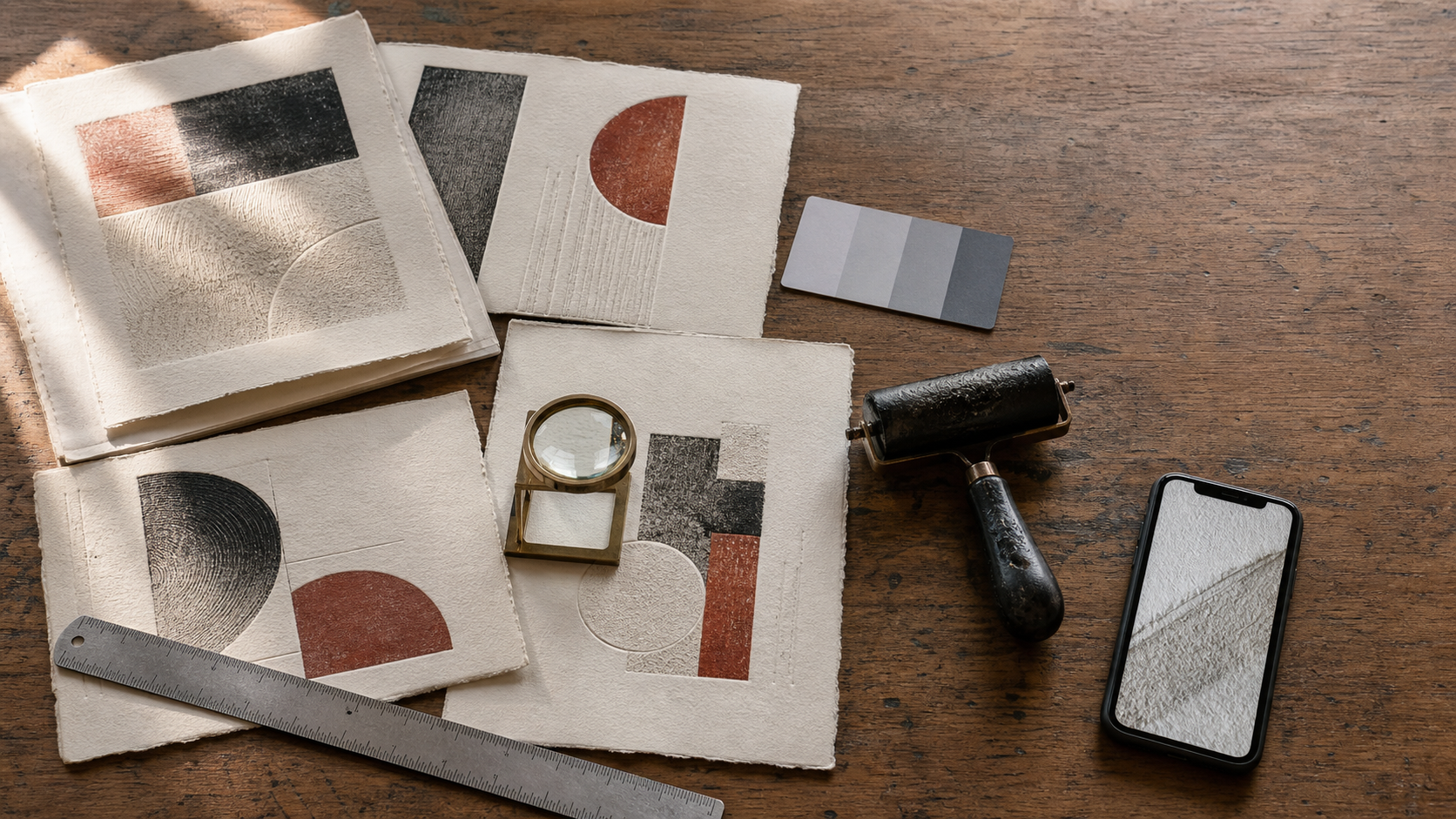
Letterpress proofs are unusually difficult to review through a screen. A photograph can show the ink color while hiding the impression, exaggerate the impression while shifting the paper tone, or make normal paper texture look like defective ink coverage. By the time a client sees the image in an email or project portal, automatic phone processing and additional compression may have changed it again.
That creates an avoidable approval problem. The printer may be presenting a perfectly acceptable result, but the digital proof does not preserve the qualities that matter: registration, ink density, edge definition, impression depth, paper color, and the position of the artwork on the finished piece.
This guide presents a practical system for small letterpress studios, independent printers, stationery designers, and book artists who need dependable approval images without a professional reproduction camera. The objective is not to make every proof look beautiful. It is to make each image honest, comparable, and easy to evaluate.
Decide What the Client Is Actually Approving
A useful proof begins with a defined review question. Sending a single attractive photograph and asking whether everything looks good leaves too much room for interpretation.
A client may need to approve one or more of the following:
- Artwork position and margins
- Front-to-back registration
- Registration between multiple ink colors
- Ink coverage and edge sharpness
- Approximate ink color
- Impression depth
- Paper stock, texture, or edge treatment
- Folding, scoring, trimming, or binding position
- Variable details such as names, dates, or numbering
Not all of these qualities can be represented accurately in one image. Flat, even illumination is useful for judging color and placement. Low angled illumination is better for revealing an impression. A close crop shows ink edges, while a full-sheet view provides context for margins and trim.
State the approval scope before taking photographs. For example: “Review spelling, artwork position, and registration. The angled detail image is included to show impression depth. Screen color is approximate.” That short note tells the client how to interpret the evidence.
Build a Repeatable Proof Photography Setup
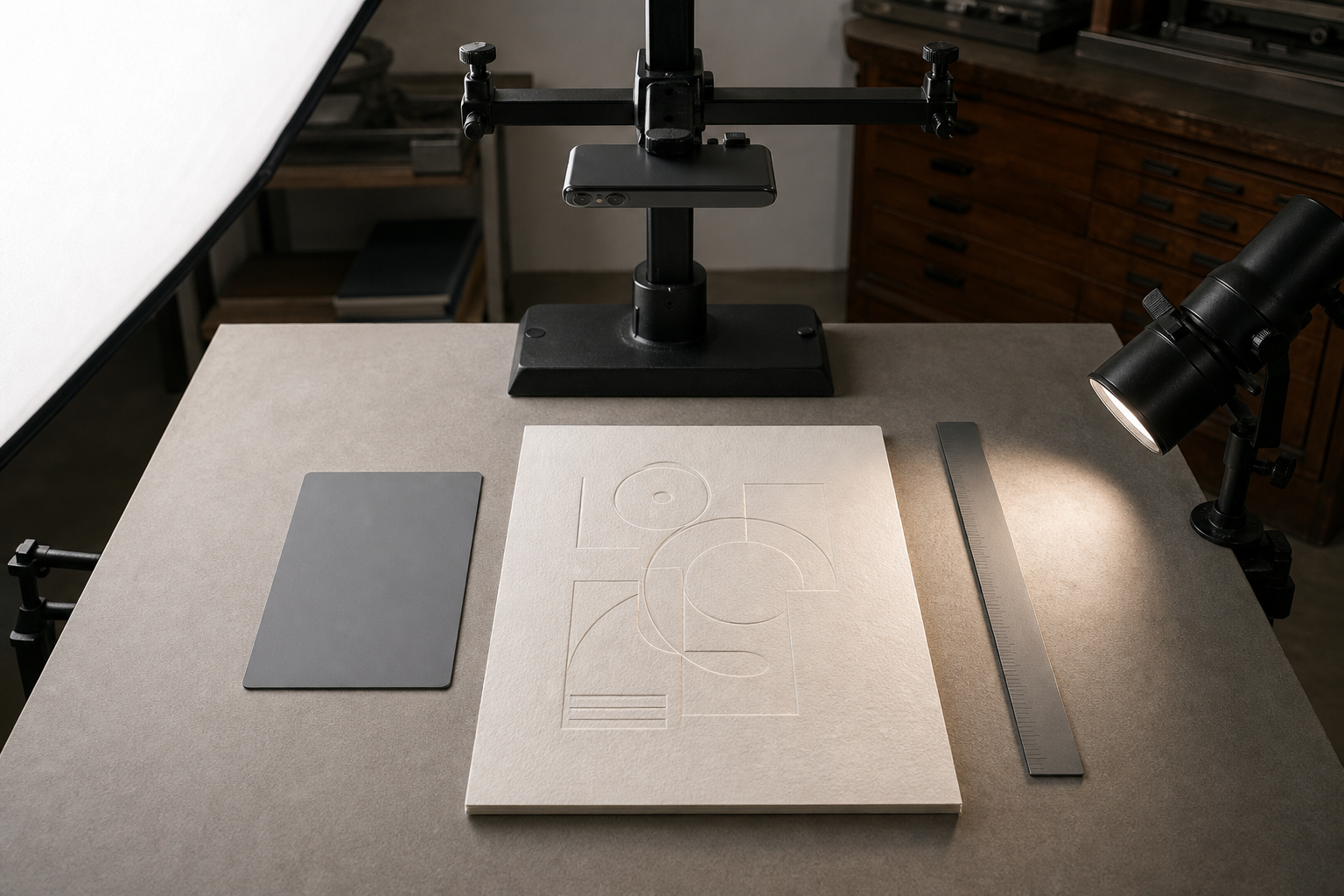
Consistency is more valuable than elaborate equipment. A recent smartphone, a stable support, a neutral background, and controlled light can produce useful proof photographs if the setup remains the same from one job to the next.
Place the proof on a clean, matte surface in white, gray, or black. Choose a background that clearly separates the paper edge without introducing a strong color cast. Warm wood, colored cutting mats, and bright fabric may look appealing, but reflected color can contaminate white or pale stock.
Mount the camera directly above the proof for the primary image. A copy stand is ideal, although a rigid overhead phone arm also works. Enable the camera grid and align the sheet edges with it. Keep the lens parallel to the paper; correcting severe perspective later can distort margins and make registration harder to judge.
Use a large, diffused light source. Window light can work when it is indirect and stable, but changing clouds make comparisons unreliable. A diffused LED panel positioned above and to one side is easier to repeat. Turn off nearby lamps with different color temperatures.
Include a small neutral gray card and a ruler in at least one setup image. They provide references for color correction and scale. Keep them outside the artwork area so they can be omitted from the clean client view without losing the original reference photograph.
Before photographing a live proof, clean the phone lens. A thin film of ink mist, paper dust, or fingerprints can soften fine type and create flare around dark areas.
Capture a Small but Complete Image Set
For most letterpress approvals, capture these views:
- A full piece photographed squarely from above
- A closer overhead view of the printed area
- An angled or raking-light detail showing impression depth
- A reverse-side image when show-through or deformation matters
- A registration close-up for multicolor work
- A scale-and-gray-card reference retained with the job records
Take more than one frame of each view, but do not send every frame. Near-duplicates make clients hunt for differences that may only be caused by exposure changes or camera sharpening.
Use Two Views When Impression Depth Matters
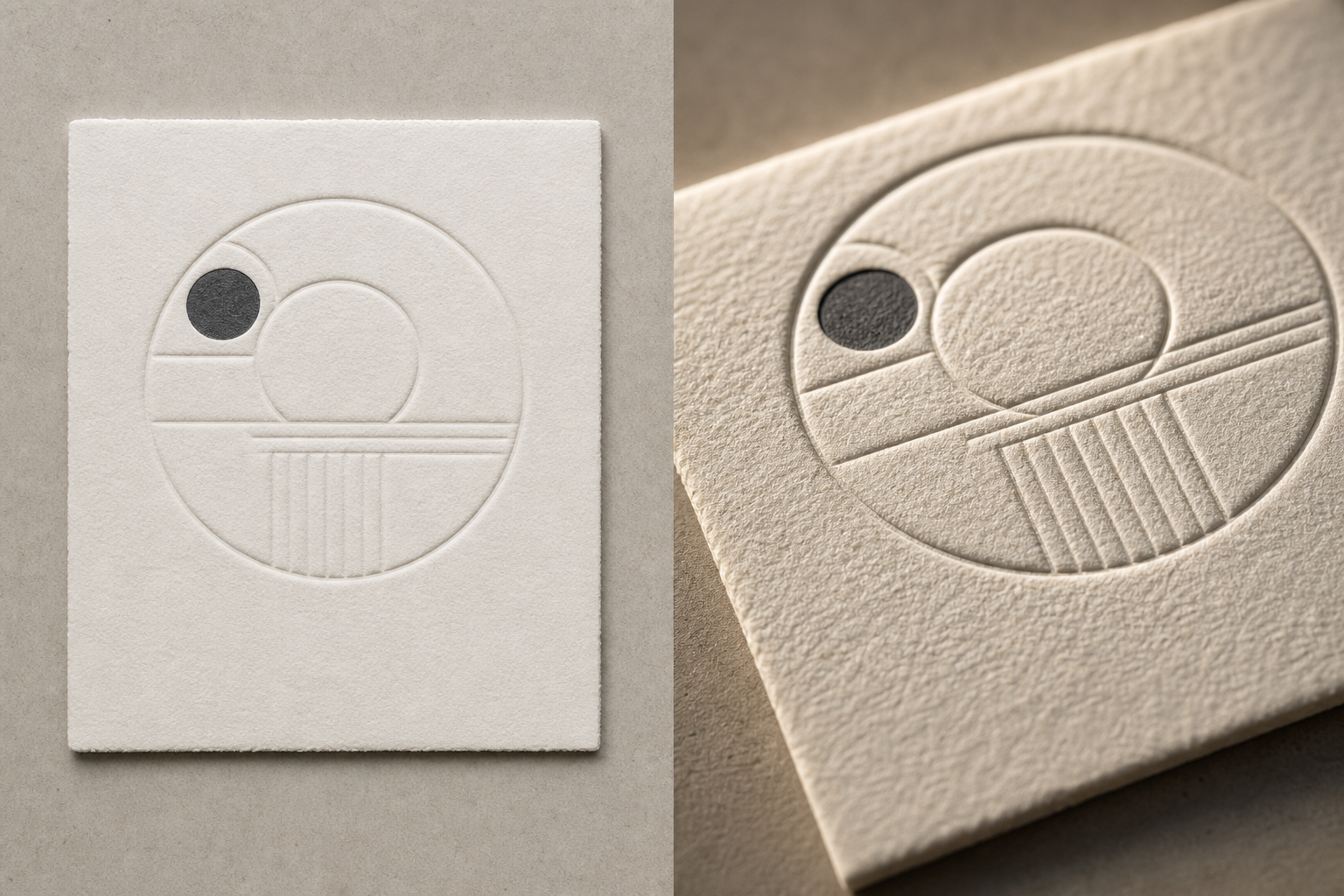
The tactile impression is one of the defining qualities of letterpress, yet it is also the quality most likely to disappear in a conventional photograph.
The primary overhead image should use broad, soft light. It will show overall placement, ink coverage, and paper color with relatively even brightness. This view should not be expected to communicate depth.
For the second view, place a light low to the paper at roughly a 15- to 30-degree angle. The exact angle depends on the stock and depth. Move the light around the piece until the impression produces a narrow, readable shadow without turning the paper surface into a dramatic landscape.
Keep the camera position and exposure controlled. Excessive contrast can make a modest impression appear extremely deep. Strong phone sharpening can also create artificial dark halos along type edges. If the camera offers a standard or neutral capture style, use it instead of a vivid or high-contrast mode.
For blind debossing, raking light may be the only way to make the artwork legible. Photograph from two light directions if the design contains both vertical and horizontal elements. A shadow that reveals one edge can conceal another.
Never substitute the angled image for the flat reference. Present the two together because they answer different questions.
Correct Geometry Before Adjusting Color
Start image cleanup with rotation, crop, and perspective. These corrections establish the visual frame the client will use to judge position.
Rotate the photograph until the paper edges are level. Apply only enough perspective correction to compensate for minor camera misalignment. If the original capture is strongly trapezoidal, retake it when possible. Heavy correction resamples the image unevenly and can change the apparent proportions of borders or margins.
Retain the complete paper edge in the full-piece image. Cropping precisely to the printed design removes information about placement. Leave a narrow, even border of background around the sheet so the client can distinguish the physical edge from a trim guide or printed rule.
Create detail crops from a copy of the corrected master. Do not repeatedly crop and resave the same JPEG, because each lossy save may soften fine serifs and small registration differences.
If the camera produced a very large file, use the image resizing tool after geometry correction. Preserve enough resolution for close inspection: approximately 2,000 to 3,000 pixels on the long edge is usually practical for a full-piece review image. Tiny email thumbnails are not suitable masters.
Make Conservative Tonal and Color Corrections
Proof cleanup should remove capture errors without disguising production characteristics. The safest order is white balance, exposure, highlight recovery, shadow adjustment, and then modest contrast.
Use the photographed gray card as the neutral reference when possible. Paper itself is not always neutral; many cotton, recycled, and handmade stocks are deliberately warm or cool. Setting white balance by clicking the paper can erase the stock’s actual character.
Adjust exposure until the paper looks plausible and highlight detail remains visible. Avoid forcing the stock to pure digital white. If the histogram is pushed hard against the bright edge, subtle impression shadows and surface texture may be clipped.
Apply contrast carefully. Increasing contrast can make ink coverage look richer than it is and deepen raking-light shadows. Reducing contrast too much can hide pinholes, weak solids, or uneven inking. Keep one minimally adjusted reference and compare every edited version against it.
Saturation deserves similar restraint. Metallic, fluorescent, and custom-mixed inks cannot be represented reliably by ordinary phone displays. A photograph may document placement and coverage, but a physical swatch or mailed proof may still be necessary for exact color approval.
Avoid Cleanup That Alters the Printed Evidence
Do not use healing, cloning, generative fill, or aggressive noise removal on the printed area. These tools can remove legitimate flaws such as hickeys, paper fibers, ink voids, or damaged type edges.
Limited cleanup is reasonable outside the evidence area. You might remove a distracting speck from the background, straighten the surrounding table, or soften identifying material that should not be shared. If sensitive job information must be obscured, make the redaction obvious rather than attempting an invisible replacement.
An AI photo editor can help with non-evidentiary surroundings or create a cleaner presentation copy, but retain the conventionally corrected master. The approval image should never imply that a corrected digital artifact is the physical print result.
Inspect Ink Coverage Without Fighting Paper Texture
Uncoated and cotton stocks contain visible fibers, valleys, and surface irregularities. Under sharp side lighting, normal texture may resemble mottled ink. Under flat frontal light, genuine coverage problems may become less obvious.
Review suspected defects at 100 percent magnification, not at an enlarged 300 or 400 percent view. Extreme enlargement emphasizes sensor noise and sharpening patterns that a person would not see on the printed object.
Compare the same area in the overhead and angled photographs:
| Observation | Likely interpretation | Useful next check |
|---|---|---|
| Light spots visible in both views | Possible weak coverage or paper picking | Inspect the physical proof with a loupe |
| Texture visible mainly under angled light | Normal surface relief may be emphasized | Compare with an unprinted area of the same stock |
| Bright halo along every dark edge | Camera sharpening or compression | Inspect the original file and reduce sharpening |
| One color appears offset consistently | Possible registration error | Measure a high-contrast junction in the close-up |
| Dark areas merge only in the shared copy | Compression or reduced resolution | Re-export at a higher quality setting |
When documenting a real concern, include one contextual image and one detail. A macro image alone can make a tiny defect appear catastrophic because the client cannot judge its actual scale.
Preserve Fine Type During Export
Letterpress stationery often contains thin rules, small serif type, hairlines, and tightly registered details. These features are vulnerable to resizing and compression.
Export the corrected master in a high-quality format first. JPEG is appropriate for photographic proof images, while PNG may help when the photograph contains unusually sharp flat-color boundaries. PNG will not restore detail already lost during capture, and it can produce much larger files.
If a portal requires a smaller upload, create a separate delivery copy with the image compression tool. Inspect the result at actual size and at 100 percent. Look for block patterns in paper texture, ringing around dark letters, smeared hairlines, and color shifts in broad ink areas.
Use a naming pattern that distinguishes purpose and view, such as:
- jobcode-proof-01-full.jpg
- jobcode-proof-02-registration-detail.jpg
- jobcode-proof-03-impression-angle.jpg
- jobcode-proof-04-reverse.jpg
Avoid names such as final-final2 or edited-new. Clear filenames reduce the chance that an outdated proof is approved.
When a recipient needs another format, convert from the high-quality master with the image converter, not from an already compressed messaging-app copy.
Assemble a Compact Approval PDF
A PDF can keep views, captions, and approval context together. It is particularly useful when a job has multiple pieces, such as an invitation, reply card, envelope, and belly band.
Use one piece or one review question per page. Place the full-piece image first, followed by details. Add short factual captions such as “Overhead view for position and coverage” or “Low-angle light for impression visibility.” Do not use decorative filters or colored page backgrounds that influence color perception.
A practical page order is:
- Job identifier, proof date, revision, and approval scope
- Full-piece front view
- Registration and ink-coverage details
- Impression-depth view
- Reverse or finishing view
- Concise list of items requiring a decision
The image-to-PDF tool can combine the selected images into a review document. Check that images are not downsampled so aggressively that small type becomes unreadable. If separate sections were prepared independently, combine them with the PDF merge tool and verify the final page order.
Keep the source photographs separately. The PDF is a delivery package, not a replacement for original evidence.
Run a Pre-Send Approval Audit
Before sharing the proof, review the actual exported files on a different screen if one is available. This catches unexpected scaling, color shifts, missing pages, and filenames that made sense only during production.
Use this checklist:
- The job identifier and revision are correct.
- The H1-level project name or customer-facing description matches the order.
- The full physical edge is visible in at least one image.
- Perspective correction has not distorted margins.
- The gray-card reference remains in the internal record.
- Overhead and angled images are clearly distinguished.
- No retouching has concealed print characteristics.
- Detail views include enough context or a scale reference.
- Compression has not damaged fine type or rules.
- Custom ink color limitations are stated where relevant.
- The PDF opens correctly and pages appear in the intended order.
- The client is told exactly which characteristics require approval.
- Superseded proof files are clearly marked or removed from the shared location.
If the job is color-critical, add a direct statement that display color is approximate and specify the physical reference used in production, such as an approved ink drawdown or supplied swatch. Do not ask a client to approve exact ink color from an uncontrolled screen image.
Choose the Right Evidence for the Decision
Different production decisions require different proof formats. A digital image is not automatically sufficient merely because it is convenient.
| Approval question | Best evidence | Digital limitation |
|---|---|---|
| Spelling and artwork content | Square overhead image or PDF | Small type must remain readable |
| Position and margins | Full-piece overhead image with visible edges | Perspective must be controlled |
| Two-color registration | High-resolution close-up plus full view | Compression may create false halos |
| Impression depth | Raking-light image plus overhead reference | Lighting can exaggerate depth |
| Exact ink color | Physical swatch or mailed press proof | Displays are not dependable color references |
| Paper texture and weight | Physical sample | Photographs cannot communicate touch or stiffness |
| Fold and trim relationships | Full layout images and assembled sample | A flat image may hide construction problems |
Escalate to a physical proof when the decision depends primarily on touch, exact color, paper behavior, or subtle impression depth. Digital documentation remains useful, but it should support the physical review rather than replace it.
Keep a Defensible Proof Record
After approval, retain the delivered package, the selected master images, the date sent, the revision identifier, and the client’s decision. Store the gray-card and scale reference with the same job when color or dimensions were discussed.
Do not silently replace an approved file with a newer export under the same filename. Create a new revision so the production team and client can refer to the same artifact. If a correction affects only one card in a suite, issue a new package or clearly documented replacement page rather than relying on memory.
A dependable letterpress proof record does more than protect against disputes. It makes reruns easier, helps diagnose press variation, and gives the studio a consistent visual history of paper, ink, impression, and finishing choices.
The central principle is simple: photograph each property in the way that reveals it honestly. Use flat light for placement and coverage, angled light for depth, close-ups for registration, and physical samples for qualities a screen cannot reproduce. Conservative cleanup and clear packaging then turn those photographs into evidence a client can approve with confidence.