Transparent WebP Overlays for Help Center Callouts: A Practical Asset Guide
Prepare crisp transparent WebP overlays for help centers, product education, and release notes with clean edges, reliable export settings, and size-conscious QA checks.
Transparent WebP Overlays for Help Center Callouts: A Practical Asset Guide
Transparent overlays are a small detail that can make product documentation feel far more polished. A good overlay can point to a button, frame a setting, blur a sensitive value, or add a lightweight visual cue without forcing the documentation team to export a brand-new full screenshot every time the interface changes.
The catch is that transparent overlays are easy to make badly. Edges turn gray. Shadows become muddy. File sizes climb for no good reason. A callout that looked sharp on a designer's desktop becomes fuzzy inside the help center, especially on mobile screens or high-density displays. When the overlay is supposed to clarify the page, that kind of visual noise hurts trust.
This guide focuses on a narrow but common publishing need: preparing transparent WebP overlays for help centers, product education articles, release notes, and support documentation. It is not about making decorative stickers or social graphics. It is about practical assets that sit on top of screenshots, diagrams, and product images while staying crisp, lightweight, and easy to maintain.
What Counts as a Transparent Overlay
A transparent overlay is any image with an alpha channel that is designed to sit above another visual. In help content, this usually means the overlay contains only the instructional element, while the rest of the canvas is transparent.
Common examples include:
- Highlight boxes around interface controls
- Arrows pointing to menu items or status indicators
- Semi-transparent masks for redacting sensitive areas
- Numbered step markers used across several screenshots
- Soft spotlight shapes that draw attention to one region
- Small product education graphics layered over screenshots
The overlay can be exported as PNG or WebP. PNG is familiar and predictable, but WebP often gives better file sizes while preserving transparency. For documentation teams publishing many articles, the difference adds up quickly.
The useful rule is simple: use transparency when the annotation should be reusable, movable, or independent from the screenshot underneath. If the annotation is permanently tied to one exact screenshot, a flattened image may be easier to maintain.
Where Transparent Overlays Actually Help
Transparent overlays are most valuable when the underlying screenshot changes more often than the instruction. Imagine a help article that explains where to find billing settings. The background screenshot may change when the product navigation is refreshed, but the visual cue around the billing button may still be useful. Keeping the cue separate makes future updates faster.
They also help when one callout style needs to remain consistent across a documentation library. A support team might decide that warning overlays are amber, click targets are blue, and redaction masks are neutral gray. If these assets are separate files, writers can reuse the same visual language without recreating each annotation from scratch.
Use overlays for:
- Repeated step markers in onboarding guides
- Product screenshots that receive frequent UI updates
- Documentation systems where images are assembled in templates
- Visual redactions that should remain editable until final review
- Help center articles that need responsive image placement
- Changelog posts showing one specific changed area
Avoid overlays when:
- The help center platform cannot reliably layer images
- The screenshot and annotation must always scale as one file
- Accessibility requirements depend on a single image description
- The overlay would cover core content on small screens
- The asset will be shared outside the publishing system as a standalone file
A transparent overlay should reduce maintenance, not create a fragile layout that only works in one browser width.
WebP, PNG, and SVG: Choosing the Right Format
Transparent WebP is a strong choice when the overlay includes soft edges, shadows, glow, blur, or photographic fragments. It supports alpha transparency and usually compresses more efficiently than PNG for complex raster graphics.
PNG is still a safe choice when the overlay is extremely simple, such as a flat icon, a sharp line drawing, or a small marker with limited colors. It is also useful when a platform has inconsistent WebP support, though modern browser support is broad enough for most web documentation.
SVG is best for vector callouts that need to scale perfectly: arrows, outlines, icons, and simple shapes. The reason teams often choose WebP anyway is that their overlays are not purely vector. They may include feathered masks, anti-aliased shadows, or edited screenshot fragments. Once the asset depends on pixel-level appearance, raster export becomes more predictable.
| Asset type | Best format | Why |
|---|---|---|
| Simple flat arrow | SVG or PNG | Sharp edges and tiny file size |
| Soft highlight box | WebP | Handles transparency and gradients efficiently |
| Redaction blur patch | WebP | Better for soft raster detail |
| Numbered badge set | SVG or PNG | Reusable and sharp at many sizes |
| Screenshot fragment overlay | WebP | Compresses mixed UI detail better than PNG |
| Documentation icon | SVG | Best scaling and styling control |
If your help center accepts all three formats, decide based on the visual content, not habit. Vector stays vector. Pixel-based overlays can move to WebP after a quick quality check.
Start With the Final Display Size
The most common mistake is exporting overlays from a design canvas without knowing how large they will appear in the article. A 1600 pixel wide overlay may be unnecessary for a 480 pixel wide screenshot slot. A 300 pixel wide overlay may look blurry on a retina display if it is stretched by the template.
Before export, identify the display context:
- Desktop article width
- Mobile article width
- Maximum screenshot width in the help center theme
- Whether images are shown at 1x or 2x density
- Whether the overlay is positioned with CSS or baked into a component
A practical target is to export at 2x the expected display size when the overlay contains fine lines or text-like UI details. For example, if a callout marker will appear at about 120 by 120 CSS pixels, export it around 240 by 240 pixels. That gives the browser enough pixel density without making the file absurdly large.
For full-width overlays that align with screenshots, keep the overlay dimensions matched to the screenshot dimensions. If the base screenshot is 1440 by 900, the overlay should use the same canvas size when exact positioning matters. This makes layering predictable because the overlay can be placed at the same width as the screenshot.
If the overlay is an independent marker, crop the canvas tightly around the visible content and include only the transparent padding needed for shadows or focus rings.
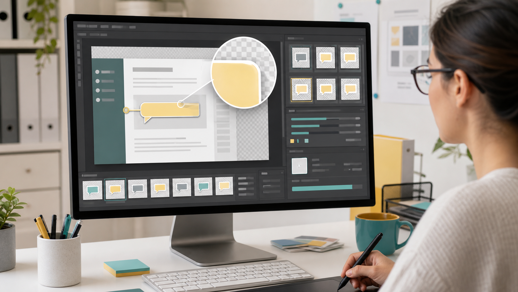
Clean Edges Before You Compress
Transparency problems usually come from the source file, not the final format. If the edge is already contaminated, compression will only make it more obvious.
Check for these issues before export:
- Pale halos around dark shapes
- Dark fringes around light shapes
- Semi-transparent pixels left from a removed background
- Jagged diagonal lines from low-resolution design exports
- Shadows that fade into an accidental matte color
- Thin outlines that disappear on white or dark backgrounds
When removing a background or isolating an overlay, inspect it on at least two contrasting backgrounds. A white checkerboard is not enough. Place the asset over white, black, and a typical product screenshot color. Edge problems often hide on one background and become obvious on another.
For product photos or UI fragments that need cleaner transparency, a dedicated editor can help. ConvertAndEdit's AI photo editor is useful when an object or visual element needs background cleanup before the final transparent asset is exported. For purely technical resizing after cleanup, use resize image to match the final display slot instead of resizing inside the CMS.
Build a Small Overlay Style System
Even a small documentation team benefits from consistent overlay rules. Without them, one article uses red arrows, another uses purple circles, and a third uses giant drop shadows. The reader starts noticing the annotation style instead of the instruction.
Create a compact set of visual decisions:
- One color for primary click targets
- One color for warnings or caution areas
- One neutral treatment for redaction or privacy masks
- One arrow style
- One corner radius for highlight rectangles
- One shadow strength for floating markers
- One minimum line thickness for mobile readability
Keep the set small. The goal is recognition. If every overlay looks custom, the system fails.
For help center callouts, avoid extremely saturated colors unless they are part of the product brand and pass contrast checks on real screenshots. Many software interfaces already contain blue buttons, green status chips, red errors, and gray panels. Your overlays need to stand apart without looking like interactive UI controls.
A good practical approach is to use slightly muted annotation colors with clear outlines. For example, a blue highlight rectangle can use a medium blue stroke, a faint translucent fill, and no heavy shadow. It will read as an instructional layer rather than a fake button.
Redaction Overlays Need Extra Care
Transparent overlays are sometimes used to hide names, email addresses, account IDs, balances, or customer data in screenshots. Treat those assets differently from decorative callouts.
A semi-transparent blur layer may look polished, but it can be unsafe if the original information remains recoverable in another layer or source image. For final public publishing, sensitive data should be permanently removed from the flattened final image or replaced with fake sample data before the image is exported.
Use redaction overlays only during review or composition, then flatten and verify the final image. Do not rely on a transparent patch in a layered layout to protect private information. Someone may download the base image separately, inspect page source, or disable the overlay.
A good public-safe sequence is:
- Duplicate the original screenshot.
- Replace or cover sensitive values in the duplicate.
- Export a flattened safe screenshot.
- Add non-sensitive transparent callouts above the safe screenshot.
- Check the published page and downloaded assets.
If the source screenshot contains text you need to extract before redaction, image OCR can help capture labels or IDs for internal notes. Do not publish real private values just because they were part of the OCR pass.
Export Settings That Usually Work
WebP export settings vary by tool, but the principles are consistent. Use transparency, preserve enough quality for edges, and avoid oversized dimensions.
For most transparent help center overlays, start with:
| Setting | Practical starting point |
|---|---|
| Format | WebP with alpha transparency |
| Quality | 80 to 90 for soft edges and UI detail |
| Dimensions | 1x to 2x final display size |
| Color profile | sRGB |
| Metadata | Remove unless needed |
| Canvas | Tight crop for markers, matched canvas for aligned overlays |
Lossless WebP can be useful for very small flat graphics, but lossy WebP at a high quality setting often produces smaller files with no visible damage. The only way to know is to export both and compare.
Watch edges, not just the center of the asset. A callout box may look fine in the middle while its semi-transparent border turns rough. This matters because overlays usually contain large transparent regions and thin visible elements.
After export, run a quick size pass with compress image. Compression is most helpful after the asset is already correctly cropped and sized. Do not expect compression to fix a canvas that is four times larger than necessary.
The Export Checklist Before Publishing
Use this checklist before adding transparent WebP overlays to a live article:
- The overlay has the intended transparent background.
- The canvas size matches its placement method.
- The asset is not larger than needed for retina display.
- Edges look clean on light, dark, and screenshot backgrounds.
- Shadows do not create muddy halos.
- Thin lines remain visible on mobile.
- The file uses sRGB color.
- Metadata has been removed unless there is a reason to keep it.
- The file name describes the article, step, or component.
- The published page has been checked at desktop and mobile widths.
For naming, prefer specific and stable names:
| Weak file name | Better file name |
|---|---|
| arrow-final.webp | billing-settings-arrow-step-02.webp |
| overlay-new.webp | user-menu-highlight-account-tab.webp |
| red-box.webp | invoice-export-warning-highlight.webp |
| screenshot-callout.webp | api-key-page-copy-button-callout.webp |
Specific names make future cleanup easier. They also reduce the chance that a writer reuses the wrong overlay in a similar article.
Placement Patterns for Help Centers
How you place the overlay depends on your publishing system. Some teams flatten the overlay onto the screenshot before upload. Others layer images in a component. Both approaches can be valid.
Flattened Image Pattern
The flattened pattern is simplest. You place the overlay on top of the screenshot in an editor, export one final WebP or PNG, and publish it as a normal image.
Use this when:
- The article platform has limited layout control
- Writers need a single asset per step
- The screenshot and callout always belong together
- You are sending the image to external partners or support teams
The downside is maintenance. If the product UI changes, you must edit the full image again.
Layered Component Pattern
The layered pattern keeps the base screenshot and overlay separate. The article or design system places them in the same container.
Use this when:
- The help center supports reliable image layering
- The same overlay appears in several places
- Product screenshots change often
- You have engineering support for documentation components
The risk is responsive behavior. If the overlay is positioned in percentages, it may drift slightly as the screenshot scales. Test at several widths, especially if the callout points to a small control.
Matched Canvas Pattern
This is a practical middle ground for precise alignment. The overlay has the same pixel dimensions as the base screenshot, but only the callout is visible. Both images are rendered at the same width.
Use this when:
- The overlay must align with a precise UI location
- The base screenshot may be replaced later with the same dimensions
- You want predictable positioning without many CSS coordinates
The file may be larger than a tightly cropped marker, but it is often easier to maintain.
Converting Existing PNG Overlays to WebP
Many documentation libraries already contain PNG overlays. You do not need to convert everything at once. Start with large files and frequently loaded pages.
A practical conversion pass looks like this:
- Sort overlay files by size.
- Identify PNGs with transparency above 100 KB.
- Convert a small sample to WebP.
- Compare edge quality against the original PNG.
- Check the converted file in the actual article template.
- Replace only files that keep the same visual quality.
ConvertAndEdit's convert image tool can help when you need to turn PNG assets into WebP without changing the rest of the image preparation process. After conversion, run the published article through the same visual checks you would use for a new asset.
Do not blindly convert tiny PNG icons. A 2 KB PNG may not become meaningfully smaller as WebP, and the extra format change may not be worth the churn.
File Size Budgets for Documentation Overlays
There is no universal file size limit, but budgets help teams make consistent decisions. Transparent overlays should usually be much smaller than the screenshots beneath them.
Reasonable targets:
| Overlay type | Typical target |
|---|---|
| Small arrow or marker | Under 15 KB |
| Highlight rectangle with soft fill | Under 25 KB |
| Matched-canvas screenshot overlay | Under 80 KB |
| Soft redaction or blur patch | Under 120 KB |
| Complex product education overlay | Under 150 KB |
These are not strict rules. A large, high-density overlay may justify a bigger file. But if a simple arrow is 300 KB, something is wrong. The canvas may be too large, metadata may still be attached, or the asset may have unnecessary visual complexity.
When an overlay remains too heavy, try these fixes in order:
- Crop unused transparent space.
- Reduce dimensions to the real display need.
- Simplify shadows and gradients.
- Lower WebP quality slightly and compare.
- Remove metadata.
- Consider SVG for simple shapes.
Compression should be the final polish, not the entire strategy.
Accessibility Notes for Overlay-Based Images
Transparent overlays can improve visual clarity, but they do not replace accessible writing. A callout arrow may help sighted users, yet the article still needs clear instructions in text.
For each annotated image, make sure the surrounding copy explains the action without relying only on color or position. Instead of writing “click the blue highlighted area,” write “open Settings, then choose Billing.” The image supports the instruction, but the text carries it.
Alt text should describe the meaningful state of the image, not every decorative overlay. If the overlay points to a specific control, include that purpose. For example: “Account settings page with the billing tab highlighted.” Avoid alt text such as “blue arrow overlay on screenshot,” unless the arrow itself is the subject.
Also consider color vision and contrast. A red outline over a dark interface may be hard to see. A translucent yellow highlight may vanish over pale panels. Test overlays on real screenshots, not blank design boards.
Turning Overlay Sets Into PDF Review Packs
Documentation images often need approval from product, legal, support, or customer success before publishing. Instead of sending scattered image files, create a compact review packet.
A useful packet can include:
- The base screenshot
- The transparent overlay version
- The flattened final image
- Notes about any redacted or replaced data
- The article section where the image will appear
When images are ready for review, image to PDF can turn a set of screenshots and overlay previews into a single review file. This is especially useful when stakeholders need to approve visual accuracy without opening a design tool.
Keep the PDF practical. One image per page is usually easier to review than a dense contact sheet when annotations are small. If the goal is quick visual scanning, a grid can work, but tiny callouts may be missed.
Common Mistakes and How to Fix Them
The Overlay Has a White Box Around It
The asset was probably exported without transparency, or the publishing system converted it to a format that does not preserve alpha. Re-export as WebP with transparency enabled, or use PNG if the platform mishandles transparent WebP.
The Edge Looks Gray or Dirty
The overlay may have been cut from a background with a matte color. Clean the edge in the source editor, then inspect it on multiple backgrounds. Do not rely on compression settings to hide the problem.
The Callout Drifts on Mobile
If the overlay is layered with CSS, its coordinates may not scale exactly with the screenshot. Use a matched canvas overlay or flatten the image for that article.
The File Is Much Larger Than Expected
Check canvas dimensions first. Large transparent areas still contribute to image data, especially when soft shadows or gradients extend across the canvas. Crop tighter or simplify the visual effect.
The Overlay Looks Like a Real Button
Documentation callouts should not be confused with product UI. Change the color, shape, or opacity so the annotation reads as an instructional layer rather than an interface element.
A Practical Production Pass
Here is a compact system for preparing a transparent WebP overlay from start to finish:
- Decide whether the overlay should be separate or flattened.
- Choose the canvas: tight crop, matched screenshot size, or component-specific dimensions.
- Create the callout using the team's standard colors and line weights.
- Inspect transparency on light, dark, and real screenshot backgrounds.
- Export as WebP with alpha transparency in sRGB.
- Compare quality at the final display size and at mobile width.
- Compress only after dimensions and edges are correct.
- Use a descriptive file name tied to the article or product area.
- Publish in a test article or preview environment.
- Verify that the written instructions still make sense without relying on the overlay alone.
This pass is intentionally small. The point is to catch the problems that readers notice: fuzzy edges, misplaced arrows, slow-loading images, and unclear instructions.
Final Thoughts
Transparent WebP overlays are not glamorous, but they are a reliable way to make help center images cleaner and easier to maintain. They work best when teams treat them as documentation assets rather than one-off decorations.
Start with the final display size. Keep the style system small. Protect sensitive information before publishing. Convert PNGs selectively. Check edges on real backgrounds. When those habits are in place, overlays become a practical tool for clearer product education without bloating every article image.