Image Text Accessibility Audit Workflow for Documentation Teams
A practical workflow for finding, extracting, rewriting, and replacing text trapped inside screenshots, diagrams, and support images before publishing documentation.
Image Text Accessibility Audit Workflow for Documentation Teams
Screenshots, diagrams, comparison tables, annotated product images, and quick tutorial graphics often contain text that never becomes real page content. It looks helpful to a sighted reader, but it can become invisible to screen readers, hard to translate, difficult to search, and painful to update. The problem is rarely one dramatic accessibility failure. It is usually a collection of small image decisions made under deadline pressure.
A button label appears only inside a screenshot. A setup diagram has three tiny captions baked into the image. A changelog image includes a warning note that is not repeated anywhere else. A customer-facing guide uses a PNG of a configuration table because it was faster than rebuilding the table in HTML. Each one feels harmless. Together, they create documentation that is less usable, less maintainable, and less resilient.
This guide gives documentation teams a practical workflow for auditing image text before publication. It is designed for small teams that do not have a dedicated accessibility specialist reviewing every article, but still want a repeatable process. The goal is not to ban screenshots or diagrams. The goal is to decide which text belongs in the image, which text belongs on the page, and how to cleanly move between the two.
Why Image Text Becomes a Documentation Problem
Image text is any meaningful text that appears inside a visual asset instead of in the surrounding page content. It can include UI labels, labels on arrows, step numbers, chart captions, error messages, table cells, callout notes, file names, or short instructions embedded in graphics.
Some image text is harmless or unavoidable. A screenshot of an app interface will naturally show interface text. A photo of a receipt or form may need to preserve the original. A historical scan may be valuable precisely because the text is part of the artifact. But documentation teams often add extra text into images because it is fast: arrows, labels, badges, boxed notes, and mini checklists. That added text is where most preventable problems begin.
When critical content lives only inside an image, several things happen:
- Screen reader users may miss the information unless the alt text fully captures it.
- Search engines and site search may not understand the content.
- Translation workflows may skip the text.
- Editors cannot easily update a sentence without reopening a design file.
- Responsive layouts may shrink the image until the text becomes unreadable.
- Compression can blur thin letters, especially in screenshots.
The fix is not just better alt text. Alt text is important, but it is not a dumping ground for whole paragraphs, tables, or long instructions. The better pattern is to separate meaning from decoration: keep the image useful, then place important wording in real, selectable page content.
Decide What Counts as Meaningful Text
Before auditing a folder of images, define what your team considers meaningful. Without that definition, reviewers waste time debating every screenshot.
A practical rule is this: if the reader needs the text to complete the task, understand the concept, avoid a mistake, compare options, or identify the right state, it is meaningful.
That includes:
- Error messages that tell users what went wrong.
- Button names required to follow a step.
- Settings values that must be copied.
- Warnings, limits, and exceptions.
- Labels in diagrams that explain relationships.
- Table content that supports a decision.
- Status text that confirms success or failure.
Text is usually less meaningful when it is incidental UI chrome, filler in a sample dashboard, decorative brand wording, or background content that is not referenced by the article. Incidental text still affects visual clarity, but it does not need to be transcribed word for word.
Use this small decision table during reviews:
| Image text type | Should it stay only in the image? | Better treatment |
|---|---|---|
| Required step label | No | Mention it in the step text and keep the screenshot as visual confirmation |
| Long warning or policy note | No | Move it into a paragraph or callout near the image |
| Diagram node label | Usually no | Repeat the label in surrounding explanation or rebuild as accessible HTML where practical |
| Decorative badge | Usually yes | Keep it visual unless it changes the meaning |
| Screenshot UI chrome | Often yes | Summarize only the relevant state |
| Table captured as an image | Rarely | Recreate as a real table or provide the key data in text |
This gives reviewers a shared standard. The question becomes less subjective: does the reader need this wording, or is it just visual context?
Build a Simple Image Text Inventory
Start with an inventory before editing anything. Most documentation teams jump directly into fixing individual images, then lose track of which pages still have problems. A lightweight inventory creates momentum and makes the work easier to split across writers.
For each article or documentation section, make a list of images and record four fields:
| Field | What to record |
|---|---|
| Image file | Filename or asset URL |
| Page location | Article title and section heading |
| Text level | None, incidental, useful, critical |
| Action | Leave, rewrite nearby, replace image, rebuild as page content |
You do not need a complex tracking system. A spreadsheet, issue checklist, or content audit board is enough. The important part is separating discovery from rewriting. First find the problem. Then decide how to fix it.
A useful first pass looks like this:
- Open the article in preview mode.
- Scan every image at desktop width.
- Resize the browser to a narrow mobile width.
- Mark any image where text becomes difficult to read.
- Mark any image where the surrounding content does not explain what the image text says.
- Use OCR for images with dense text so you do not rely on visual inspection alone.
For screenshots and scanned assets, ConvertAndEdit's image OCR tool can help extract visible text so you can compare what is inside the image with what the page actually says. OCR output does not have to be perfect to be useful. Even imperfect extraction reveals whether the image contains a long warning, important label, hidden table, or repeated instruction that deserves real page treatment.
Use OCR as an Audit Tool, Not as the Final Copy
OCR is excellent for discovery, but it should not automatically become your published text. Screenshots often include navigation fragments, truncated labels, sample names, timestamps, and visual artifacts. OCR may also misread characters, especially in small UI text or compressed images.
Treat OCR output as raw material. The documentation writer still decides what matters.
A good OCR review process has three passes:
- Capture: Extract text from the image.
- Filter: Remove incidental UI text, repeated navigation, and irrelevant sample data.
- Rewrite: Convert the useful meaning into clean documentation prose.
For example, imagine a screenshot of an account settings screen. OCR might extract dozens of snippets: sidebar links, tab names, plan details, button labels, field placeholders, and a status banner. The article may only need one sentence: The user should confirm that two-factor authentication is marked as enabled before saving the profile. That sentence belongs in the page content, not hidden in the screenshot.
The same applies to diagrams. OCR may extract every tiny label, but the article may need a simpler explanation of the flow. Instead of copying labels mechanically, explain the concept in a way that matches the reader's task.
When OCR output contains exact product labels, verify them against the current UI before publishing. Screenshot text can be stale. If the interface has changed, the audit is a chance to update both the image and the instructions.
Rewrite Image Text as Real Page Content
Once you identify meaningful image text, decide where it belongs. The right answer depends on the role of the image.
If the image supports a step-by-step instruction, put the required wording directly in the step. The screenshot then confirms what the user should see.
Weak pattern:
- See the label in the screenshot and click it.
Better pattern:
- Open Settings, choose Billing, then select Update payment method. The screenshot shows the Billing page after the payment section is expanded.
If the image contains a warning, write the warning as page content before the image. Do not rely on a red annotation inside the graphic.
Weak pattern:
- A screenshot includes a red box saying the export cannot be undone.
Better pattern:
- Before exporting, confirm the account and date range. The export action cannot be undone from this screen.
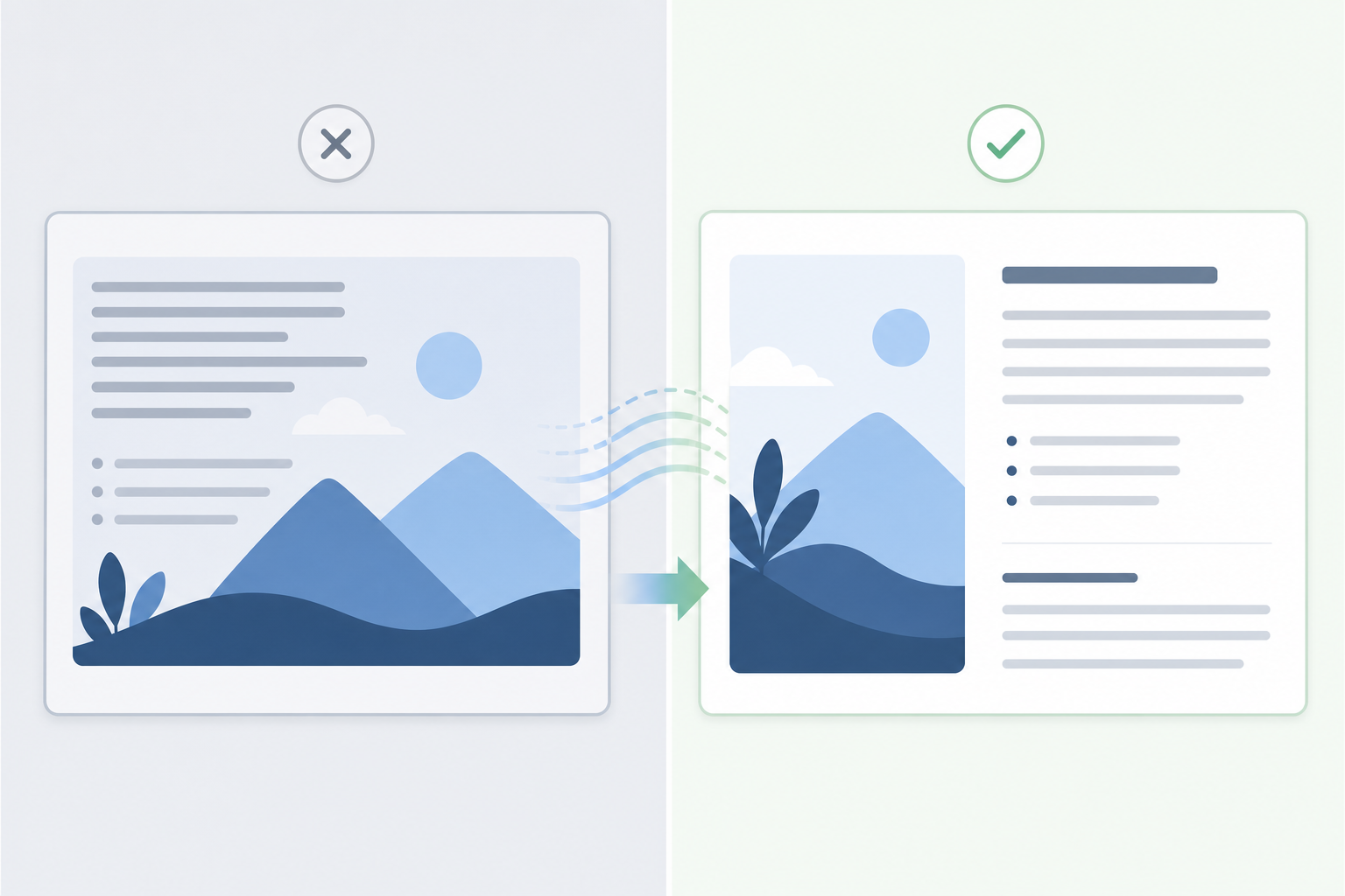
If the image contains a comparison, consider whether a real table would be clearer. Screenshots of tables are common in internal docs because they are easy to paste. They are also hard to read on mobile and hard to maintain. If the table drives a decision, rebuild it in markdown or HTML. Keep the screenshot only if the visual layout itself matters.
A simple rewrite checklist:
- Does the page say the same important thing as the image?
- Can the reader understand the task if the image fails to load?
- Can a screen reader user reach the same decision?
- Can the text be translated without editing the image?
- Can an editor update the wording without opening an image editor?
If the answer is no, move more meaning out of the image.
Choose the Right Alt Text Level
Alt text should describe the purpose of the image in context. It should not always describe every visible object. It should not be empty when the image carries meaning. It should not become a hidden article inside an attribute.
For image text audits, think in three alt text levels.
| Image role | Alt text approach | Example style |
|---|---|---|
| Decorative or redundant | Empty or minimal alt | Empty alt when the nearby text already covers it |
| Visual confirmation | Describe the state | Screenshot of the Billing page with the payment method section open |
| Essential visual information | Summarize the key meaning | Diagram showing uploaded images moving through OCR review, rewrite, and final publishing |
If an image contains a long quote, a multi-row table, or a complex decision tree, alt text alone is the wrong container. Put that content on the page. Use alt text to identify the image and summarize its purpose.
Avoid alt text like this:
- Screenshot showing settings.
- Image of dashboard.
- Diagram.
Those phrases are too vague. They do not explain why the image is present.
Also avoid alt text that tries to preserve every detail:
- Screenshot with left sidebar containing Overview, Team, Billing, Usage, Security, Integrations, and a main panel with a heading, three tabs, two buttons, and a warning banner...
That creates a noisy experience without necessarily helping the reader. Instead, write the surrounding page content well, then use focused alt text.
Fix the Image When Text Must Stay Inside It
Sometimes text has to remain inside the image. Product screenshots show real UI. Photos of labels, packaging, receipts, and forms may need to preserve text. In those cases, the task shifts from extraction to legibility.
A text-heavy image should survive three checks:
- It is readable at the published display size.
- It remains readable on mobile or has an alternate presentation.
- Compression does not blur thin strokes, small punctuation, or UI borders.
For screenshots, resize with care. If the source image is too large, shrinking it aggressively can turn small interface labels into texture. Use resize image to create a deliberate display size instead of letting the CMS or browser make every decision. If the screenshot will appear at 900 pixels wide in the article, export near that size or slightly above it. Do not upload a giant 4K screenshot and hope the layout handles it gracefully.
Compression needs the same discipline. A small file is useful only if the reader can still understand the image. Use compress image after checking the actual type of content. Photos can tolerate more compression than UI screenshots. Thin text, hairline borders, and code snippets need gentler settings.
If format conversion is part of your publishing pipeline, use convert image to standardize outputs intentionally. PNG may be better for crisp UI screenshots with flat colors. WebP can work well for many web images, but review the result at the final display size. JPEG can be fine for photos, but it is often harsh on small text and interface lines.
A practical rule: if the image is mostly text, test readability before celebrating file size.
Clean Up Annotations Without Hiding Meaning
Annotations are where documentation images often become messy. Arrows, circles, highlights, and labels can help readers focus, but they can also move important instructions into pixels.
Use visual annotations to point, not to explain everything. The explanation should usually live next to the image.
Better annotation habits:
- Use a single highlight for the relevant area instead of labeling every control.
- Keep arrows short and close to the target.
- Avoid small text labels inside the image when a bullet below the image would work.
- Do not place annotation text over dense UI text.
- Keep colors consistent so readers know what is being emphasized.
If an existing image has too much annotation text, you have two choices. You can remove the labels and rewrite them as page content, or you can keep the labels and add equivalent text nearby. The first option is usually cleaner.
For product teams using AI-assisted edits, the AI photo editor can be useful for removing distracting background elements, cleaning nonessential marks, or preparing a simpler visual. Use it carefully for documentation screenshots. Do not alter the actual product UI in a way that misrepresents the interface. AI cleanup is best for non-product photos, presentation images, or decorative assets where the exact interface state is not evidence.
When the image is a screenshot of a real workflow, accuracy matters more than polish.
Create a Replacement Plan for High-Risk Images
Not every issue deserves the same level of effort. Some images need a quick alt text improvement. Others should be replaced entirely.
Use a priority system so the audit does not become endless.
| Priority | Image condition | Recommended action |
|---|---|---|
| High | Critical instructions exist only in the image | Rewrite instructions as page content before publishing |
| High | Text becomes unreadable on mobile | Replace, crop, or provide a mobile-friendly alternative |
| Medium | Useful labels exist only in annotations | Move labels into nearby prose or captions |
| Medium | Screenshot is visually accurate but too large or blurry | Resize, re-export, and compress carefully |
| Low | Incidental interface text appears in screenshot | Leave as is if surrounding content is clear |
| Low | Decorative text has no task meaning | Leave or simplify during future refresh |
High-risk images usually appear in onboarding, billing, security, compliance, installation, account recovery, and troubleshooting documentation. If a reader makes a mistake in those flows, the cost is higher. Start there.
Low-risk images are often in announcement posts, feature overviews, or marketing-adjacent articles where the page text already carries the message. You can still improve them, but they should not block urgent publication unless they create obvious confusion.
Design Mobile-Friendly Screenshot Alternatives
Many accessibility issues become obvious only on small screens. A desktop screenshot with embedded labels may look acceptable in the editor preview, then become unreadable on a phone.
For mobile-friendly documentation, do not assume one image can do every job. Consider these alternatives:
- Crop tightly around the relevant UI area.
- Split one large screenshot into two focused images.
- Replace a full-page screenshot with a smaller detail screenshot.
- Move explanatory labels into the article text.
- Use a real ordered list instead of step numbers baked into the image.
- Provide a short text summary before a complex diagram.
Cropping is often the fastest improvement. A full dashboard screenshot may include navigation, empty panels, sample data, and footer content that the reader does not need. Crop to the relevant control or state. Then describe the path in text.
If you crop, preserve enough context. A screenshot of a single button with no surrounding UI may be too ambiguous. The reader should know where they are and what action matters.
A good mobile screenshot has a clear subject, limited visual noise, and no critical micro-text that requires pinching to read.
Add a Pre-Publish Image Text Checklist
The best audit is the one that happens before publication, not three months later. Add a short image text check to your editorial workflow.
Before publishing a documentation article, ask:
- Does every meaningful image have useful alt text?
- Does the article repeat critical image text as real content?
- Are long notes, warnings, and tables outside the image?
- Are screenshots readable at mobile width?
- Are annotations pointing to content rather than replacing prose?
- Has OCR been used on dense screenshots or scanned assets?
- Are image files resized and compressed without damaging text?
- Is the source file or editable version stored where the team can update it?
This checklist should live where writers already work: the pull request template, CMS checklist, editorial issue, or documentation review board. Keep it short enough that people use it.
For larger teams, add one reviewer role: image text reviewer. This does not need to be a separate person forever. It can rotate. The reviewer checks only whether meaningful image text is accessible, readable, and maintainable. A narrow role gets better results than asking someone to generally check accessibility without a clear scope.
Example: Turning a Text-Heavy Screenshot Into Accessible Documentation
Imagine a support article that explains how to export a usage report. The original article has one large screenshot with three red labels:
- Choose the Usage tab.
- Select the date range.
- Click Export CSV.
The screenshot also includes a warning banner that says exports may include personal data. On desktop, the image is readable. On mobile, the warning banner is tiny. The alt text says: Screenshot of usage report export.
Here is the improved workflow.
First, extract the screenshot text with OCR. The output confirms that the labels and warning are meaningful. The warning is especially important because it affects user behavior.
Second, rewrite the instructions as real page content:
- Open the Usage tab.
- Select the date range for the report.
- Review whether the export may include personal data before downloading it.
- Select Export CSV.
Third, replace the large screenshot with a tighter crop around the date range and export controls. Remove the red labels because the steps now explain the labels. Keep one subtle highlight around the export area if needed.
Fourth, update the alt text:
- Usage report screen with the date range controls and export button visible.
Fifth, resize and compress the image while checking that the button and date controls remain readable.
The result is better for everyone. Screen reader users get the warning. Mobile readers do not have to zoom into a giant screenshot. Translators can translate the warning. Editors can update the wording without editing the image.
Where ConvertAndEdit Fits in the Workflow
A practical image text audit uses several small tools rather than one heavy production system.
Use image OCR when you need to discover text inside screenshots, scanned pages, diagrams, or uploaded visual assets. Use it early, before rewriting, so the writer can decide what belongs in the article.
Use resize image when screenshots need a predictable display size. This is especially useful before uploading images into a CMS that may generate multiple versions.
Use compress image after resizing, then review the actual result. For text-heavy screenshots, choose readability over extreme compression.
Use convert image when standardizing image formats for a documentation library. A clean format policy reduces random exports and makes future maintenance easier.
Use ai photo editor selectively for cleanup tasks on non-evidentiary visuals, such as removing distractions from illustrative images or preparing cleaner editorial assets. Avoid using it to change product screenshots in ways that could mislead readers.
The workflow is simple: extract meaning, rewrite meaning, improve the visual, then publish the image as support rather than the only source of truth.
A Maintainable Standard for Documentation Teams
Image text accessibility is not a one-time cleanup project. It is a publishing habit. The standard does not have to be complicated: meaningful text should be available as real content, images should remain readable at their final size, and alt text should explain the image's purpose.
That standard helps more than accessibility alone. It makes documentation easier to search, translate, update, compress, reuse, and review. It also helps writers think more clearly about what each image is doing. Is the screenshot evidence? Is it orientation? Is it decoration? Is it carrying instructions that should really be in the article?
When teams answer those questions before publishing, they produce documentation that holds up better across devices, readers, languages, and future product changes. Screenshots and diagrams still matter. They simply stop carrying more responsibility than an image should carry.