Marketplace Thumbnail Transparency: A Practical Edge Cleanup Workflow for Product Teams
A niche workflow for cleaning transparent product thumbnails before marketplace upload, with export choices, edge checks, compression steps, and QA habits.
Marketplace Thumbnail Transparency: A Practical Edge Cleanup Workflow for Product Teams
Transparent product thumbnails look simple when they are finished well. The item appears clean, centered, and ready for a marketplace grid. The background disappears. The product shape reads clearly at small sizes. Nothing distracts from the buying decision.
Getting there is less simple.
Small ecommerce teams, marketplace operators, catalog managers, and content assistants often inherit product images from many sources: phone photos, manufacturer assets, supplier screenshots, old catalog exports, and quick designer edits. A thumbnail may technically have transparency, yet still look wrong when it lands on a marketplace page. The usual issues are not dramatic. They are thin halos, clipped corners, gray fuzz around fabric, jagged diagonal lines, soft shadows that disappear on dark mode, or products that shrink too much inside the frame.
This guide is a practical workflow for preparing transparent product thumbnails before upload. It focuses on edge cleanup, export hygiene, and repeatable checks rather than advanced retouching. The goal is not to turn every team member into a photo editor. The goal is to make transparent assets consistent enough that a marketplace catalog looks intentional.
Why Transparent Thumbnails Fail in Real Catalogs
Transparent-background images fail because they are judged in contexts the editor never previewed.
A product might look clean on a white canvas but show a pale outline on a dark marketplace card. A black shoe may look crisp on a checkerboard background but lose its sole detail when displayed on a charcoal product grid. A kitchen tool may be cropped neatly, but once the marketplace template adds padding, the item appears smaller than competing listings.
The problem gets worse when a catalog uses many asset sources. One supplier sends high-resolution PNGs. Another sends JPEGs on white backgrounds. A third sends transparent files with shadows already baked in. A content team then resizes, compresses, converts, and uploads everything under deadline pressure. Without a shared standard, the catalog becomes visually noisy.
Transparent thumbnails need a workflow because transparency is not a single edit. It is a chain of decisions:
- How much empty space should surround the product?
- Which edge pixels should remain semi-transparent?
- Should the shadow be included, rebuilt, softened, or removed?
- Which export format should be used for the marketplace?
- How small can the file become before edges begin to suffer?
- How should the image be checked against light, dark, and tinted backgrounds?
A good process answers those questions before upload.
The Edge Problems That Make Product Images Look Cheap
Most thumbnail quality problems live in the outer two to eight pixels of the product shape. At normal editing zoom, they are easy to miss. In a marketplace grid, they become visible because every product sits beside many other products.
Light Halos
A light halo appears when a product was cut out from a white or pale background and the edge pixels still contain leftover background color. This is common around hair, fabric, glass, white packaging, and reflective products.
The image may look acceptable on a white page. Then the same thumbnail appears on a gray card, black mobile interface, or colored seasonal campaign page, and the outline becomes obvious.
Light halos are especially risky for marketplaces that use hover states, dark mode, category badges, or dynamic ad placements. The asset is no longer always displayed on white.
Dark Fringing
Dark fringing is the opposite problem. It often appears when a product was photographed on a dark surface, extracted with a rough selection, or sharpened too aggressively after background removal.
Dark edges can make clean products look dirty. On pale marketplace backgrounds, the fringe may read like a thin outline that was added by mistake. This is most noticeable around white bottles, pale apparel, stationery, cosmetics, and ceramic products.
Jagged Diagonals and Stair-Stepping
Jagged edges happen when a cutout is made at low resolution, resized poorly, or exported with too little anti-aliasing. Diagonal product lines, round lids, handles, straps, and curved packaging suffer first.
A jagged edge does not only look unpolished. It can also make the product feel lower quality. Buyers may not consciously identify the pixel problem, but they notice the asset feels rough compared with nearby listings.
Dirty Semi-Transparent Pixels
Some pixels at a product edge should be semi-transparent. That is how soft edges, shadows, glass, and fabric fuzz remain natural. The problem is that semi-transparent pixels can carry unwanted color from the old background.
This creates a muddy edge. It is difficult to see on the original canvas but becomes obvious during background changes. The result is a product that appears to have a faint cloud around it.
Shadow Mismatch
Shadows help products feel grounded, but inconsistent shadows can damage a catalog quickly. One product has a soft gray oval. Another has a hard studio shadow. A third has no shadow at all. A fourth has a shadow clipped at the crop boundary.
For marketplace thumbnails, consistency usually matters more than realism. If shadows are used, they should be subtle, similar in direction, and not so large that they reduce usable product size.
Decide the Thumbnail Standard Before Editing
Before cleaning edges, define the standard. This keeps the workflow from becoming subjective.
A basic marketplace thumbnail standard can be simple:
| Decision | Recommended Standard | Why It Matters |
|---|---|---|
| Canvas shape | Square unless marketplace requires another ratio | Keeps grids aligned and predictable |
| Product scale | Product fills 75-88% of the shorter dimension | Prevents tiny listings and clipped items |
| Background | Transparent master, previewed on light and dark fills | Avoids hidden halos |
| Shadow | Either none or one subtle shared style | Keeps catalog consistent |
| Master format | PNG or source editor file | Preserves transparency while editing |
| Delivery format | PNG or WebP, based on platform support | Balances quality and file size |
| Minimum preview sizes | 64 px, 160 px, 320 px, and marketplace card size | Catches problems buyers actually see |
The exact numbers can change. The important part is that your team chooses them once and applies them repeatedly.
For product catalogs, avoid judging only the full-size image. A thumbnail may look excellent at 2000 px and unclear at 180 px. Marketplace images must survive small sizes.
Start With a Clean Working Master
The working master should preserve the most information possible. If you receive a large PNG with transparency, keep that as the base. If you receive a JPEG on a plain background, remove the background first, then save a transparent working file before resizing or compressing.
Avoid doing cleanup after heavy compression. Compression artifacts can attach themselves to edges, making the cleanup harder. The better order is:
- Start from the largest usable source.
- Remove or refine the background.
- Clean the edge and shadow.
- Set crop and padding.
- Resize for delivery.
- Compress the final export.
If the source needs background removal or light object retouching, an editor like the AI Photo Editor can help with the early cleanup stage. For precise catalog consistency, still inspect the output manually afterward. Automated edits are useful, but marketplace thumbnails need deliberate QA.
A Repeatable Cleanup Workflow
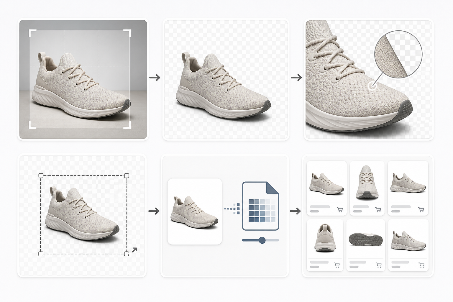
The following workflow is designed for teams that need consistency without building a heavy design production system.
Step 1: Place the Product on Test Backgrounds
Do not edit on a checkerboard only. A transparency grid tells you where transparency exists, but it does not reveal every edge problem.
Preview the product on at least three backgrounds:
- White or near-white
- Dark charcoal or black
- Mid-gray or muted brand color
These backgrounds expose different defects. Light backgrounds reveal dark fringes. Dark backgrounds reveal pale halos. Mid-tone backgrounds reveal muddy semi-transparent pixels.
If your marketplace uses both light and dark interface surfaces, make those preview colors part of the standard. If your products appear in ads, email modules, or partner feeds, include those common background colors too.
Step 2: Inspect at Buyer Sizes
Zooming in is useful for repair, but final judgment should happen at real display sizes.
Export or preview the product at the sizes buyers see most often:
- Tiny grid thumbnail
- Standard listing card
- Product recommendation module
- Mobile search result
- Larger product detail preview
At small sizes, edge defects are not the only issue. Product scale becomes important. A necklace, cable, pen, or pair of glasses may need different padding than a box or bottle. The goal is not identical object area. The goal is consistent visual weight.
A practical rule: compare each edited image beside five existing good thumbnails from the same category. If it looks too small, too soft, too sharp, or too isolated, adjust before upload.
Step 3: Remove Obvious Background Contamination
For light halos, the fix is usually not to erase aggressively. Over-erasing creates a clipped, sticker-like product. Instead, reduce contamination around the edge.
Common fixes include:
- Slightly contracting the selection before background removal
- Defringing or decontaminating edge color in an image editor
- Painting low-opacity edge corrections on a clipped layer
- Rebuilding difficult edge areas from the product color rather than the old background
- Removing isolated semi-transparent specks outside the product silhouette
For simple format preparation, you can convert source files through Convert Image after cleanup, but do not rely on conversion alone to fix dirty edge pixels. Format conversion preserves many existing edge choices. Cleanup must happen before final delivery.
Step 4: Normalize Crop and Padding
A transparent image can contain a large amount of invisible empty space. That empty space affects how the product appears in grids.
Two thumbnails with the same pixel dimensions can feel completely different if one product fills the canvas and another sits in the center with huge padding. This is a common reason marketplace pages look inconsistent even when every file is technically the same size.
Use a category-based padding rule:
| Product Type | Suggested Visual Fill | Notes |
|---|---|---|
| Boxes and bottles | 78-88% | Usually stable and easy to align |
| Apparel | 72-84% | Leave room for natural silhouette variation |
| Jewelry and thin objects | 65-78% | Avoid making delicate objects feel cramped |
| Tools and angled objects | 70-84% | Watch diagonal corners and handles |
| Bundles and kits | 75-86% | Keep group edges readable |
If your source image is too large or oddly framed, resize and crop after edge cleanup. A browser tool like Resize Image is useful when you need quick, consistent output dimensions for a batch of prepared assets.
Step 5: Decide Whether the Shadow Belongs
Shadows are a catalog policy decision, not a file accident.
Use no shadow when the marketplace demands a clean technical image, when products must sit on many background colors, or when supplier assets are too inconsistent to normalize quickly.
Use a subtle shadow when products otherwise feel like floating cutouts and the marketplace layout stays on a predictable light background. Keep shadows soft, low contrast, and safely inside the canvas.
Avoid keeping original photo shadows unless they are consistent across the set. A real shadow from a supplier photo may contain background texture, color cast, or clipping. That can look worse than no shadow.
For transparent masters, consider storing shadow and product as separate layers if your production process supports it. That gives you a cleaner path when a marketplace later changes its card design.
Format Choices: PNG, WebP, and JPEG
Transparent marketplace thumbnails usually come down to PNG or WebP. JPEG does not support transparency, so it is only appropriate when the background is intentionally flattened.
PNG
PNG is the conservative choice for transparent product thumbnails. It supports full alpha transparency and is widely accepted by marketplaces, CMS tools, and feed systems.
Use PNG when:
- The marketplace specifically requests PNG
- The asset has sharp edges, text on packaging, or UI-like details
- Compatibility matters more than file size
- You need a clean transparent master
The downside is file size. Large transparent PNGs can become heavy, especially for catalogs with thousands of products.
WebP
WebP can support transparency and often creates smaller files than PNG. It is useful for web storefronts, internal catalogs, and performance-conscious product grids where platform support is known.
Use WebP when:
- Your storefront or CMS supports it reliably
- You control the delivery environment
- You need lighter product grids
- You have already checked edge quality after conversion
When converting transparent PNG to WebP, inspect the result on test backgrounds. Smaller files are useful only if the transparent edges still look clean. A tool like Compress Image can help reduce delivery weight after you have settled the final dimensions and format.
JPEG
JPEG can be fine for product photos on a fixed background, but it is not a transparency format. Use it only when the marketplace wants a white or colored background baked into the image.
If you flatten to JPEG, choose the background deliberately. Do not let a tool default to black, white, or transparent-to-white without checking how the final image sits in the marketplace layout.
Compression Without Damaging Edges
Compression should be the last major step. If you compress early, then resize, then edit, then export again, you increase the chance of artifacts around edges and packaging details.
A simple compression QA process works well:
- Keep an uncompressed or lightly compressed master.
- Export the delivery size.
- Compress a copy.
- Compare compressed and uncompressed versions on light and dark backgrounds.
- Check the smallest real display size.
- Upload only after the compressed copy still passes edge inspection.
Watch for these compression failures:
- Edge pixels become crunchy or blocky
- Fine product labels blur too much
- Semi-transparent shadows band or posterize
- Small reflective details become noisy
- Transparent areas gain unexpected artifacts
Compression settings should vary by product type. A matte cardboard box may tolerate more compression than jewelry, cosmetics, glassware, or electronics with small ports and labels.
Naming and Version Control for Asset Handoffs
Transparent thumbnail cleanup often involves more than one person. A content assistant may prepare the source. A designer may fix edge problems. A marketplace manager may upload final files. Without file naming discipline, the wrong version gets published.
Use names that communicate state:
sku-1234-source.jpgsku-1234-cutout-master.pngsku-1234-thumb-1200.pngsku-1234-thumb-1200-compressed.webpsku-1234-marketplace-final.png
Avoid vague names like final.png, final2.png, or new-fixed-final.png. They slow down review and create upload mistakes.
If a product has multiple marketplace destinations, include the destination:
sku-1234-amazon-main.pngsku-1234-shopify-card.webpsku-1234-partner-feed.png
This matters because each destination may have different rules for canvas size, background, compression, or padding.
Quality Checklist Before Upload
Use a short checklist at the end of every thumbnail pass. It should be fast enough that people actually use it.
| Check | Pass Criteria |
|---|---|
| Transparency | No unwanted background blocks, specks, or filled corners |
| Light background preview | No dark fringe or dirty outline |
| Dark background preview | No pale halo or cutout residue |
| Mid-tone preview | Semi-transparent pixels look natural |
| Crop | Product is centered and not clipped |
| Padding | Visual size matches nearby category thumbnails |
| Shadow | Shadow style is intentional and consistent |
| Small-size preview | Product remains recognizable in grid view |
| Format | Matches marketplace or storefront requirements |
| File size | Compressed enough for delivery without visible damage |
| Filename | Includes SKU, use case, size, and final state |
For teams publishing many images, this checklist should live near the upload process. The closer it is to the final action, the more likely it is to prevent mistakes.
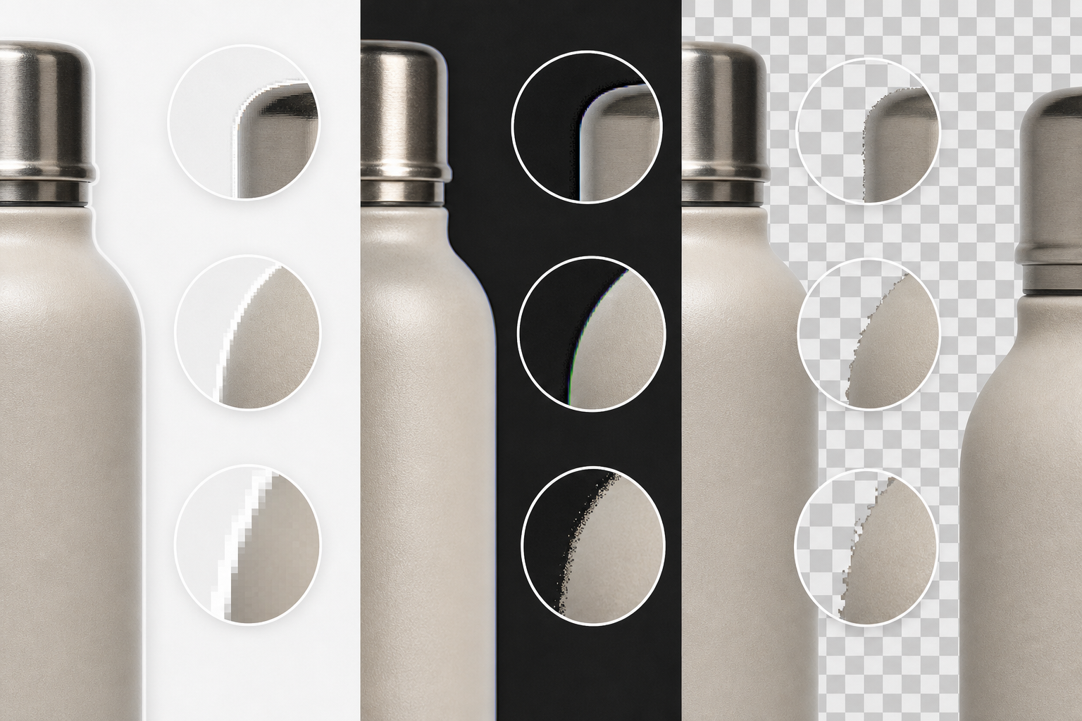
Example Workflow: Cleaning a Supplier Product PNG
Imagine a supplier sends a transparent PNG of a stainless steel water bottle. It looks clean at first glance. The marketplace team uploads it, but the bottle has a faint white glow around the cap on a gray product card.
A better workflow would look like this:
- Open the supplier PNG as the working file.
- Preview it on white, charcoal, and marketplace gray backgrounds.
- Identify the pale halo around the cap and shoulder.
- Clean the contaminated edge pixels without clipping the bottle shape.
- Check the reflection area to avoid flattening important highlights.
- Normalize the crop so the bottle fills about 82% of the canvas height.
- Export a 1200 x 1200 PNG for the marketplace master.
- Create a WebP delivery version if the storefront supports it.
- Compress the delivery copy and compare edge quality.
- Save with a destination-specific filename.
This is not a complicated retouching job. It is a controlled asset preparation pass. The value comes from catching the edge issue before it appears beside hundreds of other products.
Example Workflow: Turning a White-Background JPEG Into a Transparent Thumbnail
Now imagine a small brand has only a JPEG product photo on a white background. The product is a white ceramic mug with a printed logo. This is a harder case because the product and background share similar tones.
The workflow should be more cautious:
- Start from the highest-resolution JPEG available.
- Remove the background while preserving the mug handle and rim.
- Place the cutout on dark gray immediately to inspect white edge loss.
- Rebuild any over-erased rim areas before resizing.
- Remove stray white islands inside the handle opening.
- Decide whether the mug needs a subtle shared shadow or no shadow.
- Set square crop and consistent padding.
- Export a PNG master with transparency.
- Create marketplace-specific delivery copies.
- Compress only after the final dimensions are correct.
White-on-white extraction is where teams often damage product shape. The fastest background removal is not always the best final asset. The edge inspection step protects the product from looking melted, clipped, or artificially outlined.
When to Flatten Instead of Keeping Transparency
Transparency is useful, but it is not always the right delivery choice.
Flatten the image onto a fixed background when the destination requires it, when the marketplace applies unpredictable processing to transparent files, or when shadows and transparent edges create more inconsistency than value.
For example, a partner feed may convert all uploaded images to JPEG anyway. In that case, a carefully flattened white-background JPEG may be more predictable than a transparent PNG that gets flattened automatically by the platform.
When flattening, make the background choice explicit. Use the marketplace's required white, off-white, or brand-safe color. Then check the edge one more time after flattening. A product that looked clean with transparency may reveal a fringe once merged with a solid background.
Building a Small Team Workflow
A practical team setup does not need to be complex. It needs clear roles and a stable order of operations.
A lightweight workflow can be divided like this:
| Role | Responsibility |
|---|---|
| Source collector | Finds highest-quality supplier or internal image |
| Editor | Removes background, cleans edge, normalizes crop |
| Reviewer | Checks test backgrounds, small sizes, and category fit |
| Publisher | Uploads correct destination file and confirms display |
For very small teams, one person may do every role. Still, separating the responsibilities on paper helps prevent skipped checks.
The most important rule is to keep the master separate from the delivery copy. The master should remain high quality and editable. The delivery copy can be resized, converted, and compressed for the platform.
ConvertAndEdit tools can fit into this kind of lightweight production path. Use AI Photo Editor when source cleanup is needed, Resize Image for consistent dimensions, Convert Image for format preparation, and Compress Image for final delivery weight. The key is the order: clean first, resize second, compress last.
Common Mistakes to Avoid
The first mistake is trusting transparency because the checkerboard looks clean. Always preview on actual background colors.
The second mistake is cropping too loosely. Invisible padding still affects how large the product appears in a grid.
The third mistake is mixing shadow styles across a category. One inconsistent shadow can make a listing look imported from another catalog.
The fourth mistake is exporting only one final file for every destination. Marketplaces, storefronts, ads, and partner feeds may need different dimensions or formats.
The fifth mistake is compressing the only good copy. Always keep a master that can be reopened, adjusted, and exported again.
The sixth mistake is ignoring small previews. Buyers often meet the product first as a small card, not as a full product-detail image.
Final Asset Standard Template
Here is a simple standard your team can adapt:
| Setting | Standard |
|---|---|
| Master file | Transparent PNG at highest practical resolution |
| Delivery file | PNG unless WebP is supported and approved |
| Canvas | Square, platform-required dimensions |
| Padding | Category-based visual fill between 70% and 88% |
| Background QA | White, charcoal, marketplace gray |
| Shadow | None by default, subtle shared style when needed |
| Compression | Applied only to delivery copy |
| Filename | SKU plus destination, size, and final state |
| Review | Compare beside five approved category thumbnails |
This template keeps the work grounded. It turns subjective thumbnail polish into a repeatable publishing habit.
A Cleaner Catalog Comes From Small Edge Decisions
Transparent marketplace thumbnails rarely fail because of one huge editing mistake. They fail because small edge decisions are made inconsistently across many files.
A clean catalog does not require heavy software or a long approval chain. It requires a reliable order: start from the best source, clean the edge before resizing, preview on real backgrounds, normalize crop and padding, choose the right format, compress at the end, and keep the master intact.
When teams treat transparency as a production workflow instead of a one-click background removal task, product grids become calmer and more trustworthy. Buyers can compare items without visual noise. Publishers spend less time re-exporting emergency fixes. Designers are not pulled into the same preventable corrections every week.
The edge pixels are small, but in a marketplace grid they carry a surprising amount of trust.

