Muted Product Demo Subtitles for Landing Pages: A Practical Burn-In Guide
A practical guide for preparing readable burned-in subtitles on short product demo videos used in landing pages, help docs, launch posts, and ads.
Muted Product Demo Subtitles for Landing Pages: A Practical Burn-In Guide
Short product demo videos are often watched in the least forgiving conditions: muted, embedded above the fold, compressed by a CMS, cropped inside a responsive layout, and skimmed by someone who has not yet decided whether the product matters. In that setting, subtitles are not a nice extra. They are part of the interface.
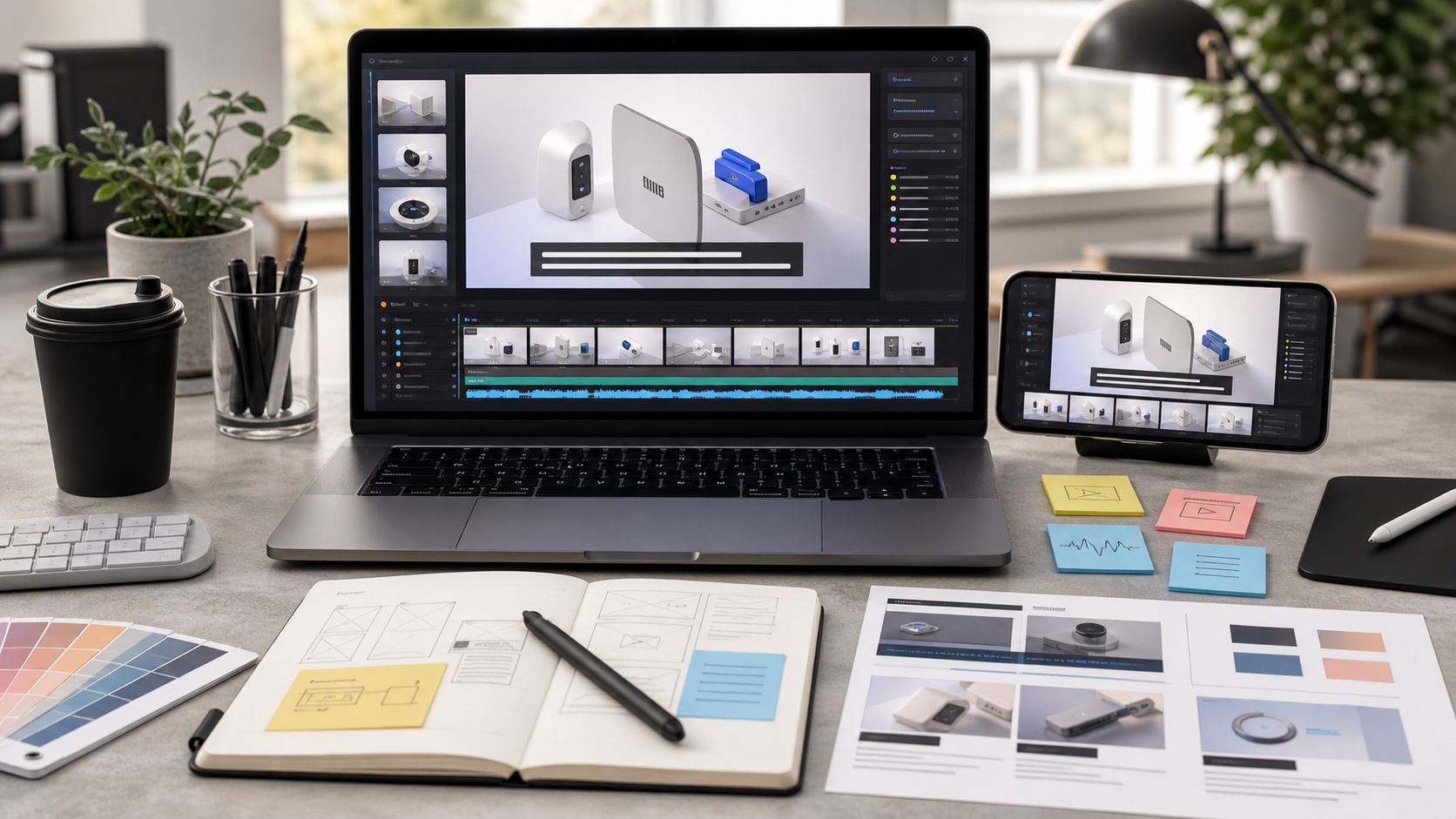
For landing pages, launch posts, help centers, and feature announcement pages, burned-in subtitles can be the most reliable way to keep a demo understandable. They travel with the video file, survive most embeds, and remain visible even when the player controls are hidden. The tradeoff is that burned-in captions are permanent. If they are too small, too low, too long, or too close to busy UI, the entire video feels less polished.
This guide focuses on a narrow but common need: preparing subtitles for short muted product demo videos, especially screen recordings and product UI clips. The goal is not cinematic captioning. The goal is readable, compressed, responsive, landing-page-safe subtitles that help visitors understand a product in seconds.
When Burned-In Subtitles Make Sense
Burned-in subtitles are captions rendered directly into the video pixels. They are different from selectable caption tracks such as WebVTT or SRT files. On a website, caption tracks are often better for accessibility because users can toggle them, customize them, and screen readers or assistive technologies may handle them more predictably. But for short marketing and education clips, burned-in subtitles solve a different problem: visibility under uncertain playback conditions.
Use burned-in subtitles when the video is likely to autoplay muted, appear inside a custom player, be republished on multiple platforms, or be embedded where caption track support is inconsistent. They are also useful when the subtitle text is part of the visual pacing, such as a product tour that relies on short explanatory lines rather than a full voiceover transcript.
Do not treat burned-in subtitles as a complete accessibility replacement. If the video contains meaningful speech, provide a proper caption track or transcript when your publishing environment supports it. Burned-in text helps many viewers, but it is still fixed visual text.
A practical rule: burn in concise explanatory subtitles for scannability, then keep a fuller transcript or caption file available for accessibility and search where possible.
The Landing Page Problem
A demo that looks excellent in an editor can fail once it reaches a real page. Landing pages create several pressure points.
The first is scale. A 1920 by 1080 export may be shown at 640 pixels wide on a laptop column, then at 360 pixels wide on a phone. Thin subtitle text that looked tasteful in the editor can become unreadable after responsive scaling.
The second is visual competition. Product demos usually show detailed UI: sidebars, charts, tables, modal windows, badges, menus, and cursor movement. Subtitles compete with all of that. If the text sits directly over a busy dashboard, viewers must choose between reading the caption and watching the action.
The third is compression. Upload tools, CMS platforms, social previews, and performance plugins may recompress video. Small text suffers quickly. Fine strokes, low contrast, and semi-transparent backgrounds are vulnerable.
The fourth is cropping. A hero video may be center-cropped on mobile, masked by rounded containers, or partially hidden behind sticky page elements. Captions placed too close to the bottom edge may disappear behind controls, cookie bars, or browser UI.
Good subtitle preparation accounts for all four before export.
Subtitle Readability Starts Before Export
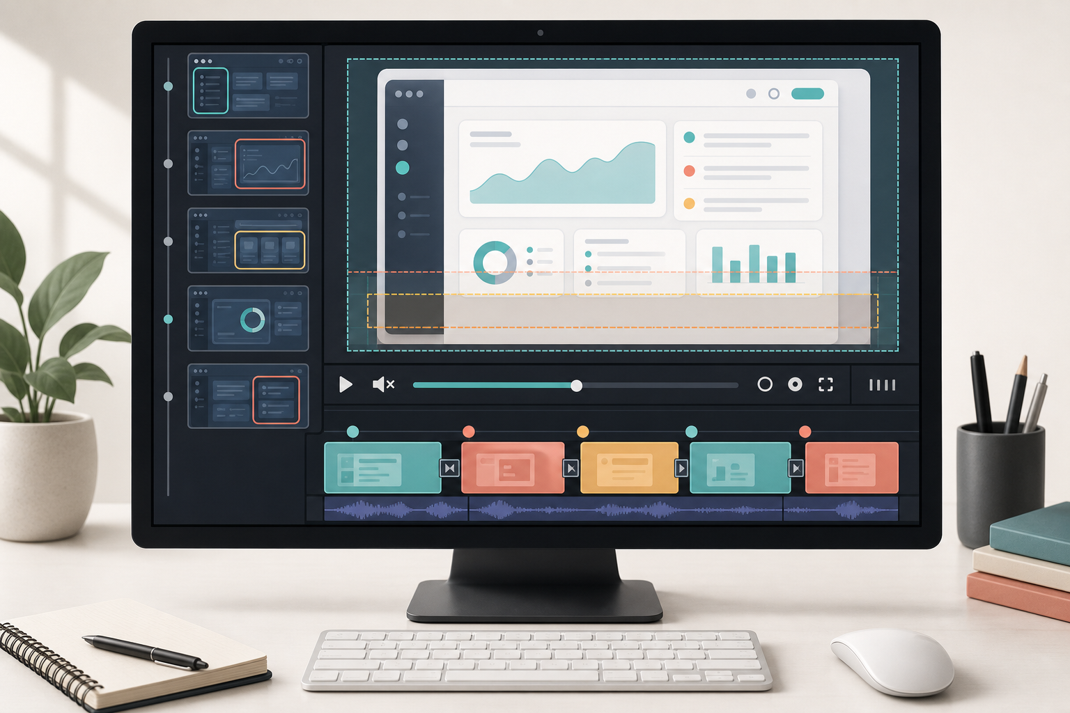
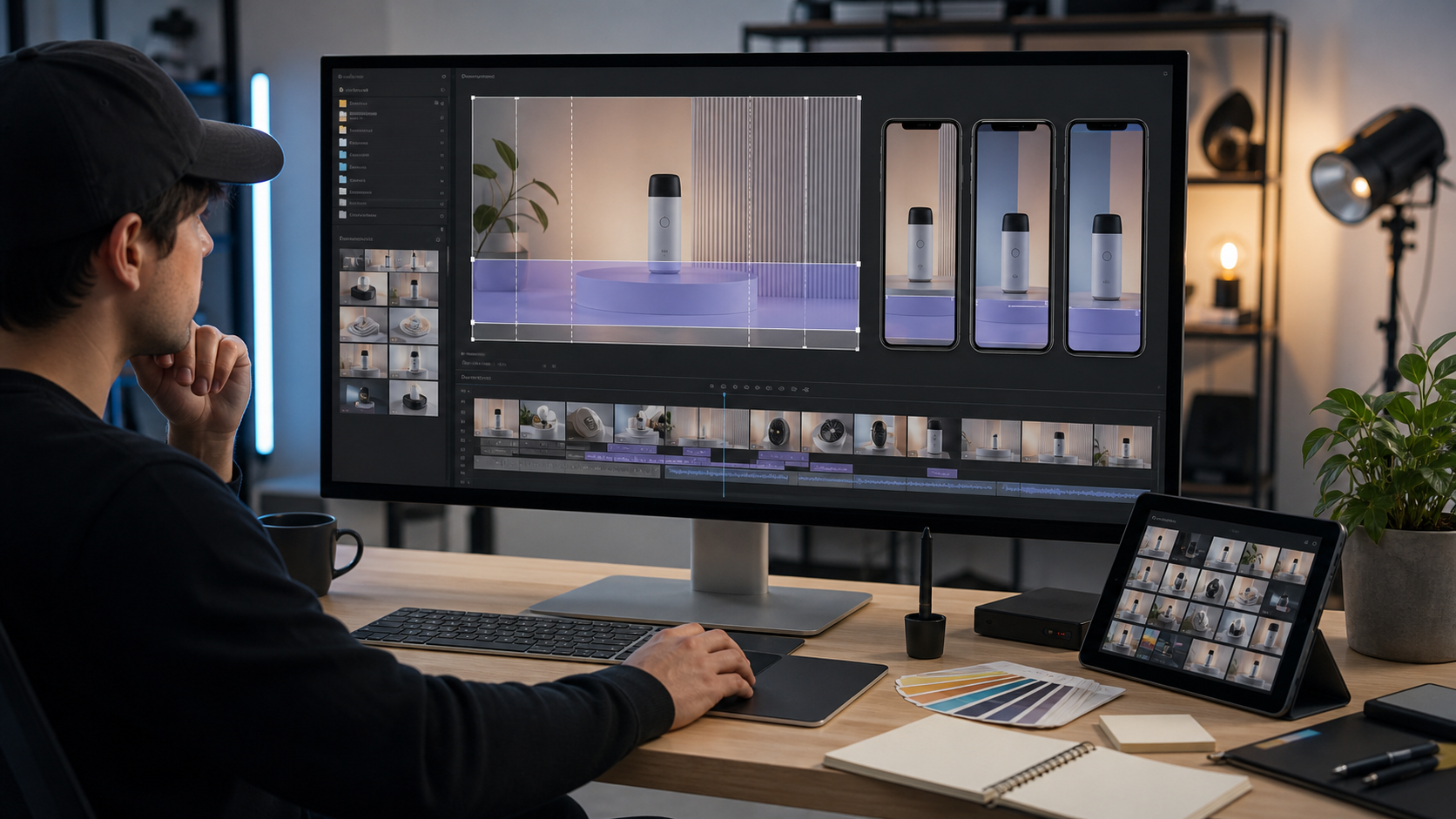
The easiest caption problems to fix are the ones you catch before rendering. Start by watching the demo muted at a small size. Do not judge the captions in a full-screen editor preview. Shrink the preview window until it approximates a real embed. If the video will sit in a two-column hero, test it at that width. If it will be used in docs, test it inside a content column.
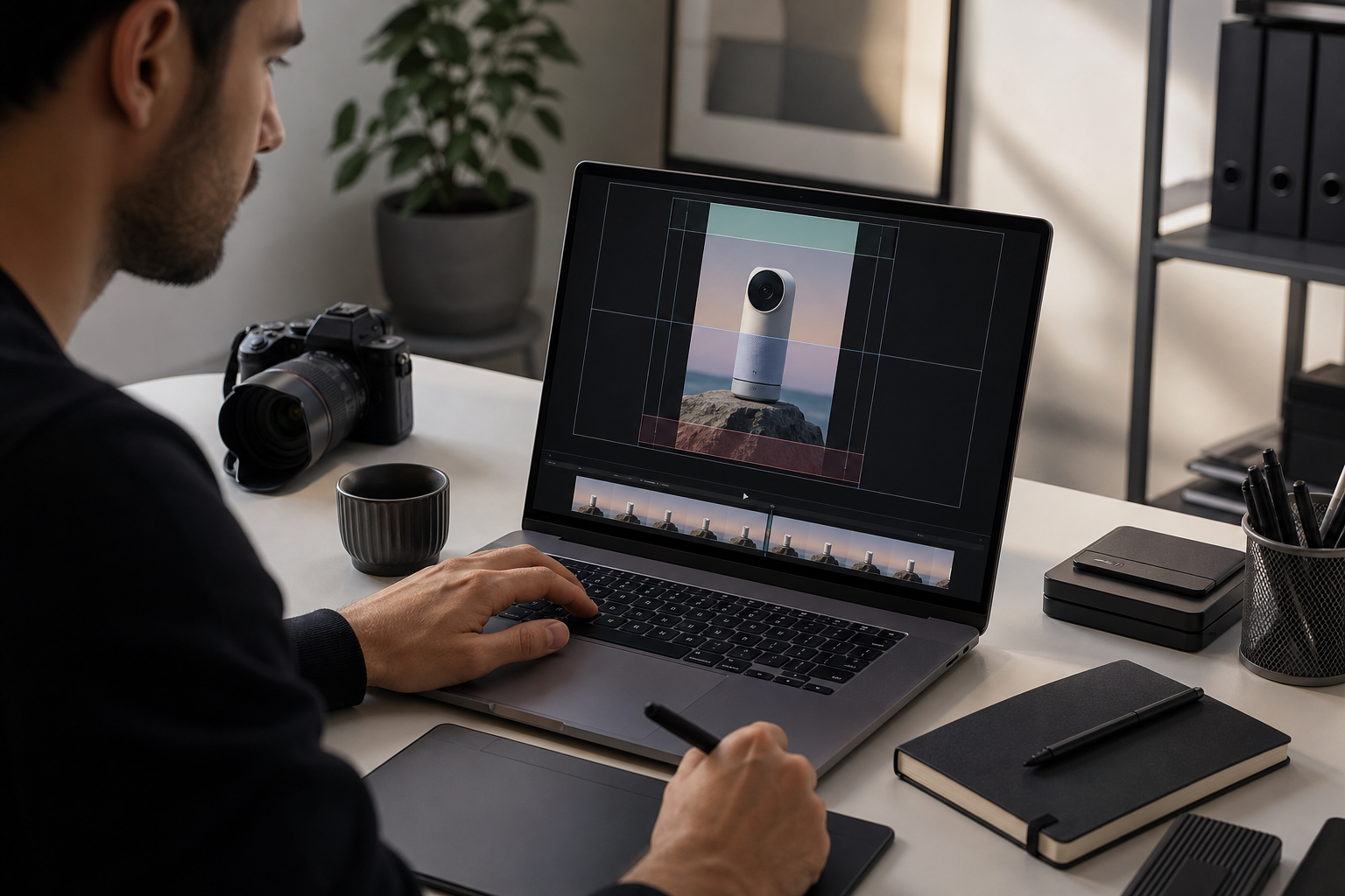
For product UI clips, subtitles should usually sit in a deliberate safe area rather than float wherever space happens to be available. A safe area is a region where important text is unlikely to collide with key UI elements, player controls, or responsive crop. For most horizontal videos, a lower-third placement works, but it needs enough padding from the bottom edge. For vertical or square videos, the safe area may need to move higher because mobile players often place controls and gestures near the bottom.
If the product interface has important information at the bottom, such as a command bar, chat input, spreadsheet rows, or timeline, consider placing subtitles near the top. Top captions can feel unusual, but they are better than covering the exact feature the viewer is supposed to understand.
Before adding subtitles, clean up the video frame itself. Crop away irrelevant browser chrome, resize to the intended aspect ratio, and remove empty space that forces the useful UI to appear too small. If you are preparing supporting images for the same page, tools like resize image, compress image, and convert image can help keep the visual system consistent across screenshots, thumbnails, and preview cards.
Caption Text That Works Without Sound
Burned-in subtitles for a landing page should not always be a literal transcript. A transcript captures what was said. A landing-page subtitle explains what the viewer needs to notice.
For example, a spoken voiceover might say: "Now we are going to open the settings panel and choose the default approval rule for invoices from this vendor." A better burned-in subtitle for a short demo might be: "Set a default approval rule for this vendor." It is shorter, more direct, and easier to read while watching the cursor action.
Aim for one idea per subtitle. Avoid stacking multiple clauses in a single caption. A viewer should be able to read the line, understand it, and return attention to the product movement in less than two seconds.
Good landing-page subtitles often use active verbs:
- "Import the CSV."
- "Match the columns."
- "Preview the changes."
- "Send the review link."
- "Export the final PDF."
Poor landing-page subtitles often explain the interface in a way the video already shows:
- "Here you can see that the user is clicking the blue button."
- "This screen shows the dashboard with different options."
- "The next step is something you may want to do after setup."
The text should add meaning, not narrate every visible movement.
Timing Rules for Short Demos
Timing is where many demo subtitles become tiring. If captions change too fast, the viewer chases text. If they linger too long, the video feels slow or the caption describes something that has already passed.
For short product demos, use these timing guidelines:
| Situation | Recommended timing | Why it works |
|---|---|---|
| One short action label | 1.5 to 2.5 seconds | Enough time to read without dragging |
| One explanatory sentence | 2.5 to 4 seconds | Gives room for comprehension |
| Dense setup or context | 4 to 5 seconds | Use rarely, usually near the start |
| Fast UI sequence | Fewer captions | Let the motion carry simple actions |
| Important result screen | Slightly longer hold | Gives the viewer time to connect cause and effect |
Keep caption changes aligned with visual events. If the subtitle says "Approve the request," it should appear before or as the approval action happens, not after the viewer has already watched it. For result captions, let the viewer see the outcome for a beat. A caption like "The client receives a share link" works best when the share confirmation or recipient view is visible.
Avoid rapid subtitle flicker. Two short captions in one second may technically be readable frame by frame, but they feel frantic in a landing-page embed. If the demo contains a fast series of clicks, summarize the sequence with one caption instead of labeling every click.
Design Specs for Burned-In Subtitles
Subtitle styling should be boring in the best way: readable, stable, and unambiguous. The text is there to serve the demo.
For most product videos, use a clean sans-serif typeface with medium or semibold weight. Avoid ultra-light fonts, condensed fonts, decorative fonts, and all-caps paragraphs. Sentence case is usually easier to read than title case.
A strong baseline spec for horizontal product demos is:
| Element | Practical starting point |
|---|---|
| Font size | 5 to 7 percent of video height |
| Line count | 1 line preferred, 2 lines maximum |
| Width | No more than 70 percent of frame width |
| Background | Solid or near-solid dark band or box |
| Text color | White or very light neutral |
| Padding | Generous enough to prevent cramped edges |
| Bottom margin | At least 8 to 12 percent of frame height |
The exact numbers depend on your video size, but the principle is stable: subtitles need more size and contrast than a designer often wants to give them.
A subtle shadow alone is rarely enough over product UI. Screen recordings have too many bright and dark zones. A semi-transparent or solid caption background is usually more reliable. If the brand style resists caption boxes, test the video at mobile size before deciding. Many elegant caption treatments fail at 360 pixels wide.
For product demos with dense dashboards, a full-width lower band can be better than small floating boxes because it creates a predictable reading zone. For demos with lots of white space, a compact rounded rectangle may work. Keep corners modest; exaggerated pill shapes can look like clickable UI rather than caption support.
Aspect Ratio Choices
The best subtitle placement depends on the video shape. A horizontal demo, square social clip, and vertical product teaser each create different risks.
| Format | Good use case | Caption risk | Practical fix |
|---|---|---|---|
| 16:9 horizontal | Landing pages, help docs, launch posts | Captions too small in narrow columns | Use larger text and strong background |
| 4:3 or 5:4 | UI-heavy demos in docs | Feels less cinematic but preserves detail | Good for readable product screens |
| 1:1 square | Social previews, cards | Crowded vertical space | Keep captions short and centered safely |
| 9:16 vertical | Mobile-first pages, reels-style embeds | Controls and crops hide lower text | Move captions above bottom control zones |
Do not force every product demo into 16:9. If the product UI is naturally tall, a 4:3 or 5:4 crop may preserve more readable detail and give captions a stable home. If the demo will be used as a landing-page hero, check the actual layout before exporting. A beautiful wide video may become unreadable if the product UI is squeezed into a small column.
When you need a poster image or thumbnail, export a clean frame without captions if possible. Then create a separate compressed preview image. You can use compress image to reduce thumbnail size without applying video compression to the still asset.
Preparing the Video for Subtitle Burn-In
Before subtitles are added, make the video itself easier to understand. Start with the shortest possible clip that still tells a complete story. Many landing-page demos should be 10 to 30 seconds. Longer videos can work lower on the page, but above-the-fold demos should make their point quickly.
Remove setup delays, loading pauses, mouse hesitation, and repeated clicks. If a loading state is meaningful, keep just enough of it to show that the product is processing something. If it is not meaningful, cut it.
Next, decide where the viewer should look. A product demo without visual focus often needs captions to do too much work. Zooming, cropping, cursor emphasis, and clean pacing reduce the burden on subtitles. If the demo has multiple UI regions, avoid moving between them faster than the caption can explain.
For videos that include spoken audio, generate or prepare a subtitle file first. If you need to convert speech into captions, video to subtitles can help create a starting point. Then edit the text for landing-page clarity before burn-in. Raw captions are often too literal, too long, or too dependent on the original narration.
If the video includes support images, diagrams, or screenshots, keep those assets consistent. Screenshots can be resized with resize image, converted for page use with convert image, or included in a PDF handoff using image to PDF when a review pack is needed.
Editing Captions for Product Meaning
A good caption pass is closer to product writing than transcription. You are deciding what a visitor should understand at each moment.
Use this editing checklist:
- Replace filler phrases with direct actions.
- Remove references to the video itself, such as "here we see."
- Use product terms consistently.
- Keep each caption tied to one visible moment.
- Prefer concrete nouns over vague labels.
- Avoid internal team shorthand unless the page audience knows it.
- Cut any caption that repeats obvious UI text already visible on screen.
Consider this rough demo sequence for a file conversion product:
| Moment | Weak caption | Better caption |
|---|---|---|
| User uploads files | "First, you can begin by adding the files here." | "Add the source files." |
| Format menu opens | "There are many output types available." | "Choose the output format." |
| Settings change | "You can adjust options depending on the result you want." | "Set size and quality options." |
| Export completes | "Now the converted files are ready." | "Download the converted files." |
The improved captions are not flashy. They are simply easier to read while the video is moving.
Handling UI Text, Logos, and Annotations
Product demos often contain visible UI labels, customer names, file names, or sample data. Subtitles should not fight those elements. If a screen already contains a large modal title, do not place a caption directly over it. If the interface includes a bottom toolbar, avoid the bottom center. If a logo sits in the lower-left corner, keep subtitles away from that corner.
Annotations add another layer. Arrows, highlights, cursor rings, and callout boxes can be useful, but they compete with burned-in captions. Use fewer annotation styles when subtitles are present. A clean cursor highlight plus a caption is often enough.
If the demo uses screenshots as source material, prepare them at the correct size before video assembly. Over-compressed screenshots produce fuzzy UI text, and subtitles cannot fix that. For static assets that need cleanup or background editing, AI photo editor can help refine supporting visuals, but avoid changing product UI in a way that misrepresents the actual experience.
Compression Without Killing Captions
After burn-in, subtitles become part of the image. Any compression damage affects them like it affects the rest of the video. Thin strokes blur, edges shimmer, and small letters become muddy.
To protect readability, export a high-quality master first. Do not burn subtitles into an already heavily compressed file if you can avoid it. Each generation adds artifacts. The cleanest path is: edit the demo, add subtitles, export a high-quality master, then create web-ready versions from that master.
Watch for these compression warning signs:
- Caption edges flicker during motion.
- White letters smear into the background box.
- Small punctuation disappears.
- The caption background creates blocky rectangles.
- Product UI text and subtitle text blur at the same time.
If you see those issues, increase caption size, strengthen the background, simplify the video motion behind the caption, or export at a higher bitrate. Sometimes the best fix is not a bigger file, but a less fragile caption design.
Animated backgrounds behind subtitles are especially risky. If the lower third contains scrolling tables, animated charts, or moving gradients, compression has to preserve both motion and text. A solid caption band gives the encoder an easier job and usually looks cleaner at smaller file sizes.
A Pre-Publish Caption Audit
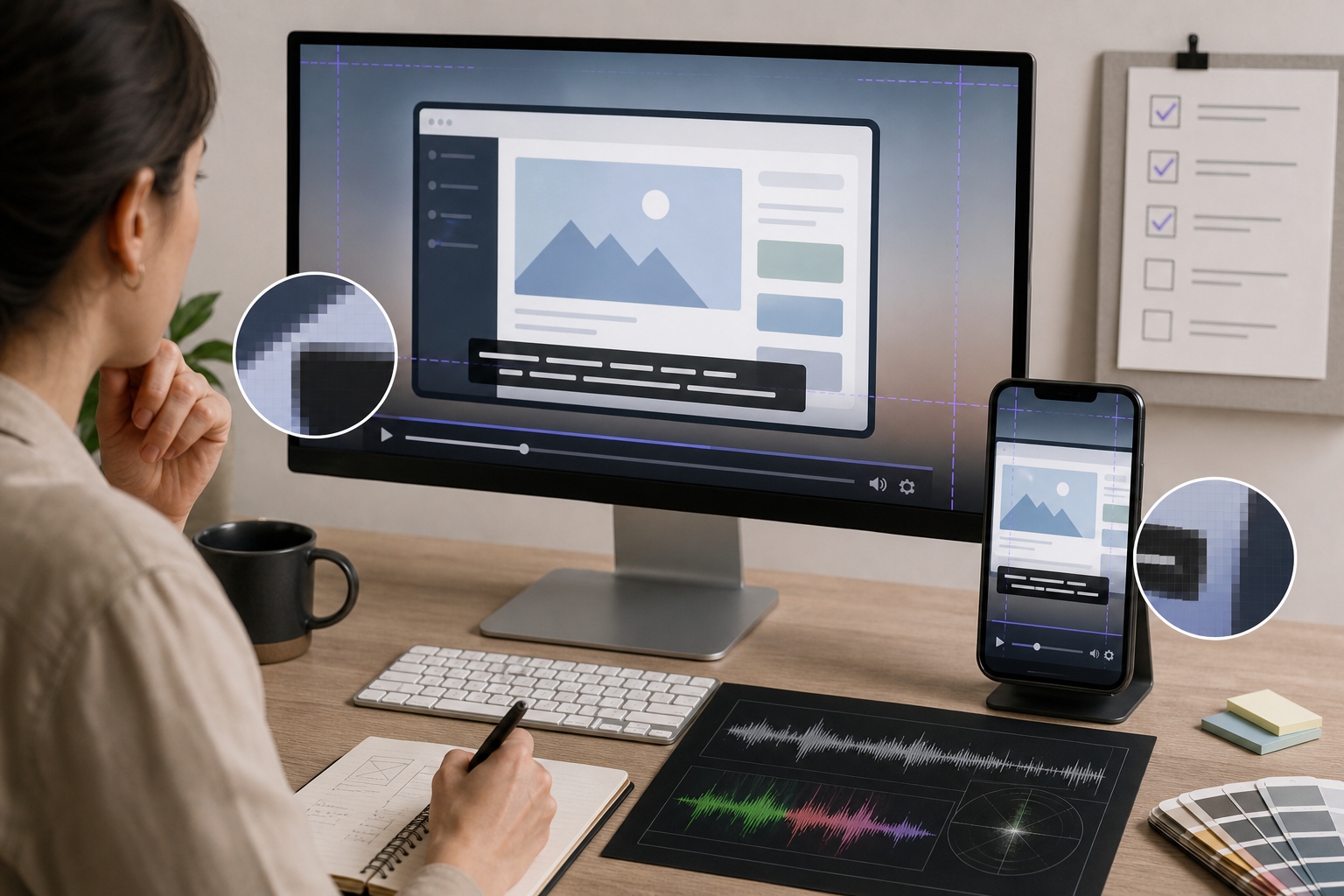
Before publishing, run the video through a small audit. This takes less time than fixing the page after someone notices the demo is unreadable.
First, test the video muted. If the main message depends on sound, the subtitles are not doing enough. Next, test at the smallest expected display size. Do this in the actual page layout when possible, not just in the editor.
Then check the first three seconds. Many visitors decide quickly whether to keep watching. The opening caption should orient them without making them read a paragraph. A strong first subtitle might say "Turn messy uploads into clean PDFs" or "Review every flagged invoice in one place." It should name the value, not explain the entire product.
Use this audit table before final export:
| Check | Pass condition |
|---|---|
| Muted playback | The demo makes sense with no audio |
| Mobile size | Captions remain readable without zooming |
| Safe area | Text is not hidden by controls, crop, or sticky elements |
| Contrast | Captions are readable over every background frame |
| Timing | Each caption appears long enough to read once calmly |
| Line length | No caption becomes a dense paragraph |
| Product truth | Captions do not promise features the video does not show |
| Compression | Final web file preserves letter edges clearly |
Finally, watch the video once without pausing. If you feel pulled between reading and watching, cut text. Captions should reduce cognitive load, not add another task.
Common Mistakes to Avoid
The most common mistake is treating subtitles as decoration. Small, low-contrast captions may look refined in a design mockup, but they fail in real embeds. Readability is the design.
Another mistake is using a full narration transcript as burned-in text. Spoken language is usually too wordy for a short visual demo. The viewer is already watching the product. Give them concise guidance.
A third mistake is placing captions at the very bottom edge. This may look balanced in the export frame, but it is risky on real pages. Player controls, mobile browser UI, cookie banners, and responsive crops often take space from the bottom.
A fourth mistake is exporting only one version. A demo made for a wide hero may not work inside a narrow documentation page. If the same clip will appear in several placements, create separate exports with subtitle placement and size adjusted for each use.
A fifth mistake is ignoring the poster frame. Many users see the video thumbnail before playback. If the poster frame contains a half-visible subtitle, a blurred transition, or a busy UI moment, the page feels less deliberate. Choose a still frame that communicates the product clearly.
A Practical Spec You Can Reuse
For a typical 20-second horizontal SaaS demo on a landing page, this starting spec works well:
- Export at 1920 by 1080 or 1600 by 900 if the source is clean.
- Keep the final embed large enough that UI details remain useful.
- Use 6 to 8 short subtitle cards across the full clip.
- Keep each caption to one line when possible.
- Use a readable sans-serif at medium or semibold weight.
- Place captions in a lower safe area with generous bottom margin.
- Add a dark solid or near-solid caption background.
- Test at desktop column width and mobile width before publishing.
- Keep a transcript or caption file available when the page supports it.
For a vertical mobile demo, adjust the spec:
- Move captions above the bottom control area.
- Reduce each caption to the shortest useful phrase.
- Avoid placing key product UI behind captions.
- Test on an actual phone-sized viewport.
- Watch for platform overlays if the clip will be reused socially.
These specs are not strict rules. They are a dependable starting point for avoiding the failures that make muted product videos hard to understand.
Final Takeaway
Burned-in subtitles for product demos are small pieces of interface design. They need information architecture, visual hierarchy, timing, and export discipline. When they are written like compact product copy and styled for real embed sizes, they make muted videos easier to understand without asking the visitor to work harder.
Start with the page context, not the editing canvas. Decide where the video will appear, how small it may become, what UI details must remain visible, and whether the viewer can understand the value without sound. Then write short captions, place them in a safe readable zone, export from a clean master, and audit the final file in the actual layout.
A landing-page demo does not need subtitles that show off. It needs subtitles that quietly keep the story intact.