Transparent Acrylic Product Photo Edge Cleanup Guide
A practical guide for photographing and editing transparent acrylic products so their edges, reflections, backgrounds, and export formats stay clean in online catalogs.
Transparent Acrylic Product Photo Edge Cleanup Guide
Transparent acrylic products are deceptively difficult to photograph and prepare for online catalogs. A white tray, a clear riser, a display block, a protective cover, or a small laser-cut component may look clean in person, then turn into a strange gray shape once it is placed on a product page. The problem is rarely the object itself. It is usually the edge treatment, background choice, reflection control, and export format.
This guide is for small catalog teams, makers, prop suppliers, retail fixture sellers, print shops, museum display vendors, and anyone else who needs clear acrylic items to look accurate without spending a full day inside advanced design software. The goal is not to make the product disappear. The goal is to make transparent material readable: clean edges, believable highlights, minimal dust, and files that stay sharp after resizing and compression.
The techniques below work for product detail pages, marketplace listings, wholesale line sheets, assembly guides, and quote packets. You can use them whether you shoot with a phone, a compact camera, or a mirrorless setup. The important part is treating transparent acrylic as a material with boundaries, not as empty space.
Why Transparent Acrylic Needs a Different Editing Checklist
Most product photo advice assumes the subject has color, texture, and obvious contrast. Transparent acrylic often has none of those. Its shape is defined by what it reflects, what sits behind it, and how its polished edges catch light. If you remove too much background, flatten every highlight, or compress the file too aggressively, the product can look like a low-quality cutout.
Acrylic also exposes tiny production details. Saw marks, router chatter, protective-film residue, static dust, fingerprints, laser haze, glue seams, and chipped corners all become more visible once the item is photographed against a bright background. Some of those details should be corrected because they are photo artifacts. Others should remain because they honestly describe the product.
That distinction matters. A catalog image should remove distracting capture problems, not misrepresent the material. Clean the background. Reduce dust. Correct color. Preserve the edge profile, thickness, holes, slots, bends, bevels, and visible construction details a buyer would need to understand the item.
Use this rule: if the mark would not be visible to a buyer holding the product under normal light, it is usually safe to reduce. If it reveals the shape, finish, thickness, or assembly of the product, keep it visible.
The Edge Problems That Make Acrylic Look Cheap
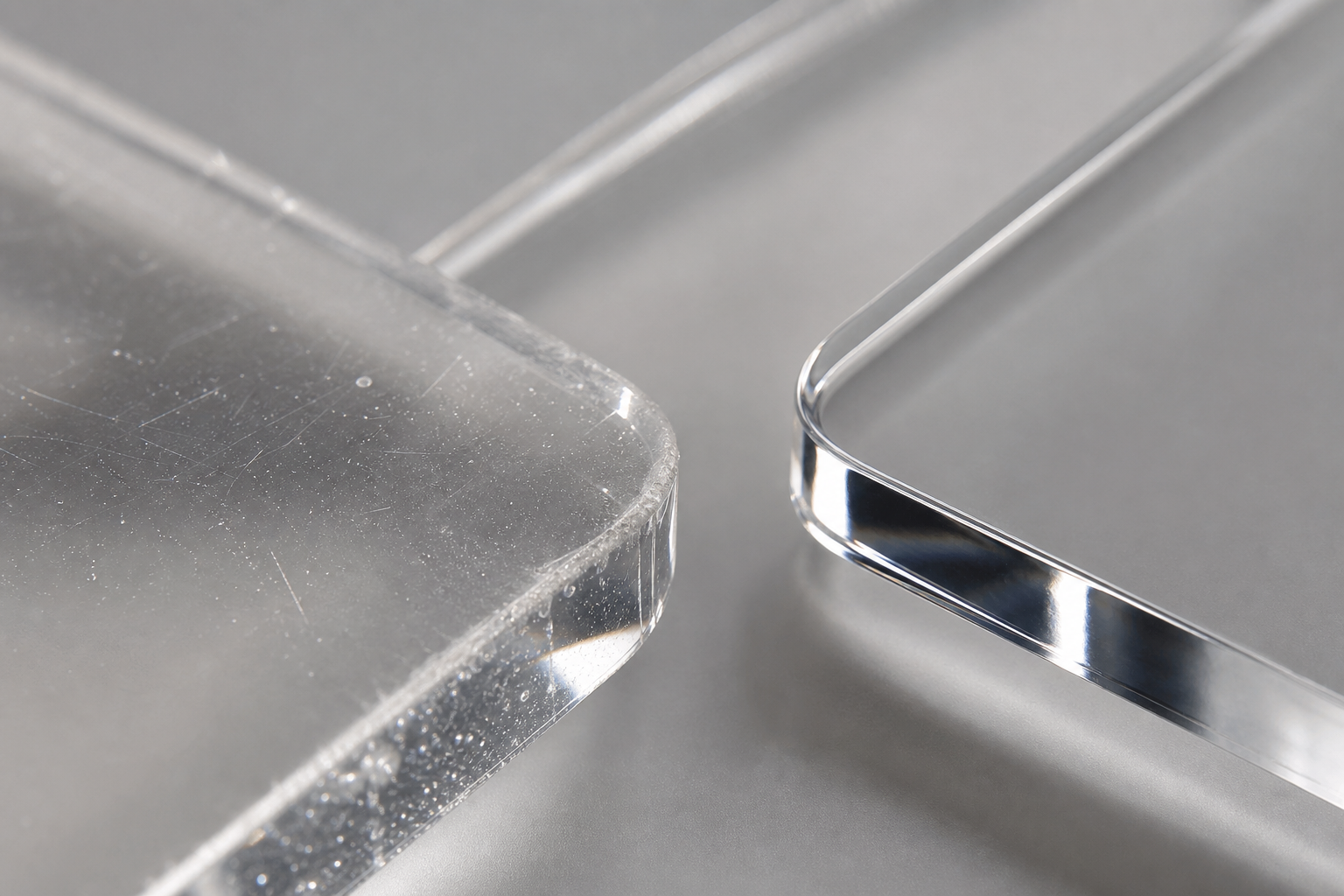
Transparent acrylic images usually fail at the edges first. The center of the object may be almost invisible, but the perimeter tells the viewer what the product is. A poor edge makes the product look warped, dirty, or badly manufactured even when the original item is fine.
Common edge problems include:
| Problem | What it looks like | Likely cause | Best correction |
|---|---|---|---|
| Gray halo | Soft dirty outline around the product | Background removal feathering or low contrast selection | Rebuild a tighter mask and use subtle contrast, not heavy blur |
| Jagged rim | Pixel stair-steps on straight acrylic edges | Low-resolution crop or aggressive compression | Resize from the original and export at a cleaner setting |
| Missing corner | Small transparent section disappears | Automatic cutout misread the product | Restore the mask manually or use a contrast layer while editing |
| Blue or green tint | Clear acrylic looks colored | White balance, nearby wall color, or protective film | Correct white balance and remove color cast selectively |
| Black outline | Product looks like a sticker | Overdone contrast or shadow layer | Lower edge contrast and replace with natural reflection |
| Dust sparkle | Tiny white dots across the surface | Static dust and hard light | Clean before shooting, then spot-correct only the distracting marks |
The biggest mistake is trying to create a perfectly invisible background before making the acrylic shape readable. A transparent object on a transparent canvas can become unusable in a marketplace grid. Before exporting a transparent PNG or WebP, test the image on white, light gray, dark gray, and the actual page background. If the item disappears on one of those, the edge treatment needs work.
Start With a Capture That Gives the Editor Something to Use
Editing cannot create clean geometry from a photo where the object has no edge separation. Before you open any tool, build a simple shooting setup that gives the acrylic a readable boundary.
Use a matte background rather than glossy paper. Light gray, warm white, and very pale blue-gray are often easier than pure white because they give transparent material a little separation. Place black or dark gray cards outside the frame to create thin reflected lines along the acrylic edges. These cards do not need to appear in the photo. They only need to reflect into the polished sides.
Avoid direct flash unless you intentionally want hard highlights. A large soft light from the side or above-front is usually safer. For curved acrylic covers or display domes, move the light until the reflection describes the curve without hiding the product interior.
Before shooting, remove protective film unless the photo is meant to show shipping condition. Wipe the item with a lint-free cloth and use an air blower. Acrylic attracts static, so do not over-polish right before shooting. If dust keeps returning, let the product sit for a minute after cleaning and blow it off again.
Shoot more than one angle. A front view may be best for the listing thumbnail, but a three-quarter view often explains thickness, bends, slots, and support feet better. For small parts, include one scale-oriented image with a ruler or known object only if that is normal for your catalog style. The main image should stay clean.
Build a Practical Editing Order
Acrylic cleanup works best when you separate global corrections from edge corrections. If you jump directly into background removal, you may hide problems that would have been easy to fix earlier.
Use this order for most images:
- Crop loosely enough to keep the full product and natural shadow.
- Correct white balance so the background and clear material are neutral.
- Remove obvious dust, lint, and fingerprints.
- Adjust exposure and contrast until edges are visible but not harsh.
- Clean or replace the background.
- Refine the perimeter mask and restore missing transparent sections.
- Resize for the destination.
- Compress only after checking fine edges.
- Export a master copy and delivery copies in the right formats.
If you need a fast online pass, start by preparing the source image with a clean crop in /resize-image, then use /ai-photo-editor for targeted cleanup around dust, glare, or background distractions. If the file format is wrong for your catalog system, use /convert-image after the edit rather than repeatedly re-saving the same file.
The key is to avoid generation loss. Keep one high-quality master file. Make your web, marketplace, PDF, and thumbnail versions from that master instead of editing each exported copy separately.
Masking Clear Products Without Losing the Shape
Automatic background removal often struggles with transparent acrylic because the background is visible through the subject. If the tool treats every pale section as background, holes, corners, bevels, and panels can vanish.
A better approach is to think in zones:
| Zone | Editing goal | Risk |
|---|---|---|
| Outer perimeter | Keep shape crisp and complete | Over-feathering creates halos |
| Interior transparent panels | Keep subtle reflections and thickness cues | Over-cleaning makes the item look fake |
| Holes and slots | Preserve exact openings | Auto-fill may close them accidentally |
| Contact shadow | Keep a light anchor under the product | Removing it makes the product float |
| Reflections | Keep useful highlights, remove confusing glare | Heavy retouching can change the perceived material |
When checking the mask, view it against several backgrounds. A cutout that looks perfect on white may show a halo on gray. A cutout that looks clean on black may have missing clear sections on white.
For ecommerce thumbnails, a faint natural shadow is often better than a fully floating transparent object. The shadow tells the buyer which side is the base and gives the object a sense of thickness. Keep it soft and consistent across the catalog. If you remove all shadows from one item and leave shadows on another, the category page will feel mismatched.
Glare, Reflections, and What Not to Remove
Acrylic needs highlights. Without them, it can look like a blank outline. The editing challenge is deciding which reflections communicate material and which ones distract.
Keep reflections that show:
- polished edges
- curved or bent surfaces
- product thickness
- transparent shelves or layered panels
- slots, joints, or stepped construction
Reduce reflections that show:
- the photographer
- ceiling lights
- window frames
- colored walls
- cluttered shelves
- harsh blown-out patches over important detail
Do not remove every bright streak. One or two controlled highlights can make the product more believable. If a highlight crosses a hole, notch, or engraved line, reduce it enough to restore the detail. If it sits along an edge and helps define the shape, leave it.
For product pages with multiple acrylic items, consistency matters more than perfection. A set of risers should share a similar highlight direction. A collection of display boxes should have similar shadow softness. Buyers notice when one image looks like a studio shot and the next looks like a cutout from a different lighting setup.
Background Choices for Clear Objects
Pure white is common, but it is not always the best working background for clear acrylic. It can erase thin panels and make beveled edges hard to see. You can still export a white-background image for marketplace requirements, but use a more informative background while editing.
Consider these options:
| Destination | Recommended background | Reason |
|---|---|---|
| Marketplace main image | White or near-white | Meets common listing expectations |
| Brand catalog | Very light gray | Gives clear edges more visibility |
| Technical spec sheet | Light gray with consistent shadow | Shows shape without visual noise |
| Installation guide | Neutral tabletop or context surface | Helps users understand placement |
| Cutout asset | Transparent canvas with tested edge contrast | Works for design reuse |
If you need both a transparent asset and a catalog-ready image, create two separate exports. The transparent version is useful for layout work, comparison graphics, and internal design tasks. The white or gray version is usually better for buyers browsing a grid.
Use /convert-image when you need to move between PNG, WebP, and JPEG versions for different destinations. Keep in mind that JPEG does not support transparency. If your product needs a transparent canvas, use PNG or WebP, then test how the file appears in the system where it will actually be published.
Export Settings for Catalogs, Marketplaces, and Spec Sheets

Export decisions have a direct effect on acrylic edges. A clear product may contain very little color information, so compression can mistake edge detail for noise. Thin highlights, faint shadows, and subtle bevels are exactly the details that make the product readable.
Use this decision table when preparing final files:
| Use case | Format | Suggested approach |
|---|---|---|
| Marketplace image with solid background | JPEG or WebP | Keep quality high enough to protect edge gradients |
| Transparent cutout | PNG or WebP | Check alpha edges on multiple backgrounds |
| Fast-loading product grid | WebP | Resize first, then compress carefully |
| Print-ready line sheet | PDF with high-quality images | Avoid tiny source files inside the PDF |
| Internal review packet | Combine views and notes into one easy file | |
| Archive master | PNG, TIFF, or high-quality original | Keep untouched or minimally processed source |
Resize before compressing. If you upload a huge image and let a platform generate every derivative, you may lose control over the edge quality. A practical catalog set might include a large master, a product-page image, a thumbnail, and a PDF-ready version.
For web delivery, use /compress-image after resizing and inspect the result at 100 percent. Do not judge only from a zoomed-out preview. Look at corners, holes, thin panels, and the contact shadow. If the product suddenly looks dusty, jagged, or surrounded by a pale halo, the compression is too aggressive or the source needs a cleaner mask.
For line sheets or installation packets, combine final images with /image-to-pdf. If you need to place multiple product views, detail shots, or variant angles into one review document, a PDF can be easier for sales reps and buyers than a folder full of loose images.
A Catalog Naming System That Prevents Mix-Ups
Transparent acrylic products often differ by small details: thickness, bend angle, hole position, corner radius, or finish. If filenames are vague, teams can easily publish the wrong image for a variant.
Use filenames that describe the item without becoming unreadable. A good pattern is:
product-family_variant-size_material-view_version.format
Examples:
- acrylic-riser_3-tier-clear_front_v01.webp
- menu-holder_a5-clear-2mm_angle_v02.png
- display-box_120x80x60-clear_open-lid_v01.jpg
- shelf-divider_300mm-frosted_detail-slot_v03.webp
Avoid names like final, final2, edited-new, or clear-product-photo. These names collapse once you have multiple sizes or variants. Add view labels such as front, angle, side, detail-edge, scale, and packaging when useful.
If your catalog team handles many assets, keep masters and delivery files in separate folders. Masters should remain large and lightly compressed. Delivery files can be resized, compressed, and renamed for the platform. This prevents accidental edits to the only high-quality version.
Quality Check Before Publishing
Before the image goes live, run a quick review that focuses on the things transparent materials tend to hide.
Check the product shape:
- Are all corners present?
- Are holes, slots, bends, and layered panels visible?
- Does the item look like the correct thickness?
- Is the contact shadow natural and consistent?
- Does the product still read clearly in a small thumbnail?
Check the cleanup:
- Are dust marks reduced without making the surface look plastic-smeared?
- Are fingerprints removed from important areas?
- Are reflections controlled but still believable?
- Is there any gray or white halo around the edge?
- Does the background match the rest of the catalog?
Check the file:
- Is the format correct for transparency or solid background use?
- Is the pixel size large enough for zoom views?
- Is the compressed version free of jagged edges?
- Does the filename identify the correct variant?
- Is there a master copy saved separately?
Finally, test the image in context. Drop it into a product grid, a detail page, and any PDF or sales sheet where it will be used. Acrylic images can look fine alone and weak next to neighboring products. The goal is a consistent catalog, not one perfect isolated file.
When to Use AI Editing and When to Stay Manual
AI-assisted editing can be useful for transparent acrylic photos, especially when cleaning dust, removing background clutter, extending a neutral backdrop, or reducing a distracting reflection. It is less reliable when exact geometry matters.
Use AI editing for:
- dust and small lint cleanup
- background cleanup around the product
- softening a distracting reflection
- removing a visible camera or room shape from a reflection
- evening out a tabletop or sweep background
Be cautious with AI editing for:
- holes and cutouts
- laser-cut shapes
- engraved details
- mounting slots
- measured edges
- product corners
- bend lines and seams
If a buyer relies on the feature for fit, installation, or compatibility, do not let an editor invent or simplify it. Use /ai-photo-editor for targeted corrections, then inspect the geometry against the original. Keep the original nearby during review so you can confirm that the edited file still represents the product accurately.
Acrylic is especially vulnerable to over-polishing. If the final image looks like a computer-rendered object but the listing describes a photographed product, buyers may mistrust it. Preserve a few real-world cues: a soft reflection, a controlled edge highlight, a gentle contact shadow, and accurate thickness.
Example: Preparing a Clear Counter Display Stand
Imagine a small shop sells clear acrylic counter display stands in three sizes. The stands have bent backs, two support feet, and polished edges. The first photo set looks acceptable on the camera screen, but the website thumbnails make the stands nearly disappear.
A practical correction pass would look like this:
- Choose the sharpest three-quarter image for each size.
- Crop with enough space around the stand for a consistent product grid.
- Correct the white balance so the acrylic is neutral rather than blue.
- Remove dust on the front face and support feet.
- Keep the edge highlights along the bend and polished sides.
- Use a light gray background version for the brand catalog.
- Export a white-background version if a marketplace requires it.
- Resize each image to the same long edge for the product page.
- Compress a WebP copy and compare it to the master at 100 percent.
- Build a PDF line sheet with front, angle, and detail views.
This gives the team a consistent set: readable web images, marketplace-safe versions, and a buyer-friendly PDF. It also prevents the common problem where the smallest stand looks like a different material because it was edited with different contrast and shadow settings.
Common Mistakes to Avoid
The most common mistake is removing the background before fixing the image. If the product is dusty, tinted, or poorly exposed, a transparent cutout will only make those problems sharper.
Another mistake is exporting only one file. A transparent PNG may be useful for design layouts, but it may look weak on a white marketplace page. A compressed WebP may be great for speed, but it may not be ideal for print review. Keep multiple destination files from one clean master.
Do not use heavy sharpening to rescue blurry acrylic edges. Sharpening can create black or white outlines that make clear plastic look cheap. If the original is soft, reshoot when possible. If reshooting is impossible, apply only light sharpening and keep the display size modest.
Avoid inconsistent shadows. A category grid with six clear products should feel like one set. If one item floats, one has a dark shadow, and another has a gray halo, the catalog feels less trustworthy.
Finally, do not erase manufacturing details that matter. If a product has a visible seam, bend radius, frosted area, or slot shape, buyers need to see it. Cleaning should make the product easier to evaluate, not more generic.
Final Preflight Checklist
Use this condensed checklist before publishing any transparent acrylic product image:
- The product edge is visible on white, gray, and the real page background.
- Corners, holes, slots, feet, bends, and seams are intact.
- Dust and fingerprints are reduced without plastic-looking smears.
- Reflections describe the material instead of distracting from it.
- Shadows are soft, believable, and consistent across the set.
- The export format matches the destination: PNG or WebP for transparency, JPEG or WebP for solid backgrounds, PDF for packets.
- The image has been resized before compression.
- The compressed file still has clean edges at 100 percent view.
- The filename identifies product family, variant, view, and version.
- A high-quality master remains available for future exports.
Transparent acrylic photography rewards patience. You do not need a complex studio or a heavy editing setup, but you do need to protect the details that make a clear object understandable. Give the edges contrast, keep useful highlights, clean only what distracts, and export with the final destination in mind. The result is a catalog image that feels clean, accurate, and easy to trust.