Dark Mode Screenshot Cleanup for Help Center Articles
A practical guide for cleaning, resizing, converting, and compressing dark mode app screenshots so help center articles stay readable on desktop and mobile.
Dark Mode Screenshot Cleanup for Help Center Articles
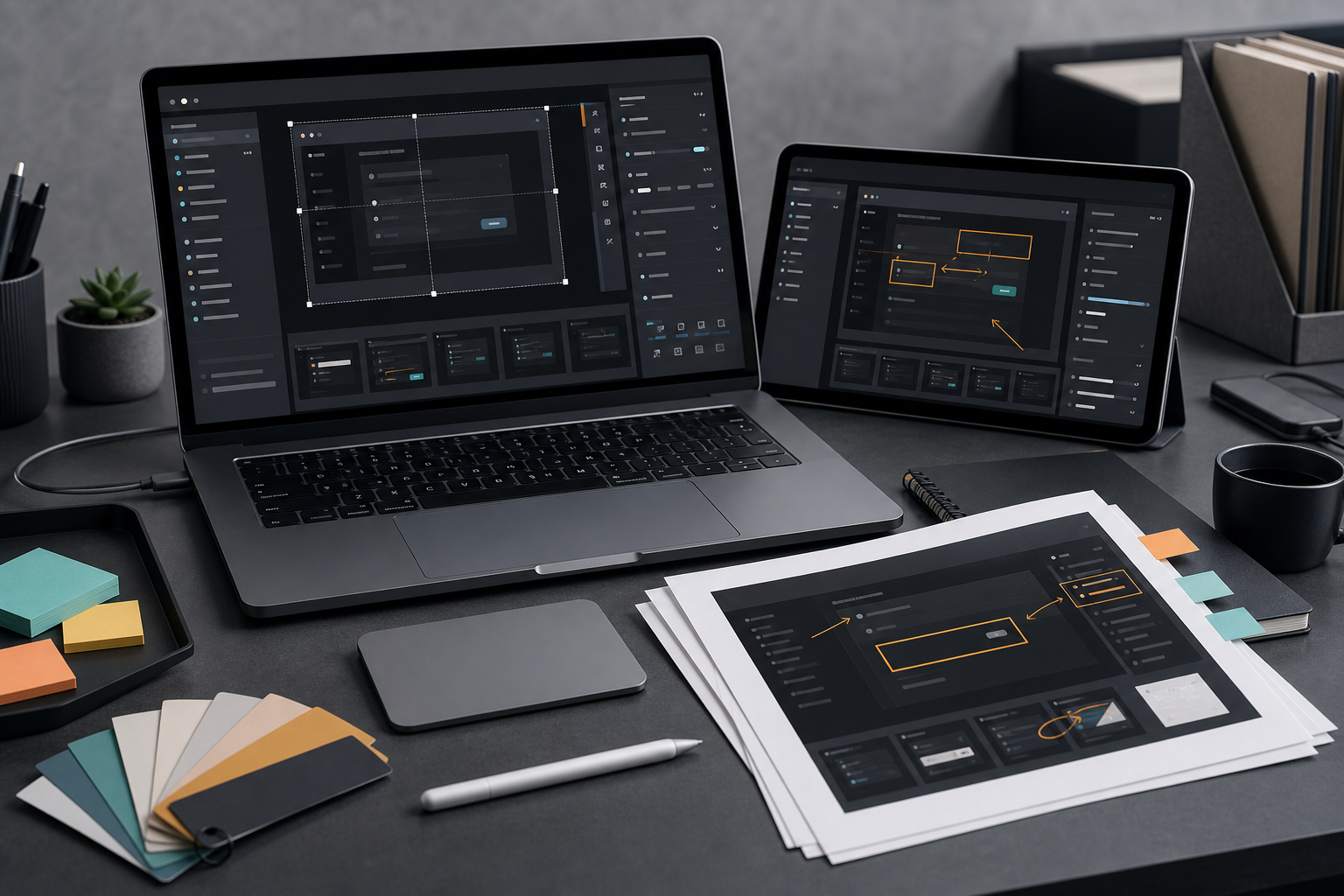
Dark mode screenshots look polished inside a product, but they can become strangely hard to read once they are placed inside a help center article. The problem is not only brightness. Dark screenshots often contain subtle borders, low-contrast labels, translucent panels, tiny keyboard shortcuts, colored status pills, and dense menus that were designed for an interactive screen, not for a compressed article image.
That difference matters. A help center screenshot has a job: it must help a reader recognize where they are, what to click, and what changed. If the image turns into a charcoal rectangle with a few glowing pixels, the article starts to feel vague even when the written instructions are accurate.
This guide is for documentation teams, support leads, product marketers, and solo founders who need dark mode screenshots to survive cropping, resizing, conversion, compression, and mobile display. It focuses on practical decisions rather than perfect studio production. You can use the same principles for SaaS dashboards, developer tools, mobile apps, admin panels, design tools, and internal support portals.
The Dark Mode Screenshot Problem
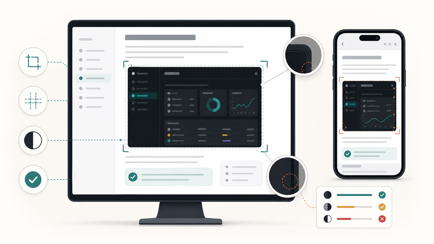
Dark mode UI is usually built from close neighboring tones. A navigation rail might be near black, the main panel slightly lighter, a modal another shade above that, and separators almost invisible. On your own monitor, the design can look elegant. In a help center, several things change at once.
First, the screenshot is no longer full size. It may be constrained by the article column, placed inside a card, or viewed on a phone. Second, it may be compressed by a content management system. Third, it may be viewed on a display with different gamma, brightness, and color settings. Fourth, the reader may be stressed, tired, or trying to fix something quickly.
Dark screenshots are especially sensitive to these changes because their structure depends on small contrast differences. A light mode screenshot often has white space that separates panels naturally. A dark screenshot may rely on borders that are only a few values away from the background.
Common symptoms include:
- Sidebars blending into the main canvas.
- Purple, blue, or green accents becoming too bright after export.
- Thin gray text disappearing after compression.
- Cursor targets becoming unclear on mobile.
- Tooltips and popovers looking like unrelated floating blocks.
- Screenshots feeling heavier than the surrounding article design.
The fix is rarely a single filter. A good pass combines capture discipline, crop choices, resizing, format selection, compression settings, and occasionally light editing.
Decide What the Screenshot Must Prove
Before touching the image, write down the reason the screenshot exists. Dark UI tends to look impressive as a full dashboard, but help content usually needs evidence, not decoration.
A screenshot may need to prove one of four things:
| Screenshot goal | Best image type | What to emphasize | What to remove |
|---|---|---|---|
| Location | Wider interface crop | Navigation, page title, selected item | Private data, unrelated side panels |
| Action | Focused crop | Button, menu item, field, toggle | Large empty regions |
| Result | Before and after pair | Changed status, confirmation, output | Settings used only to reach it |
| Exception | Error or edge case view | Error state, disabled control, warning area | Decorative chrome |
If the screenshot has no clear proof value, consider removing it. A weak dark screenshot often adds more friction than a concise instruction.
For help center articles, one strong crop usually beats a full-screen capture. Readers do not need to admire the whole app. They need to recognize the part that matches their own screen.
Capture Rules That Save Editing Time
A clean screenshot starts before editing. If you capture dark UI casually, you may spend too much time repairing problems that could have been avoided.
Use a stable browser zoom level. For most documentation screenshots, 100 percent or 125 percent is safer than 80 percent. Tiny text that looks acceptable on a large monitor often collapses when resized into an article column.
Use a consistent viewport size for related screenshots. A sequence of images with different widths makes an article feel uneven. It also complicates compression because each image has different detail density.
Turn off unnecessary browser extensions, notification badges, test banners, and personal profile indicators. Dark UI makes bright badges extremely visible. One unrelated red dot can pull the reader away from the actual step.
Choose realistic but anonymous data. Empty states can be useful for onboarding docs, but many support articles need enough structure to make menus and tables understandable. Replace customer names, emails, tokens, addresses, and transaction data before capture.
Avoid capturing while animations are mid-transition. Dark themes often use fades and shadows. A modal halfway through opening can look blurry or low contrast even before compression.
When possible, capture at a higher resolution than final display. A screenshot captured at 2x scale can be resized down cleanly, which often preserves thin UI lines better than trying to enlarge a small capture later.
Crop for Recognition, Not Decoration
Cropping is the most important cleanup step for dark mode screenshots. The crop determines whether the reader sees the relevant control or a sea of dark panels.
A practical crop should include enough surrounding context for recognition, but not so much that the key action becomes small. For a button in a settings page, include the section heading, the button, and a small amount of neighboring UI. You usually do not need the entire left navigation and top bar unless the article is about finding that page.
Use these crop patterns:
| Situation | Recommended crop | Why it works |
|---|---|---|
| Showing where a setting lives | Include sidebar selection, page heading, setting row | Reader can match navigation and target |
| Showing a menu action | Include opened menu and the control that opened it | The relationship is clear |
| Showing a table action | Include row label, action button, and nearby columns | Reader understands which item is affected |
| Showing a confirmation | Include success state and immediate surrounding panel | The result is visible without clutter |
| Showing an error | Include field, error message, and submit area | Reader sees cause and correction point |
If the screenshot still feels too busy after cropping, split it into two images: one location image and one action image. This is often clearer than adding arrows or callouts to a large capture.
For quick resizing after you crop, a tool such as Resize Image is useful when you need a predictable width across a series of screenshots. Consistent dimensions make articles easier to scan and reduce accidental layout jumps.
A Practical Cleanup Pass Before Publishing
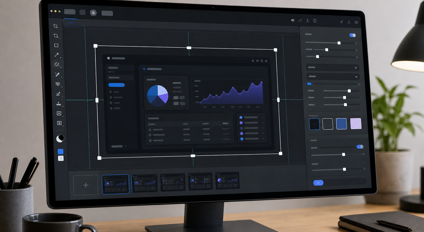
After capture and crop, review the screenshot as an article asset rather than as a product screen. A good cleanup pass is subtle. The image should still feel like the real app, but the important parts should remain legible in the article.
Start with exposure and contrast. Dark mode screenshots often benefit from a tiny lift in midtones, not a dramatic brightness boost. Raising the entire image too much can turn black panels gray and make the screenshot look washed out. Instead, aim to separate panels just enough that borders and sections are visible.
Next, check local contrast around the target area. If the screenshot highlights a disabled button, a pale gray label, or a thin divider, zoom out to the size it will appear in the article. If it disappears, the reader will miss it too.
Then remove distractions. Crop out unrelated columns. Blur or replace private values. Remove notification badges that are not part of the instruction. If the screenshot contains a user-uploaded photo or avatar, decide whether it is necessary. For sensitive or user-submitted imagery, an editing pass in AI Photo Editor can help clean background distractions while keeping the documentation asset focused.
Finally, test the image against the actual article background. A screenshot that looks clear on a white editing canvas may look heavy inside a dark help center theme, or too stark inside a minimal white documentation page.
A simple pre-publish pass looks like this:
- Crop to the smallest area that still proves the step.
- Resize to the intended article width.
- Check legibility at mobile width.
- Convert to the best format for the image type.
- Compress and compare against the original.
- Review private data and visual distractions.
The goal is not to beautify the interface. The goal is to make the instruction reliable.
Format Choices for Dark UI Screenshots
Format selection affects edges, gradients, transparency, and file size. Dark screenshots can be punishing because compression artifacts appear as blotchy rectangles in flat panels.
PNG is often best for crisp interface captures with text, icons, and hard edges. It preserves thin lines and avoids the fuzzy halos that can appear around light text on dark backgrounds. The downside is file size, especially for large dashboards.
WebP can be a strong default for help center publishing when configured carefully. It usually produces smaller files than PNG while keeping UI detail acceptable. However, aggressive settings can soften labels and introduce banding in dark gradients.
JPEG is risky for dark UI documentation. It can work for screenshots that include photos or dense visual content, but it often damages text and creates visible compression blocks in dark panels. If you use JPEG, keep quality high and inspect the target area closely.
SVG is not suitable for normal screenshots unless the image is actually a vector export from the product or design tool. Do not recreate complex UI screenshots as decorative vector art for support docs. Readers need to recognize the real interface.
Use this quick decision table:
| Screenshot content | Best starting format | Notes |
|---|---|---|
| Dense app UI with text | PNG or high-quality WebP | Inspect labels after compression |
| UI plus product photo | WebP | Balance text clarity and photo size |
| Simple modal or settings row | PNG | Usually small enough already |
| Dark gradient-heavy dashboard | WebP with careful quality | Watch for banding |
| Transparent overlay asset | PNG or WebP with alpha | Test edges on light and dark backgrounds |
If you need to standardize a mixed set of captures, Convert Image can help move screenshots into a consistent publishing format before the final compression pass.
Compression Without Destroying Thin Text
Compression is where many dark screenshots fail. A file may look fine in a preview grid but become unreadable after insertion into a help article.
The safest approach is to compress, then compare at the final display size. Do not judge only at 200 percent zoom. Readers will see the image in context, often on a phone.
For dark UI, watch these problem areas:
- Light gray text on charcoal panels.
- One-pixel dividers between sections.
- Icons with thin strokes.
- Colored badges with small labels.
- Checkboxes, toggles, radio buttons, and drag handles.
- Code snippets, terminal output, and API keys.
If compression damages the screenshot, try reducing dimensions before lowering quality further. A smaller, sharper image is often better than a huge image with aggressive compression artifacts. For example, a 2400-pixel-wide dashboard compressed heavily may look worse than a carefully resized 1400-pixel crop.
Use Compress Image after resizing and format selection, not before. Compressing first and resizing later can compound artifacts, especially around text.
A useful check is the squint test. View the screenshot at article width and briefly look away, then back. If your eye cannot quickly find the highlighted area or target control, the image is probably too busy, too dark, or too compressed.
Handling Annotations on Dark Screenshots
Annotations can help, but they can also ruin dark screenshots. Bright arrows, thick boxes, and neon circles often overpower the UI. The reader sees the annotation first and the product second.
Use annotations only when the crop alone cannot make the target obvious. If a button is already centered and visible, do not add a box around it. If the reader needs to choose one item from a crowded table, a subtle highlight may be justified.
Good annotation rules for dark UI:
- Use one annotation style per article.
- Keep strokes thick enough to survive compression.
- Avoid red unless the article is about an error or destructive action.
- Do not cover labels, icons, or state changes.
- Leave padding between the annotation and the target.
- Do not stack arrows, boxes, and numbered markers on the same crop.
For dark screenshots, a semi-transparent outline or soft highlight often works better than a saturated arrow. The annotation should guide the eye, not become the subject.
If the article contains many steps, avoid annotating every image. A repeated heavy marker can make the page feel noisy. Use annotations for the two or three moments where the reader is most likely to hesitate.
OCR Checks for Screenshots With Mixed UI Text
Some teams use screenshots as a source for release notes, migration guides, audit records, or support evidence. In those cases, the image may need to be readable by people and extractable by OCR.
Dark mode screenshots are not always friendly to OCR. Low contrast, small text, antialiasing, and colored labels can reduce accuracy. If you plan to extract text from a screenshot, prepare a separate OCR-friendly copy rather than forcing the published image to do everything.
Use a wider crop for OCR if it preserves row and column relationships. Increase scale before extraction when text is small. Avoid heavy compression before OCR. If possible, use a capture where the UI is not obscured by hover states, cursors, or tooltips.
A tool like Image OCR can help verify whether the screenshot text is machine-readable enough for your use case. Treat the OCR result as a quality signal, not as perfect truth. If the extracted text misses key labels, the visual screenshot may also be too weak for readers.
For mixed UI screenshots containing logos, annotations, and product text, separate the task into two versions:
| Version | Purpose | Preparation |
|---|---|---|
| Published image | Helps readers follow the article | Crop tightly, compress carefully, keep visual focus |
| OCR reference | Extracts text for notes or records | Keep text larger, avoid annotations, preserve context |
This small separation prevents a common compromise: an image that is too cluttered for readers and still not clean enough for OCR.
Mobile Display Checks
Many help center readers are on a second device while troubleshooting. They may read the article on a phone while using the app on a laptop, or they may be inside a mobile browser trying to fix an account issue. Dark screenshots must be checked at mobile width.
The biggest mobile issue is not file size. It is target scale. A full desktop dashboard squeezed into a phone article becomes a pattern, not an instruction. The reader cannot see labels or controls without pinching.
Before publishing, preview each screenshot at the narrowest width your help center supports. Ask three questions:
- Can the reader identify the page or panel?
- Can the reader find the action target without zooming?
- Can the reader read the important label or state?
If the answer is no, create a mobile-specific crop or split the image. Do not assume that the article platform will solve this automatically.
For mobile help articles, vertical crops can work well when the product area is naturally stacked. For desktop UI, a horizontal crop of the target section is usually better than shrinking the entire window.
Also check spacing around the image. Dark screenshots can visually merge with dark page backgrounds. A thin border or neutral container may help, but it should be part of the article design system rather than baked into every image.
Naming and Version Hygiene
Screenshot cleanup is easier when files are named predictably. A messy folder of captures named Screenshot 2026-07-07 at 10.42.11 invites mistakes, especially when an article has several similar dark panels.
Use names that describe the article, step, and state:
| Weak filename | Better filename |
|---|---|
dark-1.png | billing-settings-plan-menu.png |
final-final.webp | team-invite-success-state.webp |
screen-new.png | api-key-create-modal-cropped.png |
compressed2.png | export-history-empty-state-1400w.webp |
Include width or format when useful, especially if your team keeps source captures and published versions in the same folder. Avoid naming files after temporary article numbers unless your CMS requires it.
Keep a source copy until the article is published. If a compressed WebP turns out too soft, you will want the original crop rather than a repeatedly edited export.
For multi-image articles, keep visual consistency. Similar crops should have similar widths. Similar annotations should use the same style. Similar UI states should be captured with similar zoom and theme settings.
A Dark Screenshot Publishing Checklist
Use this checklist before adding a dark mode screenshot to a help center article.
| Check | Pass condition |
|---|---|
| Purpose | The screenshot proves a location, action, result, or exception |
| Crop | The target area is visible without excessive surrounding UI |
| Privacy | Customer data, tokens, emails, and internal notes are removed |
| Contrast | Labels, borders, and target controls remain readable |
| Size | Width is consistent with related article images |
| Format | PNG or WebP is chosen based on text clarity and file size |
| Compression | Artifacts do not damage thin text or icons |
| Mobile | The image remains useful at narrow article width |
| Annotation | Markers are necessary, subtle, and not covering UI |
| Filename | The file name describes the screen and state |
This checklist is deliberately simple. It is better to run a quick consistent review every time than to create a complicated standard nobody follows.
Example: Cleaning a Settings Screenshot
Imagine you are documenting how to turn on email alerts in a dark mode admin panel. The original screenshot shows the entire app: left sidebar, top navigation, account menu, settings page, a long list of preferences, and the email alerts toggle near the bottom.
A weak version would publish the full screenshot and add a bright arrow pointing to the toggle. On desktop, it might be barely acceptable. On mobile, the toggle becomes tiny. The arrow dominates the image, and the label is hard to read.
A stronger version would use two screenshots.
The first crop shows the left navigation with Settings selected and the page title visible. Its purpose is location. The second crop shows only the notification preferences section with the email alerts toggle, the related label, and maybe one neighboring setting for context. Its purpose is action.
The second image is resized to the same width as other step images, converted to WebP only if labels remain crisp, and compressed lightly. If compression softens the toggle label, keep it as PNG or raise the WebP quality. The final image is checked at mobile article width. If the toggle cannot be identified without zooming, crop tighter.
This approach uses more judgment than a single full-screen capture, but the result is easier to follow and usually smaller on the page.
Where ConvertAndEdit Fits Into the Pass
You do not need a heavy design tool for every documentation screenshot. Most cleanup tasks are basic but need to happen in the right order.
A practical sequence is:
- Capture the screen at a stable zoom level.
- Crop locally or in your preferred editor.
- Use Resize Image to standardize dimensions.
- Use Convert Image when you need PNG, WebP, or another consistent format.
- Use Compress Image to reduce file size after resizing.
- Use Image OCR when text extraction or readability needs a second check.
For screenshots that include distracting backgrounds, user-submitted images, or visual clutter outside the target UI, AI Photo Editor can support a cleanup pass. Keep edits honest: do not change product behavior, hide relevant warnings, or invent states that users will not see.
Final Notes
Dark mode screenshots are not harder because dark interfaces are bad. They are harder because documentation images have different constraints than interactive screens. A product UI can rely on motion, hover states, display brightness, and user familiarity. A help center image must communicate quickly inside a narrow article column, after export, compression, and resizing.
The best dark screenshot is usually not the most dramatic one. It is the one that keeps the reader oriented, makes the next action obvious, and stays readable on the device they actually use. Capture with intention, crop for proof, resize consistently, choose the format carefully, and compress only after checking the important text.
That discipline turns dark mode screenshots from stylish rectangles into useful documentation assets.