Public Transit Detour Map Screenshots: A Practical Readability Guide
A detailed guide for transit teams, local bloggers, and community managers preparing clear detour map screenshots for mobile readers, social posts, and printable notices.

Public Transit Detour Map Screenshots: A Practical Readability Guide
Public transit detour notices live in an awkward middle ground. They are not full cartographic products, but they still need to help someone make a real decision under pressure: where to wait, which stop is closed, what street the bus will use, and whether the change affects tonight, tomorrow morning, or the whole week.
That is why a raw screenshot from a trip planner, GIS dashboard, or internal mapping tool often disappoints. It may look fine on the staff member's large monitor, then collapse into a blur inside a social post, email alert, community newsletter, or printed notice taped to a shelter. Small labels disappear. Route colors blend into background roads. Browser chrome steals space. A marker covers the only street name that matters.
This guide is for small transit agencies, campus shuttle teams, neighborhood associations, local journalists, event organizers, and operations staff who need to turn map screenshots into clear public information without opening professional layout software. The goal is not to make a perfect map. The goal is to make a screenshot that survives mobile viewing, compression, reposting, and printing while still answering the rider's immediate question.
We will cover capture choices, cropping, resizing, compression, annotation restraint, OCR checks, and export formats. ConvertAndEdit tools can help with practical parts of the job, such as resizing at /resize-image, reducing file weight at /compress-image, converting formats at /convert-image, extracting text from map notices with /image-ocr, and packaging image sets into a PDF at /image-to-pdf.
Why Detour Map Screenshots Need Different Treatment
A detour screenshot is not the same as a marketing image, a route map, or a full service alert. It usually has a short shelf life, a narrow geographic scope, and a high penalty for ambiguity. Riders do not study it like a brochure. They glance at it while standing outside, walking toward a stop, or checking a phone in bright sunlight.
The strongest detour screenshots share a few traits:
- They show only the affected area.
- They make the changed path more prominent than the normal map background.
- They preserve the most useful street names and landmarks.
- They avoid tiny labels that become decorative noise.
- They match the output channel, whether that is a website, email, social post, printed handout, or shelter notice.
The most common mistake is treating one screenshot as universal. A landscape desktop capture may work in a web article but fail inside a vertical Instagram story. A dense map that prints acceptably on letter paper may become unreadable in a push alert thumbnail. A crisp PNG may be too large for an email platform that recompresses it aggressively.
Instead, prepare a small set of purpose-built versions. You do not need dozens. Usually three are enough: a website version, a mobile-social version, and a print-friendly PDF version.
The Three Places Detour Screenshots Usually Fail
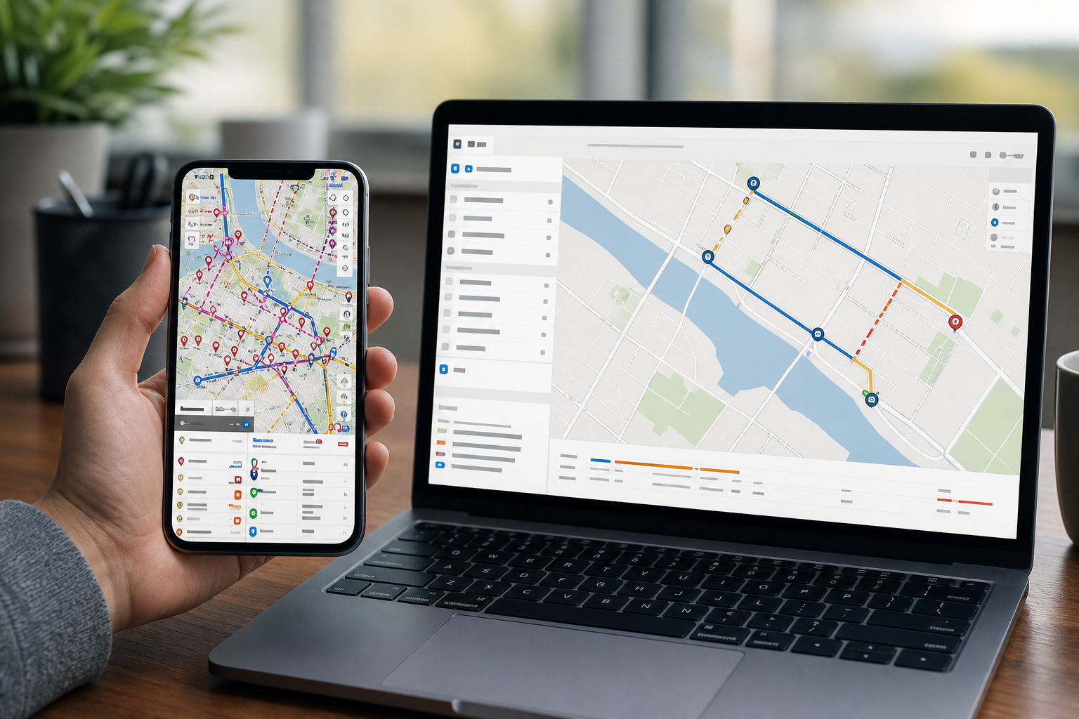
Detour screenshots tend to fail in three predictable places: capture, emphasis, and delivery. If you fix those in order, the image usually becomes clearer without much design effort.
Capture Failure: Too Much Interface, Not Enough Map
Many screenshots include browser tabs, side panels, search boxes, coordinate readouts, map layer controls, bookmarks, chat windows, or internal dashboard filters. Staff may ignore these because they are used to seeing them. Riders read them as clutter.
Before capturing, hide every panel that does not help the public. Use full-screen mode when possible. If the mapping system has a print or share view, test it, but do not assume it is better. Some share views remove useful labels or reduce contrast.
Capture the map at a slightly larger size than you need. This gives you room to crop and resize cleanly. If the final image needs to be 1200 pixels wide, capturing at 1600 to 2000 pixels wide gives you more control over sharpness.
Emphasis Failure: The Detour Does Not Visually Win
A detour map needs a clear visual hierarchy. The changed route, closed stop, temporary stop, or affected street segment should be the first thing a viewer sees. If the base map has equally strong roads, parks, businesses, POI icons, and route lines, the detour competes with everything.
If your source system lets you change layers, reduce background clutter before capturing. Hide unrelated routes, parking icons, retail labels, terrain shading, bike paths, or satellite imagery unless they are essential. Satellite views are tempting because they feel realistic, but they often reduce legibility after compression.
If you must annotate after capture, keep it restrained. One arrow, one highlight, or one circle is usually better than a map covered in labels. When every element shouts, no element guides.
Delivery Failure: The File Is Technically Fine but Publicly Weak
A screenshot can be sharp on your computer and still fail after upload. Social platforms crop previews. Email tools may recompress images. CMS editors may resize files automatically. PDFs may downsample images. Messaging apps may strip clarity from thin lines.
That is why final review should happen in the destination context. Open the website page on a phone. Send a test email. Preview the PDF at 100 percent and 150 percent. Check the image after the platform processes it, not only before upload.
Choose the Right Source Before You Capture
The quality of a detour screenshot starts before the screenshot tool opens. Pick the source view that already contains the least noise and the strongest public meaning.
| Source | Best for | Watch out for |
|---|---|---|
| Public trip planner map | Rider-friendly landmarks and familiar styling | Search panels, ads, low control over route styling |
| Internal GIS map | Accurate streets, stops, and route geometry | Too many layers and technical labels |
| Operations dashboard | Fast access to active disruption data | Internal codes, private notes, unclear public symbols |
| Static route PDF | Official route context and schedule pairing | Hard to crop cleanly, often dense |
| Open map base with custom overlay | Clean custom capture | Requires care to avoid outdated stop or route data |
For public notices, accuracy beats visual polish. If your source map is pretty but stale, do not use it. If your internal GIS map is accurate but cluttered, clean the view and crop aggressively.
Also confirm that the map source is suitable for your use. Some commercial maps have attribution or usage requirements. Keep required attribution visible when applicable, but do not let it crowd the detour information.
Frame the Screenshot Around the Rider's Question
Before cropping, write down the main question the screenshot must answer. This keeps the image from becoming a general-purpose map.
Common detour questions include:
- Where is the closed stop?
- Where is the temporary stop?
- Which streets will the bus use instead?
- Which direction of travel is affected?
- Is the rail station entrance closed or only one bus bay?
- Which side of the intersection should riders use?
- How far is the temporary boarding location from the normal stop?
A screenshot should not try to answer every possible question. If both directions of a route are affected differently, create two images or use a wider map with very careful labels. If five routes are affected in different ways, consider a map overview plus route-specific text beneath it.
The crop should include enough surrounding context for orientation. A map that shows only the detour line but no recognizable cross streets is frustrating. A map that shows the whole city is equally weak. Aim for the smallest area that still includes two or three landmarks riders are likely to know.
Crop for the Destination, Not the Staff Monitor
Cropping is the highest-impact edit for most detour screenshots. It removes clutter, increases apparent detail, and forces a decision about what matters.
For a website article or service alert page, a horizontal crop often works well. It sits naturally inside the page and gives room for street labels. For mobile social posts, a square or vertical crop may be better. For printed shelter notices, portrait orientation often gives you space for a headline, dates, text, and the map.
Useful target shapes:
| Destination | Suggested shape | Practical note |
|---|---|---|
| Website service alert | 16:9 or 4:3 | Good for page embeds and desktop viewing |
| Mobile-first post | 4:5 or 1:1 | Keeps the map large in feeds |
| Story or vertical update | 9:16 | Use only when the detour area is narrow enough |
| Email body | 4:3 or 1:1 | Avoid ultra-wide maps that shrink on phones |
| Printed notice | Portrait page with map block | Leave room for dates and plain-language instructions |
If the map contains essential horizontal geography, do not force it into a vertical frame. Instead, create a vertical post that uses the map in the top half and concise direction text below. If you need several sizes, prepare the cleanest master crop first, then resize variants at /resize-image.
Keep Street Names Large Enough to Survive
Street labels are usually the first details to break. Thin type, pale gray labels, and angled road names can vanish after resizing or compression.
A simple test helps: view the exported screenshot on a phone at the size it will appear in the final channel. Do not pinch zoom. If the critical street names are not readable at a glance, the image is not ready.
You can improve label survival by doing the following:
- Zoom the map in before capture instead of enlarging a small screenshot later.
- Crop out surrounding areas so the important streets occupy more pixels.
- Remove unrelated map layers that compete with labels.
- Use PNG or high-quality WebP for images with thin map lines and text.
- Avoid heavy JPEG compression for maps with small type.
Compression is still important, especially for web pages. A giant PNG can slow down a service alert page. Use /compress-image after you have finalized crop and dimensions, then inspect the result. Compression should reduce weight without turning street labels fuzzy.
Use Annotations Sparingly
Annotations can rescue a confusing screenshot, but they can also make it worse. Transit detour images are already dense. Every arrow, circle, label, and highlight adds another thing to interpret.
Use annotations when they add information that the map itself cannot make obvious. For example, a red circle around a closed stop can be useful if the stop icon is tiny. A single arrow toward a temporary boarding location can help if the location is offset from the usual stop. A translucent highlight over the detour street can help if the route line blends into the map.
Avoid annotations that repeat what is already visible. Do not add five arrows along a clearly drawn route. Do not label every street if the map labels are readable. Do not place labels over intersections where people need to see turn details.
If you need text annotations, keep them outside the most detailed part of the map when possible. Use plain words: "Closed stop," "Temporary stop," "Use east side," or "No service on this block." Keep the final image multilingual only if the rest of the notice is also multilingual; otherwise, pair the map with translated text on the page or PDF.
Check Color Contrast Before Publishing
Transit maps often rely on route colors, but route colors are not always enough. A red line on a busy road map may be visible to one viewer and unclear to another. A green detour line over parks or terrain shading may disappear. Pale yellow highlights can vanish on white or light-gray backgrounds.
For public notices, contrast matters more than brand subtlety. The affected route or closure marker should stand apart from the base map. If you can choose colors, use a strong line color with a light outline or dark outline. If you cannot change the route styling, crop tighter and use a simple annotation to create emphasis.
Also check dark mode contexts. If your CMS, email app, or social preview places the image near a dark background, thin black route lines can still be readable, but transparent image edges or white labels may look strange. Exporting a flattened image with a clear background is often safer than relying on transparency.
Pick the Right Format for Map Screenshots
Format choice affects clarity, file size, and compatibility. There is no single best format for every detour notice.
| Format | Use when | Avoid when |
|---|---|---|
| PNG | The image has small text, flat colors, route lines, or annotations | File size becomes too large for the page or email |
| WebP | You need smaller web files while preserving good visual quality | The publishing system or recipient environment has weak support |
| JPEG | The map is photographic or the file must be very small | Thin labels and route lines are critical |
| You need a printable notice packet or handoff document | The image must be embedded directly in a social post |
For most web map screenshots, start with PNG, then test WebP if file size is a concern. You can use /convert-image to create a WebP version and compare it against the PNG. If the WebP keeps labels readable at a much smaller size, it is often the better web asset.
For print handouts, place the final image into a PDF only after cropping and sizing are finished. If you have several detour images, package them using /image-to-pdf so reviewers can inspect a single file instead of opening many attachments.
A Practical Detour Screenshot Checklist

Use this checklist before publishing any detour screenshot. It is intentionally short enough for a communications desk or operations team to run quickly.
Capture
- The source map is accurate for the detour dates.
- Unrelated layers, panels, and browser interface elements are hidden.
- Required map attribution is visible if needed.
- The capture is larger than the final output size.
- The affected area includes useful cross streets or landmarks.
Crop and Size
- The crop answers one main rider question.
- Closed stops, temporary stops, or detour streets are not near the image edge.
- The destination shape is appropriate for the channel.
- Critical street names are readable on a phone without zooming.
- The image is not larger than necessary for its display size.
Clarity
- The detour path or closure marker is visually dominant.
- Annotations are limited and do not cover key map details.
- Route colors have enough contrast against the base map.
- Text labels are plain and short.
- The image still makes sense if viewed quickly.
Export
- PNG, WebP, JPEG, or PDF was chosen for the actual destination.
- Compression did not blur thin map labels.
- The uploaded version was checked after the platform processed it.
- The file name is specific, dated, and easy to identify.
- A text alternative or nearby written directions are provided where needed.
File Naming That Prevents Public Notice Mix-Ups
Detour images often move through email, chat, CMS uploads, and shared folders. Vague names create risk. A file called map-final.png is not enough when a detour is revised twice in one afternoon.
Use file names that identify route, location, direction, date, and version. Keep them readable without relying on folder context.
Good examples:
route-12-main-st-detour-northbound-2026-06-14-v1.pngcampus-shuttle-library-stop-closure-2026-08-02-webp-v2.webpblue-line-bus-bridge-map-weekend-2026-09-19-print.pdf
Avoid:
detour.pngnew-map-final-final.pngscreenshot-2026-06-14-at-9-43-22-am.png
If several people publish updates, agree on a naming pattern before the first major construction season or event week. Consistent names make it easier to remove outdated images later.
Use OCR as a Quality Check, Not the Source of Truth
OCR can be useful for checking whether a screenshot contains readable text, especially if the image includes a notice panel, stop names, or a captured legend. Uploading the image to /image-ocr can reveal whether important words are likely to be machine-readable.
Do not treat OCR output as proof that a map is accessible. Maps are visual objects, and OCR may miss rotated street labels, icons, route shields, or symbols. Instead, use OCR as a warning system. If the tool cannot recognize the main stop name or street name that should be obvious, the image may be too small, too blurry, or too compressed.
For accessibility, pair the image with nearby text that explains the detour plainly. A good text companion includes the affected route, dates, closed stops, temporary boarding locations, direction of travel, and a contact or link for updates. The image supports the explanation; it should not be the only source of essential information.
Build a Small Set of Reusable Output Sizes
Instead of reinventing dimensions for every notice, create a practical size set your team can reuse. This keeps pages consistent and makes review faster.
A simple set might include:
| Version | Dimensions | Use |
|---|---|---|
| Web article | 1400 x 900 px | Service alert pages and blog posts |
| 1000 x 750 px | Subscriber notices and newsletters | |
| Social square | 1080 x 1080 px | Feed posts and community updates |
| Vertical | 1080 x 1350 px | Mobile-first feed posts |
| Print image | 1800 px wide or higher | PDF notices and posters |
These are starting points, not laws. The important part is that each version is reviewed at its actual display size. Use /resize-image to create the variants after the master crop is approved.
Compression Without Destroying Map Detail
Map screenshots compress differently from photos. Photos can tolerate some smoothing because the human eye expects gradients and texture. Maps contain thin lines, small labels, icons, and sharp boundaries. Heavy compression can turn those into haze.
When reducing file size, inspect these areas closely:
- Street names at the edge of the detour.
- Route line turns and intersections.
- Stop icons and closure markers.
- Small legends or scale indicators.
- Any added arrows or labels.
If the compressed version looks weak, try a different format or a larger source capture. Sometimes a WebP export preserves clarity better than a highly compressed JPEG. Sometimes a PNG is simply the right choice, even if the file is larger. Use /compress-image as a controlled final step, not as a way to rescue an oversized, poorly cropped capture.
When One Map Is Not Enough
Some detours are too complicated for a single screenshot. Trying to force everything into one image can create a map that is technically complete and practically useless.
Create multiple images when:
- Inbound and outbound routes use different streets.
- Temporary stops are far apart.
- Several routes share part of the detour but diverge later.
- A downtown event closes many streets at once.
- The notice must serve both pedestrians and drivers.
- The map needs to show both a regional overview and a local boarding detail.
A strong two-image set might include one overview map and one close-up of the temporary stop area. The overview tells riders whether they are affected. The close-up tells them where to stand. Label the images clearly in the surrounding page text rather than stuffing long explanations into the image itself.
Common Mistakes to Remove Before Final Review
Before publishing, scan for mistakes that commonly slip into detour screenshots.
One frequent issue is a marker covering the intersection name. Move the map view slightly or choose a different zoom level so the label stays visible. Another issue is a route line that runs exactly over a street label, making both hard to read. If you control styling, add a line outline or reduce route opacity. If not, crop so the label appears elsewhere in the frame.
Watch for stale UI elements. A search term, staff initials, dashboard timestamp, internal layer name, or private note can appear in a screenshot if the capture is rushed. Also check browser bookmarks and tabs if you captured the full screen by mistake.
Finally, check dates. A beautiful map with an outdated date is worse than no map because it can send riders to the wrong stop. Make sure the image file, page text, PDF notice, and social caption all refer to the same service period.
Review the Published Version Like a Rider
The final review should not happen only at a desk. Open the notice on a phone. Stand back from the screen. Ask whether a person with 20 seconds and a weak signal can understand the change.
A useful review sequence is:
- Open the published page or draft preview on a phone.
- Look for the closed stop or changed street without zooming.
- Confirm the temporary stop or alternate path is obvious.
- Check that the text below the image matches the map.
- Open the image in any social or email preview where it will appear.
- Print one copy if the notice will be posted physically.
If the map only works after zooming, it may still be useful as a secondary detail image, but it should not be the lead visual. Create a tighter version for the first view.
Final Publishing Notes
A detour screenshot does not need to look expensive. It needs to be accurate, calm, and readable in the places riders will actually see it. Most improvements come from practical decisions: hide clutter before capture, crop around the rider's question, make the changed path visually dominant, preserve street labels, choose the right format, and test the uploaded result.
For small teams, the repeatable system is simple: capture a clean source, crop a master image, export two or three destination sizes, compress carefully, check OCR and mobile readability, then package print copies when needed. Tools like /resize-image, /compress-image, /convert-image, /image-ocr, and /image-to-pdf can handle the technical steps while the team focuses on the public message.
Clear detour images reduce repeated questions, prevent wrong-stop confusion, and make service changes feel less chaotic. That is a meaningful result for a screenshot that may only live for a weekend.