Board Game Prototype Card Proof Sheets: A Practical Print Review Guide
Build accurate PDF proof sheets for prototype game cards, catch bleed and readability problems, and prepare efficient review copies before ordering an expensive test print.
Board Game Prototype Card Proof Sheets: A Practical Print Review Guide
A prototype card can look perfectly polished at 300 percent zoom and still fail the moment it reaches a table. Body text becomes tiring to read, icons blend into their backgrounds, borders reveal tiny alignment errors, and an important symbol sits uncomfortably close to the cut edge. If those problems are discovered only after a commercial test deck arrives, the lesson comes with wasted time, materials, and shipping costs.
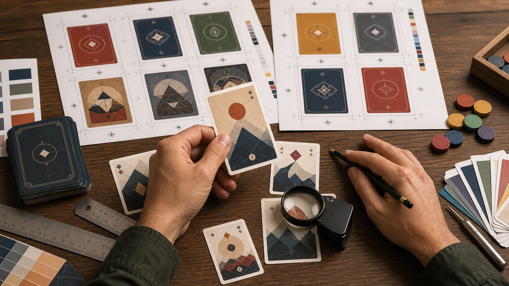
A print proof sheet is a compact PDF containing representative cards arranged at their intended physical size. It is not merely a cheaper substitute for a finished deck. Used carefully, it becomes a diagnostic instrument for checking dimensions, bleed, contrast, information hierarchy, repeated components, and the practical experience of holding cards in real light.
This guide explains how small board game teams can build useful proof sheets without dedicated imposition software. The emphasis is on review copies rather than production-ready printer files. A commercial printer may impose cards according to its own machinery, so always follow its templates and submission requirements for the final order.
Why individual card previews hide print problems
Digital design tools encourage creators to inspect one card at a time. That view is useful for illustration and typography, but it conceals several kinds of inconsistency.
A sheet containing twelve or eighteen cards makes variations visible at once. A title that shifted two millimeters on one card becomes obvious beside its neighbors. Slightly different icon sizes stop looking intentional. Dark cards that consume too much ink stand out against lighter members of the same deck.
Proof sheets also force designs into physical dimensions. A card displayed across a laptop screen may be four times larger than the printed object. Zoom settings are unreliable because screen density, browser scaling, and operating-system settings differ. A PDF printed at 100 percent gives you a much more meaningful test, provided the source dimensions and printer settings are correct.
The sheet should answer specific questions:
- Is essential information comfortably inside the safe area?
- Can players identify the card category from across a table?
- Are repeated elements aligned consistently?
- Do thin lines and small icons survive ordinary office printing?
- Can long titles, large values, and unusual illustrations fit without breaking the design?
- Does the deck remain legible under warm, cool, and uneven lighting?
A sheet designed around these questions is more valuable than one filled with randomly selected cards.
Choose diagnostic cards instead of a random sample
Do not begin by exporting the first page of the deck. Select cards that represent design extremes. A good review set deliberately tries to break the template.
Include the card with the longest title, the densest rules text, the shortest rules text, the largest numerical value, and the most visually complicated illustration. Add examples from every frame color, rarity treatment, faction, or card family. If some cards use warning symbols or status markers, include those as well.
A practical first sheet might contain:
| Test card | What it reveals |
|---|---|
| Longest title | Wrapping, truncation, and title-box height |
| Densest text | Minimum readable type and line spacing |
| Nearly empty card | Awkward gaps and weak visual balance |
| Darkest illustration | Shadow detail and ink-heavy areas |
| Lightest illustration | Faint borders and low-contrast icons |
| Maximum icon count | Spacing and symbol recognition |
| Each card family | Color and frame consistency |
| Card back | Centering and edge sensitivity |
Add at least two ordinary cards. A proof made entirely from edge cases can encourage unnecessary redesign because every example looks unusually difficult. Typical cards provide a baseline for judging the system as players will usually encounter it.
If the deck contains hidden information, keep card backs on a separate review page. Duplex alignment on a home or office printer is rarely precise enough to approve production registration, but a test can still reveal whether a back design is dangerously sensitive to small cutting shifts.
Establish dimensions before arranging the page
Card size, bleed, and safe area describe different boundaries. Confusing them is one of the easiest ways to produce an invalid review.
The trim size is the intended size after cutting. Bleed extends artwork beyond that boundary so a small cutting variation does not expose an unwanted white edge. The safe area sits inside the trim and keeps text, icons, and other essential content away from the blade.
Suppose a poker-size prototype has a trim size of 63 × 88 millimeters and the chosen printer requests 3 millimeters of bleed on every side. Each exported face would then measure 69 × 94 millimeters. That example is not universal; the printer's own template is authoritative.
Before exporting, record four values in a small production note:
- Trim width and height.
- Required bleed on each edge.
- Recommended safe-area inset.
- Target resolution and accepted color settings.
Use millimeters or inches consistently. Repeated conversions introduce rounding errors, especially when design software stores dimensions in pixels. If assets need uniform pixel dimensions, use Resize Image to standardize them, but calculate the target from the physical size and intended pixel density rather than choosing an arbitrary web resolution.
For example, a 69 × 94 millimeter export at 300 pixels per inch is approximately 815 × 1110 pixels. Preserve the exact dimensions required by the printer if it supplies a template. Do not resize a finished file back and forth between several pixel sizes.
Normalize the source images without degrading them
Proof sheets are easiest to assemble when every card face has the same canvas dimensions, orientation, and file format. Mixed exports can create subtle scaling differences even when the visible card frames appear similar.
Start with lossless master exports. PNG is a practical choice for card faces containing small type, flat colors, borders, and line art. JPEG can introduce halos around letters and icons, particularly after several save cycles. If your design application produces several formats, Convert Image can help normalize review copies while leaving the original masters untouched.
Use a simple file-naming pattern that survives sorting, such as family-cardname-v07-front.png. Include version information in the filename or project folder, but do not place it inside the printable card unless it is meant to remain in the game.
Inspect the normalized files for these common defects:
- One image has a different pixel width or height.
- A card was exported without bleed.
- Transparent pixels appear around what should be a full-bleed background.
- A profile conversion changed one family's colors.
- A previous JPEG export was converted to PNG without removing its compression artifacts.
- An image was enlarged from a low-resolution preview.
Compression can be useful when a review PDF becomes difficult to share, but apply it only after preserving clean masters. Test a few detailed cards with Compress Image and inspect thin type, diagonal lines, and textured gradients before processing the rest.
Build a review sheet that exposes expensive mistakes
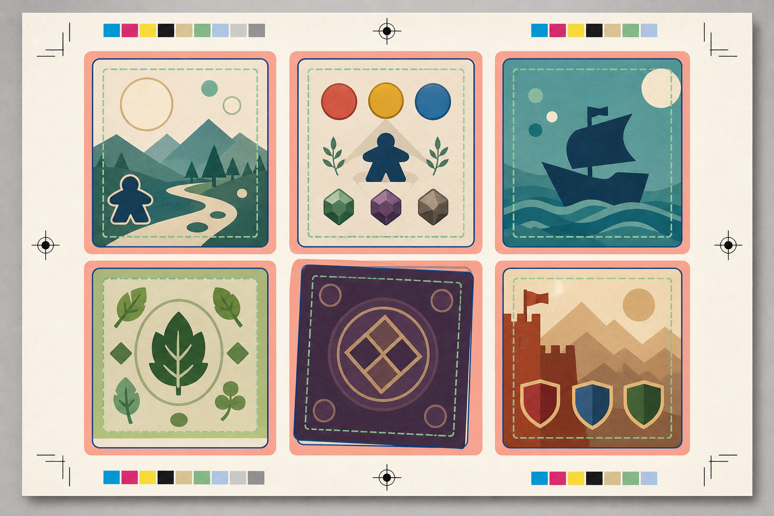
Arrange cards at 100 percent of their intended physical size. A review page is not useful if cards are enlarged to fill space or reduced to fit an arbitrary grid.
Choose a page size that your team can print reliably. A4 and US Letter are convenient for distributed reviews; A3 or Tabloid can hold more cards but may cause colleagues to print with automatic scaling. Fewer cards at the correct size are preferable to a crowded sheet that nobody can reproduce accurately.
Leave visible gaps between card images. The gap prevents one card's bleed from visually merging with the next and gives reviewers room to make notes. If reviewers will cut samples by hand, allow additional space for crop marks and safe ruler placement.
A useful PDF can contain several purpose-built pages:
Page 1: Template consistency
Place cards from the same family next to each other in a strict grid. This makes title positions, icon scales, border widths, and text baselines easy to compare.
Page 2: Stress cases
Group the longest text, busiest art, lowest contrast, and most crowded icon combinations. Label the cards outside the artwork if reviewers need identifiers. Keep those labels far enough away that they cannot be mistaken for printable card content.
Page 3: Color families
Arrange one example from every faction, suit, rarity, or resource type. The goal is to judge whether categories remain distinguishable under imperfect printing and color-vision differences.
Page 4: Front and back sensitivity
Place several fronts beside the shared back. Add a simple trim-size reference rectangle or ruler mark outside the card area. This page helps reviewers discuss centering, although it cannot certify duplex registration.
When the image pages are ready, turn them into PDFs using Image to PDF, then combine separate sections with PDF Merge. Keep the page order stable between review rounds so comments such as “page 2, row 3” remain meaningful.
Add controls that reveal accidental scaling
A PDF can contain correctly sized cards and still be printed incorrectly. Many print dialogs default to “Fit,” “Shrink oversized pages,” or a similar setting. Add a measurement control outside the card grid so each reviewer can detect scaling.
A 50-millimeter line, a one-inch square, or an outline matching the exact trim size is sufficient. After printing, measure it with a physical ruler. If it is wrong, the cards are wrong too.
Ask reviewers to select actual size or 100 percent in the print dialog. They should verify that the selected paper size matches the PDF page and disable borderless enlargement unless the test specifically requires it. Office printers can also introduce small directional distortions, so the measurement control should ideally include both a horizontal and vertical reference.
Do not rely on crop marks as the only control. A reviewer may not know the intended distance between them. A stated measurement in the review instructions is easier to verify, while the visual control itself can remain free of project branding.
Inspect the printed sheet at actual playing distance
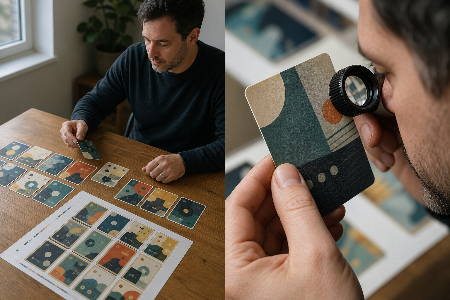
Begin the review without a magnifier. Put the sheet on a table, stand or sit where a player normally would, and locate the information needed to make a decision. If every card must be lifted close to the face, the hierarchy may be too weak.
Evaluate the design in layers.
First, check recognition. Can you distinguish card families, costs, values, and primary actions quickly? Category color should not be the only signal; shape, iconography, or frame structure can provide redundancy.
Second, check reading comfort. Read several dense cards rather than one. A type size that is technically decipherable may become exhausting over a long session. Look at line length, line spacing, paragraph breaks, and contrast behind the text.
Third, inspect production tolerance. Cut out two or three samples along the trim marks. Stack them and look for elements that appear to jump between cards. Borders close to the edge magnify tiny cutting differences. If a one-millimeter shift makes the back look badly off-center, consider a less alignment-sensitive design.
Finally, use close inspection for technical defects. Look for JPEG halos, broken fine lines, muddy shadows, banding in gradients, and tiny transparent seams. A magnifier or phone camera can help diagnose those defects, but it should not replace the normal-distance test.
Test under more than one light source. Warm household lamps can reduce separation between certain colors, while cool office lighting may make pale backgrounds look harsher. Matte sleeves add another layer of diffusion, so insert cut samples into the sleeves intended for playtesting.
Use a repeatable annotation system
Unstructured feedback such as “the card feels busy” is difficult to apply. Give reviewers a short set of annotation codes and ask them to mark the printed sheet or an exported copy.
For example:
| Code | Meaning | Likely action |
|---|---|---|
| T | Typography problem | Adjust size, spacing, or hierarchy |
| C | Contrast problem | Change value, color, or background treatment |
| A | Alignment inconsistency | Correct template position or export |
| E | Edge-risk problem | Move essential content inward or extend bleed |
| I | Icon recognition problem | Simplify, enlarge, or separate the icon |
| P | Print artifact | Inspect source quality or export settings |
Require a location and reason with each code. “C: cost icon disappears against the yellow illustration” is actionable. “C: bad color” is not.
Record findings by underlying component rather than only by card. If the same footer problem appears on nine cards, update the shared template instead of repairing nine individual exports. After revisions, regenerate the diagnostic set and keep the earlier PDF. Side-by-side versions make it easier to confirm that a correction did not introduce a new problem.
Separate design approval from printer approval
A home proof can approve hierarchy, approximate size, text comfort, and template consistency. It cannot reliably predict every property of commercial printing.
Paper stock changes contrast and color. Coatings affect glare and saturation. Rounded corners alter how close edge elements appear. Professional cutting and duplex registration have their own tolerances. Colors produced by an office printer may differ substantially from a commercial press.
Use two distinct decisions:
- Design proof approved: content, hierarchy, safe placement, and consistency are acceptable.
- Production proof approved: the selected printer's physical sample meets expectations for stock, color, cutting, and finish.
This distinction prevents a team from treating an inexpensive laser print as a color contract. It also keeps design changes from being mixed with printer-specific concerns.
Before ordering a test deck, download the printer's current template and rebuild the delivery files from the clean masters. Do not submit the arranged office proof sheet unless the printer explicitly requests that layout. Many card manufacturers want separate fronts, a specific page order, or files produced through their own template system.
Final preflight checklist
Run one last audit before sharing the proof PDF:
- Every card image has identical outer dimensions.
- Bleed, trim, and safe-area values match the intended specification.
- Cards are placed at their actual physical size.
- The PDF page size is clearly stated.
- Horizontal and vertical measurement controls are included.
- Long text, short text, dark art, light art, and crowded icons are represented.
- Every card family or visual category appears at least once.
- Card backs are checked for edge sensitivity.
- The review instructions specify 100 percent printing.
- Reviewers have annotation codes and a version identifier.
- Clean master images remain separate from compressed sharing copies.
- The final printer submission will be rebuilt according to the printer's own requirements.
A strong proof sheet is intentionally unglamorous. Its job is to make inconsistencies easy to see, give reviewers a shared physical reference, and expose expensive errors while they are still cheap to correct. For a small board game team, that modest PDF can be one of the most useful artifacts between a promising screen design and a prototype deck that genuinely works on the table.