Rubber Stamp Impression Proof Sheets for Small-Batch Packaging
Build consistent photo proof sheets for hand-stamped boxes, bags, and labels using controlled capture, crop standards, defect codes, and compact review PDFs.
Rubber Stamp Impression Proof Sheets for Small-Batch Packaging
Hand-stamped packaging gives small product runs a tactile quality that digitally printed boxes often lack. It also introduces variation. Ink coverage changes as a pad dries, flexible bags shift under pressure, and a stamp that looked centered on the first carton may drift across the next twenty.
A proof sheet turns those variations into something a maker, production lead, or remote client can review consistently. Instead of sending a loose folder of phone photos, you present comparable impressions in a compact grid with stable framing, useful identifiers, and visible defect categories.
This guide describes a practical system for documenting rubber-stamped boxes, bags, labels, belly bands, and hang tags. It is intended for short production runs where automated inspection would be excessive but visual evidence still matters.
Decide what the proof sheet must prove
Start with the decision the reviewer needs to make. A beautiful photograph is not necessarily useful evidence. The image should answer a limited set of production questions:
- Is the impression positioned inside the approved area?
- Is the ink coverage acceptably even?
- Are small details open rather than filled with ink?
- Is the stamp level relative to the package edge?
- Are ghosting and double strikes absent?
- Does the impression remain consistent across the run?
Write the acceptance criteria before taking pictures. Otherwise, the framing may change whenever a new defect appears.
For example, a coffee roaster stamping 100 kraft bags might define an acceptable impression as centered within 3 mm, fully legible, free from double edges, and without an unprinted gap crossing a major design element. A soap maker may care more about oil-resistant ink adhesion and less about tiny differences in density.
Avoid using a proof sheet to judge color with laboratory precision. Phone cameras, automatic white balance, displays, and PDF viewers all alter color. The sheet can reveal large shifts, such as a black impression becoming visibly gray, but a calibrated densitometer or physical approved sample is better for exact color approval.
Choose samples that represent the run
Photographing only the best impression hides useful production information. A small sampling plan gives the reviewer a more honest view without documenting every unit.
For runs below 30 pieces, capture the first acceptable piece, one or two middle pieces, and the final piece. For runs between 30 and 200, add a sample after every ink-pad refresh, operator change, package-material change, or interruption. Larger runs may need a fixed interval based on the cost of failure.
| Production event | Suggested sample | What it can reveal |
|---|---|---|
| Initial setup | First three strikes | Positioning and pressure problems |
| Approval point | First accepted strike | Visual reference for the run |
| Normal production | One at a fixed interval | Gradual fading or drift |
| Ink refresh | First two strikes afterward | Flooding and excess ink |
| Material change | One per new batch | Absorption or texture differences |
| End of run | Final two strikes | Pad exhaustion and operator fatigue |
Keep rejected samples when they explain a decision. One good impression beside one failed impression can be more instructive than six nearly identical good ones. Mark the physical item outside the photographed review area with a removable note so it can be traced later.
Build a repeatable capture station
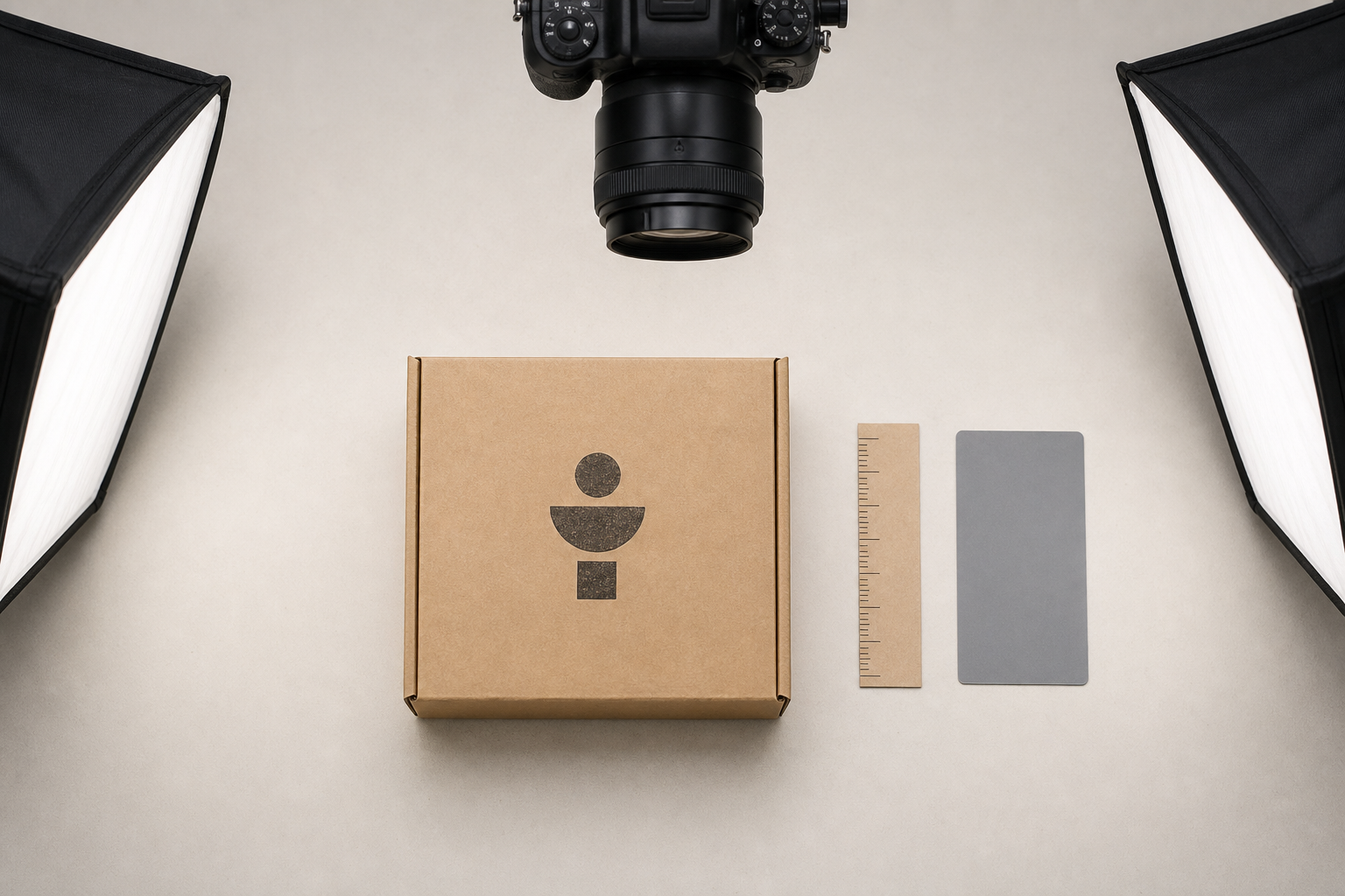
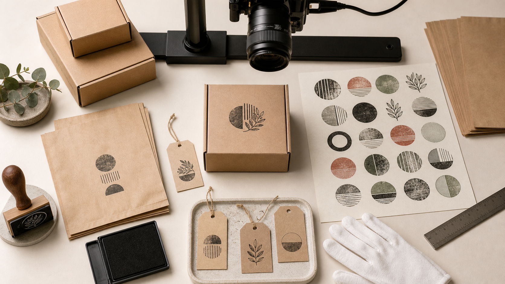
A permanent studio is unnecessary. You need a stable camera position, diffuse light, a neutral surface, and a few alignment references.
Mount the phone or camera directly above the table when the stamped face can lie flat. A small copy stand is ideal, but a rigid overhead arm also works. Avoid holding the phone by hand: slight changes in angle make rectangular packages appear skewed and complicate comparison.
Place two diffused lights at roughly 45-degree angles on opposite sides. This reduces hard shadows from box edges and reveals the impression without producing a bright hotspot. For glossy labels, move the lights farther to the sides or use a simple diffusion tent. Turn off mixed room lighting so daylight and warm bulbs do not create conflicting color casts.
Include a small ruler in one setup photograph, but do not let it cover the package. A neutral gray card can help stabilize exposure and white balance. Once the setup is established, remove unnecessary references from close-up frames unless scale is important to the decision.
Lock focus, exposure, and white balance if the camera application allows it. Automatic exposure can brighten a weak impression until it looks healthier than it does in person. Likewise, a dark kraft box may cause the camera to overexpose pale ink. Stable settings make differences between samples more meaningful.
Handle dimensional packages without misleading angles
Boxes and filled bags rarely stay perfectly flat. If the impression is on a vertical face, position the camera perpendicular to that face rather than shooting downward. Support flexible packaging from behind with a clean insert so wrinkles do not distort the stamped area.
Take one context image showing the whole package and one inspection image centered tightly on the impression. The context image proves placement; the close-up reveals ink behavior. Do not try to make a single photograph perform both jobs.
If the package shape prevents a straight view, record the limitation. A visibly angled photograph should not be used for millimeter-level position judgments.
Use a consistent shot list
A short shot list prevents missing evidence and limits unnecessary files. For each selected sample, capture:
- A full-package view with all edges visible.
- A medium view showing the stamp and its nearest alignment references.
- A close-up showing ink coverage and fine details.
- An angled detail only when surface texture, smearing, or gloss matters.
The full-package view should use nearly the same framing for every sample of a given package type. Leave a small border around the object so later cropping does not remove an edge needed for alignment assessment.
For the close-up, focus on the plane of the paper rather than a raised box seam. Check the image at full size before moving the sample. Motion blur can look like stamp ghosting, and aggressive camera sharpening can exaggerate rough paper fibers.
Create a simple capture identifier before photography, such as BAG-A-024-MID or BOX-C-001-SETUP. It may be written on a card placed beside the package for the first frame, then removed for the clean inspection images. Do not place confidential order information in the photograph.
Crop without hiding production context
Cropping is where proof images often become inconsistent. One sample fills the frame while another includes half the workbench, making size and placement difficult to compare.
Define crop templates by package and shot type. A full-package crop might retain a 5% border on every side. A close-up crop might include the impression plus a fixed amount of surrounding material. If placement is measured from the lower-right corner, that corner must remain visible in every medium view.
Use the image resizer to standardize dimensions after cropping. Consistent pixel dimensions help images align cleanly in a grid and prevent one high-resolution phone image from dominating the document.
Do not straighten each image solely by making the stamp design look level. The stamp may actually be crooked. Straighten according to a trustworthy package edge or capture reference; otherwise, editing removes the defect being inspected.
Apply only evidence-preserving corrections
Basic exposure and white-balance corrections are acceptable when they compensate for the capture environment. Retouching the impression is not. Avoid healing gaps, deepening faded ink selectively, removing double edges, or smoothing paper texture.
A safe correction should affect the full frame predictably. If a change alters only the stamped pixels, it is probably changing evidence rather than clarifying it. Keep the original files in a separate folder so any disputed correction can be checked.
AI editing requires the same restraint. The AI photo editor may be useful for non-evidentiary presentation images, but generative removal, reconstruction, and local replacement should not be applied to inspection photographs. A proof sheet should disclose the physical result, including flaws.
Classify defects with a compact code set
Defect codes make review faster and filenames shorter. Keep the vocabulary small enough that two people will apply it similarly.
| Code | Defect | Visible sign | Likely cause |
|---|---|---|---|
| LI | Light impression | Missing or pale areas | Low pressure, dry pad, uneven surface |
| FI | Filled detail | Small gaps close up | Excess ink or heavy pressure |
| DS | Double strike | Offset duplicate edge | Stamp moved during contact |
| SK | Skew | Baseline differs from package edge | Misaligned placement guide |
| SM | Smear | Ink dragged beyond the design | Contact before ink dried |
| BI | Bleed or feathering | Soft spreading edges | Absorbent stock or unsuitable ink |
| PC | Partial contact | One region consistently absent | Warped stamp or uneven backing |
Record severity separately: observation, rework, or reject is often enough. This avoids inventing an overly precise numeric score.
A filename such as BOX-C_042_DS_reject_close.jpg communicates more than IMG_7284.jpg. However, do not rename files until the originals have been copied safely. Preserve the original camera filename in a manifest if traceability is important.
Export images without destroying stamp detail
Thin letterforms, distressed artwork, and fibrous paper can suffer under aggressive compression. The result may show halos, block patterns, or false gaps that resemble production defects.
Start with a long edge between roughly 1600 and 2400 pixels for close-up review images. That is usually sufficient for screen inspection without carrying the full size of a modern phone photograph. Use a common color space such as sRGB for predictable display.
JPEG is suitable for ordinary photographs, especially when paper texture creates many subtle tones. PNG can preserve crisp edges but may become unnecessarily large for textured kraft material. WebP offers efficient delivery, but confirm that every recipient's review environment supports it before using it as the only copy. The image converter can produce consistent review formats from mixed camera exports.
Use the image compressor only after dimensions are standardized. Inspect compressed files at 100% and compare them with the originals. Look closely at fine counters inside letters, narrow negative spaces, and rough ink boundaries.
A useful rule is to stop compressing when file artifacts could be mistaken for a stamp defect. A slightly larger review pack is preferable to a small file that creates an argument about whether a broken edge exists on the package or only in the image.
Assemble an N-up proof sheet
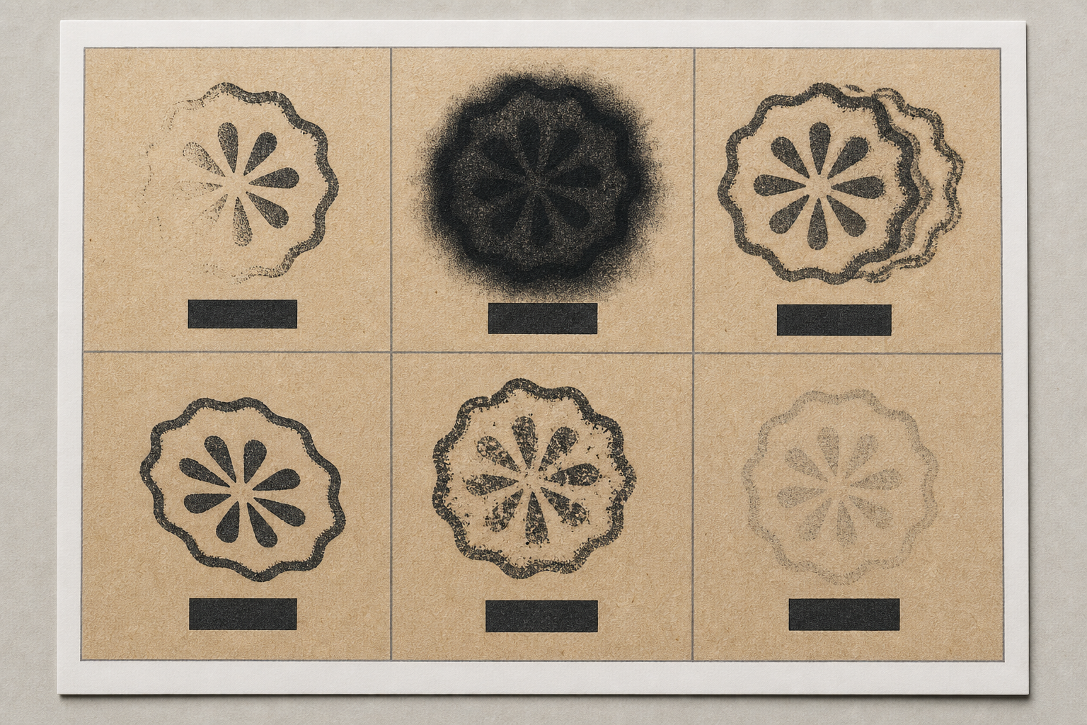
An N-up sheet places several samples on one page so the eye can compare them quickly. A two-by-three grid works well for landscape pages; a two-column layout leaves more room for notes.
Give every cell the same structure:
- Sample identifier
- Production point or time
- Full view or close-up label
- Status: accepted, rework, or rejected
- Defect code when applicable
- Short factual note
Keep captions outside the photograph. Overlay text can cover weak edges and makes the image harder to reuse. Use generous white space between cells so reviewers do not associate one caption with the wrong sample.
Place the approved reference first, followed by samples in production order. This arrangement makes fading and drift easy to spot. If the pack includes rejects, place them after the accepted sequence or on a clearly separated exception page.
Avoid shrinking six close-ups until the fine details disappear. Print a test page at actual size. If the smallest important feature cannot be assessed, reduce the number of cells per page or add a dedicated defect-detail page.
The opening page should state the product or package type, run identifier, capture date, material batch if relevant, and the approval question. Keep personal contact details and customer addresses out of the document unless they are genuinely required.
Convert the review pack to PDF
PDF is useful because it freezes page order and preserves the comparison layout. Before conversion, arrange image files in the intended sequence with sortable prefixes such as 01_reference, 02_start, and 03_mid.
The image-to-PDF tool can combine prepared pages or ordered photographs into a portable review document. If separate sections were produced by different team members, use PDF merge to join the cover, comparison pages, and exception details in the correct order.
Check the final PDF rather than assuming the source images guarantee a good result. Review it on both a desktop display and a phone. Confirm that:
- Pages appear in production order.
- Captions remain readable at normal zoom.
- Images are not stretched or unexpectedly cropped.
- Fine ink details survive export.
- No blank pages or duplicate samples remain.
- The filename identifies the run and revision.
Use revision suffixes such as r01 and r02 instead of names like final-new-really-final. When a reviewer requests replacement images, issue a new revision and retain the prior PDF. This creates a modest audit trail without requiring specialized approval software.
Review the sheet with a fixed sequence
A consistent review order reduces the chance that a striking defect distracts from less obvious problems.
First, inspect position using full-package views. Compare the impression with package edges, seams, windows, and folds. Second, inspect density across the run. Look for gradual fading as well as abrupt changes after an ink refresh. Third, zoom into detail images to find filled counters, broken fine lines, feathering, and double strikes. Finally, check exception notes against the visible evidence.
Reviewers should comment with sample identifiers rather than page position alone. “Reject BOX-C-042 for DS” remains clear if pages are rearranged; “the bottom-right one” does not.
Separate factual observations from decisions. “Lower edge is visibly lighter” is an observation. “Accept because the product code remains legible” is a decision. Recording both makes future comparisons more useful.
Keep originals, derivatives, and approvals separate
Use three top-level folders for each production run:
01-originalsfor untouched camera files02-reviewfor cropped, resized, and compressed derivatives03-approvedfor issued PDFs and approval records
Add a small manifest containing the run identifier, sample IDs, capture date, package material, ink or pad reference, operator initials, and PDF revision. A spreadsheet or plain CSV is sufficient.
Do not rely on the proof PDF as the only archive. Its grid images may be too small for later investigation. Retain the selected full-resolution originals according to the business's normal record policy, especially when packaging errors could cause expensive rework.
Final preflight checklist
Before sending the proof sheet, verify the following:
- The accepted reference is clearly identified.
- Samples cover setup, middle, ink-refresh, material-change, and end points where applicable.
- Camera position and lighting are consistent.
- Full-package views retain the edges needed to judge placement.
- Close-ups are sharp enough to separate blur from ghosting.
- Corrections affect the whole image and do not conceal defects.
- Defect codes are used consistently.
- File order matches production order.
- Compression has not introduced false gaps or halos.
- The PDF has been inspected after export.
- The revision number appears in the filename.
- Untouched originals remain available.
A strong rubber stamp proof sheet is deliberately plain. Its purpose is not to make every package look perfect; it is to make variation visible, comparable, and easy to discuss. With a fixed capture station, modest sampling plan, controlled image preparation, and readable N-up layout, even a tiny production team can create review evidence that is far more reliable than a stream of disconnected phone photos.