Preparing Transparent WebP Overlays for Help Center Screenshots
A practical workflow for creating clean transparent WebP overlays for help centers, product education, onboarding guides, and documentation screenshots.
Preparing Transparent WebP Overlays for Help Center Screenshots
Transparent overlays are one of the quietest ways to make product documentation easier to read. A highlight ring around a button, a blurred privacy mask, a numbered marker, a semi-transparent panel, or a floating cursor path can explain what changed without forcing readers to compare two full screenshots. The problem is that overlays are also easy to ship badly: fuzzy edges, halos on dark mode screenshots, giant PNG files, mismatched sizes, and inconsistent naming can turn a helpful visual layer into a maintenance problem.
This guide walks through a practical workflow for preparing transparent WebP overlays for help centers, onboarding guides, product education pages, release notes, and support documentation. The focus is not on making decorative graphics. It is on producing small, clear, reusable overlay assets that sit cleanly on top of screenshots and survive compression, theme changes, and future edits.
The workflow uses a few simple ideas: design overlays at the final display size, keep transparency intentional, export in the right format, inspect edges on multiple backgrounds, and keep a predictable file naming system. When a screenshot itself needs resizing, conversion, or compression, tools like Resize Image, Convert Image, and Compress Image can help keep the asset set consistent before it reaches the CMS.
What Counts as a Transparent Overlay?
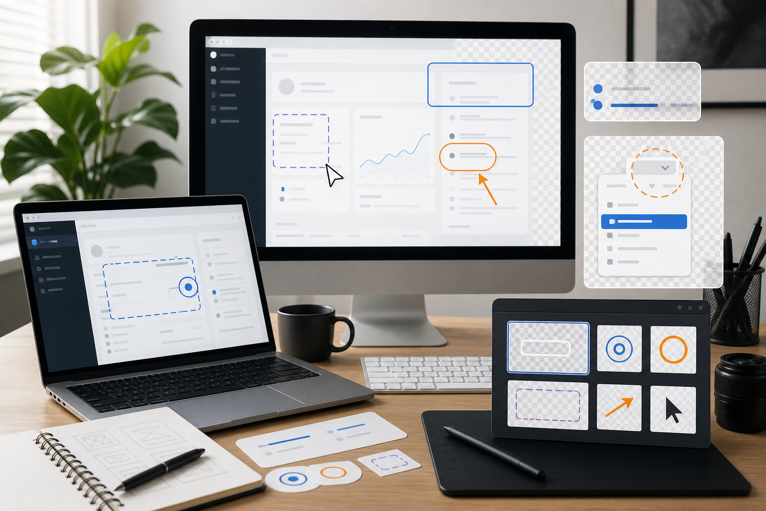
A transparent overlay is any image layer with transparent pixels that is intended to sit above another visual. In documentation, overlays usually clarify an interface rather than replace it.
Common examples include:
- A red or blue rectangle around a field that needs attention.
- A translucent wash over the rest of the screen while one area stays visible.
- A small arrow pointing to a menu item.
- A cursor trail showing a drag action.
- A privacy mask covering names, email addresses, order IDs, or account data.
- A badge that marks a new feature in a release note screenshot.
- A shadowed tooltip-shaped callout that appears above a product image.
These overlays are different from full screenshots. A full screenshot is usually a photographic or UI capture with no transparent area. An overlay depends on transparency to blend with a base image, web page, or documentation layout.
Transparent overlays are also different from annotation baked into a screenshot. A baked annotation becomes permanent. If the base screenshot changes, the entire image often needs to be recreated. A separate overlay can be updated, moved, hidden, or reused across several screenshots.
Why WebP Is Often Better Than PNG for Overlays
PNG is the traditional choice for transparency, and it is still useful. It supports lossless compression and crisp alpha transparency. But for many help center workflows, WebP gives you a smaller file while preserving enough edge quality for clean documentation.
The key is understanding what kind of overlay you are exporting.
| Overlay type | Better default | Why |
|---|---|---|
| Flat shapes with sharp edges | PNG or lossless WebP | Keeps lines and corners crisp |
| Semi-transparent shadows | WebP | Usually smaller with acceptable quality |
| Blurred privacy masks | WebP | Handles soft gradients efficiently |
| Tiny icon overlays | SVG or PNG | Vector may be better if supported by the site |
| Screenshot fragment with transparency | WebP | Smaller than PNG in many cases |
| Compliance-critical redaction | Flattened export, not decorative overlay | Avoid accidental hidden data exposure |
For help center screenshots, WebP is often the practical middle ground. It supports transparency, works broadly in modern browsers, and reduces page weight. That matters when a single article contains ten or twenty visuals.
The main risk is edge quality. A low-quality WebP export can create colored halos around transparent pixels, especially where bright annotations sit on dark UI backgrounds. The workflow below includes edge checks so the smaller file does not come at the cost of readability.
Start With the Base Screenshot
Before making overlays, clean up the base screenshot. An overlay cannot fix a screenshot that is too small, blurry, inconsistent, or full of private data.
A good base screenshot should be captured at a stable size. Avoid changing browser zoom between captures. If your help center uses images at 1200 pixels wide, capture or export close to that width. Scaling a screenshot up later usually softens UI text and makes overlays look disconnected from the interface.
Use this quick base screenshot checklist:
- Capture at a predictable browser width.
- Set zoom to 100 percent unless your documentation system has another standard.
- Hide browser extensions and unrelated tabs.
- Use realistic but non-sensitive sample data.
- Keep the cursor out of the frame unless it explains the action.
- Save the unannotated source screenshot separately.
- Resize only after deciding the final article layout.
If your screenshot dimensions need to be standardized, resize the base image first with Resize Image. This prevents a common mistake: creating an overlay for a large screenshot and then shrinking both assets separately, which can slightly misalign borders and arrows.
Decide Whether the Overlay Should Be Separate or Baked In
Separate overlays are powerful, but they are not always the right answer. Sometimes a simple annotated screenshot is more reliable.
Use a separate transparent WebP overlay when:
- The same highlight style appears across many screenshots.
- The base screenshot may be localized later.
- You want to animate or toggle annotations in the documentation page.
- The overlay is part of an interactive guide or product education component.
- The design team maintains reusable documentation marks.
Bake the annotation into the screenshot when:
- The CMS does not support layered images.
- The image will be downloaded, emailed, or shared outside the web page.
- The annotation must never be separated from the screenshot.
- The screenshot and callouts are reviewed as a single final asset.
- You need the simplest possible publishing workflow.
There is no prize for using a separate layer when the publishing system makes it fragile. If your help center editor only accepts one image per block, export a single annotated final image. If your docs site has custom components, separate overlays can reduce future maintenance.
Build the Overlay at the Final Pixel Size
The most reliable overlay is built on a canvas that matches the final base screenshot exactly. If the screenshot is 1200 by 760 pixels, the overlay should also be 1200 by 760 pixels. The transparent areas occupy the empty parts of the canvas, and the visible annotation lands at the exact coordinates it needs.
This approach avoids percentage positioning errors. It also makes QA easier: open the base screenshot, place the overlay above it, and confirm alignment.
A full-size transparent canvas is not always the smallest possible overlay, but it is often the safest for documentation. If your site can position small overlay fragments accurately, you can crop the transparent canvas later. For most teams, coordinate reliability matters more than saving a few extra kilobytes.
Use this decision table:
| Overlay canvas style | Best for | Tradeoff |
|---|---|---|
| Full screenshot-sized canvas | Help center screenshots, repeatable QA | Slightly larger file |
| Cropped overlay fragment | Icons, arrows, small markers | Requires precise placement in code or CMS |
| CSS shape instead of image | Simple boxes and highlights | Harder for non-developers to manage |
| SVG overlay | Scalable diagrams and simple vector marks | Not ideal for soft masks or raster effects |
If your documentation pipeline is maintained by writers and support specialists, full-size overlays are usually easier to audit. A file named billing-settings-highlight.webp that is the same size as the base screenshot is simple to preview and hard to misplace.
Use Transparency With a Purpose
Transparency can make annotations feel polished, but it can also make them vague. A highlight that is too faint will disappear on a busy interface. A privacy mask that is too transparent may reveal sensitive information. A shadow that looks good on a white screenshot may create a dirty edge on dark mode.
Think of transparency in three bands:
- 85-100 percent opacity for critical lines, arrows, and numbered markers.
- 45-75 percent opacity for focus washes and background dimming.
- 15-35 percent opacity for soft shadows, glows, and secondary emphasis.
For instructional overlays, clarity usually beats subtlety. A border around a button should be visible immediately. If the reader has to squint, increase contrast or reduce visual clutter.
Privacy masks deserve special treatment. If you are hiding real names, emails, IDs, addresses, or financial data, do not rely on a translucent overlay that sits separately above the screenshot. Replace or permanently obscure the sensitive content in the base image before publishing. A decorative overlay is not a redaction strategy.
Avoid the Halo Problem
The most common transparent WebP issue is a halo around semi-transparent edges. It appears when edge pixels are blended against one background during export and then displayed over another. A pale arrow may look fine on a white canvas but show a gray fringe when placed over a dark navigation bar.
To reduce halos:
- Create overlays on a transparent canvas, not a white canvas with deleted areas.
- Avoid feathered edges unless the softness is intentional.
- Test on light, dark, and mid-tone backgrounds.
- Export at a quality level that preserves edge transitions.
- Keep saturated colors away from very soft alpha edges.
- Use solid borders for important UI highlights.
A simple edge test is to preview the overlay on three temporary backgrounds: white, black, and a checkerboard or neutral gray. If the edge looks clean on all three, it will usually work on real screenshots.
For overlays used across both light and dark product themes, consider separate variants. A blue marker with a white outer stroke may work better than one universal color. The outer stroke creates separation without needing a large glow.
Choose Annotation Colors That Survive Real Screenshots
Documentation overlays often compete with product UI colors. If your app already uses blue for primary actions, a blue highlight around a button may be mistaken for part of the interface. If your app has warning states in red, red arrows may imply an error.
Choose annotation colors that are distinct from the product state language. For example:
| Product UI context | Safer overlay choice | Avoid |
|---|---|---|
| Blue SaaS dashboard | Amber or magenta highlight | Same primary blue |
| Red error-heavy form | Blue or purple marker | Red arrows that imply failure |
| Dark analytics UI | Bright cyan with light outline | Transparent black overlays only |
| Marketplace product grid | Green or violet marker | Colors used for price or discount labels |
| Admin table view | High-contrast orange border | Thin gray borders |
Keep the palette small. A help center does not need a new color language in every article. Two or three annotation colors are easier for readers to learn and easier for teams to maintain.
A practical set might be:
- Primary highlight: amber border for the target area.
- Secondary cue: blue arrow or pointer.
- Privacy mask: neutral gray block or blur.
- Disabled background wash: black at low opacity.
Export Settings That Usually Work
There is no single perfect WebP setting for every overlay. The right export depends on detail, softness, and file size budget. Still, most documentation overlays fall into a few predictable patterns.
For sharp line overlays, use lossless WebP if available, or a high-quality lossy export. The file will still often be small because most of the canvas is transparent. For soft shadows, masks, and screenshot fragments, a lossy WebP export around high quality is usually acceptable after visual inspection.
Suggested starting points:
| Overlay asset | Starting export | Check carefully for |
|---|---|---|
| Simple border rectangle | Lossless WebP or PNG | Pixel alignment and corner sharpness |
| Arrow with shadow | High-quality WebP | Shadow banding and edge halo |
| Blurred mask | WebP | Whether hidden text is still readable |
| Numbered marker | PNG or lossless WebP | Small text clarity if numbers are included |
| Full overlay with multiple callouts | WebP | Overall size and edge quality |
If your source overlay is PNG and you want a transparent WebP version, use Convert Image as part of the export pass. After conversion, open the result on a dark background and inspect edges before replacing the original.
Keep Text Out of Overlay Images When Possible
Text inside image overlays creates maintenance problems. It has to be localized, it may blur during compression, it may not meet accessibility expectations, and it is difficult to update quickly when product terminology changes.
Prefer text in HTML or MDX whenever the documentation system allows it. Use the overlay for visual attention, then explain the step in normal article text nearby.
There are exceptions. A tiny numbered marker, a short badge, or a visual label in a diagram may be acceptable. But the more words an overlay contains, the more likely it should be a real text element instead of pixels.
This is especially important for help centers that support multiple languages. A highlight rectangle can be reused across translated pages. A callout image containing English words cannot.
A Practical Overlay Workflow
Here is a clean end-to-end workflow for a small documentation team preparing transparent WebP overlays.
1. Capture the Base Screenshot
Capture the screen at the agreed documentation size. Use sample data and a stable browser width. Save the original unedited screenshot in a source folder.
Example naming:
source/billing-settings-payment-method.pngsource/billing-settings-invoice-table.pngsource/team-members-permissions-modal.png
Do not start by compressing the source. Keep a high-quality original so future edits do not compound compression artifacts.
2. Standardize Dimensions
If the article layout expects a standard width, resize the screenshot before building overlays. For example, standardize all help center desktop screenshots to 1200 pixels wide and all mobile screenshots to 390 pixels wide.
Use Resize Image for this step when the source dimensions vary. Store the standardized base separately from the raw capture.
Example:
base/billing-settings-payment-method-1200.pngbase/team-members-permissions-modal-1200.png
3. Create a Matching Transparent Canvas
Create an overlay canvas with the exact same pixel dimensions as the standardized base screenshot. Place the base screenshot underneath as a temporary guide layer, but do not include it in the final overlay export.
Add the visual marks: borders, arrows, masks, focus washes, or pointer paths. Keep them aligned to whole pixels where possible. A one-pixel misalignment can make rectangles look soft.
4. Hide the Base and Export the Overlay
Before export, turn off the base screenshot layer. The output should contain only the overlay elements and transparent pixels.
Export as WebP. If the overlay contains only simple vector-like shapes, compare PNG and WebP file sizes. PNG may be competitive for very simple assets. For soft effects and larger overlays, WebP often wins.
5. Run the Edge Check
Preview the overlay on:
- The actual base screenshot.
- A white background.
- A black background.
- A neutral gray background.
Look for halos, jagged diagonals, muddy shadows, or semi-transparent areas that accidentally reveal private information. If the overlay fails the test, revise before compression.
6. Compress Carefully
Once the overlay is approved visually, reduce file size. Use Compress Image carefully and compare the before-and-after result. Compression should not change the meaning of the annotation.
For a full article, optimize the base screenshots too. A help center page with many screenshots can become heavy even if each overlay is small.
7. Publish With Predictable Layering
In the page template or CMS, position the overlay above the base screenshot. If you use full-size overlays, the two images should share the same dimensions and scale together.
A typical structure is:
<figure class="docs-image-stack">
  <img src="/images/base/billing-settings-payment-method-1200.webp" alt="Billing settings payment method screen" />
  <img class="docs-overlay" src="/images/overlays/billing-settings-payment-method-highlight.webp" alt="" aria-hidden="true" />
</figure>
The overlay is usually decorative because the article text explains the instruction. In that case, keep its alt empty and mark it as hidden from assistive technology. If the overlay contains essential information not present in the text, revise the text so the instruction is not trapped inside the image.
File Naming That Prevents Confusion
Overlay workflows fail when nobody can tell which overlay belongs to which screenshot. Use names that connect the base, overlay, and final article.
A practical naming pattern:
article-section-screen-purpose-size.formatExamples:
billing-payment-method-base-1200.webp
billing-payment-method-highlight-card-1200.webp
billing-payment-method-mask-email-1200.webp
team-permissions-modal-base-1200.webp
team-permissions-modal-highlight-role-menu-1200.webp
Avoid vague names like arrow-final.webp, new-overlay.webp, or screenshot-3-fixed.webp. They make future maintenance expensive.
If your team uses a shared file manager, keep source, base, overlay, and final assets in separate folders:
/help-center-assets
  /source
  /base
  /overlays
  /final
This lets writers replace one layer without searching through a folder full of mixed exports.
Accessibility and Reader Experience
Transparent overlays should make the article easier to follow, not become the only place where instructions live. The reader should understand the step from the surrounding text even if the image fails to load.
Use these rules:
- Put the actual instruction in body text.
- Keep overlay images decorative when possible.
- Do not rely on color alone to communicate state.
- Use shape, position, and contrast together.
- Avoid tiny text inside overlays.
- Make sure the base screenshot has useful alt text.
- Do not obscure the area the reader needs to inspect.
For example, instead of writing only "Click the highlighted button," write "Select Settings in the left sidebar, then open Billing." The overlay can still highlight the Billing item, but the instruction remains readable and searchable.
WebP, PNG, and SVG in the Same System
A mature documentation image system may use more than one format. The goal is not to force every overlay into WebP. The goal is to use the format that fits the asset.
Use WebP for:
- Larger transparent overlays with soft edges.
- Screenshot fragments with transparency.
- Shadows, masks, and blended effects.
- Assets where size reduction matters.
Use PNG for:
- Small crisp overlays where PNG is smaller.
- Pixel-perfect UI markers.
- Assets that show compression artifacts in WebP.
- Legacy environments where WebP support is a concern.
Use SVG for:
- Simple arrows, circles, and icons that need to scale.
- Documentation systems with developer-maintained components.
- Theme-aware annotations controlled by CSS.
When you receive assets in mixed formats, normalize them during the publishing pass. Convert Image is useful when a team sends PNG overlays but the site standard is WebP. For image sets that need to become printable review packets, Image to PDF can turn selected screenshots into a PDF handoff without changing the original web assets.
Quality Control Checklist Before Publishing
Before an overlay reaches production, review it in context. Do not judge it only in the design app.
Use this checklist:
- The overlay matches the base screenshot dimensions.
- The overlay is aligned at the final display size.
- Edges look clean on light and dark areas.
- The file size is reasonable for the page.
- The annotation does not cover important UI text.
- Color choices do not conflict with product states.
- Any sensitive data is removed from the base, not merely covered by a removable layer.
- The article text explains the instruction without depending on the image.
- The base screenshot has appropriate alt text.
- File names connect the base and overlay clearly.
- Source files are stored separately from optimized publishing files.
For pages with many screenshots, test the full article on a slower connection or a mobile device. A single overlay may be tiny, but twenty base screenshots plus overlays can still create a heavy page.
Example: Highlighting a New Sidebar Setting
Imagine a product team is documenting a new setting inside an admin sidebar. The base screenshot shows the full settings page. The overlay needs to dim the rest of the interface and draw attention to one new menu item.
A good workflow would look like this:
- Capture the settings page at 1200 pixels wide.
- Resize the screenshot to the standard docs width if needed.
- Create a 1200 pixel wide transparent overlay canvas.
- Add a semi-transparent black wash over the full canvas.
- Cut out or avoid covering the target sidebar item.
- Add a high-contrast border around the menu item.
- Export the overlay as WebP.
- Preview it over the base screenshot and on dark and light backgrounds.
- Compress the base screenshot and overlay separately.
- Publish the stacked image in the article.
The article text should still say something like: "Open Settings, then choose Workspace access in the sidebar." The overlay helps the reader find it faster, but the instruction remains complete without the image.
Example: Privacy Mask for Support Documentation
Support teams often need screenshots that show realistic workflows without exposing user information. A transparent overlay may seem like an easy way to mask names or emails, but this is risky if the sensitive data remains in the base image.
A safer workflow is:
- Replace real data with fake data before capture whenever possible.
- If real data was captured, edit the base screenshot so the sensitive pixels are permanently removed or replaced.
- Use an overlay only for visual polish, such as a neutral block that matches the documentation style.
- Export the final base with no recoverable private information.
- Keep source files containing sensitive data out of shared publishing folders.
For screenshots that contain text you need to audit before publishing, Image OCR can help extract visible words from the image so reviewers can spot names, emails, ticket numbers, or customer details that should not appear.
Common Mistakes to Avoid
The first mistake is exporting the overlay against a white background. Even if the background is later deleted, edge pixels may retain a pale fringe. Always work on a real transparent canvas.
The second mistake is making overlays at one size and publishing them at another. Scaling can soften borders and shift alignment. Build and test at the final display size whenever possible.
The third mistake is over-compressing tiny text or numbered markers. If a marker contains a number, inspect it at mobile size. A file that looks fine on a desktop monitor may become muddy on a phone.
The fourth mistake is using overlays as redactions. If the base image contains private data, remove the data from the base image itself.
The fifth mistake is creating a different visual language in every article. Readers should not need to relearn what each color or marker style means. Standardize your overlay colors, border widths, and shadow styles.
A Simple Team Standard
If your team does not yet have an overlay standard, start with a small one. A lightweight standard is easier to follow than a detailed style guide nobody opens.
Here is a practical starting point:
| Rule | Standard |
|---|---|
| Desktop screenshot width | 1200 px |
| Mobile screenshot width | 390 px |
| Overlay canvas | Same dimensions as base screenshot |
| Primary highlight | 3 px amber border with 2 px light outer stroke |
| Background dim | Black at 45 percent opacity |
| Privacy mask | Permanent edit in base image, optional neutral overlay style |
| Export format | WebP by default, PNG when sharper or smaller |
| Naming | Match base screenshot name plus overlay purpose |
| QA | Check on base, white, black, and gray backgrounds |
This is enough to make future assets consistent without slowing down every article.
Final Publishing Pass
The last pass is about the whole page, not the individual image. Open the article and scan it as a reader would. The overlays should guide attention naturally. They should not make the page feel noisy, repetitive, or over-annotated.
If every screenshot has three arrows and two boxes, the reader will stop trusting the marks. Use overlays where they remove ambiguity. Leave simple screenshots alone when the surrounding text is clear.
Also check page weight. Convert large screenshots to efficient formats, compress finished assets, and remove unused exports from the publishing folder. A documentation page with crisp visuals should still load quickly.
Transparent WebP overlays work best when they are treated as part of a system: consistent screenshot sizes, clean source files, careful transparency, predictable names, and a small QA checklist. Once that system is in place, help center visuals become easier to update and easier for readers to understand. The result is not flashy. It is documentation that points to the right thing, loads without unnecessary weight, and stays maintainable after the product changes.