Gallery Wall Label Photo OCR Cleanup for Exhibition Catalog Notes
A practical guide for turning quick gallery wall label photos into readable OCR text and tidy reference PDFs for curators, writers, educators, and archivists.
Gallery Wall Label Photo OCR Cleanup for Exhibition Catalog Notes
Gallery wall labels look simple until you try to turn them into reliable notes. The type is small, the lighting is uneven, the label may sit behind reflective acrylic, and you are usually capturing it from an awkward angle while other visitors move through the room. Later, when you need the artist name, medium, lender credit, date range, or accession number, the photo that seemed clear on-site can become a gray rectangle with warped text and a bright reflection across the most important line.
This guide is for curators, educators, exhibition writers, gallery assistants, collection researchers, and local history volunteers who need to convert quick wall label photos into usable reference material. The goal is not to create a perfect archival surrogate. The goal is a practical, repeatable cleanup system that gives you readable OCR text, traceable source images, and compact PDFs you can share with a team without losing the connection between each label and the object it describes.
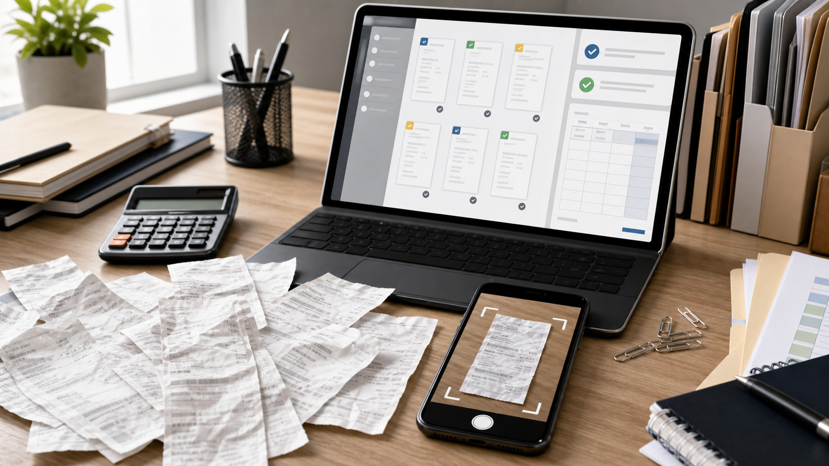
You can use the steps here after a museum visit, during exhibition documentation, while preparing a lecture, or when building catalog notes from a temporary show. The tools are simple: crop the label, correct the image enough for text recognition, extract the text with OCR, and save the evidence in a tidy packet. ConvertAndEdit tools can help at each stage, especially when you need to move between images and PDFs without opening heavy desktop software.
Why Gallery Labels Are Harder Than Ordinary Documents
A wall label is not a flat office document. It is a small object installed in a public space, often under design constraints that work against fast text capture. Museums and galleries prioritize lighting, visitor movement, object safety, and visual calm. Those choices are good for the room, but they introduce problems for OCR.
Common issues include:
- Small type captured from too far away
- Glare from acrylic, varnished wall surfaces, or nearby casework
- Warm spotlights that create yellow casts and uneven shadows
- Angled photos because the label is low, high, or close to an object
- Mixed typography, including italics, small caps, accession numbers, and lender credits
- Nearby wall texture that reduces contrast around thin characters
- Partial obstruction by visitor shadows, ropes, plinths, or object cases
OCR engines prefer clean, high-contrast, front-facing text. Gallery documentation often gives them the opposite. That is why the cleanup stage matters. You are not trying to make the image beautiful; you are making the letters boring enough for OCR to read.
A good label cleanup pass should preserve the source, improve legibility, and avoid over-editing. If the corrected image changes punctuation, compresses diacritics, or hides uncertain characters, the resulting text may look confident while being wrong. Treat OCR as a draft transcription, not as proof.
The Capture Checklist: Make OCR Boring Before You Start
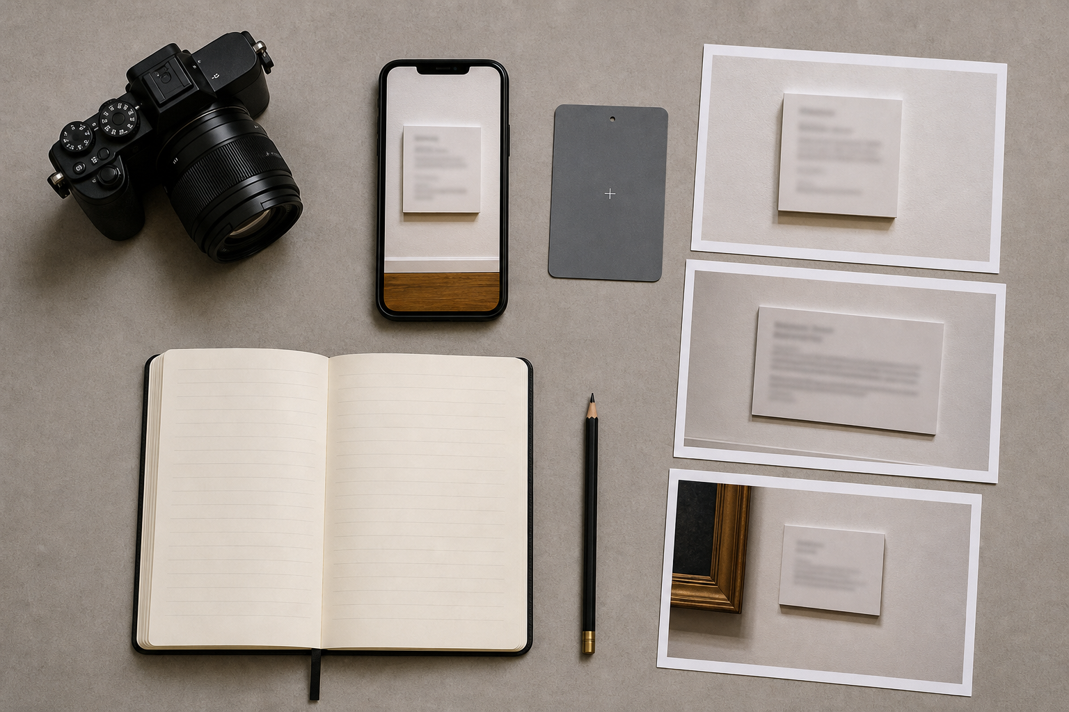
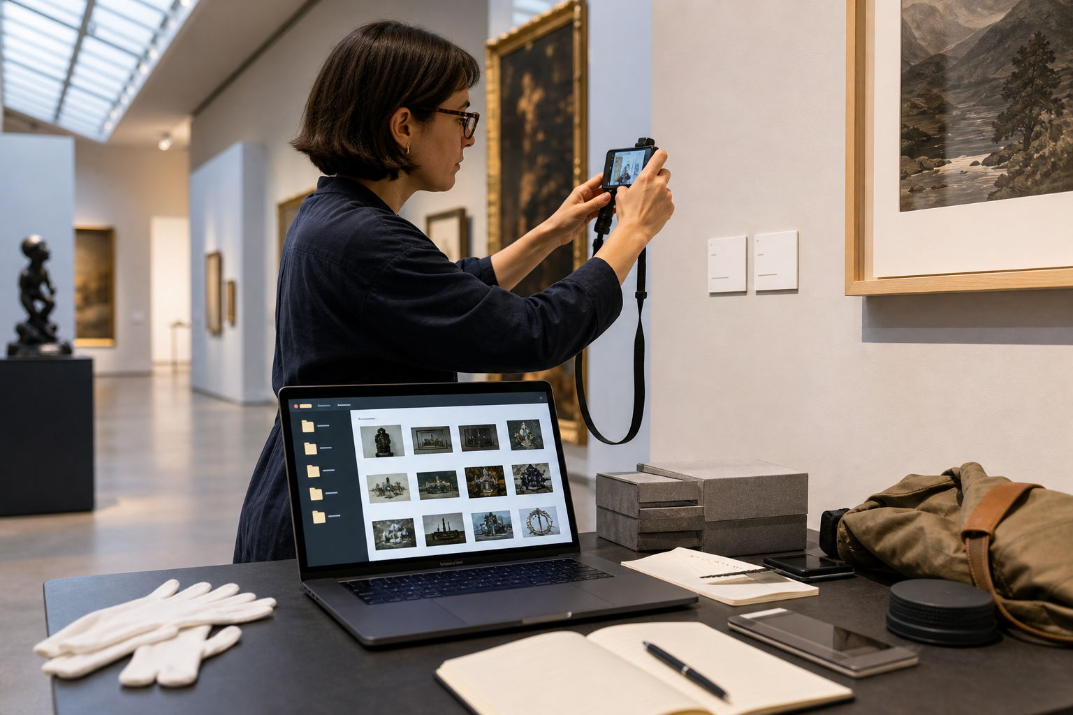
The best cleanup happens before you press the shutter. If you are allowed to photograph in the exhibition space, take a few extra seconds per label. Those seconds can save hours later.
Use this field checklist when possible:
- Photograph the artwork first, then the label immediately after it.
- Fill most of the frame with the label, but keep a little margin around all edges.
- Take one straight-on shot and one slightly angled shot to reduce glare risk.
- Tap to focus on the smallest text, not the label border.
- Hold the camera parallel to the wall whenever possible.
- Avoid digital zoom; move closer if permitted.
- Check one photo at full zoom before leaving the room.
- Capture installation context if multiple labels sit close together.
For phone photos, turn off aggressive beauty or scene filters if your camera app allows it. Some automatic processing sharpens edges in a way that looks good on the phone screen but creates halos around letters. Those halos can confuse OCR, especially on small serif type.
If the label contains several languages, accession numbers, or object dimensions, take a close-up of the lower half as well as a full label shot. The full shot is useful for context; the close-up is useful for extraction.
When you are documenting many labels, consistency matters more than perfection. A folder with 120 reasonably straight photos is easier to process than a folder with 120 improvised angles, mixed distances, and unknown object order.
Keep the Source Chain Intact
Before editing anything, separate original captures from working copies. This is not bureaucracy; it prevents later confusion when an OCR result seems suspicious.
A simple folder structure works well:
| Folder | Purpose | Example contents |
|---|---|---|
01-originals | Untouched phone or camera files | IMG_4821.HEIC, IMG_4822.JPG |
02-cropped-labels | Cropped images focused on label text | room2_label_014_crop.png |
03-ocr-text | Extracted text drafts and corrected notes | room2_label_014.txt |
04-reference-pdf | Review packets for sharing | east_gallery_labels_review.pdf |
Rename files only after you have copied the originals. If you captured artwork-label pairs, use numbering that keeps each pair together. For example, r03_017_art.jpg and r03_017_label.jpg are easier to audit than descriptive names invented later.
If your phone captured HEIC files and your OCR or editing tools prefer JPEG or PNG, convert a working set rather than replacing the originals. ConvertAndEdit's image converter is useful for turning mixed phone exports into a consistent format before cleanup. For label text, PNG is often a good working format because it avoids repeated JPEG compression around small characters.
Crop for Text, Not for Design
A gallery label photo usually includes wall space, frame edges, shadows, and sometimes part of the artwork. OCR does not need any of that. It needs the label text large, upright, and isolated.
Crop tightly around the label, leaving a narrow border so no letters touch the image edge. If the label has a title block, body text, and credit line, keep them in one crop unless the photo is extremely high resolution. Splitting every section into separate images can create more file management than it solves.
Use a tighter crop when:
- The label is small in the original image.
- The wall texture is strong and lowers contrast.
- A frame, object case, or shadow touches the label area.
- The label is one of several labels in the same photo.
Use a wider crop when:
- You need to preserve which object the label belongs to.
- The label has a nearby number, symbol, or section marker.
- You are building a visual reference packet for later human review.
If you need to standardize many crops, resize the cleaned images after cropping, not before. Resizing first may shrink important text. ConvertAndEdit's resize image tool is better used after you decide the crop boundaries and know the target size for review or sharing.
Correct Perspective Without Making the Text Worse
Perspective correction can rescue labels photographed from an angle, but it can also stretch small text into mush. Use it only when the text baseline is clearly slanted or the label shape is trapezoidal.
A good correction makes the label rectangular and the text lines horizontal. A bad correction creates stretched letters, jagged diagonals, and uneven spacing. If the label is readable without perspective correction, cropping and contrast adjustment may be enough.
When choosing between two imperfect versions, keep the one that preserves character shapes. OCR is more forgiving of a little skew than of distorted letters. For example, a slightly angled accession number like 1987.14.2 may still be recognized, while an over-corrected version can turn periods into commas or make 1 look like I.
For very angled shots, try extracting text from both the original crop and the corrected crop. If the OCR drafts disagree, inspect the image manually before accepting either version.
Contrast, Brightness, and Sharpening: The Safe Order
The safest image cleanup order for label OCR is usually crop, straighten, adjust brightness, improve contrast, then lightly sharpen if needed. Do not start with heavy sharpening. It can exaggerate paper grain, wall texture, and compression artifacts.
Use brightness to even out dim captures. Use contrast to separate letters from the label background. Use sharpening only when the letters are soft because of camera focus or motion blur.
Avoid these edits for OCR copies:
- Strong clarity filters that create halos around text
- Extreme black-and-white conversion that fills small counters in letters
- Heavy noise reduction that smears punctuation and diacritics
- Decorative color grading
- Repeated JPEG exports after every adjustment
A practical test is to zoom to 200 percent and inspect punctuation. If commas, periods, colons, and accession-number dots still look distinct, your cleanup is probably safe. If punctuation disappears or turns into black specks, back off the contrast or sharpening.
If you need a smaller file for sharing after cleanup, compress a copy rather than the only working image. ConvertAndEdit's image compression tool can help create a lightweight review set, but keep the higher-quality crops until the text has been checked.
OCR Pass: Treat the Result as a Draft
Once your label crop is clean enough, run OCR on the image. ConvertAndEdit's image OCR tool is a practical option for extracting text from prepared label photos.
Do not paste OCR output directly into catalog notes without review. Gallery labels contain details that OCR commonly mishandles:
| Label element | Common OCR problem | Manual check |
|---|---|---|
| Artist names | Diacritics dropped or letters substituted | Compare against museum spelling or object record |
| Dates | En dash read as hyphen, slash, or missing mark | Check birth-death ranges and object dates |
| Medium lines | Italic words merged or line breaks lost | Preserve material sequence accurately |
| Accession numbers | Periods, slashes, and zeros misread | Verify every separator character |
| Lender credits | Names split across lines incorrectly | Read against the image, not memory |
| Dimensions | Fractions and units damaged | Confirm symbols and order |
Create a correction habit: read the OCR text while looking at the crop, line by line. Mark uncertain characters with a bracketed note such as [check] instead of guessing. Guessing is dangerous because a plausible artist name or lender credit can pass unnoticed into later materials.
For multilingual labels, OCR may handle one language better than another. If the label includes non-English names, accents, or transliterated titles, check those sections especially carefully.
A Practical Naming System for Exhibition Notes
A naming system should help you answer three questions quickly: where was this label captured, which object does it describe, and what stage is the file in?
Use short, stable names rather than long prose titles. For example:
eg_r02_018_label_crop.png
This can mean east gallery, room 02, object 018, label crop. The exact code matters less than consistency. Avoid filenames based only on artist names because temporary exhibitions often include repeated names, collaborative works, related prints, or multiple objects from the same series.
For OCR text, use the same stem:
eg_r02_018_label_ocr.txt
For corrected text:
eg_r02_018_label_checked.txt
If you are preparing notes for a catalog, add a simple tracking sheet with columns for file stem, artist, title, date, OCR checked, and unresolved questions. This can be a spreadsheet, a plain table, or a shared document. The important part is that every text note points back to an image.
Build a Reference PDF That Future You Can Trust

After cropping and OCR, create a reference PDF for human review. This is especially useful when sharing with an editor, curator, educator, or rights coordinator who does not want a folder full of image files.
A good reference PDF should include the label image large enough to read, maintain capture order, and avoid excessive compression. It does not need elaborate design. In fact, plain pages are better because they keep attention on the evidence.
Useful PDF packet formats include:
| Packet type | Best for | Layout suggestion |
|---|---|---|
| One label per page | Careful review and correction | Large crop centered with file name below |
| Two labels per page | Quick team checking | Two stacked crops with generous margins |
| Artwork plus label | Object-label matching | Artwork image on top, label crop below |
| Question packet | Unresolved OCR issues | Only labels with marked uncertainties |
ConvertAndEdit's image to PDF tool can turn cleaned label images into a shareable review PDF. If you need to combine that packet with exhibition floor plans, loan documents, or existing notes, use PDF merge to assemble a single handoff file.
Keep the PDF as a review artifact, not as the only source. The individual crops and corrected text files remain easier to search, replace, and audit.
When to Use AI Photo Editing, and When to Avoid It
AI editing can be useful for improving a supporting image, removing distracting background outside the label, or cleaning a non-evidentiary presentation copy. It is risky when used directly on label text because generated corrections can invent plausible letters.
Use AI editing cautiously for:
- Removing irrelevant wall clutter around a label crop used in a presentation
- Improving a cover image for an internal documentation packet
- Creating a cleaner visual example when the actual text has already been transcribed
Avoid AI editing for:
- Reconstructing unreadable artist names
- Filling missing lender credits
- Guessing accession numbers
- Replacing blurred medium lines with generated text-like shapes
If you use ConvertAndEdit's AI photo editor, keep a clear distinction between evidence images and presentation images. Evidence images should preserve what the camera captured, with only legibility-focused adjustments. Presentation images can be cleaner, but they should not become the source for transcription.
A simple rule works well: if an edit changes pixels inside letterforms, do not use that edited copy as your authority.
Quality Control Before Notes Become Public
Before label text moves into a catalog draft, education handout, website caption, or press document, run a short quality check. This catches the errors OCR is most likely to introduce.
Use this review list:
- Artist names match the institution's spelling.
- Title capitalization follows the label or house style.
- Dates preserve circa marks, ranges, and uncertain dates.
- Medium lines retain commas, semicolons, and material order.
- Dimensions include correct units and separators.
- Accession numbers match every period, dash, slash, and zero.
- Credit lines are complete and not silently shortened.
- OCR line breaks have not merged unrelated sections.
- Any uncertain reading is marked for confirmation.
For exhibition catalog notes, treat wall labels as one source among several. Labels can be shortened for visitor readability, and they may omit details present in collection records. If a contradiction appears between the label, the checklist, and the object record, flag it instead of harmonizing it from memory.
Common Failure Cases and Fixes
Some label photos remain stubborn even after cleanup. Here are practical fixes for common problems.
| Problem | Likely cause | Fix |
|---|---|---|
| OCR drops the credit line | Text is too small at bottom of label | Crop lower half separately and enlarge before OCR |
| Artist name is wrong | Stylized type or glare over heading | Use alternate angle photo or manually transcribe from image |
| Accession number loses dots | Compression or over-contrast | Return to original crop and export as PNG |
| Lines are read in wrong order | Multi-column or bilingual layout | Crop each language or column separately |
| Text looks sharp but OCR is poor | Sharpening halos around letters | Reduce sharpening and try a softer export |
| Whole label is yellow or gray | Gallery lighting color cast | Adjust white balance or convert gently to grayscale |
The key is to solve the exact failure, not to keep applying global edits. If only the bottom credit line fails, crop and process that section. If only the title is unreadable because of glare, use the alternate shot. Narrow fixes preserve more evidence than broad transformations.
Example: From Phone Photo to Checked Note
Imagine you photographed a label for a small print in a crowded exhibition. The original image includes a frame edge, wall shadow, and a bright reflection across the right side of the label.
A practical cleanup path would look like this:
- Copy the original phone image into
01-originals. - Convert a working copy to PNG if the phone file is HEIC or heavily compressed.
- Crop tightly around the wall label, leaving a narrow border.
- Straighten the crop so the text baselines are horizontal.
- Adjust brightness enough to reduce the wall shadow.
- Increase contrast modestly until the body text separates from the background.
- Export the crop as
eg_r04_031_label_crop.png. - Run OCR and save the draft as
eg_r04_031_label_ocr.txt. - Compare the OCR against the crop, checking names, dates, medium, dimensions, and credit line.
- Add the crop to a reference PDF for team review.
This may sound like many steps, but each step is small. Once you have a folder convention and naming pattern, the process becomes quick and predictable.
A Lightweight Standard for Teams
If several people document the same exhibition, write a one-page standard before anyone begins. It should specify file naming, capture order, minimum image quality, and how uncertainties are marked.
A useful team standard might say:
- Capture artwork first, label second.
- Use room and object sequence numbers in filenames.
- Keep all original photos untouched.
- Crop labels into PNG working files.
- Mark uncertain OCR readings with
[check]. - Do not use AI edits as transcription evidence.
- Create one reference PDF per room or section.
- Store corrected text beside the matching crop.
This small agreement prevents the most common documentation mess: five people returning with five naming styles, mixed formats, and no reliable connection between images and notes.
Final Preflight Checklist
Before you archive or share the finished packet, run one final pass:
- Originals are preserved separately from edited files.
- Cropped labels are readable at 100 percent zoom.
- OCR text has been checked against the image.
- Uncertain readings are marked clearly.
- File names connect images, text, and PDF pages.
- Review PDFs are small enough to share but not too compressed to read.
- Presentation edits are separated from evidence images.
- Internal notes explain any missing, blocked, or illegible label sections.
The best gallery label cleanup system is not the fanciest one. It is the one that keeps evidence visible, makes text extraction repeatable, and prevents small transcription errors from becoming published facts. With careful capture, conservative image cleanup, checked OCR, and a tidy PDF handoff, quick exhibition photos can become dependable working notes instead of a folder of almost-readable images.