Green Screen Cleanup Workflow for Small Product Teams Making Explainer Assets
A practical green screen cleanup workflow for small product teams turning rough presenter clips into clean explainers, help center visuals, GIF demos, and documentation assets.
Green Screen Cleanup Workflow for Small Product Teams Making Explainer Assets
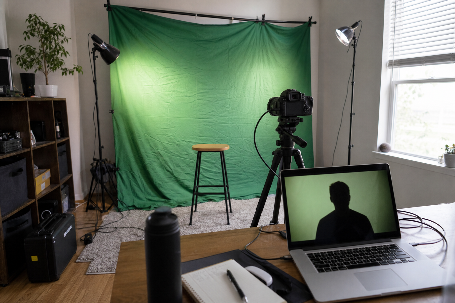
Green screen work has a strange reputation. It sounds like something that belongs in a studio, with a lighting grid, a production assistant, and someone whose whole job is removing green spill from hair. In reality, small product teams use green screen footage for much more ordinary reasons: a founder wants to record a quick product walkthrough, a support lead needs a face-on-camera intro for a help article, or a customer education team wants a presenter beside a UI screenshot without rebuilding the scene in motion graphics software.
The hard part is not recording the clip. The hard part is making the result look clean enough to use across several formats. A presenter cutout that looks acceptable in a video may look rough as a still image. A transparent PNG that works in a help center may be too large for a landing page. A short animation that looks crisp on your desktop may become muddy when compressed into a GIF for a changelog or support article.
This workflow is for small product teams that need practical cleanup, not cinematic perfection. It focuses on turning imperfect green screen material into reusable explainer assets: transparent presenter images, lightweight documentation graphics, short demo GIFs, PDF review sheets, and compressed web-ready files. It assumes you are working with browser-based tools, shared folders, and a small team where one person may be recording, editing, exporting, and publishing.
The Small-Team Green Screen Problem
Most rough green screen results come from ordinary constraints. The green background is wrinkled. The presenter is too close to it. The lighting is brighter on one side. The camera auto-adjusts exposure mid-sentence. A chair arm, microphone, watch reflection, or laptop edge sneaks into the frame. None of these problems are rare, and none automatically ruin the asset. They do change how you should clean and export it.
The biggest mistake is treating green screen cleanup as one export. Teams often record a clip, remove the background once, export a video, and then start taking screenshots from that result. That creates avoidable quality loss. A compressed video frame becomes a fuzzy transparent image. A low-resolution still becomes a stretched help center banner. A video export becomes a GIF, then gets compressed again by a CMS.
A better approach is to treat the recording as a source and create several purpose-built derivatives. The source clip stays untouched. The cleaned cutout becomes the master layer. From there, you export exactly what each publishing context needs: a transparent PNG or WebP for documentation, a resized image for web pages, a short GIF for small UI moments, or a PDF proof sheet for review.
Small teams also need consistency. If every explainer asset uses a different crop, presenter size, shadow style, and compression level, the help center starts to feel improvised. A lightweight cleanup workflow gives everyone the same decisions to make in the same order.
What To Fix Before Recording
Cleanup starts before the file exists. You do not need a studio, but you do need to avoid problems that are expensive to repair later.
Put as much distance as possible between the presenter and the green screen. Even one extra step helps reduce green spill on shoulders, hair, glasses, and skin. Keep the background smoother than you think necessary. A few wrinkles are manageable, but hard folds create shadows that can survive background removal and turn into jagged edges.
Use soft, even light rather than one bright lamp pointed directly at the presenter. The goal is not drama. It is separation. The presenter should be lit clearly, and the green background should not have bright hotspots or dark corners. If your camera lets you lock exposure and white balance, do it. Auto-exposure changes can make one part of the clip easy to key and another part difficult.
Clothing matters. Avoid green, reflective jewelry, transparent frames, and thin striped patterns. Fine patterns can shimmer when compressed, especially in GIFs and small video embeds. For product explainers, simple solid colors usually survive cleanup and compression best.
Frame wider than the final asset. Leave room around the head, hands, and elbows. A tight recording may look efficient, but it gives you no space to crop for vertical help center images, square social previews, or presenter-over-interface layouts.
A practical recording checklist looks like this:
- Presenter at least several feet from the green background when space allows
- Background evenly lit, with obvious wrinkles reduced
- Camera exposure and white balance locked if possible
- No green clothing or reflective accessories
- Hands and elbows kept inside the frame
- One short test clip reviewed before recording the full take
That test clip is not optional if you care about time. Record ten seconds, remove the background, and inspect the edges. If hair, glasses, or hands look broken in the test, the full recording will not magically improve.
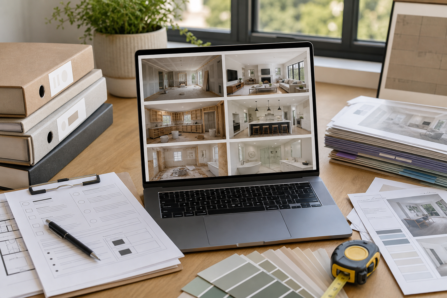
Choose The Right Master Asset
For many product teams, the best master asset is not the finished video. It is a clean frame or short transparent segment that can be reused.
If you need a talking-head explainer beside a UI demo, keep the video as your master. If you need a presenter image for help articles, release notes, onboarding cards, or internal decks, export a high-resolution still from the source recording and clean that still separately. Still images are easier to inspect, resize, compress, and place consistently.
Use the highest-quality source you can access. Avoid pulling a screenshot from a video player after the clip has already been uploaded, streamed, or compressed. If your recording tool saves a local file, use that. If you can export a still frame at source resolution, do that before any social media or CMS upload touches it.
Once you have a strong still frame, use an editing pass to remove the green background, clean edge artifacts, and correct the crop. ConvertAndEdit's /ai-photo-editor can help with cleanup tasks where a simple background removal leaves small issues around hair, fingers, or props. If the final result needs a transparent file, keep a transparent master before creating flattened versions.
For image format decisions, use this rule of thumb:
| Need | Recommended master | Why |
|---|---|---|
| Help center presenter cutout | Transparent PNG or WebP | Preserves clean edges over UI screenshots |
| Landing page visual | WebP, often flattened | Smaller file size and reliable browser delivery |
| Internal review | PDF proof sheet | Easier for reviewers to compare options |
| Changelog micro-demo | Short GIF or video | Shows motion without a heavy player |
| Thumbnail or card image | Cropped WebP or JPEG | Fast loading and predictable layout |
The master should be larger than the final display size, but not absurdly large. A 4K transparent PNG for a 280-pixel help center avatar will slow everything down and invite accidental misuse.
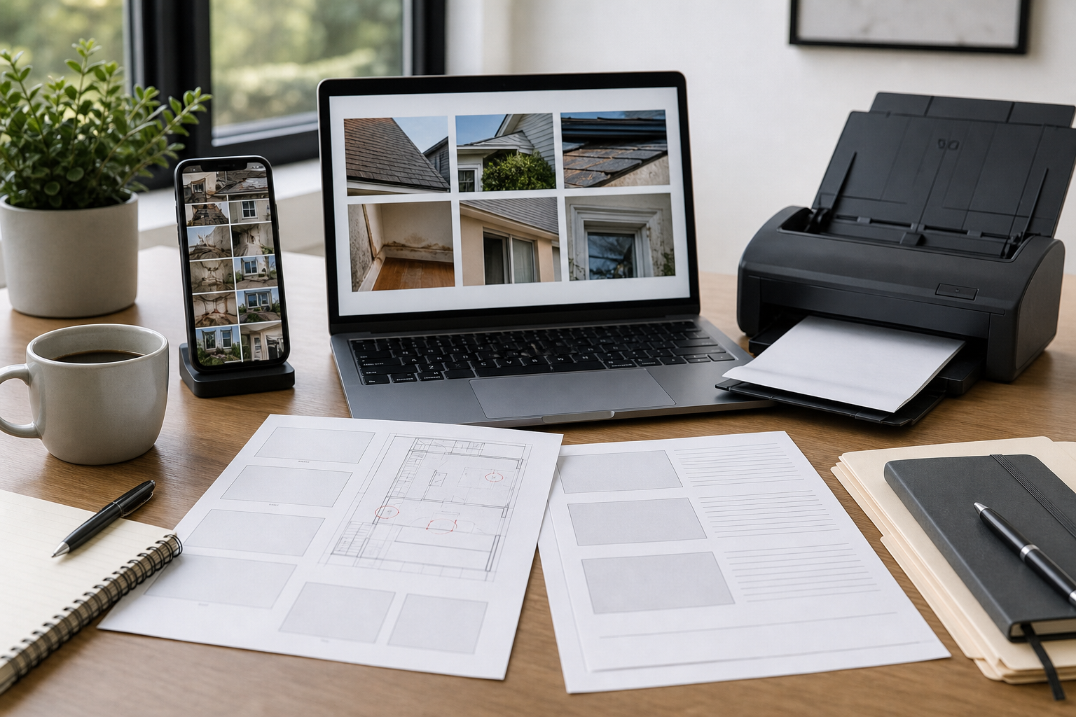
A Repeatable Cleanup Workflow
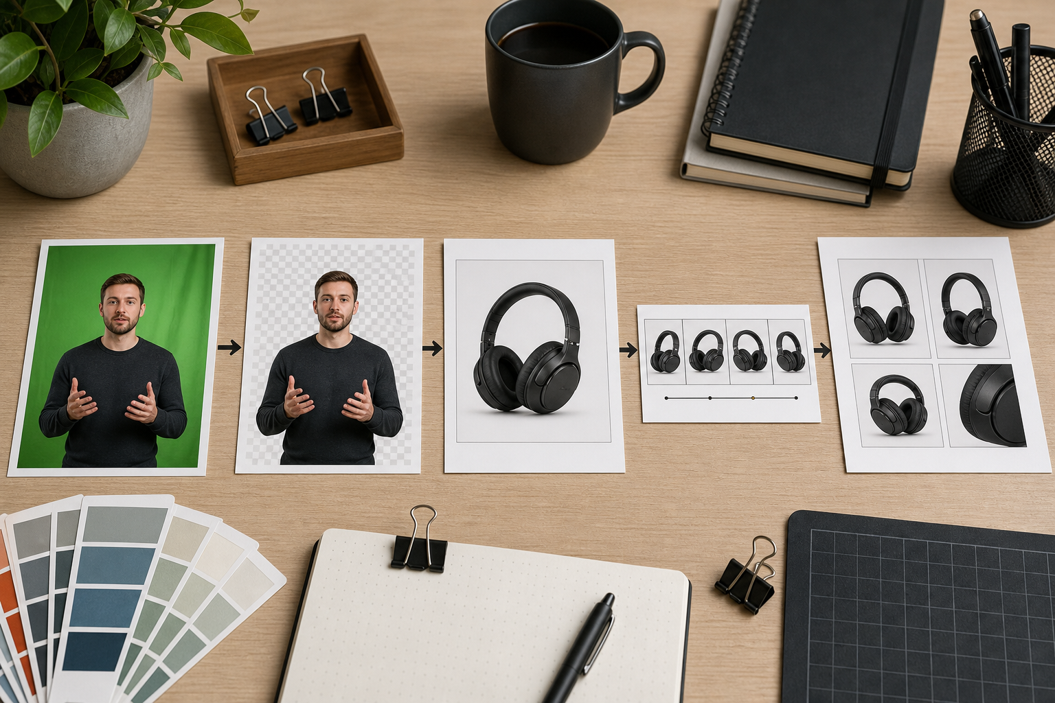
A reliable workflow has five stages: source preservation, cutout cleanup, layout testing, format export, and final compression. Skipping stages is how small defects become published defects.
1. Preserve the source
Create a folder for the recording session and keep the original file untouched. Use a simple naming pattern that survives handoff:
2026-05-product-tour-presenter-source.mp42026-05-product-tour-frame-01-source.png2026-05-product-tour-cutout-master.png2026-05-product-tour-helpcenter-800.webp2026-05-product-tour-changelog.gif
The date and asset purpose matter more than clever naming. When someone returns to the file three months later, they should immediately know which file is the original, which is the cleaned master, and which is safe to publish.
2. Clean the cutout at master size
Do edge cleanup before resizing. This is especially important around hair, hands, glasses, microphones, and laptop edges. If you resize first, the artifacts become harder to separate from the real subject.
Look for these common defects:
- Green halos around shoulders or hair
- Transparent holes inside glasses, hands, or sleeves
- Jagged edges along fingers
- Leftover green patches near the floor or chair
- Harsh cutout edges that look pasted on
- Background shadows that remain as gray smudges
If the presenter will sit over a light UI screenshot, preview the cutout over a light gray background. If it will sit over a dark product screenshot, preview it over a dark background too. Edge problems often hide on one background and become obvious on another.
3. Test the cutout in the real layout
Do not judge the presenter cutout on a blank canvas only. Place it where it will actually appear: next to a UI screenshot, inside a documentation image, beside a product card, or in a release note layout.
This is where scale decisions happen. A presenter that occupies 35 percent of a landing page visual may feel personal and direct. The same scale in a technical documentation screenshot may cover important interface details. For help center images, the presenter should support the explanation, not compete with the UI.
If the visual includes an interface screenshot, prepare that screenshot separately. Use /resize-image when the screenshot needs consistent dimensions across articles, and use /compress-image after the layout is approved so thin UI lines stay crisp without shipping a huge file.
4. Export purpose-built versions
Each destination should get its own export. Avoid one-size-fits-all files.
For help center images, use a consistent width and predictable safe area. If the article template displays images at 720 pixels wide, exporting at 1440 pixels wide is usually enough for sharp rendering on high-density screens. If the presenter is just a small overlay, the final image may not need to be larger than the screenshot itself.
For transparent assets, compare PNG and WebP. PNG is reliable and easy to inspect, but can be large. WebP can preserve transparency at smaller sizes, but you should test it in the publishing environment. If the team needs to convert between formats, /convert-image is useful for producing controlled variants without changing the original master.
For short motion examples, keep the clip brief. A green screen presenter waving at a feature update may work as a 2-second loop. A 12-second talking clip as a GIF will usually be heavy, distracting, and hard to read. If you need a lightweight animation for a changelog or support doc, use /gif-maker for the final loop and inspect the result at the size where readers will actually see it.
5. Compress last, and inspect visually
Compression is the final publishing step, not an early cleanup step. Compress after crop, resize, background cleanup, and format conversion are settled.
Use a visual pass, not just a file-size target. Green screen edges can degrade in subtle ways. A file may be smaller but show a pale outline around the subject, mushy hair, or noisy gradients near the transparent edge. For documentation screenshots, also inspect UI text, icons, and thin divider lines. A clean presenter cutout is not helpful if the interface behind it becomes unreadable.
Decision Table: What Asset Should You Export?
Small teams often lose time because nobody decides what the asset is for. Use the destination to choose the output.
| Destination | Best output | Suggested checks |
|---|---|---|
| Help center article | WebP or PNG composite | UI text readable, presenter not covering controls |
| Product onboarding modal | Transparent WebP or PNG | Edges clean on the modal background color |
| Landing page section | Compressed WebP | Fast load, consistent crop, no oversized transparent areas |
| Release note GIF | Short GIF | Under the team file-size budget, motion still understandable |
| Internal stakeholder review | PDF sheet | Versions labeled in the filename, not inside the image |
| Sales enablement deck | PNG or PDF | Enough resolution for presentation screens |
A useful rule: if the reader needs to inspect interface details, prioritize clarity over personality. If the reader needs to recognize a human explainer or spokesperson, prioritize face visibility and natural edges. Trying to maximize both in a cramped image usually creates a cluttered result.
Building Presenter-Over-UI Images
Presenter-over-UI images are popular because they feel personal without requiring a full video player. They can work well in help centers, onboarding flows, and release notes. They also fail quickly when the presenter covers the exact button, field, or menu the reader needs to understand.
Start with the UI screenshot. Decide what the reader must notice first. Then place the presenter in an area that does not hide that information. Corners are common, but not always best. If the screenshot has a dense sidebar on the left and empty workspace on the right, the right side may be better. If the interface has important bottom controls, avoid the lower corners.
Keep a subtle separation between the presenter and the UI. That can be a soft shadow, a faint outline, or simply careful placement against a less busy part of the screenshot. Avoid heavy glow effects. They often make practical documentation look like advertising.
Crop with future reuse in mind. A 16:9 image may work in a blog post, but help center cards, mobile previews, and social cards may crop differently. Keep the presenter away from the extreme edges unless the destination is fixed.
Before publishing, run this quick inspection:
- Can the reader identify the key UI area in two seconds?
- Does the presenter cover any labels, buttons, or warning states?
- Are the cutout edges clean on both light and dark interface areas?
- Does the image still work when displayed at mobile width?
- Is the file size reasonable for the page where it will appear?
If the answer to any of these is no, adjust the layout before compressing.
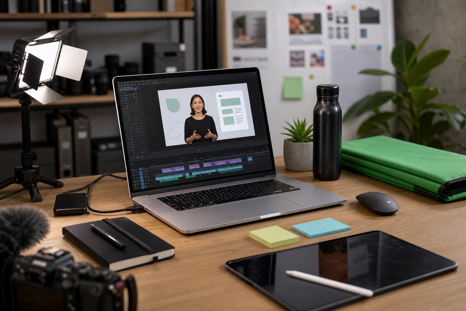
Turning Cleanup Results Into GIFs
GIFs are useful for tiny product moments: a cursor opening a menu, a setting toggling on, a drag-and-drop action, or a presenter pointing toward a new interface panel. They are not ideal for long talking-head clips. File size grows quickly, colors are limited, and fine details can become noisy.
When creating a GIF from a green screen explainer, reduce complexity before export. Use a simple background. Keep the presenter small enough to support the action but large enough that the edges do not shimmer. Avoid long loops with lots of color movement. If the presenter is not adding information, remove the presenter from the GIF and use a clean UI-only animation instead.
A good micro-demo GIF usually has one job. For example: show where the export button appears after a file is processed. That GIF does not need a talking head, a full screen recording, and multiple UI states. It needs the relevant crop, clear motion, and a file size that will not slow the article.
For changelog posts, a practical GIF workflow is:
- Crop the source screen recording to the action area.
- Add the presenter cutout only if it clarifies the moment.
- Keep the loop under a few seconds.
- Export a draft GIF.
- Check motion, readability, and file size.
- Re-export at smaller dimensions if needed.
Use /gif-maker when you need a controlled GIF output from a prepared clip or sequence. If the GIF becomes too large, shorten it before crushing quality. A shorter clear GIF is usually better than a longer blurry one.
PDF Review Sheets For Visual Approval
Green screen cleanup often involves subjective decisions. One person prefers a tighter crop. Another wants less shadow. Someone notices a green edge on a sleeve. Sending separate image files in chat makes review messy because comments lose context.
A simple PDF proof sheet solves this. Place several versions on one page: original frame, cleaned transparent cutout on light background, cutout on dark background, final help center composite, and final compressed export. The reviewer can compare versions side by side.
This is especially useful when the asset will be used in several places. A stakeholder may approve the landing page visual while missing that the transparent cutout looks poor on a dark onboarding modal. A proof sheet makes those differences visible before publishing.
If you create several image exports, combine them into a review document with /image-to-pdf. If multiple reviewers send back annotated files or separate approval pages, /pdf-merge can help collect them into one record. The point is not bureaucracy. It is to prevent scattered feedback from turning into accidental rework.
Keep the proof sheet simple. Do not add decorative labels inside the images themselves. Use filenames or surrounding document notes for version tracking so the visual assets remain clean and reusable.
Quality Checks That Catch Most Issues
Green screen defects are easiest to catch when you inspect against the conditions where the asset will live. A cutout viewed at 200 percent on a transparent checkerboard tells only part of the story. You also need to see it inside the final page or document.
Use this final checklist before publishing:
- Source file is preserved and clearly named
- Cleaned master exists separately from final exports
- Transparent edge checked on light, dark, and real UI backgrounds
- Presenter does not cover important interface details
- Final image dimensions match the destination layout
- Compression applied only after cleanup and resizing
- Thin UI text and lines remain readable after compression
- GIFs are short, focused, and not visually noisy
- PDF review files are separated from publish-ready assets
- Old drafts are archived or clearly marked so they are not uploaded by mistake
Also check accessibility context. If a presenter image is decorative, the alt text can be brief. If the image explains a workflow step, alt text should describe the relevant action or state, not the presenter’s appearance. For UI screenshots, avoid relying on the image alone when the article text can explain the same step.
Common Mistakes And Better Defaults
The most common mistake is exporting too early. A team removes the green background, exports a small PNG, and then keeps reusing that PNG everywhere. It gets stretched on a landing page, recompressed in a CMS, and pasted into a PDF. The better default is to keep one cleaned master and create destination-specific exports.
Another mistake is ignoring the background color. Transparent edges that look fine on white can look green or gray on dark surfaces. Always test the cutout over the actual destination color or screenshot.
Teams also overuse presenter overlays. A human face can make an explainer feel approachable, but not every help image needs one. If the presenter makes the UI harder to read, use the clean UI screenshot instead. The purpose of the asset is comprehension.
Finally, avoid chasing tiny file sizes at the expense of trust. A product education image should look crisp and intentional. If compression makes the presenter’s outline messy or the interface labels hard to read, the asset starts to feel careless. Reduce dimensions, simplify the composition, or shorten the animation before destroying visual quality.
A Practical Folder Structure
A small amount of structure prevents publishing mistakes. Use folders that match the workflow, not the org chart.
Example:
product-tour-green-screen/
  01-source/
  02-frames/
  03-clean-masters/
  04-layout-drafts/
  05-review-pdf/
  06-final-web/
  07-final-gif/
This structure makes it obvious where to look and what is safe to publish. It also helps when someone else needs to update the asset later. They can find the source, regenerate a cutout, or create a new web export without asking where everything went.
For filenames, include the destination and dimensions when useful:
product-tour-presenter-cutout-master.png
product-tour-helpcenter-composite-1440.webp
product-tour-onboarding-cutout-900.webp
product-tour-changelog-loop-640.gif
product-tour-review-sheet-v02.pdf
Do not rely on final-final-new.png. That naming habit costs time and causes mistakes.
Where ConvertAndEdit Fits
A small product team does not need one massive editor for every step. It needs reliable tools at the points where assets change format, size, or purpose.
Use /ai-photo-editor for cleanup passes where the green screen removal needs refinement around edges, small artifacts, or distracting background leftovers. Use /resize-image when final images need consistent dimensions for help center layouts, landing page sections, or internal templates. Use /convert-image when you need transparent PNG, WebP, or other format variants from the same master. Use /compress-image at the end of the workflow, after the visual decisions are approved. Use /gif-maker for short micro-demos where motion is useful, and /image-to-pdf or /pdf-merge when review sheets need to be shared or collected.
The important part is sequencing. Cleanup first. Layout second. Export third. Compression last. That order protects quality and makes the workflow easier to repeat.
Final Takeaway
Green screen cleanup for product explainers is not about making a small team behave like a film studio. It is about preserving the source, cleaning the cutout carefully, testing it in the real layout, and exporting only the versions each channel needs.
When the workflow is consistent, rough recordings become useful assets instead of one-off files. A single presenter session can produce a help center image, a landing page visual, a changelog GIF, and a PDF review sheet without quality falling apart along the way. That is the practical win: fewer reshoots, cleaner documentation, faster publishing, and visual assets that look deliberate even when the original setup was just a green screen, a laptop, and a small team moving quickly.