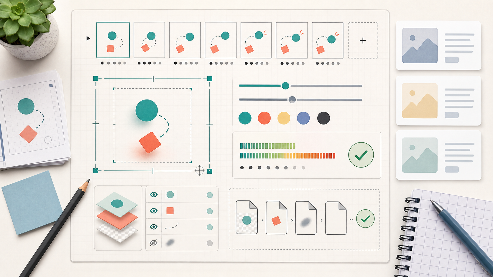
Lottie Fallback GIFs for Email and Help Docs: A Practical Size and Clarity Guide
A practical guide to turning short Lottie-style product animations into crisp, lightweight GIF fallbacks for email, help centers, changelogs, and support articles.
Lottie Fallback GIFs for Email and Help Docs: A Practical Size and Clarity Guide
Lottie animations are excellent for modern product surfaces. They are small, scalable, and smooth when they run inside an app, a marketing page, or a documentation site that supports the player. The trouble starts when the same animation has to travel somewhere less flexible: an email client, a help center CMS with strict embeds, a changelog platform, an exported PDF, or a support macro that strips scripts.
That is where a fallback GIF still earns its keep. It is not glamorous, and it is not always the most efficient animation format, but it is predictable. A short GIF can show a new toggle, an onboarding motion, a loading state, a dashboard transition, or a micro-interaction without asking the reader to click a video or load a script.
The mistake is treating the GIF as an afterthought. Teams often export the full Lottie animation at a large canvas size, accept the default frame rate, and upload whatever comes out. The result is a file that is too heavy for email, too blurry for UI text, too fast to understand, or too visually different from the original animation.
This guide explains how to prepare Lottie-style fallback GIFs for email and help documentation with practical constraints in mind: file size, legibility, loop behavior, palette limits, cropping, and handoff. The same principles apply whether your source is a JSON animation, a screen recording of an animation, a short MP4 export, or a motion comp from a design tool.
The Job of a Fallback GIF
A fallback GIF does not need to preserve every detail from the original animation. Its job is narrower: communicate the useful change when the preferred animation format cannot be used.
For product teams, that usually means one of four things:
- Showing where a control appears after a user action.
- Demonstrating a short before-and-after state change.
- Previewing a small UI animation in a release note.
- Giving support agents a visual answer they can paste into a reply.
That narrower job matters because it lets you make aggressive decisions. You can crop away unused canvas. You can reduce the frame rate. You can simplify colors. You can remove decorative entrance frames that looked good in the Lottie version but add nothing in a constrained email preview.
A good fallback GIF is not a perfect duplicate. It is a compact translation.
Where Lottie Fallbacks Usually Break
Most broken fallback GIFs fail for predictable reasons. They are not usually ruined by one big mistake; they are weakened by several small export decisions that compound.
The first problem is canvas size. Lottie files are often built in generous artboards because vector animation handles scale well. GIF does not. A 1200 pixel wide export that only contains a 420 pixel wide UI detail wastes file size on empty space, and email clients may scale it down until the important part becomes unreadable.
The second problem is thin UI detail. Hairline borders, small labels, icon strokes, and subtle shadows can look fine in the source animation but fall apart during GIF palette reduction. If the animation includes actual product UI, the fallback must be judged by whether the important visual cue is readable after export, not by whether the original design was beautiful.
The third problem is color count. GIF supports indexed color, which means each frame relies on a limited palette. Smooth gradients, transparent overlays, shadows, and blurred backgrounds can consume that palette quickly. Once the palette is under pressure, text edges and icons may dither or shimmer.
The fourth problem is timing. Lottie animations often use easing, spring motion, and short transitional frames. When exported to GIF at a reduced frame rate, those frames can create a jumpy loop or an unreadable flicker. A fallback needs deliberate pacing, especially if it will autoplay in a help article.
The fifth problem is transparency. Transparent GIFs have harsh binary transparency, not modern alpha blending. Semi-transparent edges can turn jagged, especially around rounded UI panels, shadows, cursors, or product illustrations. If transparency is essential, you may need a different asset strategy, such as a WebP fallback for surfaces that support it and a flattened GIF for email.
Start With the Reader's Context
Before touching export settings, decide where the fallback will be seen. The same animation can need different versions for different surfaces.
| Destination | Best fallback goal | Typical constraint | Practical target |
|---|---|---|---|
| Email announcement | Show the key product change quickly | Client clipping, image blocking, file weight | Short loop under a conservative size limit |
| Help center article | Explain a UI step clearly | Mobile scaling, CMS compression | Larger but slower, with strong crop discipline |
| Changelog post | Preview a feature without video | Page performance and repeat readers | Compact loop with clear first frame |
| Support reply | Answer one question visually | Attachment limits, forwarded emails | Small canvas, obvious action, minimal decoration |
| PDF export | Preserve visual evidence | Print scaling and static fallbacks | Consider a still frame or image sequence instead |
This table is intentionally practical, not absolute. There is no universal file size target because every platform has different limits. Still, a useful internal standard helps. For email, many teams aim for a small, fast-loading asset and only exceed that when the animation is truly central to the message. For documentation, you can usually allow more weight if the animation prevents confusion and sits below the fold.
The key question is simple: would the reader still understand the point if the GIF loaded slowly, displayed at half size, or stopped on the first frame? If not, simplify the asset before exporting.
Choose the Right Source Export
If you have the original Lottie JSON, you may be tempted to convert it directly. That can work, but it is not always the cleanest path. Sometimes a controlled video export gives you more predictable results because you can inspect timing, crop, and color before turning the animation into a GIF.
Use the source that gives you the most control:
- Use the original design or animation file when you need to adjust timing, background, or visible layers.
- Use a high-quality MP4 export when the motion is final and you only need to optimize the fallback.
- Use a screen recording when the animation depends on real product UI that is hard to recreate.
- Use a still image instead of a GIF when the animation is decorative or does not clarify the task.
If your fallback starts from a video, trim it before conversion. A 12 second clip with two seconds of useful motion is rarely worth preserving in full. ConvertAndEdit's GIF maker is useful here because you can focus on the short segment that matters instead of treating the whole recording as the final asset.
When the source is a static UI mockup or a set of rendered frames, prepare the canvas first. Crop with intent, resize to the actual display width, and remove visual clutter before animation compression begins. For still frame preparation, tools like resize image, compress image, and convert image can help keep the source files predictable before the final GIF pass.
Frame Rate: Smooth Enough, Not Cinematic
Many product animations are designed at 30 or 60 frames per second. A fallback GIF usually does not need that. Every extra frame increases weight, and many email or documentation contexts do not reward cinematic smoothness.
For UI motion, a practical range is often 8 to 15 frames per second. The lower end works well for simple state changes, cursor movement, and toggles. The higher end is better for animations where the path of movement matters, such as dragging a card, opening a panel, or showing a progress transition.
Use this decision guide:
| Animation type | Suggested frame rate | Why |
|---|---|---|
| Toggle, checkbox, small state change | 8-10 fps | The viewer needs the before and after more than smooth motion |
| Cursor click with menu opening | 10-12 fps | Keeps the action understandable without excess frames |
| Panel slide or drawer reveal | 12-15 fps | Motion path helps the viewer understand layout change |
| Decorative confetti or illustration motion | 8-12 fps | Usually safe to simplify or remove entirely |
| Text-heavy UI transition | 8-10 fps | Lower speed helps preserve legibility and reduces shimmer |
Do not judge frame rate only while staring at the asset in isolation. Put it in a realistic preview: an email-width column, a help article body, or a changelog card. A GIF that feels slightly choppy in a large preview may be perfectly clear at the size readers actually see.
Canvas Size and Crop Discipline
Canvas size is the largest lever you control. A 900 by 600 GIF has more than three times the pixels of a 520 by 340 GIF. If the important interaction fits inside the smaller canvas, the larger version is paying for information the reader does not need.
Start by identifying the smallest rectangle that contains the meaningful action. Then add just enough margin for context. For UI demos, the margin should answer questions like: where is this control, what changed around it, and what should the viewer look at next?
A practical crop checklist:
- Remove browser chrome unless it proves the location or product context.
- Cut empty sidebars if they do not change during the animation.
- Keep the clicked control and the resulting state in the same crop.
- Avoid cropping so tightly that the motion feels mysterious.
- Preserve enough padding around cursors, menus, and popovers so they do not hit the edge.
- Check the first and last frame, not only the middle of the animation.
If you need multiple fallback GIFs from the same Lottie source, make each one answer a single visual question. One compact GIF showing a dropdown opening is usually better than one large GIF showing a whole settings page with three tiny movements.
A Practical Export Recipe
Here is a repeatable recipe for turning a Lottie-style animation into a useful fallback GIF.
1. Define the one thing the GIF must show
Write it in a sentence before exporting: "The reader should see that the filter panel opens from the right after clicking the funnel icon." If the sentence includes two or three actions, split the asset or trim the source.
2. Prepare a clean source
Remove debug overlays, private account data, placeholder names, and distracting browser extensions. If the animation uses real product content, replace sensitive details before export. For user-submitted images or screenshots that need cleanup, AI photo editor can help with visual corrections, but keep product UI truthful and avoid changing the meaning of what the screen shows.
3. Flatten the background for GIF
If transparency is not essential, use a solid background that matches the destination page or email section. This prevents jagged transparent edges and reduces palette pressure. For help centers, white or the article background color is usually safer than a transparent GIF.
4. Trim dead time
Remove long pauses before the first action. Keep a short hold on the final state so the viewer can understand what changed. A common pattern is: brief initial state, action, result, final hold, loop.
5. Resize before conversion
Resize the source to the display size before creating the GIF. Scaling after conversion can blur thin UI lines and make dithering more visible. If the help article column displays images at 640 pixels wide, do not export a 1400 pixel GIF unless there is a specific zoom requirement.
6. Reduce frame rate deliberately
Test at 10 fps first for simple UI motion. Increase only if the action becomes hard to follow. Lower if the asset is still too heavy and the motion remains clear.
7. Control the palette
Use fewer colors when the animation is mostly flat UI. Be more generous when the asset includes photographs, gradients, or brand illustration. If text edges start to shimmer, simplify the background or reduce decorative color variety before blaming compression.
8. Compress and preview in context
After export, run a compression pass and test the GIF where it will actually live. ConvertAndEdit's compress image can be part of the final size check for related still assets, while GIF-specific reduction should be judged visually frame by frame.
9. Keep the source and final naming clear
Use names that describe destination and size, such as filter-panel-email-520.gif or billing-toggle-docs-640.gif. Avoid vague names like animation-final-final.gif, especially when support, marketing, and docs all need slightly different versions.
First Frame Matters More Than Teams Think
Many email clients and platforms show the first frame before the GIF loads fully. Some users also have animation disabled. That means the first frame has to behave like a useful still image.
A weak first frame might show an empty card, a half-rendered illustration, or a blank background before the UI enters. That may look elegant in a full Lottie animation, but it is poor fallback behavior. A strong first frame shows enough context for the reader to understand the subject even without motion.
For product UI, the first frame should usually include:
- The relevant control or area of the interface.
- A stable layout, not a transitional blur.
- No private data or accidental test content.
- Enough contrast for mobile viewing.
- A crop that still makes sense as a standalone image.
If the animation starts with a decorative entrance, remove it for the fallback. Let the first frame be the real starting state, then animate the meaningful action.
Loop Behavior: Helpful Repeat, Not Visual Noise
Autoplaying GIFs loop by default in many contexts. That is useful when the reader misses the action, but it can become annoying if the loop is too long, too bright, or too visually busy.
A helpful loop has a clean rhythm. The viewer sees the starting state, the action, the result, and a short pause. Then it resets without feeling like a glitch.
Avoid these loop problems:
- A sudden jump from final state to first frame with no visual logic.
- A cursor that teleports across the canvas on each repeat.
- A blinking highlight that competes with the article text.
- A loop longer than the reader's patience for a small UI point.
- A decorative flourish that repeats forever beside serious documentation.
For help articles, quieter loops are better. The GIF should support the instruction, not dominate the page. For launch emails, a more energetic loop may be acceptable, but only if it stays small and the first frame still communicates value.
Palette and Dithering Choices
GIF compression becomes most visible when the source contains gradients, shadows, photography, or semi-transparent overlays. Because the format uses a limited palette, it has to approximate colors. That approximation can create speckles, banding, or crawling noise across frames.
You can reduce these artifacts before export:
- Replace soft shadows with simpler, flatter shadows.
- Use a solid background instead of a gradient.
- Avoid blurred glass effects in the fallback version.
- Limit decorative accent colors if the product UI already uses many colors.
- Keep text on high-contrast solid surfaces.
Dithering can help gradients look smoother, but it may increase apparent noise and file size. For UI-heavy GIFs, less dithering often looks cleaner because flat surfaces remain stable across frames. For illustration-heavy GIFs, some dithering may be acceptable if it prevents harsh banding.
The best test is not theoretical. Export two versions, place them on the actual article or email background, and compare the important details: labels, controls, edges, and motion path.
Text in GIFs: Use Less Than You Want
Text inside animated fallbacks is fragile. It can blur during resizing, shimmer during palette reduction, or become unreadable on mobile. If the surrounding article or email can explain the step in real HTML text, let it do that job.
Keep text in the GIF only when it is part of the product UI and necessary for orientation. Even then, zoom or crop so the important label is readable. Do not rely on tiny menu items in a full-dashboard view.
If the animation explains a sequence, consider placing the explanation outside the GIF in the article copy rather than baking captions into the frames. HTML text is searchable, accessible, translatable, and easier to update. The GIF should show the visual change.
For screenshots that need extracted UI text or asset review, image OCR can help during preparation, especially when you need to verify labels from a captured interface before writing documentation. Do not use OCR output as a substitute for visual inspection; use it as a check against mistakes.
Email-Specific Constraints
Email is the strictest destination for fallback GIFs because support varies across clients, images may be blocked, and large files can slow down the message. The safest email GIFs are short, narrow, and clear on the first frame.
Practical email rules:
- Keep the visual point above the fold if the GIF is central to the message.
- Do not depend on motion for the only call to action.
- Avoid tiny UI labels that require desktop-width viewing.
- Use descriptive alt text in the email platform.
- Test the first frame as if animation never plays.
- Prefer one strong GIF over several competing animated images.
If the fallback is for a product announcement, pair it with a static image alternative when possible. Some teams use the first frame as the fallback image in clients that do not animate. Others place the key explanation in nearby copy and let the GIF act as visual reinforcement.
Also consider accessibility. Fast flashing, rapid contrast changes, and endless attention-grabbing loops can create a poor experience. Product UI fallbacks rarely need aggressive animation. Calm motion is usually more professional and more useful.
Help Center and Changelog Constraints
Documentation has different priorities. The reader is often trying to solve a problem, not admire an announcement. The GIF should reduce ambiguity at a precise point in the article.
For help centers, place the GIF immediately after the instruction it supports. If the animation shows where to click, the preceding sentence should name the action. If the animation shows the result, the following sentence should explain what the reader should see.
For changelogs, the GIF can be a preview, but it still needs restraint. A changelog page may contain several updates, and multiple looping GIFs can hurt readability and page performance. Use animation only for changes where motion explains something a still screenshot cannot.
If you need to turn multiple stills or exported frames into a shareable document for review, image to PDF can help create a simple review packet. That is often useful before publishing, especially when stakeholders need to approve the first frame, final state, and crop without opening design tools.
Quality Control Checklist
Before publishing a fallback GIF, run through this checklist:
- The first frame works as a standalone still.
- The crop includes the action and result without excess canvas.
- The file is sized for its actual display location.
- The frame rate is only as high as clarity requires.
- Important UI text is readable at mobile width.
- The loop has a short final hold and does not feel broken.
- No private data, internal URLs, test names, or account details are visible.
- Colors do not shimmer distractingly across frames.
- The asset has descriptive file naming.
- The surrounding copy does not depend entirely on animation.
This checklist is intentionally short enough to use during production. If a GIF fails two or more points, fix the source rather than trying to rescue it with stronger compression.
Common Scenarios and Better Choices
| Scenario | Weak choice | Better choice |
|---|---|---|
| Showing a new settings toggle | Full settings page at large size | Tight crop around the section, 8-10 fps, final hold |
| Demonstrating a dashboard panel opening | Entire dashboard with tiny labels | Medium crop that includes trigger and opened panel |
| Email announcement for a small UI feature | Long decorative animation | Short product-state loop with strong first frame |
| Help article step with important labels | Fast GIF of the whole screen | Slower crop where labels are readable on mobile |
| Animation with gradients and shadows | Direct GIF export from rich source | Flatten background and simplify effects before export |
| Support macro visual answer | Large attachment from original design file | Small GIF showing one action and result |
The pattern is consistent: remove what the reader does not need, preserve what helps them act, and test the asset in the place where it will be read.
Naming, Storage, and Handoff
Fallback GIFs often move between design, marketing, support, and documentation. Without a naming system, teams lose track of which version is approved, which one is compressed, and which destination it was made for.
A useful filename includes the feature, destination, width, and version:
invite-modal-docs-640-v1.gifreport-filter-email-520-v2.gifbilling-toggle-support-480-v1.gif
Keep the source export nearby if the team may need changes later. A compressed GIF is a poor editing source. If someone needs to change timing, crop, or data, they should return to the video, design file, frame sequence, or Lottie source.
For review, include a static first frame alongside the GIF. Stakeholders can approve the still-state clarity separately from the motion. This also catches a common problem: a GIF may look fine while moving, but its first frame may be confusing or visually empty.
Final Takeaway
A Lottie fallback GIF is a translation, not a downgrade by default. When it is prepared with a clear purpose, it can make emails more understandable, help articles more precise, and changelogs easier to scan.
The practical system is simple: define the one visual job, crop hard, resize early, reduce frames, simplify color, protect the first frame, and preview in context. Do that consistently and your fallback GIFs will feel intentional instead of like leftover exports from a richer animation format.
The best fallback is not the one that preserves the most motion. It is the one that helps the reader understand the product change quickly, even in the least flexible place you publish.