Transparent WebP Callout Overlays for Product Documentation: A Practical Field Guide
Learn how to prepare crisp, lightweight transparent WebP callout overlays for product tours, help centers, annotated screenshots, and interactive documentation.
Transparent WebP Callout Overlays for Product Documentation: A Practical Field Guide
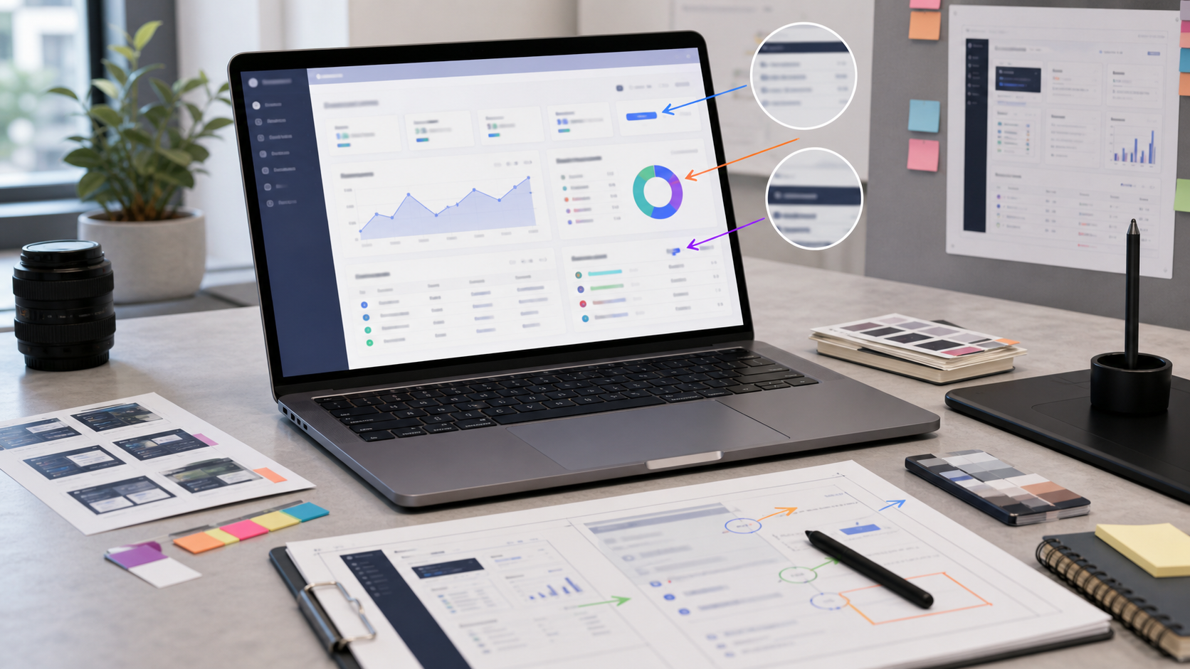
Product documentation often needs more than a screenshot. A reader may need to see which icon opens a panel, where a setting appears, or which region of a crowded interface deserves attention. The usual response is to draw arrows, circles, highlights, and labels directly onto the screenshot.
That works until the interface changes.
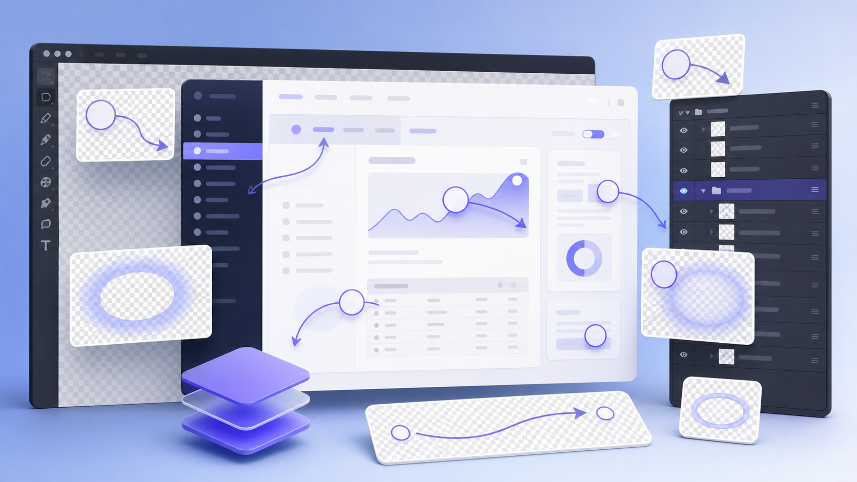
When annotations are baked into the base image, even a small product update can force a documentation team to rebuild the entire graphic. A separate transparent overlay is more flexible. The underlying screenshot can be replaced while reusable visual elements remain independent. It also becomes possible to reveal callouts interactively, adapt them for dark mode, or animate them without duplicating the base screenshot.
Transparent WebP is particularly useful for these overlays. It supports alpha transparency and can make complex, softly shaded graphics substantially lighter than an equivalent PNG. However, careless conversion can introduce halos, muddy edges, missing transparency, or details that disappear against certain backgrounds.
This field guide explains how to prepare transparent WebP callout overlays that stay sharp, align correctly, and remain easy to maintain.
Where Transparent Callout Overlays Make Sense
An overlay is a foreground image positioned over another visual element. In documentation, it might contain:
- An arrow pointing to a control
- A translucent spotlight around a button
- A cursor or tap indicator
- A border marking an editable region
- A soft mask that dims everything except the relevant area
- A decorative line connecting a label to its target
- A device-specific gesture illustration
Separating these elements is most valuable when the base interface is likely to change or when one screenshot needs several explanatory states.
Consider a product tour with four steps. Four fully annotated screenshots repeat nearly all the same pixels. A single base screenshot plus four small overlays can be easier to update and, depending on how the assets are delivered, lighter to load.
The method is less helpful when the annotation is inseparable from the screenshot, must be printed as one static image, or needs selectable text. Important instructions should remain real HTML text whenever possible. An overlay should guide attention, not carry essential information that assistive technology cannot access.
Separate the Screenshot from the Explanation Layer
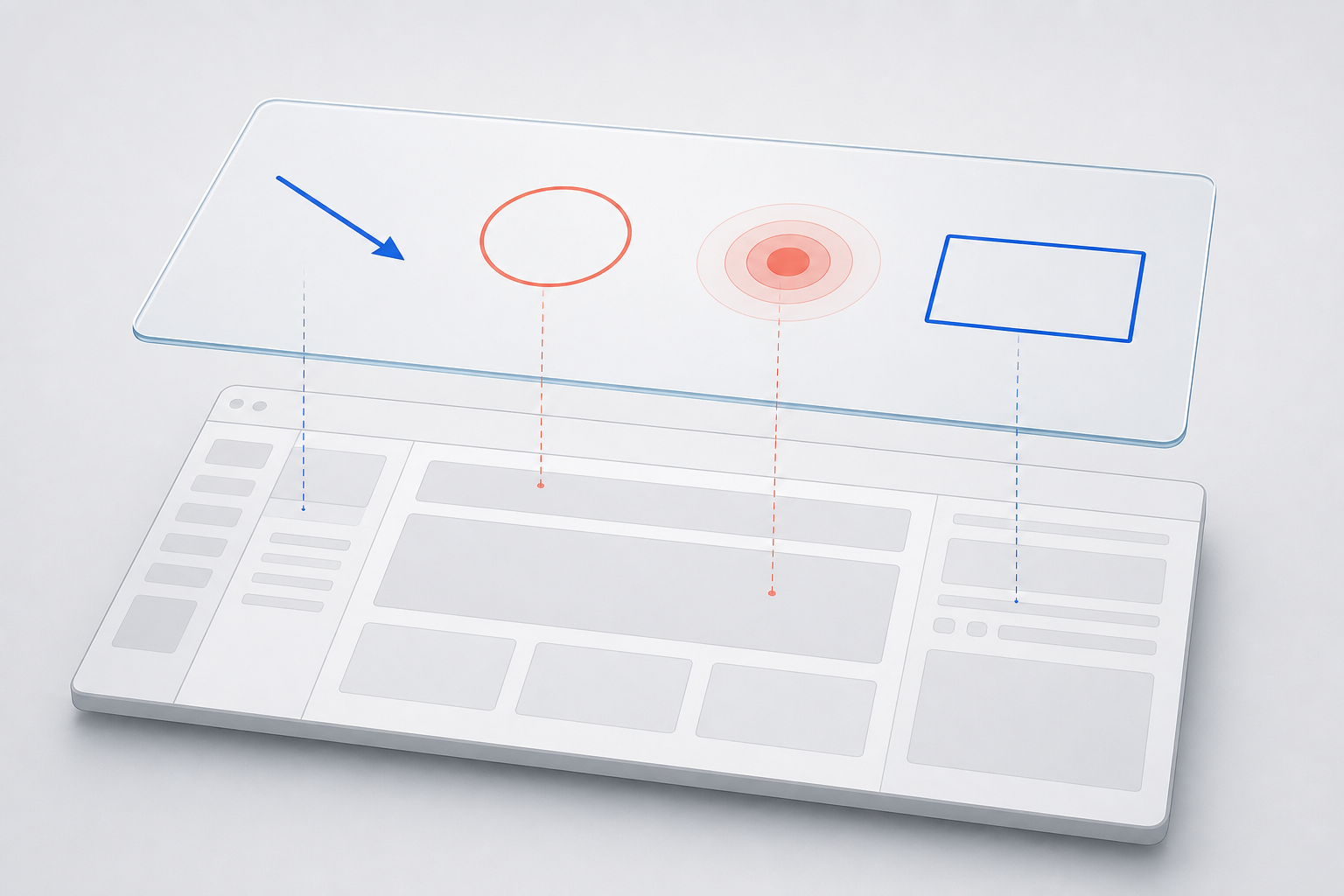
Begin with a clean screenshot that contains no arrows, labels, cursor marks, or decorative framing. Treat it as the source visual. Then create a transparent canvas with exactly the same pixel dimensions and position each callout on that canvas.
Matching dimensions are important. If the screenshot is 1440 by 900 pixels, the overlay should also be 1440 by 900 pixels. The browser can then place both assets in the same container using identical coordinates. A mismatch creates unnecessary scaling and makes alignment errors more likely.
Keep the following elements in the overlay:
- Directional arrows and connector lines
- Highlight rectangles and focus rings
- Semi-transparent dimming masks
- Cursor, hand, or gesture indicators
- Nonverbal step markers
- Shadows belonging to the callout rather than the interface
Keep actual interface pixels in the screenshot. Do not copy the highlighted button into the overlay unless a deliberate magnification effect requires it. Duplicated interface fragments are easy to overlook when the product changes.
If the callout includes explanatory wording, consider placing that wording in HTML next to the image. Real text scales cleanly, remains searchable, can be translated, and is available to screen readers. The overlay can contain the arrow or anchor shape that visually connects the text to the target.
Choose Dimensions from the Display Context
Do not choose an arbitrary export size. Start with the largest size at which the documentation component will actually render.
For a help-center article with a content width of 900 CSS pixels, a 1800-pixel source can provide a sharp result on a high-density display. If the original interface screenshot is already only 1200 pixels wide, enlarging it to 1800 will not restore missing detail. Capture the source at an adequate resolution instead.
The overlay and screenshot must follow the same sizing rule. If you resize the base image, resize the overlay by the identical percentage. The image resizing tool can help produce matching dimensions, but verify the width and height numerically rather than judging them by eye.
A useful sizing table looks like this:
| Intended presentation | Suggested source approach | Main concern |
|---|---|---|
| Inline help article | Export near the maximum article width or at 2x density | Thin UI details |
| Full-width product tour | Match the tour container and responsive breakpoints | Positional alignment |
| Small tooltip preview | Create a dedicated small asset | Excess transparent canvas |
| Zoomable technical guide | Preserve a larger master | Download weight |
| Email documentation excerpt | Prefer a flattened fallback image | Client compatibility |
Avoid using one enormous overlay for every context. A 3000-pixel-wide asset displayed at 500 pixels wastes bandwidth and may soften thin lines during browser resampling.
Design Callouts That Survive Different Backgrounds
A callout that looks clear on white may vanish over a pale dialog. The same element may become harsh or develop a visible fringe in dark mode. Test contrast against the actual interface, not an empty design canvas.
For arrows and outlines, use a two-part edge when the background varies. A colored line with a thin contrasting outer stroke can stay visible across both light and dark regions. Keep the outer stroke subtle; a heavy border makes documentation graphics look like stickers.
For spotlight effects, avoid simply painting a semi-transparent white circle. It may wash out light controls and appear gray on dark surfaces. A better construction is often a dimming mask over the full canvas with a transparent opening around the target. The reader's attention moves toward the clear region because the surrounding interface is quieter.
Soft shadows need special care. Their pixels contain partial transparency, so aggressive compression can create bands or dirty blocks. If an overlay is mostly simple geometric shapes, compare WebP with PNG instead of assuming WebP will always win.
Also leave breathing room around arrowheads, glows, and shadows. Effects touching the canvas boundary may be clipped during export. Inspect every edge of the canvas at high zoom.
Use a Stable Visual Language
Documentation becomes harder to scan when every contributor invents new annotation styles. Define a small visual system before producing a large set of overlays.
A compact system might specify:
- One highlight color for primary actions
- One warning color used only for destructive or risky actions
- A standard line thickness at the master resolution
- Two spotlight sizes
- One arrowhead shape
- One cursor treatment
- A consistent corner radius
- A maximum shadow blur
Scale these values with the image rather than applying them after resizing. A two-pixel line at a 2x master becomes approximately one CSS pixel when displayed, which is usually cleaner than drawing the line at one pixel and enlarging it later.
Color should not be the only signal. If a red outline means “do not select,” add a distinct shape or nearby HTML explanation. Readers with color-vision differences may not perceive the intended distinction.
Maintain a reusable source file containing the approved elements. Contributors can duplicate the necessary components instead of redrawing them. This reduces small variations that make a documentation library feel inconsistent.
Export to WebP Without Losing the Alpha Channel
The alpha channel controls the transparency of each pixel. Fully transparent pixels have zero opacity, partially transparent edge pixels sit between zero and full opacity, and solid shapes are fully opaque.
Before conversion, export a clean transparent PNG master. Keeping a lossless master means you can generate new versions later without repeatedly compressing an already compressed file. Repeated lossy conversion can gradually damage soft edges.
You can then use an image conversion tool to create the WebP delivery asset. Confirm that transparency is enabled and avoid flattening the image onto a default white or black background.
Test more than one quality setting. The best setting depends on the overlay:
| Overlay content | Starting approach | What to inspect |
|---|---|---|
| Solid arrows and rings | Lossless WebP or high-quality lossy WebP | Edge sharpness |
| Large dimming mask | Lossless WebP | Smooth, even opacity |
| Soft glow or shadow | High-quality lossy WebP | Banding and block artifacts |
| Illustrated hand gesture | High-quality lossy WebP | Texture and contour detail |
| Tiny simple icon | Compare WebP and PNG | Format overhead |
Lossless WebP can be an excellent choice for flat graphics, but not every encoder produces the same result. Compare actual files rather than relying on format reputation alone.
File size should be evaluated after cropping and resizing. Compression cannot compensate for an overlay exported with thousands of unused transparent pixels or at several times its display dimensions.
Crop Carefully Without Breaking Alignment
There are two valid overlay structures, and choosing between them affects implementation.
A full-canvas overlay has the same dimensions as the screenshot. It is easy to position: place it at the top-left corner of the screenshot container. The tradeoff is that the file may contain a large transparent area.
A tightly cropped overlay contains only the visible callout. It can be much smaller, but the page must know its position relative to the screenshot. That position may be stored as percentages, component properties, or design tokens.
Use a full canvas when simplicity and exact alignment matter more than a modest file-size reduction. Use a cropped asset when the visible element occupies a tiny region, appears repeatedly, or needs independent animation.
For cropped assets, record the anchor point as a proportion of the base image. For example, an arrow whose left edge begins 864 pixels across a 1440-pixel screenshot has an x-position of 60 percent. Percentage positioning adapts more reliably when the entire composition scales.
Do not automatically trim every transparent pixel if the overlay depends on an intentional origin or alignment box. Trimming changes the coordinate system.
Inspect Transparency Before Publishing
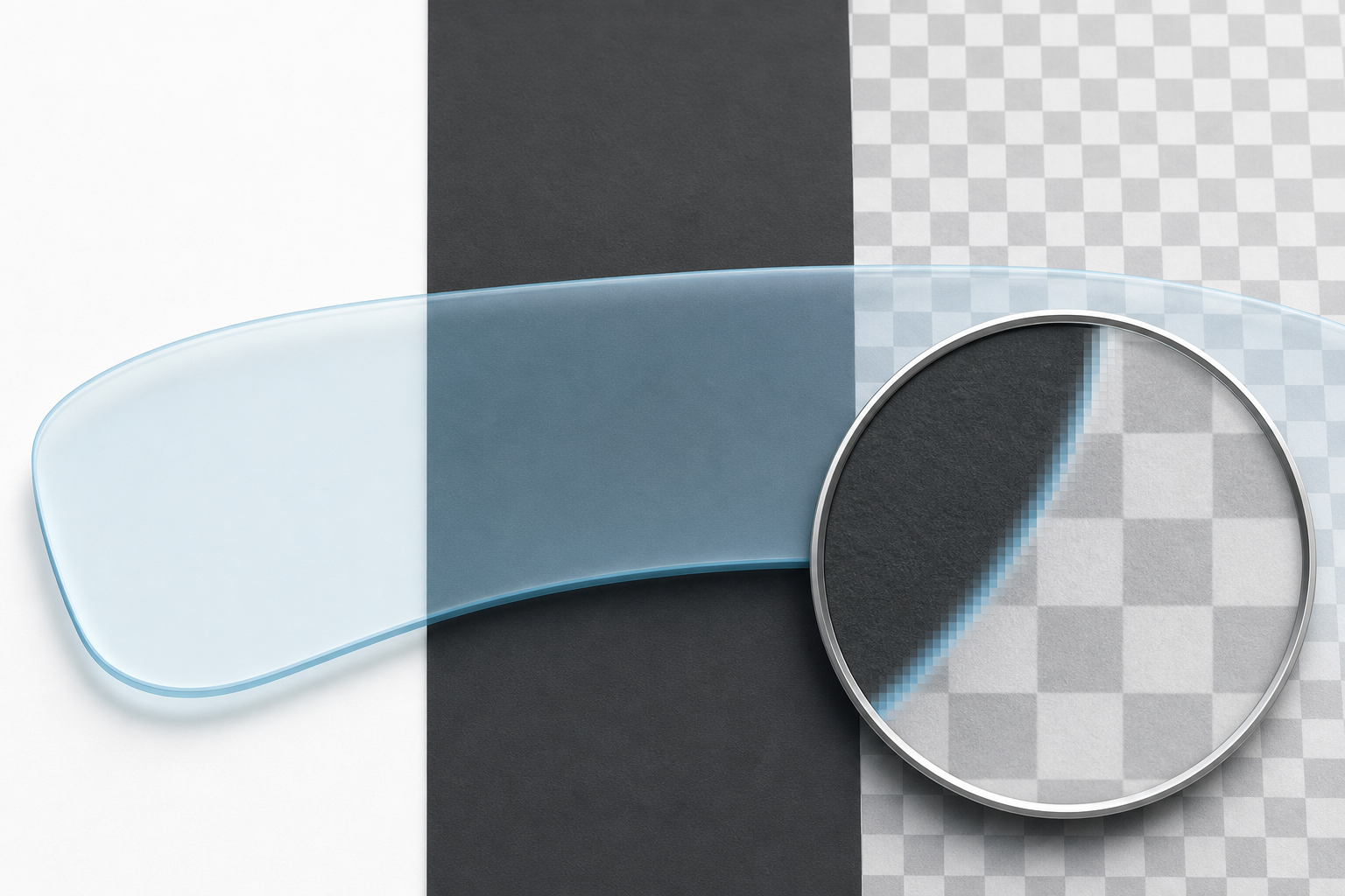
A transparent image can look correct in one preview and still contain defects. Inspect each final asset against at least three backgrounds:
- White, which exposes dark contamination around edges
- Near-black, which exposes pale or white halos
- A checkerboard or saturated color, which makes unintended opaque areas visible
Zoom to 200 or 400 percent and examine curves, diagonal lines, shadows, and the tips of arrows. Then return to normal display size. Some artifacts look alarming under magnification but are invisible in use; others only become distracting when the image is scaled down.
A pale halo usually means edge pixels were composited against a light matte before transparency was restored. The correct fix is to return to the source and export with straight transparency. Erasing the fringe manually is slow and can leave a jagged contour.
Also inspect the RGB content of fully transparent regions if your editing software allows it. Invisible colored pixels normally do not matter, but filtering and animation can sometimes reveal their colors along an edge.
The AI photo editor may help repair a damaged decorative element or clean an irregular contour, but geometric documentation callouts are usually better preserved from their original vector or layered source. Use generative edits selectively and compare the result with the intended interface target.
Compress Against a Visual Budget
The smallest possible file is not automatically the best file. A callout exists to direct attention, so damaged edges can undermine its only purpose.
Set a visual budget before a numeric one. Decide which qualities cannot be compromised:
- Arrowheads must remain sharp
- Semi-transparent masks must stay even
- Thin borders cannot break into segments
- Glows cannot develop visible bands
- The overlay must not create a halo in either color theme
Once those conditions are met, reduce the file size incrementally. The image compression tool is useful for comparing versions, especially when you keep the dimensions unchanged and vary only compression.
Judge the overlay while it is composited over the real screenshot. An artifact that is visible on a checkerboard may be hidden by the interface, while a subtle color shift could become obvious over a flat toolbar.
For a set of overlays, record the chosen export method and quality range. Consistency makes later maintenance easier. It also prevents one contributor from producing lossless assets while another compresses similar elements so heavily that the set no longer matches.
Add the Overlay Responsively
A common implementation places the screenshot and overlay inside the same relatively positioned container. Both images fill the container, while the overlay is absolutely positioned at its upper-left corner.
<figure class="annotated-image">
  <img
    src="settings-panel.webp"
    alt="Settings panel with the notifications section open"
    width="1440"
    height="900"
  />
  <img
    class="callout-overlay"
    src="notifications-callout.webp"
    alt=""
    aria-hidden="true"
  />
  <figcaption>
    Open Notifications, then enable the weekly summary option.
  </figcaption>
</figure>
.annotated-image {
position: relative;
margin: 0;
}
.annotated-image > img:first-child {
display: block;
width: 100%;
height: auto;
}
.callout-overlay {
position: absolute;
inset: 0;
width: 100%;
height: 100%;
pointer-events: none;
}The empty alternative text is intentional when the overlay is purely decorative and the explanation already exists in adjacent text. Repeating “red arrow pointing at button” through a screen reader rarely helps. If the overlay communicates information that is not present elsewhere, add that meaning to the base image's alternative text, caption, or surrounding instructions.
Always declare the base image dimensions to reduce layout movement. Test the composition at narrow widths, browser zoom levels, and any breakpoint where the documentation layout changes.
Test Dark Mode and Responsive Cropping
Dark mode is not merely a background-color swap. Product screenshots may have separate light and dark variants, and a callout designed for one may lose contrast on the other.
You have three options:
- Use one high-contrast overlay that works on both screenshots
- Export separate light-theme and dark-theme overlays
- Build simple callout shapes with CSS or SVG so their colors can change with the theme
A single raster overlay is simplest, but separate assets provide more control. If maintaining two versions, keep their geometry identical and change only the necessary color and shadow properties.
Responsive cropping is another source of failure. If the mobile layout displays a cropped portion of the desktop screenshot, a full-canvas overlay will no longer align. Create a dedicated mobile composition or keep the entire screenshot visible and scale it proportionally.
Test at the exact widths used by the publishing system. Dragging a browser window randomly can reveal issues, but fixed breakpoint checks make them reproducible.
Publication Checklist
Before placing a transparent WebP callout overlay in a product tour or help article, verify the following:
- The base screenshot contains no baked-in annotation
- The overlay matches the base image's aspect ratio or has documented coordinates
- All important instructions exist as real text
- The transparent PNG or layered master is retained
- The WebP export preserves the alpha channel
- Arrows, rings, and masks remain legible over the real interface
- No white or dark fringe appears around translucent edges
- Shadows and gradients show no obvious banding
- The file is sized for its largest realistic presentation
- Compression was judged in context, not only by file size
- Light and dark themes have both been checked
- Mobile and desktop layouts maintain alignment
- Decorative overlays use empty alternative text
- The screenshot and overlay are versioned together
Maintain Overlays Alongside Product Changes
The final challenge is not export quality but ownership. An accurate overlay can become misleading after a button moves, a panel is renamed, or a responsive breakpoint changes.
Store the base screenshot, overlay master, exported WebP, and a short note about the target product version together. Use predictable names such as notification-settings-base.webp and notification-settings-callout-step-2.webp. Avoid names like final-new-3.webp, which provide no clue about content or sequence.
During a documentation review, compare the overlay target with the current interface rather than checking only whether the image file still loads. A perfectly optimized arrow pointing at an obsolete control is worse than no arrow at all.
Transparent WebP overlays are most effective when treated as structured documentation assets rather than disposable decoration. With matched dimensions, carefully designed contrast, retained source files, contextual compression, and responsive testing, they can make complex interfaces easier to explain without turning every minor product update into a complete screenshot rebuild.