Ceramic Glaze Test Tile Photo Sheets: A Practical Studio Reference Guide
Build consistent, searchable photo sheets for ceramic glaze test tiles, with reliable lighting, filenames, image settings, comparison grids, and printable studio records.
Ceramic Glaze Test Tile Photo Sheets: A Practical Studio Reference Guide
A glaze test tile is small, but the decision attached to it may affect an entire kiln load. Unfortunately, many studio records reduce that decision to a phone photo, a handwritten code, and a note whose meaning becomes uncertain six months later.
A well-made photo sheet turns scattered tests into a durable comparison record. It lets you review several recipes together, identify promising combinations, share results with studio members, and reconnect an image with the physical tile. It is especially useful when tiles live in different boxes, samples are loaned out, or a glaze changes after a material substitution.
The goal is not perfect product photography. It is controlled documentation: photographs that preserve useful differences in color, surface, opacity, breaking, and application thickness. This guide explains how to capture those differences, prepare consistent files, assemble practical reference sheets, and avoid records that look attractive but cannot support a firing decision.
Decide What the Sheet Needs to Prove
Begin with the question behind the test series. A sheet designed to compare ten percentages of colorant needs different coverage from one documenting how a single glaze behaves across clay bodies.
Common test questions include:
- How does one recipe change across several firing temperatures?
- What happens when a colorant increases in one-percent steps?
- Does the glaze break differently over texture?
- How does application thickness affect crawling, opacity, or running?
- What changes when the same glaze is used on porcelain, stoneware, and speckled clay?
- Which glaze combinations produce stable, repeatable results?
Write the main question at the top of your project notes before taking photographs. It determines which tiles belong together and which metadata must remain visible.
A useful sheet normally represents one controlled series. Combining unrelated tests simply because they came from the same kiln creates visual clutter. If a reader cannot summarize the comparison in one sentence, divide it into separate sheets.
Give Every Tile a Durable Identity
The most important part of the system is not the camera. It is the link between the photographed tile, glaze recipe, firing record, and physical object.
Assign each test a short identifier before glazing. A practical code can combine the glaze family, variation, clay body, and firing sequence. For example, IB-04-P-C6A might mean iron blue variation four, porcelain, cone 6, firing A. Your exact syntax matters less than consistency.
Avoid identifiers based only on position, such as “top-left” or “third blue tile.” Positions change as soon as someone rearranges the samples. Avoid relying on glaze names alone, too. Names such as “Ocean” or “Floating Blue” can refer to several formulas in a shared studio.
Mark the identifier directly into the clay or apply it with a material that survives firing. Confirm that it remains readable after glaze drips, kiln wash, and handling. If the mark is on the back, photograph the back as a separate record rather than expecting memory to bridge the gap.
Your supporting notes should connect the identifier to at least:
- Recipe version and batch date
- Clay body and clay batch, when relevant
- Bisque temperature
- Glaze application method
- Number of dips, coats, or spray passes
- Final firing program and kiln location
- Cooling schedule, if controlled cooling matters
- Observed defects or unusual conditions
Do not try to place every detail on the photo sheet. The sheet should carry enough information to locate the complete record without becoming a miniature laboratory report.
Build a Repeatable Capture Station
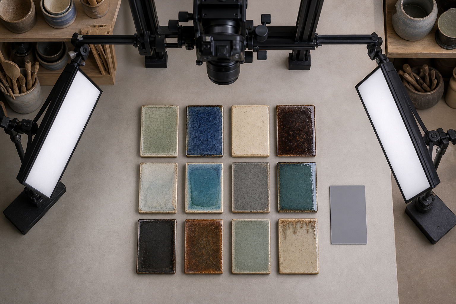
Consistency makes subtle differences easier to see. A tile photographed in warm window light will appear different from the same tile under a cool ceiling lamp, even if nothing about the glaze has changed.
Set up a small capture area that can remain stable during an entire series. You need a neutral background, a camera or phone support, diffused light, and a reference for scale and color.
A medium neutral gray background is often safer than pure white or black. White can encourage automatic exposure to darken the tile, while black can make the camera brighten it. Gray also gives translucent edges and pale clay bodies enough contrast without dominating them.
Use soft, directional light for the main record. A large window with indirect daylight can work if clouds and time of day remain stable. Diffused lamps are more repeatable. Place the primary light at roughly 45 degrees to reveal texture, then add a weaker fill from the opposite side if shadows conceal important areas.
Include a small gray reference or color target at the edge of the first frame in every session. It does not need to appear in the final sheet. Its purpose is to reveal a major exposure or white-balance shift between sessions.
Mount the camera so its position does not change as tiles are exchanged. For flat tiles, an overhead view provides consistent shape and scale. Curved tiles may need a slightly lower camera angle to show how glaze pools and breaks across their profile.
Control Reflections Without Erasing Gloss
Glossy glazes are difficult because reflections contain useful information and visual interference at the same time. A large, soft reflection can reveal gloss level and surface smoothness. A sharp image of a window, phone, or photographer hides the glaze.
Increase the apparent size of the light source by adding diffusion material or bouncing light from a white surface. Move the light rather than tilting each tile individually. If every tile is tilted differently to remove glare, their brightness and breaking patterns become harder to compare.
Take two views when surface character is central to the test:
- A standardized comparison view with controlled reflections.
- An angled detail view that deliberately reveals gloss, pinholing, crystals, or texture.
These views answer different questions. Do not replace the standardized image with a dramatic angled photograph.
Lock Automatic Camera Decisions
Automatic exposure and white balance can change from tile to tile. A camera may brighten a dark tenmoku sample, darken a pale celadon, or neutralize the warm cast that you are trying to document.
If your camera application allows it, lock focus, exposure, and white balance for the series. Keep the same focal length and distance. Digital zoom should be avoided because it can introduce inconsistent processing and reduce fine surface detail.
Capture at a resolution that preserves texture, but do not assume the largest possible file is always better. Stable lighting, focus, and framing contribute more to comparison quality than excessive pixel dimensions.
Photograph More Than the Attractive Face
A frontal photograph records overall color, but glaze behavior often appears at boundaries. Include the areas that explain how the sample behaved:
- A textured region where glaze can break
- A thick application zone
- A thin application zone
- The transition to bare clay
- The lower edge where running may occur
- Any pinholes, blisters, crawling, or crystallization
If your tiles have these features on one face, one primary image may be sufficient. Otherwise, add a detail photograph. Keep details close enough to show the defect, but retain a little surrounding surface so the viewer can understand its location.
For dimensional test forms, consider a three-frame set: front, side profile, and detail. Apply the same sequence to every sample. A comparison sheet becomes confusing when one tile has a front view, another has a back view, and a third has an artistic close-up.
Prepare Consistent Image Files
Move the photographs into a dedicated folder immediately after capture. Retain the untouched originals in a separate subfolder and prepare copies for the sheet. This prevents repeated edits from becoming the only surviving record.
Rename the working files with the permanent tile identifier. Add a view suffix such as front, side, detail, or back. A predictable set might look like:
IB-04-P-C6A_front.jpgIB-04-P-C6A_side.jpgIB-04-P-C6A_detail.jpg
Use leading zeroes for numbered variations so files sort correctly: 01, 02, and 03 instead of 1, 2, and 3.
Crop Without Removing Evidence
Apply the same aspect ratio and similar margins to every primary image. Uneven crops can exaggerate the importance or apparent size of certain tiles. The image resizer can help standardize dimensions after you establish a master crop.
Do not crop so tightly that the tile edge disappears. The boundary can show glaze thickness, clay color, running, and whether a color impression is influenced by the background. Leave enough space to distinguish the object from its surroundings.
Straighten the frame when necessary, but do not distort the tile to make an irregular handmade sample look geometrically perfect. Its shape may be relevant to how glaze accumulated.
Make Conservative Color Corrections
Color editing should correct capture problems, not beautify the glaze. Use the gray reference to detect obvious casts, then apply the same correction to all images from that session. Adjust exposure only when the capture failed to represent the tile under the chosen reference conditions.
Avoid selective saturation, aggressive contrast, clarity effects, and automatic enhancement filters. They may make crystalline details look impressive while misrepresenting color separation or surface roughness. If an image needs extensive correction, recapturing it is usually safer.
An AI photo editor can assist with distractions such as an accidental background mark, but never remove glaze defects, edge runs, dust fused into the surface, or other evidence relevant to evaluation. Keep the untouched original beside every edited derivative.
Choose a Practical Delivery Format
JPEG is suitable for most photographic sheets because ceramic surfaces contain continuous tone and natural texture. Use a high-quality setting rather than maximum compression. PNG may be appropriate for diagrams or images that combine photographs with sharp graphic annotations, but it often produces unnecessarily large files for camera images.
If source files arrive in mixed formats, standardize working copies with an image converter. Preserve the originals, and avoid repeatedly converting a lossy file.
Before assembly, resize the images to the approximate dimensions needed on the page. A tiny tile cell does not benefit from a 30-megapixel source embedded at full size. Use image compression conservatively, then inspect thin cracks, speckles, pinholes, and sharp tile edges at 100 percent magnification.
Design a Photo Sheet That Remains Useful
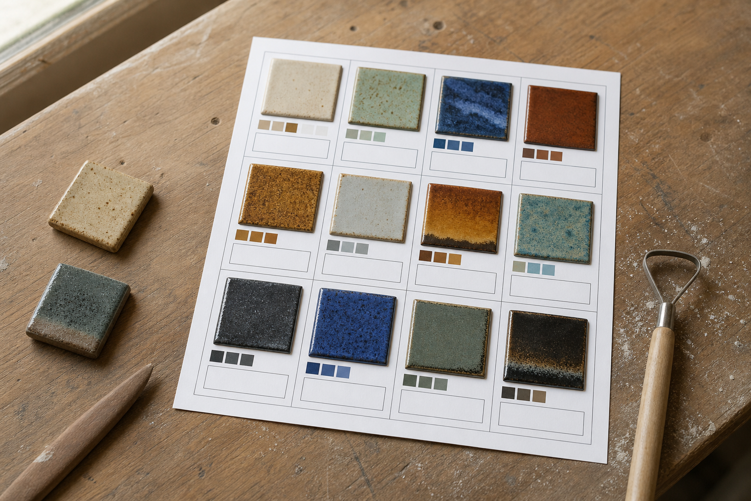
A successful sheet supports comparison before decoration. Use a regular grid, a stable reading order, and enough white space to prevent neighboring colors from visually blending together.
For a standard portrait page, four to six primary tiles often provide a comfortable balance between overview and detail. A larger series can use multiple pages with the same grid. Trying to fit twenty glossy samples on one page makes surface evidence too small to inspect.
Each tile cell should contain:
- The permanent identifier
- The primary photograph
- A short recipe or variation label
- Clay body
- Firing temperature or cone
- One concise application note
- A pointer to the full firing or recipe record
A detail image may sit beside the primary image or on a second page using the same identifier. Keep labels outside the photograph whenever possible. Text placed over a dark or variegated glaze is difficult to read and obscures evidence.
Choose the Grid From the Decision
| Decision being made | Suggested layout | Most important view |
|---|---|---|
| Select among colorant percentages | Ordered row or matrix | Standardized front |
| Compare clay bodies | One column per clay body | Front plus bare-clay edge |
| Evaluate application thickness | Thin-to-thick sequence | Front and lower edge |
| Review glaze combinations | Base glaze by overglaze matrix | Overlap detail |
| Diagnose surface defects | Fewer, larger cells | Angled macro detail |
| Compare firing schedules | Matching pages for each firing | Identical front view |
Maintain the experimental order even when another arrangement looks more attractive. A percentage series should read from low to high. Randomly arranging colors weakens the test logic and increases the chance of a mistaken conclusion.
Export a Printable Studio Record
PDF is a practical final format because it preserves page layout across devices and printers. Export at the intended page size, embed common fonts, and check that no image or identifier crosses a trim boundary.
You can assemble prepared tile images into a PDF with an image-to-PDF tool. For multi-page series, confirm that page order matches the test sequence before sharing or printing.
Print one draft on the printer normally used in the studio. The print will not reproduce every glaze accurately, especially metallic, fluorescent, highly saturated, translucent, or iridescent surfaces. Its purpose is identification and comparison, not replacement of the physical tile.
Inspect the draft for:
- Identifiers that remain readable at arm's length
- Tile images large enough to reveal important surface changes
- Predictable ordering across pages
- Adequate contrast around pale and dark samples
- Notes that do not wrap into neighboring cells
- A visible document date and version
Add a short statement that physical samples remain the color authority. This prevents a printed sheet or uncalibrated screen from being treated as an exact color contract.
Store the Sheet With Its Source Records
A photo sheet becomes less useful when separated from its recipes and firing logs. Store the exported PDF, prepared images, originals, and a simple index together under one series name.
A practical directory might contain:
originalsfor untouched camera filespreparedfor cropped and resized copiesdetailsfor defect and surface close-upsrecordsfor recipes and firing notesexportsfor dated PDF sheets
Include the date or version in exported filenames, such as iron-blue-series_C6_2026-07-12_v01.pdf. If you revise notes without changing the photographs, increment the version rather than overwriting the earlier sheet. Historical versions can explain why a glaze was selected or rejected at a particular time.
Back up the digital folder, but also decide where the physical tiles live. A shallow drawer, pegboard, or labeled sample box can mirror the digital series. The permanent identifier should be the bridge between them.
Common Documentation Failures
Several mistakes recur because they save minutes during capture but cost hours later.
Mixing Light Sources
Window light combined with warm ceiling lamps produces colored shadows that are difficult to correct. Turn off competing lights or block daylight so the scene has one controlled lighting character.
Letting the Camera Reinterpret Every Tile
Automatic exposure makes dark tiles too bright and pale tiles too dull. Lock settings for a series and include a neutral reference frame.
Recording Only the Best-Looking Angle
An attractive reflection can hide crawling, running, or uneven coverage. Capture the standardized comparison view first and expressive details second.
Editing Away the Result
Dust, pinholes, crystals, and uneven edges may be the reason the test exists. Removing them changes the record. Limit cleanup to irrelevant capture distractions and retain originals.
Separating Images From Identifiers
A folder of files named IMG_4821 through IMG_4860 is fragile evidence. Rename copies immediately and verify each code against the physical tile before putting samples away.
Making the Grid Too Dense
A crowded page gives an overview but prevents surface inspection. Split large series across matched pages and keep ordering consistent.
Final Quality-Control Checklist
Before treating the sheet as complete, verify the chain from material test to final document:
- Every tile has a permanent, unique identifier.
- Filenames begin with the same identifier shown on the sheet.
- All primary photographs use comparable lighting, framing, and camera settings.
- Color correction is restrained and consistent across each capture session.
- Tile edges, clay transitions, and relevant defects remain visible.
- The grid follows the experimental sequence.
- Recipe, clay body, firing, and application references are sufficient to locate full notes.
- Detail views are clearly associated with their primary tiles.
- The PDF has been reviewed on screen and as a physical print.
- Original photographs remain untouched and backed up.
- The location of each physical sample is recorded.
- The exported filename contains a date or version.
The strongest glaze photo sheet does not pretend to replace a tile held under good light. It reduces ambiguity around that tile. By controlling capture conditions, preserving evidence, and organizing each series around a specific decision, a pottery studio can build a reference library that becomes more valuable with every firing.