Dark Mode Screenshot Preflight for Help Centers: A Practical Readability Guide
A practical guide for preparing dark mode screenshots that keep small UI text, focus states, shadows, and annotations readable in help centers and product docs.
Dark Mode Screenshot Preflight for Help Centers: A Practical Readability Guide
Dark mode screenshots look polished in product documentation, but they are also easy to damage. Thin gray labels disappear after compression. Soft shadows become muddy blocks. Purple focus rings shift toward blue. A modal that looked clean on a Retina display can become a dark rectangle with unreadable text once it is resized into a help center article.
This guide is for product marketers, support writers, developer advocates, and small documentation teams that publish screenshots of dark interfaces. The goal is not to make screenshots dramatic. The goal is to make them dependable: readable at mobile widths, sharp enough for search and support teams, small enough for fast pages, and consistent enough that readers trust what they are seeing.
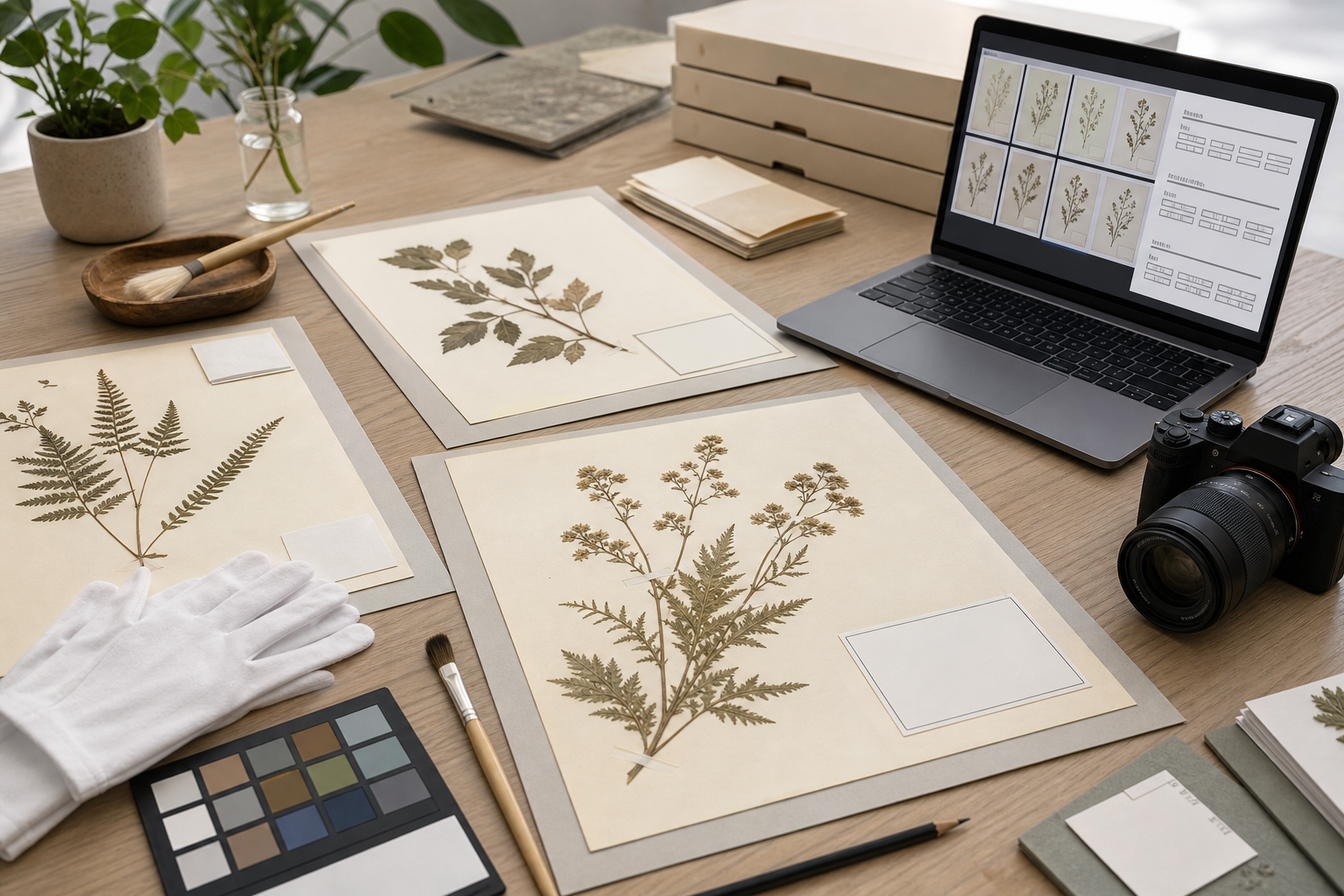
You do not need a full design suite for most of this. A careful pass through crop, resize, conversion, compression, OCR, and PDF packaging tools is enough for many teams. ConvertAndEdit tools such as Resize Image, Compress Image, Convert Image, AI Photo Editor, Image OCR, and Image to PDF can cover the practical cleanup steps when screenshots are already captured.
Why Dark Mode Screenshots Need Their Own Preflight
Light mode screenshots usually fail loudly. If text is too small, it is obviously tiny. If compression is too aggressive, white backgrounds show mosquito noise and blurred edges. Dark mode fails more quietly. A screenshot can look acceptable at first glance while still hiding the exact details a user came to understand.
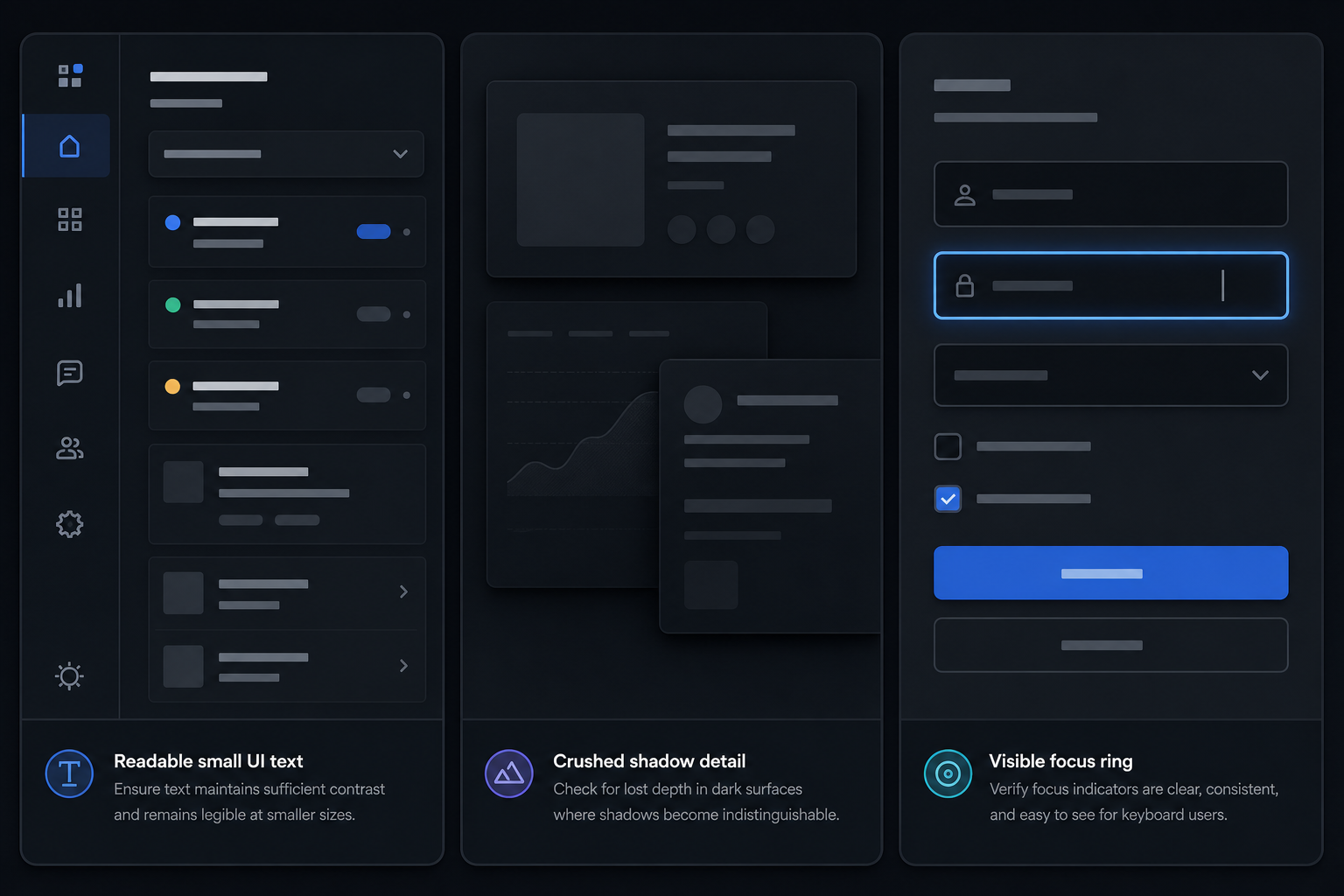
The problem is contrast layering. Dark interfaces often depend on subtle distinctions: a panel at #111827, a nested surface at #1f2937, a disabled label at #6b7280, a border at low opacity, and a hover state that is only slightly brighter than its resting state. These distinctions can survive in the app but collapse in an exported image.
Help center screenshots also travel through several transformations. They may be pasted into a CMS, converted by an image service, resized for responsive layouts, displayed on mobile screens, compressed by a CDN, or copied into internal support notes. Each step can reduce contrast or sharpness. A dark screenshot that only works in the original capture size is not ready for publication.
A good preflight asks four questions:
- Can the reader identify the target UI element without guessing?
- Does small text remain readable at the final display width?
- Are dark surfaces separated enough to show depth and hierarchy?
- Is the file small enough that it will not slow the article down?
The rest of this guide turns those questions into a repeatable editorial check.
The Dark Mode Screenshot Failure Modes to Check First
Before editing anything, inspect the screenshot for the most common dark mode issues. This first pass saves time because it tells you whether the screenshot needs a new capture, a crop, a light edit, or a full replacement.
1. Crushed Shadows
Crushed shadows happen when several dark surfaces merge into one flat block. In product UI screenshots, this often affects sidebars, dropdown menus, modal backdrops, code editors, and chart containers.
Look for places where the viewer needs to distinguish one layer from another. A dark modal on a dark overlay may look fine in the app because it has motion, focus, and context. In a static screenshot, the same modal can lose its edge. If the modal boundary is not visible, the reader may not understand which part of the page is active.
A quick check: zoom out until the screenshot is roughly the size it will appear in the article. If the panel hierarchy disappears, the image needs adjustment or a tighter crop.
2. Low-Contrast Secondary Text
Dark interfaces often use muted gray text for labels, descriptions, timestamps, placeholder text, metadata, disabled controls, and helper messages. These are the exact details that documentation screenshots often rely on.
Do not judge readability at full desktop size only. A screenshot that is 1600 pixels wide may be displayed at 720 pixels in a documentation column and less than 390 pixels on a phone. If the support article says “choose the archived status in the dropdown,” the status text has to be readable after that downscaling.
If a label is necessary for the instruction, it should either be readable in the screenshot or repeated clearly in the article copy. Screenshots should support the instructions, not force readers to decode them.
3. Blurred Hairline Borders
One-pixel borders are common in dark UI because they keep layouts restrained. Unfortunately, resizing can turn them into inconsistent gray smears. Borders may vanish on one side of a card, double on another, or create a fuzzy edge around inputs.
This is especially noticeable in screenshots of tables, settings pages, calendars, code blocks, form builders, and analytics dashboards. If the screenshot depends on a grid or row boundary, resize it carefully. A simple pass through Resize Image can help you set a predictable width instead of letting a CMS produce a soft automatic resize.
4. Color Shifts in Highlights
Dark mode UIs often use saturated accents: blue command buttons, green success states, red destructive actions, amber warnings, or purple active tabs. Compression and format conversion can shift those accents, especially around small icons or antialiased text.
A slight shift is usually harmless. A shift becomes a documentation problem when the article depends on color as a cue. For example, if the copy says “the warning badge appears in amber,” but the uploaded image makes it look brown or gray, readers may lose confidence.
Use color as a helper, not the only identifier. Combine it with position, label text, shape, or annotation.
5. Annotation Collisions
Arrows, boxes, number markers, and highlights can look heavy on dark screenshots. A bright red rectangle might dominate the image. A translucent yellow overlay can make white text muddy. A white callout may look like part of the product UI.
Annotations need to be visible without pretending to be interface elements. The safest style is usually a thin, high-contrast outline with enough padding around the target. Avoid covering text unless the text is irrelevant.
Capture Decisions That Prevent Cleanup Problems
The best edit is the one you do not have to make. Before you resize or compress, capture the screenshot under conditions that preserve detail.
Capture at a Stable Width
Pick a documentation capture width and use it consistently. For many SaaS products, 1440 pixels wide is a practical desktop capture size. It gives enough room for side navigation, content panels, and dialogs without creating enormous files. For mobile app documentation, capture real mobile dimensions instead of cropping a desktop browser into a phone-like rectangle.
Consistency matters because help center articles often place several screenshots in sequence. If one screenshot shows a wide desktop and the next shows a narrow tablet state, readers may think the product changed location or structure.
Avoid Browser Zoom Surprises
Browser zoom changes text rendering and spacing. A screenshot captured at 90% zoom can make small UI text harder to read. A screenshot captured at 125% may make the UI look different from what customers see.
For documentation, capture at 100% browser zoom unless the article specifically explains a zoomed accessibility setting. Also check that the operating system display scaling is not producing unusual results. If multiple teammates capture screenshots, document the capture settings in the team’s editorial notes.
Turn Off Visual Noise
Close side panels that are not part of the instruction. Hide personal bookmarks, browser extensions, test accounts, staging banners, chat widgets, and debug panels. In dark screenshots, these distractions often pull more attention than expected because bright icons and badges stand out sharply.
If a screenshot contains private or unstable data, do not rely on blur as the only protection. Replace the data in the product environment when possible. If replacement is not possible, crop the screenshot so the private area is not included. For light cleanup where the surrounding image must stay natural, AI Photo Editor can help remove or soften incidental visual clutter, but it should not be used to misrepresent product behavior.
Capture the Actual State, Not a Pretty Near Miss
Dark mode makes it tempting to capture the most visually balanced moment rather than the most instructional moment. Resist that. If the article is about a warning, show the warning. If it is about an empty state, show the empty state. If it is about a permission error, show the permission error.
A screenshot should answer the reader’s immediate question: “Am I in the right place, and what should I do next?” Beauty is secondary.
Cropping for Instructional Focus
Cropping is the highest-impact edit for dark mode screenshots. It reduces file size, improves readability, removes distractions, and lets the reader focus on the relevant state.
A useful crop keeps three things:
- The target element.
- Enough surrounding UI to prove where the target lives.
- Any label, heading, or navigation item that confirms context.
A weak crop keeps the target but removes the context. For example, a close crop of a toggle switch may show the switch clearly, but not which setting it controls. A wide crop of the whole app may show context, but the toggle becomes too small. The right crop usually sits between those extremes.
Context Rules for Common UI Types
| Screenshot type | Keep in the crop | Usually remove |
|---|---|---|
| Settings page | Section heading, target control, nearby helper copy | Full sidebar, unrelated settings below |
| Modal dialog | Modal title, selected option, primary action | Entire dimmed page behind the modal |
| Table action | Column header, one or two relevant rows, action menu | Full dataset, pagination, empty columns |
| Dashboard chart | Chart title, axes or legend, active filter | Unrelated widgets and navigation clutter |
| Error state | Error message, affected field, submit or retry action | Extra fields that are not involved |
| Code editor | File name, highlighted line, adjacent lines | Full project tree unless relevant |
After cropping, preview the image at the article column width. If the target still needs a magnifying glass, crop tighter or split the explanation into two screenshots.
Resizing Without Losing Thin Text
Dark mode screenshots are often text-heavy. Resizing them aggressively can make labels, menu items, and table values unreadable. The trick is to resize to a deliberate final width instead of letting every platform make its own decision.
For many help centers, a desktop article column displays images between 700 and 900 CSS pixels wide. A 2x image for that slot might be 1400 to 1800 pixels wide. If the original screenshot is 3024 pixels wide, uploading it unchanged may waste bytes. If you shrink it to 800 pixels wide, it may look soft on high-density screens.
A practical target set:
| Use case | Suggested export width | Notes |
|---|---|---|
| Full article screenshot | 1400-1800 px | Good for dense UI on high-density screens |
| Cropped settings detail | 900-1200 px | Keeps labels readable without excess canvas |
| Mobile app screen | 720-1080 px | Preserve native proportions |
| Tiny UI detail callout | 600-900 px | Use only when the surrounding context is already explained |
| Social preview or changelog thumbnail | 1200 px | Compose separately instead of reusing a dense help image |
Use Resize Image when you need predictable dimensions before upload. After resizing, do not judge only in an image viewer. Place the image into a draft article or preview width similar to the final CMS column.
When to Split One Screenshot Into Two
If one dark screenshot tries to show too much, compression and resizing will punish it. Split the instruction when:
- The target element is less than one quarter of the image width.
- The screenshot contains both navigation context and a tiny detail inside a panel.
- The article needs to explain before and after states.
- A dropdown, tooltip, or popover covers important background content.
- Mobile readers would need to pinch zoom.
A two-image sequence can be clearer than one oversized annotated image: first show where the section lives, then show the exact control or result.
Choosing PNG, WebP, or JPEG for Dark UI
Format choice matters. Dark screenshots with text and flat UI surfaces are not the same as photographs.
PNG is reliable for crisp text, sharp icons, and flat colors. It is often the safest source format for product screenshots, especially before editing. The downside is file size.
WebP can produce much smaller files while preserving good visual quality, especially for web publishing. It is a strong final delivery format for many help center images, but you should inspect small text after conversion.
JPEG is usually a poor choice for UI screenshots with dark backgrounds and thin text. It can create blocky artifacts, color halos, and muddy gradients. JPEG can still be acceptable for photographic content inside the UI, such as profile photos or product images, but it is rarely the best format for a full interface screenshot.
A simple decision table:
| Need | Best starting point | Best publishing candidate |
|---|---|---|
| Maximum text clarity | PNG | PNG or high-quality WebP |
| Smaller help center pages | PNG | WebP |
| Transparent overlays | PNG | WebP with transparency or PNG |
| Photo-heavy interface | PNG source | WebP or JPEG after inspection |
| Internal review packet | PNG | PDF or PNG set |
If your source screenshots arrive in mixed formats, normalize them before publishing. Convert Image is useful when a folder contains a blend of PNG, JPEG, and WebP files and you want consistent source files or final outputs.
Compression Settings for Dark Screenshots
Compression is where many dark mode screenshots fall apart. A compressed image may look smaller in file size but also lose the small visual cues that make the screenshot useful.
The goal is not the smallest possible file. The goal is the smallest file that still explains the interface.
Start with these checks:
- Inspect labels under icons and table headers.
- Check disabled text and placeholder text.
- Look at borders around cards, fields, and menus.
- Inspect color badges and status pills.
- Zoom out to the final article width.
- Compare the compressed version against the source.
Use Compress Image for the final size pass, then compare visually. If the screenshot contains mostly flat UI, a modest compression level may save a lot without visible damage. If it contains gradients, shadows, charts, or dense antialiased text, be more conservative.
File Size Targets That Still Respect Readers
There is no universal file size budget, but help center pages benefit from restraint. A single article with eight 2 MB screenshots is a slow article. At the same time, a 90 KB screenshot with unreadable text is false economy.
Practical targets for finished images:
| Image role | Reasonable target | When to allow more |
|---|---|---|
| Small cropped detail | 80-180 KB | Dense text or transparency |
| Standard help screenshot | 150-450 KB | Large dashboard, modal with fine text |
| Full-width hero-style product screenshot | 300-700 KB | Complex UI at high-density size |
| Animated GIF or UI demo | Case by case | Keep separate from static screenshot budgets |
If a screenshot exceeds the target, crop before compressing harder. Removing irrelevant pixels protects clarity better than crushing the entire image.
A Practical Export Checklist Before Upload
Use this checklist after capture and before the image enters the CMS.
Screenshot Content
- The screenshot shows the real product state described in the article.
- Private data, test tokens, emails, and account identifiers are removed or replaced.
- The target element is visible without relying on memory from earlier screenshots.
- The surrounding context is enough to orient the reader.
- Browser chrome and unrelated side panels are excluded unless needed.
Readability
- Small labels are readable at the final article width.
- Dark panels do not merge into one indistinct block.
- Borders, dividers, and focus states remain visible.
- Annotations do not cover important UI text.
- Color is not the only cue for the instruction.
Dimensions and Format
- The image is exported at a deliberate width.
- The format matches the content: usually PNG source, PNG or WebP final.
- Mobile screenshots keep their native proportions.
- Very wide screenshots are split when needed.
- Transparent assets are tested on both light and dark article backgrounds.
Compression and Publishing
- The compressed version is compared with the source.
- Thin text and icons survive compression.
- File size is appropriate for the image role.
- The image has descriptive alt text.
- The filename is stable, specific, and not tied to a temporary draft name.
This checklist is intentionally plain. The point is to make screenshot quality less dependent on whoever happens to publish the article that day.
Using OCR as a Readability Test
OCR is not only for extracting text. It can also act as a practical readability signal. If OCR cannot recognize key labels from a dark screenshot, there is a good chance some readers will struggle too.
Upload the screenshot to Image OCR and check whether important labels are detected. You do not need perfect extraction. Product UI often includes icons, abbreviations, and layout fragments that OCR may ignore. Focus on the terms that matter for the instruction: button labels, section headings, error messages, field names, and status values.
For example, if an article tells users to select “Require approval before publishing,” OCR should probably find that phrase or most of it. If the extracted text misses the label entirely, inspect the screenshot. The label may be too small, too low contrast, blurred by resizing, or covered by an annotation.
OCR is especially useful for:
- Screenshots of admin portals with dense tables.
- Dark code editors with small line numbers.
- Mobile screenshots with compact labels.
- Error messages shown inside modal dialogs.
- Screenshots translated into multiple locales.
Do not treat OCR as the final authority. Treat it as an extra check that catches weak readability before customers do.
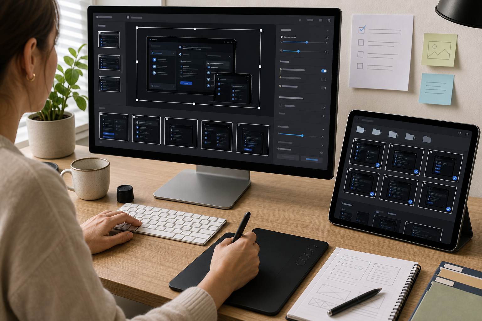
Packaging Screenshot Sets for Review
When an article includes many dark mode screenshots, review them together before publishing. A set view reveals inconsistencies that are hard to see one image at a time: uneven widths, different browser zoom levels, mismatched annotation colors, and inconsistent cropping.
For editorial review, you can collect screenshots into a simple PDF packet with Image to PDF. This is useful when product managers, support leads, or compliance reviewers need to approve images before publication. A PDF is not necessarily the final web format; it is a review artifact that keeps the set in order.
A review packet should include:
- Screenshots in article order.
- One image per page when details are dense.
- Short filenames that identify the article and step.
- A consistent page size so scale differences are visible.
- Final candidates, not rough captures mixed with polished exports.
If the review generates comments, revise the source image set and export again. Avoid marking up the PDF and then losing track of which image changed.
Naming Files So Future Editors Understand Them
Dark mode screenshot libraries become messy quickly. A filename like screen-final-new-2.png means nothing three months later. Use filenames that survive handoff.
A practical pattern:
product-area_state_step_width.format
Examples:
billing-darkmode-invoice-filter-1400.webpadmin-users-permission-modal-1200.pngeditor-dark-theme-save-error-1000.webpmobile-settings-notification-toggle-900.png
Keep filenames lowercase, use hyphens or underscores consistently, and include the final width when it helps editors avoid accidental resizing. Do not include customer names, private account details, or temporary ticket numbers.
If the same screenshot appears in multiple articles, keep a source version and export article-specific crops as needed. Reusing a screenshot is fine; reusing the wrong crop is where confusion starts.
Accessibility and Alt Text for Dark Screenshots
Alt text should describe the instructional meaning of the screenshot, not every visible pixel. For a dark mode screenshot, the alt text often needs to identify the product area, active state, and target element.
Weak alt text:
Screenshot of settings page.
Better alt text:
Dark mode settings page with the approval toggle selected in the publishing permissions section.
Alt text should not depend on color alone. If the important cue is a green status pill, mention the status label too. If the screenshot shows a selected tab, name the tab. If the screenshot is purely decorative, it may not need detailed alt text, but help center screenshots are usually instructional.
Also consider readers using forced colors, high contrast modes, or browser extensions. The article copy should still make sense if the screenshot is unavailable or difficult to inspect. Use screenshots as confirmation, not as the only source of instruction.
Common Dark Mode Screenshot Scenarios
Settings Guides
Settings pages often contain many low-contrast labels and helper descriptions. Crop to the relevant section and keep the section heading. If a toggle or checkbox is the target, show the label on the same line. Avoid placing an annotation directly over helper text.
Error Documentation
Error states in dark UI can be subtle, especially when red text appears on a dark surface. Keep the field, message, and recovery action in the crop. If the error appears after submission, include the button or control that helps the reader understand what happened.
Code and Developer Tools
Dark code editors are difficult because syntax highlighting creates many colors at small sizes. Capture at a stable zoom, crop to the relevant line range, and avoid heavy compression. If exact code matters, include a text snippet in the article instead of expecting readers to copy from an image.
Analytics Dashboards
Charts on dark backgrounds can lose gridlines, legends, and axis labels. Crop away unrelated widgets, but keep the chart title and active filters. If a trend line is important, make sure it remains visible after resizing and compression.
Mobile Product Screens
Mobile dark screenshots can look crisp alone but become tiny when inserted into a wide desktop article. Do not place a single phone screenshot at full article width unless the design benefits from it. Use a narrower image layout if the CMS supports it, or combine two related mobile states only when both remain readable.
Final Quality Pass
Before publishing, preview the article as a reader would see it. Check desktop and mobile widths. Scroll naturally, without zooming, and ask whether each screenshot earns its place.
A screenshot is ready when it passes these tests:
- The reader can understand the target state in under three seconds.
- The article copy and screenshot agree.
- The crop removes distractions without hiding context.
- Small text remains readable at the displayed size.
- Dark surfaces still show hierarchy.
- Compression artifacts do not distract from the instruction.
- The alt text explains the purpose of the image.
Dark mode screenshots do not need special treatment because they are fashionable. They need it because their useful details live in narrow contrast ranges. A little preflight protects those details from being lost during resizing, conversion, compression, and publishing.
For small teams, the practical system is simple: capture cleanly, crop for context, resize deliberately, convert only when it helps, compress with inspection, and use OCR as a quick readability check. That is enough to make dark help center screenshots clearer, lighter, and easier to maintain.