Design System Icon Audit From Screenshots: A Practical Cleanup and OCR Workflow
A niche workflow for product and documentation teams who need to extract, compare, clean, and package UI icons from screenshots without losing visual context.
Design System Icon Audit From Screenshots: A Practical Cleanup and OCR Workflow
Most design system audits begin with a clean intention and a messy reality: the official component library says one thing, production screens show another, and documentation screenshots reveal a third version that nobody remembers approving. Icons are especially hard to audit because they are small, reused everywhere, and easy to mistake for each other when they appear beside labels, badges, tooltips, and toolbar chrome.
This workflow is for product teams, documentation teams, QA leads, and solo designers who need to inspect icons from real screenshots instead of relying only on source files. The goal is not to rebuild an entire icon library. The goal is to collect visual evidence, identify inconsistencies, clean the icons enough to compare them, and package the findings so a designer or engineer can act on them.
It is a niche task, but it comes up more often than teams expect: during rebrands, accessibility reviews, help center refreshes, app migrations, marketplace listing updates, and design system consolidation. A screenshot-based audit is useful because it answers the practical question: what are users actually seeing?
When a Screenshot-Based Icon Audit Makes Sense
If you already have a perfectly maintained icon library, source components, naming rules, usage analytics, and current docs, you may not need this process. Most teams do not have that luxury. Screenshot audits are valuable when the source of truth is fragmented or when production UI has drifted away from the design system.
Use this workflow when you need to answer questions like:
- Are the same actions using different icons across product areas?
- Did old icons survive a redesign in lower-traffic screens?
- Are destructive, warning, and disabled states visually distinct enough?
- Do help center screenshots show outdated toolbar icons?
- Are exported marketplace screenshots using the current icon style?
- Are tiny icons still readable after compression and resizing?
The important distinction is that this is an evidence workflow, not an asset creation workflow. You are not trying to make final production icons from screenshots. You are using screenshots to find, compare, and document what exists.
The Output You Are Trying to Produce
Before opening any editor, define the packet you want at the end. A good icon audit packet should be compact enough for reviewers to scan, but specific enough that nobody has to guess what changed.
A practical final package usually includes:
- A folder of original screenshots, unchanged.
- Cropped icon examples grouped by feature area or icon family.
- A comparison sheet showing similar icons side by side.
- OCR notes for visible labels, tooltips, menu names, or button copy near each icon.
- A short PDF or image sheet that can be shared in a ticket, design review, or migration brief.
ConvertAndEdit can help with the mechanical parts of this workflow: cropping and cleanup, OCR, format conversion, compression, and packaging. For example, use Image OCR when labels near an icon matter, AI Photo Editor for careful cleanup around noisy screenshot backgrounds, Convert Image when you need consistent PNG or WebP exports, and Image to PDF when the audit needs to become a shareable review packet.
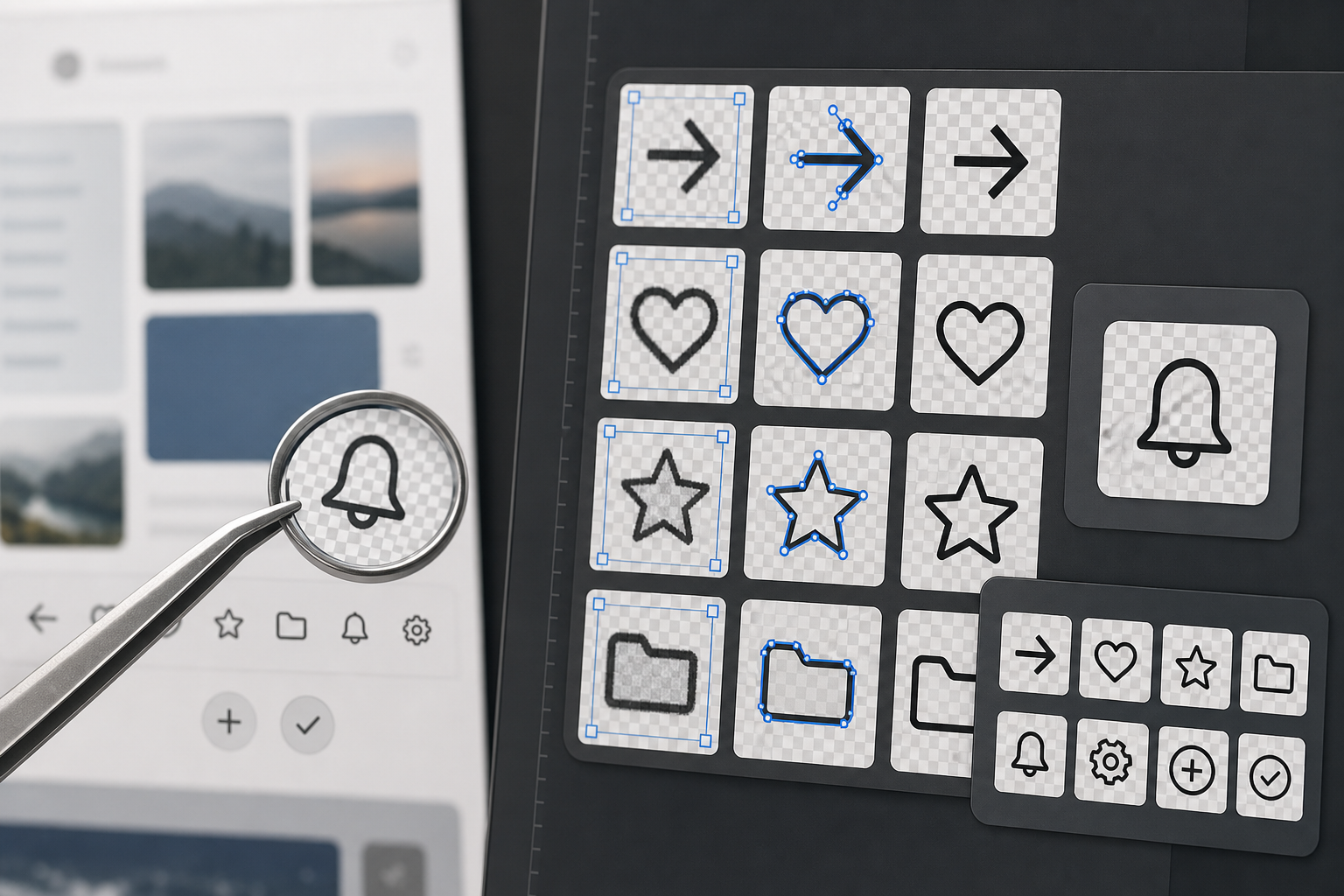
Build the Icon Evidence Set Before You Edit Anything
The most common mistake is to start cropping icons immediately. That feels productive, but it destroys context. In an icon audit, context is often more important than the tiny shape itself. A gear icon beside account settings is not the same evidence as a gear icon inside admin permissions. A trash icon in a disabled state needs the surrounding button state to make sense.
Start by collecting screenshots into an evidence set. Use full-screen or full-panel captures, not tiny snippets, and preserve the original file names if they contain useful details such as the page name, date, feature branch, or environment.
A simple folder structure works well:
01-original-screenshots02-cropped-icon-contexts03-isolated-icons04-comparison-sheets05-review-packet
The original screenshot folder should remain untouched. Every cropped or cleaned file should be derived from it. This gives you a fallback if a reviewer asks where an icon came from or whether a cleanup step accidentally changed the evidence.
Capture Screens With Audit Consistency
Screenshots taken at different zoom levels can make identical icons look inconsistent. Before collecting images, standardize the capture conditions as much as possible.
Use this capture checklist:
- Browser zoom at 100 percent unless you are auditing zoom behavior.
- Same operating system theme when possible.
- Same app theme, such as light or dark mode, for each comparison group.
- Same viewport width for screens that change layout responsively.
- No cursor covering icons unless pointer state is part of the evidence.
- Tooltips captured only when the tooltip text matters.
- Disabled, hover, active, and selected states captured as separate examples.
For web apps, capture common breakpoints separately. A sidebar icon may collapse into a tab bar icon on mobile. That is not a duplicate; it is a separate usage context.
Keep Context Crops Before Isolated Crops
For every icon that may matter, create two versions. The context crop includes the icon and enough surrounding UI to explain its meaning. The isolated crop contains only the icon area with minimal padding.
The context crop is for humans. The isolated crop is for comparison.
A good context crop might include the button label, toolbar group, nearby menu item, or selected row. If the icon appears beside text, keep the text visible. If the icon is part of a multi-icon toolbar, include neighboring icons so reviewers can see spacing and style relationships.
Then create the isolated crop from the same source. For small UI icons, generous padding is useful at first. You can tighten the crop later, but if you crop too close too early, you may lose shadow, focus ring, badge, or optical alignment clues.
Use OCR to Capture Nearby Meaning
Icons are rarely self-explanatory in screenshots. Nearby text often tells you what an icon does, whether it is legacy, and whether it matches the current terminology. OCR is useful because it turns screenshot context into searchable notes.
Run OCR on context crops, not isolated icons. The point is to extract labels, menu items, headings, tooltip copy, badge text, and button names around the icon. ConvertAndEdit's Image OCR is helpful when the text is locked inside screenshots and you do not want to manually transcribe every label.
OCR notes do not need to be perfect prose. They need to be searchable and reviewable. A lightweight row in a spreadsheet or markdown table is enough:
| Field | Example |
|---|---|
| Source screenshot | billing-settings-admin-light.png |
| Icon description | outlined gear in toolbar |
| Nearby OCR text | Settings, Billing rules, Manage plan |
| State | default |
| Concern | gear differs from account settings gear |
| Recommended action | compare against current settings icon token |
This note structure prevents a familiar problem: a reviewer sees a cropped icon and asks what it came from. With OCR context attached, the audit remains grounded.
OCR Pitfalls With Tiny UI Text
OCR can misread small type, especially if screenshots have been compressed, scaled, or captured on a high-density display and then resized. Treat OCR as a first pass, not a legal transcript.
Watch for these common errors:
1confused withIorl.- Toolbar labels split into fragments.
- Menu text read in the wrong order.
- Badges or counters merged into neighboring labels.
- Light gray disabled text skipped entirely.
- White text on dark UI interpreted inconsistently.
If the text matters for a decision, check it against the screenshot manually. For example, if the icon appears beside Archive versus Delete, that distinction is too important to trust blindly.
Decide What Kind of Icon Problem You Are Looking At
Not every difference is a defect. Sometimes an icon changes because the state, density, or platform requires it. A good audit separates acceptable variation from drift.
Use this decision table before opening tickets:
| Observation | Likely Meaning | Action |
|---|---|---|
| Same action uses filled and outline icons in the same density | Style drift | Flag for design system review |
| Same icon appears in different colors for active and inactive states | Intended state treatment | Verify contrast and documentation |
| Similar icons represent different actions | Possible ambiguity | Add context examples and ask for naming review |
| Icon looks blurred only in docs screenshot | Export or compression issue | Re-export screenshot and compare |
| Icon differs between mobile and desktop | Responsive variant or drift | Check component rules before filing |
| Icon is visible in production but absent from library | Unregistered usage | Add to inventory and request source mapping |
This table keeps the audit from becoming a personal taste exercise. You are looking for mismatches that affect recognition, consistency, accessibility, documentation accuracy, or maintenance.
Clean, Isolate, and Export Icons Without Changing Their Meaning
Once you have original screenshots, context crops, and OCR notes, you can begin isolating icons for comparison. This is where restraint matters. Cleaning should remove screenshot noise, not improve the icon.
The safest edits are mechanical:
- Crop to a consistent canvas.
- Remove unrelated background around the icon.
- Preserve the original icon color unless color is irrelevant to the comparison.
- Keep focus rings, notification dots, badges, and disabled opacity when they are part of the state.
- Export to a lossless or high-quality format for review.
Use AI Photo Editor carefully when a screenshot background makes the icon hard to inspect. For example, you may need to remove a textured image behind a white icon or clean a busy app screenshot so the icon edge can be seen. Do not use cleanup to sharpen, redraw, recolor, or modernize the icon unless your note clearly labels the result as an illustrative cleanup rather than evidence.
Transparent Backgrounds Are Useful, But Not Always Truthful
Transparent icon crops are excellent for side-by-side comparison. They make size, stroke weight, corner radius, and optical balance easier to see. But transparency can also remove meaningful context.
For example, a white icon on a blue button may look invisible when placed on a transparent checkerboard. A gray disabled icon may look like a weak design when separated from its disabled button state. A destructive icon may rely on red button color rather than red icon color.
Use transparent crops for comparison, but keep context crops in the same packet. When exporting transparent files, PNG is usually the safest working format. If the audit needs web-friendly previews, use Convert Image to create WebP copies after you have preserved the original PNG review assets.
Create a Consistent Crop System
Icon comparison fails when every crop has different padding. A 16 px icon with 4 px padding can look larger than a 20 px icon with 12 px padding. The viewer starts comparing canvases instead of icons.
Pick a crop system and stick to it. For example:
| Icon Source | Suggested Canvas | Use Case |
|---|---|---|
| 16 px toolbar icons | 48 x 48 px | Dense product UI comparison |
| 20 px navigation icons | 64 x 64 px | Sidebar and tab bar review |
| 24 px action icons | 72 x 72 px | Buttons, cards, empty states |
| Mixed unknown sizes | 96 x 96 px | Early inventory before sizing is known |
Center each icon optically, not just mathematically. Some icons, such as play triangles, chevrons, and upload arrows, may need slight optical adjustment to look centered. Record that the crop was normalized for comparison so nobody mistakes the canvas for the production layout.
Compare Icons by Family, Not by Screen Order
After cropping, do not keep everything in screenshot order. Screen order is useful for evidence, but weak for pattern detection. Group icons by meaning and visual family.
Useful comparison groups include:
- Navigation icons.
- CRUD actions such as add, edit, duplicate, delete, archive.
- Status icons such as warning, error, success, pending, locked.
- File and attachment icons.
- Communication icons such as comment, mention, notification, email.
- Admin and settings icons.
- AI, automation, and suggestion icons.
Within each group, place similar icons beside each other. The goal is to make drift visible. If three edit icons use a pencil but one uses a sliders icon, the difference becomes obvious. If five warning icons use the same triangle but one has a different stroke weight, the inconsistency becomes easy to discuss.
What to Look For in the Comparison Sheet
A comparison sheet should make reviewers faster. It should not require them to open dozens of files one by one.
Look for these traits:
- Stroke weight consistency.
- Filled versus outlined style.
- Corner radius and end-cap shape.
- Optical size within the same canvas.
- Color use across states.
- Badge and dot placement.
- Directional consistency for arrows and chevrons.
- Metaphor consistency, such as
archivebox versus tray. - Overlap with other icons that could cause confusion.
When a group contains many variants, do not declare all of them wrong. Mark the clearest current candidate, the likely legacy variants, and the examples that need design review. The audit should narrow decisions, not pretend every difference has an obvious answer.
Package the Audit for Review
The final review packet should work for people who were not involved in the collection process. A designer should be able to inspect visual differences. An engineer should be able to locate source screens. A product manager should understand the user-facing impact.
A practical packet can include three sections:
- Summary sheets with grouped icon comparisons.
- Context sheets showing where disputed icons appear.
- OCR notes or a table that maps each crop back to a source screenshot.
If you need a portable review artifact, combine selected sheets with Image to PDF. A PDF is useful for async review because comments can refer to page numbers and grouped examples. If the packet becomes large, compress the image assets before packaging with Compress Image, but keep a lossless working copy of important crops.
A Simple Naming Convention That Survives Review
File naming is boring until the audit has 300 crops. Then it becomes the difference between a useful packet and a pile of thumbnails.
Use names that encode source, meaning, state, and sequence:
| Pattern Part | Example |
|---|---|
| Product area | billing |
| Screen or flow | plan-settings |
| Icon meaning | gear |
| State | default |
| Sequence | 03 |
A complete file name could be:
billing-plan-settings-gear-default-03.png
For context crops, add context:
billing-plan-settings-gear-default-03-context.png
For isolated crops, add isolated:
billing-plan-settings-gear-default-03-isolated.png
This structure helps when assets are attached to tickets, exported to PDFs, or uploaded to a shared drive. It also keeps OCR notes easy to match with files.
Example Workflow: Auditing Settings Icons Across an Admin App
Imagine you are auditing an admin product before a documentation refresh. The settings icon appears in a global sidebar, account menu, billing page, integration cards, and table row actions. The design system says the product should use one outlined gear icon, but screenshots show several variants.
A focused workflow might look like this:
- Capture full screenshots of every page where settings, preferences, configuration, or manage actions appear.
- Save all originals in
01-original-screenshots. - Crop context examples around each settings-related icon.
- Run OCR on those context crops to capture nearby labels such as
Settings,Configure,Manage,Preferences, andBilling rules. - Create isolated icon crops on a consistent 64 x 64 px canvas.
- Group the isolated crops into one comparison sheet.
- Mark each icon as current, legacy, ambiguous, or unknown.
- Package the comparison sheet, context crops, and OCR table into a review PDF.
The review might reveal that the sidebar uses the current icon, billing uses an older filled gear, integrations use a sliders icon for configuration, and docs screenshots include a deprecated cog from a previous UI kit. That is actionable. The team can decide whether sliders is a valid metaphor for integrations, whether billing needs a component update, and which help center screenshots need replacement.
Quality Control Before You Share the Packet
Before sending the audit to reviewers, do a short quality pass. This catches issues that can waste meeting time.
Use this checklist:
- Every isolated crop has a matching context crop.
- Every disputed icon has a source screenshot name.
- OCR notes are corrected where they affect meaning.
- Crops use consistent canvas sizes within each group.
- Transparent icons remain visible in the comparison sheet.
- Compression did not blur thin strokes or small badges.
- Legacy and current labels are marked as assumptions unless confirmed.
- The packet separates evidence from recommendations.
That last point matters. Evidence says: these five icons appear in production. Recommendation says: standardize on this one. Mixing them too early can make the review feel biased.
Common Mistakes That Make Icon Audits Harder
The first mistake is over-cleaning. If a screenshot icon is blurry because it was exported badly, that blur is part of the evidence. Create a cleaned comparison copy if needed, but keep the original crop.
The second mistake is ignoring state. Disabled icons, selected icons, warning icons, hover icons, and high-contrast icons may all be intentionally different. Label the state before comparing style.
The third mistake is grouping by page instead of meaning. Page grouping helps locate examples, but it hides repeated problems. Meaning-based grouping reveals whether one action has too many visual treatments.
The fourth mistake is exporting everything as JPEG. JPEG compression can create artifacts around thin UI strokes, especially on high-contrast icons. Use PNG for audit crops. Create compressed copies only when sharing size becomes a practical problem.
The fifth mistake is treating OCR output as finished documentation. OCR is a speed tool. Review the extracted text anywhere labels affect the conclusion.
Where ConvertAndEdit Fits in the Workflow
A screenshot-based icon audit does not need a heavyweight design tool for every step. The practical work is mostly conversion, cleanup, OCR, resizing, compression, and packaging.
Use ConvertAndEdit tools where they reduce friction:
- Use Image OCR to extract labels and nearby UI text from context crops.
- Use AI Photo Editor for careful cleanup when busy backgrounds make icon edges difficult to inspect.
- Use Resize Image to normalize comparison canvases or prepare sheets for review.
- Use Convert Image to create consistent PNG, WebP, or other review formats.
- Use Image to PDF to turn selected evidence sheets into a shareable packet.
The key is to keep the original evidence intact while making derived assets easier to compare. That gives reviewers both visual clarity and traceability.
Final Review Standard
A good icon audit does not need to be beautiful. It needs to be trusted. Reviewers should be able to see what appeared in the product, understand where it appeared, compare it with related icons, and decide what to fix.
The strongest version of this workflow is deliberately modest: capture consistent screenshots, preserve originals, crop context first, use OCR for nearby meaning, isolate icons on stable canvases, compare by family, and package only the evidence that supports decisions.
That process turns a vague complaint like the icons feel inconsistent into a concrete design system task list. It also gives documentation and product teams a reliable way to update screenshots, clean up legacy visuals, and prevent small interface details from drifting unnoticed.