Documentation Screenshot Compression Audit: Keep Thin UI Text Crisp
A practical guide for shrinking documentation screenshots without blurring labels, table lines, icons, or small interface details that readers rely on.

Documentation Screenshot Compression Audit: Keep Thin UI Text Crisp
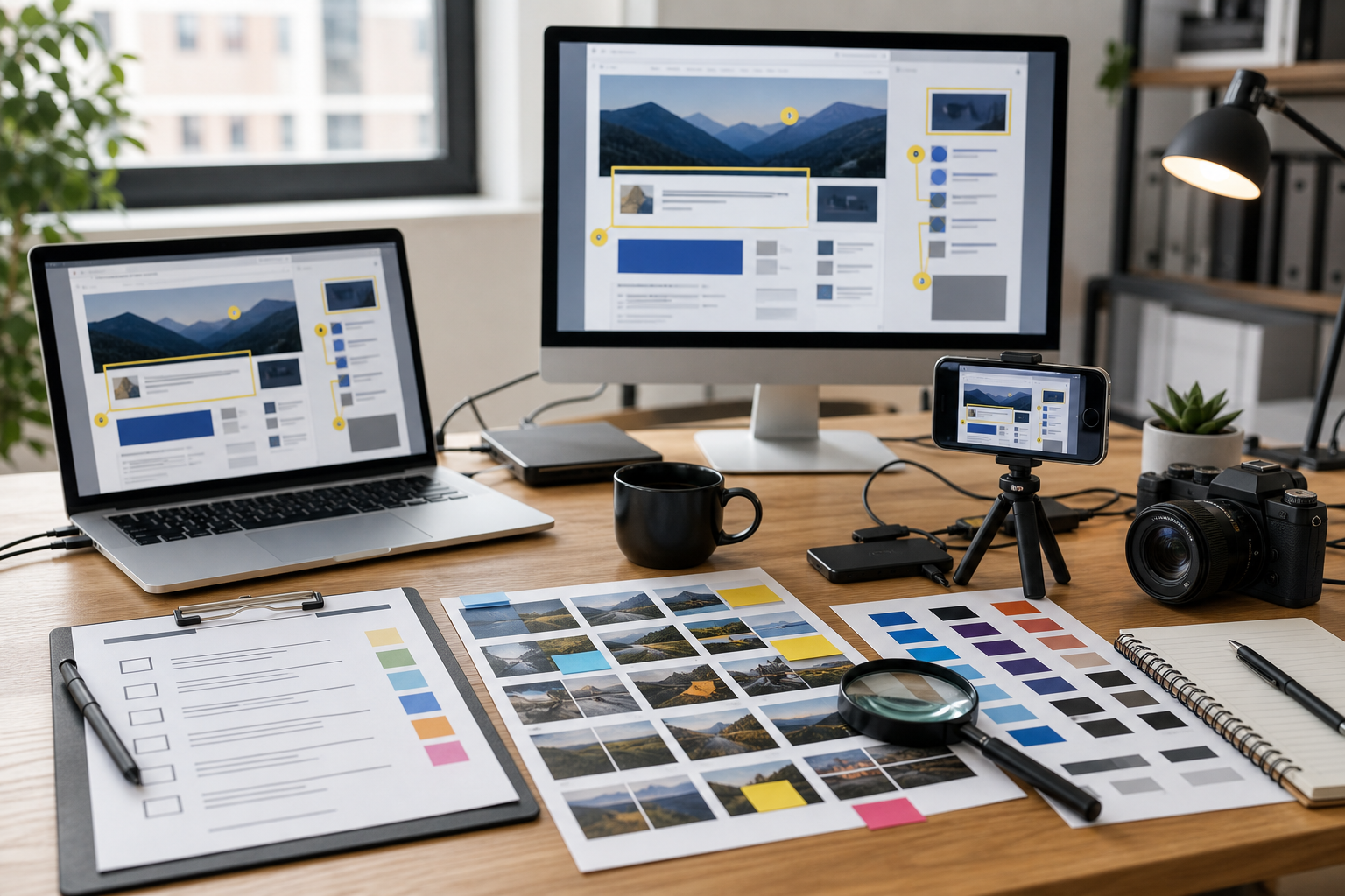
Documentation screenshots are easy to damage because they look simple. A product screen may contain flat colors, straight borders, tiny icons, hairline dividers, tooltip shadows, chart labels, and dense table rows. Those details are exactly what many compression tools are eager to simplify. The file becomes smaller, but the image stops doing its job.
This guide is for technical writers, product marketers, support teams, and solo founders who publish a lot of screenshots in help centers, changelogs, onboarding pages, internal guides, and release notes. The goal is not just to make images lighter. The goal is to reduce weight while keeping the interface readable on real screens.
The practical problem is narrow: screenshots with thin UI text and fine interface lines need different handling than photos, thumbnails, and decorative graphics. If you use one export setting for every image, your docs can end up with fuzzy labels, ringing around icons, or table grids that disappear on mobile.
A better approach is to audit the screenshot before compressing it, pick the right dimensions, choose the right format, and inspect the details that matter. ConvertAndEdit tools can help with the image stages: resize the capture with Resize Image, reduce file weight with Compress Image, change formats with Convert Image, extract visible text with Image OCR, and package visual review sets with Image to PDF.
Why Documentation Screenshots Break Differently
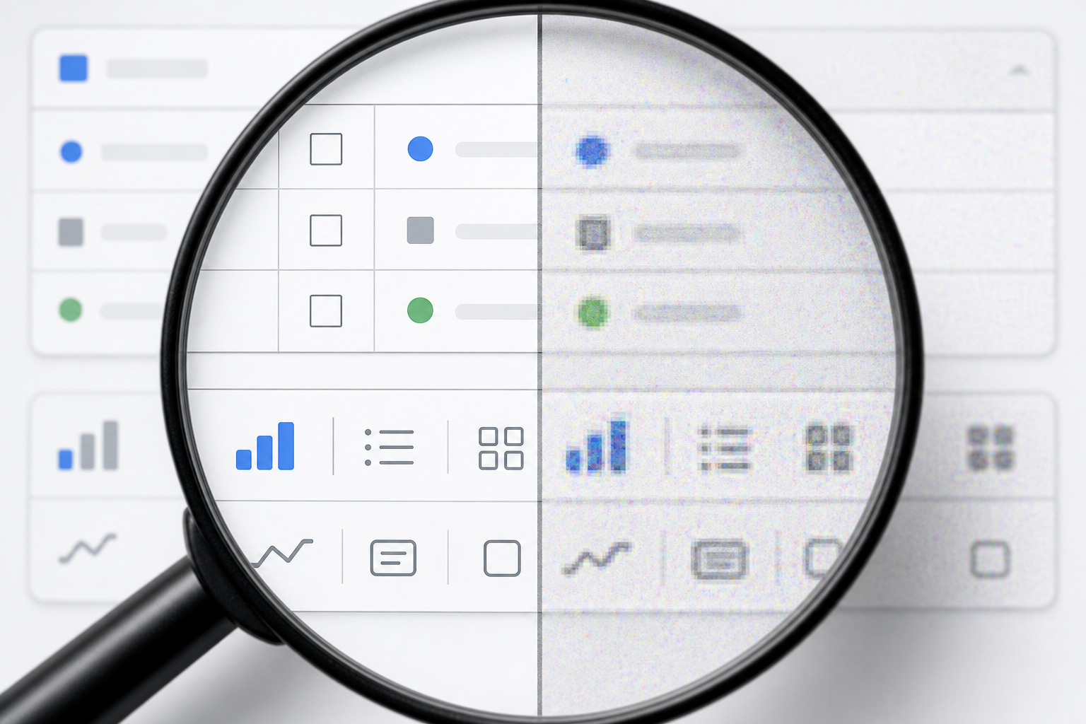
A normal product photo can tolerate a lot of compression. Skin texture, fabric, wood grain, and background blur often hide small artifacts. A screenshot has no such hiding places. It is mostly flat color and high-contrast edges.
That makes damage visible in specific ways:
- Black or dark gray text becomes soft around the edges.
- One-pixel borders turn uneven or vanish.
- Colored badges develop halos.
- Icons lose their internal cutouts.
- Small chart labels become readable only at full zoom.
- Drop shadows become blotchy.
- White panels look dirty because compression adds faint noise.
Readers may not complain directly. They just slow down. They zoom, squint, misread labels, or skip the visual instruction and rely on the surrounding paragraph. In a help article, that is a real usability cost.
The most fragile screenshots are usually not the large hero images. They are the compact ones inside procedural documentation: a settings panel, a permission dialog, a checkout error state, a narrow mobile screen, or a cropped table with highlighted fields.
The Screenshot Damage Checklist
Before compressing a documentation screenshot, inspect it for the elements most likely to fail. This takes less than a minute and prevents most avoidable quality problems.
Use this checklist on the original capture:
- Does the screenshot include text smaller than 13 pixels high?
- Are there thin table borders, chart grid lines, timeline ticks, or separator rules?
- Does the image include colored labels, status pills, or badges?
- Are there icons with fine interior shapes?
- Is the screenshot mainly white, light gray, or another flat pale background?
- Will readers view it on mobile?
- Is the screenshot cropped tightly around the relevant UI?
- Does the article depend on exact button labels or field names?
If the answer is yes to three or more, treat the screenshot as a precision asset. It needs more careful resizing and compression than a decorative image.
A common mistake is to judge quality at the original browser zoom only. Documentation screenshots are usually displayed smaller than the capture size. A 2400-pixel-wide screenshot may render at 720 pixels in the article body. If the browser downsizes it, thin details can become mushy even before compression is considered.
The audit should therefore happen at the final display size, not only at the source size.
Start With The Real Display Width
Compression should not be the first step. Dimensions come first.
If your documentation column is 760 pixels wide, uploading a 2400-pixel-wide screenshot is rarely useful. The browser still has to download the large file, then shrink it for display. That can waste bandwidth and produce less predictable sharpness.
Start by finding the maximum width where the image will appear:
| Placement | Typical useful export width | Notes |
|---|---|---|
| Inline help article image | 720 to 1200 px | Match the content column and support high-density displays. |
| Narrow step-by-step crop | 480 to 900 px | Crop tightly so the important UI remains readable. |
| Full-width landing page screenshot | 1400 to 2000 px | Use only when the image is visually important above the fold. |
| Mobile app screenshot | 390 to 900 px | Avoid excessive scaling; preserve the phone aspect ratio. |
| Changelog thumbnail | 600 to 1000 px | Crop to the changed area instead of shrinking the full app. |
For many docs, a good starting export is about 1.5x to 2x the rendered width. If the article column displays images at 760 pixels, an exported width around 1200 to 1500 pixels often keeps high-density screens crisp without shipping the original capture.
Use Resize Image when the capture is larger than the final use case requires. Resize from the original, not from a previously compressed copy. Repeated saving compounds artifacts.
Crop Before You Shrink
Cropping is the most underrated compression technique for screenshots. Removing irrelevant UI is better than trying to compress it.
A full dashboard capture might include navigation, empty panels, account menus, browser chrome, and whitespace. If the article is about one export button, the screenshot should usually show that region, plus enough surrounding context to orient the reader.
Good documentation crops have three qualities:
- They include the target element and its nearest visual landmarks.
- They remove unrelated panels that compete for attention.
- They keep enough margin so callouts and shadows do not feel clipped.
Over-cropping can be just as harmful. If a reader cannot tell where the control lives in the product, the crop becomes a mystery. Include the local heading, selected navigation item, or nearby field group when it helps orientation.
A practical rule: crop until the important text is comfortably readable at article width, then stop. Do not crop only for neatness. Crop for reader confidence.
Choose Formats By Edge Behavior
Format choice matters because screenshots are edge-heavy. PNG, WebP, JPEG, and AVIF treat those edges differently.
| Format | Best for | Watch out for |
|---|---|---|
| PNG | Exact UI captures, transparency, sharp text | Can be large for complex screens. |
| WebP | Smaller screenshots with good visual quality | Lossy settings can blur text if pushed too far. |
| JPEG | Photo-heavy pages and mixed screenshot-photo images | Poor choice for tiny UI text and flat panels. |
| AVIF | Very small files for photographic or large visual assets | Fine text can suffer depending on settings and browser needs. |
For screenshot-heavy documentation, PNG is the safest quality baseline. WebP can be excellent when exported carefully. JPEG should be reserved for screenshot-photo hybrids or large visuals where text is not central.
If your current image is in the wrong format, use Convert Image from the cleanest available source. Avoid converting a damaged JPEG screenshot to PNG and expecting quality to return. PNG can preserve what exists, but it cannot reconstruct details that were already blurred.
For transparent UI overlays, PNG or WebP with transparency is usually more appropriate than JPEG. For normal article screenshots, transparency is rarely needed and can complicate file handling.
Compression Settings That Respect UI Text
The right compression level depends on the screenshot, but the goal is consistent: reduce file size until quality starts to fail, then step back.
For documentation screenshots, inspect these areas after using Compress Image:
- Primary button labels.
- Sidebar navigation labels.
- Table row text.
- Input placeholders.
- Icons inside buttons.
- Divider lines between cards or table rows.
- Highlight boxes, arrows, or annotations.
Do not judge only the whole image. Compression damage often appears in small parts while the overall screenshot still looks acceptable.
A practical starting point:
| Screenshot type | Starting approach | Quality target |
|---|---|---|
| Dense settings screen | Resize first, then light compression | Text remains sharp without halos. |
| Table or report view | Conservative compression | Row lines and numbers stay readable. |
| Marketing product screenshot | Moderate compression | Overall layout and major labels stay clean. |
| Dark UI screenshot | Inspect shadows and colored edges | Avoid blocky gradients and glowing halos. |
| Mobile screen capture | Crop carefully, compress lightly | Small labels survive narrow display. |
If the screenshot contains many tiny labels, file size is not the only metric. A 180 KB image that causes misread instructions is worse than a 320 KB image that explains the task clearly.
A Practical Export Ladder for Documentation Teams
Instead of debating every image from scratch, create an export ladder. This is a small set of standard sizes and formats your team uses repeatedly.
Here is a practical ladder for help centers and product docs:
| Use case | Export width | Format | Notes |
|---|---|---|---|
| Small inline UI crop | 720 px | PNG or WebP | Best for controls, dialogs, and settings panels. |
| Standard article screenshot | 1200 px | WebP or PNG | Good balance for desktop docs. |
| Retina-safe wide screenshot | 1600 px | WebP | Use when the image renders large. |
| Mobile app capture | 780 px | PNG or WebP | Keep phone UI readable on desktop and mobile. |
| Review packet image | 1200 px | PNG | Use consistent width before combining into PDF. |
The ladder prevents random exports such as 837 pixels, 1920 pixels, and 3024 pixels all living in the same article. Consistent sizing also makes future maintenance easier because writers know what to replace.
When you update an old article, check whether its screenshots follow the ladder. If not, replace only the images that create real problems: oversized files, blurry text, inconsistent widths, or outdated UI.
Testing At The Size Readers Actually See
The most reliable test is simple: view the article draft at common screen widths and look at the screenshot details without zooming.
Check at least these contexts:
- Desktop article column.
- Laptop width around 1280 pixels.
- Mobile width around 390 pixels.
- Browser zoom at 100 percent.
- Dark mode if your site changes image framing or background color.
On mobile, a wide desktop screenshot often becomes too small to read. That does not always mean the image is bad. Sometimes the right fix is to split one screenshot into two focused crops rather than forcing one full-screen capture into a narrow column.
If an instruction says select Advanced Settings, and the mobile reader cannot read that label in the screenshot, the image is failing. The surrounding paragraph may still carry the instruction, but the visual support is not doing useful work.
Use OCR As A Readability Test
OCR is not only for extracting text. It can also act as a rough readability signal.
After resizing and compressing a screenshot, run it through Image OCR and compare the extracted text with the important labels in the image. You do not need perfect OCR for every decorative element. You are looking for obvious failures.
If the OCR misses or mangles the key UI labels, ask why:
- Was the screenshot resized too small?
- Did compression blur text edges?
- Is the crop too wide for the article column?
- Is the contrast too low?
- Are annotations covering the interface text?
OCR is not a final judge of human readability, but it catches many issues that teams otherwise miss. It is especially useful for table screenshots, form panels, and mobile captures with dense labels.
For accessibility, do not rely on OCR text as a replacement for alt text or nearby explanation. Use it as a quality check, then write alt text that describes the purpose of the image in the article.
Annotation Rules For Compressed Screenshots
Annotations can make compression worse if they are added carelessly. Bright arrows, thick boxes, blurred backgrounds, and semi-transparent overlays introduce extra edges and colors. Those can increase file size and create artifacts around the marked area.
Use annotations sparingly:
- Prefer one highlight per screenshot.
- Use a high-contrast outline instead of a heavy filled shape.
- Keep arrows away from small UI labels.
- Avoid semi-transparent color washes over text.
- Do not blur large areas unless privacy requires it.
If you must redact private data, do it before compression and inspect the result after compression. Redaction blocks should remain solid and irreversible. A weak blur may look tidy, but it can be unsafe and can also create messy compression artifacts.
For screenshots that need visual editing beyond simple crop and resize, AI Photo Editor can help with cleanup tasks, but use judgment around product UI. Do not change interface labels, controls, or states in a way that would make the documentation inaccurate.
File Naming And Version Hygiene
Compression audits become painful when nobody knows which image is the source and which one is the final export. A small naming convention helps.
Use names that explain placement, subject, and size:
| Pattern | Example |
|---|---|
| article-section-subject-width.format | account-settings-api-token-1200.webp |
| product-area-state-width.format | billing-failed-payment-dialog-900.png |
| mobile-screen-subject-width.format | mobile-filter-panel-780.webp |
Avoid names such as screenshot-final-final2.png. They make future updates slower and increase the risk of uploading the wrong version.
Keep the original capture separate from the optimized export. If a product screen changes next month, the original may help you match crop boundaries and replacement size. If the only saved file is already compressed, you have less room to adjust.
When To Split One Screenshot Into Several
Some screenshots are too dense to survive as a single image in an article. This is common with analytics dashboards, admin tables, design tools, and developer settings pages.
Split one screenshot into multiple crops when:
- The important labels become unreadable at article width.
- The article explains separate areas of the same screen.
- A callout would need to cover other important UI.
- The image contains both navigation context and a tiny target detail.
- Mobile readers would need to pinch zoom to understand the step.
A good pattern is context first, detail second. Show a wider screenshot to orient the reader, then show a tighter crop for the exact control or field. This often performs better than one heavily annotated full-screen image.
Do not overdo it. Too many screenshots can make a guide feel slow and fragmented. Use the second crop only when it removes real ambiguity.
Building A Review Packet For Visual QA
When several people approve documentation, screenshots are often reviewed inside the article draft. That is useful, but it can hide inconsistencies. A visual packet makes differences easier to spot.
For a release with many screenshots, export the final images at their intended sizes and combine them into a simple review document with Image to PDF. Reviewers can then scan for:
- Inconsistent crop margins.
- Mixed image widths.
- Outdated interface states.
- Blurry labels.
- Different zoom levels.
- Accidental private data.
- Annotation colors that vary from page to page.
A PDF packet is not a replacement for checking the live page, but it is useful before publishing. It also gives non-technical reviewers a single artifact to mark up.
Keep the packet lightweight. The purpose is visual QA, not archive storage. If the PDF becomes huge, that is a signal that the underlying images may also be too large.
A Pre-Publish Screenshot Audit
Use this compact audit before publishing an article with several UI screenshots:
| Check | Pass condition |
|---|---|
| Dimensions | Image width matches the article placement or export ladder. |
| Format | PNG or WebP is used for UI-heavy captures. |
| Text clarity | Small labels remain readable at actual display size. |
| Lines and icons | Borders, icons, and table rules are not broken or fuzzy. |
| Crop | The screenshot includes enough context without wasting space. |
| File weight | Size is reduced without damaging key details. |
| Mobile view | The image still supports the instruction on narrow screens. |
| Privacy | Personal data, tokens, and customer details are removed. |
| Alt text | The image has purposeful alt text tied to the article. |
| Replacement source | Original capture is stored separately from the final export. |
This list is intentionally practical. It does not require a design review meeting or a specialized optimization stack. It simply catches the issues that make documentation images heavy, blurry, or untrustworthy.
Common Mistakes To Avoid
The most common mistake is compressing before resizing. If the original is huge, resize from the clean source first, then compress the export.
Another mistake is using JPEG for every screenshot because it is familiar. JPEG is often a poor fit for flat UI, especially when the image includes small text or crisp borders.
A third mistake is relying on browser scaling to solve everything. Browser scaling is useful, but it should not be your entire image strategy. If every article image is uploaded at the full capture size, page weight grows quickly.
Finally, teams often judge screenshots on large monitors only. Documentation is read on laptops, phones, tablets, and split-screen windows. A screenshot that looks clean on a 27-inch display can become useless in a mobile help article.
Final Takeaway
Good screenshot compression is not about chasing the smallest possible number. It is about protecting the information inside the image. For documentation, that information is usually text, edges, icons, and spatial context.
Start with the real display size. Crop for clarity. Resize from the clean source. Choose PNG or WebP based on the screenshot content. Compress carefully, then inspect the exact details readers need. When in doubt, keep the image slightly larger and clearer rather than publishing a tiny file that makes the article harder to use.
A clean screenshot should feel invisible. The reader sees the instruction, recognizes the interface, and moves forward without stopping to decode the image. That is the real win: lighter pages, sharper docs, and fewer moments where a visual aid becomes another obstacle.
