Email Signature GIF Size Budgets: A Practical Workflow for Tiny Product Demos
A practical workflow for creating tiny email signature GIF demos that load quickly, stay readable, and avoid annoying recipients or breaking brand polish.
Email Signature GIF Size Budgets: A Practical Workflow for Tiny Product Demos
Email signature GIFs are easy to make and surprisingly easy to make badly. A three-second animation can make a support reply feel helpful, show a new feature without asking the reader to click, or quietly reinforce a product workflow below a sender's name. The same GIF can also turn into a heavy, distracting, blurry loop that clutters every thread it touches.
The problem is not whether animated signatures are good or bad. The problem is that most teams treat them like miniature social videos. They record too much screen, export too many colors, leave unnecessary browser chrome visible, and attach the same oversized animation to every email. In a signature, the GIF is not the main asset. It is a supporting cue. It has to be small, fast, readable, and polite.
This guide gives you a practical size-budget workflow for tiny product demo GIFs used in email signatures, sales follow-ups, onboarding replies, customer success handoffs, and lightweight support documentation. It focuses on a niche but common production problem: how to show motion in a very small space without creating a file that punishes every recipient.
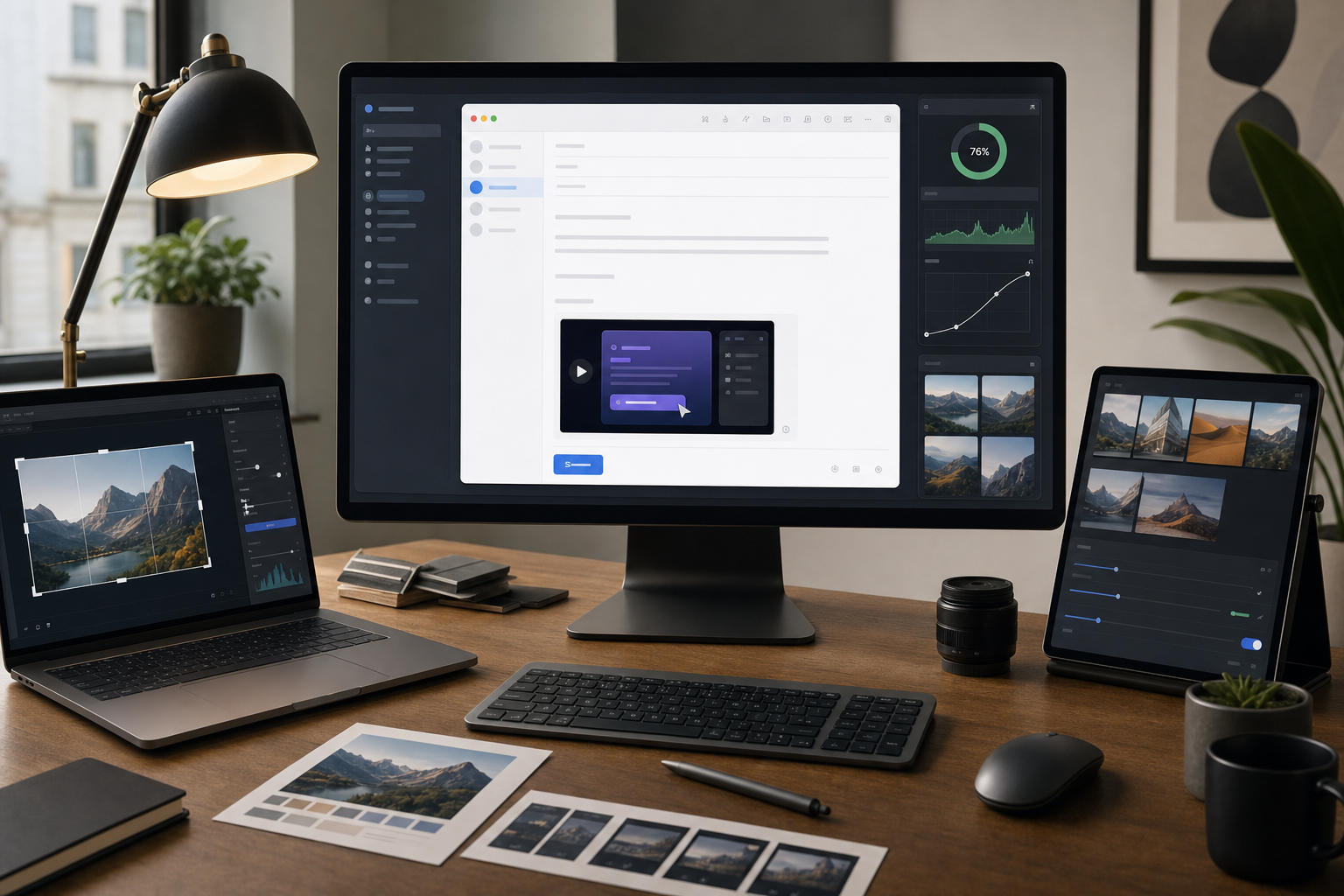
You can follow the workflow with any editor, but the browser-based ConvertAndEdit tools are especially useful for the boring parts that matter: cropping, resizing, converting, compressing, and creating the final GIF. For example, you might trim the source video elsewhere, use /gif-maker for the loop, pass still frames through /resize-image, or compress supporting screenshots with /compress-image before they enter the signature package.
Why Email Signature GIFs Need Their Own Rules
An email signature GIF lives in a hostile environment. It may be viewed in Gmail, Outlook, Apple Mail, a mobile client, a help desk system, a CRM preview pane, or a forwarded thread that has already been quoted six times. Some clients animate GIFs smoothly. Some show only the first frame. Some proxy images. Some resize them. Some block remote images until the recipient allows them.
That means the signature GIF has to work under three conditions at once:
- The first frame must make sense as a still image.
- The animation must communicate something useful within a small footprint.
- The file must stay light enough that it does not slow the email or feel intrusive.
A normal marketing GIF can be forgiven for being larger because the page or campaign is built around it. A signature GIF appears repeatedly, often in operational conversations where the recipient did not ask for a visual asset. The standard should be stricter.
A good email signature GIF usually shows one tiny action: opening a menu, toggling a setting, dragging a file, applying a filter, generating subtitles, converting an image, or confirming that a workflow is simple. It should not try to explain an entire product.
If your animation needs labels, captions, voiceover, or ten seconds of context, it probably belongs in a help article, landing page, or product email instead. The signature version should be the smallest meaningful slice.
The 400 KB Signature Rule of Thumb

For most teams, a practical target is to keep each email signature GIF under 400 KB, with 250 KB as a better everyday target and 700 KB as a hard ceiling for special cases. These are not universal laws. They are working limits that force good decisions.
| Use case | Recommended GIF budget | Notes |
|---|---|---|
| Daily personal signature | 150-300 KB | Best for frequent senders and long threads. |
| Customer support macro | 200-400 KB | Useful when the GIF directly reduces confusion. |
| Sales follow-up signature | 250-500 KB | Acceptable if the animation is highly relevant. |
| Launch week temporary signature | 400-700 KB | Use briefly, then retire or replace. |
| Anything above 700 KB | Avoid | Usually too large for a repeated signature asset. |
The smaller budget changes creative choices. You cannot record a full 1440-pixel-wide screen and expect a clean signature GIF. You cannot keep every gradient, shadow, cursor movement, and tooltip. You need to decide what matters before you export.
The budget also protects your brand. A crisp 280 KB GIF that loops calmly feels intentional. A 2.8 MB signature animation feels like an attachment wearing a name badge.
What Actually Makes a Signature GIF Heavy
GIF file size is affected by more than duration. The largest drivers are usually pixel dimensions, frame count, color complexity, and how much changes from frame to frame.
A small animation with a lot of moving gradients can be heavier than a larger animation with mostly static UI. A five-second loop with a cursor moving across the entire screen creates more changing pixels than a two-second loop where only a dropdown opens. Screen recordings with video thumbnails, avatars, maps, shadows, blur effects, and transparent overlays often balloon quickly.
The main file-size levers are:
| Lever | Lower-size choice | Higher-size choice |
|---|---|---|
| Dimensions | 320-480 px wide | 800 px or wider |
| Duration | 2-4 seconds | 8-15 seconds |
| Frame rate | 8-12 fps | 24-30 fps |
| Motion area | Small region changes | Whole screen changes |
| Colors | Flat UI, limited palette | Photos, gradients, shadows |
| Loop style | Calm reset or ping-pong | Long narrative sequence |
The goal is not to make the ugliest possible tiny file. The goal is to spend bytes only where the recipient gets value.
Pick a Signature Job Before You Record
A signature GIF should have a job. If you cannot name the job in one sentence, the animation will probably become too broad.
Good jobs include:
- Show that a file can be converted by drag and drop.
- Show where the export button appears after processing.
- Show a before-and-after state for a simple image edit.
- Show a short subtitle generation moment.
- Show a PDF merge action completing successfully.
- Show that a GIF maker accepts a short video source.
Weak jobs include:
- Show everything the product can do.
- Make the signature look more dynamic.
- Reuse a social media demo in email.
- Add motion because competitors have motion.
For ConvertAndEdit-style workflows, the best signature GIFs often show one file moving through one tool. A support specialist might use a tiny animation of dragging images into /image-to-pdf. A content teammate might show a quick resize-and-export flow using /resize-image. A product marketer might show a short conversion moment with /convert-image.
Each one is specific. Each one can be shown in a few seconds. Each one still works if the first frame is visible and the rest does not animate.
Choose the Right Source Format
Start with the cleanest source you can. The final GIF will always be less efficient than modern video, so do not begin with a messy, oversized recording.
For product UI demos, record a short MP4 or WebM first. Keep the browser window small. Zoom the page to the size you expect users to see in the final asset. Hide bookmarks, unrelated tabs, notification badges, and personal account details. Use sample files with boring, non-sensitive names.
A good source recording for an email signature usually has these properties:
- 2 to 5 seconds long.
- One visible product action.
- No personal data.
- No full-screen desktop recording.
- Minimal cursor travel.
- A stable layout with little scrolling.
- A first frame that makes sense if animation is blocked.
Avoid recording at full desktop size and relying on compression later. Compression can reduce file size, but it cannot rescue a bad composition. If the action is unreadable at 420 pixels wide, the signature version will fail no matter how carefully you export it.
Frame the Demo Like a Small Object
Email signatures are narrow. Many teams design the GIF as if it will be viewed in a large preview pane, then discover that it appears as a tiny strip under a name on mobile. Instead, frame the action like a small object from the beginning.
A strong signature crop usually includes:
- The control being used.
- The immediate result of that control.
- Enough surrounding UI to orient the viewer.
- No unnecessary sidebars, top bars, or empty canvas.
For example, if the animation shows image compression, do not record the entire browser. Crop around the upload area, compression state, and final export area. If the animation shows OCR, crop around the uploaded image preview and extracted text panel. If the animation shows PDF merging, crop around the file list and merge result, not the full page.
Use /resize-image when you need to standardize still assets before building the animation, and use /compress-image for supporting images that appear elsewhere in the same email template. If your source includes screenshots that need format cleanup first, /convert-image can help keep everything in a predictable format before production.
Recommended Signature Dimensions
There is no single perfect size, but these dimensions are practical starting points:
| Placement | Width | Height | Notes |
|---|---|---|---|
| Minimal personal signature | 280-360 px | 90-160 px | Good for frequent email. |
| Support team signature | 360-480 px | 140-220 px | More room for UI detail. |
| Sales or onboarding signature | 420-520 px | 160-260 px | Use only when relevant. |
| Mobile-conscious signature | 320-400 px | 120-200 px | Safer in narrow clients. |
A wide, shallow crop often works better than a tall one because it sits more naturally below signature text. But do not force a panoramic crop if the product action is vertical. Cropping away essential context to hit a shape is worse than choosing a slightly taller layout.
Design the First Frame as a Poster
Some email clients or user settings may show only the first frame of a GIF. Treat that frame like a poster image. It should not be a blank loading state, a half-open menu, a cursor hovering over nothing, or a transition blur.
The first frame should answer three questions:
- What product or workflow is this about?
- What is about to happen?
- Is this visually safe and professional enough to live in an email thread?
For a drag-and-drop demo, the first frame might show the file near the drop zone. For a PDF merge demo, it might show two files already listed with the merge control visible. For an AI photo edit, it might show the before image and the relevant edit area, without implying an unsupported guarantee about the result.
If the first frame is not useful, edit the source recording before creating the GIF. Starting with a clean frame is usually better than trying to patch the GIF after export.
Keep Motion Small and Intentional
The most efficient signature GIFs move very little. This is not just a file-size trick. Small motion is easier to understand in a signature because the viewer is not focused on it for long.
Use motion for the meaningful state change:
- A file enters a drop zone.
- A progress state completes.
- A preview changes after a resize.
- A subtitle line appears under a clip.
- A set of pages becomes one merged PDF.
Avoid motion that consumes attention without adding information:
- Cursor circles.
- Animated background gradients.
- Decorative confetti.
- Full-page scrolling.
- Rapid tab switching.
- Zooming in and out.
A cursor can be helpful, but it should travel the shortest reasonable distance. If your cursor needs to move across the entire screen, crop tighter or begin the recording closer to the action.
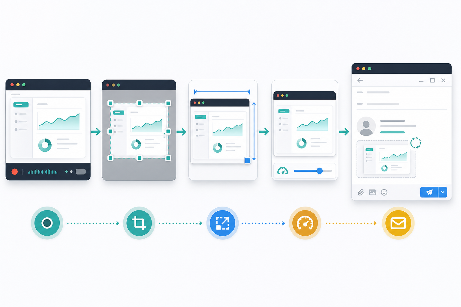
A Clean Production Workflow From Screen Recording to Final GIF
Here is a reliable workflow for building a tiny product demo signature GIF without wasting time on repeated exports.
1. Write a One-Line Brief
Before recording, write the job of the GIF in one line:
| Audience | Signature job | Tool path example |
|---|---|---|
| Support recipient | Show how to turn site photos into a PDF packet | /image-to-pdf |
| Content editor | Show a screenshot being resized for a CMS slot | /resize-image |
| Product marketer | Show a short clip becoming a reusable GIF | /gif-maker |
| Operations teammate | Show pages being merged into one review file | /pdf-merge |
| Documentation writer | Show text being extracted from an image | /image-ocr |
If the job feels too broad, split it into a help article GIF and a signature GIF. The signature version should be the teaser, not the whole lesson.
2. Prepare a Clean Demo State
Use sample data. Close unrelated UI. Reset the browser zoom if needed. Make sure no private workspace names, customer files, email addresses, browser extensions, or internal notes appear.
For signature demos, fake-looking sample data is often better than realistic sensitive data. A file named product-photo.png is safer than an actual customer upload. A neutral screenshot is safer than an internal dashboard.
3. Record Short and Tight
Record only the portion needed for the action. If your recorder captures the whole screen, crop the recording afterward before making the GIF. Keep the source clip around 2 to 5 seconds.
A common structure works well:
- Frame 1: ready state.
- Second 1: action begins.
- Second 2: result appears.
- Final frames: hold on the completed state.
That final hold matters. If the animation loops instantly, the viewer may miss the result. A calm half-second hold makes the GIF feel less frantic.
4. Crop Before Resizing
Cropping removes irrelevant pixels. Resizing makes the remaining pixels smaller. Do them in that order.
If you resize first, you may shrink important UI text and then crop around text that is already too soft. Crop to the meaningful area, then choose the final display width. For still frames or supporting images, /resize-image can help standardize dimensions before the assets are assembled.
5. Reduce Frame Rate
Most product signature GIFs do not need 24 or 30 frames per second. Try 10 or 12 fps first. For simple UI changes, 8 fps may still look fine. Lower frame rate reduces file size quickly, but it can make cursor movement feel choppy if the movement is long.
The practical solution is to shorten cursor travel and reduce frame rate together. Do not rely on frame rate alone.
6. Limit Colors Carefully
GIF uses a limited palette. Reducing colors can lower file size, but aggressive color reduction can damage UI detail. Thin text, icons, borders, and shadows may become noisy.
For clean UI, start with 128 colors. Try 64 if the interface is simple. Use fewer only if the output remains readable. If the GIF includes photos, gradients, or complex image previews, expect a larger file or consider whether GIF is the wrong format for that signature placement.
7. Export and Test Against the Budget
Use /gif-maker to create the final loop, then compare output size against your chosen budget. If the result is too heavy, adjust in this order:
- Crop tighter.
- Shorten duration.
- Reduce dimensions.
- Reduce frame rate.
- Reduce colors.
- Simplify the recorded action.
This order protects readability. Many people start by crushing colors or frame rate, but that often creates an ugly GIF while leaving unnecessary pixels untouched.
Decision Table: Fix the Specific Problem You See
When the first export disappoints you, diagnose it instead of randomly changing settings.
| Problem | Likely cause | Best fix |
|---|---|---|
| File is too large | Dimensions or duration too high | Crop tighter, shorten the loop, then resize. |
| Text is blurry | Export width too small or source zoom too low | Record closer, increase UI zoom, crop around fewer elements. |
| Motion feels frantic | Loop has no hold frame | Add a brief pause on the final result. |
| GIF looks noisy | Too few colors or complex visuals | Increase colors or simplify the scene. |
| Cursor is distracting | Too much cursor travel | Start closer to the target or remove nonessential movement. |
| First frame looks broken | Recording starts during transition | Trim the beginning or set a better poster frame. |
| Mobile view is unreadable | Crop includes too much UI | Create a dedicated narrow signature version. |
This table is useful because most signature GIF problems are composition problems pretending to be export problems. Better export settings help, but the most important decisions happen before export.
Build a Small Signature Asset Set
One GIF is rarely enough for a team. Different departments need different signature jobs, and a single generic animation becomes vague quickly. Instead, build a tiny asset set with strict budgets.
A practical set might include:
| Asset | Owner | Purpose | Budget |
|---|---|---|---|
| Support signature GIF | Support lead | Show common file workflow | 250 KB |
| Onboarding signature GIF | Customer success | Show first successful action | 350 KB |
| Launch signature GIF | Marketing | Show one new capability | 500 KB |
| Static fallback image | Design | First-frame backup | 80 KB |
| Documentation GIF | Docs | Larger help article version | 1-2 MB |
The documentation version can be larger because it appears in a page where the user expects instruction. The signature version should remain tiny. Keeping both versions prevents the common mistake of forcing one GIF to serve every context.
You can use ConvertAndEdit tools as part of that asset set: /gif-maker for the actual animated asset, /compress-image for static fallback images, /convert-image when changing formats for compatibility, and /ai-photo-editor if a non-sensitive visual needs cleanup before it appears in the demo. For OCR-related workflows, /image-ocr can also become the subject of a signature GIF, especially for teams that receive photos of labels, forms, or screenshots.
Make the Loop Feel Polite
A signature GIF loops beside serious messages: invoices, bug reports, onboarding questions, renewal conversations, and support escalations. The loop should be quiet.
A polite loop has these traits:
- It does not flash.
- It does not jump abruptly.
- It does not include large full-frame motion.
- It has a clear end state.
- It can be ignored without making the email hard to read.
One useful trick is to make the final frame visually similar to the first frame. The action can complete, hold briefly, then reset without a dramatic snap. Another approach is a ping-pong loop, where the action reverses gently. Use that only when the reversal does not confuse the workflow. A file being dragged into a tool and then dragged back out may communicate the wrong thing.
For most product demos, a standard forward loop with a calm reset is clearer.
Accessibility and Recipient Respect
Animated email signatures can create accessibility concerns. Some recipients are sensitive to motion. Some rely on reduced-motion settings. Some view email in clients that do not handle animation gracefully.
You cannot control every client, but you can reduce risk:
- Keep animation slow and non-flashing.
- Avoid strobe effects and rapid color changes.
- Make the first frame meaningful.
- Include descriptive alt text where your email signature system supports it.
- Use the GIF only where it helps the conversation.
- Provide a static signature option for teams that send sensitive or formal messages.
Also consider internal policy. Legal, finance, and executive communications may not be the right place for animated signatures. A support team helping users complete a visual workflow has a stronger reason to use them.
The point is not to make every email more animated. The point is to make a few repeated workflows easier to understand.
Test in Real Email Clients
Do not approve a signature GIF by looking only at the exported file on your desktop. Put it into the actual signature system and send test messages.
Test at least:
- Gmail desktop.
- Gmail mobile.
- Outlook desktop or web, if your audience uses it.
- Apple Mail, if relevant.
- Your help desk or CRM email composer.
- A forwarded thread with multiple replies.
Check these details:
| Check | What to look for |
|---|---|
| Display size | Does the GIF appear at the intended dimensions? |
| First frame | Does the still state communicate enough? |
| Load behavior | Does the email feel slow or heavy? |
| Signature balance | Does the GIF overpower the sender details? |
| Thread behavior | Does repetition become annoying after several replies? |
| Mobile readability | Can the action be understood on a phone? |
If the GIF feels annoying in a test thread, it will feel worse to a recipient who did not ask for it. Reduce size, slow the loop, or replace it with a static image.
Naming and Version Control for Signature GIFs
Tiny assets still need organized naming. Without it, teams accidentally upload old versions, mix heavy and compressed exports, or keep using a launch-week GIF months after the feature changed.
Use names that include the workflow, dimensions, and version:
| File name | Meaning |
|---|---|
signature-gif-image-to-pdf-420x180-v1.gif | Production-ready signature GIF. |
signature-gif-ocr-demo-360x160-v2.gif | Updated OCR signature demo. |
signature-static-pdf-merge-420x180-v1.png | Static fallback image. |
docs-gif-image-to-pdf-full-v1.gif | Larger help article version. |
Keep source recordings separately from final exports. A future teammate should be able to recreate the GIF without recording the whole workflow again. If you change the UI, rebuild the GIF rather than stretching an outdated asset.
A Practical Example: Support Signature for Image-to-PDF
Imagine a support team often tells customers how to turn several receipt photos into a single PDF. A signature GIF could make that workflow feel obvious without adding another paragraph to every reply.
The one-line brief:
Show three image files becoming one PDF packet.
The source recording:
- Browser window cropped around the upload area and file list.
- Three sample images with generic names.
- A short action showing files added, then a completed PDF state.
- No customer data, no full desktop, no unrelated tabs.
The export target:
- 420 px wide.
- 160-200 px tall.
- 3 seconds.
- 10 fps.
- 128 colors.
- Under 350 KB.
The production flow:
- Prepare sample images and resize them consistently with
/resize-imageif needed. - Record the action in the
/image-to-pdfworkflow. - Crop to the file list and result state.
- Create the GIF in
/gif-maker. - Export under the team budget.
- Test in real support replies.
If the export is too large, do not immediately crush quality. First crop away empty interface space. Then remove any unnecessary waiting time. Then reduce the width. Only after that should you lower frame rate or colors.
Common Mistakes That Make Signature GIFs Feel Cheap
The fastest way to make an email signature GIF look unprofessional is to treat it like a novelty. These are the mistakes to avoid.
Recording the Whole Product
A signature is not a product tour. Showing five features in one tiny loop makes every feature unreadable. Pick one action.
Using a Social Media Export
Social GIFs are usually too large, too tall, too fast, and too visually loud. Create a dedicated signature export.
Ignoring the First Frame
If the first frame is blank or mid-transition, the GIF fails in clients that do not animate it. Always design the first frame intentionally.
Over-Compressing Thin UI
UI text and borders break quickly under aggressive compression. If readability suffers, record closer or crop tighter instead of lowering quality further.
Leaving Personal Data Visible
A tiny GIF can still expose email addresses, workspace names, filenames, browser extensions, bookmarks, or internal URLs. Review every frame.
Using One Signature Forever
Products change. UI changes. A stale animation makes your team look careless. Put signature GIFs on a review schedule.
Review Checklist Before Publishing
Use this checklist before a signature GIF goes live:
- The GIF has one clear job.
- The first frame works as a still image.
- The file is under the team budget.
- The action is readable at final display size.
- The loop is calm and non-flashing.
- No private or customer data appears.
- The file name includes workflow, dimensions, and version.
- A static fallback image exists if needed.
- The GIF has been tested in real email clients.
- The team knows where the source recording is stored.
This review takes only a few minutes, but it prevents most signature problems.
When Not to Use an Email Signature GIF
There are times when a signature GIF is the wrong asset.
Use a static image when the message is formal, legal, sensitive, or likely to be forwarded widely outside the original context. Use a help article GIF when the workflow requires multiple steps. Use a short video when audio, captions, or detailed timing matter. Use a plain link when the recipient needs to make a decision rather than absorb a visual cue.
For example, a muted product demo clip with captions may belong in a landing page or follow-up resource, especially if you are using workflows like /video-to-subtitles. A signature GIF should remain smaller and simpler: one moment, one job, one loop.
Final Takeaway
A strong email signature GIF is not a tiny advertisement. It is a lightweight visual hint. The best ones are almost boring in production terms: tight crop, short duration, low frame rate, calm motion, clear first frame, and a strict file-size budget.
That discipline is what makes them work. When a support reply includes a small, readable animation that shows the exact next step, the recipient gets help without opening another tab. When a sales follow-up includes a quiet product moment that loads instantly, the signature adds context without taking over the conversation.
Start with one workflow that your team explains repeatedly. Record only the useful motion. Build the GIF around a 250-400 KB budget. Test it in real email clients. Keep the source file. Review it when the UI changes.
A signature GIF should feel like a considerate detail, not a heavy attachment. If it earns its pixels, it can make repeated email workflows clearer without making the inbox noisier.