PDF N-Up Proof Sheets for Print Review Without Layout Software
Learn a practical PDF proof sheet workflow for reviewing labels, cards, inserts, and small print assets without opening a full design or layout application.
PDF N-Up Proof Sheets for Print Review Without Layout Software
Small print assets create a strange review problem. A postcard can be checked at full size. A poster can be reviewed as a reduced proof. But stickers, product labels, business-card inserts, care cards, coupon slips, swing tags, shelf talkers, and tiny instruction sheets often arrive as dozens of separate files. Opening each one individually is slow, and sending a folder of single-page PDFs to a client or print partner almost guarantees scattered feedback.
An N-up proof sheet solves that. Instead of reviewing each asset as a separate file, you place multiple pages or designs onto fewer PDF pages in a grid. The result is not always meant for final production. It is a review document: compact, easy to print, easy to annotate, and easy to compare.
The important part is building the proof sheet without accidentally changing the production files. You want a PDF that helps people check spelling, crop, visual balance, SKU consistency, hierarchy, and rough sizing while keeping the original artwork untouched. You do not need a full layout application for this stage. With a disciplined browser-based workflow, image conversion, PDF merging, and compression are enough for many review cycles.
This guide focuses on practical N-up proof sheets for small teams: ecommerce operators, packaging coordinators, print buyers, local studios, operations teams, and content managers who need to review many small assets quickly.
What N-Up Proof Sheets Are Good For
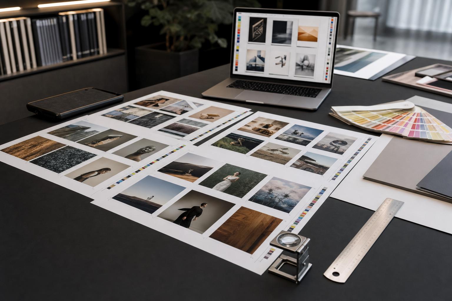
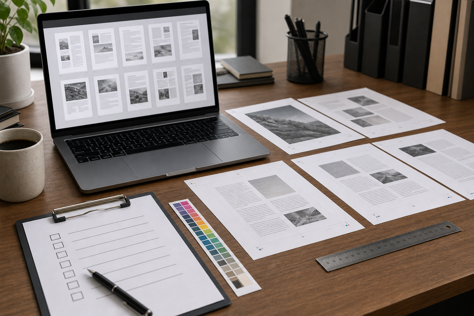
An N-up layout places multiple source pages on one output page. A 2-up proof puts two items on a page. A 4-up proof puts four. A 12-up or 16-up proof can show many small labels, cards, or tags at once.
For print review, N-up proof sheets are especially useful when the unit being reviewed is physically small. A 40 mm product label, for example, can feel abstract when viewed alone on a large monitor. When several related labels are arranged together, inconsistencies become visible faster.
Common use cases include:
- Product label families with different scents, flavors, sizes, or regulatory notes.
- Care cards, return inserts, and warranty slips for ecommerce parcels.
- Event badges, table cards, drink tokens, and small signage.
- Sticker sheets and promotional decals.
- Multi-language instruction cards.
- Retail shelf tags and price cards.
- Test prints for icon sets, QR labels, or machine-readable codes.
The goal is not to replace prepress. It is to make review less chaotic before anything goes to final imposition, print setup, or vendor approval.
A good N-up proof sheet lets reviewers answer simple questions quickly: Does this set look consistent? Are the margins reasonable? Did one version use the wrong logo? Is the text still readable at approximate final size? Are there unexpected white borders? Does a QR code or barcode need a larger quiet zone?
When Not to Use N-Up as a Production File
A proof sheet is not automatically a production imposition file. That distinction matters.
Final print imposition may need bleed, crop marks, creep adjustment, printer-specific spacing, duplex alignment, grain direction, finishing marks, and exact sheet usage calculations. A casual N-up proof sheet is usually built for visual review, not for operating a commercial press or cutter.
Use N-up proof sheets for review when:
- You need quick feedback from non-designers.
- The design files are still changing.
- The printer has not yet provided exact imposition requirements.
- The team needs to compare many variants side by side.
- You want a low-cost office printout before vendor proofing.
Avoid treating a simple N-up proof as final artwork when:
- The job needs precise bleed and trim handling.
- Items must align front-to-back on duplex printing.
- A cutter, die, or finishing process depends on exact coordinates.
- The printer has supplied a required template.
- Color accuracy is business-critical.
The practical rule is simple: label the file as a proof, keep source files separate, and ask the printer what they need for production.
Choose the Right Proof Sheet Format
Before arranging anything, decide what the proof sheet is supposed to prove. Different review goals need different layouts.
| Review goal | Best layout | Why it works |
|---|---|---|
| Check small text and codes | Fewer items per page | Keeps each item close to real size |
| Compare many variants | Dense grid | Makes inconsistencies obvious |
| Client approval | Moderate grid with whitespace | Leaves room for comments |
| Internal design QA | Contact-sheet style | Prioritizes speed over presentation |
| Print shop handoff discussion | Larger pages with labels in order | Helps connect feedback to source files |
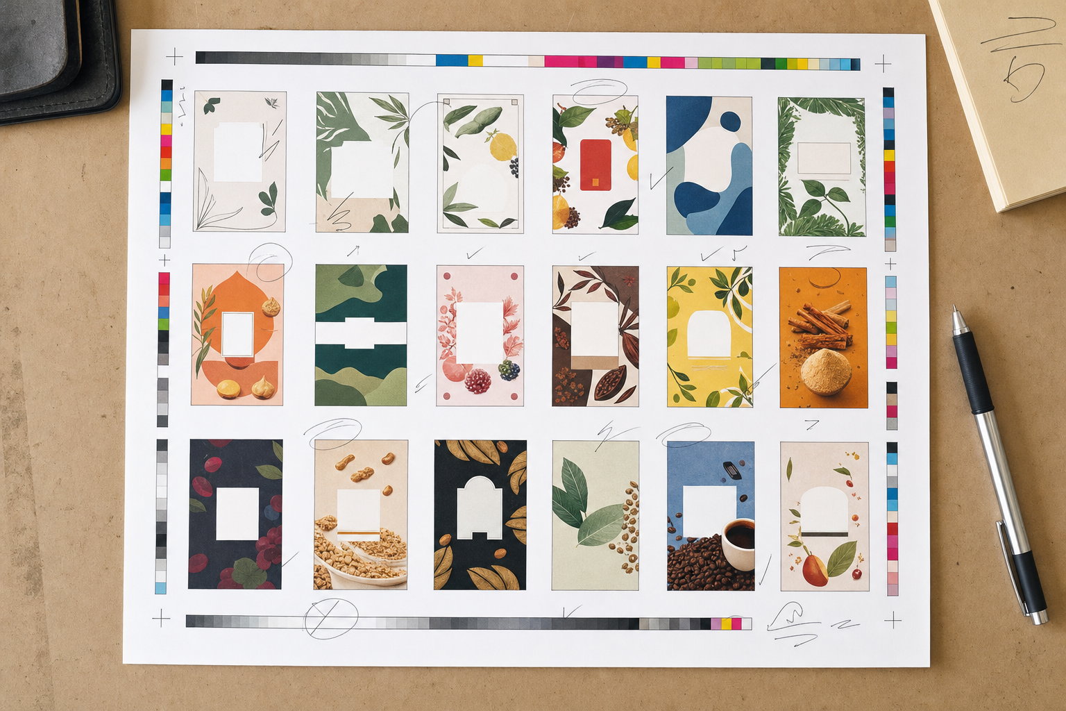
A 16-up page may be efficient, but it can make small typography impossible to judge. A 4-up page may be easier to review but produce too many pages. The best proof sheet balances density with legibility.
For most small print assets, start with one of these:
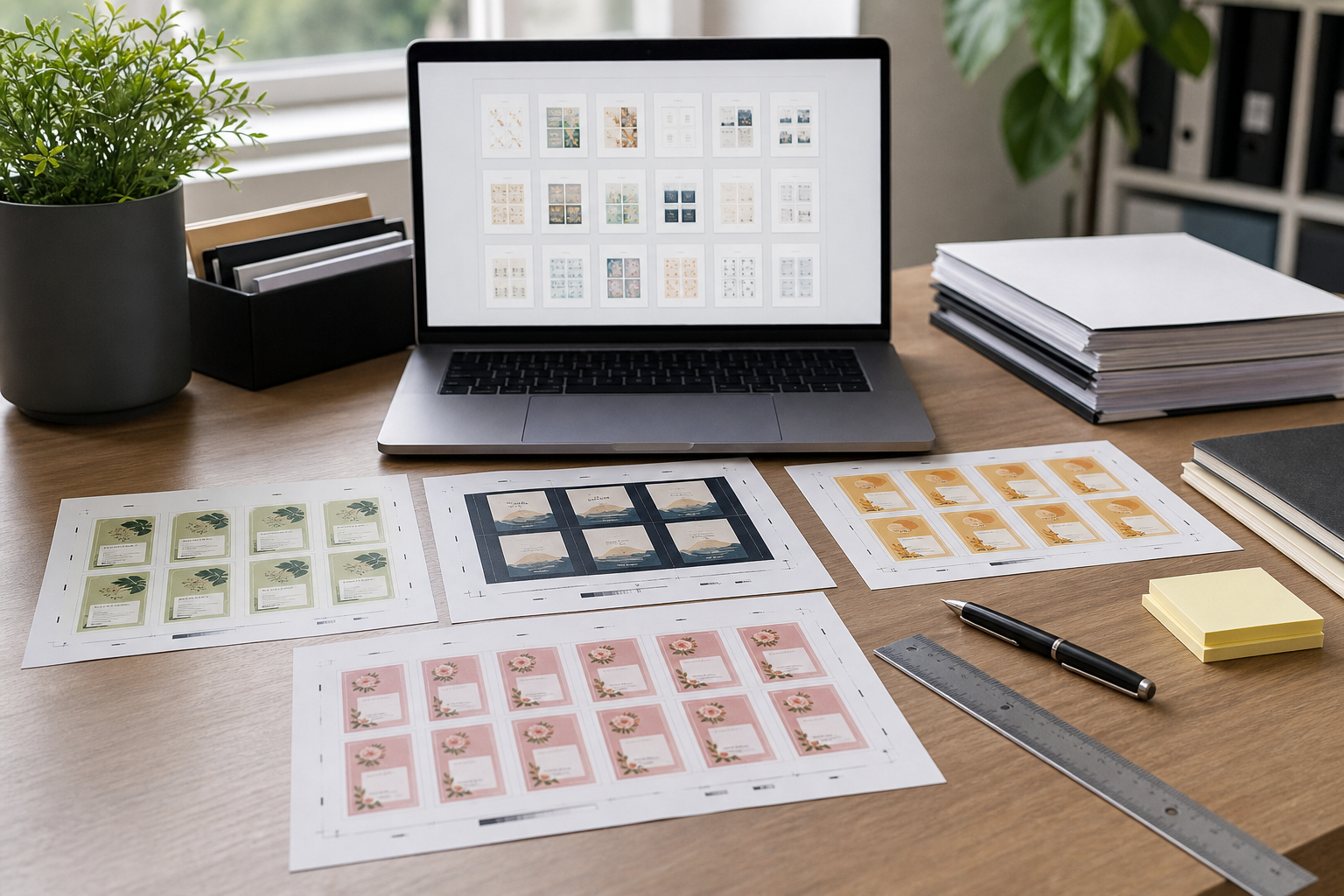
- 4-up on letter or A4 for postcards, folded inserts, or larger labels.
- 6-up or 8-up for care cards, hang tags, and package inserts.
- 12-up or 16-up for stickers, tiny labels, icon labels, and QR tags.
If the team will print and mark up the proof, leave more whitespace than you think you need. Comments, initials, and correction marks need somewhere to go.
Prepare Source Files Before You Combine Them
The fastest way to ruin an N-up review is to mix inconsistent source files. If some assets are PNGs, some are JPEGs, some are oversized exports, and some are already PDFs with unexpected page boxes, the proof sheet can become misleading.
Before building the proof, normalize the source set.
Start by checking format. If the assets are images, convert them into a predictable format first. For example, transparent label art may need to stay PNG, while photographic inserts may be fine as JPEG. If you need to standardize mixed image files, use an image conversion step such as Convert Image before turning the set into a PDF.
Next, check dimensions. Small variations might be intentional, but accidental differences are common. A label exported at 1000 x 1000 pixels next to a related label exported at 1200 x 1200 pixels can create a false impression of size or spacing. If the assets should share a common footprint, resize the outliers before proofing with a tool such as Resize Image.
Then check backgrounds and transparency. A transparent PNG placed on a white PDF page may hide edge problems. A white border around a label might be invisible until it is printed on colored stock or placed near another design. If transparent artwork needs cleanup, use AI Photo Editor or your usual image editor before building the proof.
Finally, establish naming. Reviewers need to identify each item without guessing. Even if the proof sheet itself does not display filenames, the page order should match a clear folder order. Use names such as label-lavender-30ml-v03.pdf rather than final2-new.pdf.
A Practical Workflow for Building a Review-Ready Proof PDF
A reliable proof workflow has four stages: normalize, convert, combine, and compress. The exact tools may vary, but the structure should stay the same.
1. Make a Copy of the Review Set
Never build proof sheets from the only copy of production artwork. Create a review folder and copy the files into it. This protects the originals and gives you a clean place to rename, resize, or convert assets without damaging the source set.
Suggested folder structure:
project-name/
  production-artwork/
  review-set-v03/
  proof-pdfs/
  client-feedback/
This seems basic, but it prevents a common problem: someone compresses, flattens, or resizes the final artwork because they were only trying to make a proof easier to email.
2. Normalize Images or Single-Page PDFs
If the source files are images, convert them into PDFs or place them into a PDF workflow after resizing. If your review set includes phone photos, exported screenshots, label PNGs, and JPEG mockups, standardize them first.
A useful path is:
- Resize images that are too large or inconsistent.
- Convert odd formats into PNG, JPEG, or PDF as needed.
- Use Image to PDF when you want each image to become a page in a PDF review packet.
- Keep the resulting proof-source PDF separate from production files.
If the source files are already PDFs, check whether each file has one page. Multi-page files can be useful, but they can also disrupt ordering. A two-page insert placed among single-page labels may create a proof that looks complete while hiding one side of the insert later in the sequence.
3. Merge the Review Set in the Correct Order
Once each item is ready as a PDF page or predictable image page, combine the pieces into one review document. A browser tool such as PDF Merge is useful here because the merge order becomes the review order.
This merged PDF is your proof source. It is not yet the N-up sheet, but it is the clean sequence from which the sheet should be generated.
Before moving on, open the merged PDF and skim every page. Look for wrong orientation, missing transparency, oversized art, unexpected blank pages, and duplicate versions. Fixing those issues now is easier than after the proof sheet has been shared.
4. Create the N-Up Layout
Depending on your available PDF tools, this may be called N-up, multiple pages per sheet, contact sheet, print layout, or pages per page. The concept is the same: place several pages from the merged source PDF onto each proof page.
Choose settings based on the review goal:
- Use 2-up or 4-up for close reading.
- Use 6-up or 8-up for balanced review.
- Use 12-up or 16-up for high-level comparison.
- Keep page order left-to-right and top-to-bottom unless your team uses another convention.
- Add enough spacing between items to avoid visual blending.
If you are using a print dialog to create the proof, print to PDF instead of paper first. That gives you a shareable proof file and lets you inspect the result before anyone uses printer ink.
5. Compress Only the Proof Copy
Proof sheets can become large, especially when they contain high-resolution product photos or many raster labels. Compressing the review PDF can make it easier to email or upload, but compression should happen only to the proof copy, never to source artwork.
If your proof includes many image-heavy pages, reduce the image files before PDF assembly using Compress Image, or compress the final PDF with your preferred PDF compression step. The purpose is convenience, not archival quality.
Use stronger compression for internal review and lighter compression for client-facing approval. If small text or codes become fuzzy, the file is too compressed for the job.
Proof Sheet Settings That Usually Work
There is no universal N-up setting, but a few starting points are reliable.
For labels smaller than a business card, use 8-up or 12-up on A4 or letter. This gives enough density to compare variants while leaving items visible. For micro labels, use 16-up only if the review is about color blocking, shape, or version consistency rather than fine text.
For business cards, care cards, and inserts, use 4-up. If the items are double-sided, create separate front and back proof sheets, or arrange front/back pairs in a consistent sequence. Do not mix sides casually, because reviewers may approve a front without realizing the back changed.
For stickers or decals with irregular shapes, add more spacing. Irregular silhouettes need breathing room, especially if the proof is being reviewed on a monitor. Tight grids can make separate stickers appear like one combined design.
For QR codes and barcodes, print at or near final size. A dense proof may show that the code exists, but it cannot confirm scan reliability. If scan performance matters, make a second proof sheet with fewer items per page and test it using real devices.
A Review Checklist for Small Print Assets
A proof sheet works best when reviewers know what to check. Without a checklist, people comment on taste while missing operational problems.
Use this list for small print assets:
- File order matches the SKU list, campaign list, or production spreadsheet.
- Each version has the correct product name, variant, size, and legal line.
- Logos are consistent across variants.
- Margins and safe areas look visually consistent.
- Backgrounds, borders, and transparent edges behave as expected.
- Small text remains readable at the intended physical size.
- QR codes or barcodes have enough quiet space.
- Front and back designs are paired correctly.
- No old version appears beside the current version.
- Color families are consistent enough for review, while noting that office printers are not color proofing devices.
For regulated packaging, add a separate compliance review step. A proof sheet can help people see issues, but it should not replace legal, safety, or printer-specific checks.
Naming and Version Control for Proof PDFs
The proof file name should tell people exactly what they are looking at. Avoid names like proof.pdf or labels-final.pdf. They age badly.
Use a pattern such as:
brand-label-proof-8up-v03-2026-05-06.pdf
brand-care-card-proof-4up-internal-v02.pdf
spring-campaign-stickers-proof-12up-client-review.pdf
Include the layout when it matters. If someone prints 8up and complains that small text is too small, you can create a 4up close-reading proof without confusion.
Also avoid using final until the job is actually released. A file named final-final-approved-new.pdf is a sign that the workflow has lost control. Version numbers and dates are calmer and more useful.
How to Handle Feedback Without Losing Context
N-up proof sheets are easy to mark up, but feedback can become ambiguous if people do not identify the item being discussed. If the proof sheet lacks visible filenames or numbers, reviewers may say “third one on page two,” which becomes unreliable once the proof is updated.
A practical workaround is to keep the proof order identical to a review spreadsheet. The spreadsheet can contain item names, filenames, status, notes, and owner. The proof sheet supplies the visual comparison; the spreadsheet supplies the audit trail.
Suggested columns:
| Column | Purpose |
|---|---|
| Item ID | Stable reference for the design |
| Filename | Connects feedback to source artwork |
| Version | Prevents old comments from applying to new files |
| Reviewer | Shows who requested the change |
| Status | Draft, revise, approved, blocked |
| Notes | Keeps correction details outside email threads |
If the review is small, comments on the PDF may be enough. If the review includes dozens of variants, use a spreadsheet or project tracker alongside the proof.
Common Mistakes That Make Proof Sheets Misleading
The biggest mistake is mixing scale. If one item is shown at 100 percent and another is automatically fitted to a different box, reviewers may make bad decisions about typography or spacing. Fit-to-page settings are convenient, but they can hide size differences.
Another mistake is compressing too early. If image quality is reduced before small text is reviewed, the team may approve artwork that looks fuzzy only because the proof was damaged. Keep a high-quality proof source and compress copies only when needed.
Orientation errors are also common. Landscape inserts placed among portrait labels may rotate unexpectedly. Skim the merged source PDF before creating the N-up layout, and then inspect the final proof again.
Watch for hidden white backgrounds. Transparent artwork may look fine on white paper, but the same file can fail when placed on kraft packaging, colored labels, or a dark product mockup. If transparency is part of the deliverable, include at least one review view that makes edges visible.
Finally, do not let the proof sheet become the only artifact. It is a review aid. The source files, version list, approvals, and production handoff still matter.
Example: Reviewing 48 Candle Labels
Imagine a small ecommerce brand preparing 48 candle labels across four scent families and three jar sizes. Each label is exported as a PNG from a design tool. The team wants to catch copy errors and visual inconsistencies before sending artwork to the label printer.
A practical workflow could look like this:
- Copy all 48 PNG files into
review-set-v04. - Rename files using scent, size, and version.
- Resize any accidental outlier exports so every label shares the same pixel dimensions.
- Convert the PNG set into a single PDF where each label is one page.
- Merge any separately exported label groups into the correct order.
- Create a 12-up proof for visual comparison.
- Create a 4-up proof for close text reading.
- Compress only the client-facing copies if the files are too large to share.
- Track approvals in a spreadsheet using the same order as the proof.
The 12-up proof helps the team notice that one lavender label uses the wrong icon style. The 4-up proof helps catch that a small warning line is too close to the trim on two sizes. Neither proof replaces the printer’s final template, but both reduce the chance of sending messy artwork downstream.
Example: Care Cards for a Subscription Box
A subscription box team may need to review care cards, coupon inserts, warranty slips, and product tip cards every month. These files are often small and text-heavy, and they may come from different contributors.
For this kind of work, a 4-up or 6-up proof is usually better than a dense sheet. The reviewer needs to read copy, check offer dates, and confirm that URLs or QR codes are correct. A 16-up sheet might look efficient, but it will hide the exact problems the team needs to find.
The review packet could include:
- One merged PDF containing every insert as a separate page.
- One 4-up proof for reading and markup.
- One single-page-per-item PDF for archival approval.
- A compressed sharing copy for stakeholders who only need to comment.
This keeps the workflow simple while still giving different reviewers the format they need.
Final Preflight Before Sharing
Before sending the proof sheet, open it like a skeptical reviewer.
Check the first page, middle pages, and final page. Confirm that no items disappeared during conversion. Look for unexpected blank pages. Zoom in on the smallest text. Print one page if physical size matters. Try scanning any QR code that will be used by customers. Make sure the file name includes the version and review purpose.
Then send the proof with clear context. Say whether it is for visual review, copy review, size review, or general approval. If color is not final, state that. If the printer will still create a production imposition file, state that too.
A good N-up proof sheet reduces review friction because it makes many small decisions visible at once. It gives teams a shared object to mark up, compare, and approve without opening layout software or passing around a folder of scattered files. For small print assets, that is often the difference between a controlled review and a slow chain of avoidable corrections.