Pixel-Density Handoff Workflow for App Screenshots
A practical workflow for preparing high-DPI app screenshots that stay readable in help centers, changelogs, pitch decks, and support documents without bloated files.
Pixel-Density Handoff Workflow for App Screenshots
App screenshots are easy to capture and surprisingly easy to damage. A product manager grabs a retina screenshot, a designer crops it in a canvas, a technical writer drops it into a help center, a marketer reuses it in a landing page, and a support lead pastes it into a PDF. By the time the same image has passed through three tools and two content systems, thin UI lines look soft, small labels become gray mush, and the file is still bigger than it needs to be.
The usual advice is too broad: compress images, export WebP, keep screenshots readable. That is not enough for teams that publish interface screenshots every week. App screenshots have a density problem. They are not photos, and they should not be treated like photos. They contain tiny type, one-pixel borders, icons, cursor states, sidebars, empty space, and sometimes confidential details that need to be removed before publishing.
This guide gives you a practical pixel-density handoff workflow for app screenshots. It is meant for product documentation, SaaS changelogs, onboarding guides, sales enablement decks, internal SOPs, and support macros. The goal is simple: capture once, prepare deliberately, and hand off files that stay sharp wherever they are used.
The Density Problem Most Teams Miss
A screenshot has two sizes that matter: its actual pixel dimensions and the size at which it appears on the page. The trouble starts when those two sizes drift apart without anyone noticing.
A modern laptop may capture an app window at 2880 pixels wide even though the visible layout behaves like a 1440-pixel interface. That screenshot looks crisp on the original machine because the operating system maps multiple physical pixels to one layout point. But when the image is uploaded to a CMS, inserted into a help article, or pasted into a document, the display width may become 720 pixels, 980 pixels, or whatever the template allows.
That is where teams lose control. A screenshot that was readable at full scale may be unreadable after being squeezed into a narrow article column. Another screenshot may be uploaded at huge dimensions but displayed small, adding page weight without adding clarity. A third may be resized twice, once by a design tool and once by the CMS, which creates soft UI edges.
The density problem is not just about file size. It is about choosing the right capture area, visible scale, export dimensions, and final compression so the reader can understand the interface without zooming.
Use this rule of thumb: if the reader needs to inspect a label, button, menu item, number, table cell, or setting, the final displayed screenshot should be treated as instructional evidence, not decoration.
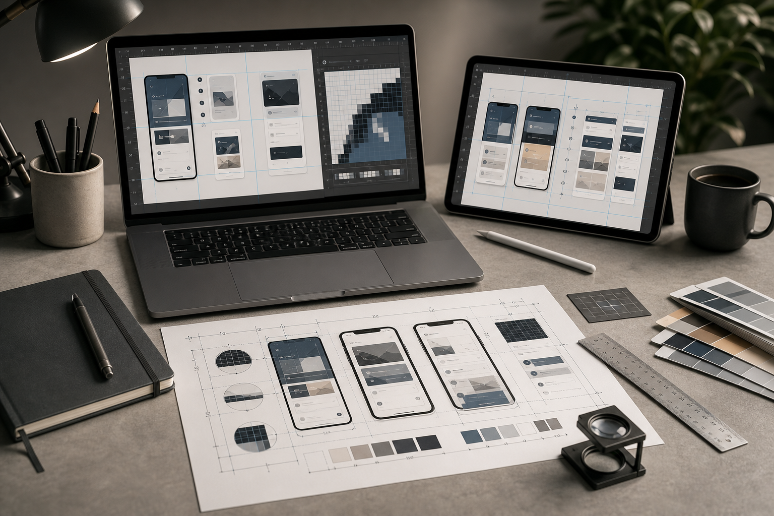
Decide the Job of the Screenshot First
Before resizing anything, decide what the screenshot is supposed to do. Most poor screenshot workflows fail because every image is prepared the same way, even though different screenshots have different jobs.
A full-window screenshot is useful when the reader needs orientation: where a feature lives, how a page is structured, or what part of the product they are in. It can tolerate slightly smaller details because its purpose is spatial context.
A task screenshot is narrower. It shows the exact control, panel, menu, field, modal, or table state the reader needs. It should be cropped tighter and displayed larger relative to its content.
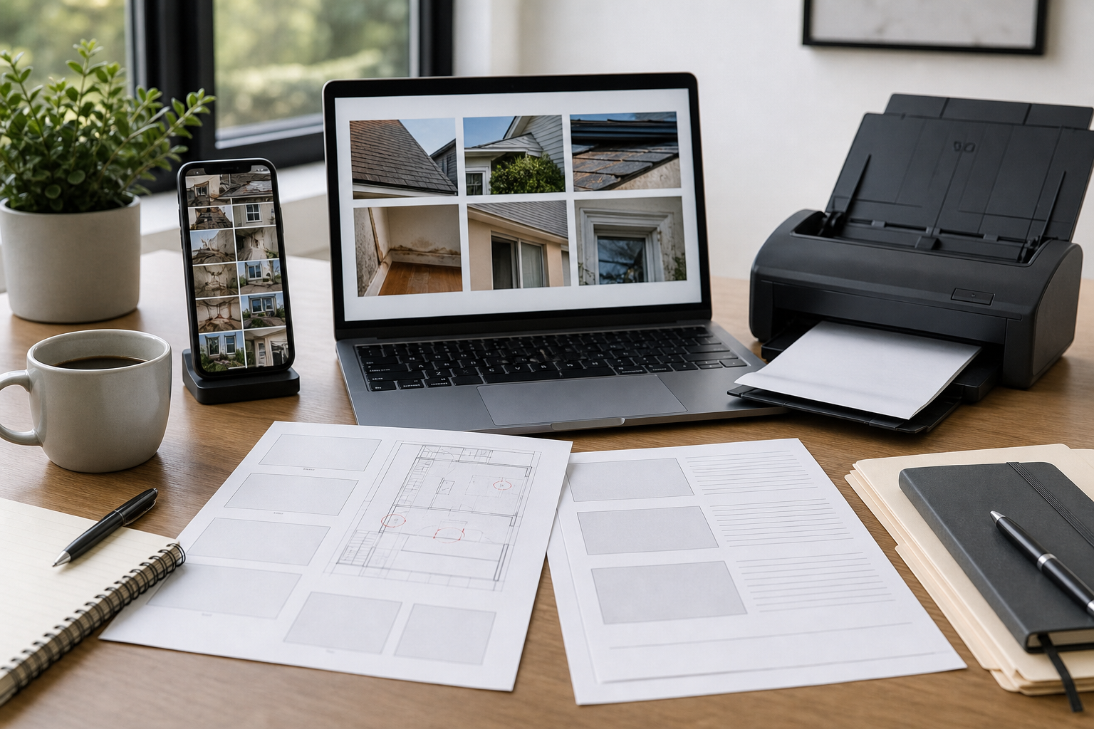
A proof screenshot is used for review rather than publication. It may include extra surrounding context, version notes in the filename, or multiple states placed on one page. For these, a PDF proof sheet can be more useful than separate loose images.
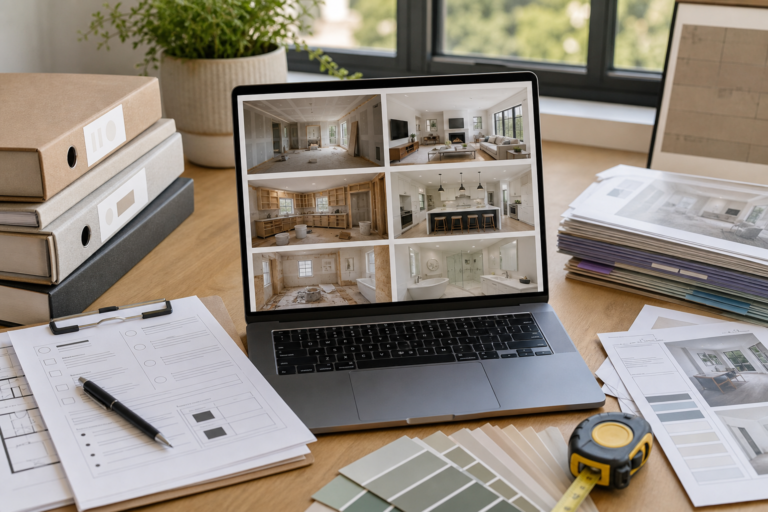
A marketing screenshot needs polish. It may require background removal, cleanup, masking, or consistent framing. If you need to remove a distracting item or tidy a non-critical visual blemish, an editor like AI Photo Editor can help, but do not use generative edits to change product behavior or invent UI states.
A support screenshot needs privacy. It often starts as user-submitted evidence and may contain names, addresses, account IDs, or internal notes. For these, the workflow should include cropping, redaction outside the image tool if needed, and a conservative export that avoids exposing hidden layers or original metadata.
Quick Decision Table
| Screenshot job | Best crop style | Display priority | Export concern |
|---|---|---|---|
| Feature orientation | Medium-wide window crop | Layout context | Keep width reasonable |
| Step-by-step instruction | Tight task crop | Text readability | Avoid overcompression |
| Changelog proof | Consistent repeated crop | Side-by-side comparison | Stable naming |
| Sales or landing page | Polished product frame | Visual clarity | Responsive size variants |
| Support evidence | Privacy-first crop | Relevant detail | Remove unrelated data |
This decision takes less than a minute, but it prevents most downstream problems.
Capture at a Stable Product State
Screenshots are easier to process when the source is stable. Before capture, make the interface boring in the best possible way. Use realistic sample data, close irrelevant panels, dismiss notifications, avoid hover states unless they matter, and set the browser zoom or app zoom deliberately.
For documentation, capture at 100 percent browser zoom unless your documentation system has a reason to standardize another value. Mixing 90 percent, 100 percent, and 110 percent captures across the same article creates subtle inconsistency. Button labels shift, sidebars change width, icons appear at different apparent sizes, and readers feel it even when they cannot name it.
Use a repeatable capture viewport for recurring documentation. For example, product teams often choose a desktop viewport around 1440 by 900 layout pixels for full-window captures and a narrower crop for panels, drawers, and settings pages. The exact number matters less than consistency.
If the final screenshot will appear in a narrow help center column, do not capture an entire ultra-wide monitor. The reader does not benefit from seeing empty sidebars and whitespace if the important action is a small control in the top right. Capture only enough context to answer the reader's question.
Crop Before You Resize
Cropping should happen before resizing because every unnecessary pixel competes with the useful detail. A screenshot with too much surrounding UI may technically be sharp, but the important button still appears tiny after the CMS scales it down.
Start by removing browser chrome, desktop background, unrelated tabs, and empty application space. Then decide whether the screenshot needs orientation context. If it does, keep a small amount of surrounding UI: a sidebar label, a page title, or a neighboring section. If it does not, crop tightly around the task area.
For fast cleanup, use a simple crop and resize path rather than opening a heavy design file. A tool such as Resize Image is useful when you need to create consistent dimensions for a batch of screenshots without changing the content itself.
A good task crop often includes three things: the control being used, the result of that control, and one recognizable anchor that tells the reader where they are. A bad task crop includes the entire app, five unrelated panels, and a tiny highlighted menu item.
Crop Checklist
- Remove browser and operating system chrome unless it is part of the instruction.
- Keep one orientation anchor when the reader might feel lost.
- Avoid cropping exactly on a border or shadow; leave a few pixels of breathing room.
- Use the same crop logic for repeated states in the same article.
- Do not crop out the result if the screenshot is meant to prove what changed.
Choose Display Width Before Export Width
The most important question is not how wide the original screenshot is. It is how wide the screenshot will appear to the reader.
If your article column displays images at 760 CSS pixels wide, then a screenshot exported at 1520 pixels wide can look crisp on high-density screens when displayed at 760 pixels. That is a useful 2x asset. But exporting the same image at 3200 pixels wide usually adds weight without improving the reading experience.
For instructional screenshots, a practical approach is to prepare images at roughly 1.5x to 2x the intended display width. If the screenshot will display at 700 pixels, export around 1050 to 1400 pixels wide. If it will display in a full-width product page section at 1100 pixels, export around 1650 to 2200 pixels wide. If the screenshot is mainly decorative, you can be more aggressive.
Do not blindly downscale every screenshot to one universal width. A tight crop of a settings modal may only need 900 pixels. A full dashboard overview may need 1600 pixels to keep labels readable. A mobile app screenshot may need a different rule because the source is tall and narrow.
The handoff note should include intended display width. Even a simple filename pattern can help, such as account-settings-modal-display-720-export-1440.webp. That may look fussy, but it prevents someone from later wondering whether the image is oversized by accident.
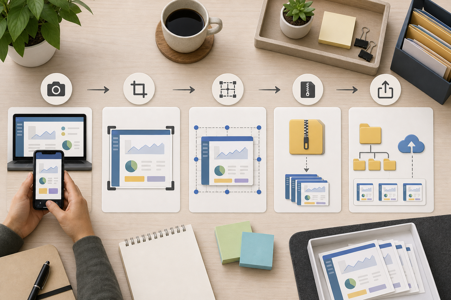
A Practical Handoff Workflow
A reliable screenshot workflow does not need expensive software. It needs a consistent order of operations.
- Capture the interface in a stable state.
- Save the untouched source in a private working folder.
- Crop to the job of the screenshot.
- Resize for the intended display width.
- Convert to the right format.
- Compress carefully.
- Check readability at the actual display size.
- Store the final asset with a useful filename.
The source file matters because it gives you a way back if the crop is wrong, a product label changes, or the content team needs a wider version later. The final file matters because it is what your site, PDF, or CMS should actually serve.
When screenshots move between formats, use a conversion step deliberately. Convert Image is helpful when a team receives PNG files but wants WebP for web publishing, JPEG for a slide deck, or PNG for a transparency-sensitive asset. The point is not to chase one perfect format. The point is to choose the format that matches the destination.
For many web help centers, WebP is a strong final format for app screenshots because it can reduce size while preserving sharp edges when configured carefully. PNG is still useful for screenshots with transparency, simple flat UI, or cases where lossless fidelity matters more than file size. JPEG is usually the weakest choice for dense UI text because compression artifacts can gather around letters and icons, but it may be acceptable for large photographic backgrounds inside product screenshots.
Compression Without Blurring the Interface
Compression is where screenshot quality often fails. Photo compression settings are tuned for gradients, skin, texture, and natural scenes. App screenshots have different visual risks: thin text, flat fills, hairline borders, tiny icons, and high-contrast edges.
After resizing, run compression on the final export and inspect it at the size readers will see. Compress Image is useful for this final pass because you can reduce weight after the dimensions are already correct.
The inspection step matters. Do not judge quality only by opening the image at full size in a viewer. A 1400-pixel screenshot may look fine at full size but fail when displayed at 700 pixels in a help article. Check the final image at the intended display width and scan for these issues: broken letterforms, fuzzy toolbar icons, muddy disabled text, noisy shadows, and color banding in panels.
A practical compression target is not one fixed kilobyte number. It depends on the role of the screenshot. A small task crop should often be well under 150 KB. A full dashboard overview might be higher. A hero product screenshot may justify more weight if it is above the fold and central to the page. The key is to remove waste without making the UI harder to read.
Compression Review Checklist
- Inspect at the final display width, not only at full size.
- Compare against the resized image before compression.
- Watch small gray text and disabled labels.
- Avoid heavy JPEG compression for dense UI.
- Keep one clean source export in case the compressed version is too harsh.
When OCR Belongs in a Screenshot Workflow
OCR is not only for scanned documents. It can be useful for screenshot QA when text accuracy matters.
For example, a technical writer may need to confirm that a cropped screenshot still contains the exact label mentioned in the article. A localization manager may need to check whether a translated UI state made it into the right image. A support operations team may need to extract visible error messages from user-submitted screenshots before filing a bug.
In those cases, Image OCR can act as a verification tool. Upload the screenshot, extract the visible text, and compare it against the article or ticket. This is especially useful when screenshots contain codes, field labels, short error messages, or table headers.
OCR should not replace manual visual review. It will not understand layout intent, and it may misread icons or stylized text. But it can catch a surprising number of handoff errors, including old labels, cropped-off headings, or screenshots from the wrong environment.
Use OCR carefully with sensitive screenshots. If an image contains private customer data, remove or mask that information before using it in any publication workflow.
Building Proof Sheets for Review
When a documentation update includes many screenshots, reviewing them one by one is slow. A proof sheet is often better. It lets reviewers scan a set of images together and notice inconsistency: one screenshot has a different sidebar width, another uses old sample data, another has a stray cursor, and another is cropped too tightly.
A simple proof sheet can be a PDF containing several screenshots arranged in order. For image-heavy internal reviews, you can convert selected screenshots with Image to PDF, then combine review pages with PDF Merge if the assets are grouped by article or workflow.
This is especially useful before publishing a large help center refresh, onboarding guide, or release-note package. Reviewers can mark issues in one place instead of leaving scattered comments across a CMS, chat thread, and design file.
The proof sheet does not need to be beautiful. It needs to reveal consistency. Place screenshots in article order, keep filenames visible outside the image if your PDF workflow supports it, and group related states together. If filenames are not visible, use a separate checklist that maps screenshot names to article sections.
Naming Files So They Survive Handoff
Screenshot filenames should answer three questions: what feature is shown, what state is shown, and what size or destination the file serves.
A weak filename is screenshot-final-new2.webp. A useful filename is billing-plan-drawer-empty-state-1440.webp. The useful filename tells a future teammate what the image contains without opening it.
For repeated workflows, use a predictable pattern:
feature-area--state-or-step--destination-or-width.format
Examples:
- billing--plan-drawer-open--help-1440.webp
- onboarding--invite-modal-error--changelog-1200.webp
- analytics--date-filter-applied--support-pdf.png
- mobile-checkout--coupon-field-empty--docs-900.webp
Avoid spaces, mystery abbreviations, and temporary labels like final, latest, or approved unless your team has a controlled versioning system around them. Dates can help for archival screenshots, but they are less useful than feature and state for active documentation.
If a screenshot contains a specific product version, include that in the folder or metadata rather than cramming everything into the filename. The filename should stay readable.
Common Failure Modes and Fixes
The screenshot is sharp but unreadable in the article. The crop is probably too wide for the display container. Go back to the source, crop tighter around the task, and export at 1.5x to 2x the intended display width.
The screenshot looks soft after upload. The CMS may be resizing it again. Export closer to the rendered size, avoid uploading huge originals as final assets, and check whether the CMS creates its own derivative images.
The file is tiny but the UI looks dirty. Compression is too aggressive or the wrong format was used. Try WebP with a less aggressive setting or PNG for dense, flat UI.
The screenshots in one article feel inconsistent. The capture viewport, browser zoom, or crop logic changed between images. Re-capture the set with one viewport and one crop rule.
The screenshot shows too much private information. The capture was not staged properly. Recreate the state with sample data where possible. If that is impossible, crop or redact before the asset enters the publishing flow.
The same screenshot is being used for web, PDF, and slides. Create destination-specific exports from the same source. A help article, printed review PDF, and sales deck often need different dimensions and formats.
A Small Team Example
Imagine a three-person SaaS team preparing a release note for a new permissions panel. The product manager captures the full settings page on a retina laptop. The first screenshot is 3024 pixels wide and includes the browser toolbar, left navigation, empty right-side space, and a modal in the center.
Instead of uploading that file directly, the team saves it as the source. They crop a task version around the permissions modal while keeping the settings page title and one sidebar item as orientation anchors. The final article column displays images around 760 pixels wide, so they export the crop at 1520 pixels wide.
Next, they convert the file to WebP for the web version and compress it. They inspect it at the article width, notice that the smallest role descriptions are slightly fuzzy, and reduce compression. Then they create a PDF proof sheet with the modal closed, modal open, error state, and saved state so the reviewer can confirm the sequence.
For the support team, they export a PNG version of the error state because it will be pasted into an internal troubleshooting guide where fidelity matters more than page weight. The files share the same base naming pattern, so everyone can tell they came from the same source capture.
That workflow takes a few extra minutes, but it prevents unclear documentation, oversized assets, and repeated rework.
Final Pre-Publish Checklist
Before publishing app screenshots, run through this short checklist:
- The screenshot has one clear job.
- The crop removes irrelevant space while preserving necessary context.
- The export width matches the intended display width.
- The format fits the destination.
- Compression was reviewed at actual display size.
- Small text, icons, and borders remain readable.
- Sensitive data is removed or replaced with sample data.
- The filename describes feature, state, and destination.
- Related screenshots use consistent viewport, zoom, and crop logic.
- A proof sheet exists for large screenshot sets.
This is not bureaucracy. It is a way to keep visual evidence reliable as it moves through product, documentation, marketing, support, and review.
The Takeaway
Good screenshot handling is not about making every image as small as possible. It is about preserving the information the reader needs while removing everything the delivery channel does not need.
Pixel density gives teams a practical language for that tradeoff. Capture a stable source, crop for the screenshot's job, resize for the real display container, convert intentionally, compress with UI details in mind, and review the result where it will actually appear.
Once that workflow becomes routine, app screenshots stop being throwaway assets. They become durable product documentation: lighter, clearer, easier to review, and much less likely to break when reused across channels.