Transparent WebP Overlays for Product Documentation: A Practical Production Guide
Prepare crisp, lightweight transparent WebP overlays for help centers, annotated screenshots, interactive guides, and product education without halos or unreadable details.

Transparent WebP Overlays for Product Documentation: A Practical Production Guide
Transparent overlays are unusually useful in product documentation. A cropped menu can float beside an instruction. A pointer can sit above a screenshot without requiring a new composite. A small interface fragment can be reused across onboarding pages, release notes, and support articles. Compared with a complete screenshot, an overlay also directs attention toward the control that matters.
The difficult part is not merely exporting an image with transparency. The asset must remain convincing on different page backgrounds, retain thin interface details, load quickly, and survive responsive resizing. A file that looks correct on a checkerboard canvas may reveal pale fringes on a dark help-center theme. Aggressive compression may preserve the silhouette while quietly damaging icons, shadows, and tiny status indicators.
This guide presents a practical production system for transparent WebP overlays used in help centers, interactive guides, product education, and technical documentation. It focuses on the decisions that tend to create avoidable rework: choosing what belongs in the overlay, cleaning alpha edges, controlling dimensions, testing contrast, and selecting a sensible format.
Where Transparent Overlays Earn Their Keep
An overlay is most effective when it isolates one visual idea. Common examples include:
- A cropped toolbar group placed beside a numbered instruction.
- An annotation arrow positioned independently over a responsive screenshot.
- A dialog, menu, or tooltip shown without unrelated application chrome.
- A device frame placed over a page background.
- A before-and-after slider containing objects with irregular outlines.
- A reusable cursor, tap marker, selection rectangle, or focus ring.
- A decorative interface fragment used to connect sections of a product tour.
The technique is less suitable when surrounding context explains the action. A floating Save button, for example, may be ambiguous if several editors in the product contain similar controls. In that case, retain enough neighboring interface to establish location.
A useful rule is to crop to the smallest area that still answers three questions: what is the control, where does it belong, and what state is being shown? If the crop answers only the first question, it may be attractive but not instructional.
Why Transparent Overlays Fail in Documentation
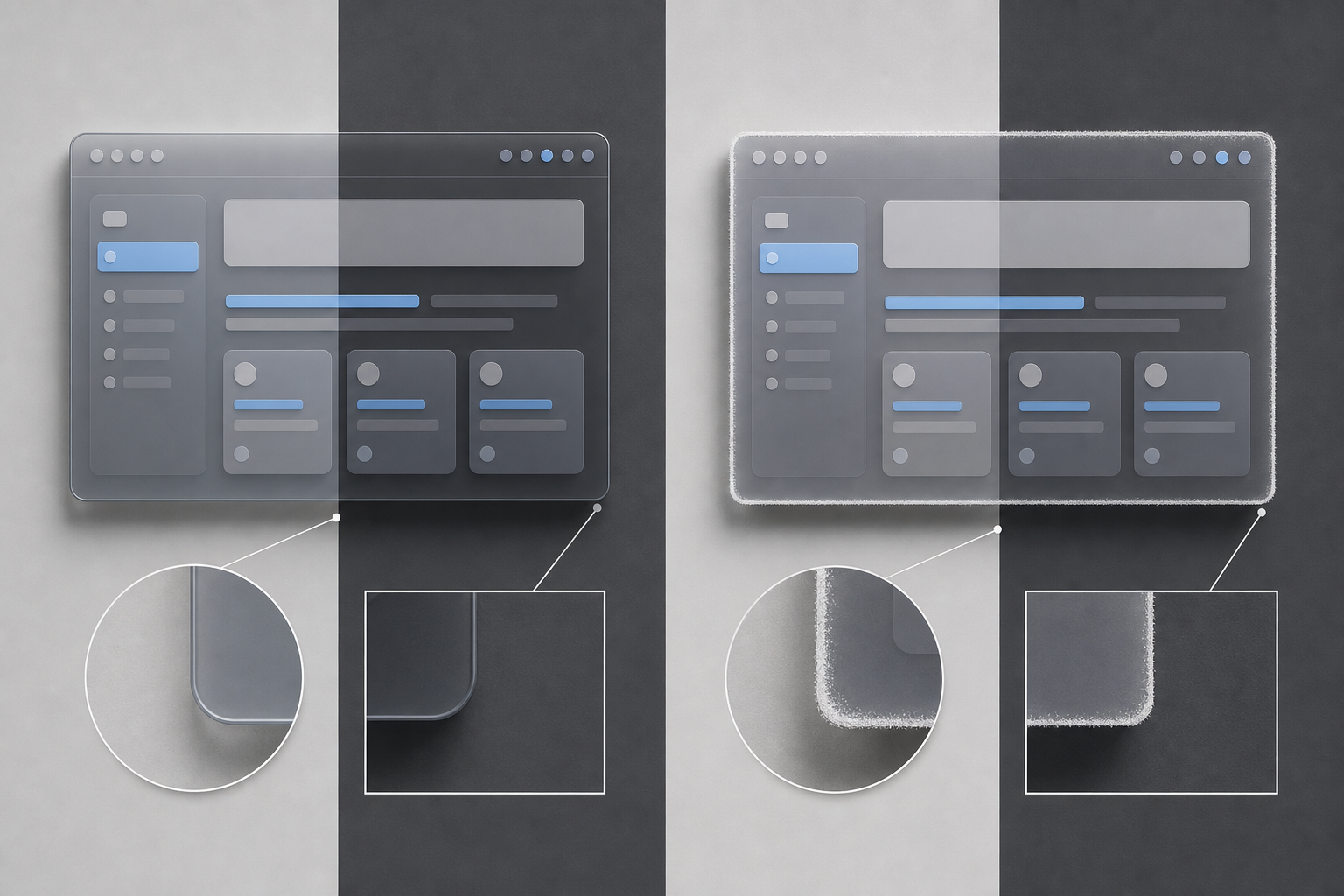
Transparency problems often hide during editing because design applications display an artificial checkerboard rather than the backgrounds used by the published site. Four defects are especially common.
Matte contamination
A subject removed from a white screenshot may retain partially transparent white pixels around its edge. Those pixels look harmless on white but form a bright halo over charcoal or colored surfaces. Dark contamination produces the reverse problem.
The remedy is not simply to erase more pixels. Hard erasure can create jagged corners and damaged antialiasing. Edge colors need to be cleaned while useful partial transparency is retained.
Clipped shadows
Menus, dialogs, and tooltips often rely on soft shadows to separate them from the page. A crop that ends at the visible panel boundary may cut off the shadow. The defect becomes obvious when the asset is placed over a flat background.
Include deliberate breathing room around soft effects. The required margin depends on blur radius and spread, not just the solid object boundary.
Compression damage in tiny details
WebP can reduce file size substantially, but a small numerical label, one-pixel divider, or muted icon may deteriorate before the overall image appears visibly compressed. Documentation readers depend on those details more than viewers of a decorative photograph do.
Evaluate the instructional feature at its actual published size. A clean-looking source viewed at 300 percent magnification says little about its usability in a mobile article.
Incorrect assumptions about the page background
A transparent asset does not have a single appearance. Its translucent pixels blend with whatever sits beneath them. Shadows, glass-like panels, and low-opacity highlights can change dramatically between a white article, a dark theme, and a colored callout box.
This is why transparency must be tested as a relationship between asset and page, not as an isolated file property.
Decide Whether WebP Is the Right Output
Transparent WebP is a strong default for many web-based documentation systems, but it is not automatically the best format for every asset.
| Asset type | Usually suitable format | Main reason |
|---|---|---|
| Cropped interface panel with shadows | WebP | Handles alpha transparency and can reduce complex raster data efficiently |
| Flat icon or geometric pointer | SVG | Scales cleanly and is easy to recolor when the source is truly vector |
| Pixel-critical interface crop | PNG or lossless WebP | Avoids artifacts around fine text and one-pixel lines |
| Photographic cutout | WebP | Efficient for continuous tones and soft edges |
| Animated pointer demonstration | Animated WebP, GIF, or video | Choice depends on publishing support and motion complexity |
| Master editing file | Layered source or PNG | Preserves quality for future revisions |
Do not convert a vector arrow to raster WebP merely for consistency. Conversely, tracing a complicated interface panel into SVG creates unnecessary complexity and can produce accessibility or font-rendering surprises.
Keep a high-quality master and treat the WebP as a delivery derivative. If the documentation layout changes later, you can generate a new size without recompressing an already compressed asset.
Build a Small but Representative Test Set
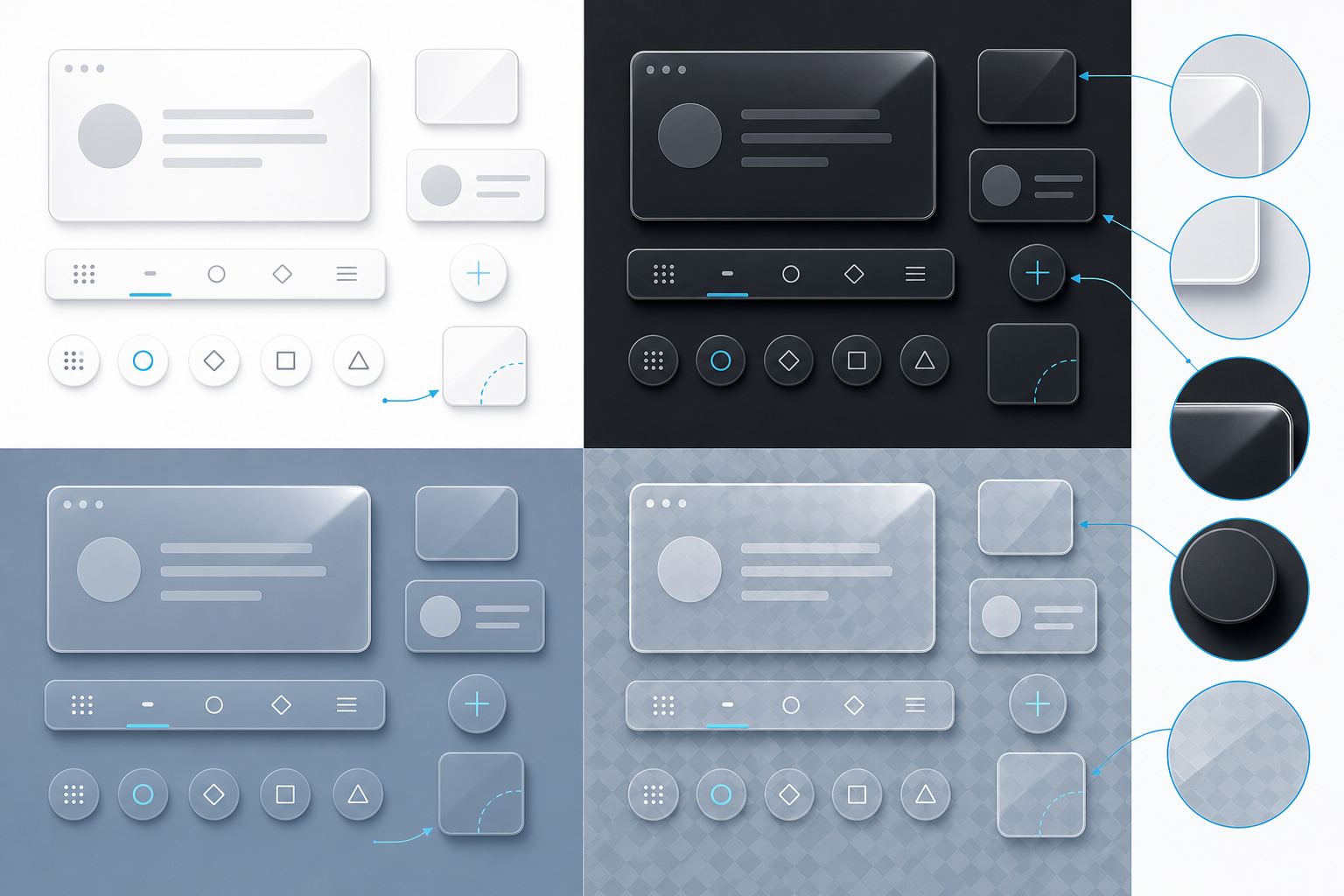
Before processing dozens of overlays, select five to eight difficult examples. Include the kinds of details most likely to fail:
- A rounded menu with a diffuse shadow.
- A crop containing small interface text.
- A thin annotation arrow or focus ring.
- A translucent tooltip or glass-like surface.
- An object with both pale and dark edges.
- A wide overlay likely to be reduced on mobile.
- A high-density screenshot captured from a Retina or similar display.
Place every candidate on at least four surfaces: white, near-black, the primary help-center background, and a saturated brand-adjacent color. A subtle grid or photograph is also useful for revealing unintended translucent regions.
This test set becomes a compact quality benchmark. Establish export settings with it before touching the full collection. If the chosen settings survive these edge cases, routine assets are less likely to cause trouble.
Prepare the Source Before Removing the Background
Good transparency begins with a controlled source. If you are capturing product UI, use a stable application state and a consistent display scale. Disable unrelated notifications, personal account details, changing timestamps, and experimental features that will make the image age quickly.
Capture more surrounding area than the final crop requires. Extra pixels make it easier to preserve shadows and reconstruct edges. When possible, capture against a uniform background that contrasts with the desired object but does not share its edge colors.
For photographic subjects, avoid strong colored light spilling onto the boundary. A green background may be easy to select, yet reflected green light can contaminate pale products, hair, glass, or polished metal. A neutral contrasting surface is often easier to correct.
If the source is too large for the intended page, do not resize it repeatedly during editing. Work from the master, complete the cleanup, and make delivery sizes near the end. You can use Resize Image to create consistent variants after the edge treatment is settled.
Clean Alpha Edges Without Creating Cutout Scars
Edge cleanup should preserve a controlled transition between opaque and transparent pixels. The goal is not the smallest possible silhouette; it is an edge that blends naturally with the backgrounds on which it will appear.
Inspect the alpha channel indirectly
Place the cutout over strongly contrasting layers. Switch between white, black, saturated magenta, and saturated green. Each surface exposes different contamination. A white halo becomes obvious on black, while missing dark edge pixels may be easier to see on white.
Zoom in to diagnose the issue, but also return frequently to the intended display size. Minor irregularities visible at extreme magnification may be harmless, while a subtle one-pixel fringe can become conspicuous at normal size.
Separate hard and soft boundaries
Interface panels usually have hard geometric edges and soft effects such as shadows. Treating both with one selection or eraser setting causes damage. Preserve antialiasing around the solid panel while allowing the shadow to fade gradually.
For straight UI edges, reconstructing a clean mask can be faster than repairing a contaminated automatic selection. For irregular photographic subjects, smaller localized adjustments are safer than globally contracting the selection.
Check corners and internal holes
Rounded corners are frequent failure points because they contain partially transparent pixels. Internal spaces also deserve attention: gaps inside handles, loops, icons, or interface controls may retain the original background even when the outer silhouette looks correct.
An AI Photo Editor can help remove or reconstruct distracting material, especially around complex objects. Treat its result as a draft that still requires edge inspection rather than assuming every partially transparent pixel is correct.
Choose Dimensions from the Published Layout
Export dimensions should follow the largest realistic display size, not the arbitrary size of the source capture. Begin by measuring or estimating the content column and the overlay's role within it.
Suppose a toolbar fragment is displayed at 360 CSS pixels wide on desktop and nearly full width on a 320-pixel mobile viewport. A 720-pixel-wide export provides a two-times density source for the desktop placement. Exporting it at 2,400 pixels adds download weight without producing a meaningful improvement for most readers.
Use the following calculation as a starting point:
delivery width = maximum CSS display width × target pixel density
A density factor of two is common for crisp UI imagery. Higher factors may be justified for assets that users zoom, but they should not be applied automatically.
Keep related overlays consistent. If every dialog crop represents the same product scale, avoid exporting one at native size and another at an arbitrary percentage. Inconsistent scale makes documentation feel assembled from unrelated sources.
Set a File Size Budget by Function
There is no universal ideal file size. A 20 KB pointer and a 180 KB photographic cutout may both be appropriate. The useful question is whether each byte supports comprehension.
Establish budgets by asset class rather than forcing every file under one threshold. For example, simple annotation elements should remain extremely small; interface fragments can receive more room to protect text; photographic cutouts may need a larger allowance for edge detail and tonal variation.
When reducing size, use this order:
- Crop unnecessary transparent canvas.
- Reduce pixel dimensions to match the real placement.
- Remove obsolete metadata when appropriate.
- Test lossless and high-quality lossy WebP outputs.
- Compare the smallest acceptable candidates at published size.
- Use Compress Image for additional delivery optimization once dimensions are correct.
Transparent padding can be deceptively expensive because it increases image dimensions even when much of the canvas is invisible. Keep only the space required for shadows, motion, or intentional layout alignment.
Compare Exports with a Decision Table
Record test results instead of choosing by vague impression. A small table makes compromises visible and helps another editor reproduce the decision.
| Check | Lossless WebP | Lossy WebP | PNG |
|---|---|---|---|
| Fine UI text remains intact | Pass or fail | Pass or fail | Pass or fail |
| Alpha edge is clean on dark surface | Pass or fail | Pass or fail | Pass or fail |
| Soft shadow remains smooth | Pass or fail | Pass or fail | Pass or fail |
| File meets class budget | Pass or fail | Pass or fail | Pass or fail |
| CMS and target browsers accept file | Pass or fail | Pass or fail | Pass or fail |
Do not assume the newest format always creates the smallest acceptable file. Flat interface graphics sometimes compress exceptionally well as PNG. The correct result is the smallest file that preserves the information readers need and works reliably in the publishing environment.
If you need to compare formats from the same clean master, Convert Image can generate candidates without changing the conceptual content of the asset.
Design Overlays for Light and Dark Themes
A single overlay can often support both themes, but not always. Begin with the neutral version and test it against both extremes.
Dark interface fragments may disappear into a dark page. Pale panels may lose their boundaries on white. A subtle neutral shadow or one-pixel outline can help, but it should reflect the product's real visual language rather than becoming an invented decoration.
Annotation elements require special care. A blue arrow that works on white may vanish over a screenshot containing the same blue. Consider a contrasting keyline around pointers, markers, and selection boxes. The keyline should remain visible without making the annotation bulky.
If a single asset cannot remain legible across themes, create explicit light-theme and dark-theme variants. Name them clearly and document the pairing. Two intentional variants are better than one compromised image that works nowhere particularly well.
Avoid embedding a background solely to hide an alpha defect. That converts the overlay into a rectangle and usually creates a visible patch when the page color changes.
Add Accessibility and Context Outside the Bitmap
Transparency is visual presentation, not semantic structure. The surrounding document must still explain what the image demonstrates.
Write alt text for the instructional purpose, not the file's appearance. Instead of describing a transparent crop, identify the relevant control and state: “Export panel with WebP selected and transparency enabled.” If the adjacent text already communicates all information and the overlay is decorative, an empty alt attribute may be more appropriate.
Do not place essential instructions only inside tiny raster text. Readers may zoom the page, use a screen reader, translate the article, or view it on a narrow display. Repeat critical labels and actions in normal HTML text.
Use captions when readers need orientation, version context, or a distinction between similar screens. A concise caption can state that the example shows the desktop editor or a particular menu state without permanently baking that explanation into the image.
Name and Organize the Delivery Files
A practical filename describes subject, state, theme, and size without becoming a sentence. For example:
export-panel-webp-selected-dark-720w.webp
Avoid names such as final-new-2.webp. They become meaningless once files leave the editor's computer. Also avoid including customer names, email addresses, internal ticket numbers, or other sensitive details.
For a larger documentation set, use consistent tokens:
- Product area:
editor,billing, orlibrary. - Component:
menu,dialog,toolbar, orpointer. - State:
open,selected,error, orcomplete. - Theme:
lightordarkwhen variants exist. - Width: a suffix such as
720wwhen multiple delivery sizes are stored.
Keep the master separate from published derivatives. This prevents an optimized delivery file from being mistaken for the editable source during a future update.
Run a Publication Audit
Review the asset inside the actual article template, not only in an image viewer. The template introduces real constraints: maximum width, lazy loading, background color, border styles, mobile scaling, and content-management transformations.
Use this checklist before publication:
- The overlay has clean edges on white, dark, and brand-colored surfaces.
- Shadows and glows have enough canvas space and are not clipped.
- Fine text, dividers, and icons remain readable at actual size.
- The image does not expose personal, customer, staging, or internal data.
- Desktop and mobile placements preserve the intended emphasis.
- Light and dark themes use the correct variant when necessary.
- Alt text communicates the instructional purpose.
- The filename follows the team's established pattern.
- Dimensions match the maximum realistic placement.
- File size is reasonable for its asset class.
- The high-quality master remains available for future revisions.
- The overlay still matches the current product interface.
When several screenshots or overlays form a downloadable review pack, Image to PDF can create a convenient artifact for stakeholder annotation. Keep that PDF separate from the web delivery assets so it does not become an accidental image source.
Common Shortcuts That Cause Rework
The first problematic shortcut is exporting directly from a rough background-removal result. Automatic removal can save time, but only a contrasting-background inspection reveals whether the alpha boundary is ready for publication.
The second is optimizing before dimensions are settled. Compression decisions made on an oversized file become irrelevant after resizing, and repeated encoding can compound defects.
The third is checking only the desktop article. On mobile, a wide interface crop may become too small to read. A focused alternate crop can be more useful than shrinking the desktop asset until every control is microscopic.
The fourth is using transparency to conceal weak composition. Removing the background does not automatically make a crop instructional. Retain enough interface context, choose a clear state, and place the asset near the step it supports.
The fifth is assuming every asset should share one compression setting. A photographic cutout, a thin pointer, and a text-heavy dialog have different visual risks. Shared quality criteria are helpful; identical encoder settings are not always helpful.
A Maintainable Standard for Documentation Teams
A small written standard prevents asset quality from depending on individual memory. It can fit on one page and should define approved formats, target density, theme testing surfaces, filename tokens, master-file storage, and the publication checklist.
Include two or three reference assets: one clean interface panel, one annotation element, and one difficult photographic cutout. These examples communicate expectations more effectively than abstract quality labels.
Revisit overlays when the product interface changes. Floating fragments are visually prominent, so an obsolete icon or menu label can undermine trust even when the surrounding instructions remain accurate. Connect each asset to an article owner or review date if the documentation system supports it.
Transparent WebP overlays work best when they are treated as small interface components rather than disposable screenshots. With clean alpha boundaries, deliberate dimensions, format comparisons, theme testing, and meaningful accessibility text, they can make technical pages lighter, clearer, and easier to maintain without sacrificing the visual details readers rely on.