Calibration Photo Packs for Print Color Disputes: A Practical Evidence Guide
A practical guide for print shops, designers, and ecommerce teams that need clear photo evidence when packaging, labels, or proofs come back with disputed color.
Calibration Photo Packs for Print Color Disputes: A Practical Evidence Guide
Color disputes are hard because they often start with a sentence that sounds simple: the label looks too dark, the blue is not the same, the foil feels warmer, the proof was fine but the shipment is wrong. By the time a designer, print vendor, brand manager, and warehouse lead are all looking at different phone photos, the discussion can drift away from evidence and into opinion.
A calibration photo pack gives everyone a steadier reference point. It is not a substitute for a press-side measurement, a formal spectrophotometer report, or a certified proof. It is a practical evidence set for teams that need to document what arrived, compare it against a known reference, and decide what to escalate. The goal is not to make a photo perfectly color accurate. The goal is to make the photo honest, repeatable, and useful enough that the next person can understand the issue without guessing.
This guide is written for small print shops, packaging teams, ecommerce operators, agencies, and in-house marketers who review labels, cartons, inserts, sleeves, stickers, hang tags, and simple printed collateral. It focuses on practical image handling: how to capture the samples, prepare comparison images, package them into a clean review file, and avoid edits that accidentally weaken the evidence.
When a Calibration Photo Pack Is Worth Making
You do not need a full photo pack for every print concern. If a single internal reviewer dislikes a shade on a monitor, start with the original proof, the production specification, and the vendor conversation. A photo pack becomes useful when the physical item is already in hand and the team needs a shared visual record.
Common cases include packaging that arrived darker than the approved proof, labels that vary across cartons, paper stocks that make the same ink appear different, spot color questions, suspected batch variation, and ecommerce product photos that no longer match updated packaging. It is also useful when one office has the sample but decision makers are remote.
The best pack answers four questions:
- What item was photographed?
- What reference was placed beside it?
- What lighting and background were used?
- Which part of the print is being questioned?
If the file does not answer those questions, people will fill the gaps with assumptions. That is where disputes become slow.
What This Pack Can and Cannot Prove
A camera photo can show visible differences, surface conditions, inconsistent batches, and obvious mismatches. It can show that one run appears warmer than another under the same light. It can document that several cartons from the same shipment do not match each other. It can help a vendor triage whether the issue is likely ink, substrate, finishing, storage, photography, or expectation.
A camera photo cannot prove exact LAB values. It cannot replace a controlled light booth. It cannot settle metamerism, where colors match under one light source and diverge under another. It cannot prove contractual failure unless your agreement accepts this kind of visual documentation. Treat the pack as a clear first evidence layer, not the final technical authority.
That framing matters. If you overclaim, the pack becomes easier to dismiss. If you present it as a structured visual record, it becomes easier to discuss.
Gather the Right References Before Shooting
The most useful reference is the approved physical proof or a previously accepted production sample. If you have one, photograph it beside the disputed item. A printed color card or neutral gray card is also helpful because it gives reviewers a familiar anchor. A ruler helps with scale, especially for labels, dielines, and small packaging details.
Avoid using only a digital mockup as the visual reference. Screens vary too much, and a mockup often contains lighting and rendering effects that were never part of the print specification. If the digital file is relevant, include it later as a separate source file or screenshot, not as the main color reference.
Use this priority order when choosing references:
| Reference | Best use | Risk |
|---|---|---|
| Approved physical proof | Strongest practical comparison | May have aged or been handled differently |
| Accepted production sample | Good for batch-to-batch checks | May not represent the official target |
| Printed color card | Useful neutral anchor | Does not prove brand color accuracy |
| Gray card | Helps exposure and white balance | Limited value if used alone |
| Digital mockup | Useful for context | Weak evidence for physical color |
If you have no reference at all, you can still create a useful condition record. Be explicit that the pack documents appearance, not proof variance.
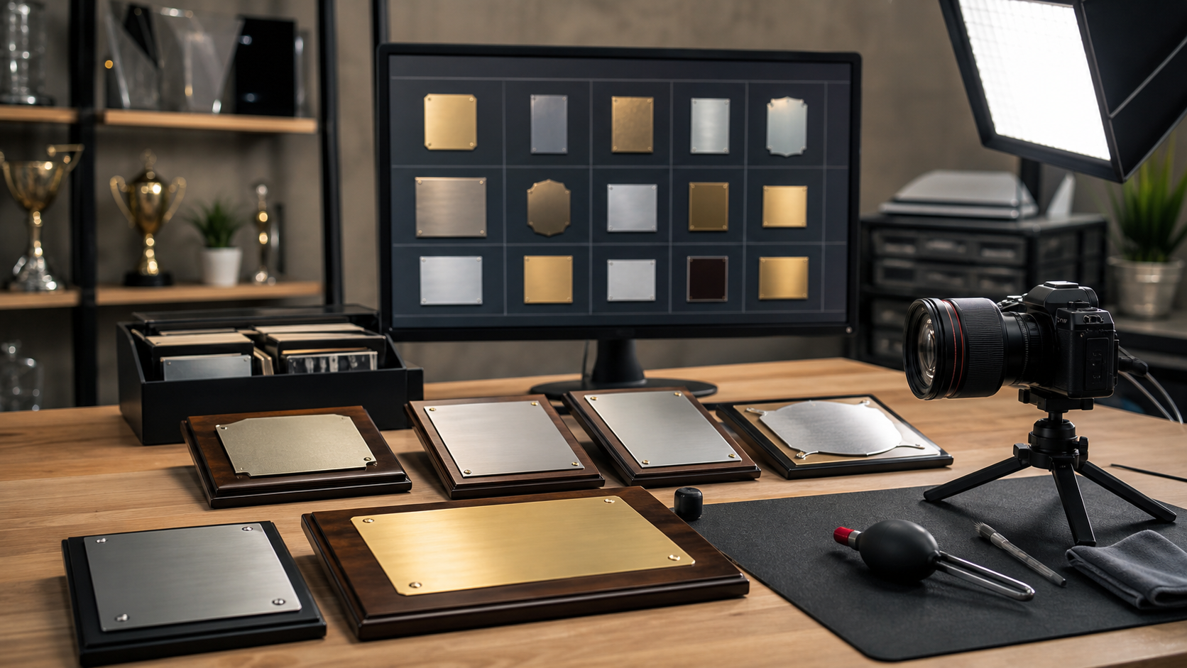
Build a Repeatable Capture Set
Consistency is more important than drama. Use a neutral background, steady light, and a camera position you can repeat. A gray, white, or matte black board is better than a wood desk, colored table, or patterned surface. The background should not compete with the sample or tint the image.
Place the disputed item, reference item, color card, and ruler in the same plane whenever possible. If one object is closer to the camera, it may appear brighter or sharper, which can mislead reviewers. Keep glossy pieces angled slightly to reduce glare, but do not angle one sample differently from the other unless you are deliberately showing finish behavior.
A good capture set usually includes:
- One full item photo showing the disputed piece and reference together.
- One closer comparison of the problem color area.
- One angled photo if gloss, foil, varnish, laminate, or texture is part of the concern.
- One batch spread if multiple units vary from each other.
- One packaging or carton identifier photo if traceability matters.
Do not crop too tightly at capture time. Leave room around the object so you can straighten and crop later without cutting off context.
Lighting That Keeps the Discussion Fair
Use one broad light source if you can. Indirect daylight near a window can work, but it changes quickly and may be too blue or too warm depending on time of day. A softbox, LED panel, or evenly lit office area is often easier to repeat. Turn off mixed light sources if possible. A sample lit by window light on one side and warm ceiling light on the other will be difficult to interpret.
Avoid flash unless you know how to diffuse it. Direct flash can flatten texture, create hot spots, and make coatings appear harsher than they look in normal viewing. For reflective packaging, move the light rather than chasing the glare with heavy edits.
Take a quick test shot and check for clipped highlights. If a white label area is blown out, color comparison in nearby areas becomes less trustworthy.
Camera Settings for Practical Evidence
A recent phone camera is usually good enough if you control the setup. Use the main lens, not ultra-wide. Tap to focus on the print surface. Lock exposure if your camera app allows it. Avoid portrait mode, beauty filters, vivid color modes, and automatic document enhancement. Those features are designed to make images pleasing, not neutral.
If your phone saves both HEIC and JPEG, use the format your team can open reliably. You can convert later with an image converter if needed. For shared review, standard JPEG or PNG files are usually safer than niche camera formats. Convert copies with Convert Image rather than overwriting the originals.
Name Files So the Evidence Survives Handoff
File names are not cosmetic in a dispute pack. They help the vendor, account manager, or internal reviewer connect images to samples without opening every file.
Use a simple pattern:
project_item_batch_view_sequence.ext
Examples:
tea-carton_batch-a_full-reference_01.jpgtea-carton_batch-a_blue-panel-closeup_02.jpgtea-carton_batch-b_batch-spread_03.jpgtea-carton_carton-label_traceability_04.jpg
Avoid names like IMG_4831_final_FINAL.jpg. Also avoid putting private customer names or contract terms in filenames if the pack may be forwarded externally.
If you receive images from several people, normalize the names before assembling the packet. That small step prevents the review file from becoming a pile of disconnected uploads.
Prepare Images Without Weakening the Evidence
Editing for clarity is acceptable. Editing that changes the disputed color is not. The safest edits are rotation, cropping, resizing, light compression, and format conversion. More subjective edits, such as saturation, warmth, selective color, sharpening, and AI replacement, should be avoided on evidence images unless they are clearly labeled as illustrative copies.
Start by preserving originals in a separate folder. Work only on copies. Then straighten the sample so edges align naturally. Crop enough to remove distraction, but keep the reference card or approved sample visible in comparison shots. If you need a tight closeup, include both a context image and the closeup.
For large camera files, resize review copies so they open quickly in email and browsers. A long edge of 1800 to 2400 pixels is often enough for review while keeping details readable. Use Resize Image for copies that need consistent dimensions across the pack.
Compression should be gentle. Heavy JPEG compression can create color blocks, edge noise, and false banding in flat printed areas. If you need to reduce file size, test one image first with Compress Image, then zoom into the disputed color area before applying the same setting to the rest.
Edits to Avoid
Some edits make a photo look better but reduce its value as evidence:
- Auto enhance, because it may change contrast and saturation globally.
- Selective color correction, because it changes the disputed subject directly.
- Background replacement, because edge spill and reflections may shift perception.
- Heavy sharpening, because it can exaggerate halftone dots and print texture.
- Beauty, food, or product presets, because their purpose is visual appeal.
- Cropping out the reference, because the comparison loses its anchor.
If you must create a cleaned presentation image for a slide or internal summary, keep it separate from the evidence set. Label it as a presentation copy in the surrounding notes.
Use AI Editing Only for Non-Evidence Copies
AI photo editing can be useful for removing a distracting desk object, extending a neutral background, or preparing an internal illustration. It should not be used to modify the actual evidence image that supports a color claim. If you use AI Photo Editor, create a separate copy and do not use it as the source of truth for the dispute.
A simple rule keeps the pack credible: evidence copies may be cropped, resized, converted, and lightly compressed; AI-edited copies are for communication only. Never use AI to recolor a disputed area, reconstruct missing print, remove glare from the exact color patch under review, or generate a cleaner version of a defect.
This is not because AI tools are bad. It is because the question is about what physically arrived. The evidence should stay close to the capture.
Create Comparison Frames That Reviewers Understand
A comparison frame is a single image that places the disputed item and reference in one view. It can be more useful than sending two separate photos because lighting, scale, and context are easier to judge.
For each comparison frame, include one clear purpose. Do not try to show every issue in one image. A good frame might compare the front blue panel of two cartons, the black ink density on two hang tags, or the warmth of a cream label against the approved sample.
Keep the layout plain. Put the reference and disputed sample side by side, with the color card visible if available. If you add arrows or annotations, use them sparingly. Annotations can help identify the exact area, but too many overlays become distracting. If annotations cover the print, create an unmarked version too.
For teams that need text from labels, batch stickers, or small printed identifiers, use Image OCR on a separate copy. OCR can help capture lot numbers or product codes for notes, but it should not replace the photo itself.
Create a Review Packet That Travels Cleanly
Once the images are prepared, assemble them into a packet that another person can open without special software. A PDF is often the easiest format because it preserves order, keeps images together, and can be attached to an email or ticket.
Use Image to PDF to turn selected images into a single review document. Put the broad context images first, then closeups, then batch spreads, then traceability photos. If you have separate documents such as a vendor form, signed proof scan, or delivery note, combine them with PDF Merge after the photo pages.
A useful order looks like this:
- Cover page or first image showing the main disputed item beside the approved reference.
- Full item comparison.
- Closeup of the disputed color area.
- Finish or angle photo if glare, varnish, foil, or laminate matters.
- Batch spread showing variation across units.
- Carton label, shipment label, or production identifier.
- Related proof, spec sheet, or vendor document if available.
The packet should be easy to scan in two minutes. If it takes ten minutes to understand what is being disputed, simplify it.
Keep a Source Folder Beside the PDF
The PDF is for review. The source folder is for traceability. Keep original photos, prepared image copies, and any notes together. If the dispute escalates, you may need to provide the untouched files.
A simple folder structure works well:
originalsreview-copiespacket-pdfnotes
Put a plain text note in the folder with capture date, location, camera or phone model if known, lighting description, and the name of the person who captured the images. This does not need to be formal. It just needs to prevent confusion later.
Decision Table: What to Send for Each Dispute Type
Different color disputes need different evidence. Sending too much can bury the useful part. Sending too little can force another round of photos.
| Dispute type | Must include | Helpful extra | Avoid |
|---|---|---|---|
| Whole package looks too dark | Full item beside approved reference | Gray card and exposure-stable closeup | Auto brightened copies |
| One spot color looks wrong | Closeup of exact area with reference visible | Original artwork screenshot as context | Screen-only comparison |
| Batch variation | Several units in one frame | Unit or carton identifiers | Single isolated closeup |
| Gloss or coating concern | Angled photo under even light | Straight-on photo for context | Removing glare digitally |
| Label stock appears warmer | Reference sample on same background | Edge view showing material | Mixed lighting |
| Small printed code is questioned | Closeup plus OCR notes | Full item for location | OCR output without photo |
Use the table as a packing checklist before sending the file. If a row says the evidence needs a batch spread, do not rely on one dramatic closeup.
A Practical Capture Checklist
Before you send the pack, run through this checklist. It catches most avoidable problems.
- The approved reference or accepted sample is visible where available.
- The disputed area appears in both a context image and a closeup.
- Lighting is even, with no obvious color cast from mixed sources.
- The background is neutral and not visually distracting.
- File names identify item, batch, view, and sequence.
- Originals are preserved separately from edited review copies.
- Review copies are not auto-enhanced or recolored.
- Compression has not damaged flat color areas or fine print.
- The PDF pages are in a logical order.
- Traceability photos are included if batch, shipment, or vendor follow-up matters.
This list is intentionally plain. In print disputes, boring documentation usually beats beautiful documentation.
Example: Label Blue Looks Different Across Two Shipments
Imagine a tea brand receives a second shipment of carton labels. The blue side panel appears slightly purple compared with the first accepted shipment. The team needs to decide whether to ask the vendor for a technical review.
A weak evidence set would be three phone photos taken under office lights, each attached separately with names like image1.jpg and image2.jpg. One photo is close, one is angled, and one has the label on a warm wood table. The vendor can see that something might be different, but cannot tell whether lighting or camera behavior is responsible.
A stronger pack would include the accepted first-shipment label beside the disputed second-shipment label on a neutral board. A color card sits in the frame. The first page shows both full labels. The second page crops into the blue panel while keeping both labels visible. The third page shows five labels from each shipment in a grid, making batch consistency easier to assess. The fourth page shows carton identifiers.
The note says: captured July 5, 2026, indirect daylight blocked, LED panel used, phone main camera, no auto enhancement, review copies resized only. That is enough for a practical first review. The vendor may still request physical samples or measurements, but the conversation starts from shared evidence.
Common Mistakes That Slow Down Resolution
The biggest mistake is sending only the most dramatic photo. A closeup can make a color problem look obvious, but without context it may also exaggerate the issue. Always pair a closeup with a broader view.
The second mistake is mixing captures from different environments. If one team member photographs the approved proof near a window and another photographs the disputed item in a warehouse, the comparison is weak. When possible, have one person photograph both items in the same session.
The third mistake is over-editing. People often try to make the photo match what their eye saw. That instinct is understandable, but it creates a new problem: reviewers no longer know where capture ends and interpretation begins. Keep edits mechanical and minimal.
The fourth mistake is compressing the pack until it is too small. A 300 KB PDF may be easy to email, but if flat colors are blocky and fine edges are smeared, it will not support a careful review. Reduce size only as far as the dispute allows.
Final Handoff Notes for Vendors and Internal Teams
When sending the packet, write a short message that identifies the concern without overstating it. For example: The attached photo pack compares the approved carton sample with units from shipment B. The blue side panel appears warmer and more purple under the same capture setup. Please review pages 2 and 3 for the closest comparison and page 5 for carton identifiers.
That kind of note is more useful than The color is wrong. It points the reviewer to the evidence and leaves room for technical evaluation.
Also include whether physical samples are available. If they are, say how many and from which cartons. A photo pack can get the discussion moving, but print vendors often need the actual item to confirm root cause.
The Standard to Aim For
A strong calibration photo pack is consistent, modest, and easy to inspect. It does not pretend a phone camera is a lab instrument. It does not hide the setup. It shows the disputed print beside the best available reference, keeps edits minimal, and packages the images in an order that supports review.
For small teams, that standard is achievable without specialized layout software. Capture carefully, prepare copies with restraint, convert formats only when needed, and assemble the final PDF so it travels cleanly. The result is a calmer, more useful discussion about what changed, what can be verified, and what should happen next.