Mobile-First Technical Screenshots: A Preflight Guide for Documentation Teams
A practical guide for preparing readable mobile-first technical screenshots, with capture rules, crop decisions, compression checks, and handoff standards for documentation teams.
Mobile-First Technical Screenshots: A Preflight Guide for Documentation Teams
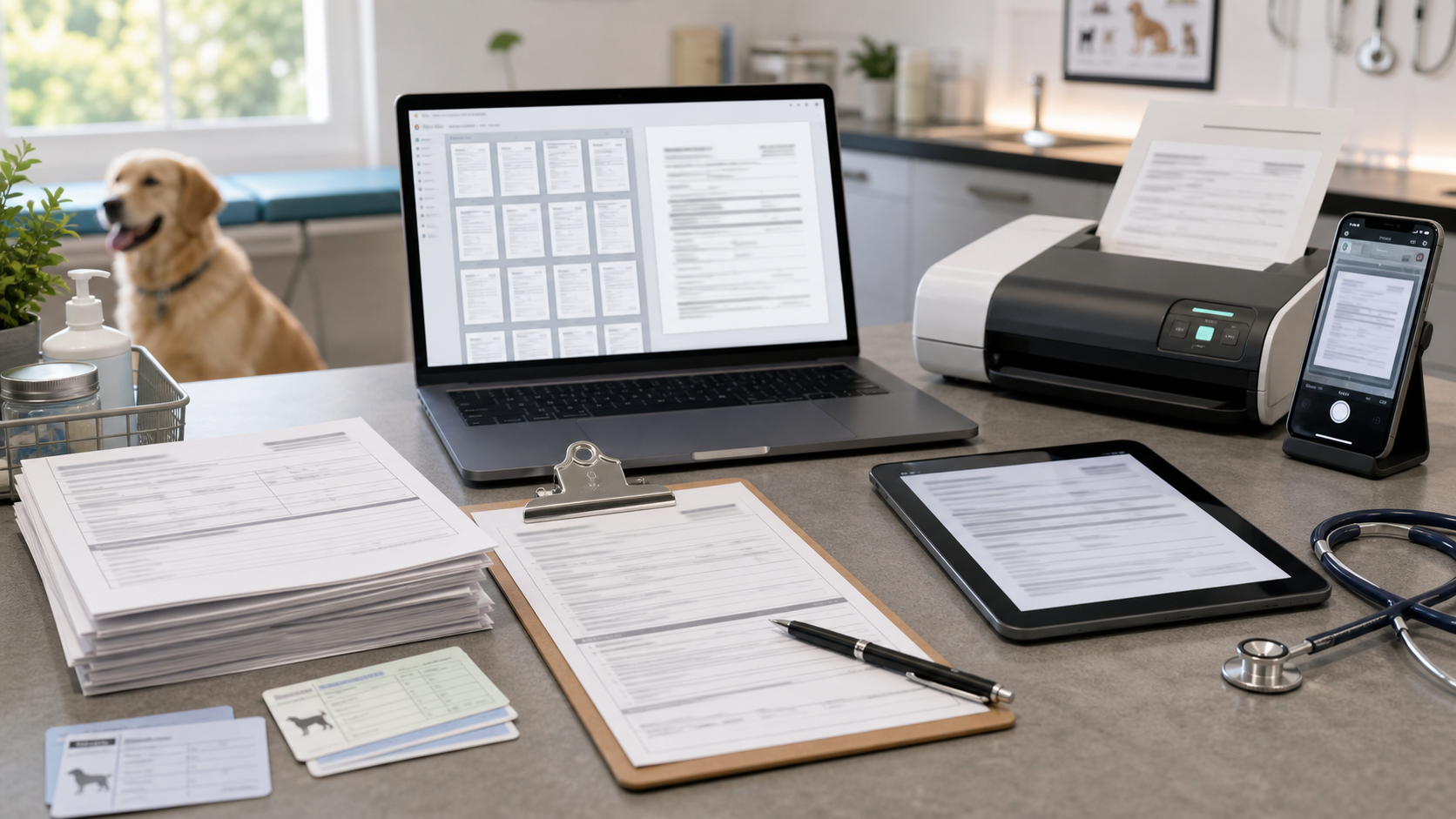
Technical screenshots are often captured on a large monitor and then placed into documentation that most readers open on a phone. That mismatch creates a quiet readability problem: tiny UI labels, cropped menus, fuzzy icons, and images that look acceptable in the editor but fail inside a mobile help article.
This guide is for documentation teams, support writers, developer advocates, product marketers, and solo founders who publish technical instructions with screenshots. The goal is not to make screenshots decorative. The goal is to make them useful on the smallest reasonable screen without damaging clarity, page speed, or trust.
A good mobile-first screenshot is not simply a smaller screenshot. It is a deliberate visual excerpt. It shows enough surrounding interface to orient the reader, removes everything that does not help the next action, preserves thin text and UI lines, and exports in a format that survives compression.
Use this preflight guide before publishing product docs, changelog notes, setup tutorials, troubleshooting articles, onboarding guides, or internal runbooks that include interface captures.
The Mobile Screenshot Problem Is Mostly About Context
Most unreadable documentation screenshots fail for one of two reasons: they show too much, or they show too little.
A full desktop capture often includes the browser chrome, side navigation, unrelated panels, a crowded toolbar, hidden account data, and a tiny target area. On desktop, a reader may zoom mentally and still understand the image. On mobile, the same capture becomes a gray rectangle with scattered colored marks.
A screenshot that is cropped too tightly has the opposite problem. It may show the exact button or setting, but the reader cannot tell where it lives. If the article says “open the export menu,” and the image only shows a floating menu with no nearby product landmarks, the reader has to guess whether they are in the right place.
Mobile-first screenshot preparation is about keeping the minimum useful context.
For most technical articles, keep these three zones visible:
| Zone | What it gives the reader | Typical crop rule |
|---|---|---|
| Product landmark | Confirms the right page, panel, or state | Include a nearby heading, tab, sidebar item, or unique control |
| Action target | Shows the exact button, field, toggle, menu, or message | Keep it large enough to read without zooming |
| Boundary clue | Shows where the element sits in relation to the interface | Leave a small amount of surrounding UI on at least two sides |
If a screenshot cannot preserve all three zones at mobile size, split it into two images: one orientation image and one action detail image. That is usually clearer than forcing a single wide capture into a narrow article column.
Capture the Right Source Before Editing
The strongest screenshot edits start before the screenshot tool opens. If the source capture is messy, every later step becomes damage control.
Before capturing, set up the product state intentionally:
- Use demo data that is realistic but not private.
- Collapse panels that are not relevant to the instruction.
- Close notification banners, chat widgets, cookie prompts, and browser extensions.
- Set the browser zoom to 100 percent unless the docs have a specific reason to show another zoom level.
- Use a clean viewport that matches a common reader environment.
- Avoid capturing during loading states unless the loading state is the subject.
For web apps, a good default capture width is often between 1200 and 1440 pixels. That gives enough detail for cropping while avoiding huge files. For mobile app documentation, capture from the actual device size or emulator size you expect readers to recognize. Do not stretch a mobile screenshot to look like desktop content.
If you need a smaller final image, resize after cropping. Cropping first protects the useful pixels. Resizing first throws away detail that you may still need.
Decide Whether the Screenshot Should Be Wide, Tall, or Detail-Only
A screenshot should match the job it performs in the article. Documentation images usually fall into three shapes.
| Screenshot type | Best for | Risk | Better approach |
|---|---|---|---|
| Wide orientation capture | Showing where a feature lives in a larger interface | Small labels become unreadable on mobile | Crop around one page region, not the whole monitor |
| Tall mobile capture | Showing a sequence inside a phone-sized UI | Article page becomes visually heavy | Use only when vertical position matters |
| Detail crop | Showing a specific control, field, error, or result | Reader may lose location context | Include a nearby landmark or pair with an orientation image |
A setup guide may need one orientation capture at the start of a section, followed by detail crops for the steps. A troubleshooting article may need the opposite: a close view of the error first, then a wider screenshot that shows where to fix it.
When in doubt, ask one practical question: what should the reader do immediately after seeing this image? If the image does not answer that, crop again or remove it.
Crop for the Article Column, Not the Design Tool
Screenshots often look sharp in a design tool because the canvas is large and the viewer is close to the image. The real test is the article column.
A mobile documentation page may display the image at 320 to 390 CSS pixels wide. If the original screenshot contains a 14-pixel UI label inside a 1440-pixel-wide capture, that label can become unreadable after scaling. The issue is not only compression. It is geometry.
Use this practical crop sequence:
- Identify the target control or state.
- Keep one product landmark near it.
- Remove unrelated panels, empty canvas, browser chrome, and repeated navigation.
- Preserve a small margin so the screenshot does not feel clipped.
- Resize only after the crop communicates the action.
- Preview it at the width where the article will display it on mobile.
ConvertAndEdit’s resize image tool is useful after you have the right crop and need consistent display sizes across a documentation set. For example, you might standardize detail crops at 900 pixels wide and orientation crops at 1200 pixels wide, then let the article layout scale them down responsively.
Do not crop every screenshot to the same aspect ratio just for visual neatness. Documentation images should be consistent, but the instruction comes first. A setting panel may need a tall crop. A toolbar action may need a shallow horizontal crop. A modal may need a balanced rectangle.
Use Annotations Carefully
Annotations can help, but they can also make a screenshot less trustworthy. A big arrow, colored box, or numbered marker may cover the exact UI detail the reader needs. On mobile, annotations compete with interface text for space.
Use annotations when they reduce effort, not when they decorate the capture.
Good uses:
- Highlighting a small icon that has no label.
- Calling attention to a menu item in a dense list.
- Showing the difference between two similar states.
- Marking an area that users commonly miss.
Weak uses:
- Pointing at an obvious primary button.
- Adding multiple arrows to a simple screen.
- Covering labels or values.
- Using colors that conflict with the product’s own warning or success states.
If the screenshot needs more than two annotations, consider breaking the step into smaller images. Dense annotation is usually a signal that the article is asking one image to do too much.
Format Choice: PNG, WebP, or JPEG
Technical screenshots are not like photos. They contain flat color, sharp edges, small text, thin borders, and icons. Format choice matters.
| Format | Use it for | Avoid it when |
|---|---|---|
| PNG | Small UI crops, transparent overlays, images with lots of text | The file becomes too heavy for long articles |
| WebP | Most documentation screenshots after quality testing | Your publishing system or audience cannot reliably display it |
| JPEG | Photo-heavy captures or mixed images with real-world content | The screenshot contains thin UI text, code, diagrams, or icons |
PNG is often the safest editing source because it preserves crisp edges. WebP is often the better publishing format because it can reduce weight while keeping UI detail acceptable. JPEG can work for photo-like material, but it tends to create artifacts around small text and flat interface colors.
If you have a PNG source and need a lighter web asset, try ConvertAndEdit’s convert image tool to test WebP output. Keep the PNG source in your documentation asset folder if your team may need to revise annotations later.
The rule is simple: edit from a clean source, publish the smallest version that still reads clearly.
Compression Checks for Thin Text, Icons, and UI Lines
Compression problems often hide until the article is live. The screenshot looks fine at full size, but once it is scaled down inside the page, the UI text softens and borders shimmer.
Before publishing, inspect these areas at the final display width:
- Button labels.
- Menu items.
- Code snippets inside the UI.
- Error messages.
- Form field labels.
- Icons with thin strokes.
- Divider lines and table borders.
- Badges, chips, and status indicators.
A screenshot passes the compression check when the reader can understand the action without zooming. It does not need to preserve every pixel from the source. It does need to preserve meaning.
Use ConvertAndEdit’s compress image tool when you need to reduce file size while testing visual quality. Export more than one candidate if the screenshot contains small UI text. A 40 KB difference may be worth it if the lighter file makes a command label fuzzy.
Here is a practical compression decision table:
| Symptom after compression | Likely cause | Fix |
|---|---|---|
| Text has color halos | Lossy compression is too aggressive | Increase quality or use PNG/WebP with gentler settings |
| Thin lines disappear | Image was resized too small or compressed too hard | Use a wider crop or larger export width |
| Icons look muddy | Source was captured at low resolution | Recapture or export from a higher-density display |
| Flat backgrounds show blocks | Low-quality JPEG-style artifacts | Try WebP or PNG depending on file size |
| The whole image feels soft | Resizing happened too early | Crop from the original source, then resize once |
Avoid repeatedly exporting the same screenshot through multiple tools. Each lossy export can add damage. Keep one clean source, then create final delivery versions from that source.
Redaction Without Breaking Trust
Technical screenshots often include customer names, emails, API keys, internal URLs, workspace names, order numbers, or support ticket IDs. Redaction should be handled before the image enters a public article.
The best redaction is not a blur added at the end. It is a clean demo state that never contains sensitive data. When that is not possible, cover sensitive regions with solid shapes that clearly indicate removal. Blurs can be risky because they may preserve recoverable patterns, and they often make the image look careless.
Check these locations before publishing:
- Browser address bar.
- Account menu.
- Avatar initials.
- Workspace switcher.
- Sidebar project names.
- Table rows and record IDs.
- Search queries.
- Notifications.
- Hidden panels that became visible in the crop.
If redaction removes too much context, recreate the screenshot with demo data. Documentation should not feel like a censored production incident report unless the article is specifically about incident review.
When OCR Helps Documentation Teams
OCR is useful when screenshots are part of a larger documentation audit. For example, a team may need to locate all images that mention an old feature name, deprecated setting, or retired pricing tier. Manually inspecting every screenshot in a large help center is slow.
ConvertAndEdit’s image OCR tool can help extract visible text from screenshot files during an audit. OCR will not understand every icon or layout, but it can surface strings that need review.
Useful OCR checks include:
- Finding outdated product names in screenshots.
- Detecting old navigation labels after a redesign.
- Searching for private domains or internal project names.
- Checking whether a screenshot still shows a retired button label.
- Building a rough index of screenshot content for a migration project.
OCR is not a replacement for visual QA. It is a fast way to decide which images deserve human attention.
Build a Screenshot Preflight Checklist
A good checklist keeps screenshot quality consistent across multiple writers and release cycles. It should be short enough that people actually use it.
Use this preflight list before adding a screenshot to a technical article:
| Check | Pass condition |
|---|---|
| Purpose | The image supports a specific step, state, comparison, or result |
| Context | The reader can tell where they are in the product |
| Crop | Irrelevant interface areas are removed |
| Mobile readability | The image is understandable at mobile article width |
| Privacy | No real customer, account, token, or internal data is visible |
| Format | PNG, WebP, or JPEG is chosen based on screenshot content |
| File weight | The image is not heavier than its instructional value justifies |
| Consistency | Similar screenshots in the article use similar treatment |
| Alt text | The alt text describes the image’s instructional purpose |
| Source retained | A clean editable source remains available for future updates |
The final item matters more than many teams expect. Product UI changes constantly. If you only keep compressed final files, future edits become slower and worse. Store clean source captures separately from published exports.
Naming Files So Future Editors Can Find Them
Screenshot file names should help future maintenance. A file called image-12-final-new.png tells the next editor almost nothing. A useful name includes the feature, screen, state, and size or crop type.
Example pattern:
feature-area_screen-name_state_crop-width.format
Examples:
billing_invoice-settings_tax-toggle_900w.webpproject-import_csv-error-detail_800w.pngadmin-users_role-menu-orientation_1200w.webp
Keep names lowercase, use hyphens where possible, and avoid dates unless the screenshot is tied to a specific release. If your documentation platform rewrites asset names, keep the original source files organized in a shared folder with the same naming logic.
Alt Text for Technical Screenshots
Alt text should describe the useful content of the screenshot, not every visible pixel. It should help someone understand why the image is present.
Weak alt text:
- “Screenshot”
- “Settings page”
- “Image of dashboard”
Better alt text:
- “Export menu showing the CSV option selected”
- “Account settings panel with the two-factor authentication toggle enabled”
- “Error message shown after uploading a CSV file with missing headers”
Avoid stuffing alt text with keywords. Also avoid writing step instructions only in the image. The surrounding article should carry the instruction, while the image supports it.
Preparing Screenshot Sets for PDF Handoffs
Sometimes documentation screenshots need to become a review packet for legal, compliance, localization, training, or support teams. In that case, single web images may not be enough.
A PDF handoff can be useful when reviewers need to comment on a fixed sequence of screenshots. ConvertAndEdit’s image to PDF tool can help turn a prepared set of images into a single review file. This is especially useful when the reviewer does not work inside the documentation system.
Before creating a PDF packet, make sure the screenshots are already cropped, named, and ordered. A PDF should not become a dumping ground for raw captures. It should represent the same quality bar as the final article.
A simple packet order might be:
| Page | Content |
|---|---|
| 1 | Article title and screenshot inventory |
| 2 | Orientation screenshot for the feature area |
| 3-6 | Step detail screenshots in article order |
| 7 | Edge states, errors, or alternate permissions |
| 8 | Notes for replacement images or pending UI changes |
If the packet becomes long, split it by article section or product area. Reviewers are more accurate when the visual set is focused.
Common Mistakes That Make Screenshots Feel Unprofessional
The most damaging screenshot mistakes are usually small.
One common mistake is leaving browser chrome visible when it adds nothing. Browser tabs, bookmarks, extension icons, and address bars distract from the product. Keep them only when the URL or browser state is relevant.
Another mistake is mixing visual styles inside one article. If one screenshot has thick red arrows, another uses yellow boxes, and another has no annotation at all, the article feels assembled from fragments. Decide on a light annotation style and apply it consistently.
A third mistake is over-compressing screenshots because page speed is important. Page speed is important, but a fast-loading unreadable screenshot is still a failed screenshot. Compress with judgment. Remove unnecessary images first, crop tighter second, and tune compression third.
Finally, many teams forget to update screenshots after interface copy changes. A button renamed from “Export” to “Download” may seem minor, but it can make a help article feel stale. OCR audits and source file naming make these updates easier.
A Practical Publishing Pass
Use this short publishing pass after the article is drafted but before it goes live:
- Open the article preview on a phone-sized viewport.
- Read the article without zooming any screenshot.
- For every image, ask whether it helps the next action.
- Replace full-screen captures with focused crops where needed.
- Check that sensitive data is absent, not merely blurred casually.
- Confirm that image weight is reasonable for the article length.
- Verify alt text and file names.
- Keep clean source images in the team’s asset folder.
This pass often takes less than ten minutes for a short article and prevents many support questions later. It also makes the documentation feel calmer. Readers do not notice every good crop or compression choice, but they do notice when screenshots make instructions easier to follow.
Final Takeaway
Mobile-first technical screenshots are a clarity tool. They should reduce uncertainty, not simply prove that a screen exists.
Capture clean source images, crop around the reader’s next action, preserve enough context to avoid confusion, compress only after checking thin UI details, and keep source files organized for future updates. A documentation team that treats screenshots as maintained assets will publish articles that age better, load faster, and help readers complete the task with less guessing.