Subtitle-Safe Vertical Crop Workflow for Product Demo Clips
A practical workflow for turning landscape product demo recordings into vertical clips without cutting off captions, cursors, UI labels, or key product moments.
Subtitle-Safe Vertical Crop Workflow for Product Demo Clips
Product demo clips are often recorded in the most convenient format for the person making them: a full browser window, a desktop app, or a wide screen capture with plenty of horizontal space. That makes sense during recording. The problem begins when the same clip needs to become a vertical asset for a landing page, social post, changelog, help article, sales follow-up, or mobile-first product announcement.
A simple center crop rarely works. It cuts off side panels, hides button labels, removes the cursor path, and leaves subtitles competing with the very interface the viewer is supposed to understand. The result is a video that technically fits a vertical format but feels broken: the viewer can see movement, yet not the meaning.
This guide focuses on a narrow but common problem: how to crop product demo recordings into vertical clips without losing subtitles, cursor context, UI labels, or the product moment. It is written for small teams that do not have a motion designer rebuilding every demo from scratch. The goal is a repeatable workflow that works for browser tools, SaaS dashboards, mobile app walkthroughs, admin panels, and recorded support flows.
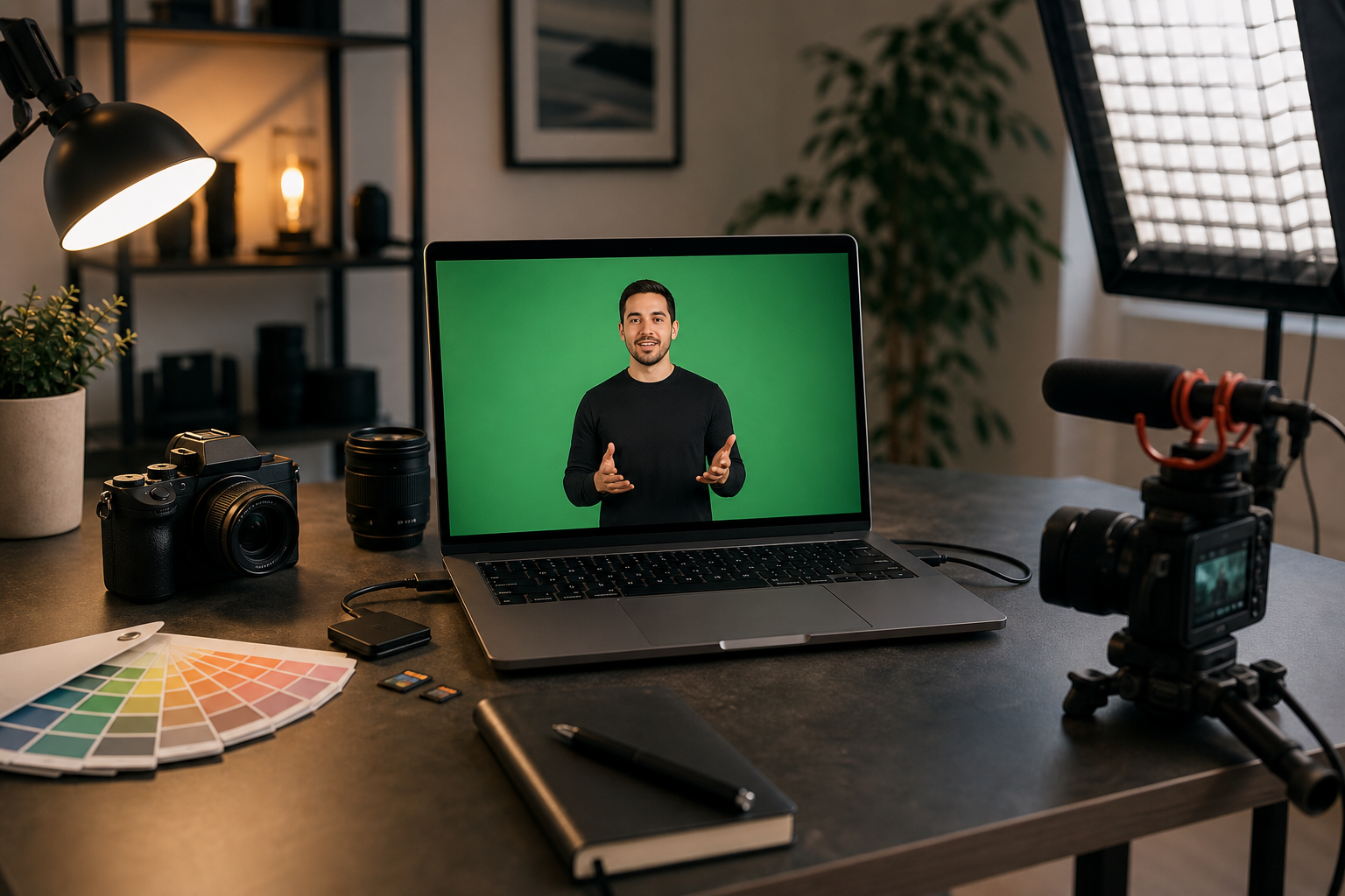
You can use this process whether you edit in a full video editor or a lightweight browser workflow. ConvertAndEdit tools such as Video to Subtitles, Convert Image, Resize Image, and Compress Image can support the preparation and asset cleanup steps around the video itself.
The Vertical Crop Problem Is Usually a Caption Problem

When teams talk about cropping a landscape demo into vertical video, they usually describe it as a framing issue. The frame is too wide, so they need to choose what part stays visible. That is true, but incomplete.
The harder problem is that captions, cursors, tooltips, dropdowns, notification banners, and product UI all want the same space. In a 16:9 screen recording, captions can sit comfortably at the bottom. In a 9:16 crop, the bottom area may already contain a sticky toolbar, modal buttons, table pagination, chat widget, timeline, or mobile browser controls. If subtitles are burned in after the crop, they may cover the action. If they are burned in before the crop, they may get cut off.
That is why subtitle-safe cropping needs a different order of operations. You are not just choosing a rectangle. You are deciding where the viewer's eye should go, where subtitles can live, and which UI areas must remain legible.
A good vertical product demo has three things visible at the same time:
- The active product area where the important change happens.
- The supporting context that explains what the viewer is seeing.
- The captions or subtitle area that lets the video work without sound.
If any one of those disappears, the clip becomes weaker. A beautiful crop with unreadable captions fails. A caption-perfect crop that hides the clicked button also fails. A recording that keeps the full app visible but shrinks it into tiny vertical mush fails in a different way.
The practical solution is to plan the crop around safe zones before subtitles are finalized.
Start With the Destination, Not the Recording
Before touching the video, define where the clip will appear. Vertical video is not one format. A clip for a landing page embed has different needs than a clip for a short-form social feed. A clip inside a support article has different needs again.
Use this decision table before editing:
| Destination | Best framing priority | Subtitle placement | Typical risk |
|---|---|---|---|
| Landing page product demo | Product action and clean UI | Lower third or side-safe bottom band | Captions covering CTA buttons |
| Changelog post | Before-and-after feature moment | Compact lower third | UI text too small after crop |
| Social short | Motion, cursor, emotional clarity | Large burned-in captions | Crop cuts off context panels |
| Help center article | Step clarity and readable labels | Minimal captions or callout support | Viewer cannot follow exact steps |
| Sales follow-up clip | Outcome and customer-relevant screen | Clean captions with breathing room | Recording includes too much setup |
This table matters because the same source recording may need two versions. A social version can be tighter and more dramatic. A help center version should be less cropped and more readable, even if it feels slower. A landing page version may need cleaner pacing and less visible setup.
If you decide the destination after editing, you often end up patching problems with awkward zooms, excessive caption movement, or repeated exports. Decide first.
Record With a Vertical Edit in Mind
The easiest vertical crop is the one you planned before recording. That does not mean recording in vertical format every time. For many product demos, a landscape capture is still better because the interface was designed for desktop. But you can record in a way that leaves options.
Use these recording habits:
- Keep the browser or app window narrower than your full monitor when possible.
- Avoid placing key actions at the far left or far right edge.
- Move slowly enough that a crop can follow the action without feeling frantic.
- Pause briefly after clicks so captions and UI changes have time to register.
- Hide unnecessary sidebars, bookmarks, extensions, and personal workspace clutter.
- Use realistic zoom levels so labels survive compression later.
A common mistake is recording a full 2560px-wide monitor and assuming the editor can rescue it. A vertical crop from a very wide canvas may only show one narrow strip of the product. If the important action moves across the screen, the crop has to chase it. That creates a restless video, especially once subtitles are added.
For many desktop product demos, a browser window around 1280 to 1440 pixels wide is easier to crop than a full ultrawide workspace. It leaves enough interface context while keeping the active area closer to the center.
If you need thumbnail stills, title frames, or documentation images from the same recording, capture clean screenshots separately. You can resize them with Resize Image or convert formats with Convert Image without depending on video frames that may include motion blur.
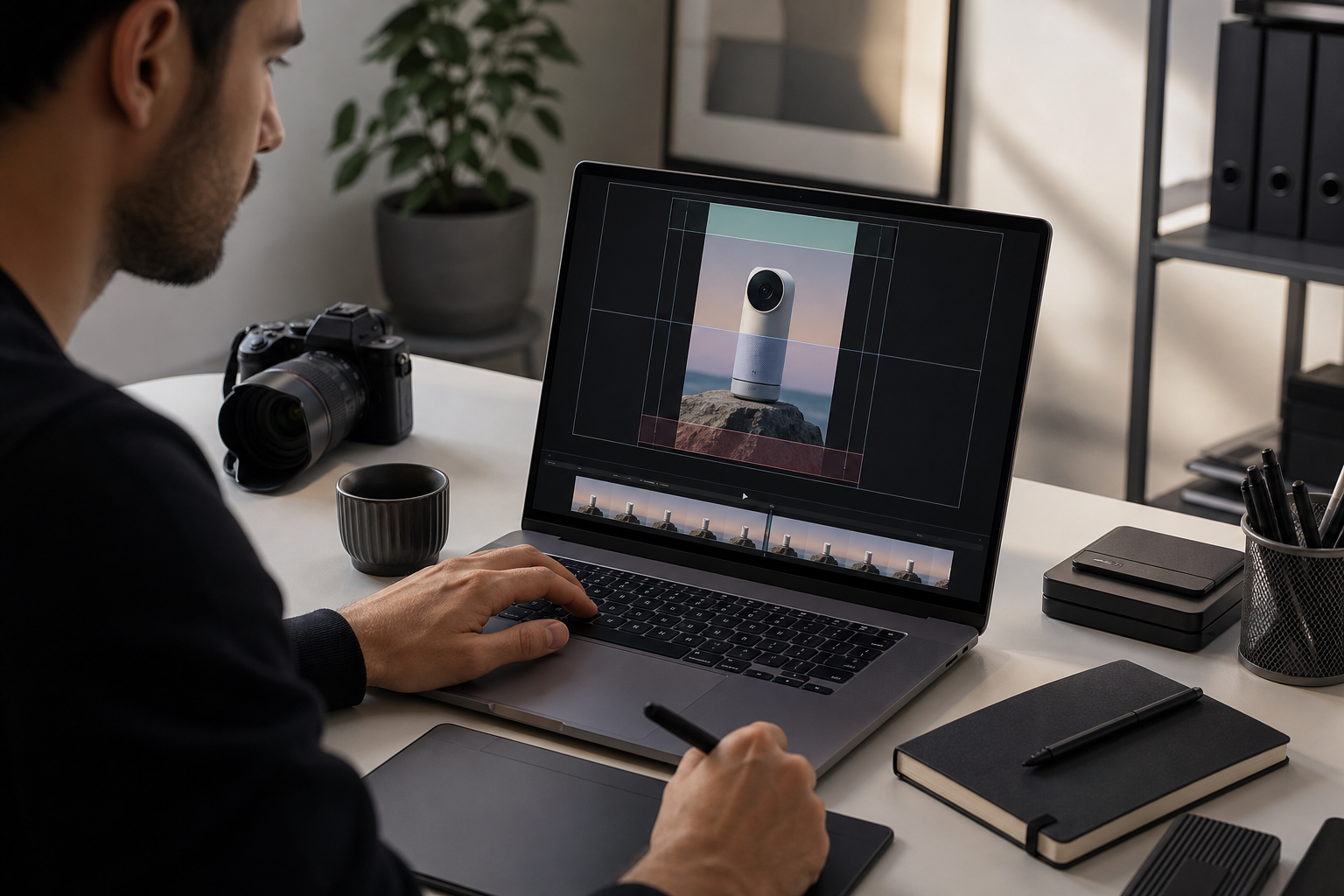
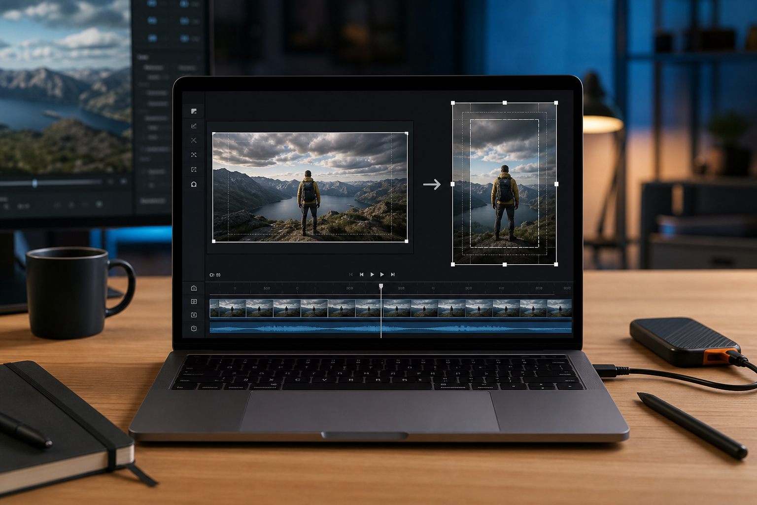
Choose the Right Crop Strategy
There are four useful crop strategies for vertical product demos. Pick one before you start moving clips around.
| Strategy | When to use it | Strength | Weakness |
|---|---|---|---|
| Center crop | Main action stays near the middle | Fast and consistent | Fails when UI is spread out |
| Anchored crop | Action is usually on one side | Preserves a panel or preview area | Can feel unbalanced |
| Guided pan crop | Action moves across the interface | Keeps important moments visible | Requires more review |
| Rebuilt vertical layout | High-value demo or launch asset | Most polished | Takes the most work |
A center crop is fine for a product where the main action is central: a canvas editor, chat interface, dashboard card, or modal flow. An anchored crop works well when one region matters most, such as a preview panel on the right or a settings sidebar on the left.
A guided pan crop follows the cursor or active UI region. Use it carefully. Too much panning makes the video feel like the camera is lost. It is better to use fewer, slower crop shifts than constant tracking.
A rebuilt vertical layout means arranging the demo footage, captions, background, and supporting screenshots into a purpose-built vertical composition. This can be worth it for launch announcements, ads, or a homepage hero, but it is usually too heavy for routine changelog clips.
For small teams, the best default is an anchored crop with one or two planned crop shifts. It gives you control without turning every demo into a motion design project.
Map the Safe Zones Before Adding Final Captions
Do not place final subtitles until you know the crop. But do not crop blindly either. The middle step is a safe-zone pass.
A vertical frame has several zones:
| Zone | What belongs there | What should not go there |
|---|---|---|
| Top band | Light context, product header, status changes | Dense captions or tiny UI text |
| Middle focus area | Main product action | Large subtitles that block clicks |
| Lower caption band | Captions, short labels, transcript emphasis | Important buttons or form fields |
| Edge margins | Background, inactive UI, visual breathing room | Critical labels or cursor movement |
For subtitle-safe product demos, the lower caption band needs to be protected. That does not always mean captions must sit at the bottom. Sometimes a lower-middle caption position is better. Sometimes captions belong above a sticky toolbar. Sometimes the demo needs a side caption block if the product action is low in the frame.
The key is consistency. If captions jump around too often, viewers spend energy finding the text instead of watching the product. If the product has fixed bottom controls, choose a caption position that avoids them for the whole clip.
A practical rule: keep the most important UI action out of the bottom 20 to 25 percent of the vertical frame when possible. That gives subtitles room without hiding the product. If the source recording already has important action at the bottom, consider cropping higher, zooming less, or using shorter captions.
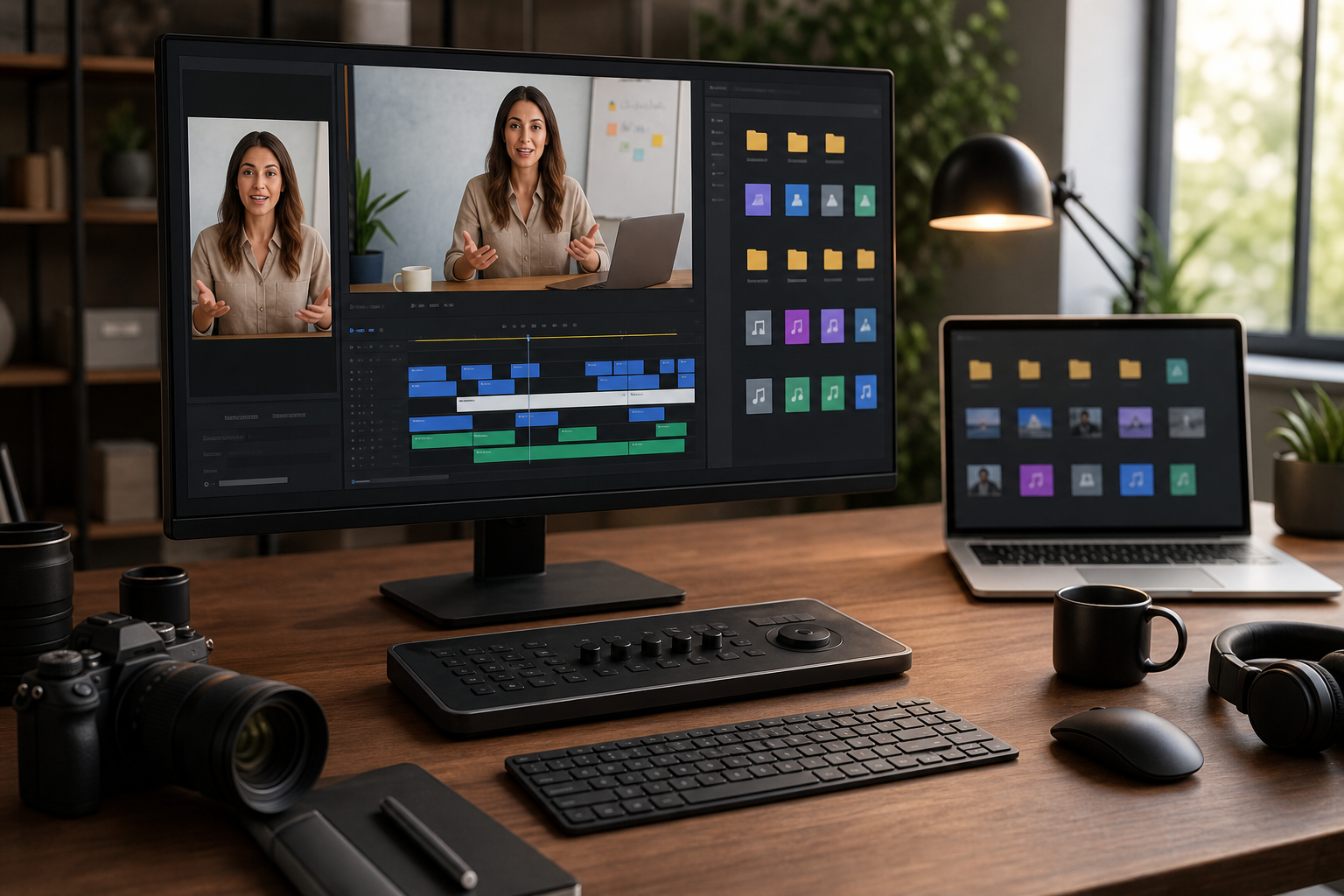
Generate or Clean the Transcript Early
Subtitles are not just an accessibility layer. In product demos, they are part of the editing structure. They reveal whether the clip has too much explanation, whether the pacing is too fast, and whether the visual action matches the spoken narration.
Use Video to Subtitles early in the process to create a transcript or subtitle file from the source recording. Even if you later edit the captions manually, starting with a transcript helps you spot timing problems.
Look for these issues:
- A caption explains a click before the click appears.
- A long sentence covers two or three unrelated UI actions.
- A product name or feature label is misheard.
- The speaker uses filler words that make captions too long.
- The caption timing changes while a modal or dropdown is opening.
For vertical clips, shorter captions are usually better. A wide landscape video can tolerate longer subtitle lines. A vertical clip cannot. Two short caption lines are easier to read than a dense three-line block, especially on mobile.
Good product demo captions often rewrite speech slightly for clarity. The goal is not to preserve every hesitation. The goal is to make the clip understandable without audio while staying faithful to the meaning.
For example:
| Spoken narration | Better vertical caption |
|---|---|
| "So now what I'm going to do is click into this export menu here." | "Open the export menu." |
| "You can see it automatically picked up the fields from the receipt." | "The fields are detected automatically." |
| "This is where we can change the size before we send it over." | "Resize before sharing." |
Do this cleanup before final layout. If a caption changes from three lines to one line, the safe-zone problem changes too.
A Repeatable Subtitle-Safe Crop Workflow
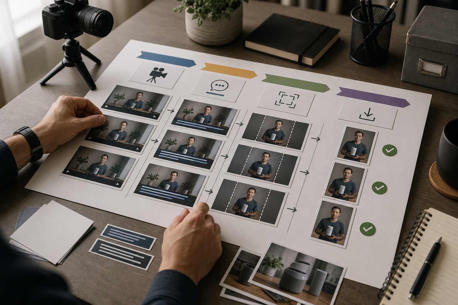
Here is a reliable workflow for converting landscape product demos into vertical clips.
1. Duplicate the Source and Keep a Master
Keep the original recording untouched. Create a working copy for vertical editing. This sounds basic, but it prevents a common problem: exporting multiple versions from a progressively degraded file.
Use the highest-quality source recording you have. Avoid starting from a compressed social upload or a messaging app copy. Product demos contain thin lines, small labels, and cursor movement. Compression damage becomes more obvious after cropping and scaling.
2. Trim the Clip Before Cropping
Remove setup time, dead pauses, login screens, repeated clicks, and anything that does not support the final point. Cropping before trimming can waste time because you may carefully frame moments that will be deleted later.
A strong vertical product clip usually focuses on one job:
- Turn a messy screenshot into clean text.
- Convert a file into a shareable format.
- Add subtitles to a muted product demo.
- Merge documents into one review package.
- Create a short GIF from a support recording.
If the clip needs to show three different jobs, consider making three clips.
3. Create a Rough Subtitle Pass
Generate a subtitle file or transcript. Clean the wording. Shorten long lines. Fix product terms. Remove filler. Keep captions close to the action they describe.
At this stage, subtitles do not need perfect styling. They just need accurate timing and approximate line length.
4. Add a Temporary Caption Box
Before final design, add a temporary caption box or placeholder where subtitles are likely to sit. This can be a simple lower band. The goal is to see collisions early.
Watch the clip once with only one question in mind: does the caption area cover anything essential?
If the answer is yes, solve it now. Do not wait until export.
5. Pick the Crop Anchor
Decide whether the crop should favor the center, left, right, top, or bottom. Product demos often work best when the crop is anchored around the active panel rather than the whole app.
For example, if the demo shows file conversion settings on the right side of a tool, do not center the entire page. Anchor the crop around the settings and preview area. If the demo shows a before-and-after image edit, anchor around the image canvas rather than the navigation.
6. Add Crop Shifts Only Where the Meaning Changes
A crop shift should happen because the viewer needs a different part of the product, not because the cursor moved a few pixels. Good moments for crop shifts include:
- Moving from file upload to preview.
- Opening a settings panel.
- Switching from timeline to export options.
- Showing a result after processing.
- Comparing before and after states.
Keep transitions calm. Fast crop moves make interface demos harder to follow.
7. Review Without Sound
Mute the clip and watch it on a small display size. This is the real test. If the video only makes sense with audio, the vertical version is not ready.
Check whether a viewer can answer these questions:
- What tool or interface is being used?
- What action is happening now?
- What changed after the action?
- Are the captions readable before they disappear?
- Does the cursor support the story or distract from it?
If you cannot answer those questions without sound, tighten the edit or captions.
8. Export a Review Version Before the Final Version
Export a medium-quality review version first. Watch it in the actual destination if possible: a phone preview, webpage draft, social scheduler, help article, or internal review doc.
Many crop problems only appear in context. A caption that looks fine in an editor may sit too close to app chrome on a phone. A product label that looked readable on a large monitor may become too small in a mobile feed.
9. Export the Final Clip From the Clean Timeline
Once the review version passes, export the final clip from the original high-quality assets, not from the review export. This helps preserve UI lines and subtitle edges.
If you also need supporting still images for the article, changelog, or social carousel, export clean screenshots separately and prepare them with image tools. For example, use Compress Image when uploading stills to a page where performance matters, or Image OCR when you need to extract text from a screenshot for documentation.
Caption Styling for Product Interfaces
Product demo subtitles should be readable without feeling like a meme caption unless the destination specifically calls for that style. The interface already has a lot of visual information. Captions should support it, not overpower it.
Use these styling guidelines:
| Caption choice | Recommended approach | Reason |
|---|---|---|
| Line count | One to two lines | Reduces UI coverage |
| Position | Stable lower band unless UI conflicts | Easier scanning |
| Font weight | Medium or semibold | Readable over interface detail |
| Background | Subtle translucent shape or shadow | Keeps text legible |
| Timing | Slightly longer than speech minimum | Allows mobile reading |
| Wording | Edited for clarity | Avoids long caption blocks |
Avoid captions that cover the cursor path. If the viewer cannot see what is being clicked, the demo loses credibility. Also avoid placing captions over form fields, export buttons, progress bars, or confirmation messages. Those are often the exact details viewers need.
If the product interface is bright, use a caption style with enough contrast. If the interface is dark, avoid huge white blocks that dominate the frame. The caption should feel like part of the edit, not a sticker placed after the fact.
Handling Cursors, Menus, and Tooltips
Cursors are useful in product demos because they show intent. They also create crop problems. A cursor often travels from a central workspace to a side navigation item, then to a top menu, then to a bottom confirmation button. In vertical framing, that movement can drag the viewer's attention all over the frame.
Use the cursor as a pacing signal. When the cursor moves to a new area, ask whether the crop needs to follow. Sometimes it does. Often it does not.
Menus and tooltips need extra care. Dropdowns can open outside the crop if the source UI is too close to the edge. Tooltips can cover labels, and captions can cover tooltips. If the tooltip text is essential, leave it visible long enough to read. If it is not essential, consider disabling tooltips during recording or moving the cursor away after the click.
For product teams, one useful habit is to record a second clean pass after the rough edit reveals crop issues. It is often faster to re-record a 45-second demo with better window placement than to rescue a flawed recording with complex crop animation.
When to Use Still Frames Instead of More Video
Not every detail needs to remain video. Sometimes the clearest vertical edit uses a short moving clip followed by a still result frame. This works especially well for conversion, export, compression, OCR, and PDF workflows where the important result is a final state.
For example, a clip could show:
- Uploading a file.
- Choosing a setting.
- Starting the process.
- Holding on a clean still of the result.
The still frame gives captions room and lets viewers absorb the outcome. If you need the still to match the video size, prepare it with Resize Image. If the still comes from a screenshot and needs a different format for publishing, use Convert Image.
Still frames are also useful when UI text is too small in motion. A one-second pause on a crisp result can do more than a moving crop that tries to show everything.
Common Failure Modes and Fixes
Here are the crop problems that show up most often in vertical product demos.
| Problem | Likely cause | Practical fix |
|---|---|---|
| Captions hide the main button | Caption band was added after crop | Reserve caption space before final crop |
| UI labels are unreadable | Source window was too wide | Re-record narrower or crop less aggressively |
| Cursor leaves the frame | Crop anchor is too static | Add one slow crop shift at the meaningful transition |
| Video feels jumpy | Too many crop moves | Remove minor tracking and keep only story-based shifts |
| Captions are too dense | Transcript copied speech verbatim | Rewrite captions as short action statements |
| Dropdown is cut off | Menu opened near source edge | Re-record with more margin or anchor crop differently |
| Export looks blurry | Low-quality source or repeated compression | Export final from master assets |
| Viewer cannot tell what changed | Clip ends too soon | Hold on the result state longer |
Most fixes are simpler when caught early. That is why the rough subtitle pass and temporary caption box are so important.
A Practical Example: Turning a Wide Demo Into a Vertical Launch Clip
Imagine a team has recorded a 70-second landscape demo of a new export feature. The recording shows a browser-based editor. The speaker explains how to open the export panel, choose a file type, preview the output, and download the result.
The raw recording has several problems:
- The browser window is full width.
- The export panel opens on the right edge.
- The cursor moves between the canvas, sidebar, and top navigation.
- The spoken narration is accurate but wordy.
- The bottom of the interface contains important confirmation buttons.
A rushed vertical edit would center crop the recording and add large captions at the bottom. That would cut off the export panel and cover the confirmation buttons.
A better workflow looks like this:
- Trim the clip from 70 seconds to 38 seconds by removing setup and repeated explanation.
- Generate subtitles and rewrite long spoken phrases into short action captions.
- Add a temporary lower caption band and notice it conflicts with the confirmation buttons.
- Move captions slightly above the bottom controls and keep that position stable.
- Anchor the crop toward the right side during the export panel section.
- Shift the crop back toward the center for the final preview.
- Hold on the exported result for two seconds so the outcome is clear.
- Watch muted on a phone-sized preview before final export.
The final clip is not just vertical. It is understandable. The captions explain the action, the crop shows the relevant interface, and the viewer can follow the result without sound.
Pre-Export Checklist
Before exporting the final vertical demo, run this checklist:
- The first two seconds show what the clip is about.
- The crop does not cut off the main action.
- Captions do not cover important buttons, fields, or result messages.
- Caption lines are short enough for mobile viewing.
- The cursor remains visible when it matters.
- Dropdowns, modals, and tooltips are not clipped awkwardly.
- The result state stays on screen long enough to understand.
- The clip works when muted.
- The exported file is made from the clean source, not a compressed draft.
- Supporting stills are resized and compressed separately when needed.
This checklist is intentionally plain. Most vertical demo problems are not exotic. They come from skipping one of these basic checks.
File Hygiene for Teams Making Many Clips
If your team produces product clips every week, naming and version control matter. A folder full of files called final, final-new, final-vertical, and final-real will eventually cause a bad upload.
Use a simple naming pattern:
feature-destination-ratio-version.ext
Examples:
| File | Meaning |
|---|---|
export-panel-launch-9x16-v01.mp4 | First vertical launch draft |
export-panel-help-4x5-v02.mp4 | Help article version, second draft |
export-panel-result-still-1080x1350.webp | Supporting still image |
export-panel-captions-clean.srt | Edited subtitle file |
Keep the source recording, subtitle file, project file, review export, and final export separate. If you later need to create a square version or update captions, this structure saves time.
For still image assets that accompany the video, keep the same naming logic. Convert formats only when needed, and compress web images as a final publishing step rather than repeatedly during editing.
Build a Small Reusable Template
Teams that publish frequent demos should create a vertical template. It does not need to be elaborate. A useful template includes:
- A 9:16 canvas.
- A protected caption area.
- A few crop anchor presets.
- A standard caption style.
- A short result hold at the end.
- Export settings for review and final delivery.
The template should make the correct workflow easier, not force every clip to look identical. Product demos vary. A dashboard clip, file conversion clip, and AI editing clip may need different crop anchors. The reusable part is the structure: safe zones, subtitle style, review steps, and file naming.
If your demo includes generated or edited images, prepare those assets outside the video timeline first. For example, an edited before-and-after image can be cleaned in AI Photo Editor, exported, resized, and then placed into the video as a crisp still. This avoids relying on a low-resolution frame grab.
The Best Vertical Crop Feels Intentional
A subtitle-safe vertical crop is not about fitting a wide recording into a narrow box. It is about deciding what the viewer needs to understand at each moment, then protecting that meaning from the crop, captions, and export process.
The workflow is straightforward: define the destination, trim the story, generate and clean subtitles early, map safe zones, choose a crop strategy, review muted, and export from clean source assets. The details matter because product demos are dense. A few hidden pixels can remove the button, label, or result that makes the whole clip make sense.
For small teams, the biggest improvement is simply changing the order of operations. Do not crop first and hope captions fit later. Do not caption first and hope the crop preserves them. Build the vertical frame around both the product action and the subtitle area from the beginning.
That is how a routine screen recording becomes a vertical demo people can actually follow.