Architectural Finish Sample Board Photos: A Practical Guide for Searchable Material Records
Turn inconsistent photos of paint, tile, fabric, wood, and hardware sample boards into readable, searchable records for design reviews, substitutions, and project handovers.
Architectural Finish Sample Board Photos: A Practical Guide for Searchable Material Records
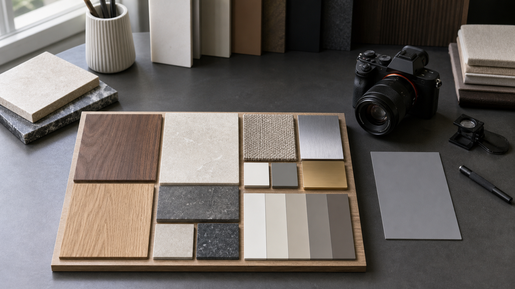
A finish sample board can settle dozens of design questions in a single meeting. It may show the approved floor tile, wall paint, timber veneer, upholstery, grout, metal coating, and cabinet hardware together. Unfortunately, the photograph taken after that meeting is often much less useful than the physical board.
Labels become too small to read. Glossy pieces reflect the ceiling. Pale paint chips merge into the background. A phone automatically changes the colors, while perspective distortion makes square tiles look trapezoidal. Months later, someone must determine whether the board shows the approved finish, an early option, or a proposed substitution.
A dependable photographic record does not require a commercial studio. It requires a consistent capture method, a few reference elements, careful image preparation, and a sensible file structure. This guide explains how architects, interior designers, contractors, fabricators, and facilities teams can document material boards so that both the samples and their identifying labels remain useful.
Why Ordinary Board Photos Fail
Material boards combine subjects that normally need different photographic treatment. A matte paint card can tolerate broad frontal light, while polished stone and brushed metal reveal every reflection. Dark fabric absorbs shadow detail. White ceramic can lose its edges against a white backing. Tiny printed product codes may require more resolution than the sample itself.
The most common failures are predictable:
- The camera is angled instead of parallel to the board.
- Mixed daylight and room lighting create inconsistent color casts.
- Automatic white balance changes between overview and detail photos.
- Glossy surfaces contain bright reflections that hide texture.
- Labels are handwritten, partially covered, or too small for OCR.
- Heavy compression damages thin characters and material edges.
- The final filename says little more than
IMG_4821.jpg. - An image is detached from the project, room, approval stage, or revision.
These are documentation problems, not merely photography problems. A beautiful image can still be a poor record if nobody can identify its status or search for its product codes.
Decide What the Record Must Prove
Before arranging the board, identify the questions the record may need to answer later. Different purposes call for different evidence.
| Intended use | Essential content | Helpful additions |
|---|---|---|
| Design review | Complete board and visible relationships | Detail images of key junctions |
| Client approval | Clear samples, labels, date, revision | Approval form or meeting reference |
| Substitution review | Original and proposed products | Side-by-side details under identical light |
| Procurement | Manufacturer, range, color, product code | Supplier reference and lead-time note |
| Installation check | Approved appearance and sample scale | Room reference and installation location |
| Project handover | Final selected materials | Searchable index and consolidated PDF |
Do not ask one photograph to perform every role. A strong record normally contains an overview, several detail frames, and structured metadata. The overview establishes context; the details preserve surface character and label legibility.
Prepare the Board Before Photography
Photography cannot fully rescue a poorly organized board. Spend a few minutes making the physical arrangement unambiguous.
Remove obsolete sticky notes, loose packaging, and unrelated samples. If rejected alternatives must remain visible, separate them clearly from approved or proposed finishes. Avoid placing labels directly over distinctive grain, pattern, or texture.
Use a consistent label pattern. A practical label might include:
- Finish reference used in the project schedule
- Material or product type
- Manufacturer and collection
- Color or finish name
- Product code
- Status such as proposed, approved, substituted, or installed reference
Keep supplementary commercial information outside the main visual record when it changes frequently. Prices, stock levels, and delivery estimates can quickly make an otherwise valid board appear outdated.
Inspect labels for curled corners and glare-producing tape. Matte removable labels are easier to photograph than glossy tape. If a manufacturer label is tiny, add a larger project reference beside it without covering the original.
Include Scale and Color References Carefully
A ruler or scale marker is useful when sample dimensions matter, but it should not obscure the board. Place it in the same plane as the samples. Perspective makes a raised or distant ruler misleading.
A neutral gray card can help identify major color-balance errors. It does not turn a phone photograph into a calibrated color measurement, and it should never be presented as proof of an exact finish match. Physical samples and agreed project specifications remain the authority for critical color decisions.
When precise color evaluation matters, note the lighting conditions and retain the physical approved sample. Screens, camera processing, compression, and ambient light can all change the apparent result.
Build a Repeatable Capture Station
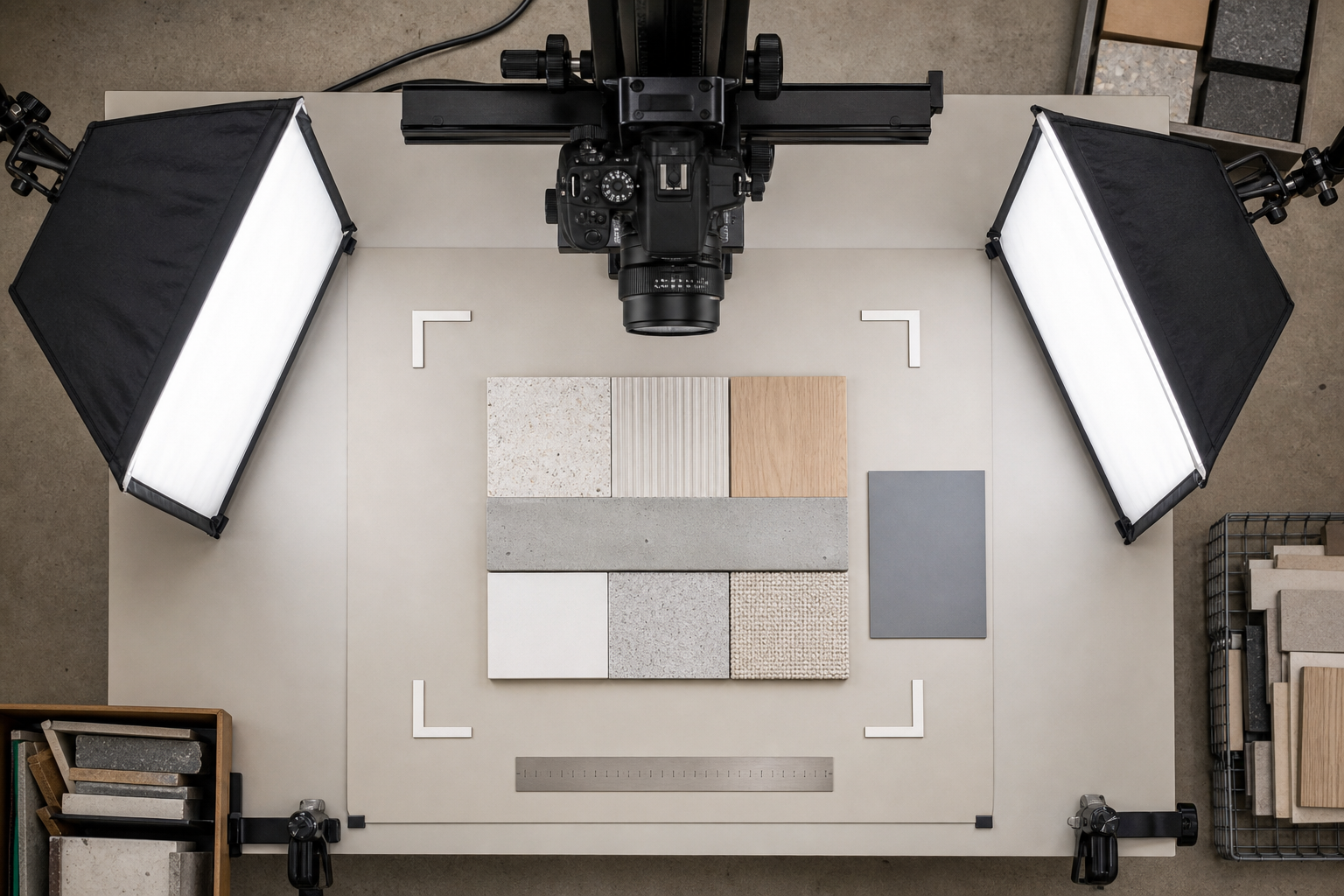
Place the board on a stable vertical surface or flat table. The camera sensor should be parallel to the board. A small spirit level, camera grid, or alignment against the board edges makes this easier.
Use two broad, diffused light sources positioned symmetrically at roughly 45 degrees to the surface. This arrangement reduces hard shadows and can keep direct reflections away from the camera. Move the lights farther back if illumination is uneven. Avoid combining window light with warm ceiling lamps.
For very reflective materials, change the relationship between the camera, lights, and sample rather than attempting to remove every highlight later. A slight adjustment to an individual removable sample may reveal its finish, but document that adjustment if orientation affects the material’s appearance.
A tripod or fixed phone mount improves consistency. Use the main rear camera rather than a low-resolution secondary lens. Clean the lens before starting. Select the highest practical image quality, disable decorative filters, and avoid digital zoom.
Capture at least these frames:
- A full-board overview with all boundaries visible.
- A second overview containing the project or board identifier.
- Detail images for labels that are not clearly readable in the overview.
- Close views of reflective, patterned, or strongly textured finishes.
- A scale view when dimensions are relevant.
- A replacement overview after any revision to the board.
Check focus at full magnification before dismantling the setup. Fine print can appear sharp on a phone screen while remaining unusable when enlarged.
Control Perspective Without Sacrificing Labels
Perspective correction is useful, but extreme correction stretches pixels and softens text near the edges. Capture the board as squarely as possible so editing only needs to make a modest adjustment.
Leave a narrow margin around the board. This gives you room to straighten and crop without clipping sample edges or labels. If the board is too large to photograph at adequate resolution, make one contextual overview and then photograph overlapping zones.
For a zoned set, use a predictable sequence such as top-left, top-right, bottom-left, and bottom-right. Include a small overlap between adjacent images. The purpose is not necessarily to stitch a panorama; the overlap simply helps reviewers understand where each detail belongs.
After correction, compare square objects and parallel board edges. A rectangular tile should not become unnaturally wide just to force every border into alignment.
Make Labels Readable Without Making Materials Artificial
Material appearance and text extraction often benefit from different edits. Strong contrast can help a label while making pale wood grain or subtle fabric color inaccurate. Preserve a natural master image, then create a separate OCR-oriented copy when necessary.
Start with restrained corrections:
- Set a neutral white balance using a trustworthy reference from the scene.
- Correct mild lens distortion and perspective.
- Adjust exposure without clipping white ceramic or metallic highlights.
- Lift shadows only enough to reveal dark textiles and timber.
- Apply moderate sharpening after resizing, not repeatedly.
- Avoid aggressive clarity on woven fabric, stone, or brushed metal.
If the labels occupy only a small part of the overview, crop them into separate images before recognition. Enlarging the entire board creates a bigger file but does not restore detail that was never captured.
Use the Image OCR tool on clear label crops rather than relying on the board overview. Review every extracted manufacturer name, finish code, dimension, and revision reference against the image. OCR commonly confuses 0 with O, 1 with I, and hyphens with spaces. Product codes deserve manual verification because a single incorrect character can point to a different finish.
Keep an Untouched Master
Retain the original camera file or a minimally corrected archival master. Derivative files can then serve distinct purposes:
- A natural-color overview for visual review
- Label crops for OCR and indexing
- Smaller JPEG or WebP copies for messaging and project portals
- A consolidated PDF for handover
This separation prevents repeated editing and compression from degrading the only available record.
Choose Resolution by the Smallest Important Detail
Do not choose dimensions only from the physical size of the board. Choose them according to the smallest label or surface feature that must remain visible.
Open the overview at its intended viewing size. If a critical product code cannot be read comfortably, keep a separate detail crop. Attempting to make an enormous overview carry every detail can produce files that are slow to open and awkward to review.
Use Resize Image to create consistent derivatives for portals or presentation decks. Preserve the aspect ratio, and avoid enlarging small originals unless enlargement is needed solely for convenient viewing. Upscaling cannot recreate missing label detail.
Compression should be evaluated on the hardest parts of the image: fine label text, grout lines, narrow metal edges, fabric weave, and high-contrast stone patterns. With Compress Image, compare the output at 100 percent magnification. Increase quality if characters develop halos, thin lines disappear, or patterned surfaces become blocky.
A practical policy is to retain a high-quality master and generate delivery copies for specific destinations. Email, a project portal, a presentation, and a long-term archive do not need identical files.
Create a Searchable Finish Record
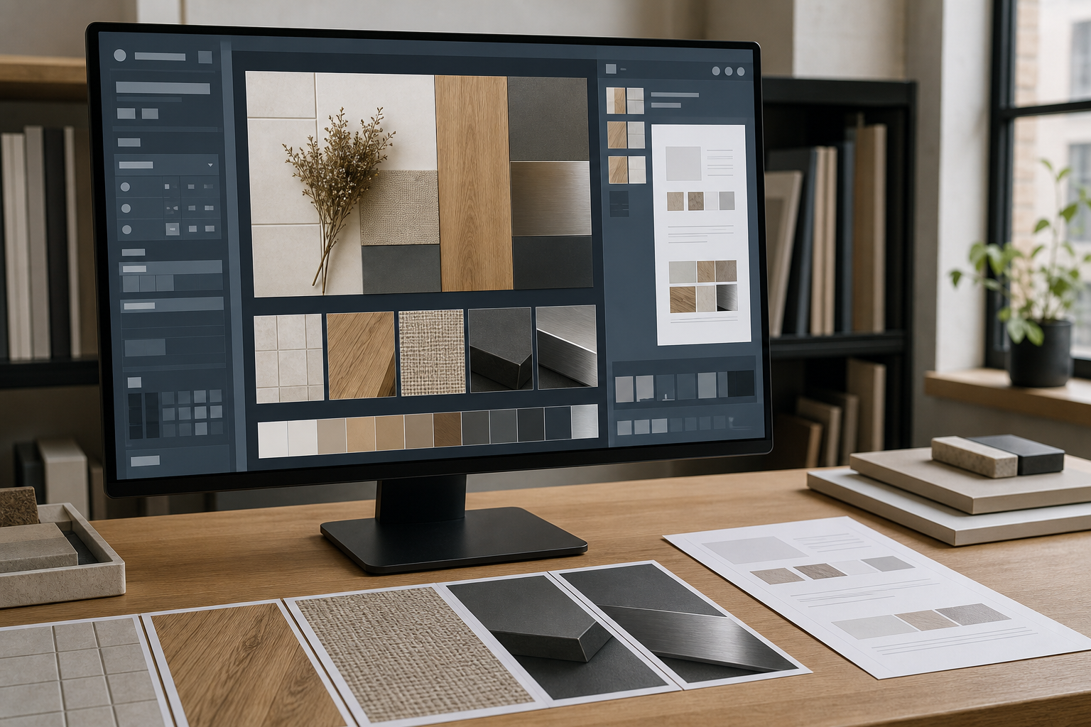
The image is only one part of the record. A compact index turns photographs into searchable project information.
For each board, record fields such as:
| Field | Example structure |
|---|---|
| Project | Short project code or full project name |
| Area | Level, room, elevation, or package |
| Board ID | Stable identifier independent of filename |
| Revision | Sequential revision or issue reference |
| Status | Proposed, reviewed, approved, superseded, or installed |
| Capture date | ISO format: YYYY-MM-DD |
| Photographer | Team or role if personal identification is unnecessary |
| Finish references | Codes matching the finish schedule |
| Related document | Drawing, specification, submittal, or meeting record |
A filename can carry the most useful fields without becoming a paragraph. For example:
RIV-L02-LOBBY-FINISHBOARD-B03-REV02-2026-07-17-overview.jpg
Use hyphens or underscores consistently. Avoid characters that cause problems across operating systems, and avoid ambiguous labels such as final, final2, or latest. A status field in the index is safer than embedding uncertain approval language in an informal filename.
Store OCR text beside the corresponding board ID. Do not silently replace the photographed label with corrected text; retain both the visible source and the reviewed transcription. This makes later audits much easier.
Assemble a Review PDF Without Losing the Originals
A PDF is useful for issuing a stable review pack, but it should not replace the original image files. The PDF may resize or recompress images, and extracting them later can be inconvenient.
A clear packet order is:
- Cover or record summary
- Full-board overview
- Enlarged label zones
- Material detail images
- Substitution comparisons, if applicable
- Notes, status, and related references
Use Image to PDF to combine ordered copies after checking their orientation and filenames. Keep page margins consistent, and avoid shrinking multiple dense board images onto a single page if labels become unreadable.
For several boards, one PDF per room, package, or approval event is usually easier to navigate than a single enormous project document. Where a consolidated issue is required, individual packets can be combined with PDF Merge. Confirm the page sequence afterward and preserve the source packets separately.
Document Substitutions as Comparisons, Not Isolated Photos
A proposed replacement should be photographed beside the original approved sample whenever feasible. Separate images taken under different lighting can exaggerate or conceal differences.
Use the same camera, exposure approach, lighting, background, and viewing angle. Include an overview showing both samples and close views showing texture, edge treatment, sheen, or pattern scale. If the materials have directional grain, align them according to their intended installed orientation.
State which sample is the reference and which is the proposal in accompanying metadata. Never depend on left-versus-right placement alone; images may be cropped, reordered, or separated later.
For patterned materials, capture enough area to show repeat scale. A close-up that shows print quality but hides the overall repeat is incomplete. For tiles, include face variation across multiple pieces if the product is intentionally nonuniform.
Apply a Short Quality-Control Checklist
Before issuing the record, inspect it as if the physical board were no longer available.
Capture checks
- The full board is visible and in focus.
- Camera alignment does not noticeably distort sample shapes.
- Highlights do not hide important finish characteristics.
- Dark materials retain visible surface detail.
- A scale or color reference is included where justified.
- Detail frames cover every label that is unreadable in the overview.
Information checks
- Board ID, project, area, date, revision, and status are recorded.
- Finish references match the schedule or source document.
- OCR text has been checked character by character for product codes.
- Superseded and current boards are clearly distinguishable.
- Substitution images identify both reference and proposed materials.
Delivery checks
- Master images remain separate from compressed copies.
- Filenames sort into a sensible sequence.
- PDF pages have the correct orientation and order.
- Fine text remains readable in the actual delivery file.
- Links or references point to the correct drawing, submittal, or approval record.
Common Mistakes That Create False Confidence
Automatic image enhancement can make a record look polished while changing the evidence. Excessive saturation may turn a muted textile into a stronger color. Heavy noise reduction can erase fine grain. Generative fill or object removal can alter edges and should not be used on documentary masters.
Another mistake is treating photographed color as an exact specification. Even a carefully captured image is mediated by the light source, camera processing, display, and viewer environment. Use the photograph to identify and compare materials, but rely on approved physical samples and formal specifications for exact acceptance decisions.
Finally, do not overwrite history when a board changes. Create a new revision and mark the older record as superseded. The earlier image may explain a procurement decision, resolve a later discrepancy, or show when a substitution entered the project.
A Durable Record Is More Than a Good Photograph
The best finish-board documentation combines honest images, readable identifiers, controlled derivatives, and clear status information. Its value becomes apparent months or years later, when the physical samples have been returned, damaged, separated, or stored away from the project team.
Capture the full context, photograph difficult materials deliberately, preserve a natural master, and use detail crops for small labels. Then connect every image to a stable board ID and a reviewed index. That modest discipline turns a casual phone photo into a practical material record that can support design review, procurement, installation checks, substitutions, and final handover.