Reticle Overlay Transparency Checks for Hardware Docs
A practical guide for preparing transparent reticle, crosshair, and measurement overlays that stay readable in hardware manuals, support articles, and QA evidence packs.

Reticle Overlay Transparency Checks for Hardware Docs
Transparent reticles, crosshairs, measurement rings, alignment marks, and inspection overlays are small assets with a disproportionate effect on hardware documentation. They appear in repair guides, calibration notes, QA evidence, onboarding manuals, field service PDFs, teardown posts, and support articles where a reader needs to see exactly where to look.
The problem is that these overlays often look correct in the design file and then fail in the place that matters: over a real hardware photo, inside a compressed web article, inside a PDF viewed on a tablet, or inside a screenshot pasted into a ticket. A line that is crisp on a white canvas can disappear over brushed metal. A subtle shadow can become dirty after compression. A transparent PNG can gain a pale halo on dark mode documentation. A crosshair that looks elegant at 2x can become mushy when resized for mobile.
This guide focuses on a narrow but common publishing problem: preparing transparent technical overlays so they remain readable, lightweight, and reusable across hardware docs. It is written for documentation teams, support engineers, product marketers, field technicians, QA leads, and small hardware companies that do not want every annotated image to become a custom design job.
The goal is not to make decorative graphics. The goal is to make overlays that survive real backgrounds, resizing, compression, and PDF export without hiding the hardware detail they are supposed to clarify.
What Counts as a Reticle Overlay
A reticle overlay is any transparent visual aid placed on top of a hardware image to direct attention or show alignment. It may be as simple as a crosshair or as specific as a camera calibration target.
Common examples include:
- Crosshairs over lens centers, ports, screws, sensors, solder joints, and mounting holes
- Circular rings that show acceptable placement zones
- Corner brackets around serial plates, labels, or connector bays
- Measurement bars used beside components for scale
- Transparent grids for alignment, spacing, or repeatable inspection photos
- Mask outlines that show where a part should sit before assembly
- Highlight bands over rows of DIP switches, pins, or LED states
- Inspection frames used in QA reports and field evidence packs
These overlays are different from ordinary arrows and labels. Arrows can be moved image by image. A reticle usually needs consistency. It may be reused across dozens of photos, applied by several team members, exported to multiple formats, and viewed in both web and PDF contexts.
That consistency is why export quality matters. If the overlay asset is poorly prepared, every image that uses it inherits the same flaw.
The Overlay Problems That Only Appear Late
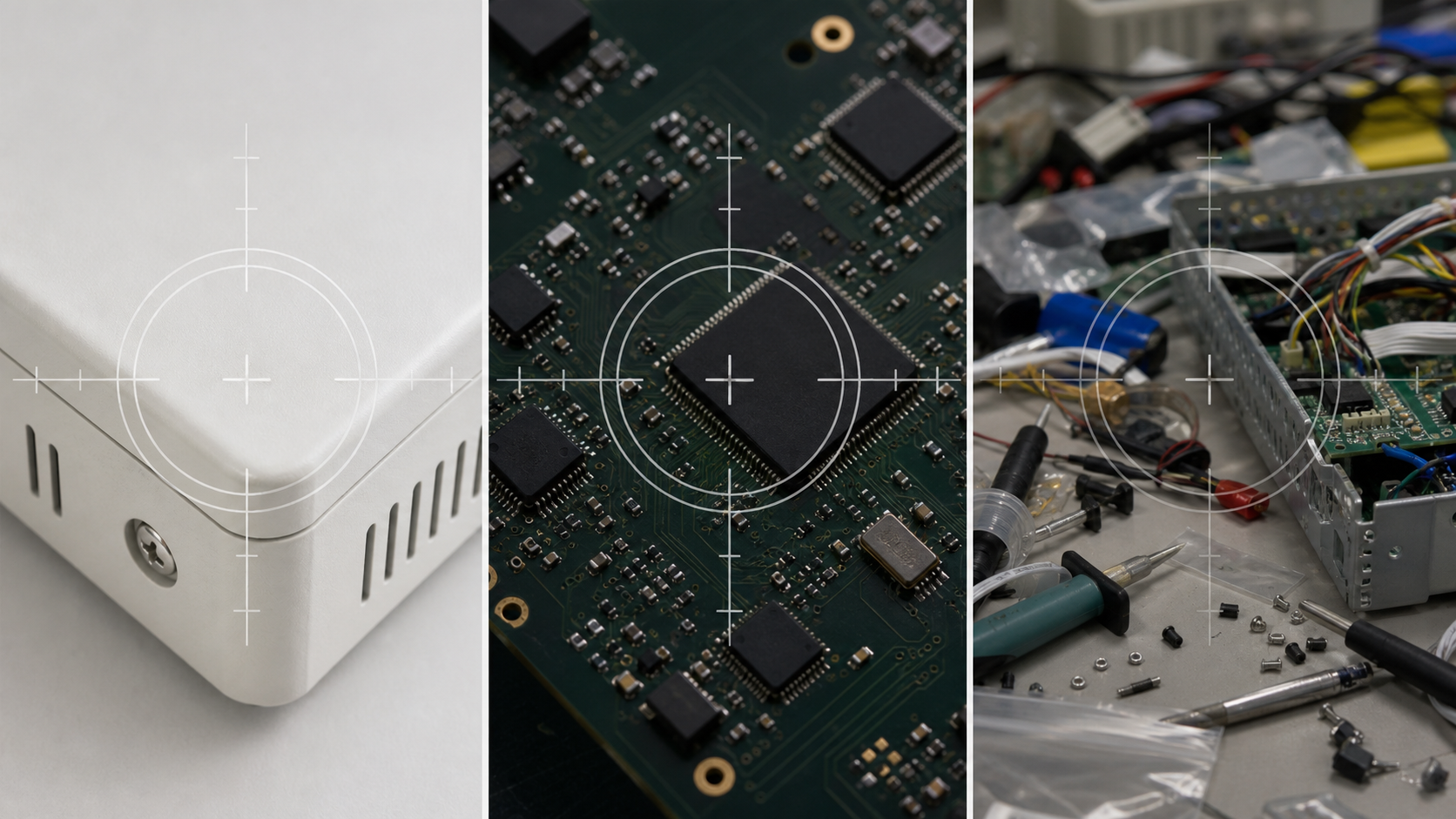
Most overlay mistakes are not obvious on the first preview. They appear after the asset has been placed on real images and moved through the publishing chain.
The most common late-stage failures are contrast loss, alpha halos, inconsistent stroke weight, and compression damage.
Contrast loss happens when the overlay color is too close to the image underneath. White lines vanish over aluminum, plastic shells, paper labels, and bright lab benches. Black lines vanish over circuit boards, shadowed ports, rubber feet, and dark device bezels. Brand colors often perform badly because they were chosen for identity, not image inspection.
Alpha halos appear when a semi-transparent edge was exported against the wrong matte color or when a soft shadow blends poorly with the final background. A pale rim around a dark overlay looks unprofessional and can make technical images feel less trustworthy.
Inconsistent stroke weight appears when a reticle is resized casually. A two-pixel line at the original size may become a fuzzy 1.3-pixel line after scaling. On high-density screens it may look acceptable, but after PDF export or screenshot compression it can break into uneven fragments.
Compression damage appears when fine overlay lines are saved into aggressive JPEGs or heavily compressed preview images. The hardware photo might still look acceptable, but the reticle line can show ringing, blur, or color artifacts.
The best way to prevent these problems is to test overlays against the types of backgrounds they will actually sit on, not against a blank canvas.
Choose the Right Overlay Style Before Export
Before exporting anything, decide what role the overlay needs to play. Different documentation tasks need different visual treatments.
| Use case | Better overlay style | Why it works |
|---|---|---|
| Lens, port, or sensor center | Thin crosshair with small open center | Shows exact alignment without covering the point |
| Screw or fastener location | Ring or corner brackets | Keeps the screw head visible |
| Acceptable placement area | Semi-transparent filled zone with clear border | Shows tolerance without implying a single exact point |
| Connector orientation | L-shaped bracket plus subtle direction cue | Frames the part while preserving details |
| QA comparison photo | Fixed grid or repeatable measurement marks | Helps reviewers compare images consistently |
| Tiny PCB feature | High-contrast outline with no blur | Avoids hiding traces, labels, and solder detail |
| Support article callout | Slightly thicker mark with restrained shadow | Survives mobile viewing and article compression |
A reticle should not compete with the object. If the reader notices the overlay before they understand the hardware, it is probably too heavy. If they need to zoom in to find the overlay, it is too subtle.
For most hardware documentation, a dual-stroke style works well: a main line plus a thin contrasting edge. For example, a white center line with a dark outer edge stays visible over both bright and dark surfaces. This can be more reliable than a single brand-colored line.
Avoid large blurred glows unless the image background is extremely busy. Blurs increase file size and often degrade badly when compressed. If you need separation, use a clean outline, a narrow shadow, or a small break in the center of the reticle instead.
Build a Background Test Set
A useful overlay test set does not need to be large. It does need to represent the surfaces your team actually photographs.
Create a folder with eight to twelve background images. Include the awkward cases, not just the attractive ones.
Good candidates include:
- A bright product shell or white enclosure
- A dark circuit board or black plastic panel
- Brushed metal or reflective aluminum
- A label area with dense printed text
- A photo with hand shadows or uneven lighting
- A busy workbench image
- A mobile phone photo with mild blur
- A screenshot from a support ticket or inspection app
- A compressed image from your CMS or help center
- A PDF-exported page viewed at common zoom levels
Place the same overlay on every background and review at 100 percent, 50 percent, and mobile article width. The 100 percent view shows edge problems. The smaller views show whether the overlay remains discoverable.
If your images are too large for quick review, resize test copies first with a tool such as /resize-image. Keep the originals separately. Testing at the exact publish dimensions is more useful than testing only on camera-resolution files.
Prepare Transparent Edges Carefully
Transparency is where many technical overlays fail. The edge of the overlay determines whether it feels precise or pasted on.
For reticles, crisp edges usually perform better than soft edges. A technical mark should feel deliberate. Anti-aliasing is fine, but avoid wide feathering. Feathered edges can look elegant on a design canvas and vague on a hardware photo.
When exporting transparent PNGs, inspect the asset over both black and white backgrounds. If the edge looks clean only on one of them, there may be a hidden matte problem. This is especially common when an asset was copied out of a slide deck, screenshot tool, or design file that assumed a white background.
A quick edge check looks like this:
- Place the overlay on a pure white background.
- Place it again on a pure black background.
- Place it on a mid-gray background.
- Place it on a real hardware image.
- Zoom to 200 percent and inspect the outer pixels.
- Return to 100 percent and judge normal readability.
Do not make decisions only while zoomed in. Pixel inspection catches halos, but normal zoom catches visual balance.
If you need to remove a background from a draft overlay or clean up a rough transparent asset, an editor such as /ai-photo-editor can help with small corrections. For production overlays, still do a manual visual check afterward. Transparent technical marks need precision, and a human review pass is worth the extra minute.
Use PNG, WebP, and SVG for Different Jobs
There is no single best format for every overlay. The right format depends on where the asset will be used and who needs to edit it later.
PNG is the safest general-purpose choice for transparent bitmap overlays. It preserves alpha, is widely supported, and is easy for non-designers to place in documents, slides, help center articles, and image editors. Use PNG when compatibility matters more than the smallest possible file.
WebP can produce smaller transparent overlays, especially when the asset includes soft effects or photographic fragments. It is useful for web documentation where modern browser support is expected. If the overlay is a crisp technical mark with very few colors, PNG may already be small enough.
SVG is ideal for simple vector reticles, grids, and line marks when your publishing surface supports it reliably. It scales cleanly and keeps strokes editable. However, SVG can behave inconsistently when imported into office tools, older CMS systems, or PDF generators. If your team includes non-designers assembling assets in mixed tools, a PNG export may reduce surprises.
For broad compatibility, keep a master vector file and export tested PNG or WebP versions for publishing. If you need to convert between web-friendly formats during preparation, use /convert-image and then inspect the result on the same background set.
A Practical Export Checklist
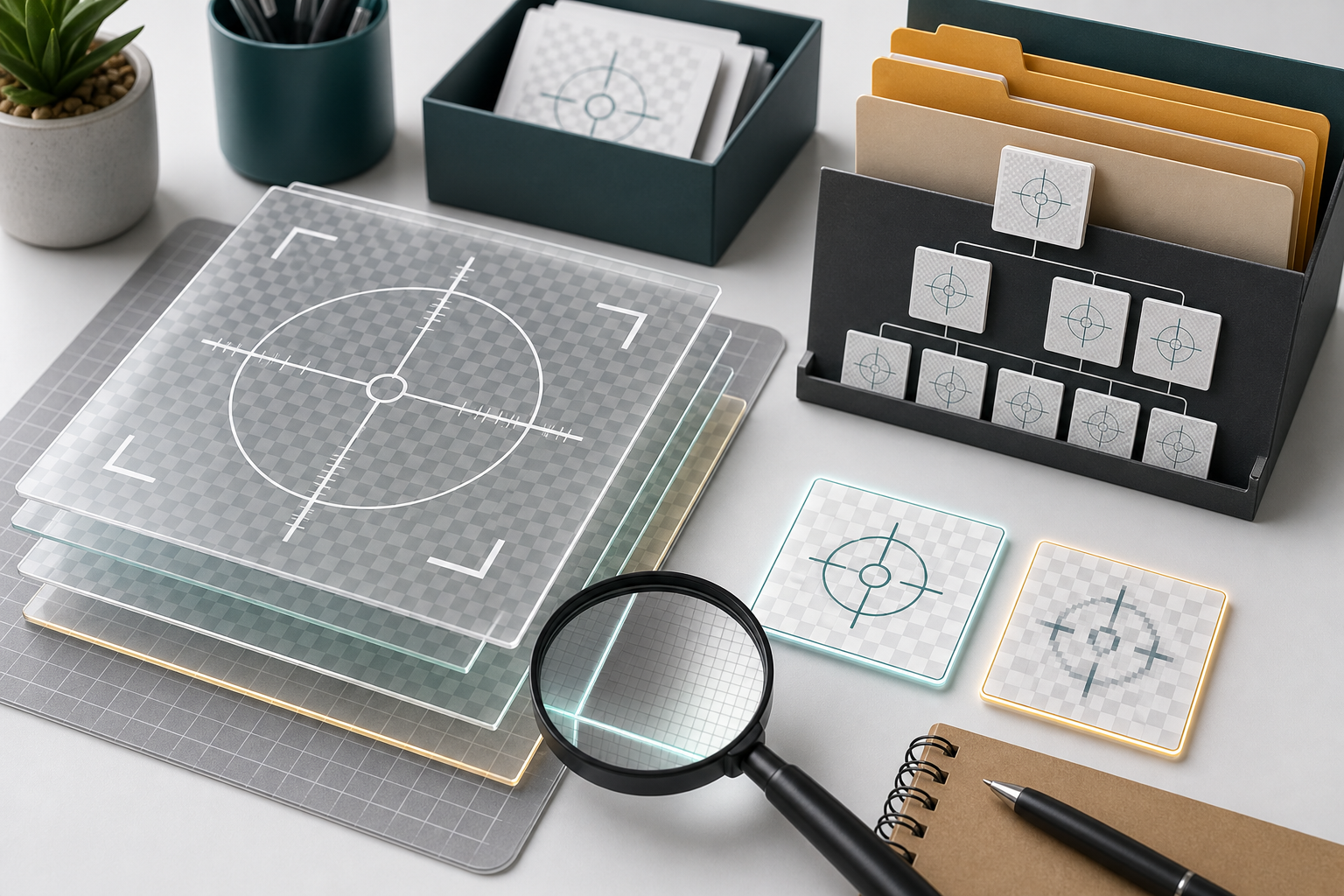
A reliable export checklist prevents small visual defects from spreading across a documentation library.
Use this checklist before adding an overlay to a shared asset folder:
- The filename describes the mark, size, and color treatment.
- The transparent edge has been checked on black, white, gray, and a real hardware image.
- The overlay is readable at the smallest expected display size.
- The mark does not cover serial numbers, pin labels, warning icons, or measurement detail.
- The stroke weight remains crisp after resizing.
- The asset has no accidental white box, matte edge, or hidden background.
- The PNG or WebP file is small enough for repeated use in articles.
- The master editable file is stored separately from publish exports.
- The overlay has been tested inside at least one PDF or help center page if those are target outputs.
For file naming, use boring names that sort well:
reticle-crosshair-white-darkedge-1200.pnginspection-ring-green-dualstroke-800.webpconnector-corner-bracket-yellow-600.pngalignment-grid-gray-1600.png
Avoid names like final, new, updated, or use-this-one. These names stop being meaningful within a week.
Keep Overlay Files Light Without Damaging Lines
Transparent overlay files are often repeated across many images. A single large PNG may not matter, but dozens of oversized overlay exports can slow pages and clutter shared folders.
Start by removing unnecessary canvas space. A crosshair on a 3000 by 3000 transparent canvas may be easy to place in a design tool, but it is wasteful if the useful mark occupies only the center. Crop to the smallest practical bounding box unless the transparent padding is intentionally used for alignment.
Then compress carefully. Fine lines, thin outlines, and semi-transparent edges should be checked after compression. Do not assume that a smaller file is automatically acceptable. Compare the compressed result against the original over light, dark, and busy backgrounds.
A compression tool such as /compress-image is useful for reducing publishing weight, especially when an article contains many annotated images. For transparent overlays, evaluate the output visually rather than relying only on file size.
Here is a simple decision table:
| Asset type | Compression priority | Review focus |
|---|---|---|
| Crisp one-color crosshair | Low to medium | Edge sharpness and exact alignment |
| Dual-stroke reticle | Medium | Outer contrast edge and inner line clarity |
| Semi-transparent zone | Medium | Banding, opacity, and color shift |
| Soft highlight glow | High | File size, blur quality, and halo behavior |
| Full annotated screenshot | High | Text readability and line artifacts |
If compression makes the line harder to trust, reduce the visual complexity instead. A simpler line often beats a heavily optimized decorative effect.
Place Reticles Without Hiding Evidence
The hardest part of using overlays is restraint. A mark that explains one detail can hide another.
When placing a reticle over hardware, protect these elements first:
- Serial numbers and part numbers
- Regulatory labels and warning symbols
- Pin labels, polarity marks, and port names
- Damage, wear, corrosion, cracks, and alignment gaps
- LED states and switch positions
- Measurement reference points
If the reticle covers important evidence, change the overlay style. Use an open center, a broken line, corner brackets, or an offset ring. Do not simply reduce opacity until the mark is barely visible. Low opacity can make the overlay ambiguous while still obscuring the image.
For small PCB features, avoid placing a filled highlight directly over traces or solder joints. Use a ring, bracket, or external callout line instead. For product shell photos, a semi-transparent area may be acceptable because the surface detail is less critical.
A good test is to temporarily hide the overlay and ask what information returns. If hiding the overlay reveals details that a reader may need, adjust the mark.
Prepare Overlay Sets for PDFs and Review Packs
Hardware teams often need the same images in web articles and PDF review packs. A reticle that works in a responsive web page may fail inside a PDF because the page is scaled, printed, or viewed on a tablet.
When preparing PDF-ready images, use consistent image dimensions and avoid excessive downscaling during PDF creation. If an annotated image is inserted into a PDF at a tiny size, the overlay may become too thin to read.
For review packets, combine related annotated images into a single PDF only after the image exports have been checked. A tool such as /image-to-pdf can help assemble field photos, inspection shots, or marked hardware images into a shareable document. If multiple PDFs need to be joined for a vendor or internal review, /pdf-merge can help keep the packet together.
Before sending the PDF, inspect it in the same way a reviewer will use it:
- Fit-to-page view on a laptop
- 100 percent zoom
- Tablet portrait view if field teams use tablets
- Printed sample if print review is common
- Dark mode viewer if your organization uses one
PDF export can slightly soften images. If a reticle is already barely visible before export, it may not survive the PDF step.
Make Shared Overlay Libraries Less Fragile
A shared overlay library saves time only if people can choose the right file without guessing. Organize assets by purpose, not by the person who created them.
A practical folder structure might look like this:
hardware-overlays/
  masters/
  png/
    crosshairs/
    rings/
    brackets/
    grids/
  webp/
    crosshairs/
    rings/
    brackets/
  test-backgrounds/
  examples/
Keep master files separate from exports. The master folder can contain editable design files, vector sources, and notes. The publish folders should contain only tested assets.
Include example images that show correct use. A crosshair file is easier to understand when a teammate can see it placed over a lens, connector, or screw boss. Examples also prevent people from misusing a tolerance ring as a decorative highlight.
If several teams contribute assets, require a short review before adding new overlays to the shared set. The review does not need to be formal. It should confirm that the asset passes contrast, edge, size, and naming checks.
A Small Example: USB-C Port Alignment Mark
Imagine a support article that helps technicians verify whether a USB-C daughterboard is seated correctly inside a device shell. The article needs an overlay that marks the intended centerline of the port without hiding the port edges.
A weak version would be a single red vertical line across the entire photo. It might be visible, but it would cover the port opening and look imprecise.
A better version uses two short vertical guide marks above and below the port, leaving a gap over the opening. The marks use a white line with a dark outer edge. The asset is exported as a transparent PNG, tested over the black port interior, the silver shell, and a slightly blurred phone photo from a technician.
The final article image remains readable because the overlay points to the alignment issue without covering the evidence. The same mark can be reused in a PDF inspection packet because it has been tested at the smaller PDF display size.
This is the standard to aim for: not flashy, not invisible, and not dependent on the exact background of one perfect product photo.
Common Mistakes to Remove From the Process
Several habits create recurring overlay problems.
The first is exporting from presentation software without checking transparency. Slide tools are convenient, but they may add unexpected background fills, shadows, scaling, or anti-aliasing artifacts. If a slide tool is used for drafting, inspect the exported image carefully.
The second is using brand colors as the default annotation color. Brand colors may look consistent in a marketing system but fail over hardware surfaces. Documentation overlays need functional contrast first.
The third is treating opacity as the only readability control. Opacity helps, but stroke design, outline contrast, placement, and open centers usually matter more.
The fourth is compressing annotated images after placing fragile overlays. If the final image must be compressed, compare before and after versions at publish size. Thin marks can degrade while the rest of the image appears fine.
The fifth is skipping mobile review. Many support articles are read beside the device being repaired or inspected. If the reticle only works on a large desktop monitor, it is not finished.
Final QA Pass Before Publishing
Before publishing a hardware article, support note, or inspection PDF that uses transparent overlays, run one final pass with reader intent in mind.
Ask these questions:
- Can a new reader identify the marked part in three seconds?
- Does the overlay remain visible on both light and dark parts of the image?
- Is any important hardware evidence hidden by the mark?
- Does the image still make sense when viewed at mobile width?
- Does compression change the overlay edge or color noticeably?
- Does the PDF version preserve the mark clearly?
- Are the source image, overlay asset, and final export named clearly enough to find later?
This pass is quick, but it catches the mistakes that create support confusion. Hardware documentation depends on trust. When a reader sees a clean, precise overlay that respects the underlying image, they can focus on the instruction rather than interpreting the graphic.
Transparent reticle overlays are small assets, but they deserve a real quality standard. Build a compact test set, export with clean edges, choose formats intentionally, compress with visual review, and keep shared files organized. The result is a documentation set that looks consistent across articles, PDFs, and field evidence without turning every marked image into a custom design task.