Accessibility Audit Screenshot Source Images: A Practical Capture Guide
A detailed guide for preparing clean, consistent screenshot source images for accessibility audits, alt-text reviews, issue reports, and remediation handoff.

Accessibility Audit Screenshot Source Images: A Practical Capture Guide
Accessibility audits often succeed or fail on the quality of their evidence. A finding that says a button has an unclear label, a form error is not announced, or a focus state is too subtle may be technically correct, but the person fixing it still needs to see the exact screen, viewport, state, and surrounding context. That is where screenshot source images become more than decoration. They become the shared evidence layer between auditors, designers, developers, content editors, and product owners.
This guide focuses on a specific but common problem: preparing clean, consistent screenshot images for accessibility audits and remediation handoff. It is not a legal checklist and it does not replace manual testing with assistive technology. Instead, it helps teams produce image evidence that is easier to review, easier to quote in tickets, easier to include in reports, and less likely to create confusion during fixes.
The goal is simple: each screenshot should prove one thing clearly without hiding the page context that made the issue meaningful.
Why Screenshot Source Quality Matters in Accessibility Reviews
Accessibility findings are often state-based. A component may look acceptable at rest, fail when focused, change behavior after an error, or become unreadable only at a narrow viewport. A single vague screenshot can flatten those differences. A well-prepared set of source images keeps them visible.
Good screenshot evidence helps in four practical ways.
First, it reduces back-and-forth. If a developer can see the input state, viewport width, browser zoom, and affected component, they do not need to ask for reproduction details before starting.
Second, it protects nuance. Accessibility issues are rarely just visual, but visual context often explains why the issue is hard for users. A focus indicator that technically exists may still be swallowed by a nearby border. A long label may wrap into a layout in a way that changes reading order. A sticky header may cover the top of an error summary after navigation.
Third, it makes remediation review faster. When the same component is captured before and after a fix using the same framing, reviewers can compare the change without mentally reconstructing the original page.
Fourth, it creates a durable archive. Teams revisit audit findings months later, especially when a design system is updated. Clean images make old decisions understandable to people who were not present during the original review.
The risk is that screenshots are easy to create casually. Casual capture leads to inconsistent zoom levels, missing browser context, oversized images, unreadable crops, and files with names like Screenshot 2026-05-24 at 14.03.11.png. Those files may be fine for chat, but they are poor source material for an audit record.
The Capture Standard: What Every Screenshot Should Prove
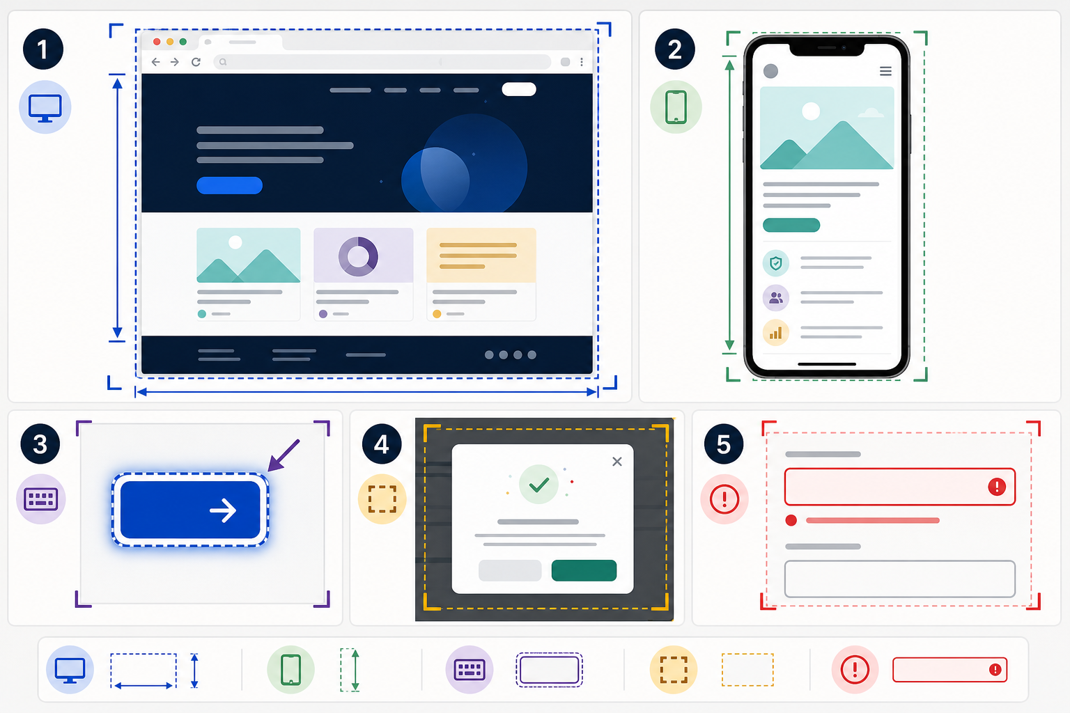
Before taking screenshots, decide what each image must prove. This keeps the image set smaller and more useful.
A strong accessibility audit screenshot usually answers these questions:
| Question | Why it matters | What to capture |
|---|---|---|
| Where is the issue? | Reviewers need page and component context. | Include enough surrounding layout to identify the area. |
| What state is shown? | Many failures appear only after interaction. | Capture focus, hover, expanded, error, loading, disabled, or selected states. |
| What viewport is used? | Responsive behavior can create or remove issues. | Use consistent desktop and mobile sizes. |
| What changed from the default state? | Fixers need to know whether the problem is persistent or conditional. | Capture both default and affected states when useful. |
| What text is involved? | Labels, instructions, and error messages often drive the finding. | Keep text crisp enough for reading or OCR extraction. |
Do not try to make every image do everything. For example, if the issue is a weak focus ring on a checkout button, one full-page screenshot can show page context and one tight crop can show the focus indicator. The pair is more useful than one giant image where the focus ring is hard to inspect.
Capture Full Context First
Start with a full-page or large-viewport screenshot before cropping. The full-context image establishes location and prevents a common audit problem: isolated crops that no one can map back to the product.
For web pages, capture the full browser viewport rather than only the component. For authenticated dashboards, include the main navigation when it helps identify the product area, but avoid exposing private customer data. For forms, include the section heading and nearby instructions. For dialogs, include enough background page context to show whether the modal is visually and programmatically distinct.
If the page contains sensitive user information, replace it before capture when possible. If that is not possible, crop or redact carefully before sharing. Avoid blurring large regions when the blur itself makes the layout hard to understand. A clean test account with realistic but non-private data is usually better.
Then Capture the Smallest Useful Crop
After the context image, make a focused crop. The crop should isolate the issue while preserving the immediate neighbors that affect interpretation.
For example:
| Issue type | Useful crop includes | Avoid |
|---|---|---|
| Low contrast text | Text, background, nearby state or card | Cropping so tightly that the background context is lost |
| Missing visible focus | Focused control and adjacent controls | Capturing the whole page only |
| Form error association | Field, label, error message, submit trigger if nearby | Showing only the error text |
| Ambiguous icon button | Icon, tooltip if available, surrounding toolbar | Isolated icon without product context |
| Reflow issue | Broken element and nearby column or container | A crop that hides the viewport constraint |
This two-level capture habit is especially helpful when your audit findings are later transferred into tickets. The full image answers "where," and the crop answers "what."
Recommended Viewports and States
Accessibility issues often appear at layout boundaries. You do not need to capture every possible screen size, but you should standardize a small set so comparisons stay meaningful.
A practical baseline is:
| Capture type | Suggested size | Use when |
|---|---|---|
| Desktop | 1440 px wide | Main product pages, content pages, admin screens |
| Narrow desktop | 1024 px wide | Dense dashboards, tables, sidebars |
| Mobile | 390 px wide | Public pages, forms, menus, checkout, documentation |
| Zoomed desktop | 1280 px wide at 200 percent browser zoom | Text resizing, reflow, sticky elements, dialogs |
The exact sizes matter less than consistency. If your organization already tests specific breakpoints, use those. Record them in the file name or the report table so reviewers know what they are seeing.
States deserve the same discipline. Capture the normal state only if it helps explain the affected state. For interactive components, the affected state is usually the evidence.
Common states to include are:
- Keyboard focus on links, buttons, custom controls, menu items, tabs, and form fields.
- Expanded and collapsed states for accordions, menus, comboboxes, and disclosure controls.
- Error states for forms, including the label, input, error message, and page-level summary when present.
- Disabled states when they may be confused with active controls or when contrast is too weak.
- Loading and empty states when screen-reader announcements or visual instructions are unclear.
- High zoom or reflow states when content overlaps, disappears, or requires two-dimensional scrolling.
When an issue depends on motion, animation, or short-lived UI, still images may not be enough. Capture a short clip or create a lightweight GIF only when the motion itself is the evidence. For static reports, a small sequence of stills is often clearer than a large animated file. ConvertAndEdit's GIF maker can help when you need a compact visual sequence for a ticket or internal note.
Preparing Images Before They Enter the Report
Raw screenshots usually need light preparation. The trick is to improve readability without changing the evidence.
Use these rules:
- Crop for relevance, not aesthetics.
- Preserve original proportions when the viewport size is part of the finding.
- Do not increase contrast, sharpen, recolor, or retouch the affected UI in a way that changes the issue.
- Keep annotations separate from the source copy when possible.
- Save a clean original and an annotated version if the issue is complex.
For most audit images, PNG is the best source format because it keeps UI text and hard edges crisp. JPEG can introduce artifacts around small type, focus rings, and thin borders. WebP may be appropriate for publishing a compressed article or documentation page, but audit source images should prioritize fidelity.
If your image is extremely large, resize only after you have saved the source. For report copies, use a consistent maximum width such as 1600 or 2000 pixels. ConvertAndEdit's resize image tool is useful when you need a predictable presentation size while keeping the original file intact.
Compression needs the same caution. Screenshots can often be reduced significantly, but aggressive compression may damage exactly the details the audit is about. Thin gray text, dotted outlines, 1 px borders, and small icon labels are common casualties. Use image compression on report-ready copies, then inspect the result at 100 percent zoom before replacing anything.
OCR as a Quality Check, Not a Substitute for Testing
Optical character recognition can help audit teams catch problems in screenshot handling. It is not an accessibility test by itself, but it can expose whether the captured text is readable enough for humans and downstream documentation.
A practical use is to run OCR on screenshot crops that contain labels, instructions, table headers, or error messages. If OCR cannot identify obvious text because the crop is too blurry or compressed, the image may also be frustrating for reviewers.
ConvertAndEdit's image OCR tool can help extract visible text from a screenshot so you can paste exact labels into a finding. This is especially useful when documenting:
- Error messages that need to be associated with fields.
- Button labels that differ between visual text and accessible name.
- Dense table headers in admin screens.
- Long instructions in onboarding or checkout forms.
- Modal dialog titles and confirmation messages.
Use OCR output carefully. Screenshots only show visible text. They do not reveal the actual accessible name, ARIA attributes, semantic heading structure, focus order, or live region behavior. If a finding involves those details, confirm them with browser inspection, automated tools, and assistive technology testing.
The best pattern is to combine OCR with manual verification. Use OCR to speed up quoting and reduce typing errors. Use accessibility testing to determine whether the experience is correct.
Annotation Without Distorting the Evidence
Annotations can make an audit report easier to read, but heavy annotation can also hide the issue. The safest approach is to keep a clean source image and make a separate annotated copy.
Good annotations are minimal. A thin outline, small arrow, or numbered marker can guide attention without covering the UI. Avoid large opaque boxes over the affected component. Avoid red marks that obscure red error messages or focus states. If color is central to the finding, do not use annotation colors that change the visual comparison.
For text notes, keep them outside the screenshot when possible. Put the explanation in the report, ticket, or caption instead of embedding paragraphs into the image. Images with embedded explanatory text are harder to translate, harder to search, and less useful when the report is reused.
A simple annotation standard might look like this:
| Annotation need | Recommended treatment | Reason |
|---|---|---|
| Identify affected control | Thin outline around the component | Preserves the component interior |
| Show focus order | Numbered markers beside controls | Does not cover focus indicators |
| Point to missing label | Small arrow from margin | Keeps form field visible |
| Compare before and after | Two separate images with same crop | Avoids cramped side-by-side details |
| Show viewport boundary | Include browser or device frame only when relevant | Prevents decorative framing from distracting |
If you use an AI editor to clean a background, remove private content, or create a neutral illustrative version for public documentation, keep it away from the evidence copy. ConvertAndEdit's AI photo editor can be useful for public-facing article visuals or sanitized examples, but audit evidence should remain faithful to the tested interface.
A Practical File Set for Review and Remediation
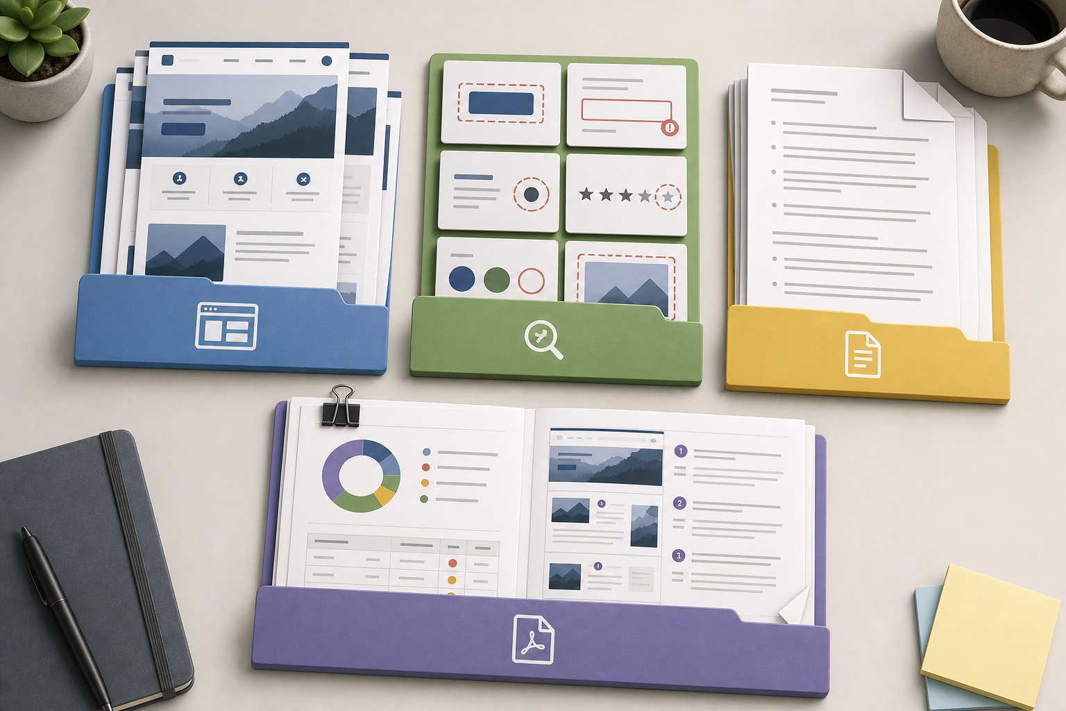
A useful accessibility image set is organized before it reaches the report. File names should make sense without opening the image.
A reliable naming pattern is:
area-page-issue-state-viewport-version.ext
Examples:
checkout-payment-card-focus-desktop-v1.pngcheckout-payment-card-focus-crop-desktop-v1.pngaccount-settings-error-summary-mobile-v1.pngdocs-search-empty-state-zoom200-v1.pngdashboard-filter-menu-expanded-1024-v1.png
The file name should not carry the entire finding, but it should identify the page, component, state, and capture size. Avoid spaces if the files will move between ticketing systems, cloud storage, and report tools.
For each finding, keep a small set:
| File | Purpose |
|---|---|
| Full context screenshot | Shows where the issue appears |
| Focused crop | Shows the exact visual problem |
| Annotated copy | Helps non-technical reviewers locate the issue |
| OCR text note, if useful | Captures exact visible wording |
| After-fix screenshot | Supports verification and closure |
Do not bury every screenshot in a single giant folder. Group by page, feature, or audit section. A small public website might use folders such as home, pricing, contact, and checkout. A product dashboard might use navigation, forms, tables, modals, and settings.
When a report needs to travel as one file, convert selected images into a PDF review copy. The source images should still remain available separately. A PDF is convenient for signoff, but individual images are easier to attach to tickets and compare after fixes. ConvertAndEdit's image to PDF tool can help create a clean visual appendix, and PDF merge can combine that appendix with the written audit report.
Example: Form Error Evidence Set
Consider a checkout form where the email field shows an error message after submission, but the message is visually separated from the field and the page-level error summary does not receive focus.
A weak evidence set might include one screenshot of the top of the page after submission. The reviewer can see that something is wrong, but the field, message, and focus behavior are not obvious.
A strong evidence set would include:
| Image | What it proves |
|---|---|
checkout-contact-submit-error-desktop-v1.png | Full page section after failed submit |
checkout-email-error-crop-desktop-v1.png | Field label, input, and error message relationship |
checkout-error-summary-focus-desktop-v1.png | Whether the page-level summary receives visible focus |
checkout-email-error-mobile-v1.png | Whether the same issue appears on a narrow viewport |
checkout-email-error-afterfix-desktop-v2.png | Verification after remediation |
The written finding can then describe the actual accessibility concern: the error message may not be programmatically associated with the field, the summary may not be focused after submission, or the visible placement may make the correction path unclear. The images do not replace that analysis, but they make it easier to understand and verify.
For form findings, capture after an actual validation event when possible. Manually editing the DOM or mocking a state can be useful for design discussion, but it may not prove the product behavior users encounter.
Example: Focus Indicator Evidence Set
Focus indicators are easy to document poorly because the difference may be only a few pixels. The capture needs to be precise.
Use keyboard navigation to place focus on the control. Do not click it unless the component uses the same visual state for mouse and keyboard, and even then, verify with keyboard interaction. Capture the surrounding controls so the reviewer can compare focused and unfocused states.
A strong focus evidence set includes:
| Image | What it proves |
|---|---|
| Full toolbar or navigation screenshot | Shows the component family and context |
| Focused control crop | Shows the exact indicator |
| Adjacent unfocused control crop, if needed | Shows whether the focus state is distinguishable |
| High contrast or forced-colors capture, if part of the review | Shows behavior under user settings |
Avoid scaling the crop so much that it exaggerates the indicator. If you include a zoomed detail, label it in the report as a magnified view and keep the original crop nearby.
Focus evidence should never depend only on color descriptions. The screenshot may show that the outline is blue, but the finding should explain whether it is visible, consistent, and distinguishable from the default state.
Common Mistakes That Make Audit Images Hard to Use
The most common screenshot problems are small, but they add friction during remediation.
One mistake is capturing too late. If a toast message, focus movement, or temporary validation state disappears before capture, the image no longer proves the issue. Use browser tools, slower reproduction steps, or screen recording when timing matters.
Another mistake is compressing too early. Once compression artifacts damage small text or thin interface lines, the image may be unsuitable as evidence. Keep an original PNG and make compressed copies only for report delivery.
A third mistake is inconsistent zoom. If one screenshot is taken at 90 percent browser zoom and another at 125 percent, layout differences may be misread as product behavior. Reset zoom before capture unless zoom is the thing being tested.
A fourth mistake is using decorative device frames for audit evidence. Device frames can be useful in presentations, but they add pixels, reduce usable image area, and sometimes imply a device that was not actually tested.
A fifth mistake is mixing source images and edited images in the same folder without clear names. If an AI-cleaned example, annotated crop, compressed copy, and original evidence file all sit together with vague names, reviewers may cite the wrong one.
Use suffixes that make file purpose obvious:
| Suffix | Meaning |
|---|---|
source | Original capture, unedited except for safe privacy handling |
crop | Focused crop from the source |
annotated | Marked copy for report readability |
compressed | Smaller delivery copy |
afterfix | Verification image after remediation |
Privacy and Sensitive Data Handling
Accessibility audit screenshots often come from real products, and real products contain real data. Treat screenshots as shareable documents, not casual images.
Before capture, remove or replace private information where possible. Use staging environments, demo accounts, seeded test records, or local fixtures. This is better than masking after the fact because it avoids accidental leakage through filenames, browser tabs, visible account menus, or recent activity panels.
When post-capture redaction is necessary, use solid blocks rather than blur for sensitive values. Blur can sometimes be reversed or guessed, especially with short text. Keep the redaction limited to the sensitive value so the surrounding layout remains useful.
Check these areas before distributing images:
- Browser address bar and query strings.
- User menus, avatars, and account names.
- Table rows, customer names, emails, and IDs.
- Chat widgets and notification panels.
- File names visible in upload controls.
- Internal environment labels or tokens.
- Calendar entries and timestamps that identify private activity.
If a finding depends on text that is sensitive, replace it with realistic test text and reproduce the issue. If that is not possible, describe the text category in the report and include a redacted image. Do not publish private data simply because it appears in an accessibility bug.
Report-Ready Image Checklist
Before attaching screenshots to an audit report or remediation ticket, run a quick quality check.
Use this checklist:
- The image shows the tested state, not just the default state.
- The viewport or zoom condition is recorded in the file name, caption, or finding.
- Text relevant to the issue is readable at 100 percent zoom.
- The crop includes enough surrounding context to identify the component.
- The original source image is preserved separately from annotations.
- Compression has not damaged thin text, borders, icons, or focus indicators.
- Sensitive data has been removed or replaced.
- The file name identifies page, component, issue, state, and version.
- Related images are grouped in the same folder or report section.
- After-fix screenshots use matching framing where possible.
This checklist is intentionally practical. It does not ask whether the issue is valid under a specific guideline because that belongs in the accessibility analysis. It asks whether the image evidence is clear enough to support that analysis.
Choosing the Right Output Format
Different recipients need different outputs. Keep your source set stable, then generate delivery formats for each use.
| Recipient | Best format | Notes |
|---|---|---|
| Developer ticket | PNG crop plus context image | Attach directly and include reproduction notes |
| Design review | PNG or PDF appendix | Keep before and after images aligned |
| Executive summary | Compressed images in PDF | Use fewer images, focused on patterns and risk |
| Public case study | Sanitized images, possibly WebP | Remove private UI and avoid claiming more than tested |
| Internal archive | Original PNGs plus merged report PDF | Preserve source quality for future review |
If you need to change formats for publishing or archiving, use image conversion on copies rather than replacing the evidence originals. Format conversion is useful for delivery, but the audit source should remain stable.
For long reports, a merged PDF can make review easier. For active remediation, individual image files are still better because each ticket can carry only the evidence it needs.
A Repeatable Capture Routine
A simple routine prevents messy image sets.
Start by creating a folder for the audit area. Add a short naming note if multiple people will capture images. Reset browser zoom. Confirm the viewport size. Reproduce the issue using the same steps a user would take. Capture the full context. Capture the focused crop. Save the clean originals. Make annotations only on copies. Run OCR when exact visible wording matters. Compress only the delivery copy. Add the images to the report or ticket with the same finding ID.
This routine may sound careful, but it is faster than cleaning a chaotic screenshot folder later. It also makes peer review easier. Another auditor can open the folder and understand what each image is meant to prove.
The most important habit is restraint. Do not make beautiful screenshots. Make truthful, readable screenshots. Accessibility remediation depends on accurate evidence more than visual polish.
Final Thoughts
Screenshot source images are not the whole accessibility audit, but they are one of the most visible parts of it. They shape how quickly a finding is understood, whether the right component gets fixed, and how confidently a team can verify the result.
Use full-context captures to show location. Use tight crops to show the issue. Preserve originals. Keep annotations separate. Name files so they explain themselves. Use OCR, resizing, compression, conversion, and PDF assembly as support steps, not as substitutes for accessibility judgment.
When the image set is clean, the audit becomes easier to act on. Developers see the state they need to reproduce. Designers see the visual system problem. Product owners see the user impact. Reviewers can compare the fix against the original evidence without guessing what changed.