Lightweight UI Demo GIFs for Changelog Posts: A File Size Budget Guide
Build crisp, lightweight UI demo GIFs for changelog posts with practical frame-rate, dimension, color, cropping, and file-size targets that preserve essential interface details.
Lightweight UI Demo GIFs for Changelog Posts: A File Size Budget Guide
A short interface animation can explain a product update faster than several paragraphs. It can show where a new control lives, what happens after a click, or how an interaction has changed. In a changelog, however, an animation must compete with the rest of the page for bandwidth and attention.
The common mistake is to record a large section of the screen, export it at a high frame rate, and optimize only after the GIF becomes uncomfortably heavy. That approach often produces a compromised result: blurry interface text, uneven motion, or a file that still takes several megabytes to load.
A better method begins with a file size budget. Dimensions, duration, frame rate, color count, and crop area can then be chosen around the one interaction readers actually need to understand.
This guide presents practical targets for SaaS teams, independent developers, technical writers, and product marketers publishing compact UI demonstrations in changelog posts. The focus is not cinematic smoothness. It is legibility, predictable loading, and a clear explanation of one product change.
Why Changelog GIFs Become Heavy So Quickly
GIF is convenient because it plays automatically in many browsers, documentation systems, issue trackers, and email clients. Its technical limitations are also the source of its size problems.
A GIF stores a sequence of frames using a limited color palette. Areas that remain unchanged between frames can be encoded efficiently, but large gradients, shadows, video-like movement, scrolling content, and noisy backgrounds create substantial visual change. More change means more image data.
Interface recordings often contain several expensive elements at once:
- A large browser viewport with mostly irrelevant content.
- Smooth scrolling that changes nearly every pixel in the frame.
- Soft shadows and translucent overlays containing many similar colors.
- A cursor moving continuously for several seconds.
- Blinking carets, timers, avatars, or background animations.
- Long pauses before and after the meaningful interaction.
The resulting GIF may appear simple to a person while remaining difficult to compress. A five-second recording at 1,200 pixels wide and 30 frames per second contains 150 frames. Even if each frame is optimized, the total can be excessive for a page containing several release notes.
The main optimization opportunity is therefore editorial: show less area, for less time, with fewer visual changes.
Set a File Size Budget Before Recording
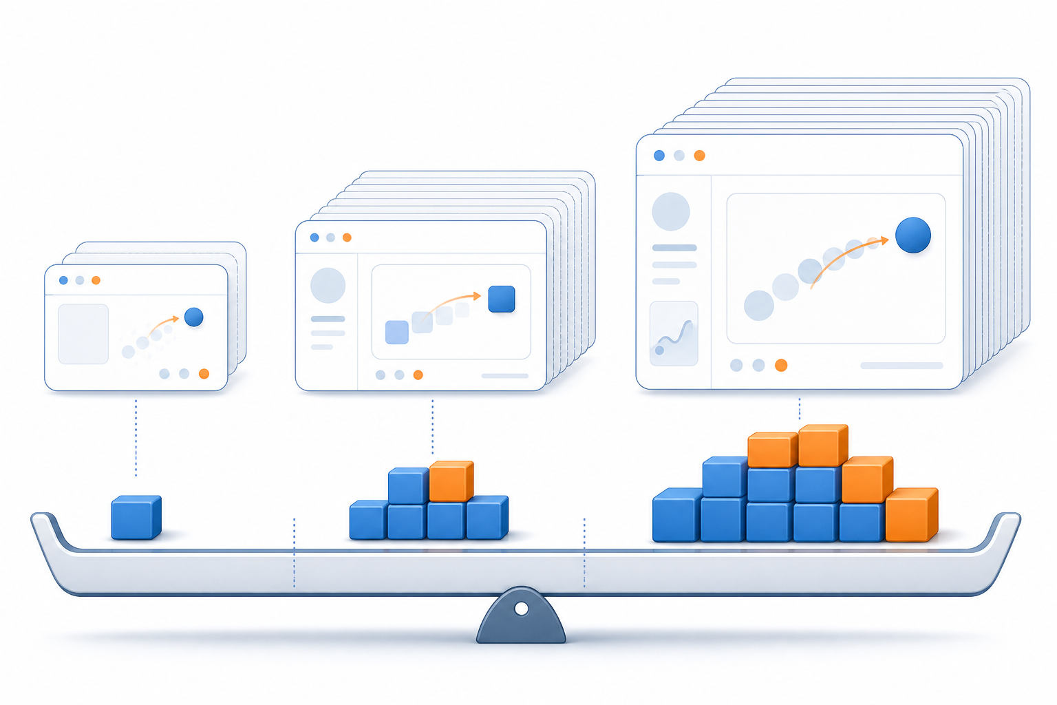
A file size target turns optimization into a design constraint instead of a final rescue attempt. The right target depends on where the animation appears and how many animated assets share the page.
The following ranges are useful starting points rather than universal limits:
| Placement | Suggested target | Practical ceiling | Typical use |
|---|---|---|---|
| Changelog card or index page | 300–700 KB | About 1 MB | One compact interaction or state change |
| Individual release-note page | 500 KB–1.5 MB | About 2 MB | A focused feature demonstration |
| Support article with several animations | 250–800 KB each | About 1.2 MB each | Short instructional steps |
| Email-linked asset page | 300 KB–1 MB | About 1.5 MB | Fast loading on mobile connections |
These targets should be considered collectively. One 1.5 MB animation may be reasonable on a dedicated release page. Six animations of the same size on a changelog index create a 9 MB burden before fonts, screenshots, scripts, and other assets are counted.
A useful page-level rule is to reserve a total animation allowance. For example, a team might permit up to 2 MB of animated assets on a changelog index. A prominent release receives 800 KB, while three smaller demonstrations receive 400 KB each.
Write down the target before capture. It will influence every later decision:
- How tightly the interface should be cropped.
- Whether the cursor needs to remain visible.
- How many seconds are available.
- Whether a static before-and-after image would be clearer.
- Whether the asset belongs on the index or only on the detail page.
Is GIF the Right Format?
GIF is not automatically the best format for every interface demonstration. Its broad compatibility and automatic looping are valuable, but short MP4 or WebM videos can deliver better image quality at a much smaller size when the publishing platform supports them.
Use this decision table before editing:
| Requirement | Better starting choice | Reason |
|---|---|---|
| Automatic loop in a documentation platform | GIF | Usually simple to embed and replay |
| Many colors, gradients, or photographs | MP4 or WebM | Video compression handles complex imagery better |
| A two-state comparison | Static image pair | Animation may add no explanatory value |
| Precise cursor and menu demonstration | GIF or short video | Motion communicates the interaction clearly |
| Accessibility controls are required | Video | Pause and playback controls are easier to provide |
| Asset must appear inside an email | Small GIF with a useful first frame | Client support for embedded video is inconsistent |
If the source is a screen recording, preserve that original recording. It can later be used for a video version, a revised crop, or a higher-quality export. Do not treat the GIF as the master asset.
When GIF is appropriate, a browser-based GIF maker can turn a trimmed source clip or selected frames into the publishable animation. The decisions made before conversion will matter more than an aggressive final compression setting.
Crop to the Interaction, Not the Browser Window
Dimensions are often the strongest predictor of GIF size. Reducing a recording from 1,200 × 800 pixels to a focused 640 × 420 crop removes nearly three quarters of its pixel area.
Begin by identifying the interaction’s visual boundaries. If the demonstration shows a filter menu, the crop may need only the trigger, the menu, and a small amount of surrounding context. The browser tabs, desktop dock, full navigation sidebar, and empty content columns probably contribute nothing.
A good crop answers three questions:
- Where does the action begin?
- What changes after the action?
- Which nearby landmark helps the reader understand the location?
Keep one stable landmark when possible. This might be a panel heading, toolbar edge, or recognizable card. A crop that is too tight can remove context and make the animation feel like an unexplained floating control.
For most changelog columns, an export width between 560 and 800 pixels is sufficient. A 2× capture can still be useful during editing, but the final display asset rarely needs the full captured resolution. Use the image resize tool for supporting poster frames or static alternatives that must match the animation’s displayed width.
Avoid relying on HTML or CSS alone to visually shrink a large GIF. A 1,400-pixel file displayed at 700 pixels still transfers the full-size asset. Resize the actual export.
Record One Complete Action
The ideal changelog animation is usually three to eight seconds long. It begins close to the initial action, shows the resulting state, and ends after a short moment of confirmation.
A compact sequence might look like this:
- 0.0–0.4 seconds: initial interface state.
- 0.4–1.2 seconds: cursor approaches and selects the control.
- 1.2–2.2 seconds: menu or panel appears.
- 2.2–3.5 seconds: changed state remains visible.
- 3.5 seconds: loop ends.
Remove the seconds spent positioning windows, searching for the target, or waiting before the click. Also remove extended pauses at the end. Readers can watch the next loop if they need another look.
A loop does not need to be visually seamless. In instructional UI material, a clear reset is often beneficial because it signals that the explanation is starting again. A forced crossfade between the ending and beginning can add frames and colors without improving comprehension.
If the action requires more than about ten seconds, reconsider the format. Break the explanation into two focused animations, use a controlled video, or pair a static screenshot with concise numbered instructions.
Choose Frame Rate by Interface Motion
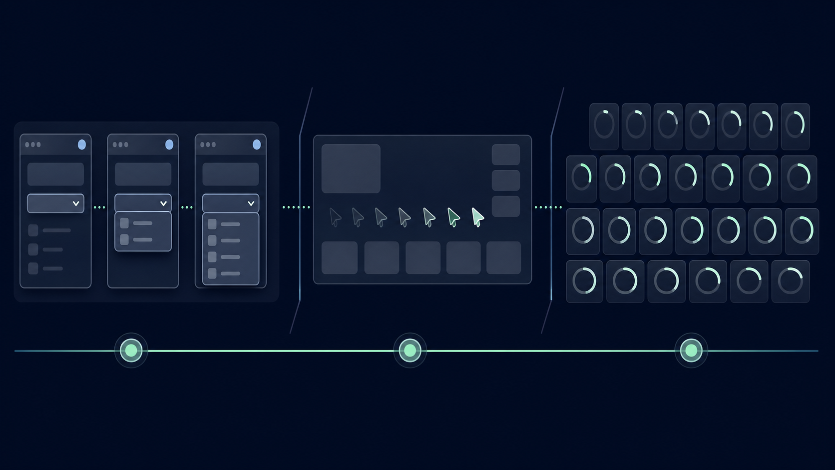
Many screen recorders capture at 30 or 60 frames per second because those settings suit general video. A changelog GIF rarely needs that density.
Frame rate should reflect the type of motion being explained:
| Interface motion | Useful export range | Notes |
|---|---|---|
| Menu opening or checkbox change | 6–10 fps | State transitions remain easy to follow |
| Cursor moving between nearby controls | 10–12 fps | Usually smooth enough at small dimensions |
| Drag-and-drop demonstration | 12–15 fps | Extra frames help show the path and destination |
| Fast drawing or scrubbing interaction | 15–20 fps | Use only when intermediate movement matters |
| Mostly static before-and-after state | 3–6 fps or static images | Additional frames provide little value |
Reducing a five-second capture from 30 fps to 10 fps removes 100 frames. That is a much more meaningful reduction than shaving a few colors from an unnecessarily dense export.
Variable frame delays can improve efficiency further. A menu transition may use several short-delay frames, followed by one final frame held for a full second. This preserves readable pacing without duplicating an unchanged interface many times.
Be cautious when removing every other frame mechanically. The result may skip the exact click state, hover effect, or drag destination that communicates the feature. Review the animation at its intended display size after changing frame density.
Control Cursor Movement and Scrolling
A cursor is helpful when it explains cause and effect. It is distracting when it circles the screen, hesitates, or moves through unrelated areas.
Before recording, place the cursor close to the first target. Move in a direct line, pause briefly over the control, and click once. If a click indicator is available, keep it subtle and high contrast. Large ripples or bright trails introduce extra motion and can obscure the interface.
Scrolling deserves even more restraint. Smooth scrolling changes most rows of pixels in every frame, which is expensive for GIF compression. It can also make small UI text difficult to read.
Prefer one of these alternatives:
- Begin with the target already in view.
- Cut directly between two scroll positions.
- Use a very short scroll at a reduced frame rate.
- Divide the demonstration into separate local interactions.
If continuous scrolling is the feature being announced, consider video instead. GIF performs best when most of the canvas stays stable.
Simplify the Interface Before Capture
Capture a controlled interface state instead of recording a busy personal workspace. This improves clarity and often reduces the number of colors and changing pixels.
Before recording:
- Hide notification badges and live chat widgets.
- Pause animated charts, carousels, or background previews.
- Close unrelated panels and browser extensions.
- Use short, realistic sample data that does not wrap unpredictably.
- Remove personal account details and confidential content.
- Disable blinking insertion points when they are not relevant.
- Keep the browser zoom level consistent across the asset set.
A neutral test account is preferable to blurring sensitive information after capture. Blur introduces gradients, increases visual complexity, and can still fail to protect data if applied inconsistently.
Also inspect the interface theme. Dark themes with soft shadows and translucent surfaces can require many near-identical shades. A light theme is not inherently smaller, but flat surfaces and limited tonal variation generally encode more efficiently. Use the theme that reflects the product experience, then minimize unnecessary decorative motion within it.
Protect Small Text and Thin UI Lines
An optimized GIF is unsuccessful if readers cannot distinguish labels, icons, borders, or input states. Thin interface details are commonly damaged by resizing and palette reduction.
Judge legibility at the size used in the actual changelog column, not only in an editor’s enlarged preview. Pay particular attention to:
- One-pixel dividers.
- Light gray placeholder text.
- Compact menu labels.
- Small checkmarks and radio controls.
- Focus rings and selection outlines.
- Syntax highlighting with several similar colors.
Resize once, near the end of editing. Repeatedly shrinking and enlarging the capture softens edges. If the final GIF will be 640 pixels wide, test a direct export at that width rather than resizing several intermediate copies.
Palette reduction can cause color banding or merge a faint border into its background. Preserve contrast in the product state before capture when possible. If a border is essential to the explanation, it may need slightly stronger contrast in the demo environment.
Dithering can make gradients look smoother, but it introduces patterned pixel noise that may increase file size. For interfaces with flat surfaces, low dithering or no dithering often provides a cleaner result. Reserve heavier dithering for a small region where a gradient genuinely matters.
Use Color Reduction Deliberately
GIF supports a maximum of 256 colors per frame, but many interface demonstrations need far fewer. An asset based on a simple settings panel may remain clear at 64 or even 32 colors.
Test color counts in descending stages:
- Export at 128 colors and note the file size.
- Compare a 64-color version at normal display size.
- Try 32 colors if the interface is mostly flat.
- Stop when text edges, icons, shadows, or state colors visibly degrade.
Do not choose the smallest result solely by percentage. A 10% reduction is not worthwhile if it makes a selected tab ambiguous. Conversely, a subtle shadow may be expendable if removing its shades cuts hundreds of kilobytes.
Brand gradients, user avatars, photographs, and colorful charts make palette reduction harder. Crop them out when they are unrelated to the release. If they are central to the feature, a short video or static WebP image may be the more responsible format.
For static supporting frames, the image converter can help compare PNG, JPEG, and WebP alternatives. This is useful when the animation can be replaced with a still image on an index page and linked to a richer demonstration on the release page.
Build a Useful First Frame
Some email clients, content previews, reduced-motion settings, and slow-loading environments may expose only the first frame. It should make sense on its own.
Avoid beginning with an empty loading state or a cursor outside the crop. Instead, show the relevant control and enough context to identify the feature. If the end state is more informative than the beginning, consider using it as a separate static poster image where the platform permits one.
The first frame should also reserve the correct layout space. Width and height attributes or an aspect-ratio container prevent surrounding text from shifting when the asset loads. This improves page stability even though it does not reduce the GIF itself.
Do not place essential instructions inside the animation. Small labels added during editing can become blurry, and users who cannot view motion may miss them. Put the explanation in the changelog copy and treat the GIF as supporting evidence.
Test the Loop in Its Real Publishing Context
An asset viewed alone on a desktop can seem excellent while performing poorly inside a narrow content column. Test the actual page or a realistic preview.
Use this release checklist:
- Confirm that the GIF’s intrinsic dimensions are close to its display dimensions.
- Load the page on a phone-width viewport.
- Test with a throttled or ordinary mobile connection.
- Verify that the first frame is informative.
- Check the transition from the last frame back to the first.
- Confirm that surrounding copy explains the action without relying on motion.
- Inspect text, dividers, and focus states at 100% zoom.
- Ensure no private data, internal URLs, or account identifiers are visible.
- Compare total animated bytes against the page-level budget.
- Provide a static alternative when the publishing system supports reduced-motion behavior.
If the page contains several GIFs, test them together. Simultaneous animation can become visually exhausting even when each asset works in isolation. Consider allowing only the primary demonstration on the index page and moving secondary assets to individual release pages.
A static preview can be optimized separately with an image compression tool, allowing the index to remain light while the detailed page carries the animated explanation.
A Practical Export Teardown
Consider a seven-second recording of a new table-filter interaction. The original capture is 1,440 × 900 pixels, 30 fps, and includes a navigation sidebar, header, table, cursor movement, and a short scroll. Its first GIF export is 8.4 MB.
A focused revision could proceed as follows:
| Change | New specification | Why it helps |
|---|---|---|
| Remove idle time | 4.5 seconds | Eliminates frames before and after the action |
| Tighten crop | 720 × 460 pixels | Retains the filter and enough table context |
| Reduce frame rate | 10 fps | Cuts frame count from 210 to about 45 |
| Remove scroll | Target begins in view | Keeps most pixels stable between frames |
| Limit palette | 64 colors | Suits the flat interface surfaces |
| Hold final state | Longer delay on last frame | Allows reading without duplicate frames |
The revised animation has less than one quarter of the original pixel area and roughly one fifth of its frame count. The exact output size will depend on the interface, but these structural changes are likely to matter far more than a generic optimization slider.
Notice what was preserved: the filter trigger, cursor action, open menu, selected option, and updated table. The animation did not become merely smaller; it became more specific.
Naming and Maintaining Changelog Assets
A consistent naming scheme makes it easier to replace, audit, and retire animations. Avoid vague filenames such as demo-final-2.gif.
A practical pattern is:
release-date_feature_action_width.gif
For example:
2026-07_saved-filters_apply-filter_640.gif
The filename records the release period, feature, demonstrated action, and export width. Store the source recording beside an editable project or capture note, not only the final GIF. Record the crop dimensions, frame rate, color count, duration, and approximate file size so future assets can match the established standard.
When a feature is redesigned, review old changelog and support animations. An outdated GIF can create more confusion than no animation, especially when controls have moved or labels have changed.
Final Publishing Checklist
Before uploading a UI demo GIF, confirm the following:
- The animation explains one product change.
- The duration is usually under eight seconds.
- The crop includes the action and one useful landmark.
- The exported width matches the content column.
- The frame rate reflects the motion rather than the recorder default.
- Long cursor travel and smooth scrolling have been removed.
- Small text and thin lines remain readable.
- The color count is reduced only as far as the interface permits.
- The first frame works as a meaningful fallback.
- The file fits both its individual budget and the page-level allowance.
- The original screen recording has been preserved.
- Sensitive data and internal identifiers are absent.
- The surrounding copy remains understandable without animation.
Lightweight changelog GIFs are created primarily through selection. Select one action, one useful crop, a short duration, and only enough frames and colors to communicate the result. When those decisions are made before export, compression becomes a finishing step rather than an emergency repair.