LMS Course Screenshot Pack Audit for Training Content Updates
A practical guide for cleaning, checking, resizing, and packaging LMS course screenshots so training teams can review interface changes without confusing learners.

LMS Course Screenshot Pack Audit for Training Content Updates
Learning management system screenshots age faster than most training teams expect. A button label changes, a sidebar gains a new icon, a mobile view moves a menu behind a drawer, or an admin setting quietly relocates to a different tab. The course may still be accurate in spirit, but learners notice when the screen in the lesson does not match the screen in front of them.
This guide is for training managers, instructional designers, enablement teams, and support educators who maintain screenshot-heavy courses inside an LMS. The goal is not to make every image pretty. The goal is to make course screenshots reliable, readable, consistently sized, and easy to review before they are uploaded again.
A good screenshot pack audit answers four practical questions:
- Does each screenshot still match the live product or process?
- Is the important area visible without extra clutter?
- Will the image remain readable on mobile and desktop course pages?
- Can reviewers sign off on the full set without chasing scattered files?
The method below works for SaaS training, internal systems, HR portals, compliance courses, customer onboarding, and help center lessons that are exported into an LMS.
Why LMS Screenshot Packs Need Their Own Audit
Course screenshots are different from marketing images and support screenshots. They carry instructional authority. A learner may pause a video, compare the course image to the live application, and follow each visible step. Small visual mismatches can create disproportionate confusion.
Common problems include:
- Screenshots captured at mixed zoom levels
- Old navigation labels mixed with new ones
- Crops that hide the button learners need to click
- Blurry text after repeated compression
- Desktop screenshots used in mobile-first lessons
- Instructor annotations that cover key interface states
- Sensitive user data left visible in sample accounts
- File names that no longer identify the lesson or step
A general image cleanup pass can improve file size and appearance, but an LMS audit needs a stronger editorial layer. You are not only asking whether the image looks clean. You are asking whether it teaches the right thing.
Choose a Narrow Review Scope
Do not begin by opening every course image your team has ever published. Start with one course, one module, or one learner path. Screenshot audits become messy when the scope is vague.
A useful scope statement is specific enough that another teammate could gather the same files:
| Scope Type | Good Example | Risky Example |
|---|---|---|
| Course | Customer Admin Basics, version 2026.2 | All onboarding screenshots |
| Module | Lesson 3: Creating user groups | Admin training |
| Platform | Desktop web only | All device types |
| Learner role | Billing manager screenshots | Customer screenshots |
| Update trigger | Navigation redesign released May 2026 | Recent UI changes |
For a first pass, choose screenshots that are most likely to mislead learners: navigation, settings, permissions, payment screens, account creation, reporting filters, and anything with step-by-step instructions.
If the course has video lessons, downloadable PDFs, and embedded images, treat the embedded images first. They are often easier to update quickly and are more likely to be reused across lessons.
Build a Source Folder Before You Edit
Before resizing, compressing, or annotating anything, gather the original screenshot files into a source folder. If originals are not available, export the best available versions from the LMS and label them clearly as exported copies.
A simple folder structure works well:
course-screenshot-audit/
  00-source/
  01-review-crops/
  02-final-images/
  03-review-pdf/
  notes/
Use file names that preserve course context. Avoid names like image-1.png, screen-final-new.png, or admin-updated-v2-final.png. They collapse as soon as another lesson is added.
A better naming pattern is:
course-module-step-device-short-description.pngFor example:
admin-basics-03-04-desktop-add-user-button.png
admin-basics-03-05-mobile-role-menu.png
admin-basics-04-02-desktop-report-filter.png
This makes review easier because the file name already tells reviewers where the screenshot belongs. It also helps later when the LMS media library separates files from lesson pages.
The Audit Pass: What to Check Before Editing

Start with review, not retouching. If you crop and polish an outdated screenshot, you have made the wrong file easier to publish.
Open each screenshot next to the current live interface or the latest product reference. Check the core instructional elements first:
- The main page or panel still exists
- Navigation labels match the lesson text
- Buttons and menu items are in the expected location
- Empty, loading, and error states are not accidentally shown
- User names, emails, company names, IDs, and financial data are safe
- Any visible dates are generic or intentionally current
- The screenshot matches the learner role described in the lesson
- The image supports the exact step, not just the general area
If you need to extract visible labels from a screenshot to compare them with a script or lesson outline, an OCR pass can help. ConvertAndEdit's Image OCR tool is useful for pulling interface text from screenshots so you can spot outdated labels, misspellings, or inconsistent terminology without manually reading every pixel.
Do not rely on OCR as the only review method. It may miss tiny text, icon-only controls, disabled states, or labels hidden by annotations. Use it as a second set of eyes for text-heavy screens.
A Simple Status System
Use a status label for each file before editing:
| Status | Meaning | Action |
|---|---|---|
| Keep | Accurate and readable | Resize or compress if needed |
| Recapture | Interface has changed | Take a new screenshot |
| Crop | Correct screen, too much clutter | Create a cleaner crop |
| Redact | Sensitive or distracting data visible | Remove or replace before review |
| Replace | Wrong role, wrong step, or poor quality | Do not reuse |
| Confirm | Unclear accuracy | Ask product owner or trainer |
This keeps the audit from turning into a subjective design debate. The first decision is whether the screenshot can teach the intended step. Visual polish comes after that.
Recapture Screenshots With Consistent Conditions
When a screenshot must be replaced, capture it under controlled conditions. Mixed capture conditions are one of the main reasons course images feel uneven.
Pick standards before the team starts capturing:
| Setting | Recommended Choice | Why It Matters |
|---|---|---|
| Browser zoom | 100 percent | Prevents inconsistent UI scale |
| Window width | Fixed desktop width, such as 1440 px | Keeps navigation and panels predictable |
| Theme | Match the course default | Avoids light and dark mode confusion |
| Account role | Real learner role or demo equivalent | Prevents admin-only controls from appearing |
| Demo data | Clean, generic, realistic | Reduces redaction work |
| Cursor | Hide unless it clarifies the action | Avoids accidental visual clutter |
| Notifications | Clear before capture | Prevents irrelevant banners |
For mobile lessons, capture mobile screenshots separately. Do not crop a desktop screenshot into a tall image and pretend it represents the mobile experience. Mobile views often change navigation, spacing, menus, and visible fields.
If your LMS displays screenshots inside a narrow lesson column, test one image in the actual course shell before recapturing the full set. The ideal screenshot width for a help article may not be the ideal width for an LMS lesson page.
Crop for the Learner's Next Action
The best crop is not always the tightest crop. In training content, learners need enough surrounding context to recognize where they are. A button alone may be too abstract. A full browser window may be too busy.
Use the learner's next action as the crop anchor. Ask: what must the learner locate, compare, or confirm at this point in the lesson?
For a navigation step, include the sidebar and the active page area. For a form step, include the field label, the field itself, and the nearby save or continue action if relevant. For a settings step, include enough breadcrumbs or panel context to make the location clear.
A practical crop rule:
- Keep the action target visible
- Keep one layer of surrounding context
- Remove browser chrome unless the browser itself matters
- Remove empty whitespace that does not help orientation
- Avoid crops that cut through labels, panels, or buttons
When you need a consistent final size across images, crop first and resize second. If you resize first, you may shrink important text before deciding what should remain visible.
ConvertAndEdit's Resize Image tool is useful after the editorial crop is approved. It can help standardize screenshot widths for LMS upload while keeping the original source files untouched.
Make Text Readable Without Oversizing Every Image
LMS screenshots often fail in two opposite ways. Some are too large, forcing learners to scroll past huge interface images. Others are too small, turning labels into gray texture.
A readable course screenshot usually needs three things:
- A crop that removes irrelevant space
- A final width that fits the LMS content column
- Compression that does not smear thin UI text
For desktop interface screenshots, a final width between 1200 and 1600 pixels is often enough for standard course pages, but the right number depends on your LMS template. For mobile screenshots, preserve the phone aspect ratio and avoid stretching them to match desktop image widths.
Use these checks before final upload:
| Check | Pass Condition |
|---|---|
| Lesson preview | Key labels are readable inside the LMS page |
| Mobile preview | Screenshot does not require awkward pinch zooming |
| Annotation clarity | Arrows or highlights do not cover important UI text |
| File size | Image loads quickly on a typical connection |
| Scaling behavior | LMS does not enlarge a small image beyond its real quality |
If your LMS automatically compresses uploaded images, keep a higher-quality final image than you would use on a static web page. Some platforms recompress aggressively, and a file that looked acceptable before upload may become fuzzy afterward.
Use Compression Carefully on Interface Images
Screenshots with UI text, thin lines, icons, and subtle borders are less forgiving than photos. Heavy compression can blur the exact details learners need to identify.
The safest pattern is to keep a lossless or high-quality source image, then create a separate upload version. Never overwrite the source during compression.
Use ConvertAndEdit's Compress Image tool when you need smaller upload files, but inspect the result at the size learners will actually see. Do not judge only from a zoomed-out file manager preview.
Pay close attention to:
- Thin text in navigation menus
- Disabled button labels
- Table grid lines
- Small icons near field labels
- Red error messages
- Badges, tags, and status pills
- Dotted focus outlines or selection states
If the screenshot contains mostly flat UI and text, PNG may preserve clarity better. If it contains photographic content inside the interface, WebP or JPEG may reduce size more effectively. For mixed screenshots, compare two exports before choosing one format for the full pack.
ConvertAndEdit's Convert Image tool can help test format options without changing the original capture set.
Annotations: Helpful Only When They Reduce Search Time
Annotations can make a course screenshot clearer, but they can also become visual noise. The test is simple: does the annotation help the learner find the next action faster?
Use annotations for:
- Highlighting a small control in a dense interface
- Showing the active tab or selected menu item
- Distinguishing similar buttons on the same screen
- Calling attention to a field that is below a heading
- Marking a before-and-after state
Avoid annotations when:
- The lesson text already names the only visible button
- The arrow covers the label being discussed
- Multiple highlights compete for attention
- The screenshot will be reused in another lesson with a different purpose
- The annotation style looks different from the rest of the course
Keep annotation colors consistent. A training course that uses red circles, yellow boxes, blue arrows, and green highlights interchangeably begins to feel accidental. Pick one primary highlight style and reserve stronger colors for warnings or important exceptions.
If an image needs multiple callouts, consider splitting the lesson step into two screenshots instead. A crowded annotated screenshot often means the instruction is doing too much at once.
Redaction Without Breaking the Lesson
Training screenshots often include names, emails, account numbers, customer records, calendar details, or internal project labels. Redaction should protect sensitive data without making the interface look suspicious or confusing.
Good redaction is boring. It replaces or masks sensitive details while preserving the structure learners need to understand.
Use generic but realistic sample data:
| Sensitive Item | Better Replacement |
|---|---|
| Real customer name | Sample Company |
| Real email address | learner@example.com |
| Internal project name | Demo Project |
| Actual invoice number | INV-000123 |
| Private address | 100 Sample Street |
| Real teammate name | Jordan Lee |
When possible, create or update demo data in the source application before recapturing. Editing the screenshot afterward is useful for small fixes, but it can introduce inconsistencies if the same fake record appears elsewhere with different details.
If a screenshot needs object removal, replacement, or careful cleanup, use an editing pass rather than crude blocks. ConvertAndEdit's AI Photo Editor can help with visual cleanup, but keep the result faithful to the interface. The purpose is not to redesign the product. The purpose is to remove distractions while preserving the teaching value.
Packaging the Final Review Set
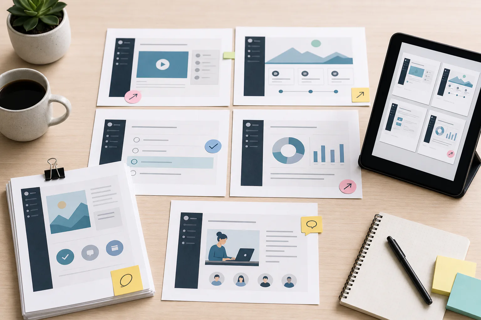
A screenshot audit is only useful if reviewers can inspect the final set easily. Sending a folder of individual files may work for the designer, but product owners, compliance reviewers, or training leads often need a compact packet.
A review packet should show screenshots in course order, with enough context to approve or reject each one. You can create a simple PDF that includes the screenshot, file name, lesson location, and status notes.
A lightweight review page can include:
- Course name
- Module and lesson number
- Screenshot file name
- Intended learner action
- Replacement status
- Reviewer decision
- Short notes field
If your team stores screenshots as separate image files, ConvertAndEdit's Image to PDF tool can turn the final review images into a PDF packet. For larger courses with separate sections, create one PDF per module so reviewers are not forced to scan a long mixed document.
When multiple reviewers need to compare images, consider adding a contact-sheet page at the beginning. It helps people spot obvious inconsistencies in size, theme, crop style, and annotation color before reading every lesson.
Upload Order and LMS Media Hygiene
Uploading final images into the LMS can create a second round of confusion if old and new files sit beside each other with similar names. Before upload, decide whether your LMS supports replacing media in place or requires new assets.
If it supports replacement, confirm that replacing one file will update every lesson where that image appears. That can be useful for shared screenshots, but risky if the same image was reused in different instructional contexts.
If it requires new uploads, use clear versioned names. A date or product release number is more useful than new or final.
Examples:
admin-basics-03-04-desktop-add-user-button-2026-05.png
admin-basics-03-04-desktop-add-user-button-release-2026-2.png
After upload, check the actual course page, not just the media library preview. Some LMS themes add borders, scale images, lazy-load assets, or display them differently inside accordions, tabs, quizzes, and mobile apps.
Verify at least three conditions:
- The image appears in the correct lesson step.
- The image is readable inside the learner view.
- The old screenshot no longer appears in cached or duplicated lesson content.
If your LMS has a staging or preview mode, use it. If not, publish during a low-traffic window and keep a rollback folder with the previous assets.
A Practical Checklist for the Final Pass
Use this checklist before calling the screenshot pack complete.
Accuracy
- The screenshot matches the current interface
- The learner role is correct
- Navigation labels match the lesson copy
- The visible state supports the described action
- No obsolete banners, beta labels, or temporary messages are visible
Readability
- Main labels are readable in the LMS preview
- The crop includes enough context to orient the learner
- Important UI text is not blurred by compression
- Mobile and desktop screenshots are not mixed accidentally
- Annotations do not cover the target control
Privacy
- Real user data is removed or replaced
- Account IDs, tokens, and internal URLs are not exposed
- Demo data is consistent across the course
- Redaction does not hide information required for the lesson
File Hygiene
- File names identify course, module, step, device, and subject
- Source files are preserved separately from upload versions
- Final images are stored in course order
- Review notes are archived with the final packet
- The LMS media library does not contain confusing duplicates
Review
- Product owner or subject expert approved changed screens
- Training owner approved crop and annotation choices
- The review packet matches the uploaded files
- A sample learner view was checked after upload
- Any unresolved questions are documented for the next course update
Example: Updating a User Permissions Lesson
Imagine a course module that teaches managers how to grant reporting access to a teammate. The product team recently renamed Team Settings to Workspace Members, moved permission controls into a side panel, and changed the save button label.
A rushed update might replace only the first screenshot and leave the rest untouched. That creates a confusing lesson: the learner sees the new navigation in step one, then old labels in step two, then a button name that no longer exists.
A better audit would identify every screenshot in the lesson that includes the old navigation or permissions panel. The team would recapture the sequence using a clean demo account, crop each image around the learner's next action, and extract visible labels with OCR to compare against the lesson script.
The final image set might include:
permissions-02-01-desktop-workspace-members-nav.png
permissions-02-02-desktop-member-row-actions.png
permissions-02-03-desktop-access-side-panel.png
permissions-02-04-desktop-save-permissions.png
The review PDF would show all four in order. The product owner would confirm the interface state, the training owner would confirm instructional clarity, and the LMS publisher would upload the final images using the same file names.
This kind of structured pass prevents partial updates, which are often worse than visibly old courses because they make learners question which parts are trustworthy.
Common Mistakes That Slow Teams Down
The most common mistake is editing before deciding. Teams crop, blur, compress, and annotate screenshots, then discover the underlying screen is obsolete. Always check accuracy first.
The second mistake is optimizing for the file manager instead of the learner view. An image that looks fine when opened at full size may be unreadable inside a narrow LMS content area. Preview inside the course shell before final approval.
The third mistake is treating screenshots as disposable attachments. In long-running courses, screenshots are part of the curriculum. They need naming, versioning, and review notes just like lesson scripts.
The fourth mistake is using one capture for every device. If a lesson is meant for mobile learners, capture mobile screens. If the process differs by device, say so and show the correct interface.
The fifth mistake is over-annotating. Every arrow and highlight should earn its place. If the learner needs five visual marks to understand one step, the lesson probably needs to be broken into smaller actions.
When to Update the Lesson Text Too
A screenshot audit often reveals that the surrounding lesson copy needs attention. Do not treat image replacement as isolated maintenance.
Update the text when:
- A button, menu, tab, or field has been renamed
- The order of actions has changed
- A screen now includes a required confirmation step
- The screenshot shows a new warning, tooltip, or status message
- A role or permission requirement has changed
- The lesson refers to a visual location that no longer exists
For example, Click Team Settings in the left sidebar may become inaccurate even if the screenshot clearly shows the new Workspace Members label. Learners still read the instruction first. Image and text must agree.
If lesson text is maintained in a separate authoring tool, log every copy change next to the screenshot file name. That makes it easier to confirm that both assets moved together during publishing.
A Sustainable Cadence for Screenshot Maintenance
You do not need to audit every screenshot every week. You need a cadence tied to real change triggers.
Good triggers include:
- Major product navigation updates
- New onboarding course releases
- Compliance or certification review cycles
- Support ticket spikes around a trained task
- LMS theme or template changes
- Product screenshots reused in sales or partner training
- Localization updates that affect interface labels
For stable courses, a quarterly sample review may be enough. For fast-moving SaaS products, audit the highest-impact modules after every major release. Prioritize lessons tied to activation, billing, permissions, security, reporting, and integrations because mistakes there create more learner friction.
Keep a short audit log with the date, scope, reviewer, and files changed. It does not need to be elaborate. The value is in knowing when a course was last checked and what triggered the update.
Final Thoughts
An LMS screenshot pack audit is part visual cleanup, part product accuracy check, and part publishing discipline. The images do not need to be flashy. They need to match the current interface, guide the learner's eye, load cleanly, and survive handoff between reviewers.
Start with a narrow module, preserve your source files, verify the interface before editing, standardize crops and sizes, compress carefully, and package the final set for review. That gives your team a repeatable practical system for keeping screenshot-heavy courses trustworthy without turning every update into a full course rebuild.