Marketplace Product Photo Background Consistency Audit for Small Catalog Teams
A practical guide for checking, cleaning, resizing, and exporting marketplace product photos so backgrounds, edges, shadows, and file sizes stay consistent across a small catalog.

Marketplace Product Photo Background Consistency Audit for Small Catalog Teams
Marketplace product photos rarely fail because one image is terrible. They fail because the catalog slowly becomes uneven. One item has a warm gray background, another is pure white, a third has a hard shadow, and the fourth still has a ragged cutout edge from a rushed edit. Each photo may look acceptable alone, but the grid feels inconsistent when customers compare products side by side.
This guide is for small ecommerce teams, marketplace sellers, content assistants, and product managers who need a repeatable way to review product photo consistency without opening heavyweight design software for every image. The focus is not high-end retouching. It is practical catalog hygiene: backgrounds, crops, shadows, edges, dimensions, file size, and export format.
You can use this audit before uploading a new batch of products, before a seasonal refresh, or before moving a catalog between platforms. It works for handmade goods, replacement parts, cosmetics, packaged food, apparel accessories, used equipment, and any catalog where product photos need to look like they belong together.
Why Background Consistency Matters More Than Perfect Retouching
A marketplace grid is a comparison interface. Shoppers scan price, shape, color, size, and trust signals within seconds. If every image uses a slightly different visual language, the shopper has to work harder to understand the products.
Inconsistent backgrounds create several problems:
- Products look like they came from different sellers, even when they are from one brand.
- Color perception shifts because warm, cool, or tinted backgrounds change how the product reads.
- Search and category pages look less credible.
- Small products appear cheaper when they float too far from the camera.
- Cutout edges become obvious when placed against white marketplace pages.
- Compression artifacts become more visible around shadows and transparent edges.
The goal is not to make every image sterile. A catalog can still have personality. The key is to define a narrow visual range so shoppers can compare items without distraction.
Pick One Background Standard Before Editing
Before touching any files, decide which background type the catalog should use. Do not mix standards unless there is a clear product reason.
| Background type | Best for | Watch out for |
|---|---|---|
| Pure white | Marketplace listings, small product grids, technical parts | Ragged edges, disappearing white products, harsh cutouts |
| Light gray | Premium goods, white products, soft shadow styling | Platform rules that require white backgrounds |
| Transparent PNG or WebP | App assets, overlays, documentation, composite images | Edge halos, inconsistent previews, larger files if exported poorly |
| Lifestyle surface | handmade goods, decor, food, apparel accessories | Harder to keep consistent across batches |
| Brand color backdrop | limited collections, campaign pages | Can distract from color-sensitive products |
For most marketplace catalogs, pure white or very light gray is the safest standard. If you sell white, clear, metallic, or reflective items, a faint gray can make product edges more visible. If the platform requires white backgrounds for primary images, use gray only for secondary images.
If you need to convert existing product files into a standard format before review, start with a neutral pass in ConvertAndEdit's image converter. Standardizing JPEG, PNG, or WebP inputs makes the rest of the audit easier.
Build a Small Reference Set
A reference set is a group of 6 to 12 images that define what good looks like for the catalog. It should include different product shapes, sizes, materials, and colors.
Choose examples that are already close to the desired standard. Include:
- One dark product.
- One light product.
- One reflective or glossy product if your catalog has any.
- One tall item.
- One wide item.
- One small item that tends to look lost in the frame.
- One product with fine edge detail, such as fabric, hairline parts, labels, or transparent packaging.
Place these images in a folder named something like reference-product-photos. Do not constantly replace them. The reference set should act as a visual ruler for new batches.
When reviewing a new batch, compare against the reference set rather than relying on memory. Memory is too forgiving. A side-by-side grid reveals problems quickly.
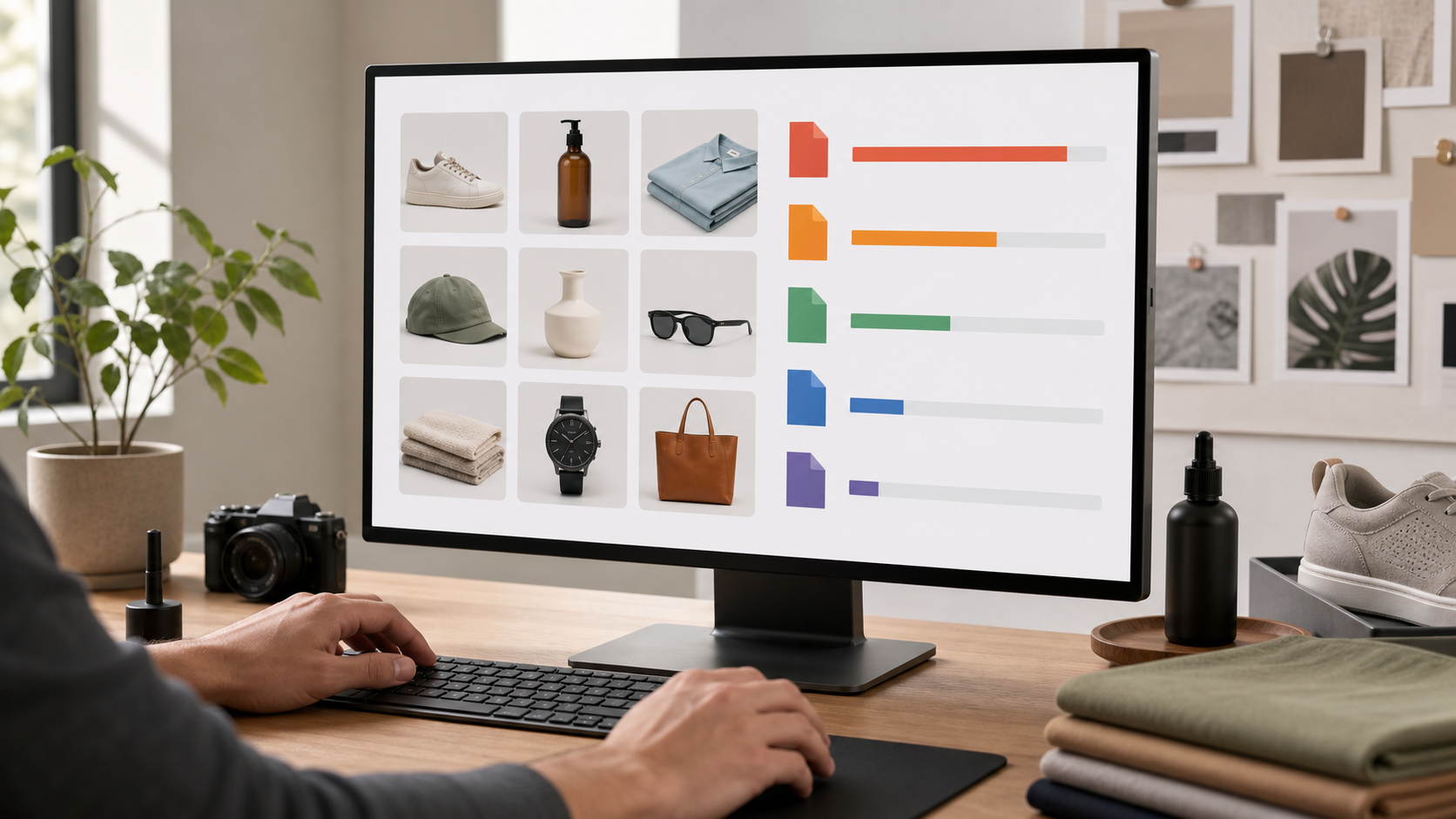
The Background Consistency Scorecard

Use a simple scorecard for each image. The point is to make review decisions fast and less subjective.
| Check | Pass | Needs edit | Reject and reshoot |
|---|---|---|---|
| Background color | Matches reference range | Slight tint or uneven brightness | Strong color cast, visible room, messy surface |
| Product scale | Similar visual size to related products | Slightly too small or large | Product cropped off or lost in frame |
| Centering | Balanced and intentional | Slight drift | Product touches edge or feels accidental |
| Shadow | Soft and consistent | Too dark or uneven | Shadow hides product shape |
| Edge quality | Clean at normal zoom | Minor halo or jagged area | Obvious cutout damage |
| Color accuracy | Believable next to reference | Slight warmth or coolness | Product color clearly misleading |
| File weight | Reasonable for use | Needs compression | Too large for catalog pages |
A pass does not mean the image is perfect. It means it is good enough to sit next to the reference set without calling attention to itself.
Review at Grid Size First
Start by viewing images in a grid, not at full size. Most shoppers first see the photo as a thumbnail or category tile. Problems that matter at grid size should be fixed first.
Look for:
- Products that appear much smaller than related items.
- Backgrounds that look warmer, cooler, or darker than the rest.
- Shadows that form heavy gray blocks.
- Images where the product is not visually centered.
- Items that appear blurry compared with their neighbors.
Only after the grid pass should you open individual files. This prevents spending time on tiny flaws that shoppers will never notice while missing obvious catalog-level inconsistency.
Review at 100 Percent for Edge Problems
Once the grid looks coherent, open suspect images at 100 percent. This is where cutout issues and compression damage appear.
Check the edges around:
- Handles, straps, and hooks.
- Transparent packaging.
- Hairline product details.
- White labels on white backgrounds.
- Dark products against light backgrounds.
- Fine fabric, threads, bristles, or fibers.
If the image has a visible halo, jagged outline, or leftover background fragments, use an editor before resizing or compressing. Resizing can hide some defects, but it can also make halos harder to fix later.
For edge cleanup, background removal, object cleanup, or small retouching passes, use the AI photo editor. Keep the request specific: clean the edge, remove leftover background fragments, preserve the product shape, and avoid changing the product color.
Background Cleanup Without Making Products Look Fake
The easiest way to ruin product images is to over-clean them. A perfectly isolated object with no grounding shadow can look artificial, especially for physical goods.
Use these rules when cleaning backgrounds:
- Remove stains, seams, clutter, and color casts.
- Preserve natural product contours.
- Keep soft grounding shadows when they help the product feel real.
- Avoid adding dramatic shadows that are not in the reference set.
- Do not smooth away texture that is part of the product.
- Do not brighten white products until their edges disappear.
If an item was photographed on a white sweep, keep the background natural but even. If it was photographed on a table, decide whether that surface is part of the catalog style. A mixed catalog where some items sit on wood and others float on white usually looks accidental unless the distinction is intentional.
The White Product Problem
White products on white backgrounds need extra care. If you push the background to pure white and remove all shadow, the item can lose its shape. This is common with ceramics, paper goods, white packaging, medical supplies, replacement parts, and apparel accessories.
Use one of these approaches:
| Situation | Better choice |
|---|---|
| Marketplace requires white primary image | Keep a very soft natural shadow and visible edge contrast |
| Product is white and glossy | Use controlled highlights, not heavy contrast |
| Product shape disappears | Add a secondary image on light gray if allowed |
| Edge cleanup creates a halo | Re-edit the cutout before resizing |
If the product color is important, avoid aggressive automatic color correction. A slightly imperfect background is better than a misleading product color.
Crop and Scale Rules for a Calm Product Grid
Cropping is where many catalogs lose consistency. One product fills the frame, another has huge margins, and another is slightly rotated. Even when the background is clean, the grid feels unstable.
Create a few crop rules:
- Leave consistent breathing room around the product.
- Use the same square or vertical ratio for primary images.
- Keep product centers aligned unless the shape requires an exception.
- Do not crop shadows so tightly that they look cut off.
- Group similar product types with similar scale.
For square marketplace thumbnails, a useful starting point is to let the product occupy 70 to 85 percent of the image height or width, depending on shape. Tall products can use height as the guide. Wide products can use width. Small accessories may need category-specific rules so they do not look insignificant.
Use ConvertAndEdit's resize image tool after cleanup, not before. Editing first and resizing second keeps the master file more flexible.
Category-Specific Scale Rules
Different product groups need different framing. A catalog with jewelry, boxes, and posters should not use one strict size rule for every item.
| Product type | Suggested framing |
|---|---|
| Jewelry and small accessories | Larger in frame, strong detail visibility |
| Apparel accessories | Enough margin to show shape and straps |
| Replacement parts | Consistent orientation and clear silhouette |
| Packaged goods | Front label centered, verticals straight |
| Art prints and paper goods | Minimal perspective distortion, square edges |
| Home decor | Keep grounding shadow or surface context if useful |
Document these rules in a short note. The note can be as simple as: Primary images are square, product fills about 80 percent of the frame, soft shadow allowed, background white or near-white, no props. That is enough to keep future batches aligned.
Shadow Consistency: The Overlooked Trust Signal
Shadows are small, but they influence perceived quality. A soft, realistic shadow makes a product feel grounded. A hard, inconsistent, or dirty shadow makes the image feel patched together.
When auditing shadows, compare three things:
- Direction: shadows should not point in wildly different directions across a category.
- Density: shadows should not be much darker for one product than another.
- Shape: shadows should match the product footprint and not look like a generic blur.
For products that stand upright, the shadow can be subtle. For flat products, the shadow may be nearly invisible. For transparent or reflective products, the shadow and reflection need more care because they can create unwanted gray patches.
Do not add heavy artificial shadows just to create depth. Product grids usually benefit from restraint.
Export Settings That Keep the Catalog Fast
A clean product image still needs to load quickly. Oversized catalog images slow category pages, landing pages, and mobile browsing. The trick is to reduce weight without destroying edges, labels, and fine product detail.
Use a two-file mindset:
| File | Purpose | Treatment |
|---|---|---|
| Master file | Future edits and archive | Keep larger, cleaner, less compressed |
| Publish file | Website or marketplace upload | Resize and compress for use |
Never treat the compressed upload file as the only copy. If you need to edit later, go back to the master.
For web publishing, compress after resizing. A 4000 pixel image compressed heavily is still wasteful if it will display at 1200 pixels. Use image compression to create lighter publish files once dimensions are final.
Choosing JPEG, PNG, or WebP
Format choice depends on content and platform support.
| Format | Use when | Avoid when |
|---|---|---|
| JPEG | Standard product photos, white backgrounds, lifestyle images | You need transparency or very sharp flat graphics |
| PNG | Transparency, screenshots, simple graphics, exact edges | Large photographic catalogs where file size matters |
| WebP | Modern web catalogs with good compression | A marketplace does not accept it |
Transparent product cutouts usually need PNG or WebP. Standard marketplace photos usually work well as JPEG if compression is not too aggressive. If you are preparing assets for help centers, app pages, or landing pages, WebP can be useful where supported.
Use the image converter when you need to create platform-specific versions from the same edited master.
A Practical Naming System for Batch Review
File names are not glamorous, but they prevent mistakes. A clean naming system helps you find the right image, compare versions, and avoid uploading old files.
Use names that include:
- Product identifier or SKU.
- View type.
- Version or date if needed.
- Publish status if your team needs it.
Examples:
sku-4821-front-master.png
sku-4821-front-web.jpg
sku-4821-detail-01-web.jpg
sku-4821-packaging-web.jpg
Avoid names like:
final.jpg
final2.jpg
new-final-fixed.jpg
image-1234.jpg
When a catalog has multiple channels, add the destination only when settings differ:
sku-4821-front-marketplace.jpg
sku-4821-front-store-webp.webp
sku-4821-front-print-master.png
This is especially useful when marketplace images need pure white backgrounds but your own store uses light gray or transparent product assets.
Batch Audit Checklist
Use this checklist before uploading a product photo batch.
Before Editing
- Confirm the required platform image dimensions.
- Confirm allowed file formats.
- Choose the background standard.
- Select or update the reference set.
- Separate master files from publish files.
- Remove duplicates and obvious failed shots.
During Cleanup
- Fix background color or clutter.
- Clean edge halos and cutout fragments.
- Preserve product color and texture.
- Keep shadows within the reference range.
- Straighten packaging, labels, or rectangular products.
- Crop related products to a similar visual scale.
Before Export
- Resize to the required pixel dimensions.
- Compress a copy, not the only master.
- Check fine text or labels at 100 percent.
- Compare the compressed version against the clean version.
- Confirm file names match the upload list.
- Open the folder as a grid and scan one final time.
For catalogs that need a printable review packet, convert selected images into a PDF contact sheet or evidence file with image to PDF. This is useful when a manager, client, or supplier needs to approve the batch without downloading individual images.
Common Problems and Fast Fixes
| Problem | Likely cause | Fast fix |
|---|---|---|
| Product looks gray or dull | Background correction affected the product | Re-edit with product color preserved |
| White item disappears | Background is too bright and shadow is gone | Restore edge contrast or use a secondary gray image |
| Cutout has a glow | Old background color remains on edge | Clean edge before resizing |
| Category grid feels uneven | Crop scale varies | Re-crop by product group |
| Files are too large | Images were compressed before resizing or not resized | Resize first, then compress |
| Fine label text looks broken | Compression is too strong | Use lighter compression or larger dimensions |
| Transparent asset previews poorly | Format or matte color mismatch | Test PNG and WebP against the real page background |
Do not fix every issue with the same tool setting. A glossy bottle, a cotton pouch, and a metal bracket have different edge and shadow needs. The audit gives you a consistent standard, but the edit still needs judgment.
When to Reshoot Instead of Edit
Some images are not worth saving. Editing can clean many problems, but it cannot reliably fix poor source quality without creating fake-looking results.
Reshoot when:
- The product is out of focus.
- Important detail is hidden by glare.
- The product color is clearly inaccurate.
- The item is cropped off at the edge.
- The camera angle misrepresents shape or size.
- The original resolution is too small for the required output.
- The background contaminates transparent or reflective edges too heavily.
A reshoot is often faster than ten rounds of cleanup. This is especially true for reflective products, white packaging, metallic surfaces, and transparent plastic.
Approval Pass for Small Teams
A small team does not need a complex approval system. It needs a clear final pass that catches mistakes before upload.
Use a three-pass review:
| Pass | Reviewer focus | Time per image |
|---|---|---|
| Grid pass | Consistency, scale, background | 5 to 10 seconds |
| Detail pass | Edges, labels, compression | 15 to 30 seconds for flagged images |
| Upload pass | filenames, dimensions, format | quick folder check |
If two people review the batch, split responsibilities. One person checks visual consistency. The other checks technical requirements. This keeps review focused and reduces circular opinions about style.
For larger batches, review in groups of 25 to 50 images. After that, fatigue makes small differences harder to see.
A Simple Example: 40 Handmade Product Photos
Imagine a shop preparing 40 handmade ceramic items for a marketplace refresh. The existing photos were taken over several months. Some use a white paper sweep, some use a beige table, and some have warm afternoon light.
A practical cleanup plan would look like this:
- Choose the strongest 8 images as the reference set.
- Decide that primary images will use a near-white background with a soft grounding shadow.
- Remove obvious beige surface color from the table images.
- Keep subtle shadows so white ceramics do not disappear.
- Crop bowls, mugs, and plates with separate scale rules.
- Resize all primary images to the marketplace requirement.
- Compress publish copies while keeping master files untouched.
- Review the final folder as a grid before upload.
The result does not need to look like a luxury studio campaign. It needs to look coherent, accurate, and easy to compare.
Final Pre-Upload Standard
A product photo batch is ready when a shopper can scan the grid without noticing the editing. The background should support the product, not announce itself. The crop should make comparison easy. The file should be light enough for the page. The product should still look like the actual item.
Use this final standard:
- The background belongs to the same visual family across the batch.
- Similar products have similar scale and placement.
- Edges are clean at normal viewing size.
- Shadows are soft, believable, and consistent.
- Product color has not been sacrificed for a cleaner backdrop.
- Publish files are resized and compressed from clean masters.
- File names make uploads and future edits easy to track.
Small catalog teams do not need a full creative department to produce consistent marketplace images. They need a reference set, a repeatable audit, and careful export habits. Once those pieces are in place, each new batch becomes easier to review, easier to edit, and easier for shoppers to trust.