Partner Logo Image Preflight: A Practical Workflow for Help Centers and Marketplace Pages
A niche, practical workflow for preparing partner logos, integration badges, and app marks so they stay sharp, transparent, consistent, and lightweight across help centers.
Partner Logo Image Preflight: A Practical Workflow for Help Centers and Marketplace Pages
Partner logos look simple until they have to live inside a real publishing system. A partner page needs them to align in a grid. A help center article needs them to remain readable on mobile. A marketplace listing needs them to work on white, gray, and sometimes dark surfaces. A sales deck needs the same files in a PDF. Then someone uploads a 4,000 pixel PNG with invisible padding, a JPEG with a white box around it, or a tiny transparent mark that becomes soft after resizing.
This post is a practical preflight workflow for teams that publish partner logos, integration badges, certification marks, sponsor logos, and app marketplace icons. It is intentionally niche because the problem is niche: not general image optimization, not brand design, and not logo creation. The goal is to make third-party logo files predictable before they enter your CMS, help center, marketplace page, or documentation library.
You can use this workflow when you receive assets from partners, agencies, vendors, community sponsors, affiliate programs, software integrations, event organizers, or internal teams. It works especially well when you do not control the original design system and need to clean up what you were given without redesigning the logo itself.
Why Partner Logos Break Publishing Workflows
Most logo problems are not obvious in the original file. They appear after the file is placed inside a constrained layout.
A partner logo may look fine when opened alone, but fail when it sits beside ten other logos. The most common issues are uneven padding, blurry exports, white backgrounds disguised as transparency, tiny strokes that vanish after compression, and mismatched aspect ratios that make one brand look louder than another.
The publishing risk is not only visual. Messy logo files slow down content operations. Editors start resizing by hand. Developers add one-off CSS rules. Designers rebuild assets that should have been ready already. Support teams upload oversized files into articles. A single inconsistent logo can turn a clean integration page into a patchwork.
A preflight workflow solves this by separating asset quality from page design. Before a logo reaches the CMS, it passes a short set of checks: source quality, transparency, crop bounds, safe padding, format choice, pixel size, compression, naming, and final preview.
The Preflight Standard: What Good Looks Like
A web-ready partner logo should satisfy a few practical conditions.
It should have a clean transparent background when transparency is needed. It should not include random whitespace around the mark. It should have enough internal padding to breathe inside a card, table, article, or grid cell. It should be exported at predictable dimensions. It should be lightweight enough for repeated use. It should have a clear filename that makes sense six months later.
This does not mean every logo must be forced into the same shape. A horizontal wordmark, a square app icon, and a circular certification badge are different assets. The standard is not visual sameness. The standard is operational consistency.
A useful target is to prepare each logo in two forms:
| Asset type | Best use | Suggested output |
|---|---|---|
| Transparent logo | Partner grids, integration pages, help articles | PNG or WebP with alpha |
| Square icon | App cards, directories, mobile layouts | PNG or WebP, centered in a square canvas |
| PDF-ready version | Sales sheets, reports, review packs | Image placed into a PDF or source vector retained |
| Lightweight web version | Repeated logo lists and CMS embeds | Compressed PNG/WebP with inspected edges |
If your team only needs one version, make the transparent web version first. It is the most reusable.
Build a Logo Intake Folder Before Editing Anything
![]()
Start with file organization, not editing. A small folder structure prevents accidental overwrites and makes it easier to prove where a final image came from.
Use a structure like this:
partner-logos/
  originals/
  working/
  exports-web/
  exports-pdf/
  rejected-or-replaced/
Put every file you receive into originals unchanged. That includes SVG, PNG, JPG, PDF, EPS, ZIP files, and screenshots. Do not rename the only copy before reviewing it. If the partner later asks why their mark looks different, you want the original available.
Move editable copies into working. Use exports-web for CMS-ready files. Use exports-pdf when the image is intended to be bundled into review documents, sales PDFs, or internal approvals. Use rejected-or-replaced for assets that are too small, distorted, unofficial, or clearly grabbed from a website screenshot.
For filenames, avoid vague names like logo-final-new.png. Use a predictable pattern:
brandname-logo-transparent-800w.png
brandname-icon-square-512.png
brandname-logo-webp-800w.webp
brandname-logo-review.pdf
This naming convention tells an editor what the file is before they open it. It also reduces duplicate uploads in CMS media libraries.
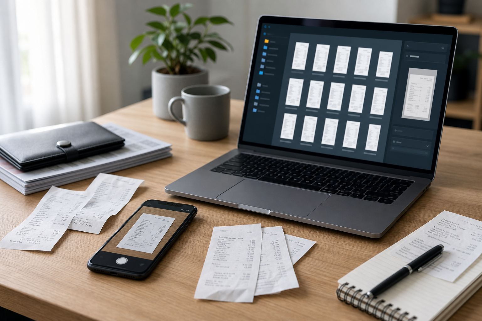
Step 1: Identify the Best Source File
Before using any conversion or resize tool, decide which source file deserves to become the master.
Prefer vector files when available. SVG, PDF, EPS, or AI exports usually contain scalable artwork. If the vector is official and clean, use it as the source for raster exports. If you only have raster files, choose the largest clean PNG with transparency. Use JPEG only when no better file exists and the background is meant to be solid.
Watch for fake high-resolution files. A 3,000 pixel image can still be bad if it was upscaled from a small web logo. Zoom in to inspect edges. If curves look stair-stepped, small text looks smeared, or the background has compression blocks, ask for a better source.
Use this quick source decision table:
| Received file | What to check | Recommended action |
|---|---|---|
| SVG | Official source, clean viewbox, no hidden junk | Use as master if approved |
| Contains vector logo or embedded raster | Export carefully, inspect transparency | |
| PNG | Real transparency, enough pixels, sharp edges | Good web source |
| WebP | Transparency and quality settings unknown | Convert or inspect before publishing |
| JPG | Background is baked in | Use only for solid-background placements |
| Screenshot | Cropped from a website or deck | Reject unless there is no alternative |
If a logo comes from a screenshot, it should be treated as a temporary placeholder. Screenshots often include anti-aliased edges against the wrong background, making transparency cleanup harder.
Step 2: Convert Into a Workable Format
Once you know your best source, convert it into a format you can inspect and edit. For many teams, that means exporting a transparent PNG first, then producing WebP or compressed PNG variants later.
If you receive a WebP, TIFF, HEIC, or odd vendor export, normalize it before the rest of the workflow. ConvertAndEdit's image converter is useful for turning uncommon inputs into a predictable PNG or WebP workflow file. For logos, do not convert blindly into JPEG unless you intentionally need a solid background.
A practical sequence is:
- Convert unusual formats into PNG for inspection.
- Preserve transparency if the source has it.
- Keep the original file untouched.
- Export final web versions only after crop, padding, and size decisions are complete.
If the source is a vector file, export a large transparent PNG first. Something around 1,200 to 2,000 pixels wide is usually enough for inspection and resizing. You can reduce it later. Starting too small limits every downstream option.
Step 3: Check for Hidden Background Problems
Transparency mistakes are the most common cause of ugly partner logo grids.
A file may look transparent in a preview window but still contain a white rectangle. A logo may have a light gray edge left over from a previous background. A semi-transparent shadow may disappear on dark mode. A white wordmark may be invisible on a white page unless it is paired with an approved container.
Inspect each logo on at least three backgrounds:
| Background | What it reveals |
|---|---|
| White | Invisible white marks, weak pale strokes |
| Light gray | White boxes and uneven padding |
| Dark gray | Dirty halos, leftover matte edges, shadows |
If you need to remove a background from a raster asset, use the AI photo editor carefully. The goal is not to redesign the mark. The goal is to remove an unwanted box or background while preserving the original logo edges. After cleanup, inspect the logo at 100 percent and at the size it will appear in the page.
For official brand assets, be conservative. Do not recolor, reshape, stretch, or simplify a partner logo unless their usage guidelines explicitly allow it. When in doubt, ask for an approved transparent version.
Use the Transparency Check Before You Resize
![]()
Resize comes after transparency, not before it. If you resize first, small edge problems become harder to see and easier to bake into the final export.
Open the logo on a checkerboard or contrasting background and inspect the edges. Look for four issues.
First, check for a rectangle. If the logo appears inside a white or off-white box, the background is not actually transparent. Second, check for a halo. This often happens when a logo was cut out from a white page and placed on transparency. Third, check for stray pixels outside the main artwork. These can create unexpected bounding boxes and weird alignment. Fourth, check for low-opacity shadows. Shadows may be part of the brand style, but they often make logos look blurry inside compact UI cards.
If you find a white box, remove the background and export again. If you find a halo, use a cleaner source if possible. If you find stray pixels, crop tightly enough to exclude them. If you find a shadow, confirm whether it belongs to the official mark.
A useful rule: if the edge problem is visible at 200 percent zoom, it may be visible after compression or on high-density screens. Fix it before resizing.
Step 4: Crop the Real Bounds, Then Add Deliberate Padding
Many partner logos arrive with accidental whitespace. This whitespace breaks alignment because the layout system sees the full image dimensions, not the visible artwork.
The right approach is not always a tight final crop. Instead, do two separate operations:
- Crop to the real artwork bounds.
- Add intentional padding on a standard canvas.
This distinction matters. Accidental whitespace is unpredictable. Intentional padding is part of your asset system.
For a horizontal logo, you might crop to the visible wordmark and then place it on a 4:1 or 3:1 transparent canvas. For a square icon, you might center the artwork inside a 512 by 512 canvas with 10 to 15 percent padding. For a circular badge, you might preserve enough breathing room so it does not touch the edge of a card.
Use ConvertAndEdit's image resize tool when you need consistent final dimensions after the crop is clean. If a logo grid uses 240 by 120 pixel slots, prepare assets that fit that slot instead of relying on editors to resize each upload by eye.
A simple padding guide:
| Logo shape | Suggested canvas | Padding target |
|---|---|---|
| Wide wordmark | 800 x 300 | 8-14 percent top and bottom |
| Compact horizontal mark | 600 x 300 | 10-16 percent on all sides |
| Square app icon | 512 x 512 | 10-15 percent unless already padded |
| Circular badge | 512 x 512 | 8-12 percent outside the circle |
| Tall logo | 400 x 600 | 10-16 percent left and right |
The numbers do not have to be perfect. The point is to make spacing intentional and repeatable.
Step 5: Decide Between PNG, WebP, and JPEG
Logo format decisions are usually simple if you separate transparency from file size.
Use PNG when you need reliable transparency and crisp edges, especially for logos with text, fine lines, or flat colors. Use WebP when you need smaller files and have confirmed the alpha edge remains clean. Use JPEG only for photographic partner images, banners, or logos intentionally placed on a solid background.
For most partner logo libraries, PNG is the safest working export and WebP is a strong web delivery option after inspection. If your CMS or older email environment does not handle WebP consistently, keep a PNG fallback.
| Format | Good for | Avoid when |
|---|---|---|
| PNG | Transparent logos, sharp text, flat graphics | File size is too large across huge grids |
| WebP | Lightweight web delivery with transparency | You cannot inspect edge quality after export |
| JPEG | Photos, banners, solid backgrounds | You need transparency or crisp small text |
| SVG | Scalable official vector artwork | The CMS sanitizes or breaks SVG files |
If you are unsure, publish PNG for the canonical media library asset and create WebP variants for performance-sensitive pages.
Step 6: Compress Without Damaging Thin Lines
Logo compression is different from photo compression. A tiny amount of blur can make text look cheap. A slight color shift can make a brand mark look unofficial. Over-aggressive compression can damage diagonal strokes, small registered marks, and thin icon outlines.
Use the image compressor after resizing, not before. Compressing a large file and then resizing it can stack quality loss. The cleaner order is source, cleanup, crop, resize, final compression.
When testing compression, compare three views:
- Full size, to catch obvious artifacts.
- Actual display size, to see what users will see.
- Dark or contrasting background, to reveal transparency edge damage.
For flat logos, a small file size is nice, but not at the cost of readability. If a 9 KB version makes the wordmark fuzzy and a 22 KB version looks crisp, use the 22 KB version. Partner logos are often repeated in grids, but they are still brand assets. The right budget balances page speed with visual trust.
Step 7: Prepare CMS Variants for Real Layouts
A common mistake is preparing one perfect logo file without considering where it will appear. Real websites reuse partner marks in different components.
Before exporting final assets, list the placements:
| Placement | Asset need |
|---|---|
| Integration grid | Consistent transparent canvas |
| Help article | Readable at small inline size |
| Marketplace card | Square or near-square variant |
| Footer sponsor strip | Lightweight horizontal version |
| PDF handout | High-resolution version or vector source |
| Social preview | Larger raster image with safe padding |
If the same partner appears in multiple layouts, create named variants instead of repeatedly editing the same file. For example:
acme-logo-horizontal-800x300.png
acme-icon-square-512.png
acme-logo-horizontal-800x300.webp
acme-logo-pdf-source.png
This lets editors choose the correct file without guessing. It also protects the original transparent logo from being stretched into a shape it was not designed for.
If your team turns partner listings into downloadable review documents, you can assemble approved logo sheets with image to PDF. This is helpful when stakeholders need to review a batch of partner marks outside the CMS.
Step 8: Run a Visual Grid Test
Do not approve logos one at a time only. The real test is the grid.
Create a quick review page, design board, or document with all prepared logos placed in the same card size. Use the same background color and spacing your site uses. Then scan for outliers.
Look for logos that appear too large because their artwork fills the canvas. Look for logos that appear too small because they include too much padding. Look for marks that become illegible at mobile sizes. Look for white logos that disappear on light backgrounds. Look for black logos that feel too heavy beside colored marks.
A grid test should answer these questions:
| Question | Why it matters |
|---|---|
| Does each logo feel optically balanced? | Equal canvas size does not guarantee equal visual weight |
| Are text-based logos readable on mobile? | Partner pages often collapse into narrow columns |
| Do transparent edges stay clean? | Dirty edges are more visible in groups |
| Are file sizes reasonable as a set? | One page may load dozens of logos |
| Are variants named clearly? | Editors need to pick the right asset later |
If only one logo looks wrong, fix that asset. If many logos look wrong, revisit your canvas and padding standard.
Step 9: Add Alt Text and Media Library Notes
A clean image file is only part of a publishable asset. Partner logos also need sensible metadata.
For alt text, describe the logo plainly when the image communicates partner identity. For example: Acme Analytics logo. Do not write promotional alt text. Do not repeat words like logo icon image graphic unless needed for clarity. If the logo is purely decorative and the partner name appears as nearby text, the CMS may allow empty alt text, depending on your accessibility workflow.
In media library notes or internal documentation, track the source and approval status. A short note is enough:
Source: partner media kit received April 2026. Transparent PNG export prepared for integration directory. Do not recolor.This helps future editors avoid replacing an approved asset with a random downloaded version.
Step 10: Package Review Sets When Many Logos Change
When a whole partner directory is being refreshed, individual image approval becomes messy. Package review sets instead.
Create one folder of web exports and one PDF proof sheet. The PDF proof sheet gives non-technical reviewers a stable view of the set. The export folder gives editors the actual files they need. If several stakeholders need to approve layout order or grouping, merge review documents with PDF merge so the discussion happens around one file instead of scattered attachments.
A useful review package might include:
| Item | Purpose |
|---|---|
| Original asset folder | Preserves source files |
| Web export folder | Ready for CMS upload |
| PDF proof sheet | Easy visual approval |
| Change note | Explains replaced, rejected, or missing assets |
| Naming guide | Keeps future additions consistent |
This is especially useful for integration marketplaces, association member pages, event sponsor pages, and procurement portals where logos change regularly.
Common Problems and Practical Fixes
Some logo issues happen often enough that they deserve standard responses.
| Problem | Likely cause | Practical fix |
|---|---|---|
| White box around logo | JPEG or non-transparent PNG | Request transparent source or remove background carefully |
| Logo looks tiny in grid | Excess accidental padding | Crop to artwork bounds, then apply standard canvas padding |
| Logo looks huge beside others | No breathing room | Add transparent padding on standard canvas |
| Text is blurry | Low-resolution source or over-compression | Ask for vector source or export larger before resizing |
| Dirty outline on dark background | Cutout from white matte | Use cleaner source or redo background removal |
| File is much larger than others | Oversized dimensions or uncompressed PNG | Resize first, then compress |
| White logo disappears | Wrong background context | Use approved dark container or alternate brand asset |
| SVG displays incorrectly | CMS sanitization or unsupported effects | Export approved PNG/WebP version |
The important habit is to fix the cause, not only the symptom. If a logo looks too small because it has hidden whitespace, scaling it up may create a second problem. Crop and standardize the canvas instead.
A Lean Workflow for Small Teams
If your team does not have a designer available for every logo update, use this short workflow.
- Save the original file unchanged.
- Choose the best source, preferring vector or large transparent PNG.
- Convert unusual formats into PNG for inspection.
- Check transparency on light, gray, and dark backgrounds.
- Crop accidental whitespace.
- Place the logo on a standard transparent canvas.
- Resize for the actual layout.
- Compress carefully and compare before and after.
- Save a clearly named PNG and optional WebP.
- Test the logo in a grid before uploading.
This workflow is fast enough for occasional publishing but structured enough to avoid the usual mess. It also gives you a repeatable standard when a new teammate or freelancer helps with asset prep.
Example: Preparing 24 Integration Logos for a Help Center
Imagine a SaaS team is building a help center page for 24 supported integrations. The source files arrive in a ZIP from different partner contacts. Some are SVGs, some are transparent PNGs, some are JPEGs pulled from old landing pages, and one is a screenshot from a presentation.
A practical production pass could look like this:
| Stage | Action |
|---|---|
| Intake | Save all files into originals and log missing official sources |
| Source selection | Use SVG where available, large PNG where not |
| Cleanup | Remove accidental backgrounds only when necessary |
| Canvas | Prepare horizontal logos on 800 x 300 transparent canvas |
| Icon variant | Prepare square 512 x 512 icons only for app-card layouts |
| Compression | Create web PNGs, then WebP versions for the page build |
| Review | Place all 24 in the same grid and check visual weight |
| Handoff | Upload approved exports and keep originals archived |
The team should not spend equal time on every logo. Clean SVGs may take one minute each. Bad JPEGs may need a partner request. The screenshot should be replaced, not polished forever.
Quality Checklist Before Upload
Use this checklist before a logo enters your CMS or help center.
| Check | Pass condition |
|---|---|
| Original preserved | Source file is saved unchanged |
| Source quality | No obvious upscaling, blur, or screenshot artifacts |
| Transparency | No unwanted box, halo, or stray pixels |
| Crop | Accidental whitespace removed |
| Padding | Canvas spacing is intentional and consistent |
| Dimensions | Export matches the intended layout family |
| Format | PNG, WebP, or JPEG chosen for a clear reason |
| Compression | File is lighter without visible damage |
| Naming | Filename identifies brand, variant, and size |
| Grid preview | Asset looks balanced beside neighboring logos |
| Metadata | Alt text or decorative handling is decided |
This checklist works best when it is used before upload, not after a page already looks wrong.
Where ConvertAndEdit Fits Into the Workflow
ConvertAndEdit can support the practical parts of this process without turning it into a full design project. Use convert image to normalize odd source formats. Use AI photo editor when a raster logo has an unwanted background that needs careful removal. Use resize image to create consistent output dimensions for grids and cards. Use compress image at the final step to reduce weight while checking that small text and transparent edges remain clean.
For review documents, image to PDF can turn prepared logo exports into a proof sheet or approval file. That is useful when the people approving partner marks do not work inside the CMS.
The key is order. Convert first when needed. Clean transparency before resizing. Resize before compression. Review in context before publishing.
Final Handoff: Make the Next Update Easier
A partner logo workflow is successful when the next update is boring. Someone should be able to receive a new integration logo, place it into the same folder structure, follow the same crop and canvas rules, export the same variants, and upload it without reinventing the process.
The final handoff should include the approved web files, the preserved originals, and a short note about the standard. For example: horizontal partner logos use an 800 x 300 transparent canvas, square icons use 512 x 512, PNG is the canonical upload format, WebP is optional for performance-sensitive pages, and source files are archived unchanged.
That small amount of discipline prevents the slow drift that makes partner directories look uneven over time. Logos remain sharp. Grids stay balanced. CMS editors stop guessing. Developers do not have to patch individual assets with layout exceptions. Most importantly, the brands represented on the page look intentional, approved, and trustworthy.