PDF N-Up Proof Sheets for Small-Batch Packaging Label Review
Build compact PDF proof sheets that make small-batch packaging labels easier to compare, annotate, approve, and archive without relying on specialist layout software.
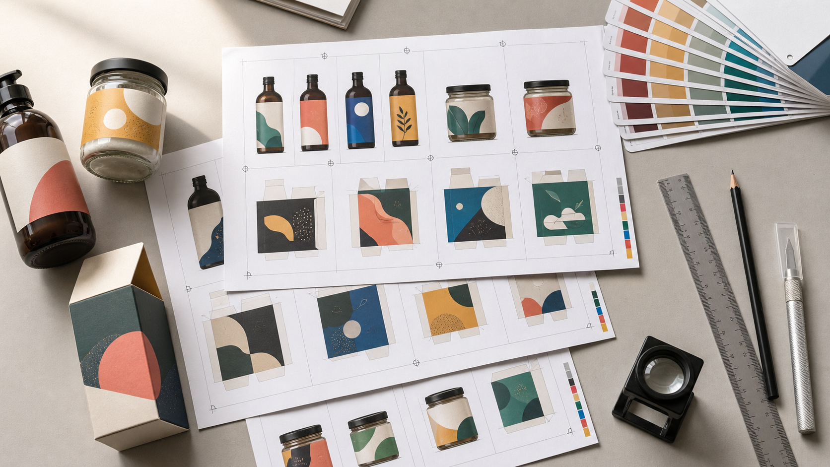
PDF N-Up Proof Sheets for Small-Batch Packaging Label Review
Packaging labels are often reviewed in the least helpful way possible: one design per screen, viewed at an arbitrary zoom level, with feedback scattered across messages. That approach hides differences between versions and makes it difficult to judge physical scale. It also encourages reviewers to comment on whichever file they opened first rather than comparing every candidate under the same conditions.
An N-up proof sheet solves a different problem from a polished presentation. It places multiple label designs, revisions, or size variants on one PDF page so reviewers can compare them side by side. The result can be printed, annotated, circulated, and archived as a compact decision record.
This is particularly useful for small producers working on candle labels, spice jars, soap wraps, coffee bags, cosmetic containers, seed packets, or limited-edition food packaging. These teams may not have a dedicated prepress department, but they still need a disciplined way to catch tiny type, inconsistent margins, outdated ingredients, and incorrect dimensions before a print order is approved.
This guide explains how to prepare the source images, choose a useful page structure, assemble the PDF, and perform both screen and physical checks. It is intended for review copies, not as a replacement for the printer's production-ready artwork requirements.
Why Single-File Review Misses Packaging Errors
A label can look convincing when it fills a laptop display. The same label may become unreadable when printed at 42 millimeters wide. Screen previews also conceal small alignment differences because each file can open at a different zoom level or position.
Side-by-side proofs expose relationships that isolated previews hide:
- Whether the product name shifts between flavors or sizes
- Whether one barcode has a smaller quiet zone than the others
- Whether mandatory information occupies a consistent location
- Whether a revised background reduces contrast behind fine text
- Whether an old logo, weight statement, or legal line remains in one variant
- Whether the design feels balanced at its actual physical dimensions
A proof sheet also gives feedback a stable coordinate. Instead of writing “the blue version near the end,” a reviewer can identify a page and panel. Even a simple handwritten circle becomes easier to interpret when everyone is looking at the same arrangement.
Define the Review Question First
Do not put every available file into a grid merely because it fits. A useful proof sheet answers one defined question.
Common review questions include:
| Review purpose | What belongs on the sheet | Best arrangement |
|---|---|---|
| Select a visual direction | Three to six distinct concepts | Equal-size grid |
| Compare a revision | Previous and current versions | Paired rows or columns |
| Check a product family | Every flavor, scent, or size | Consistent matrix |
| Inspect fine details | Full label plus enlarged crops | Main panel with detail panels |
| Confirm physical dimensions | One or more labels at 100% scale | Sparse page with measurements |
| Review front and back labels | Matching pairs for each product | Repeated two-panel groups |
Mixing these purposes weakens the review. For example, a concept-selection sheet should not show one candidate at actual size and another enlarged. A physical-size proof should not shrink twelve labels simply to fit them on one page.
Before preparing anything, write a one-sentence objective such as: “Choose between three hierarchy options for the 60 ml jar front label” or “Confirm that all six scent variants use the approved ingredient panel.” That sentence determines which files are included and how they are displayed.
Gather and Normalize the Source Files
Create a clean collection containing only the candidates under review. Remove exports with ambiguous names such as final, new-final, or use-this-one. Filenames should identify the product, panel, revision, and dimensions where relevant.
A compact pattern might be:
cedar-front-r03-45x70mm.png
cedar-back-r03-45x70mm.png
citrus-front-r02-45x70mm.png
Revision identifiers are valuable even if the proof sheet itself will include captions later. They reduce the chance that an obsolete export is pulled into the next round.
Standardize Image Formats
Designers may supply a mixture of PNG, TIFF, JPEG, and WebP previews. Convert review copies to one predictable format before assembly. PNG is useful for flat artwork, fine lines, and transparent areas. High-quality JPEG can be acceptable for photographic labels, but aggressive compression may create halos around small lettering.
Use the image converter when source previews arrive in mixed formats. Conversion copies should remain separate from the original artwork. Never overwrite the printer-ready source merely to make a review sheet easier to assemble.
Preserve Useful Resolution
A review export needs enough detail for small text and line inspection. However, a label image exported at poster dimensions creates a bloated PDF without improving an ordinary office print.
For printed proofs, calculate the required pixels from the intended physical size and print resolution:
required pixels = size in inches × target pixels per inch
A 50 mm label is approximately 1.97 inches wide. At 300 pixels per inch, it needs roughly 591 pixels of width for a full-resolution print at that size. If reviewers only need a screen comparison, a somewhat larger preview may be convenient for zooming, but enormous exports are rarely necessary.
If files are needlessly large, create lighter review copies with the image compression tool. Inspect the compressed versions at 100% and at a close zoom before using them. Thin rules, reversed white type, small trademark symbols, and barcode edges are the first areas to check.
Normalize Canvas Boundaries
Two labels with identical printed dimensions can have different exported canvas sizes because one includes extra transparent padding. When those images are placed into equal cells, the artwork appears at different scales.
Crop surplus canvas consistently, but retain any deliberate bleed area. If one file includes bleed and another does not, resolve that discrepancy before building the proof. Otherwise the comparison will be misleading.
Keep a clear distinction between:
- Trim size: the final cut dimensions
- Bleed: artwork extending beyond the trim edge
- Safe area: the inner region intended to protect important content
- Export canvas: the complete pixel boundary of the review image
The proof should state, in its supporting notes or captions, whether the displayed edge represents trim or bleed.
Choose the Right Proof-Sheet Structure
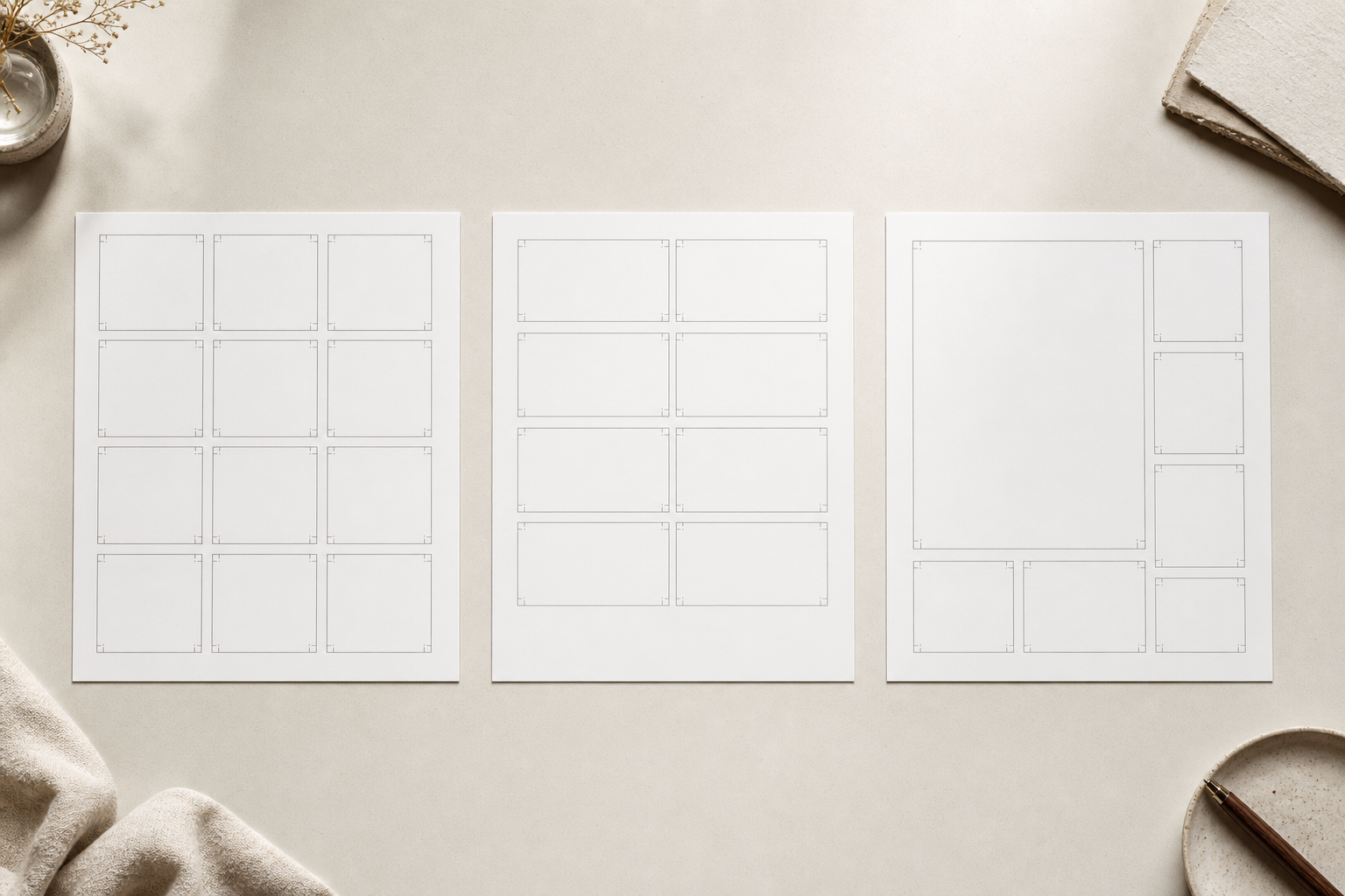
The page structure should make differences visible without forcing reviewers to decode the layout.
Equal Grid for Family Consistency
Use a regular grid when every item has equal importance. This works well for comparing six jam flavors or eight candle scents. Keep each panel the same size and align corresponding labels from the same baseline.
A grid becomes ineffective when labels are reduced below a readable size. If twelve candidates fit mathematically but require a magnifying glass, split them across two or three pages. Page count matters less than inspection quality.
Paired Layout for Revision Checks
Place the earlier and later versions next to each other when the purpose is to verify changes. Keep their display scales identical. Use the same left-to-right order throughout the document, such as previous version followed by proposed version.
A paired arrangement is ideal for checking whether a requested change was applied without introducing another problem. Reviewers can scan repeated locations instead of remembering what the old file looked like.
Main View with Detail Crops
Some decisions require both an overall impression and close inspection. Place the complete label prominently, then add enlarged crops of the ingredient block, barcode, recycling symbols, or small legal copy.
Detail crops should be derived from the exact same export as the full view. Do not rebuild or retype the content in a separate panel. A recreated detail can accidentally correct the very error the proof is supposed to reveal.
Separate Pages for Separate Scales
Do not mix actual-size labels with enlarged details unless the scale difference is obvious. A safer structure is:
- A comparison page with equal-sized candidates
- An inspection page with enlarged details
- An actual-size page for physical testing
This division makes each page understandable even if it is printed or forwarded without the rest of the file.
Assemble the Review PDF
Once the images are normalized, arrange them into page-sized sheets using a document editor, presentation application, or any layout tool that preserves image proportions and supports PDF export. The objective is not decorative page design. It is predictable comparison.
Use a common paper size available to the reviewers, usually A4 or US Letter. Leave sufficient outer margins because many office printers cannot print to the edge. Maintain equal gaps between panels and avoid ornamental backgrounds that compete with the labels.
If your assembly method produces one image per page first, combine the pages with PDF Merge. Use a deliberate order: overview, comparison pages, detail pages, then physical-size tests. The final PDF should open in the same sequence in which a reviewer should examine it.
For image-based pages, Image to PDF can turn prepared proof sheets into a portable document. Verify that page dimensions and image scaling remain correct after conversion, especially for pages intended to print at actual size.
Add Only Essential Identification
A proof needs enough metadata to remain understandable after it leaves the original conversation. Include:
- Project or product-family name
- Proof date
- Revision or round identifier
- Candidate identifier for each panel
- Intended label dimensions
- A brief scale note, such as “comparison only” or “print at 100%”
Keep this information outside the artwork boundary. Reviewers must be able to distinguish the proof's captions from content that will actually appear on the package.
Avoid relying on color alone to identify candidates. Printed colors can shift, and color-coded feedback becomes ambiguous in grayscale copies. Use short, stable panel identifiers alongside any visual cue.
Build an Inspection Page for High-Risk Details
Packaging contains small elements with outsized consequences. Give these elements enough room to be inspected rather than assuming reviewers will zoom into the overview.
A detail page can include enlarged crops of:
- Net quantity or weight statements
- Ingredient and allergen areas
- Usage or safety instructions
- Lot-code or date-code zones
- Barcode and surrounding quiet zone
- Recycling and material symbols
- Website addresses and contact details
- Fine rules, keylines, and knockout type
The review team should know who is responsible for checking each type of information. A designer can confirm alignment and visual contrast, but a designated business or regulatory reviewer should approve required wording. The proof sheet organizes the evidence; it does not validate legal compliance by itself.
If text has arrived only as a flattened image, Image OCR can provide a draft extraction for comparison against an approved source document. Treat OCR output as a checking aid, not an authoritative transcription. Small capitals, fractions, punctuation, and stylized characters require manual verification.
Run a Physical Size Test Before Approval
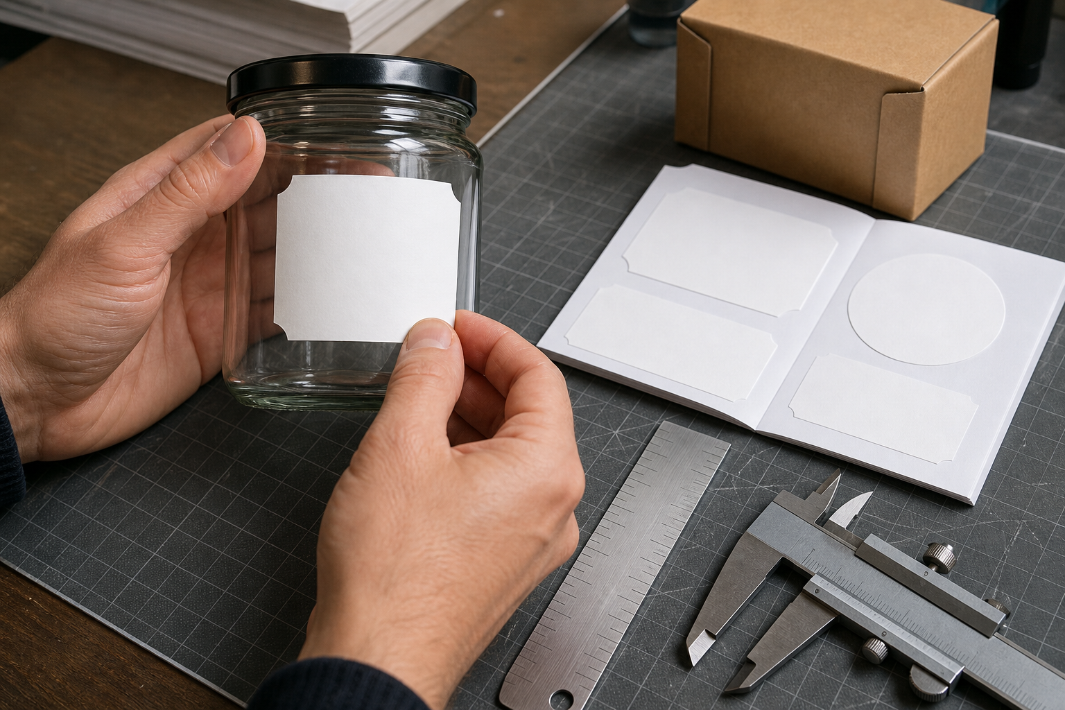
A screen cannot reproduce the relationship between a label, a hand, and a container. Print the actual-size page on an ordinary printer before approving dimensions or small typography.
Disable options such as “fit to page,” “shrink oversized pages,” and automatic borderless enlargement. Select actual size or 100% scale. Printer drivers use different terminology, so include a calibration mark or measurement bar on the page.
Measure that reference after printing. If a 50 mm line does not measure 50 mm on paper, the proof was scaled and cannot be trusted for dimensional review.
Cut out the label at the trim boundary and place it against the intended container. Low-tack tape can hold a paper test in position without suggesting that it represents the final adhesive material.
Inspect the mock placement from several angles:
- Is the product name visible from the likely shelf position?
- Does the label cross a strong curve, seam, or taper?
- Is important copy lost near the container edge?
- Can the back panel be read without excessive rotation?
- Does the lid, cap, or closure obscure any content?
- Is there enough room for a date or batch code?
- Do front and back labels appear intentionally aligned?
For wrap labels, test the overlap or gap with a physical strip cut to the specified width. A flat screen preview cannot show how much of the artwork disappears around a narrow bottle.
Review Color Without Overpromising Accuracy
An office print is useful for hierarchy, density, contrast, and obvious color-family errors. It is not necessarily a color contract. Monitors, office printers, paper stock, coatings, inks, and production methods can all change appearance.
Use the N-up sheet to ask comparative questions: Is one flavor too similar to another? Does pale text disappear against its background? Is the proposed red noticeably darker than the approved family? Reserve exact color approval for the proofing method recommended by the printer.
Transparency can also behave unexpectedly during conversion. Inspect drop shadows, semi-transparent overlays, white artwork, and blend effects in the exported PDF. Open the file in more than one reputable PDF viewer when these effects are important, because preview rendering can vary.
Use a Two-Pass Review
Separating visual review from content review reduces distraction and creates clearer feedback.
Pass One: Visual and Structural Checks
Review alignment, hierarchy, scale, spacing, image quality, contrast, and family consistency. Look for accidental stretching, uneven margins, displaced elements, or one variant that uses a different baseline.
Pass Two: Content and Production Checks
Compare every word, number, symbol, dimension, and revision identifier against the approved source. Confirm that files expected to contain bleed actually include it and that no crop marks intrude into artwork.
A concise approval checklist might read:
- Correct product and variant are shown
- Current revision is identified
- Dimensions match the specification
- Front and back panels are paired correctly
- Required content has an assigned reviewer
- Small text is readable at physical size
- Barcode area has not been cropped or crowded
- Bleed, trim, and safe-area assumptions are understood
- Calibration mark measures correctly after printing
- Feedback refers to stable page and panel identifiers
Record exceptions rather than hiding them. If color is provisional or barcode verification will occur later, state that limitation in the approval record.
Keep the PDF Small Enough to Circulate
A proof that is too large to send encourages screenshots, partial exports, and unofficial substitutes. Once review is complete, create a circulation copy that remains sharp enough for its purpose.
Reduce redundant resolution rather than applying severe compression indiscriminately. Overview pages usually need less pixel detail than enlarged inspection crops. Flattening can simplify some documents, but it may also reduce searchability or alter transparency, so inspect the result carefully.
Check the final circulation copy at three levels:
- Full-page view for overall organization
- Actual-size view for scale and readability
- Close zoom for thin rules, image artifacts, and fine copy
Then print the dimensional page again from the final PDF. Compression and PDF reconstruction should not change physical scaling, but the last distributed file—not an earlier draft—is the artifact that must pass the test.
Archive the Decision, Not Every Accidental Export
After approval, retain the final proof PDF, the approved panel identifiers, the date, and a concise decision note. Keep printer-ready artwork in its own controlled location. The proof is a review record, not the production master.
A practical archive name could be:
candle-label-family-proof-r04-approved-2026-07-22.pdf
Do not mark a file approved if approval was conditional. Use a status such as changes-requested or approved-pending-barcode-check when that more accurately represents the decision.
Obsolete proofs may still be useful for tracing why a design changed, but they should not sit beside current artwork without clear status labels. A simple archive structure with folders for active review, approved records, and superseded rounds prevents an old PDF from returning during a rushed reorder.
Common Proof-Sheet Mistakes
Several shortcuts make an N-up sheet look complete while reducing its reliability.
Scaling Every Label to Fill Its Cell
This makes unlike dimensions appear equal. Preserve relative scale when physical size matters, or clearly label the page as a visual comparison only.
Using Screenshots of the Design Application
Screenshots may include selection boxes, guides, interface scaling, or color-management differences. Export clean review images from the source document instead.
Shrinking Too Many Variants onto One Page
A crowded page technically contains the files but prevents meaningful inspection. Split the candidates into logical groups and provide an overview page if navigation is needed.
Omitting Revision Identifiers
Visual memory is not version control. Every panel should map back to a specific source export.
Treating Office Output as a Production Color Proof
Use ordinary prints for scale and comparative judgment. Follow the printer's requirements when exact color or substrate behavior matters.
Approving from the Assembly File Instead of the Distributed PDF
PDF export can introduce image resampling, font substitution, clipping, transparency changes, or page scaling. Review the exact file that will be shared and archived.
A Compact Example for a Six-Scent Candle Range
Imagine a studio updating six candle labels. The review question is whether the collection feels consistent and whether the revised warning panel remains readable.
The team could prepare three pages:
- Page one: six front labels in a uniform two-by-three grid for family comparison
- Page two: six back labels at equal scale, aligned from the same baseline
- Page three: one representative label at actual size plus enlarged warning and batch-code areas
Each panel carries the scent identifier and revision number outside the label boundary. The final page includes a measurable calibration line and a reminder to print at 100%.
The visual reviewer examines alignment, color separation, and hierarchy. The content owner compares warnings and quantities with the approved text. Someone prints page three, measures the calibration mark, cuts out the label, and wraps it around the production jar.
This modest proof packet is far more informative than six unrelated image attachments. It gives each reviewer the view needed for a specific decision while preserving one compact record of the round.
Final Handoff Checklist
Before sending the proof, confirm that:
- The PDF opens without errors
- Pages appear in the intended order
- The H1-style cover identification, if used, does not resemble package artwork
- Every candidate has a stable identifier
- Comparison panels use consistent scale
- Enlarged crops match the complete label shown
- Actual-size pages include a measurable reference
- Compression has not damaged fine text or lines
- The filename includes the revision and status
- Reviewers know the decision deadline and their assigned check
A good N-up proof sheet does not need elaborate presentation. Its value comes from controlled scale, deliberate grouping, visible revision information, and a clear distinction between visual comparison and production approval. Those details turn a collection of label exports into a review document that a small team can actually trust.