Trade Show Booth Graphic Proof Sheets: A Practical N-Up PDF Guide for Marketing Teams
A detailed guide for turning booth panels, counter graphics, sponsor logos, QR signs, and handout art into readable proof sheets before trade show print deadlines.
Trade Show Booth Graphic Proof Sheets: A Practical N-Up PDF Guide for Marketing Teams
Trade show graphics are usually reviewed under pressure. The booth builder wants final files, the print vendor has a cutoff time, the sales team wants the newest product message included, and someone notices at the last minute that the QR code on the counter sign points to an old campaign page.
The risky part is not only the design file. It is the review format.
A folder full of separate PNGs, PDFs, Illustrator exports, sponsor logos, and mockup screenshots makes it hard to spot inconsistencies. People open assets one at a time, compare from memory, and leave vague comments such as “logo feels small” or “can we make the CTA match the banner?” By the time the error appears on a 10-foot wall panel, fixing it is expensive.
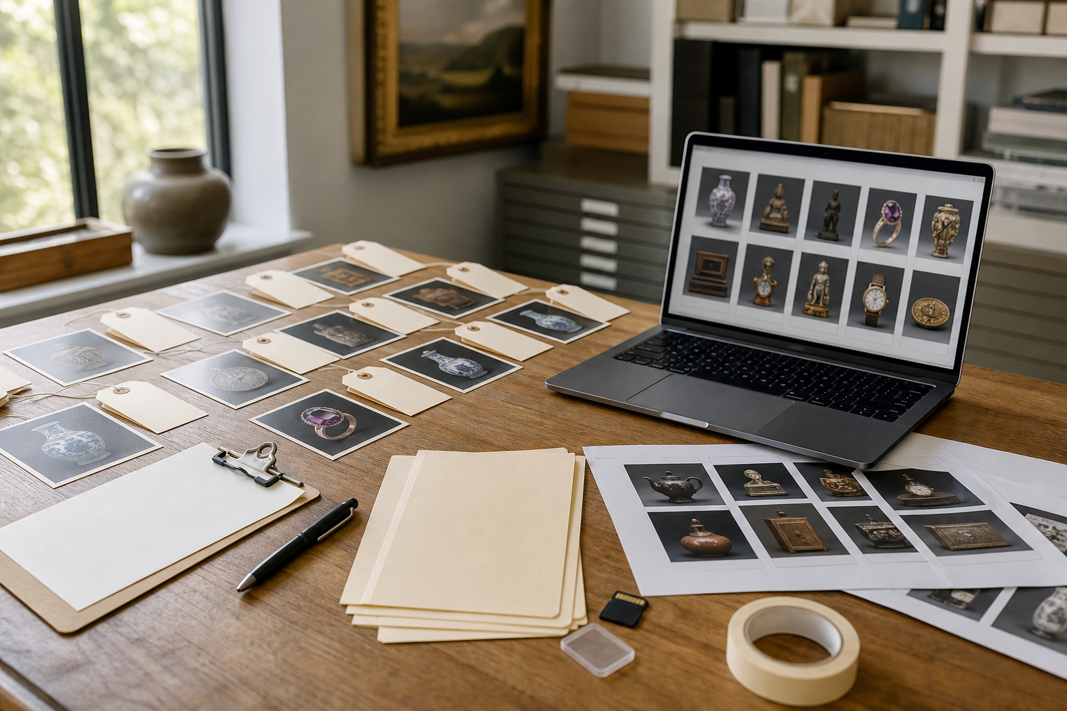
A proof sheet solves a very specific problem: it puts many related booth assets into one readable PDF so reviewers can compare them quickly. This guide explains how to prepare N-up proof sheets for trade show booths without layout software, what to include, what to leave out, and how to keep the PDF clear enough for non-designers to approve.
Why trade show graphics need proof sheets
Trade show booths are rarely one asset. Even a small booth may include a back wall, retractable banner, table throw, counter card, monitor slide, badge insert, printed handout, QR sign, floor sticker, and sponsor logo lockup. Each piece may be created at a different size and exported from a different tool.
That scattered format creates review problems:
- Reviewers cannot see whether headlines match across pieces.
- Small signs get ignored because large wall graphics feel more urgent.
- Old logos survive in secondary assets.
- QR codes are checked late or not at all.
- Print bleeds and safe margins are reviewed by only one person.
- Sales and event staff approve copy without seeing the full visual set.
A proof sheet is not a replacement for final production files. It is a review layer. The final print-ready files can still be full-size PDFs with proper bleed, trim, color settings, and vendor specifications. The proof sheet is the compact packet that lets stakeholders review the whole booth system as one package.
For small marketing teams, this is especially useful because not everyone has access to design software. A single PDF can be opened on a laptop, shared in a message thread, printed for a quick desk review, or attached to a vendor email as a reference document.
What N-up means in this context
N-up simply means placing multiple items on one page. A 2-up sheet has two items per page. A 4-up sheet has four. A contact-sheet style page may have 9, 12, or more thumbnails.
For trade show review, N-up should not mean cramming every file into a tiny grid. The goal is comparison, not decoration. The right layout depends on the kind of asset being reviewed.
A practical packet often uses several page types:
| Page type | Best for | Typical density |
|---|---|---|
| Large preview pages | Back walls, booth panels, hanging signs | 1 to 2 items per page |
| Medium comparison pages | Pull-up banners, counter graphics, tabletop signs | 2 to 4 items per page |
| Thumbnail audit pages | Logos, QR signs, small decals, handout covers | 6 to 12 items per page |
| Detail pages | Legal copy, QR codes, small sponsor marks | 1 to 4 enlarged crops per page |
This mix matters. A 10-foot booth wall and a 3-inch QR card should not be reviewed at the same thumbnail size. The wall graphic needs composition review. The QR card needs legibility review. Treating both the same is how errors hide.
What belongs in a booth proof packet
A useful proof packet includes every asset that affects what attendees will see, scan, read, or carry away. It should also include enough context for reviewers to understand where each asset appears.
Include these items when relevant:
- Back wall or fabric display graphics
- Side panels and tower graphics
- Retractable banners
- Counter wraps and podium graphics
- Tabletop signs and acrylic inserts
- QR code placards
- Sponsor logo panels
- Printed handouts and one-sheets
- Badge ribbons or inserts
- Floor decals and directional signs
- Monitor slide stills used at the booth
- Giveaway package labels or sticker art
- Product cards and demo station instructions
Do not include every source file. Reviewers do not need layered design files, raw logo packages, or alternate exports that are not being produced. The packet should show the planned public-facing set.
A simple naming convention helps the packet stay readable. Use plain names such as back-wall-main, counter-front, qr-demo-booking, product-card-front, and sponsor-strip. Avoid internal abbreviations that only the designer understands.
If you need to convert exported assets into a common format before assembling the packet, a tool such as Convert Image can help standardize PNG, JPG, or WebP files before they are placed into a PDF. If some exports are too large for easy sharing, reduce the file size with Compress Image before building the review packet.
Decide the review purpose before choosing the layout
The same booth art can be reviewed for different reasons. If you do not decide the purpose first, the proof sheet can become visually busy but not useful.
Ask what decision the PDF should support:
| Review goal | Best proof style | What reviewers should check |
|---|---|---|
| Brand consistency | Group similar assets together | Logo use, colors, typography, tone |
| Message hierarchy | Show large booth pieces first | Main claim, supporting copy, CTA visibility |
| Print readiness | Use larger previews and detail crops | Bleed, margins, resolution, trim risk |
| On-site usability | Include signs and QR cards together | Scan distance, placement, instructions |
| Final stakeholder approval | Use a clean packet with only final candidates | Spelling, offer accuracy, dates, product names |
For example, a brand consistency review may place all banner-style assets on one page so the team can see whether the headline language aligns. A print readiness review may need one asset per page with enlarged corner details. A QR review may need close-up crops, not tiny thumbnails.
This is why one proof packet may have sections. The first pages help people understand the full booth. The middle pages compare related assets. The last pages zoom in on details that often break.
Prepare the source images before making the PDF
Most proof sheet problems start before the PDF exists. If your exports are inconsistent, the packet will be inconsistent too.
Before assembly, collect the final review candidates in one folder. Remove outdated drafts. If you must keep alternates, place them in a clearly named folder such as alternates-not-for-approval. The proof packet should not force reviewers to guess which file matters.
Then check the basics:
- Are all assets exported in the intended orientation?
- Are transparent-background graphics visible on the proof page?
- Are thin lines, small type, and QR codes sharp enough in the export?
- Are file names understandable to a reviewer outside the design team?
- Are duplicate versions removed or clearly marked?
- Are images cropped to the artwork area rather than a random canvas?
If an asset has extra empty space around it, crop it before adding it to the sheet. Empty canvas makes the item appear smaller than it really is and wastes room in the PDF. If a wall panel export is enormous, use Resize Image to create a review copy while keeping the original production file untouched.
For photographic booth mockups, avoid over-compressing too early. Compression should make the packet shareable, but not at the cost of unreadable small text. Keep a high-quality review export until you know the PDF is legible.
Build pages by asset family
The easiest proof packet structure is asset family first, size second. That means grouping similar pieces together instead of following file export order.
A strong structure might look like this:
- Full booth overview and main wall graphic
- Large vertical graphics and banners
- Counter, tabletop, and demo station signs
- QR code and lead capture signs
- Handouts, cards, and printed takeaways
- Sponsor and partner logo placements
- Detail crops for small type, legal copy, and codes
This order mirrors how people experience the booth. They see the booth from a distance, approach the graphics, interact with the counter or demo station, scan a code, and leave with printed material.
It also keeps review comments cleaner. Instead of “page 7, top right image, maybe the smaller sign,” someone can say “QR signs page, demo booking card.” That reduces back-and-forth and makes revisions easier to track.
When building the PDF, use Image to PDF to combine prepared review images into a single packet. If you already have several PDF exports from different tools, combine them with PDF Merge after arranging them in the correct order.
Choose image size for readability, not symmetry
A proof sheet can look tidy and still fail. The most common failure is making every item the same visual size.
A booth wall, a pull-up banner, and a small counter sign serve different purposes. If they are all placed into identical boxes, the review page may look organized, but the important details may be unreadable.
Use these practical sizing rules:
- Give hero booth graphics at least half a page when reviewing message hierarchy.
- Put vertical banners 2-up or 3-up, not 8-up.
- Keep QR signs large enough that the code can be tested from the PDF or printed proof.
- Enlarge crops of legal lines, dates, URLs, and product names.
- Use thumbnail grids only for assets that do not need copy review.
For small type, assume someone will review the PDF at normal laptop zoom. If they must zoom to 300 percent to read the line, the proof sheet is not doing its job.
There is one exception: thumbnail audit pages are useful for spotting duplicates, wrong logos, and inconsistent colors. But thumbnails should be paired with larger detail pages for anything that must be read.
Make QR codes reviewable
QR codes deserve their own section because they fail in ways that ordinary graphics do not. A QR code can look fine and still point to the wrong page. It can scan at full size but fail when printed small. It can be technically correct but placed next to vague copy that gives attendees no reason to scan.
For each QR sign or printed code, include:
- The full sign preview
- A larger crop of the code area
- The intended destination written in the review notes outside the artwork, if your packet format allows notes
- The campaign owner or page owner responsible for final link approval
Do not rely only on visual inspection. Scan every QR code from the proof PDF and, if possible, from a printed review page. Test on more than one phone camera app. If the code goes through a tracking redirect, check the final page too.
If the QR graphic came from a screenshot or a low-resolution export, regenerate it from the source rather than enlarging it. Enlarging a weak code can blur the hard edges that scanners need.
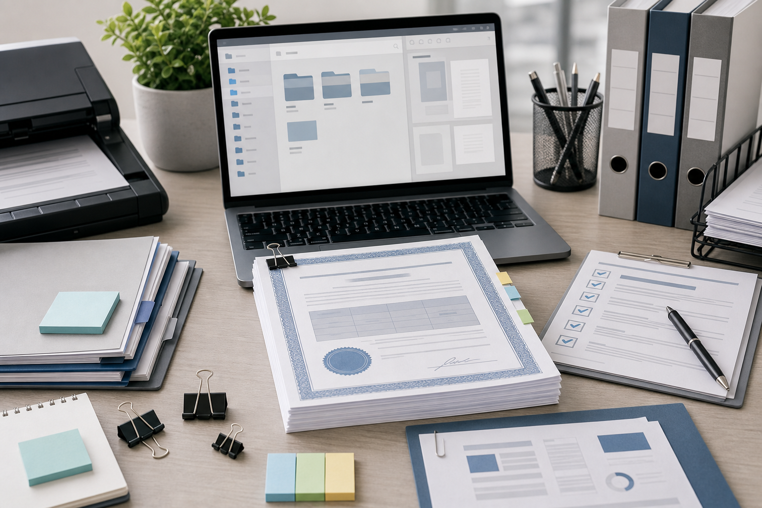
Keep proof sheets separate from production files
A proof PDF is for review. A production file is for printing. Mixing those purposes creates confusion.
Your proof sheet can include reduced-size images, contact-sheet pages, and explanatory ordering. Your production package should include vendor-ready files at the requested dimensions, bleed, color mode, and resolution. The proof packet helps humans approve the set; it should not be the file a vendor prints unless the vendor explicitly requested that format.
Use names that make this distinction obvious:
| File | Purpose |
|---|---|
booth-proof-packet-v03.pdf | Stakeholder review and approval |
back-wall-print-final.pdf | Vendor print file |
counter-front-print-final.pdf | Vendor print file |
qr-signs-print-final.pdf | Vendor print file |
booth-reference-mockup.pdf | Context only, not for print |
This small naming habit prevents a rushed teammate from uploading the wrong PDF to a vendor portal.
A practical preflight checklist before you send the PDF

Before sending the proof packet, do one complete pass as if you are the least-informed reviewer. Open the PDF fresh, not from inside your design tool. If possible, review it on a laptop screen and also print a copy of the most important pages.
Use this checklist:
- The H1-level event name, campaign name, or product name is consistent across all assets.
- Dates, booth numbers, locations, and session times match the event plan.
- Sponsor names and partner logos are current.
- All QR codes scan and land on the expected page.
- URLs are readable and not broken across awkward lines.
- Legal copy, disclaimers, and trademark lines are included where required.
- The main CTA is consistent across the booth, handouts, and signs.
- Small type is readable at normal PDF zoom.
- Crops do not cut off logos, product images, badges, or code edges.
- Transparent logos appear correctly on light and dark proof backgrounds.
- No outdated draft, placeholder, or stock image watermark remains.
- File order matches the review order you want stakeholders to follow.
- The PDF file size is reasonable for email, chat, or vendor upload.
If the packet is too large to share comfortably, compress image-heavy pages carefully. Start with large photographic mockups and background images, not QR code crops or thin-line artwork. Compression artifacts around small text can hide exactly the errors you are trying to catch.
How to handle transparent logos and booth mockups
Transparent PNG and WebP assets can disappear on white proof sheets if they contain white marks, pale outlines, or subtle shadows. This often happens with sponsor logos, app icons, certification marks, and partner badges.
When reviewing transparent assets, place them on a neutral light background and a darker background if the booth will use both. You do not need a complex layout. Two simple preview rows can reveal whether a logo has missing edges, unwanted halos, or poor contrast.
If a transparent asset has a jagged edge or a leftover background fringe, clean it before it appears in the booth packet. For image-level cleanup, the AI Photo Editor can be useful for preparing review visuals, especially when a mockup or product photo needs small distractions removed. Keep edits conservative for brand and legal assets; do not alter official partner logos unless you have the right source file and permission.
For booth mockups, be clear about their status. A realistic mockup helps stakeholders imagine the booth, but it can also create false confidence. A mockup may hide low-resolution artwork, crop small text, or distort a panel. Use mockups as context, then include flat artwork pages for actual review.
Commenting rules that prevent messy approvals
A proof packet is only as useful as the comments it receives. If everyone comments in different places, approval becomes a scavenger hunt.
Set simple rules before sending the PDF:
- Comments must reference page number and asset name.
- Copy edits must include exact replacement text.
- “Looks off” comments should identify the specific concern: color, size, spacing, crop, or hierarchy.
- Link and QR issues must include the expected destination.
- Only one person should consolidate final stakeholder feedback.
- Approval should be explicit, not implied by silence.
These rules may feel basic, but they reduce late-stage ambiguity. A comment like “make logo bigger” is hard to act on when a page contains six logos. “Page 4, sponsor strip, increase Silverline mark to match the height of the other partner logos” is much clearer.
If comments are collected outside the PDF, paste the exact page and asset names into the task or message thread. The packet’s structure should make that easy.
Versioning the packet without confusing the team
Trade show reviews often move through several rounds. Versioning needs to be boring and obvious.
Use a simple pattern such as:
| Version | When to use it |
|---|---|
v01 | First internal marketing review |
v02 | Revised after internal comments |
v03 | Sent to sales, events, or leadership for approval |
final-review | Last proof packet before production export |
archive | Stored after the event with final public-facing assets |
Avoid names like final, final2, and final-new. They are common because they are quick, but they become dangerous when vendor deadlines are close.
Also avoid replacing old PDFs in shared folders without notice. If someone is reviewing v02 while another person uploads v03, comments can cross. Keep versions visible until the review round is closed, then archive older packets.
Common booth proof sheet mistakes
The most common mistakes are not dramatic design failures. They are small review failures that pass unnoticed.
One mistake is mixing concepts and finals in the same packet. If the proof sheet includes both experimental layouts and approved assets, reviewers may approve the wrong thing. Separate concept review from final production review.
Another mistake is making the PDF beautiful but not inspectable. Large margins, decorative mockups, and tiny thumbnails can make the packet look polished while hiding spelling errors. For approval, clarity beats presentation.
A third mistake is forgetting the small signs. Counter cards, QR placards, demo instructions, and takeaway inserts often contain the most operationally important text. They may tell attendees where to scan, what to ask for, or how to book a meeting. Give them enough space.
A fourth mistake is compressing the final packet too aggressively. If thin letters, QR code edges, or sponsor logos get fuzzy, reviewers cannot judge the asset. Compress for sharing only after checking readability.
Finally, teams sometimes review only on large monitors. Many stakeholders will open the PDF on a laptop or tablet. If the packet cannot be understood on those screens, it is not ready to send.
A simple packet structure you can reuse
Here is a practical structure for a 10x10 or 10x20 booth review packet:
| Page | Content | Notes |
|---|---|---|
| 1 | Booth overview mockup | Context only, not the only approval page |
| 2 | Main back wall flat art | Large enough for headline and CTA review |
| 3 | Side panels or secondary banners | 2-up if text is short, 1-up if copy is dense |
| 4 | Counter and tabletop signs | Include exact placement names |
| 5 | QR and lead capture signs | Include enlarged code crops |
| 6 | Handouts and cards | Front and back grouped together |
| 7 | Sponsor logo placements | Show on expected background colors |
| 8 | Detail crops | Legal copy, URLs, dates, product names |
| 9 | Final audit thumbnail page | Quick scan for missing or duplicate assets |
This structure scales. For a larger booth, add sections. For a smaller pop-up event, remove pages. The key is that every page has a job.
When a proof sheet is enough and when it is not
A proof sheet is enough for stakeholder approval when the question is, “Are these the right messages, visuals, and assets?” It is also enough for catching many practical mistakes before final export.
It is not enough for technical print approval if the vendor requires exact production specs. The proof packet does not replace checking bleed, trim, safe zones, color profiles, ink limits, scale, material templates, or installation requirements. Those checks belong to the production files and vendor proofing process.
Use the proof sheet to align the team before production files are packaged. Then send the vendor exactly what they requested, with the proof packet included only as a reference if helpful.
That separation keeps everyone focused. Stakeholders approve what attendees will see. Designers and production partners handle how it is printed.
Final takeaways
A trade show booth proof sheet is a practical review tool for teams that need clarity before print deadlines. It turns scattered booth graphics into one structured PDF where headlines, QR signs, sponsor logos, handouts, and detail crops can be checked together.
The best packets are not the prettiest. They are readable, ordered, and specific. They give large graphics enough room, enlarge small details that matter, separate proof files from production files, and make comments easy to act on.
For a small marketing team, that can prevent expensive reprints, awkward booth-day surprises, and last-minute message mismatches. Before you send the next booth package to print, build a proof packet that lets the whole team review the booth as an actual set, not as a folder of disconnected files.