Volunteer Event Photo Triage for Nonprofit Recap Pages
A practical field guide for turning messy volunteer event photos into fast, readable, privacy-aware recap assets for nonprofit websites and newsletters.
Volunteer Event Photo Triage for Nonprofit Recap Pages
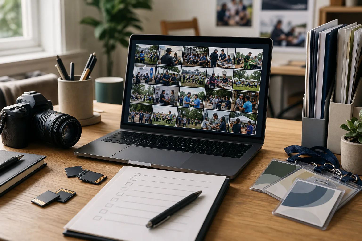
A nonprofit event can generate hundreds of photos in a single afternoon: check-in tables, speakers, volunteers unloading supplies, donors shaking hands, kids doing activities, staff holding signs, a group shot, a few blurred candids, and the inevitable close-up of a snack table that somehow appears in every batch.
The problem is rarely that you have too few images. The problem is that the useful images are buried inside a messy camera roll. If your communications team is small, the recap page, donor email, social post, and internal archive may all depend on the same tired person making fast decisions after the event.
This guide is for that moment. It gives nonprofit teams a practical system for turning raw event photos into publishable assets without over-editing, losing context, or accidentally sharing something sensitive. The goal is not to create a glossy campaign from scratch. The goal is to publish a clear, human recap that loads quickly, respects participants, and gives future staff enough organized material to reuse later.
Why Event Photo Triage Matters for Small Nonprofits
Event photos do several jobs at once. They document impact, thank supporters, reassure future attendees, give grant writers visual evidence, and help staff remember what actually happened. A recap page with three strong images often communicates more trust than a long paragraph of generic event copy.
But raw event photos are not ready for publication. They often include duplicate bursts, accidental faces in the background, name badges, classroom walls, registration sheets, sponsor banners, children, private addresses, or medical and accessibility details that should not be casually exposed. Even when privacy is not an issue, photos may be too large, too dark, too wide, or too visually cluttered for a website.
A disciplined triage pass gives you four benefits:
- You find the few images that carry the story.
- You remove or set aside images with consent or privacy concerns.
- You prepare smaller, faster files for public pages.
- You preserve clean originals for future reporting and historical records.
The key is to separate selection from beautification. Do not start by editing every promising photo. First decide what each image is for, then make only the changes that support that use.
Start With a Simple Asset Map
Before opening an editor, decide what deliverables you need. Most nonprofit recap packs fall into a few predictable buckets.
| Asset | Typical use | Best image type | Risk level |
|---|---|---|---|
| Hero image | Recap page or newsletter header | Wide, emotionally clear, low clutter | Medium |
| Body images | Story sections and captions | Candid action, speaker, volunteer detail | Medium |
| Social crop | Instagram, LinkedIn, or Facebook | Strong subject, readable at small size | Medium |
| Donor proof image | Grant report or thank-you email | Activity, attendance, visible service context | High |
| Archive image | Internal history and future reuse | Original or lightly corrected full-resolution file | Low to high |
This map prevents a common mistake: choosing images only because they are visually attractive. A beautiful close-up of decorations may be fine for social media, but it does not prove attendance, service delivery, or volunteer participation. A less polished image of the distribution line, a training table, or a community partner speaking may be more valuable for a recap.
Create a temporary folder for the event and keep originals untouched. Inside it, use plain names such as originals, review, publish, newsletter, and archive. If your file manager supports tags or stars, use them. If not, folders are enough.
Sort Photos by Story Value, Not by Time
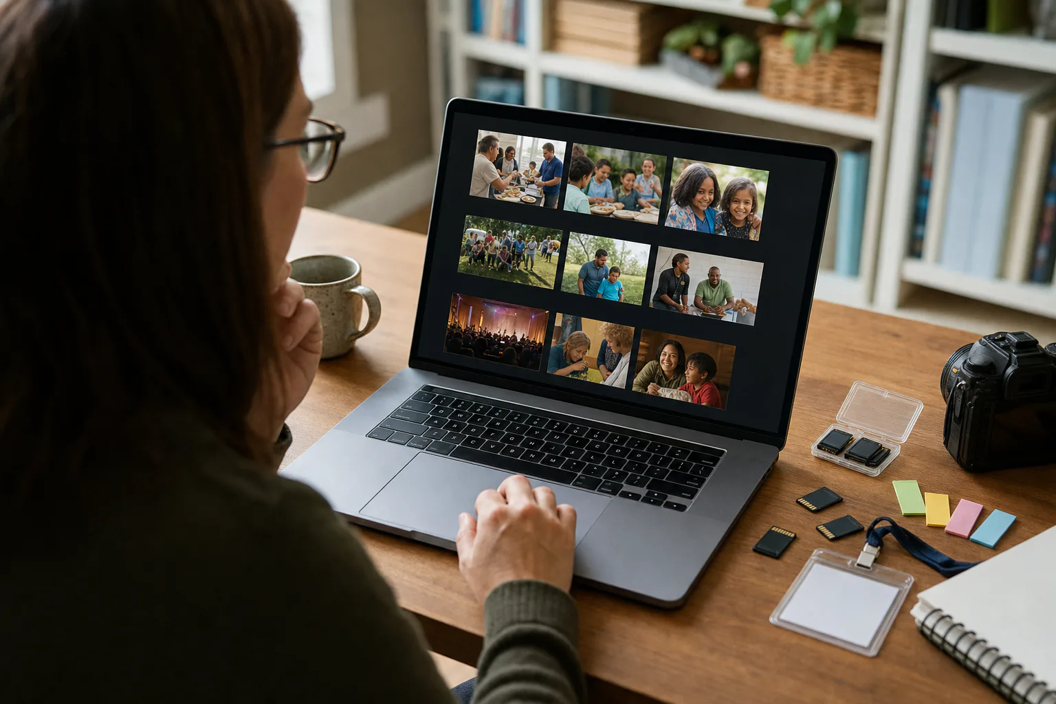
Camera rolls are chronological, but readers do not experience a recap that way. They need a short visual arc: arrival, activity, people, outcome, and a closing moment. Sorting by story value helps you build that arc faster.
Use these groups during the first pass:
| Group | Keep if the photo shows | Reject or hold if |
|---|---|---|
| Setting | Venue, room, table, outdoor scene, visible context | It is empty, crooked, or too generic |
| Action | People doing the core event activity | The action is unclear or blocked |
| Human moment | Expression, collaboration, gratitude, attention | The subject is unflattering or consent is uncertain |
| Evidence | Attendance, delivered goods, workshop materials, partner presence | Private information is visible |
| Detail | Hands, supplies, signage, program materials | It does not add meaning |
| Closing | Group photo, final result, cleaned space, staff wrap-up | It feels staged without context |
Do this pass quickly. Your goal is not to pick the final images yet. It is to reduce 400 files to perhaps 40 candidates. If two photos are nearly identical, keep the sharper one with better expressions. If a photo is technically imperfect but captures a mission-critical moment, keep it for a second look.
For recap pages, avoid using too many photos of people posing at the camera. One posed group image is useful. Five posed images in a row can make the event look less active than it was. Mix faces, hands, materials, room context, and outcomes.
Run a Privacy and Consent Pass
The privacy pass should happen before resizing, compressing, or designing the page. Once an image enters the publish folder, it is easy for it to spread into newsletters, partner decks, and social posts.
Check every candidate for these issues:
- Name tags or full names on lanyards.
- Registration lists, sign-in sheets, donation forms, or clipboards.
- Children or vulnerable participants without clear permission.
- Medical, legal, housing, immigration, or financial details.
- License plates, home addresses, school names, or room numbers.
- People in the background who are isolated, distressed, or clearly not part of the intended shot.
- Whiteboards or posters containing private plans or phone numbers.
If the image is strong but contains a small issue, decide whether cropping solves it. A crop that removes a sign-in sheet is better than heavy retouching that changes the reality of the scene. If the issue sits near the subject or cannot be removed cleanly, do not use the photo publicly.
For minor cleanup, the AI Photo Editor can help remove a distracting object or soften an unwanted background detail. Use restraint. Nonprofit event images should still feel documentary. Do not change who attended, what was delivered, or what happened. Avoid edits that could misrepresent turnout, diversity, partner involvement, or service conditions.
A good rule: if the edit would make a staff member uncomfortable when explaining it to a participant, choose another image.
Choose a Recap Page Image Set
Most event recap pages do not need a full gallery. A strong set of five to eight images is usually enough for a small nonprofit site. The image set should answer a few basic questions without forcing the reader to study captions.
Aim for this mix:
| Position | Image purpose | Example |
|---|---|---|
| Hero | Immediate event identity | Volunteers preparing supply bags |
| Context | Where it happened | A wide room or outdoor setup |
| Activity | What people did | Workshop table, cleanup effort, food distribution |
| People | Human connection | Volunteer helping attendee, speaker listening |
| Detail | Texture and specificity | Hands sorting materials, tools, art supplies |
| Outcome | What changed | Completed kits, full donation table, final presentation |
If your event involved sensitive services, favor partial-body images, hands, backs of heads, materials, and room details. You can still tell a human story without exposing participants. A photo of a volunteer placing fresh produce into bags may be safer and more useful than a close-up of a recipient.
For the hero image, choose clarity over cleverness. It should still make sense when cropped on mobile. Avoid images where the main subject is near the far left or far right unless your page template supports that composition. If the photo contains a banner, do not rely on the banner text being readable. Many users will see the image at a small size or behind a page overlay.
Crop Before You Resize
Cropping is a story decision. Resizing is a delivery decision. Do them in that order.
Start by making the subject clear. Remove empty ceiling, floor, parking lot, and visual clutter that does not add context. Keep enough surrounding detail to show the event setting. For nonprofit recaps, an overly tight crop can make the event feel generic. A slightly wider crop with visible supplies, tables, or activity often works better.
Use aspect ratios based on destination:
| Destination | Useful ratio | Notes |
|---|---|---|
| Website hero | 16:9 or 3:2 | Keep the subject near center for mobile cropping |
| Inline article image | 4:3 or 3:2 | Good balance of people and context |
| Newsletter image | 3:2 or 4:3 | Avoid tiny faces and busy backgrounds |
| Square social post | 1:1 | Works for detail shots and single-subject images |
| Vertical story | 4:5 or 9:16 | Leave space around faces and hands |
After cropping, use Resize Image to create predictable dimensions. For many recap pages, 1600 pixels wide is enough for large web images, while 1000 to 1200 pixels wide is often enough for inline images. If your CMS creates responsive variants, upload a clean source that is not enormous. If your CMS does not, prepare web-sized images yourself.
Do not upscale small, blurry photos to make them look more important. A weak photo at a larger size is still weak, and it may slow the page down.
Prepare Web, Newsletter, and Archive Versions
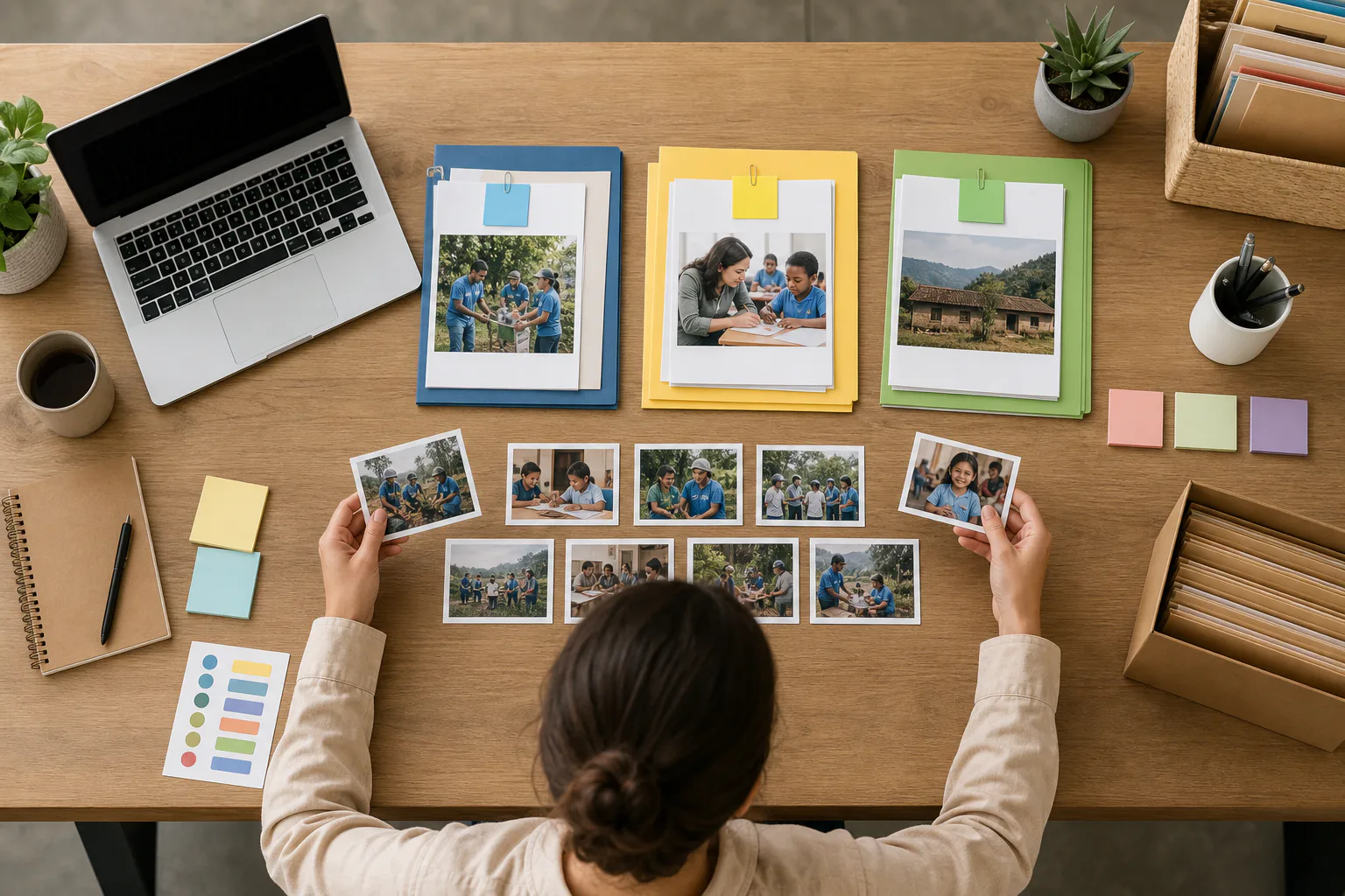
One image can have several legitimate versions. Treat them separately so you do not accidentally overwrite the best source file.
Use a naming pattern that gives future staff context:
| Version | Example name | Purpose |
|---|---|---|
| Original | 2026-spring-cleanup-raw-0342.jpg | Untouched source |
| Web | 2026-spring-cleanup-hero-web.jpg | Recap page |
| Newsletter | 2026-spring-cleanup-volunteers-email.jpg | Email body |
| Social | 2026-spring-cleanup-supply-table-square.jpg | Social post |
| Archive | 2026-spring-cleanup-partner-table-archive.jpg | Internal reuse |
The file name should describe the image, not just its placement. A file called hero-final-final2.jpg is useless six months later. A file called 2026-spring-cleanup-volunteers-sorting-kits-web.jpg is searchable and understandable.
For web and newsletter files, convert only when it helps. JPEG is usually fine for event photos. PNG is better for screenshots, logos, and graphics, but it can be unnecessarily large for camera images. WebP can reduce size while keeping quality high, but make sure your publishing environment handles it reliably. If you need to change formats, Convert Image is useful for creating clean web-ready versions without changing the original.
Keep archive versions closer to the original. Light exposure correction is fine, but avoid aggressive compression or permanent cropping. Future uses may need a different crop, a print-ready version, or a higher-resolution image for a report.
Compress Without Flattening the Story
Compression should make the page faster without making people look waxy or text look broken. Event photos can usually tolerate some compression, especially if they do not contain fine text. But photos with banners, posters, certificates, or small printed materials need more care.
Use this decision table:
| Image content | Compression caution | Check before publishing |
|---|---|---|
| Faces | Medium | Skin texture, eyes, expression |
| Hands and supplies | Low to medium | Edges, color accuracy |
| Posters or banners | High | Letter shapes, sponsor marks |
| Wide room shot | Medium | Noise in darker areas |
| Group photo | High | Faces in the back row |
| Detail shot | Low | Object edges and color |
After resizing, run public images through Compress Image. Then inspect the result at the size it will appear on the page. Do not judge only from a zoomed-out file preview. Open the recap draft on a phone if possible. If the image looks muddy, step back to a slightly higher-quality export.
A fast recap page matters because supporters often open it from email or social media on mobile networks. Large uncompressed images can make a small nonprofit site feel broken even when the writing is strong.
Handle Photos With Text Carefully
Event photos often include posters, whiteboards, schedules, sponsor banners, or handouts. Text inside photos can be useful because it proves context. It can also create risk if it reveals names, phone numbers, internal notes, or private program details.
When text is intentional and public, keep it readable enough to support the story. Do not over-compress a speaker photo if the event title on the poster is part of the context. When text is incidental or private, crop it out or choose another image.
If you need to identify what a blurry sign or paper says before making a privacy decision, use Image OCR on a review copy. OCR can help you catch personal details that are easy to miss when scanning thumbnails. It is especially useful for photos of registration tables, classroom walls, workshop boards, and printed handouts.
Do not publish an image just because the sensitive text is hard to read on your monitor. Users can zoom, download, sharpen, or view the image on larger screens. If the information should not be public, remove the image from the public set.
Build a Caption Pass That Adds Context
Captions are not decoration. They help readers understand why the photo matters. For accessibility and clarity, captions should identify the scene without overloading it.
Weak caption: Volunteers at the event.
Better caption: Volunteers sort donated hygiene kits before the afternoon distribution session.
Weak caption: Great turnout.
Better caption: Community members gather for the Saturday resource fair hosted with local partners.
A good caption usually includes one or two of these details:
- Who is shown in broad terms.
- What activity is happening.
- Why the moment matters.
- When or where the scene fits in the event.
Avoid naming private individuals unless you have permission and a clear reason. For public officials, speakers, staff, or partner representatives, follow your organization’s normal communications policy.
Alt text should be more direct than captions. It should describe the image for someone who cannot see it. Do not stuff it with campaign language. If the image is a volunteer packing boxes, say that. If it is decorative and repeats nearby text, keep the alt text brief.
Make a Review Packet for Stakeholders
Before publishing, it is often helpful to send a small review packet to the event lead, program manager, or executive director. Do not send the entire camera roll. Send the likely public set plus alternates.
A simple packet can include:
- 5 to 8 proposed recap images.
- 3 to 5 alternates.
- Notes about any images excluded for privacy reasons.
- Suggested captions.
- A reminder that originals are preserved separately.
If stakeholders prefer reviewing in PDF form, place the selected images into a compact proof document. You can create a simple visual review file with Image to PDF, especially when reviewers are not comfortable with shared folders. Keep the PDF clearly labeled as review only so nobody mistakes it for the final web set.
This step can prevent last-minute concerns. A program manager may notice a participant who opted out of photography. A development director may identify a donor who should not be featured. A volunteer coordinator may know that a photo implies the wrong partner or activity.
Common Mistakes to Avoid
The fastest way to improve nonprofit recap images is to stop repeating a few common errors.
Do not publish too many photos. A 40-image recap gallery can weaken the story and slow the page. Choose fewer, stronger images.
Do not use every sponsor banner photo. Sponsors matter, but recap pages should still center the event and the people served. Include sponsor visibility where it naturally appears.
Do not crop out all context. Tight face crops can feel warm, but readers also need to see what happened. Include materials, tables, rooms, or activity.
Do not rely on social media images as your only archive. Social platforms compress, crop, and rename files. Keep your own organized set.
Do not edit away reality. Cleaning exposure or removing a stray object is different from making a room look fuller, changing signage, or altering participant appearance in a misleading way.
Do not forget mobile. A hero image that looks balanced on desktop may crop awkwardly on a phone. Preview the page before sending the recap widely.
A 30-Minute Photo Triage Checklist
When time is tight, use this checklist.
First 5 minutes:
- Copy originals into a dated event folder.
- Create folders for review, publish, newsletter, social, and archive.
- Remove obvious blanks, accidental shots, and unusable blur.
Next 10 minutes:
- Group candidates by setting, action, people, evidence, detail, and outcome.
- Pick 20 to 40 images for closer review.
- Mark likely hero and body image candidates.
Next 10 minutes:
- Check privacy, consent, name tags, signs, forms, and background details.
- Crop only when it clearly solves a composition or privacy issue.
- Choose 5 to 8 public images plus alternates.
Final 5 minutes:
- Resize public images for the web.
- Compress copies and inspect faces, signs, and details.
- Rename files with event date, subject, and destination.
- Save originals and archive copies separately.
This checklist is intentionally plain. It is designed for the day after an event, when the team is tired and the recap still needs to ship.
Final Pre-Publish Audit
Before the recap goes live, open the draft page and check it like a reader, not like the person who attended the event.
Ask these questions:
- Does the first image make the event understandable within a few seconds?
- Do the photos show action, not just posing?
- Is there at least one image that shows context or outcome?
- Are private names, forms, addresses, or sensitive details hidden or excluded?
- Do the images load quickly on mobile?
- Do captions add useful information?
- Are file names clear enough for future staff?
- Are originals preserved somewhere separate from web exports?
If the answer to any of these is no, fix that issue before publishing. Most fixes are small: swap the hero, crop a distracting edge, compress a large file, rewrite a vague caption, or remove one risky image.
The Practical Standard
Nonprofit event photos do not need to look like a national campaign shoot. They need to be honest, readable, respectful, and useful. A strong recap image set helps supporters understand what happened, helps staff document impact, and gives the organization a cleaner archive for future reporting.
The best standard is simple: choose photos that make the work clear without exposing people unnecessarily. Keep originals intact. Prepare separate versions for web, email, social, and archive use. Resize and compress with care. Write captions that explain the moment.
When that becomes routine, the camera roll stops being a stressful pile of files and becomes a dependable source of public stories, internal memory, and future proof of impact.