E-Ink Screen Photo Cleanup for Readable Support Documentation
Learn how to photograph, straighten, clean, resize, and compress e-ink display images while preserving faint text, status icons, refresh artifacts, and device context.
E-Ink Screen Photo Cleanup for Readable Support Documentation
E-ink displays are unusually difficult to document well. They look calm and paper-like to the eye, yet photographs often show gray backgrounds, uneven illumination, moiré, reflections, soft status icons, or traces of the previous screen. A quick contrast adjustment can make the main text darker, but it may also erase disabled controls, battery segments, selection borders, and refresh artifacts that matter during troubleshooting.
This guide presents a careful method for producing readable e-ink screen photographs for help centers, repair records, test reports, knowledge bases, and product manuals. It is intended for photographed displays rather than native screenshots. That distinction matters: a photograph records the display, its lighting, and part of the device, while a screenshot records only rendered interface pixels.
The objective is not to make the screen look like a perfect black-and-white graphic. The objective is to preserve useful evidence while removing distractions that arose during capture.
Why E-Ink Screens Need Special Treatment
An LCD usually emits light or is illuminated from behind. Most e-ink panels reflect ambient light, so the photograph depends heavily on the room, camera angle, and display surface. Even a clean panel can produce a bright hotspot from a window or a dark gradient from the photographer standing nearby.
E-ink interfaces also contain several kinds of low-contrast information:
- Fine text rendered with partial gray pixels
- Pale menu dividers and inactive controls
- Small battery, wireless, and synchronization icons
- Dithered illustrations or book covers
- Selection boxes that differ only slightly from the background
- Ghost images remaining after a partial refresh
- Warning states shown through flashing or temporary inversion
An aggressive black-point adjustment can make a heading look excellent while destroying the distinction between an active button and a disabled one. Sharpening can create halos around pixel clusters. Automatic background removal can mistake the rectangular display for a replaceable backdrop.
For support documentation, accuracy should take priority over dramatic contrast.
Decide What the Image Must Prove
Before taking a photograph, write down the fact the image is supposed to communicate. This keeps the edit from drifting toward cosmetic improvement at the expense of evidence.
A screen photograph may need to prove one of several things:
| Documentation purpose | Preserve carefully | Usually safe to reduce |
|---|---|---|
| Setup instructions | Menu labels, selection state, navigation icons | Desk clutter and excess bezel |
| Error diagnosis | Complete message, status bar, device model context | Uneven empty background outside the device |
| Refresh-quality testing | Ghosting, gradients, damaged pixel regions | Almost nothing on the display itself |
| Repair intake | Cracks, pressure marks, frozen screen state | Unrelated surroundings |
| Product manual | Readable controls and consistent framing | Minor sensor noise and neutral color cast |
| Accessibility review | Text weight, contrast, focus indicators | Glare that was not present during normal use |
This decision also determines whether ghosting is a defect or a distraction. In a menu tutorial, a faint previous page may be reduced if it obscures the current state. In a display-quality report, that same trace is the subject of the image and must remain untouched.
When the image supports a repair case, retain an unedited original alongside the presentation copy. The cleaned version improves communication; the original remains the capture record.
Build a Repeatable Capture Setup
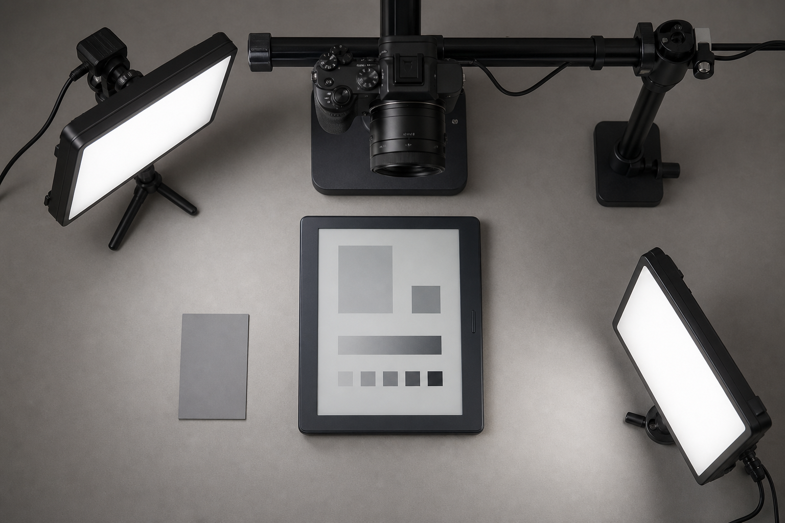
Better source photographs require fewer edits and preserve more subtle screen information. You do not need a large studio, but you do need control over alignment and reflections.
Clean the Surface Without Changing the State
Remove loose dust with a blower or a clean, soft brush. If the manufacturer permits wiping, use an appropriate lint-free cloth and minimal pressure. E-ink panels can be vulnerable to pressure, and pressing the display may create temporary marks or cause damage.
Do not wake, refresh, or navigate away from an error screen merely to clean it. Capture the diagnostic state first. You can make a more polished instructional image later if necessary.
Stabilize the Camera
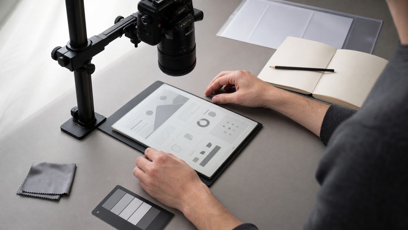
Place the camera or phone directly above the display, with the sensor plane parallel to the screen. A copy stand is ideal, but a stable overhead arm or tripod can work. Use the grid in the camera application to align the display edges.
Perspective correction can repair a modest trapezoid, but it cannot restore detail that was never recorded. A strongly angled photograph stretches one edge and compresses the other, making small interface text harder to recover.
Use a timer or remote shutter control to avoid movement. If the camera offers optical zoom, a slightly longer focal length from farther away often produces less geometric distortion than placing a wide-angle phone camera close to the screen.
Control Reflections With Broad Light
Start with one large, diffused light positioned above and to one side. Move it while watching the screen until the display is evenly illuminated without a hard reflection. Add a weaker fill source from the opposite side only if needed.
Avoid a ring light directly around the lens. On some e-ink surfaces it creates a conspicuous circular reflection. Bare bulbs and small LED panels can also produce sharp hotspots.
A dark shirt and a matte surface behind the camera can reduce reflections from the photographer and room. If the device has a glossy protective layer, a polarizing filter may help, but test it carefully. Polarization can introduce unevenness or interact with other layers in unexpected ways.
Capture More Than One Exposure
Take a short bracket rather than trusting a single automatic exposure:
- One frame at the camera's suggested exposure
- One slightly darker frame to protect highlights and glare-prone areas
- One slightly brighter frame to preserve pale interface elements
Do not automatically merge these frames into an HDR image. Tone merging can invent halos and local contrast around text. Instead, inspect the frames and choose the single exposure that preserves the most useful screen detail.
If the interface changes during refresh, capture the stable final state and any transitional state separately. Do not present a refresh transition as a normal static screen.
Check the Source Before Editing
Open the photograph at 100 percent magnification and inspect the smallest meaningful elements. Judge the source based on those elements, not on the large heading or illustration.
Look for:
- Legible small menu text
- Complete battery and connectivity icons
- Separation between pale borders and the display background
- Clipped bright areas caused by glare
- Motion blur along pixel edges
- Focus that falls behind or in front of the screen
- Moiré or false color caused by the camera sensor
- A previous page visible through the current interface
If critical text is blurred or a highlight is completely white, recapture the screen when possible. Editing cannot reliably reconstruct missing characters. Retaking one photograph is usually faster than attempting to rebuild a tiny icon or guessing at an error code.
For recordkeeping, give the original and edited file related names, such as reader-error-e42-source.jpg and reader-error-e42-doc.png. Avoid names such as final2-new.jpg, which become ambiguous as soon as another revision appears.
A Conservative Editing Sequence
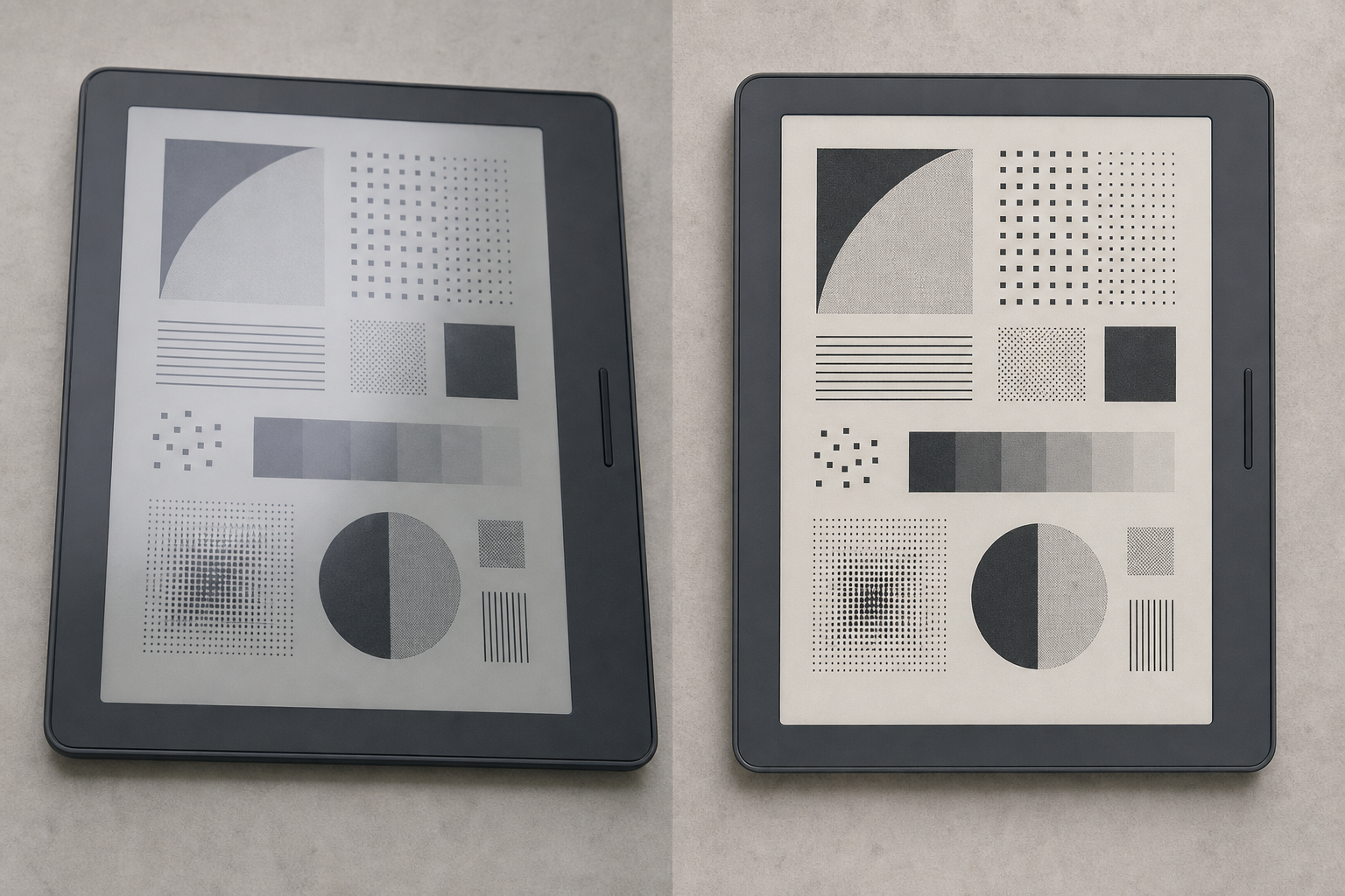
Perform corrections from structural to cosmetic. This limits repeated resampling and makes it easier to identify which adjustment caused lost detail.
1. Correct Rotation and Perspective
Straighten the longest reliable edge, then correct vertical and horizontal perspective until the display is rectangular. Use the physical display boundary rather than a menu box, since interface elements may not be perfectly centered.
Leave a little extra area around the intended crop while transforming. Perspective correction can pull corners outside the canvas. Once the geometry is stable, make the final crop.
For a manual, showing a narrow strip of bezel can be useful because it proves orientation and distinguishes a photograph from a native screenshot. For an error report, include enough of the device to identify buttons, indicator lights, or physical damage relevant to the problem.
You can use the image resizing tool after the geometry is corrected. Resizing before perspective correction wastes detail because the image must be sampled again during the transform.
2. Neutralize Color Cast Carefully
Although many e-ink displays are monochrome, a photograph may look blue, yellow, or green under room lighting. Set white balance using a neutral reference card captured under the same light, if available. Otherwise, sample a clean part of the bezel or display only when you know it is physically neutral.
Do not force every screen background to pure white. E-ink substrates are commonly light gray or warm gray, and preserving that tone keeps the image believable. A completely white background can also hide reflections and unevenness that technicians need to see.
If color is irrelevant, converting the image to grayscale can eliminate distracting sensor color and chromatic moiré. Keep a color version when indicator LEDs, colored buttons, case markings, or tinted display layers carry information.
The image conversion tool can create a consistent delivery format after you decide whether the documentation set should remain in color.
3. Set Exposure Before Contrast
Adjust overall exposure until the display background is comfortably visible and highlights retain texture. Then set black and white points with restraint.
A useful check is to watch three reference areas simultaneously:
- The darkest primary text
- A pale inactive control or divider
- A blank part of the display
If the primary text becomes dark but the inactive control disappears, the correction is too strong. If the blank area turns featureless white, you may be concealing glare or clipping useful surface information.
Prefer a gentle curve over a severe threshold operation. Thresholding converts every pixel to black or white, which can destroy antialiasing, dithering, partial-refresh evidence, and gray interface states.
4. Correct Uneven Illumination Locally
A broad light gradient is common in reflected-display photography. Correct it with a large, soft local adjustment rather than increasing global contrast. The correction should affect illumination, not redraw individual interface elements.
Keep local adjustments wide and low in strength. Small brushes around letters often create bright or dark halos that make the display look retouched. Toggle the correction off and on while viewing at normal reading size. If the edit calls attention to itself, reduce it.
The goal is an evenly readable screen, not a mathematically uniform background. Slight natural variation is preferable to plastic-looking flatness.
5. Reduce Noise Without Smearing Pixel Structure
Noise is most visible in pale display areas, especially in photographs taken at high ISO. Apply modest luminance noise reduction while viewing small characters and diagonal icon edges.
Stop as soon as noise becomes less distracting. If punctuation, thin strokes, or pixel clusters begin to merge, back off. Color-noise reduction can often be stronger on a monochrome screen because colored speckles are camera artifacts rather than display content.
For severe noise, return to the source and check whether a longer, stabilized exposure at a lower ISO is possible. Capture quality is a better remedy than heavy smoothing.
6. Apply Output-Specific Sharpening
Sharpen only after geometry, noise correction, and resizing are complete. Use a small radius and moderate strength. E-ink pixels already form high-frequency patterns, so strong sharpening quickly creates crunchy edges and dark halos.
Inspect rounded letters, diagonal strokes, and small icons. These reveal oversharpening earlier than large text. Compare the result at 100 percent and at the size readers will actually see in the help center.
If the image will be displayed responsively, test at both desktop and narrow mobile widths. A version that looks crisp at 1200 pixels may become muddy after a publishing platform generates a smaller derivative.
Preserve Ghosting When It Is Evidence
Ghosting is one of the most easily mishandled details in e-ink documentation. It may indicate a partial refresh, temperature-related behavior, a software problem, or an aging panel. Removing it can invalidate a test image.
Use this rule: if the article discusses display performance, do not retouch ghosting. If the photograph merely illustrates navigation and the ghosting came from an unrepresentative capture, prefer refreshing and recapturing the screen instead of painting over it.
For before-and-after testing, lock the following variables:
- Device orientation
- Camera position and focal length
- Exposure and white balance
- Light placement
- Display content
- Time elapsed after refresh
- Ambient temperature when it is relevant to the test
Place comparison images side by side without applying different contrast settings. Otherwise, editing differences may be mistaken for changes in panel behavior.
OCR Is a Verification Aid, Not the Master Copy
Optical character recognition can help index error messages, serial information, menu labels, and firmware screens. It is especially useful when a team needs to search a large support archive. However, e-ink photographs contain conditions that can confuse OCR: dotted rendering, ghost characters, glare, icons mixed with text, and unusual fonts.
Run OCR on a straightened, moderately corrected copy with sufficient resolution. The image OCR tool can provide a text draft, but compare every result with the photograph before adding it to documentation or a ticket.
Pay special attention to ambiguous pairs:
0andO1, lowercasel, and uppercaseI5andS8andB- Hyphens and minus signs
- Colons and pairs of faint dots
Error codes should be transcribed exactly. Never silently repair an OCR result because a different code seems more plausible. If one character cannot be confirmed, mark the uncertainty in the accompanying notes and retain the image.
Icons should be described separately rather than forced into OCR text. For example, record that a crossed-out cloud icon appears beside a synchronization message. That observation may be more useful than an inaccurate automatically generated symbol.
Choose Dimensions and Formats by Use Case
A documentation image should be large enough to keep the smallest relevant text readable, but it does not need to preserve every camera pixel.
| Destination | Practical preparation | Suitable format |
|---|---|---|
| Help-center article | Resize for responsive display; retain readable small labels | WebP, PNG, or JPEG depending on detail |
| Repair archive | Keep original plus a corrected derivative | Original format plus PNG or high-quality JPEG |
| Printable manual | Prepare at the final physical size and inspect a proof | PNG or appropriately encoded JPEG |
| Issue tracker | Crop to the relevant state but retain orientation clues | PNG or JPEG |
| OCR archive | Preserve resolution and moderate contrast | PNG or high-quality JPEG |
| Email attachment | Use a readable derivative rather than the full camera file | Compressed JPEG or WebP where supported |
PNG is useful for crisp interface detail and repeated flat tones, although photographic noise can make it unexpectedly large. JPEG can be efficient for photographs that include the device and surrounding context, but low-quality settings may create blocks and ringing around fine text. WebP can work well for web delivery when the publishing environment supports it consistently.
After choosing dimensions, use the image compression tool and inspect the result rather than relying only on the reported file size. Zoom in on small gray labels, thin borders, and status icons. These usually fail before large black text does.
Keep one higher-quality master derivative. Generate smaller delivery copies from that file instead of repeatedly recompressing an already compressed image.
Assemble Consistent Documentation Sets
A single clean image is useful; a consistent series is much easier to follow. For step-by-step instructions, keep the crop, device orientation, scale, and background stable across every frame.
Use a simple capture list before navigating the device:
- Starting screen and visible status bar
- Physical control used to begin the action
- Each menu selection state
- Confirmation screen
- Final result or error state
- Recovery screen, if the guide includes recovery
Avoid mixing tight screen-only crops with wide device photographs unless the change serves a purpose. A wide view can introduce a physical button; the following close view can show its on-screen result. Unexplained jumps in framing make readers wonder whether the device or firmware changed.
If annotations are needed, place them on a duplicate delivery image. Keep arrows outside important text, use consistent colors, and ensure arrowheads point to one unambiguous target. Do not cover display artifacts that may help diagnose the problem.
For multilingual documentation, retain an unannotated master so translated callouts can be produced without reconstructing the screen. Record the device language and firmware version in nearby text rather than burning that metadata permanently into every image.
Quality-Control Checklist
Review the finished image at actual display size, at 100 percent magnification, and on a narrow mobile viewport. Each view exposes different problems.
Before publishing, confirm that:
- The title or caption identifies the correct device state
- The screen is straight and not visibly stretched
- The smallest necessary label remains readable
- Pale controls and selection borders have not disappeared
- Reflections no longer obscure information
- Natural screen tone has not been forced to pure white without reason
- Ghosting has been preserved when it is evidence
- Noise reduction has not merged characters
- Sharpening has not produced halos
- OCR text has been checked character by character
- The crop retains enough device context for orientation
- An unedited source is retained for diagnostic or archival material
- The delivery file has been inspected after compression
- Alt text describes the useful screen state rather than merely saying “device image”
Also compare the image with the written instruction immediately beside it. If the prose says to select the second menu item but the photograph highlights the third, the image is technically clear yet editorially wrong.
Common Failure Modes and Better Fixes
The Background Looks Dirty Gray
First determine whether the gray is the real substrate, a color cast, underexposure, or uneven lighting. Correct white balance and exposure gently. Do not erase the entire background with a selection unless the image is intended as a purely illustrative reconstruction.
Tiny Text Looks Worse After Compression
Return to the high-quality derivative, resize once to the intended output dimensions, and use a less aggressive compression setting. PNG may outperform JPEG when the crop contains mostly flat display tones and sharp characters.
A Reflection Covers an Error Code
Use another bracketed frame only if the device and message remained unchanged. Otherwise, recapture the state. Cloning characters from elsewhere would create an unsupported record.
The Screen Has Colored Ripples
This is often sensor moiré rather than a display color. Try a slightly different camera distance or focal length during capture. For an already captured monochrome interface, a careful grayscale conversion may reduce the distraction, provided no meaningful color information is present elsewhere.
Automatic Enhancement Removes Faint Icons
Undo it and apply exposure, curves, and local illumination correction separately. One-click enhancement systems often optimize for a bold-looking image rather than preservation of low-contrast interface states.
Every Image in the Series Has a Different Tone
Select one representative frame as the visual reference. Match the remaining images by comparing the blank display background, darkest text, bezel tone, and crop position. Apply shared settings only when lighting and exposure were genuinely consistent; inspect every frame afterward.
A Reliable Final Handoff
For a small documentation set, deliver three clearly separated assets: the untouched camera original, a corrected master, and the optimized publishing copy. Accompany them with brief notes identifying the device, screen state, capture date, firmware version when known, and any intentional edits that affect interpretation.
This structure prevents a compressed web image from becoming the accidental archive master. It also lets another editor produce a new crop or format without amplifying previous compression damage.
E-ink screen cleanup succeeds when readers stop noticing the photography and can confidently interpret the device state. Straight capture, broad controlled light, conservative tonal correction, verified OCR, and output-specific compression do most of the work. The remaining discipline is knowing which imperfections are distractions and which are evidence. Preserve that distinction, and the finished images will be both clearer and more trustworthy.