Thin UI Line Screenshot Compression Audit for Technical Documentation
A practical guide for compressing tutorial screenshots while preserving hairline borders, small labels, icons, code snippets, and interface clarity in technical documentation.
Thin UI Line Screenshot Compression Audit for Technical Documentation
Technical documentation screenshots are unusually fragile. A product photo can survive moderate compression because the viewer expects texture, shadow, and natural variation. A UI screenshot is different. It depends on one-pixel borders, pale dividers, small icons, antialiased text, code tokens, cursor states, and subtle contrast changes that tell the reader exactly where to click.
That is why a screenshot that looks acceptable in a CMS preview can fail in the actual docs page. The file is lighter, but the important part is gone: the checkbox outline has softened, the tab border has disappeared, the tooltip arrow has blended into the background, or the code sample is still technically readable but tiring to scan.
This guide is for documentation teams, product marketers, support writers, developer advocates, and solo maintainers who publish many software screenshots and need to reduce image weight without turning the interface into mush. The goal is not maximum compression at any cost. The goal is a repeatable audit that keeps screenshots sharp enough to teach while still respecting page speed, mobile bandwidth, and storage hygiene.
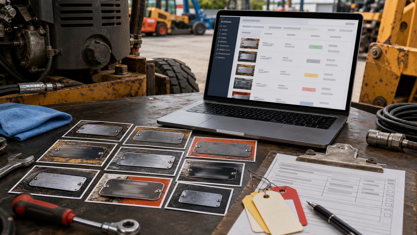
You can use ConvertAndEdit tools such as Compress Image, Resize Image, Convert Image, Image OCR, and Image to PDF as practical checkpoints while preparing assets. The important part is knowing what to test before you publish.
The Thin-Line Problem: Why UI Screenshots Break Differently
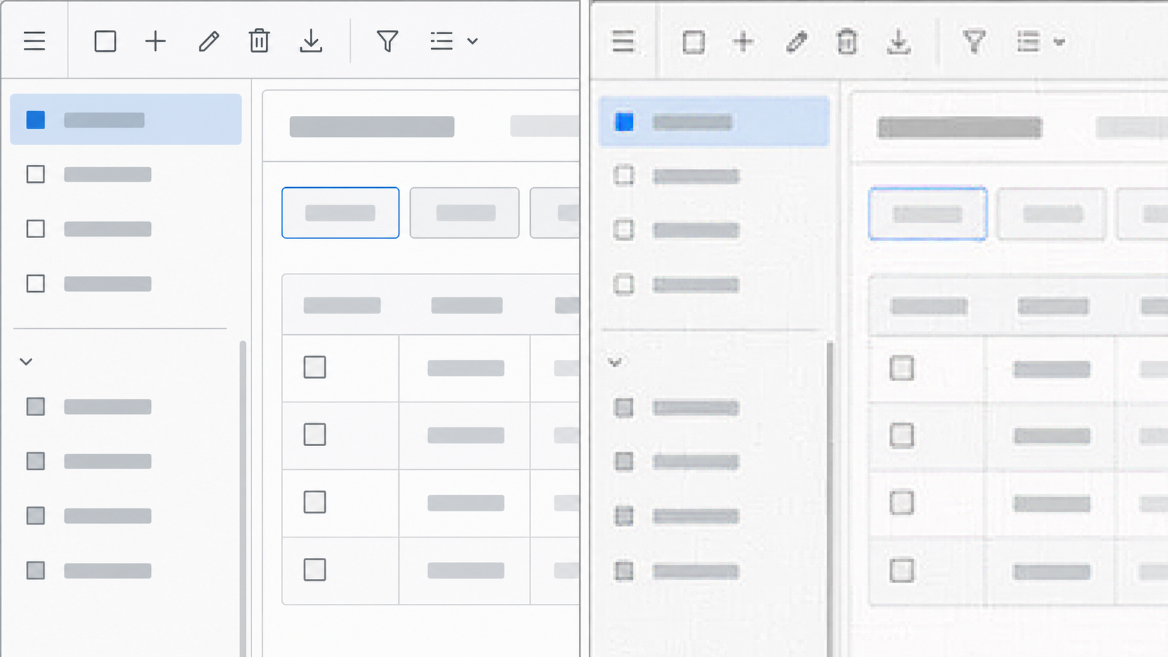
Most compression advice treats images as if they are photos. That advice often fails for screenshots because software interfaces are built from crisp geometry. A UI screenshot may contain large flat areas and tiny critical details at the same time. This creates a trap: the file looks easy to compress because much of it is visually simple, but the meaningful information lives in the smallest shapes.
Common failure points include:
- One-pixel borders around inputs, cards, dialogs, and tables
- Pale gray divider lines in navigation and settings panels
- Small monochrome icons in toolbars and sidebars
- Text rendered at 11 to 14 pixels before resizing
- Code snippets with punctuation that matters
- Red, yellow, or blue status dots that communicate state
- Focus rings, selection outlines, and hover indicators
- Fine chart gridlines in analytics dashboards
- Cursor pointers and drag handles
Lossy compression can introduce color bleeding around these elements. Resizing can be even harsher because the browser or editor may resample the screenshot in a way that breaks the pixel grid. A one-pixel line cannot be reduced gracefully if it lands between output pixels. It becomes gray, uneven, or invisible.
The practical lesson is simple: compression should happen after you know the display size. If a screenshot will appear at 760 pixels wide in an article, exporting it at 2400 pixels wide and letting the page shrink it may waste bytes. But exporting it at exactly 760 pixels wide may make high-density screens look soft. A better target is usually a clean multiple of the rendered width, then compression tuned for that final asset.
Pick the Right Screenshot Class First
Do not audit every screenshot the same way. A hero image, a step-by-step UI capture, and a tiny inline button example have different quality requirements. Before touching compression settings, assign each image to a screenshot class.
| Screenshot class | Main risk | Suggested priority |
|---|---|---|
| Step instruction screenshot | Reader cannot identify the control | Preserve labels, borders, and cursor targets |
| Code or terminal screenshot | Punctuation and indentation blur | Prefer high clarity or use real code blocks instead |
| Dashboard screenshot | Chart lines and legends degrade | Preserve small labels and chart geometry |
| Marketing UI crop | General impression matters more than every label | Balance size and polish |
| Full-page capture | Text becomes too small after scaling | Crop, resize, or split into panels |
| Error message screenshot | Support detail may be lost | Keep text readable and consider OCR backup |
This classification prevents bad tradeoffs. A background image can tolerate more compression than a screenshot that explains a payment setting. A tiny status indicator in a help article might deserve a larger file because it prevents user mistakes.
When a screenshot contains sensitive or irrelevant areas, crop first. Cropping reduces file size without damaging the remaining pixels. It also improves comprehension because the reader sees the relevant control sooner. A crop plus a careful export is usually better than compressing a full window aggressively.
Capture Clean Before You Compress
Compression cannot rescue a messy source. Start with a screenshot that is already clear, calm, and purposeful. The best compression audit begins before the file exists.
Use a consistent browser zoom level, ideally 100 percent unless your documentation style requires larger UI. Hide personal account details, browser extensions, debug overlays, and unrelated notifications. Make sure the UI state is stable: menus fully open, loading spinners gone, selected rows visible, and tooltips not covering the target.
For retina or high-density displays, decide whether your source capture will be high resolution. High-density captures can preserve UI detail well, but they often produce huge files. That is not automatically bad. A large source gives you room to resize cleanly. The mistake is uploading the untouched capture without deciding how it will render on the page.
A good source screenshot usually has these qualities:
- The target control is visible without guessing
- There is enough surrounding context to orient the reader
- No private data appears in the frame
- UI scale is consistent across the article
- The capture has not already been repeatedly exported
- The background is not filled with unrelated windows or tabs
If the screenshot includes small text that must remain searchable for your team, run it through Image OCR before and after optimization. OCR is not a substitute for human review, but it is a useful signal. If OCR accuracy drops sharply after compression, your readers will likely struggle too.
Resize With Display Context, Not Habit
Many documentation image problems come from resizing by habit. Teams pick a width such as 1200 pixels for every screenshot because it sounds reasonable. But a narrow modal, a full dashboard, and a mobile app view should not all be treated the same.
Start from the actual placement:
| Placement | Typical decision | Why it helps |
|---|---|---|
| Main article image | Export around 1.5x to 2x rendered width | Keeps high-density screens crisp |
| Inline control close-up | Crop tightly, then export larger than displayed | Lets readers inspect small controls |
| Full-page UI capture | Split into sections or use a zoomed crop | Avoids unreadable mini text |
| Mobile screenshot | Keep natural aspect ratio and avoid stretching | Preserves app proportions |
| PDF handout image | Test inside the PDF page size | Print and PDF viewers render differently |
The Resize Image tool is useful when you need to normalize dimensions across a documentation set. For example, a release note may need every UI screenshot to fit a maximum content width while keeping crisp edges. Resize first, inspect at the intended display size, then compress.
Avoid resizing screenshots multiple times. Each resample can soften text and lines. Keep an original capture folder and create optimized derivatives from that source. If a screenshot must be updated later, return to the original or capture a fresh source instead of editing an already compressed file.
Choose PNG, WebP, or JPEG Based on the Pixels
The best format depends on the screenshot content. There is no single correct answer for every docs site.
PNG is often strong for UI screenshots because it handles flat colors, hard edges, and text cleanly. It can produce larger files, especially for complex dashboards or screenshots with photos inside the interface. Still, for screenshots with thin lines and small text, PNG is often the safest starting point.
WebP can be excellent when configured carefully. It may reduce file size substantially while preserving enough detail for documentation. The risk is using lossy WebP settings that blur text or introduce artifacts around icons. Test visually before replacing PNGs across a whole library.
JPEG is usually a poor fit for crisp UI screenshots with text, but it can be acceptable for marketing images, product screenshots with photographic content, or UI captures where exact labels are not important. JPEG artifacts are most visible around text and flat color blocks, which are common in software interfaces.
Use this decision table as a starting point:
| Screenshot content | First format to test | Notes |
|---|---|---|
| Settings page with small labels | PNG or high-quality WebP | Inspect input borders and label clarity |
| Dashboard with charts | PNG or WebP | Check gridlines, legends, and colored markers |
| App screenshot with user photo thumbnails | WebP or JPEG | Watch text areas separately |
| Terminal or code editor capture | PNG | Better yet, use real code blocks when possible |
| Marketing page preview | WebP or JPEG | Visual polish matters more than exact text |
| Transparent UI overlay | PNG or WebP with alpha | Verify edge transparency on light and dark backgrounds |
If you need to change formats, use Convert Image and compare outputs side by side. The correct result is the one that survives inspection in the actual article layout, not the one that wins a file size contest in isolation.
Compression Settings That Preserve Reader Trust
Compression quality should be chosen by evidence. A screenshot can look fine at full size in an image viewer and fail when embedded in a page column. Always test in context.
For screenshot-heavy documentation, create a small compression ladder. Export the same screenshot at a few settings, such as PNG optimized, WebP high quality, WebP medium quality, and JPEG high quality if relevant. Place them in a test page or preview environment. View them at desktop width and mobile width.
When inspecting, look for these issues:
- Text halos around dark letters on light backgrounds
- Color blocks that look dirty or speckled
- Icons that lose their intended shape
- Borders that appear broken or uneven
- Red or green status marks that shift color
- Cursor arrows that blend into white panels
- Code punctuation that becomes ambiguous
- Dropdown shadows that turn into blocky bands
Use Compress Image for individual checks when you want quick feedback. For a larger documentation set, sample a few representative screenshots before applying similar settings broadly. Include at least one dense dashboard, one form screen, one modal, and one image with icons.
The practical threshold is not whether you can see any difference when zoomed to 400 percent. The threshold is whether the reader can complete the task without friction. Some visual difference is acceptable. Lost instructional detail is not.
A Practical Audit Checklist Before You Publish
A good audit is short enough to repeat and strict enough to catch real issues. Use the following checklist before adding optimized screenshots to production docs.
1. Confirm the screenshot purpose
Ask what the image must prove or teach. If the screenshot is decorative, compress more aggressively. If it identifies a control, preserve detail around that control. If it documents an error or setting, keep the relevant text readable.
2. Check the rendered size
Preview the image where it will actually appear. Do not judge only from the file opened in a desktop viewer. Documentation pages often constrain image width, add borders, or display different sizes on mobile.
3. Inspect the target area at normal zoom
Look at the control, menu, field, error, or chart that the text references. If the reader needs to zoom manually to understand it, crop tighter or create a close-up image.
4. Compare against the source
Open the original and optimized version next to each other. Do not hunt for microscopic differences across the whole image. Focus on the instructional details: labels, outlines, icons, and state indicators.
5. Test on a narrow viewport
Many documentation readers are on laptops, tablets, or phones. A screenshot that works in a wide editor may collapse into unreadable detail on a phone. For dense screens, consider splitting the image or adding a cropped follow-up.
6. Verify format behavior
If the image has transparency, place it on both light and dark backgrounds. If it is a WebP, confirm your publishing system serves it correctly. If your docs platform creates derivative sizes, inspect those derivatives too.
7. Run OCR for text-heavy images
For screenshots that contain important messages, use Image OCR as a quick readability check. If OCR output becomes messy after compression, reduce compression or enlarge the crop.
8. Keep the original source
Store original captures separately from optimized files. This makes future updates less painful and prevents quality loss from repeated editing.
Cropping Beats Crushing
When a screenshot is too heavy, the first question should be whether the whole frame is necessary. Cropping often gives a better result than pushing compression harder.
For example, a full browser screenshot of a settings page may include a large sidebar, top navigation, empty white space, and unrelated controls. If the article explains one checkbox, a focused crop around that section will be smaller and clearer. The reader does not need the entire application shell every time.
Use three common crop types:
| Crop type | Best for | Watch out for |
|---|---|---|
| Context crop | Showing where a feature lives | Do not include too much empty UI |
| Detail crop | Explaining a small control | Keep enough context to avoid confusion |
| Sequence crop | Showing before and after states | Keep dimensions consistent between images |
A context crop can introduce the area. A detail crop can then show the exact field or button. This pair is often more readable than one giant screenshot. It also lets you compress each image according to its role.
If the final article needs to be shared as a PDF, collect the selected images into a review copy with Image to PDF. This helps editors and stakeholders inspect screenshots outside the CMS without opening separate files.
Handling Code, Terminal, and Developer Tool Screenshots
Code screenshots deserve special caution. In most documentation, real code blocks are better than images because readers can copy, search, translate, and resize the text. Use screenshots only when the UI around the code matters, such as a developer console panel, a visual diff, or an IDE setting.
When you must use a code or terminal screenshot, preserve punctuation. A blurred comma, period, bracket, or pipe character can change meaning. Compression artifacts around monospace text are also more noticeable because readers expect code to align cleanly.
Practical rules for code-related captures:
- Increase the editor font size before capturing
- Use a clean theme with strong contrast
- Avoid capturing more lines than needed
- Prefer PNG for final output
- Do not shrink the image until punctuation is hard to distinguish
- Include real code text nearby when possible
For terminal screenshots, crop to the command and result. Remove unrelated prompt history. If a command output is important, consider writing it as text in the article instead of relying entirely on a screenshot.
Naming and Version Hygiene for Screenshot Sets
Compression audits become easier when file names explain intent. A folder full of names like screenshot-final-new-2.png is difficult to review and easy to misuse.
A practical naming pattern might include the feature, state, crop type, and size:
- billing-settings-tax-toggle-context-1600w.png
- billing-settings-tax-toggle-detail-1200w.webp
- release-notes-import-modal-error-1400w.png
- api-keys-empty-state-mobile-900w.webp
This style helps writers understand which file belongs where. It also makes it easier to replace an image without breaking mental context.
Keep source files and published files separate:
| Folder | Contents |
|---|---|
| source-captures | Original screenshots, uncompressed or minimally processed |
| edited | Cropped, redacted, annotated, or resized versions |
| optimized | Files ready for the docs site |
| archive | Retired screenshots kept for reference |
Avoid editing files in the optimized folder unless you are recreating them from a better source. Published assets should be treated as output, not as the starting point for future revisions.
When Annotations Help and When They Hurt
Annotations can make a screenshot easier to understand, but they also add compression risk. Arrows, boxes, callouts, and highlights create additional edges and colors. If they are too thin, compression may damage them. If they are too loud, they distract from the interface.
Use annotations when the reader needs help finding a small target. Avoid them when the surrounding prose already identifies the control clearly. For dense screens, a subtle highlight around the relevant area is often better than a large arrow.
Annotation tips:
- Use consistent highlight colors across the article
- Keep annotation lines thicker than one pixel
- Avoid placing callouts over important labels
- Test the annotated version after compression, not before
- Do not rely on color alone to communicate meaning
If an annotation makes the file much larger, consider cropping instead. A tight crop can focus attention without adding visual elements.
Publishing Tests for Documentation Teams
Before a screenshot-heavy article goes live, run a short publishing test. This is especially important if your CMS or static site generator creates responsive image versions automatically.
Check the final page, not just the uploaded image. Some platforms recompress uploads, strip metadata, create lower-quality thumbnails, or serve different formats depending on the browser. A carefully optimized PNG may become a poor JPEG derivative if the system is configured badly.
Test these conditions:
- Desktop article width
- Narrow laptop width
- Mobile width
- Dark mode if your docs support it
- Browser zoom at 125 percent
- PDF export if your readers use printed guides
- Slow connection preview if available
For images that will be embedded in support macros, help widgets, or changelog emails, test those surfaces separately. Email clients and embedded widgets may scale images differently from your main docs site.
Example: Compressing a Settings Page Screenshot
Imagine a help article that explains how to enable invoice reminders in a SaaS billing page. The original screenshot is a 2880-pixel-wide retina browser capture. It includes the full app sidebar, account menu, billing tabs, a settings form, and several empty panels. The file is 3.8 MB.
A poor optimization path would simply compress the full screenshot until it drops below an arbitrary size target. The result may be 420 KB, but the checkbox and helper text are now soft.
A better path looks like this:
- Crop the screenshot to the billing settings panel plus enough sidebar context to show location.
- Create a detail crop of the invoice reminder toggle.
- Resize the context crop to suit the article column at high-density display size.
- Keep the detail crop larger relative to its display size so the toggle remains crisp.
- Test PNG and WebP versions for both crops.
- Use the smallest version that keeps the toggle outline, label, and helper text clear.
- Preview on mobile and confirm the article still makes sense.
The final article may use two smaller images instead of one large image. The total file weight can still be lower, and the reader gets a clearer explanation.
Common Mistakes That Quietly Damage Screenshots
The most common screenshot mistakes are not dramatic. They are small quality losses repeated across dozens of images until the docs feel less trustworthy.
Watch for these patterns:
- Uploading retina captures at full size with no display plan
- Compressing every screenshot with the same setting
- Judging quality only in an image viewer
- Letting the CMS create poor automatic derivatives
- Using JPEG for text-heavy UI captures by default
- Cropping so tightly that the reader loses context
- Leaving huge empty panels inside full-page screenshots
- Reusing old compressed images for new edits
- Making annotations thinner than the UI lines they point to
- Ignoring mobile rendering until after publication
A documentation screenshot should feel intentional. It does not need to be pixel-perfect in a laboratory sense, but it should never make the reader work harder than the product already does.
A Sustainable Standard for Screenshot Quality
The best standard is one your team can apply consistently. A 40-step quality procedure will be ignored during a busy release. A short, visible standard will survive.
Use a simple rule set:
- Crop before compressing.
- Resize for the actual placement.
- Prefer PNG or carefully tested WebP for UI detail.
- Inspect thin lines, icons, and small labels.
- Test in the published layout.
- Keep original captures.
This is enough for most teams. It gives writers and editors a shared language for quality without turning every screenshot into a design review.
When in doubt, optimize for the reader trying to complete a task under mild pressure. They may be switching between your docs and the product. They may be on a small screen. They may not know the interface yet. Crisp screenshots reduce hesitation, support tickets, and repeated reading.
Compression still matters. Fast pages matter. But in technical documentation, clarity is part of performance. A smaller image that fails to teach is not truly optimized. The best screenshot is light enough to load quickly and sharp enough to remove doubt.