WCAG Contrast Audit Screenshot Packs: A Practical Evidence Guide for Product Teams
Build clear, compact screenshot evidence packs for WCAG contrast reviews, with capture rules, OCR cleanup, annotation habits, and PDF handoff tips.

WCAG Contrast Audit Screenshot Packs: A Practical Evidence Guide for Product Teams
Contrast issues are some of the easiest accessibility problems to misunderstand. A button can look fine in a Figma frame and fail once it appears over a hero image. A gray label can pass on a white settings page and disappear inside a disabled card. A link can be readable on a large monitor and become nearly invisible on a dim phone outdoors.
That is why screenshot evidence matters. A good WCAG contrast review pack does not only say that a color pair passed or failed. It shows the exact interface state, the surrounding context, the relevant text size, and the part of the product where the issue appears. It gives designers, engineers, accessibility reviewers, and product managers the same visual reference.
This guide is for product teams that need to collect, clean, organize, and share contrast evidence without turning the task into a heavy documentation project. It focuses on practical screenshot packs: small enough to send, clear enough to review, and structured enough to support real remediation decisions.
The Evidence Pack Your Reviewer Actually Needs
A contrast evidence pack is not a random folder of screenshots. It is a compact set of visual records that answers four questions quickly:
- Where does the contrast issue appear?
- What text or UI element is affected?
- Which state, viewport, theme, or background causes the problem?
- What should the reviewer or implementer check next?
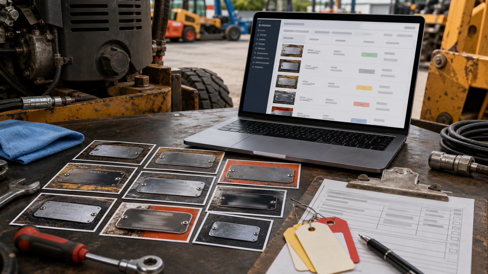
The best packs are boring in a useful way. They use consistent file names, consistent crops, readable annotations, and predictable page order. Nobody should need to open twenty screenshots just to understand which one contains the failing label.
For most product teams, a strong pack includes:
- A cover or index page listing screens and issue groups.
- One screenshot per distinct state, not one per tiny variation.
- Cropped close-ups for small text, icons, badges, and disabled controls.
- Full-page context screenshots where the background or layout affects contrast.
- Notes that identify light mode, dark mode, mobile, desktop, hover, focus, disabled, error, or selected states.
- A final PDF for sharing, plus the original images retained for later inspection.
You do not need a perfect design-system audit to start. Even a small pack covering checkout, signup, settings, and help content can reveal patterns that are expensive to fix later if they spread across the product.
A useful rule: if a reviewer cannot tell what they are looking at within five seconds, the screenshot needs a better crop, file name, or note.
Where Contrast Evidence Gets Messy
Contrast screenshots become hard to use when they mix too many purposes. A screenshot taken for a bug report is usually not ideal for accessibility review. A marketing screenshot is often polished but may hide active states. A QA screenshot may show the issue but include too much browser chrome, debug data, or unrelated content.
The most common problems are simple:
| Problem | Why it hurts review | Better habit |
|---|---|---|
| Oversized full-page screenshots | Reviewers waste time zooming and searching | Add cropped evidence beside full context |
| Blurry mobile captures | Small text and thin icons become unreliable | Capture at native resolution and avoid repeated resizing |
| Random file names | Issues cannot be matched to product areas | Use screen, state, viewport, and issue group in the name |
| Heavy PNG folders | Packs are hard to upload or send | Compress copies while keeping originals |
| Inconsistent annotations | Notes distract from the actual issue | Use a small set of annotation styles |
| Screens without state labels | Disabled, hover, and focus states get confused | Label the state in the file name or nearby caption |
The goal is not to make the pack pretty. The goal is to make it dependable. Contrast decisions are often based on small visual differences, so the evidence must not introduce noise.
A Practical Capture Checklist
Start with a short capture plan before anyone begins taking screenshots. This prevents duplicate work and makes the final pack easier to review.
1. Define the Product Surfaces
List the areas that matter for the audit. For a SaaS product, that may be:
- Signup and login.
- Dashboard summary cards.
- Primary navigation.
- Tables and filters.
- Forms and validation messages.
- Billing or checkout.
- Help center widgets.
- Modals, popovers, and alerts.
For a mobile app, add device-specific surfaces such as bottom navigation, permission screens, empty states, and notification-style messages.
Do not capture every page at first. Capture representative patterns. If ten tables share the same token system, one clean table screenshot plus one edge case is more useful than ten nearly identical images.
2. Capture States, Not Just Screens
Contrast failures often hide in states that are not visible in a default screenshot. Include these when they exist:
- Default state.
- Hover state.
- Focus state.
- Disabled state.
- Selected state.
- Error state.
- Loading state.
- Empty state.
- Dark mode and light mode.
- High-density or compact mode.
Focus indicators deserve special attention. Teams often test body text and buttons but miss keyboard focus rings, outline contrast, or focus states on custom components. When you capture focus evidence, make sure the focused element is clearly visible and not obscured by the cursor.
3. Keep Browser and Device Context Under Control
For web products, decide whether browser chrome should appear. In most cases, the useful evidence is the product UI, not the address bar. Crop browser chrome unless it helps prove viewport size or page location.
For mobile products, keep device frames out unless they add context. A clean native screenshot is usually better than a decorative phone mockup. If you include device frames in a presentation version, keep an unframed copy for review.
Use the same viewport sizes across the pack when possible. A practical set is:
- Mobile narrow: around 360 to 390 CSS pixels wide.
- Tablet or small desktop: around 768 to 1024 CSS pixels wide.
- Desktop: around 1366 to 1440 CSS pixels wide.
The exact values matter less than consistency. If screenshots jump between random widths, reviewers may mistake responsive layout changes for color problems.
4. Capture Image Background Cases Separately
Text over images is one of the trickiest contrast areas. A headline may pass over the dark part of a photo and fail over a bright part. A gradient overlay may work in one crop and fail when the CMS changes the image.
For these cases, capture:
- The full hero or card context.
- A close crop around the lowest-contrast text area.
- Any overlay, scrim, or shadow treatment if it can be isolated.
- At least one alternate content image if editors can change it.
If the design relies on image darkness, treat that as a risk. The evidence pack should show whether the contrast depends on a specific image rather than a stable component rule.
Cleaning Screenshots Without Damaging Evidence
Screenshot cleanup should make the evidence easier to inspect, not change what the evidence says. Avoid edits that alter colors around the tested element. That means no beauty filters, saturation boosts, contrast sliders, or background replacement on the audited area.
Safe cleanup tasks include:
- Cropping away irrelevant browser or desktop space.
- Resizing copies for presentation while preserving originals.
- Compressing duplicate sharing versions.
- Removing unrelated personal information.
- Adding restrained callout boxes outside the tested pixels.
- Straightening phone photos of screens when a native capture is unavailable.
Risky cleanup tasks include:
- Changing brightness or contrast.
- Recoloring text or backgrounds.
- Blurring too close to the tested element.
- Exporting small text through repeated compression cycles.
- Scaling screenshots so far down that anti-aliasing changes readability.
When you need a clean crop, use a dedicated image tool instead of dropping screenshots into a slide deck and exporting them repeatedly. For example, you can prepare exact dimensions with Resize Image, convert scattered formats with Convert Image, and create lighter review copies with Compress Image. Keep the original captures in a separate folder so nobody confuses edited review copies with source evidence.
Redaction Without Losing Context
Accessibility packs sometimes include names, emails, internal project labels, invoices, or customer-like sample data. Redaction is fine, but it should be deliberate.
A good redaction leaves the interface structure visible. For example, replace a user name with a neutral block or blur only the characters, not the entire row. If the failing contrast is inside the redacted area, create a safe test account or staging screen instead of hiding the very evidence you need.
Avoid redaction colors that look like interface elements. A bright red rectangle can be mistaken for an error state. Neutral gray blocks or simple masks are usually clearer.
Using OCR to Make Screenshot Packs Searchable
OCR is not required for contrast review, but it is useful when packs get large. Searchable text helps reviewers find every screenshot that contains labels like Required, Disabled, Continue, Warning, or Learn more.
Use OCR as an index layer, not as the source of truth. The screenshot remains the evidence. OCR simply helps people navigate it.
Good OCR targets include:
- Button labels.
- Form field labels.
- Error messages.
- Navigation items.
- Table headers.
- Legal or consent text.
- Tooltip content.
Poor OCR targets include tiny decorative labels, distorted screenshots, and heavily compressed text. If OCR misreads a label, do not overcorrect the image just to make recognition better. Capture a sharper screenshot instead.
A practical approach is to run important screenshots through Image OCR, copy the recognized text into an issue index, and then attach the original image. If you need a single shareable review file, convert the final image sequence into a PDF with Image to PDF. This gives the team a portable artifact while preserving the visual order.
A Simple OCR Index Format
You do not need a complex spreadsheet. A small table is enough:
| ID | Screen | State | Text found | Review note |
|---|---|---|---|---|
| C-01 | Signup | Error | Password must include | Low-contrast error helper text |
| C-02 | Dashboard | Disabled | Export report | Disabled button label hard to read |
| C-03 | Pricing | Mobile | Most popular | Badge text over gradient needs check |
| C-04 | Settings | Focus | Save changes | Focus outline is faint in dark mode |
Use IDs that match file names. For example, C-02_dashboard_disabled_export-report_mobile.png is much easier to discuss than Screenshot 2026-06-28 at 10.41.12.png.
File Naming That Survives Review
File names are part of the evidence. They help people reference screenshots in tickets, pull requests, design comments, and meeting notes.
Use a predictable pattern:
contrast-id_surface_state_viewport_short-issue.ext
Examples:
c-01_signup_error_mobile_password-helper.pngc-02_dashboard_disabled_desktop_export-button.pngc-03_pricing_badge_mobile_gradient-card.pngc-04_settings_focus_desktop_save-button.png
Keep names lowercase. Use hyphens or underscores consistently. Avoid spaces if the files will move through issue trackers, cloud drives, or automated scripts.
If screenshots are part of a larger review, add a version folder:
contrast-review-2026-06-28/source/contrast-review-2026-06-28/crops/contrast-review-2026-06-28/pdf/contrast-review-2026-06-28/index/
This structure prevents accidental overwrites and makes it obvious which files are originals.
Annotation Rules for Contrast Evidence
Annotations can help, but they can also ruin a screenshot. A giant arrow over the low-contrast label makes the label harder to inspect. A bright rectangle near a color sample can influence perception. Keep annotations outside or around the evidence whenever possible.
Use three annotation types only:
- A thin outline around the relevant component.
- A small numbered marker placed outside the tested text.
- A short caption below the screenshot or in the PDF page notes.
Avoid:
- Handwritten notes over UI text.
- Semi-transparent color overlays on tested areas.
- Decorative arrows.
- Multiple callout colors with unclear meaning.
- Crops so tight that the surrounding background is lost.
If the issue is tiny, create two images: one clean crop with no annotation and one marked version for orientation. Reviewers can inspect the clean crop and use the marked version to understand location.
For sensitive or user-submitted images, AI-assisted cleanup can help remove irrelevant distractions, but it must not alter the contrast evidence itself. If you use AI Photo Editor, reserve it for peripheral cleanup, safe redaction, or presentation copies. Keep source captures untouched for audit discussion.
Building the PDF Review Pack
A PDF pack is useful when stakeholders need one file instead of a folder of images. It is also easier to attach to tickets, archive with release notes, or send to external reviewers.
A clear PDF order looks like this:
- Cover page or index.
- Summary table of issue IDs.
- High-priority failures.
- Component patterns that repeat across screens.
- State-specific evidence such as focus, disabled, and error states.
- Background-dependent evidence such as image cards or gradients.
- Appendix with full-page screenshots.
Do not start with every full-page screenshot. Lead with the evidence that needs decisions. Put context screenshots later unless context is essential.
Each page should include:
- Issue ID.
- Product surface.
- State and viewport.
- Screenshot or crop.
- Short note about what to inspect.
- Link or reference to the ticket if available.
Keep notes factual. Instead of writing This is unreadable, write Secondary label on disabled card has low contrast against gray background in mobile view. Specific notes reduce debate and help engineers locate the component.
When you create the PDF from images, check the page size. A mobile screenshot on a huge page may appear tiny. A desktop screenshot on a small page may become unreadable. If needed, create separate sections for mobile and desktop images rather than forcing all captures into one layout.
Compression Without Losing Thin Text
Contrast packs can become large because screenshots are often PNG files. Compression is useful, but thin text and UI lines are fragile. The wrong export settings can make a real contrast problem look worse, or make a pass look questionable.
Use this rule: compress distribution copies, not source captures.
For source files:
- Prefer PNG for UI screenshots with sharp text.
- Avoid resizing unless required.
- Store original native captures.
- Do not repeatedly export the same screenshot through multiple tools.
For sharing copies:
- Compress after cropping.
- Compare the compressed copy against the original at 100 percent zoom.
- Watch small gray labels, icons, dividers, and focus rings.
- Use PDF compression only after image order and page sizes are final.
A practical review copy can be smaller without being degraded. The key is to test the result visually before sending it. If a reviewer has to ask whether the blur is in the product or in the file, the pack needs a cleaner export.
Decision Table: What to Capture for Each Issue Type
Use this table when deciding how much evidence is enough.
| Issue type | Minimum evidence | Add this when needed |
|---|---|---|
| Low-contrast body text | Full section plus close crop | Mobile crop if text wraps differently |
| Disabled control text | Default and disabled state | Hover or tooltip state if present |
| Error helper text | Form field with error | Full form if several errors appear together |
| Text over image | Full image card plus lowest-contrast crop | Alternate image example from CMS |
| Focus indicator | Focused component crop | Keyboard path context if focus order is relevant |
| Icon-only button | Icon crop and surrounding controls | Tooltip or accessible name evidence |
| Badge or label | Component crop | Dark mode and light mode variants |
| Data visualization label | Chart context and label crop | Legend, hover state, or exported chart image |
This keeps the pack proportional. A single label issue does not need a twenty-page section. A repeated token problem may need several examples across the product.
Common Mistakes That Slow Down Fixes
The biggest mistake is mixing diagnosis and redesign too early. A contrast evidence pack should show the problem clearly. It does not need to solve the entire color system in the same document.
Other common mistakes include:
- Capturing only the happy path while errors and disabled states go unreviewed.
- Testing text color without considering the actual background behind it.
- Sending screenshots with no product route or screen name.
- Cropping so tightly that reviewers cannot identify the component.
- Compressing images before OCR or close inspection.
- Treating dark mode as a simple inversion of light mode.
- Ignoring hover and focus states because they are harder to capture.
A slower but cleaner capture session usually saves time later. Each missing state becomes a follow-up request. Each unclear screenshot creates another round of questions.
A Small Team Example
Imagine a product team preparing a contrast review for a billing area. The team has a settings page, a payment method modal, invoice table, coupon field, and confirmation screen.
A useful pack might include:
c-01_billing_table_desktop_secondary-links.pngc-02_payment-modal_error_mobile_card-number.pngc-03_coupon-field_disabled_desktop_apply-button.pngc-04_invoice-status_badge_mobile_pending.pngc-05_confirmation_success_desktop_subtext.png
The PDF starts with a one-page index. Each issue gets one page with a clean crop and one sentence of context. Full-page screenshots sit in the appendix. OCR text from key labels is copied into the index so the pack is searchable.
The team keeps originals in a source folder, compressed copies in a review folder, and the final PDF in a handoff folder. Designers can inspect patterns, engineers can connect issues to components, and product managers can see which issues affect the purchase path.
That is enough structure to be useful without becoming a documentation burden.
Final Preflight Before Sharing
Before you send the pack, run a quick preflight:
- Does every screenshot have a useful file name?
- Are source captures preserved separately?
- Are crops sharp at 100 percent zoom?
- Are annotations outside the tested text whenever possible?
- Are mobile and desktop screenshots clearly identified?
- Are light mode and dark mode separated or labeled?
- Are sensitive details redacted without hiding the issue?
- Does the PDF open cleanly and show pages in the intended order?
- Is the compressed version still readable?
- Can a reviewer search or scan the index quickly?
This final pass catches the small issues that make packs feel unreliable. A contrast review is already detail-heavy. The evidence should reduce friction, not add it.
Closing Notes
A good WCAG contrast screenshot pack is a practical bridge between visual design, implementation, and accessibility review. It captures the product as users actually encounter it: in states, themes, viewports, and content conditions that a design token table alone cannot fully describe.
Keep the process simple. Capture representative surfaces. Preserve originals. Crop for clarity. Use OCR for navigation. Compress only the copies meant for sharing. Package the final set as a readable PDF when stakeholders need one artifact.
The result is not just a cleaner audit file. It is a clearer conversation about what needs to change, where it appears, and how the team can verify the fix.