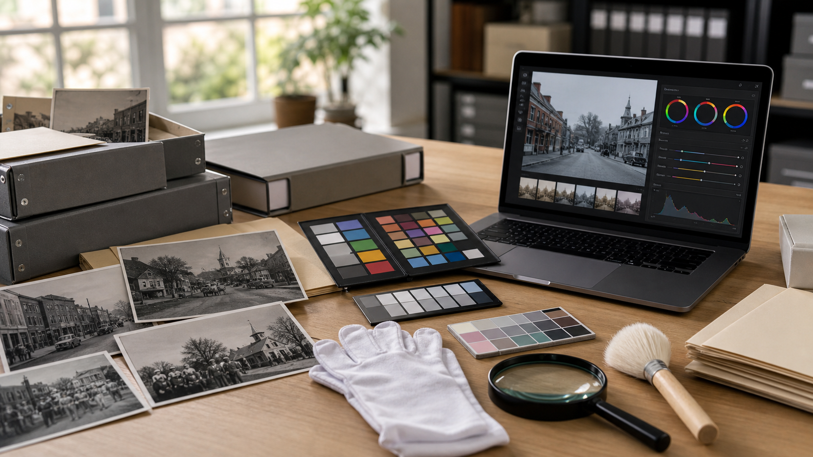
Archive Photo Colorization Prep for Local History Newsletters
A practical guide for cleaning, sizing, colorizing, and documenting old community photos before they appear in local history newsletters or small archive features.
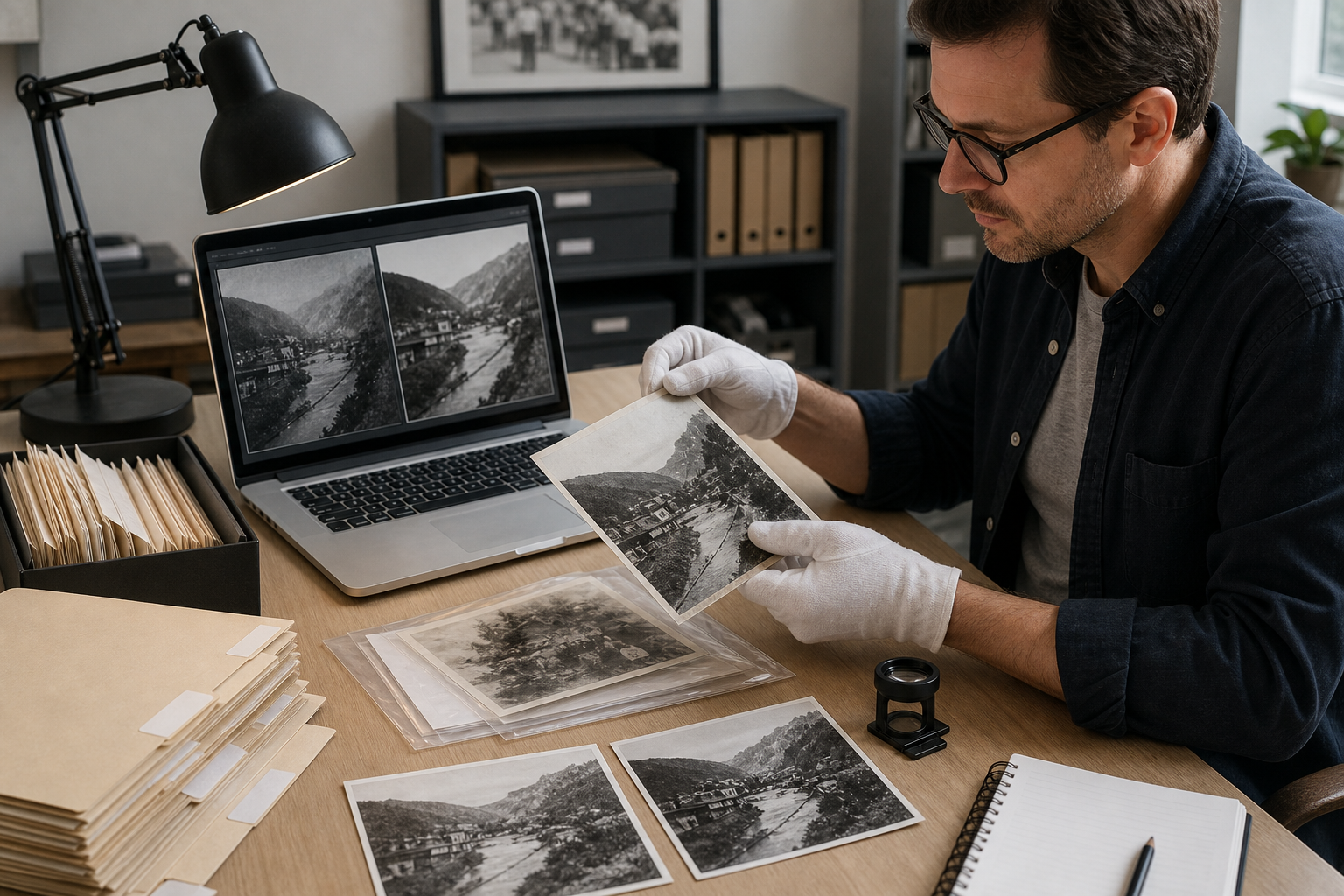
Archive Photo Colorization Prep for Local History Newsletters
Colorizing an old community photograph can make a local history newsletter feel immediate. A schoolyard from 1912, a main street storefront, a factory picnic, or a volunteer fire company portrait suddenly becomes easier for readers to enter. But colorization is also one of the easiest ways to accidentally damage trust. If the scan is dusty, cropped too tightly, over-compressed, or presented without context, the result may look polished while becoming less useful as a historical record.
This guide is for small museums, town clerks, historical societies, library volunteers, local editors, and neighborhood groups that publish archive images in newsletters, PDF bulletins, web posts, exhibit handouts, or donor updates. The aim is not to create museum-grade conservation files. It is to create clear, honest, newsletter-ready images while keeping the original evidence intact.
The practical system is simple: preserve the source, clean the scan, make a separate colorized derivative, document what changed, size it for publication, and package it so reviewers can compare the before and after image without guessing.
Why Colorization Needs a Lighter Touch
A colorized archive photo is usually an interpretation, not a recovered fact. The color of a brick wall, dress fabric, painted sign, or delivery truck may be inferred from local knowledge, era references, or visible tonal clues, but it is rarely guaranteed. That does not make colorization useless. It means the image should be handled like an annotated historical illustration.
For newsletters, colorization often works best when the goal is reader engagement rather than forensic accuracy. A restrained version can help readers notice faces, storefronts, street details, and clothing patterns that disappear in a gray scan. A heavy version can make the photo look like a modern reenactment, which may be attractive but historically confusing.
Before opening any editor, decide which role the image will play:
| Use case | Best treatment | Risk to avoid |
|---|---|---|
| Newsletter feature image | Gentle color, clean crop, original nearby | Making the image look like confirmed color evidence |
| Donor update | Warm but conservative restoration | Over-polishing family or community records |
| Exhibit handout | Clear before and after comparison | Hiding edits from visitors |
| Social post teaser | Readable crop and compressed copy | Uploading the only edited version as the master |
| Research packet | Original scan first, colorized copy optional | Mixing interpretive files with source files |
A good colorized newsletter image should invite attention while still respecting the source.
Start With the Source Scan, Not the Pretty Version
The most common mistake is colorizing a low-resolution image copied from a website, social media post, or old PDF. That file may already include compression blocks, sharpening halos, clipped shadows, and unknown edits. When color is added on top, those flaws become harder to separate from real details.
If you have access to the physical print, scan it again. If not, locate the highest-quality digital master available. Ask whether the archive has a TIFF, large JPEG, or uncropped scan before settling for the small version used in an earlier article.
For small newsletter teams, these scanning targets are practical:
| Original type | Suggested capture | Notes |
|---|---|---|
| Small photo print | 600 dpi | Gives enough room for cropping and repair |
| Large print | 300 to 600 dpi | Higher is useful if faces or signs matter |
| Newspaper clipping | 600 dpi | Descreening may be needed later |
| Postcard | 600 dpi | Keep the full border if it contains clues |
| Already digital file | Use largest original | Do not upscale before cleanup unless necessary |
If the scan will later appear online, it may eventually be resized and compressed. That is fine. The master should still remain large and uncompressed enough for future use.
Build a Before-Colorization Prep Pass
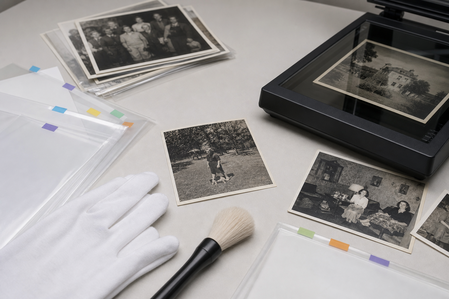
Do not jump straight into color. A preparation pass gives the colorization step better visual information and prevents avoidable artifacts.
Start with a duplicate of the scan. Keep the original untouched in a folder named clearly, such as original-scans. Create a second folder named prep-edits or newsletter-edits for working files. Small teams often skip this distinction and later cannot tell which file came from the scanner.
A useful prep pass includes five checks:
- Confirm orientation. Rotate the image so buildings, people, and horizon lines are correct.
- Remove obvious dust. Clean specks, hair, scanner lint, and surface marks that are not part of the historical scene.
- Preserve real damage when it matters. A torn corner, handwriting, stamp, border, or mounting mark may be evidence.
- Correct exposure gently. Lift shadow detail without crushing the blacks or turning paper texture into pure white.
- Crop with context. Leave enough border or surrounding scene to show where the image came from.
The distinction between dust and history is important. A white scratch across a face may be a defect to reduce. A stamp from a local studio on the border may be part of the record. When in doubt, keep a wider version.
If you need a quick web-ready copy after cleanup, resize with ConvertAndEdit Resize Image only after the archival-sized working version has been saved. Resizing too early removes details that colorization and review may need.
Name Files So Reviewers Can Trust Them
File names are not glamorous, but they prevent confusion. A newsletter folder can quickly contain source scans, cropped images, colorized attempts, compressed web copies, and PDF proofs. If all of them are named photo-final-final.jpg, someone will eventually publish the wrong one.
Use names that say what the file is:
| File role | Example name |
|---|---|
| Original scan | 1928-main-street-original-scan.tif |
| Cleaned grayscale copy | 1928-main-street-clean-grayscale.jpg |
| Colorized draft | 1928-main-street-colorized-draft-01.jpg |
| Approved newsletter image | 1928-main-street-colorized-newsletter.jpg |
| Small web copy | 1928-main-street-colorized-web-1200.jpg |
| Review PDF | 1928-main-street-review-packet.pdf |
If the photo has a catalog number, include it. If the date is uncertain, do not fake precision. Use circa-1930 or date-unknown instead of inventing a year.
A simple naming convention also makes it easier to merge related material into a PDF packet with ConvertAndEdit Image to PDF when a board member, donor, or family contributor needs to approve the image before publication.
Decide What Color Can Be Inferred
Before colorizing, list what is known and what is guessed. This can be a small note in your production document, a spreadsheet, or a caption draft.
Known details might include:
- The school colors from the period.
- A fire truck model that was painted red by department records.
- Brick color from a building still standing today.
- Uniform colors documented in a town report.
- A parade banner described in a newspaper article.
Guessed details might include:
- Dress fabric colors.
- Painted storefront trim.
- Skin tones in a faded print.
- Vehicle paint if no record exists.
- Flower beds, awnings, or interior walls.
When an image includes people, be especially careful. Over-smoothing faces or inventing skin tones aggressively can make the result feel artificial or disrespectful. Aim for believable restraint rather than dramatic transformation.
A helpful caption phrase is: Colorized from an original black-and-white photograph. If the article discusses the image in detail, add a short note such as: Colors are interpretive where no source documentation was available. That kind of clarity supports trust without turning the newsletter into a technical report.
Use AI Editing as an Interpretive Layer
AI editing can be useful for colorization, but it should be treated as a derivative layer. Upload a cleaned copy, not the only master. Keep the grayscale version available for comparison.
When using ConvertAndEdit AI Photo Editor, ask for restrained, historically plausible color rather than modern saturation. A useful prompt might describe the period, setting, and desired finish:
Gently colorize this early twentieth-century town street photograph with natural, muted colors, preserve facial details, keep signs and architecture sharp, avoid modern saturation, maintain the original documentary look.
For a family portrait, the instruction should be softer:
Gently colorize this black-and-white family portrait with realistic skin tones and muted period clothing colors, preserve film grain and facial structure, avoid smoothing, avoid a modern studio look.
For a building or storefront, include material clues:
Colorize this historic storefront photograph with plausible red-brown brick, dark painted window frames, neutral stone pavement, and muted period signage colors, preserve all architectural detail.
Review the result at full size. Do not judge only from a small preview. Look closely at hands, eyes, signage, hats, tree branches, windows, and shadows. These areas often reveal whether the edit stayed faithful to the image or began inventing shapes.
Run a Detail Audit Before Approval
A colorized image may look impressive at a glance and fail under inspection. Before approving it for a newsletter, run a short detail audit.
Use this checklist:
- Faces still look like the same people.
- Eyes, mouths, and hands have not been redrawn strangely.
- Sign lettering remains legible if it was legible before.
- Dark clothing has not become a flat black mass.
- White shirts, paper, snow, or sky have not turned neon blue.
- Brick, grass, wood, and pavement look plausible but not overly vivid.
- Dust or scratches have not become colored streaks.
- The image still reads as historical, not like a staged modern photo.
- The original grayscale copy is still available.
- The caption states that the image was colorized.
If the color version fails one or two items, revise it. If it fails many, return to the cleaned grayscale file and create a more conservative version.
For screenshots, scanned labels, or image captions connected to the photo, ConvertAndEdit Image OCR can help pull visible text into your notes. Use OCR output as a draft only. Historical type, faded ink, and decorative lettering can be misread, so verify against the image.
Crop for the Newsletter Layout Without Erasing Clues
Newsletter editors often need a wide banner, a square teaser, and a portrait crop from the same image. Cropping is where historical context quietly disappears.
Before cropping, identify the clues that should stay visible:
| Visual clue | Why it matters |
|---|---|
| Street signs | Helps readers identify location |
| Storefront names | Connects the image to local memory |
| Clothing and hats | Gives period context |
| Vehicles | Helps date the image |
| Building edges | Shows scale and location |
| Photo borders | May show print type, studio marks, or age |
| Background people | Can be part of the story |
Make one publication crop and one reference crop if needed. The publication crop can be tighter and more visually direct. The reference crop should keep more surrounding detail for reviewers, archives, or readers who ask follow-up questions.
A good rule: if a detail helps explain the caption, keep it in at least one version.
Prepare Copies for Print, Email, and Web
A single image file rarely suits every destination. The version placed into a print PDF may be larger than the one embedded in an email newsletter. A web article needs a balance between clarity and page speed.
Use a copy-based approach:
| Destination | Practical target | Main concern |
|---|---|---|
| Print newsletter PDF | High-quality JPEG or PNG, sized to layout | Detail and caption readability |
| Email newsletter | Smaller JPEG, often 1200 px wide or less | Load time and inbox size |
| Website article | WebP or optimized JPEG | Page performance and clarity |
| Archive review | PDF packet with original and color copy | Comparison and documentation |
| Social preview | Cropped duplicate | Visibility on small screens |
After the final crop is approved, use ConvertAndEdit Compress Image to create lighter web and email copies. Compression should be checked visually. Old photographs contain grain, paper texture, and subtle tonal shifts that can break down quickly under aggressive compression.
If you need a different format for a CMS, use ConvertAndEdit Convert Image from the approved derivative rather than from a small compressed copy. Converting a heavily compressed file into another format will not recover lost detail.
Compression Settings for Old Photos
Archive images are not the same as modern product photos. They often include fine grain, handwritten marks, faded edges, and soft shadows. These details can be mistaken for noise by compression tools.
Use this decision table as a starting point:
| Image type | Safer format | Compression advice |
|---|---|---|
| Portrait with faces | JPEG or WebP | Moderate compression, inspect eyes and skin texture |
| Newspaper clipping | PNG or high-quality JPEG | Avoid heavy compression around type |
| Building exterior | JPEG or WebP | Moderate compression is usually acceptable |
| Photo with handwriting | PNG or high-quality JPEG | Protect thin strokes |
| Colorized feature image | JPEG or WebP | Check color banding in sky, walls, and clothing |
| Line-heavy scanned document | PNG | Avoid blurry edges |
When comparing copies, zoom to 100 percent and inspect the most important detail. For a class photo, that is faces. For a storefront, it is signs. For a letter or postcard, it is handwriting.
The best compressed copy is not the smallest possible file. It is the smallest file that still preserves the details readers need.
Create a Reversible Review Packet
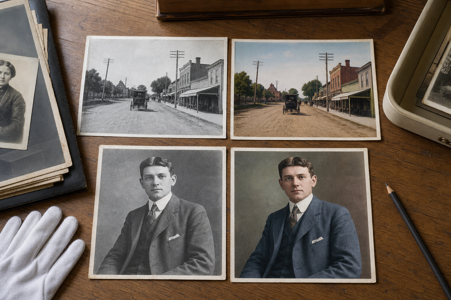
Before publishing, package the original and the colorized version together. This is especially useful when photos come from families, private collectors, or community members who care deeply about the material.
A simple review packet can include:
- Original scan or cleaned grayscale version.
- Colorized draft.
- Proposed newsletter crop.
- Caption draft.
- Source credit line.
- Short note on what is known and what is inferred.
Use ConvertAndEdit Image to PDF to combine images into a clean review copy. If several pages need to be sent as one file, ConvertAndEdit PDF Merge can combine the image packet with permission notes, release forms, or an editorial draft.
Keep the packet simple. Reviewers should not need design software or archive training to answer the key questions: Is this the right photo? Is the caption accurate? Does the color version feel acceptable? Are any important details missing from the crop?
Captioning Without Overexplaining
Captions are where trust is built. A clear caption does not need to be long, but it should separate fact from interpretation.
Weak caption:
Main Street in 1925, restored in color.
Better caption:
Main Street, circa 1925. Colorized from an original black-and-white photograph courtesy of the North Street Historical Society.
Best when uncertainty matters:
Main Street, circa 1925. Colorized from an original black-and-white photograph courtesy of the North Street Historical Society. Storefront colors are interpretive; building placement and signage are based on the source image.
For newsletters, use plain language. Readers do not need a lecture on digital imaging. They do need to know whether they are seeing an original color photograph or a modern colorized version.
Common Mistakes to Avoid
The biggest problems usually come from speed, not from lack of care.
Avoid these mistakes:
- Publishing the colorized file without the original saved separately.
- Cropping out borders, signs, or background clues before review.
- Using a social media copy as the source file.
- Applying strong sharpening after colorization.
- Compressing once for email and then reusing that file for print.
- Presenting guessed colors as confirmed facts.
- Removing damage that is historically meaningful.
- Letting an AI edit alter faces, signs, or architecture without correction.
- Forgetting credit lines or collection names.
- Naming every file
final.
Most of these are easy to prevent with folders, names, and a short review pass.
A Practical Production Checklist
Use this checklist when preparing one photo for a newsletter issue:
- Locate the best available source scan.
- Save the untouched original in a clearly named folder.
- Duplicate the file for cleanup and color work.
- Correct rotation and basic exposure.
- Remove dust that is clearly not part of the record.
- Preserve borders, stamps, handwriting, and meaningful damage.
- Write down known color references and uncertain areas.
- Create a restrained colorized version.
- Compare the color version with the grayscale copy at full size.
- Check faces, hands, signs, clothing, and building edges.
- Create publication crops without erasing important clues.
- Export separate copies for print, web, email, and review.
- Compress only the copies that need to be smaller.
- Create a review packet if approval is needed.
- Caption the image as colorized and credit the source.
- Keep all source and derivative files after publication.
This list may look long, but it becomes fast after a few issues. The point is not bureaucracy. The point is to avoid losing evidence while making the image easier for readers to enjoy.
Example: A 1930s Storefront Photo
Imagine a historical society wants to publish a 1930s photo of a grocery storefront. The scan is slightly tilted, dusty, and faded. A sign over the door is readable, but the awning is torn and one corner of the print has a studio stamp.
A careful edit would keep the full scan first. The cleanup copy would rotate the storefront, reduce scanner dust, and improve contrast enough to make the sign easier to read. The stamp would stay in the reference version because it may identify the photographer or print source.
For colorization, the prompt would ask for muted brick, natural pavement, restrained clothing colors, and preserved sign detail. If the AI edit turns the sign into unreadable shapes or paints the awning in a bright modern color, that draft should be rejected or revised.
The newsletter might use a crop centered on the storefront and two pedestrians. The review packet would include the wider grayscale version, the colorized version, and a caption noting that the awning color is interpretive. The web version would be resized and compressed, while the PDF issue would use a higher-quality copy.
Readers see a vivid image. The archive still has a reliable source trail.
Final Thoughts
Colorization can be a strong tool for local history publishing when it is handled with restraint. The best results do not try to erase age or uncertainty. They make old images more approachable while keeping the original record visible and respected.
For newsletter teams, the winning habit is simple: preserve first, interpret second, publish clearly. Keep the grayscale source, colorize a duplicate, document uncertainty, use careful crops, and create destination-specific copies. That way, a single historical photo can serve the reader, the editor, the donor, and the archive without forcing one version to do every job.